![]() by Tom Gurney
by Tom Gurney
Tom Gurney BSc (Hons) is an art history expert with over 20 years experience
Published on June 19, 2020 / Updated on October 14, 2023
Email: tomgurney1@gmail.com / Phone: +44 7429 011000
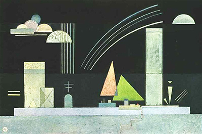
At Rest was completed by Wassily Kandinsky in 1942 and was similar in style to much of his work during this period.
The artist produced a number of light-on-dark geometric scenes from around the late 1930s up to this point. One can see similarities with the work of Paul Klee and abstract paintings such as Castle and a Sun and Architecture. These Kandinsky paintings marked an interesting development in his career where abstract forms were far easier to identify as compared to some of his earlier periods. For example, we immediately spot clouds, boats, multi-storey buildings, perhaps a church and also a stretch of water on which the calming scene is set.
There is also a zig-zag of lines which suggest that we might be on the other side of the river, looking out from the side of a bank. The zig zags would therefore represent some steps to the waterfront. Kandinsky offers something for everyone during his career, from the wild slaves of energy in his compositions, to the colourful German landscapes, up to the abstract cityscapes found in paintings such as this one. At Rest can now be found in a private collection, but little else is known about this painting, at least in content that has been translated into English (German speakers may be able to find out more in local publications).
There are a number of other black and white paintings with abstract lines and shapes from around 1937 as the artist moved into a slightly new direction for a period of several years. Kandinsky was as knowledgeable around the theories of colour as almost any artist in history, but that did not mean that he forced himself to brightly decorate all of his paintings. He enjoyed variety in form, content and colour. Additionally, he also made use of shaded colour in some cases, whilst at other times he would go for solid blocks of tone, each choice giving a different impact.