 by Tom Gurney
Tom Gurney BSc (Hons) is an art history expert with over 20 years experience
Published on June 19, 2020 / Updated on October 14, 2023
Email: tomgurney1@gmail.com / Phone: +44 7429 011000
Several Circles by Wassily Kandinsky: Introduction
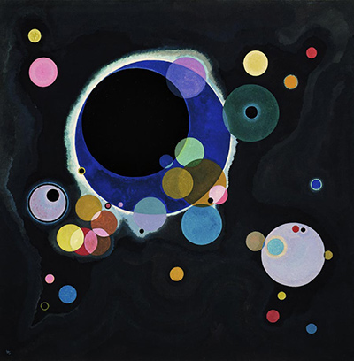
Wassily Kandinsky's Several Circles gathers differently sized circles in a dark, nearly square field. The largest black disk is edged and partly crossed by blue, pale and warm colour; smaller circles appear to drift, cluster or stand apart. The painting feels spacious despite the number of forms it contains. The Solomon R. Guggenheim Museum in New York identifies it as Several Circles (Einige Kreise), an oil on canvas made in January–February 1926. It belongs to Kandinsky's Bauhaus years and makes the circle an especially concentrated subject of visual experiment. The Guggenheim also records a physical contrast that a small reproduction cannot show well: varnish on selected forms creates glossy passages amid matte ones. [1].
Watch: Wassily Kandinsky
Five museum videos about Kandinsky’s art, sources of inspiration and the relationship between colour and music.
Vasily Kandinsky: Around the Circle
Curator Megan Fontanella introduces Kandinsky and the Guggenheim collection.
Watch on YouTubeAt a Glance
- Artist:Wassily Kandinsky.
- Title:Several Circles (Einige Kreise; French Quelques cercles).
- Date:January–February 1926.
- Medium:oil on canvas, with selected varnished passages documented by the museum.
- Size:140.7 × 140.3 cm (55 3/8 × 55 1/4 in) in the Guggenheim checklist.
- Collection:Solomon R. Guggenheim Museum, New York; Founding Collection, by gift; accession 41.283.
- Context:painted during Kandinsky's Bauhaus period after the school's move to Dessau.
Where this work sits in Kandinsky’s career
The Blue Rider
1903Composition VII
1913Composition VIII
1923Several Circles
1926Sky Blue
1940Contents
- First look: circles against darkness
- A nearly square field with unequal weights
- What do the overlaps do?
- Colour within a restricted shape
- Families of circles, not one repeated sign
- Matte, gloss and a surface a screen cannot show
- Does the picture represent the cosmos?
- Kandinsky's own explanation of the circle
- Why 1926 matters
- Several Circles and Composition VIII
- How to look closely
- Collection and title
- Why Several Circles matters
- A useful way to compare reproductions
- Frequently asked questions
- References
First look: circles against darkness
The background is a dark field, but it does not read as a single flat black rectangle. In the existing reproduction, slight changes of tone surround the bright forms. The eye first meets a large dark disk near the centre-left, then notices blue and pale colour around its edge and smaller circles overlapping that zone. Other disks spread out above, below and to the right. A bright, pale circle at the lower right balances the larger dark one without mirroring it. Far smaller accents near the borders keep the edge of the picture active.
The relative sizes change how each circle feels. The largest disk can seem heavy and still, while a tiny yellow or red point appears sudden and mobile. Medium-sized circles bridge the two extremes. Some form close groups; others are isolated by broad stretches of darkness. This distribution makes the composition more than a collection of round shapes. The viewer moves between clusters, pauses in dark intervals and returns to the dominant form with a changed sense of its neighbours.
The title invites counting, but an exact count is not the most useful first question. Some forms are partly obscured, edged by other colours or seen through another circular area. The answer can change according to what one treats as a separate circle. The title's “several” accommodates this variety. Try following the changes of size and transparency instead. The Guggenheim emphasizes layered and transparent circles that produce shifting colour relationships. That description is stronger evidence about the original surface than a small screen image alone. [1].
A nearly square field with unequal weights
A square-like canvas can invite a centred, symmetrical arrangement. Kandinsky resists that easy balance. The biggest dark circle sits to the left of a vertical centre line, and an array of lighter and smaller forms responds across the remaining space. A group at the lower left draws the eye in one direction; a large pale circle lower right pulls it in another. Small high notes keep the upper area from becoming empty. The whole can feel balanced without dividing into matching halves.
The edges matter. A tiny circle near a border has much less mass than the central form, yet its isolation makes it conspicuous. A form close to a corner can stretch the viewer's awareness of the canvas farther than a large shape placed centrally. Kandinsky uses both sizes and distances. The dark intervals between circles are not unused territory; they set the scale of each encounter. A small disk surrounded by dark space may command more attention than a larger one buried in a crowded cluster.
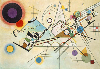
The format also distinguishes this painting from the wide Composition VIII of 1923. In VIII, circles share a pale field with numerous straight lines, bands, triangles and arcs. In Several Circles, the near-square space concentrates attention on variations within a single dominant motif. It would be misleading to say that Kandinsky simply removed the lines from the earlier work: the changed ground, shape of the canvas, colour and surface effects create a different kind of experience. [1].
What do the overlaps do?
Several circles seem to pass in front of or behind others. Translucent-looking areas allow one colour to alter another rather than merely covering it. The Guggenheim describes layered, precise and transparent circular forms and varied chromatic relationships. Where a blue area meets a paler disk, an overlap can make the edge of one form feel less final. Where a dark form cuts across colour, the same basic shape can gain weight. The circle stays recognisable while its position in a set of layers changes. [1].
Overlap also gives a suggestion of depth, though the picture is not an ordinary landscape. A viewer may read one disk as nearer because it interrupts another, then find a different cue nearby. There is no horizon, floor or perspective grid to settle all distances at once. The circles behave like objects in some passages and like patches of colour on a canvas in others. This instability is part of the painting's pleasure: a clear geometry supports relationships that remain mobile.
The circles do not all meet by the same rule. Some just touch. Some appear to cut deeply through one another; others are separated by dark ground. Repetition therefore creates comparison rather than sameness. An overlap at one scale may feel like a tight knot, while a similar contact between larger areas feels expansive. Describing these differences is more exact than assigning each disk to a single emotional or cosmic symbol.
Colour within a restricted shape
If the outer shape stays mostly circular, colour has room to vary. Yellow, blue, pink, red and greenish tones appear across the dark field, and several disks contain more than one hue. The large central form combines dark mass with blue and pale edging. A small light circle may seem warm because of a yellow centre, while a neighbouring cool one changes the contrast. The painting tests how a familiar outline behaves when colour, scale and placement change together.
The dark ground can make colours seem bright, but it does not guarantee the same brightness everywhere. A colour at the edge of the central disk may be absorbed into that dark weight; the same colour isolated elsewhere can flash. The pale lower-right circle has a different effect from the tiny pale accents: its size and position give it a kind of counterweight. These are observations about relationships visible in the reproduction, not measurements of pigments or claims about the precise intensity of the original canvas.
Kandinsky's writings and later comments make clear that he was interested in forms' expressive potential. They do not supply a universal rule that blue always means one feeling or yellow another. In this painting, a colour's effect depends on its neighbour and the dark interval around it. The same principle applies to the circle itself. Repeated geometry becomes a means of differentiation, not a way to make every part equivalent. [3]; [4].
Families of circles, not one repeated sign
The large dark disk and the lower-right pale one are both circles, but they do not operate as two tokens of equal value. One is partly wrapped in colour and lies near a dense group. The other seems to hold a lighter area farther across the dark field. Smaller disks link them through a loose network of similarities: roundness, a coloured centre, a halo or a sharp edge. The relations are easier to see when the viewer moves from one family resemblance to another rather than trying to count identical units.
Some circles seem to have a core and an outer ring. Others appear as nearly single-colour spots. A few are so small that they register first as light against dark, with their exact circular boundary noticed only later. These differences alter the pace of looking. A large form can be taken in at once, but a tiny one may be discovered after the eye has crossed a dark interval. The picture contains both immediate and delayed events, even though no part physically moves.
The repetitions also help prevent the central disk from becoming a single subject set against anonymous decoration. Each smaller form changes its context. A warm disk near the centre can soften its edge; a cool one can extend its colour outwards; a pale disk at a distance can challenge its dominance. Those effects are visual propositions, not a claim that Kandinsky specified a sequence for every viewer to follow. The canvas permits multiple routes, and repeated viewing can make different relationships stand out.
A helpful test is to imagine changing only one variable. What if two neighbouring circles exchanged positions but kept their colours? What if a small disk grew to the size of the lower-right one? The exercise does not reconstruct Kandinsky's process. It reveals how strongly the actual arrangement depends on scale, distance and adjacency. The work's restriction to a familiar shape makes those other variables more noticeable. [1].
Matte, gloss and a surface a screen cannot show
The Guggenheim's account identifies selective varnishing, including on the largest black circle. That treatment set glossy areas against matte paint. This is a material fact worth knowing because it changes how the work can respond to light and viewing angle. A glossy circle may catch a reflection or appear to come forward in a way that a matte neighbour does not. The effect belongs to the painting as an object, even if a photograph suppresses it. [1].
It is important to keep the description selective. The source does not say the entire canvas received an identical shiny coating. Nor does the existing small image prove exactly where every boundary between gloss and matte lies. What can be stated securely is that Kandinsky used varnish on chosen forms and that the museum finds this contrast significant. The reproduction can show the composition of circles; a careful visit or detailed technical image would be needed for a fuller account of surface variation.
Knowing about the varnish also guards against treating this work as a purely digital-looking design. Precise circles can appear flat on a screen. Oil paint, canvas and variable sheen make the object more complex. The painted edge of a circle, the way colours meet and the response to light all belong to the encounter. Geometry here is a working vocabulary carried by materials, not a formula floating free of them.
Does the picture represent the cosmos?
The Guggenheim says the dark, atmospheric background suggests infinite cosmic space and that the circles can evoke celestial movement. It is a persuasive way to describe the work's visual effect. The dark field offers few fixed reference points, while bright disks differ in apparent distance and size. A viewer can feel that the forms inhabit a space larger than the square canvas. Such an impression helps explain why the composition often attracts astronomical comparisons. [1].
That reading is not the same as identifying specific planets, a solar-system diagram or an astronomical event. The museum's language is evocative rather than a catalogue of literal depicted bodies. No object record cited here establishes a scientific map behind each disk. A visitor is free to see celestial movement, but should present it as an interpretation arising from the picture's darkness, spacing and circular forms.
Other experiences remain possible. The circles can seem like coloured lights, overlapping sounds, or simply painted forms held in relation. None needs to replace close looking. Ask which part of the dark field creates the sense of distance, and which overlap interrupts it. The visual evidence gives the cosmic interpretation its strength and also keeps it from hardening into an unsupported story.
Kandinsky's own explanation of the circle
A 1930 letter to Kandinsky's friend and biographer Will Grohmann, cited in the Centre Pompidou's French dossier, explains that Kandinsky valued the circle for its inner force and varied possibilities rather than for geometric properties alone. He compared his later attraction to circles with an earlier attachment to the rider. The remark is especially useful for this painting because it confirms that repetition of the round form was expressive for him, not simply an exercise in geometry. [3].
The letter was written four years after Several Circles. It is retrospective testimony about an artistic preference, not a set of instructions written beside this canvas. It does not say that the largest circle must represent the rider, or that each smaller one has a fixed counterpart in an earlier work. Kandinsky's comparison invites a broader historical question: how did one flexible motif become important after another? It should not collapse the difference between a recognisable horseman in an early picture and a field of circles in 1926.
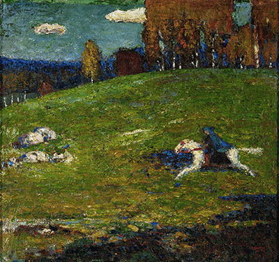
Compare The Blue Rider of 1903 with Several Circles and the contrast becomes concrete. A mounted figure gives the earlier image a narrative point of departure. The later painting offers no equally explicit figure, but it still asks the viewer to feel variation, movement and relations among forms. Kandinsky's letter lets us connect the two periods without claiming that they illustrate the same subject. A motif can change while the desire for expressive force persists. [3].
Why 1926 matters
Kandinsky made the picture after the Bauhaus moved from Weimar to Dessau in 1925. The school provided a context for teaching and examining basic visual elements, and Kandinsky's own work continued to investigate line, colour and form. The date places Several Circles between the early Bauhaus Composition VIII and later paintings that explore different balances of geometric and freer forms. It is a point within an active period, not the result of a single stylistic conversion. [1]; [4].
A school context can explain why Kandinsky discussed fundamental shapes, but it should not be turned into a claim that all Bauhaus pictures resemble diagrams. This canvas uses circles precisely and also makes them look transparent, dense, bright, faint, close or distant. Its selective varnish makes material differences part of the design. The work demonstrates how an apparently limited formal vocabulary can open many perceptual possibilities.
Kandinsky also published Point and Line to Plane in the Bauhaus period. The book explores basic elements of visual art, yet it is not a decoder for every mark in a painting. The stronger connection is a shared attention to what a form can do in relation to another. Several Circles asks the question in oil, size and sheen rather than only in theoretical language. The object's date and materials therefore matter alongside any excerpt from Kandinsky's writing. [5].
Several Circles and Composition VIII
The Guggenheim owns both Composition VIII and Several Circles. The 1923 Composition spreads many kinds of geometry across a light, wide ground. It contains circles, but also diagonals, bars, triangles and arcs that compete for attention. Three years later Several Circles concentrates the vocabulary and darkens the field. The comparison makes Kandinsky's choices visible: one painting uses contrast among different types of form, the other uses variation within one dominant type. [1].
This is not a straight journey from complexity to simplicity. Several Circles reduces the kinds of outline but multiplies differences of scale, colour, apparent transparency, spacing and sheen. Composition VIII has a more varied shape vocabulary but a different type of open ground. Each work establishes its own terms. Asking which is “more abstract” would tell us less than asking how the viewer's attention travels across each surface.
Both paintings also resist a sharp division between feeling and calculation. The placement of forms in Several Circles is deliberate, yet the field can feel atmospheric or mobile. The shapes in VIII look exact, yet their crossing directions can create visual tension. Kandinsky's Bauhaus painting does not become emotionally empty when its edges become clearer. These two canvases make that point in contrasting ways.
How to look closely
Begin by choosing three circles of different sizes. Notice where each sits, how much darkness surrounds it, and whether it overlaps another form. Then compare their colours and edges. The largest may hold the composition, but a small accent can change the direction of attention. This exercise helps make “several” concrete: the forms belong to a family while doing different work.
Next follow the zones of contact. At an overlap, ask which colour seems to advance and which seems to recede. The answer may not be stable across the canvas. That is a useful finding, because it shows the picture making space without a conventional scene. A transparent-looking area can join forms while preserving their difference. A dark, opaque zone can block one route and push the eye elsewhere.
Finally consider what the existing photograph cannot settle. It shows broad colour and placement, but the Guggenheim's account of selective varnish points to an effect of light that a static reproduction may miss. A future visit should include looking from more than one angle where the museum permits it. A larger reproduction may improve scrutiny of edges; it will still be an image of a physical surface. [1].
Collection and title
The owner records the work in New York as part of its Founding Collection, by gift, accession 41.283. The German title Einige Kreise and English Several Circles both identify this same 1926 oil. The Centre Pompidou's French dossier adds Quelques cercles as a translation while crediting the Guggenheim as owner. These parallel titles are useful for searching institutional records; they are not evidence of three separate paintings. [1]; [3].
The nearly identical dimensions in the two institutions' presentations appear in reverse order. Since the Guggenheim owns the object, its current checklist supplies the dimensions used here. The difference is small but worth stating because precise measurements should not be made to appear more certain than the records allow. Both sources describe the same approximately 1.4-metre square canvas. Neither justifies inventing a variant painting to explain the reversal.
The title itself is deliberately modest. It names a shape repeated on the canvas without prescribing an emotion, place or narrative. That openness directs attention back to the image. A catalogue number, date and physical description keep the object distinct; the title leaves viewers room to discover how the circles relate. The historical facts and open-ended visual experience work together rather than competing for authority.
Why Several Circles matters
Several Circles tests how much variation Kandinsky could draw from a seemingly restricted motif. Its circles differ in scale, colour, opacity, spacing and surface treatment. The dark ground offers both separation and an impression of depth. A simple description—coloured circles on black—misses the relations that make this canvas particular. Its place in the Guggenheim's collection, documentation of the surface and Kandinsky's later explanation of his attraction to circles make it a strong entry point for studying his Bauhaus years. [1]; [3].
It also shows the limits of labels. “Geometric” describes the outlines; “cosmic” describes one institutional reading of the atmosphere. Neither replaces observation of the painted object. The selected gloss reminds us that the work changes with light and viewpoint. The unequal distribution of disks reminds us that repeated shape need not become pattern in a mechanical sense. The best way to understand its importance is to move between secure object facts, careful looking and attributed interpretation, keeping each kind of evidence clear.
A useful way to compare reproductions
Reproductions can make this painting look more uniform than it is. A bright screen tends to lift the colours from the dark field, while a printed page may compress nearby dark tones together. Neither effect proves that one reproduction is false. It shows that the viewer should keep the documented material facts beside the image: oil on canvas, a nearly 1.4-metre square support and selected glossy passages. The Guggenheim's account of the surface is especially important when a photograph presents every area under the same light. [1].
To compare two images responsibly, first make sure both reproduce the Guggenheim's Einige Kreise, accession 41.283. Then note what changes in colour balance, crop and visible paint texture. A tighter crop can make a small circle appear closer to a border than it is; a brightened image can make a near-black background look blue or green. If the question is about the exact hue or varnish, give priority to the owner museum's object information and, when possible, direct observation. If the question is about broad placement, the existing reproduction can still be useful.
The same care applies to a written description. “Dark” is secure at a broad level; an exact pigment name would need technical evidence. “Overlapping” describes visible forms and is reinforced by the Guggenheim's account; a proposed order in which each disk was painted would need a conservation study. Making those distinctions does not weaken a reading. It allows visual attention and source evidence to support one another without pretending that every appealing inference is already documented.
Kandinsky artworks directory
Frequently Asked Questions
The Guggenheim dates it to January–February 1926, during Kandinsky's Bauhaus years after the school had moved to Dessau. [1].
It belongs to the Solomon R. Guggenheim Museum in New York, Founding Collection, accession 41.283. [1].
The owning museum records 140.7 × 140.3 cm, or 55 3/8 × 55 1/4 inches. A Centre Pompidou dossier reverses the order of the two near-equal metric dimensions; both describe an almost square canvas. [1]; [3].
The Guggenheim says the dark field can suggest cosmic space and celestial movement. It does not identify a literal planetary map. Reading them as planets is an interpretation, not a documented key to every disk. [1].
In a 1930 letter cited by Centre Pompidou, he described valuing their varied inner force rather than their geometry alone. The letter explains an artistic attraction but does not assign a fixed meaning to each circle in this earlier painting. [3].
The Guggenheim describes varnish on selected forms, including the largest black circle, producing a contrast with matte areas. A small reproduction cannot fully show that surface effect. [1].
Discussion
What do you notice first in Several Circles? Share a close observation or a question about the evidence for this work.
Comments are for comparing what we see and what the cited sources establish.
Reader Insights
Which small circle most changes the weight of the large dark disk?
How does the dark ground alter your comparison with Composition VIII?
What could viewing the documented glossy passages in person add to a reading from photographs?
Join the Conversation
Add your observation below and tell us which part of the artwork led you to it.
References
- Solomon R. Guggenheim Museum, Vasily Kandinsky: Around the Circle press kit, checklist and catalogue text. View source.
- Solomon R. Guggenheim Museum, Several Circles object page. View source.
- Centre Pompidou, French Kandinsky exhibition dossier. View source.
- The Museum of Modern Art, Kandinsky artist essay. View source.
- Centre Pompidou, English Kandinsky biographical chronology. View source.