
 by Tom Gurney
Tom Gurney BSc (Hons) is an art history expert with over 20 years experience
Published on June 19, 2020 / Updated on November 5, 2025
Email: tomgurney1@gmail.com / Phone: +44 7429 011000
Composition VIII by Wassily Kandinsky: Introduction
Wassily Kandinsky's Composition VIII places circles, arcs, triangles and long straight lines in a wide, pale field. A dark disk commands the upper left, while smaller coloured forms and intersecting diagonals carry the eye across the surface. The painting can look precise at first glance, yet its parts do not settle into a static diagram. They differ in size, weight and pace. The Solomon R. Guggenheim Museum in New York owns this July 1923 oil on canvas, which it catalogues as Composition 8 (Komposition 8). It belongs to Kandinsky's especially ambitious numbered series and to his first years of teaching at the Bauhaus. [1]; [3].
Watch: Wassily Kandinsky
Five museum videos about Kandinsky’s art, sources of inspiration and the relationship between colour and music.
Vasily Kandinsky: Around the Circle
Curator Megan Fontanella introduces Kandinsky and the Guggenheim collection.
Watch on YouTubeAt a Glance
- Artist:Wassily Kandinsky.
- Title:Composition VIII, catalogued by the Guggenheim as Composition 8 (Komposition 8).
- Date:July 1923.
- Medium:oil on canvas.
- Size:140.3 × 200.7 cm (55 1/4 × 79 in).
- Collection:Solomon R. Guggenheim Museum, New York; Founding Collection, by gift; accession 37.262.
- Context:the first numbered Composition after Composition VII of 1913, made during Kandinsky's Bauhaus years.
Where this work sits in Kandinsky’s career
The Blue Rider
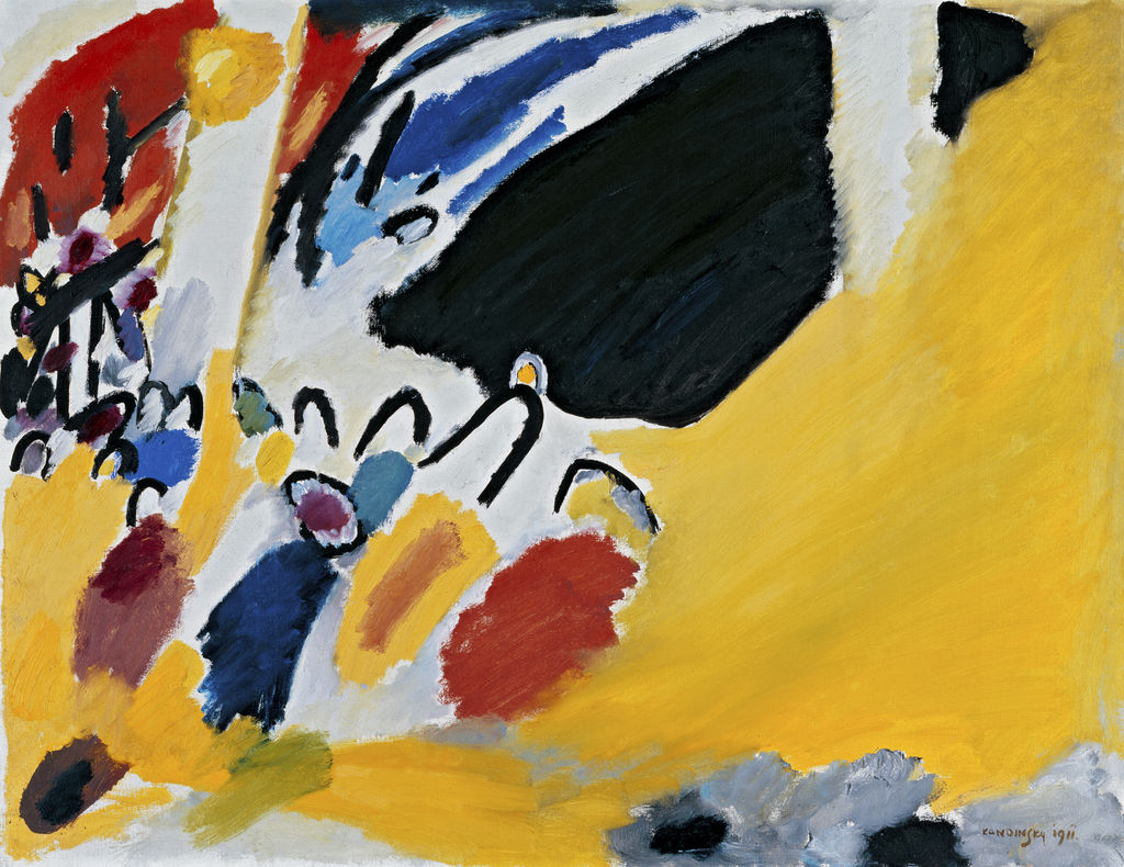
1903Composition VII
1913Composition VIII
1923Several Circles
1926Sky Blue
1940Contents
- First look: an open field with competing centres
- Why is it called a Composition?
- Circles of different weight
- Lines, angles and the pace of looking
- Colour and the pale ground
- Kandinsky at the Bauhaus
- From Composition VII to VIII
- What a comparison can and cannot establish
- The painting in the Guggenheim collection
- How to look without a fixed code
- Form, balance and the limits of a diagram
- Why Composition VIII matters
- Frequently asked questions
- References
First look: an open field with competing centres
The picture is about one and a half times as wide as it is high. Its pale, warm ground lets individual marks register as separate events, even where several cross. The large dark circle at the upper left is an obvious entry point. It has a coloured interior and a warmer ring around it, making it seem both compact and radiant. Below it, a smaller yellow circle with a blue edge creates a distant echo. Neither circle acts alone. A web of lines and bands pulls attention towards the centre and then to the right, where smaller disks, verticals and angled strips gather. The surface feels open in one area and crowded in another.
Try following one line rather than naming every shape. A diagonal may run from the lower left towards the centre, meet a stack of short bars, and continue into a tangle of arcs and fine strokes. Other lines appear to interrupt it. The eye alternates between reading a path and noticing that no single path explains the whole. This is one way the painting keeps movement alive while its forms remain firmly placed. The Guggenheim describes an interplay of dynamic and calm, forceful and quiet passages. That description fits the visible contrast between the emphatic upper-left circle and the thinner marks dispersed elsewhere. [1].
The reproduction introduces those broad relationships, but it cannot show every transition in the paint of a canvas two metres wide. Claims about tiny strokes or exact pigment mixtures should be made from a reliable, sufficiently detailed image or the painting itself. The large-scale pattern is already enough to raise questions: why does the heaviest circle sit near an edge, how are distant coloured spots brought into relation, and what makes the otherwise pale ground feel active?
Why is it called a Composition?
Kandinsky used the numbered Composition title for only ten paintings made between 1910 and 1939. MoMA's 1995 exhibition brought surviving canvases together with studies and described the series as a sustained investigation of painting's ability to organise form and colour beyond a literal subject. The number VIII therefore places this work in a particular group, rather than declaring it the eighth painting Kandinsky ever made or a sequel with an identical method. The first seven were painted before the First World War; VIII arrived a decade after VII. [3].
“Composition” also suggests relations among parts: balance, contrast, repetition and interval. The musical association mattered to Kandinsky, but no source identifies this canvas as a transcription of a specific score. The word is better used to ask what happens when a large circle meets a small one, a line cuts across a coloured shape, or a crowded area adjoins a quiet one. Those relations are visible. A secret code in which every circle stands for one emotion is not established by the title.
Kandinsky's interest in spiritual and psychological effects did not vanish because he adopted geometric forms. The Guggenheim presents the numbered series as a search into how colour and form could act on a viewer. MoMA sees VIII's shapes as balanced and dynamic rather than inert. These are institutional interpretations, not instructions to feel a particular emotion. A viewer may experience tension where diagonals converge, relief where the pale ground opens, or both at once. The painting's complexity gives those responses a basis without making them compulsory. [1]; [3].
Circles of different weight
The upper-left disk is so large and dark that it could overwhelm the rest of the surface. Kandinsky counters its mass with distribution rather than another identical mass. Smaller round forms appear in different positions and colours. Some are contained by dark outlines; others seem lighter, or meet lines that make their edges less self-sufficient. A viewer can compare them as a family without treating them as repeated stamps. Scale changes their force. A tiny circle that would barely register alone can become sharp when set against a quiet part of the ground.
The great circle also changes the balance of the canvas. It sits high and to the left, away from a central position that might have made the composition feel settled. From there it seems to pull on the field, while diagonals and bars draw attention towards the opposite side. The picture's equilibrium is therefore active. It does not rest on mirror symmetry. What appears near one edge is answered elsewhere in a different language: a cluster of line, a coloured spot, or a tilted plane rather than a matching disk.
It is easy to call every circle a sun, eye or planet. Such analogies can help describe an impression, but the Guggenheim record does not supply a fixed illustrated story for the painting. Kandinsky's own theoretical writing gives circles an expressive place in his later work, yet a form's effect still depends on its particular size, neighbour and ground. The better question here is what each circle does in this arrangement. The large disk holds attention, smaller disks mark intervals, and partial arcs suggest the movement of a round form without closing it. [2].
Lines, angles and the pace of looking
Straight lines give the painting a different energy from the circles. Some are long enough to seem like directions across the whole field. Others occur in short, ruler-like series or in stacks that recall a ladder. Fine dark strokes cross coloured passages. Broad angled bands become shapes in their own right. Their variety makes “geometry” an accurate but incomplete description: one type of mark cannot account for the motion of the whole image.
The diagonals are especially important. A horizontal or vertical can steady the eye, but a diagonal asks it to travel. Several directions coexist here. One line can appear to gather forms along a route; another cuts that route before it becomes a stable axis. The eye must keep revising its sense of the centre. This is different from the continuous rush of marks in Composition VII, yet both paintings make viewing a process rather than the recognition of one dominant figure.
The arcs complicate the contrast between straight and round. Some almost form complete circles; others seem like gestures passing through the field. An arc can bridge two distant areas or frame a coloured spot without enclosing it. It can also make a triangular point seem sharper by passing near it. Looking at these local meetings is more revealing than dividing the canvas into “circle section” and “line section”. Kandinsky designed relations, not a catalogue of isolated shapes.
The lines should not be mistaken for measurements merely because some look exact. They do not present a scale or a plan that a builder could execute. Their widths, crossings and positions matter pictorially. A thin line crossing a pale passage has a different effect from a heavy dark bar at a crowded junction. The geometric vocabulary is put to expressive use, and its effects change as the eye moves. MoMA describes the forms' dynamic relationships as more prominent here than in the earlier Compositions. [3].
Colour and the pale ground
Although circles and lines are easy to name, colour gives them differing pressures. A dark, nearly black disk anchors one corner; yellow and blue enliven a smaller circle; red accents punctuate quieter stretches. Blue can sit inside a form, lie beside an orange or red passage, or mark an edge. The same colour family does not perform one permanent task. It gains meaning through contrast and location.
The ground is not a blank leftover after the shapes are placed. Its warm, pale tone provides room between them, and that room changes their relationships. Some marks seem suspended with space around them; others press against nearby lines or disks. A broad empty interval can make a tiny form appear more audible to the eye. A busy crossing can make the next quiet area feel deliberate. The picture uses spacing as actively as it uses paint.
MoMA's account says geometric forms play a greater expressive role than colour in VIII when compared with earlier Compositions. That is a comparison of emphasis, not a reason to ignore colour. The dark left circle would not carry the same weight if its centre and halo were identical to the ground. Nor would the smaller circles and bars create the same rhythm if all were black. The design depends on both the clarity of shape and the contrasts that make those shapes differ. [3].
A reduced image can make the surface look perfectly flat. The painting is oil on canvas, and fine differences of paint handling may become visible at closer range. This page limits its detailed observations to relationships clear in the existing reproduction. The official dimensions remind us that a visitor would read those relationships over a much wider physical area than a screen thumbnail supplies. Scale changes the distance between marks and the work required to bring them into one view.
Kandinsky at the Bauhaus
Kandinsky began teaching at the Bauhaus in Weimar in 1922. He made Composition VIII in July 1923, during his early years there and before the school moved to Dessau in 1925. The Bauhaus setting encouraged teaching about basic visual elements, materials and their interaction. It did not simply hand Kandinsky a ready-made formula for painting. He arrived after long experiments with colour, line, abstraction and the relation of an image to inner experience. [1]; [2].
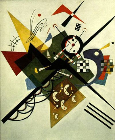
The canvas makes a strong comparison with On White II, another work of 1923. Both allow lines and defined shapes to claim attention, but each arranges them differently. One painting does not serve as a diagram explaining the other. A later work such as Several Circles makes round forms more nearly the central vocabulary. Here, circles share the field with sharp diagonals, bars, triangles and coloured patches. A chronology of motifs can show development without pretending that the artist completed one exercise before starting the next.
Kandinsky's Russian years between the first seven Compositions and VIII were also active. War and revolution changed his circumstances, and he worked in several media while taking part in cultural institutions. MoMA describes a move away from the prewar works' expressionistic density towards a more geometric idiom. That shift can be seen in the paintings, but it should not be written as a story in which years of work disappear. The gap in the numbered Composition series is not a gap in his career. [3]; [7].
From Composition VII to VIII
Composition VII was completed in 1913 on a very large canvas now in the Tretyakov Gallery. Its arcs, colour and dense crossings encourage the eye to travel through a field without easy boundaries between parts. VIII, made ten years later, often gives a circle or line a clearer edge and leaves more ground around it. The contrast is visible even in modest reproductions. It is also the basis for MoMA's distinction between the earlier picture's turbulent, prewar intensity and VIII's more measured geometry. [3]; [6].
The contrast should not become a rigid opposition between feeling and reason. VII was carefully prepared through numerous studies, despite its rushing appearance. VIII uses controlled-looking forms to create tension, interruption and surprise. Both are compositions in which a part has to be experienced in relation to the whole. An apparent change of vocabulary is real, but a loss of expressive ambition does not follow from it. The Guggenheim's description of VIII as alternately forceful and quiet makes the point especially clear. [1].
The difference in size also matters. VII is around three metres wide; VIII measures just over two metres. Both are large paintings, but the smaller canvas of VIII offers a different field for intervals and the spacing of defined shapes. A visitor moving from one to the other would encounter not only a change of decade but a change of physical demand. The chronology tells when they were made; looking tells how they work.
What a comparison can and cannot establish
The numbered title invites viewers to place VIII beside the earlier Compositions, but a sequence is not a controlled experiment. Kandinsky changed countries, institutions, materials and working habits across the intervening decade. A difference between two finished canvases cannot by itself tell us which one of those changes caused it. The comparison can establish something narrower and stronger: how two documented objects use line, colour and surface at different moments. Historical sources then help explain the conditions in which those choices became possible.
For a practical comparison, start with one formal question. In VII, where can the eye pause between dense crossings? In VIII, where does an apparently open interval become active because a small disk or thin line occupies it? Ask the same question of each painting before reaching for labels such as “chaotic” or “rational”. Those labels may capture a first impression but flatten the texture of both. VII includes planned structure, and VIII includes moments that feel unpredictable. A comparison is useful when it reveals these features rather than simply confirming the labels with which the viewer began.
The works' museum records also set a limit. VIII's Guggenheim dimensions and VII's Tretyakov measurements identify different physical surfaces. The works may look roughly alike when digital images are displayed at the same width. In a gallery, VII's greater width would change how a person scans it, and VIII's clearer spaces would be encountered at their own large scale. Online looking can still be rewarding, but it needs this correction. It should not quietly replace two canvases with two equal-sized rectangles on a screen. [1]; [6].
The painting in the Guggenheim collection
The Guggenheim lists Composition 8 as a work in its Founding Collection, received by gift, with accession number 37.262. The painting also has a special place in the history of Solomon R. Guggenheim's relationship with Kandinsky. Institutional accounts describe it among the first works he acquired directly in connection with a visit to the artist. His collection ultimately came to include many Kandinskys. The history helps explain why this painting is so closely associated with the New York museum. [1]; [2].
Guggenheim publications do not agree on a precise year for the initial visit or purchase. A 2019 teaching text places both in spring 1929; a 2021 catalogue account says summer 1930. The foundation's archival chronology records an introduction and purchases in 1929, while another museum page places a Dessau studio visit in 1930. These may reflect several encounters or differing summaries of the collection history. Without a reconciled owner record, it is more accurate to state the documented connection than to repeat one exact acquisition date as settled fact. [2]; [1]; [4].
The accession number is a catalogue identifier. It should not be read as a simple date of purchase, and the “by gift” collection label should not be replaced with an invented transaction history. The painting's secure identity lies in the museum's title, medium, date, dimensions and accession. Those facts are enough to distinguish it from reproductions or differently numbered works, while leaving room for future clarification about the collector's itinerary.
How to look without a fixed code
Begin with the broad layout, then test one local relationship. Compare the upper-left disk with a smaller circle elsewhere. What happens to its apparent weight when you follow a diagonal away from it? Does a thin arc return you to that area, or lead towards a different cluster? Such questions make the viewer attend to actual placements rather than to an imagined list of symbols. The picture does not need a single hidden key to reward sustained looking.
Next consider the ground. Notice where a line is almost alone and where several forms touch or overlap. The eye may linger on a quiet interval before the crowded centre interrupts it. That alternation gives time to the composition, even though all parts remain present at once. Kandinsky's own interests in the effects of visual elements help explain why this could matter to him. They do not predetermine exactly how every visitor must feel. [2].
Finally, compare the work with an exact neighbour in date or series. On White II tests different balances in 1923; Composition VII tests the same ambitious title in another decade; Several Circles develops the round motif more extensively. Identify the work, year and museum before drawing a conclusion. A small web image can make unlike surfaces look deceptively similar. Source records and slow observation keep the comparison attached to real objects.
Form, balance and the limits of a diagram
One way to test the painting's balance is to imagine removing its largest circle. The remaining diagonals would still point and cross, but the left side would lose a weight that holds their motion against it. Imagine instead erasing the small circles: the large disk would become more isolated, and the passage from one side of the field to the other would have fewer pauses. Neither imagined change proves what Kandinsky planned in a sketch. It helps describe why the surviving arrangement is particular rather than an interchangeable selection of elementary shapes.
A diagram can show that lines meet at an angle or that circles differ in diameter. It cannot, by itself, convey how a warm ground affects a dark outline or how a thin stroke gains force beside a coloured patch. Kandinsky's painting invites the exactness of geometric observation while resisting the reduction of its effect to measurements. The eye notices relations across distance, then revises them when a nearer form claims attention. This is why the canvas can seem ordered and restless at the same moment.
The same caution applies to the word “balance”. It need not mean that every form has a counterpart of equal size on the opposite side. Here, unequal things answer one another. A dense network can counter a single heavy disk. Several small coloured marks can keep a large quiet area from becoming empty. Balance is an experienced relation across the whole field, not a rule one can confirm by folding the image down the middle. MoMA's description of dynamically related geometric forms points to this kind of activity. [3].
Look again at the far right and lower edges. Marks near a border can seem to continue beyond the frame or press back against it, depending on their direction. This does not mean there is a hidden second canvas outside the one the museum owns. It means the edge participates in how a line is read. The format, scale and placement of the painted elements all shape the experience. Even a well-known abstract image becomes more precise when it is treated as one physical composition rather than a free-floating pattern.
Why Composition VIII matters
Composition VIII is a hinge in the numbered series. It resumes a title Kandinsky had not used for a finished canvas since 1913 and places it in the visual world of his early Bauhaus years. The work shows that circles, straight lines and open intervals can carry an ambitious painting without a depicted scene. Its effect depends on their precise but unsettled relationships: a heavy form at one edge, scattered colour, crossing directions and spaces of apparent calm. MoMA's exhibition and the Guggenheim's collection record both mark its importance, though they emphasize different aspects of its history. [3]; [1].
The painting also gives a way to question easy stories of Kandinsky's career. A shift to geometry did not make his art merely mechanical. A gap in the numbered series did not mean a gap in artistic work. An institutional disagreement about a collector's visit does not undermine the painting's well-documented date, size and location. Keeping those distinctions in view lets the canvas remain more interesting than a label such as “geometric abstraction” can make it. Its visual argument begins each time the viewer moves from one form to another and discovers that the whole has changed with that move.
Kandinsky artworks directory
Frequently Asked Questions
The Guggenheim dates its Composition 8 (Komposition 8) to July 1923, during Kandinsky's early Bauhaus teaching years in Weimar. [1].
It belongs to the Solomon R. Guggenheim Museum in New York, Founding Collection, accession 37.262. [1].
The museum gives its dimensions as 140.3 × 200.7 cm (55 1/4 × 79 inches). It is an oil painting on canvas. [1].
The museum identifies interacting circles, triangles and lines rather than a single depicted subject. Analogies such as planets or instruments can describe a viewer's impression, but no documented key assigns a fixed object to every form. [2].
The 1913 Composition VII is denser and more interwoven. VIII gives many geometric forms clearer edges and wider intervals. Both use careful relationships among parts to sustain an expressive whole. [3].
Discussion
What do you notice first in Composition VIII? Share a close observation or a question about the evidence for this work.
Comments are for comparing what we see and what the cited sources establish.
Reader Insights
How does the large dark circle balance the thinner lines and smaller disks?
What changes when you compare VIII with the denser Composition VII?
What collection record would help settle the competing dates for Guggenheim’s first visit and purchase?
Join the Conversation
Add your observation below and tell us which part of the artwork led you to it.
References
- Solomon R. Guggenheim Museum, Vasily Kandinsky: Around the Circle press kit, checklist and catalogue text. View source.
- Solomon R. Guggenheim Museum, permanent-collection teaching materials on Composition 8. View source.
- The Museum of Modern Art, Kandinsky: Compositions, 1995 exhibition. View source.
- Solomon R. Guggenheim Foundation records, collection chronology. View source.
- Solomon R. Guggenheim Museum, Kandinsky Gallery history. View source.
- State Tretyakov Gallery, Composition VII object record. View source.
- Centre Pompidou, Kandinsky biographical chronology. View source.