 by Tom Gurney
Tom Gurney BSc (Hons) is an art history expert with over 20 years experience
Published on June 19, 2020 / Updated on October 14, 2023
Email: tomgurney1@gmail.com / Phone: +44 7429 011000
Composition VI by Wassily Kandinsky: Introduction
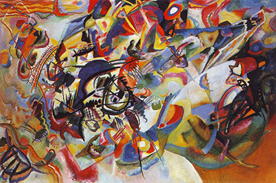
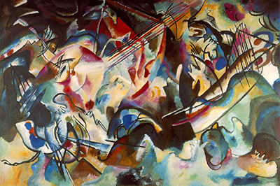
Wassily Kandinsky's Composition VI is a broad, turbulent painting completed in March 1913. Dark and coloured lines cross pale pink, blue, red, yellow and green passages; forms appear, break apart and rejoin across the surface. Kandinsky identified the Deluge as his starting subject, but he did not set out to make the final canvas a plainly illustrated scene of Noah's Ark. In an account published the same year, he described a long struggle to move from recognisable flood imagery towards the feeling and sound that the word “Deluge” summoned for him. The result is held by the State Hermitage Museum in Saint Petersburg. MoMA's 1995 catalogue records it as oil on canvas and gives the dimensions as 195 × 300 cm. A Russian collection-history project prints a conflicting width of 243 cm; the discrepancy is noted below rather than silently resolved. MoMA, Kandinsky: Compositions catalogue, PDF pp. 42–44; [5].
The painting is one of Kandinsky's numbered Compositions, works he treated as especially deliberate and ambitious. Composition V had taken the Resurrection as its theme; in Composition VI the Deluge became a point of departure. MoMA emphasises that the pictorial force of the sixth work is not measured by how completely it describes an Ark, animals or water. Its clustered lines and shifting colour create the sensation of a catastrophic event and a space that is hard to locate. That effect is available even when a particular motif cannot be named. [2].
Watch: Wassily Kandinsky
Five museum videos about Kandinsky’s art, sources of inspiration and the relationship between colour and music.
Vasily Kandinsky: Around the Circle
Curator Megan Fontanella introduces Kandinsky and the Guggenheim collection.
Watch on YouTubeAt a Glance
- Artist:Wassily Kandinsky.
- Title:Composition VI (Komposition 6 or Komposition VI).
- Date:1913; Kandinsky's handlists give 5 March as the completion date, according to MoMA.
- Medium:oil on canvas.
- Collection:State Hermitage Museum, Saint Petersburg, inventory ГЭ-9662 in Russian collection-history records.
- Size:MoMA lists 195 × 300 cm; a separate Russian project lists 195 × 243 cm. This page identifies the conflict rather than offering a false consensus.
- Starting subject:the Deluge, documented in Kandinsky's own 1913 explanation.
Where this work sits in Kandinsky’s career
The Blue Rider
1903Composition VII
1913Composition VIII
1923Several Circles
1926Sky Blue
1940Contents
- First look: a field of collisions
- Kandinsky's Deluge starting point
- Three centres rather than one
- The left: misted light and motion
- The right: a sharper interruption
- The lower field and the sense of water
- Studies, the lost glass work and revision
- Colour, line and the feeling of catastrophe
- Composition V, VI and VII
- Collection history and the size question
- How to look closely
- Why Composition VI matters
- Frequently asked questions
- References
First look: a field of collisions
The first impression is of many forces meeting at once. Black, blue and red diagonals cut across lighter passages. Curves pull the eye back into the centre, while darker masses gather at the edges and around more saturated colour. Pale pink and white areas do not form a stable sky. Blue and green passages do not simply become water or land. The arrangement makes ordinary foreground and background difficult to separate.
One can begin at the bright cluster towards the left of centre, where lighter colour seems to push against a darker surround. From there, long crossing strokes lead towards the right. The eye then encounters another denser, more sharply edged region before returning to the lower middle, where blue and pale forms meet. The work rarely gives a single resting place. It can be followed as several routes across the surface rather than one scene viewed from a fixed position.
The image on this page is the existing local reproduction. It clearly supports a broad account of intersecting lines and distributed colour, but its modest size is not enough for exact pigment, brush or conservation claims. The full canvas is monumental by either published width. A person seeing it in a gallery would have to step back for the whole and move closer for local relations. That changing distance is part of how a work this dense can be read.
Kandinsky's Deluge starting point
In his 1913 account, Kandinsky said the idea had occupied him for roughly a year and a half. He began from a reverse-glass picture with recognisable things associated with the flood, including the Ark, animals, people, palms, lightning and rain. The glass work is reported lost in MoMA's catalogue. He found that trying to carry those specific forms into a major composition made his task less clear. The difficulty was not a lack of subject; it was how to make the subject work through the painting's own means. MoMA catalogue, PDF p. 42.
The distinction between the expression of a flood story and the expression of the word or feeling of “Deluge” mattered to him. He wrote that some sketches dissolved bodily forms while others sought a more abstract solution, and that neither initially worked. This account gives unusually close evidence of an artist revising an ambitious picture. It does not support the popular shortcut that he simply painted a completely spontaneous abstraction in a few days. His description points to a prolonged process, numerous studies and a decision to loosen literal imagery.
A reader can therefore keep the flood in mind without searching for every animal. A deluge can imply an overwhelming event, competing directions, loss of stable ground and the possibility of renewal after destruction. The painting builds such an experience from colour, line and apparent spatial instability. The biblical theme is documented, but the visual path through the work is not a caption-by-caption retelling of Genesis. [2].
Three centres rather than one
Kandinsky's own explanation describes two centres that a viewer may first notice and a third that becomes apparent more gradually. He placed a soft, pinkish and blurred area on the left; a sharper, discordant red-blue area higher on the right; and a more important centre between them, nearer the left. His account is useful because it gives a route through a painting that can initially feel without hierarchy. MoMA catalogue, PDF p. 43.
The left centre has pale and pink-white passages whose edges appear uncertain. Lines pass near it without turning it into a neat enclosed shape. The right centre is more forceful, combining darker colour and stronger directional marks. A viewer may feel a shift from suspended light to sharper interruption when moving across the canvas. The third centre is less immediately obvious. Its gradual emergence asks for more than one quick scan of the whole.
This is an artist's map, not a compulsory sequence for every viewer. The reproduction may draw one's eye first to a black diagonal or bright accent elsewhere. Testing Kandinsky's description against the visible picture is more productive than accepting it as a diagram that ends looking. Do the centres remain distinct? Which strokes connect them? Does a colour that appears calm at one distance become restless at another? These questions make the written account an aid to observation.
The left: misted light and motion
The pale left region is not empty. Pink, white and blue areas overlap, and slender lines lead away from them. Kandinsky likened this part of the painting to a difficult-to-place, almost floating visual experience. MoMA's catalogue discusses how he used the comparison of a person in steam: neither close nor far, but indeterminately “somewhere.” The point is a spatial effect, not a claim that the painting depicts a bath. MoMA catalogue, PDF pp. 43–44.
The light colour can make the darker lines seem to emerge suddenly. Their crossing paths create motion without giving the viewer a road or a riverbank to follow. In a conventional landscape, pale distance often sits behind a darker foreground. Here the pale area can feel in front of or between the marks. The uncertainty makes the picture less like a window onto a place and more like a field where depth changes as one looks.
MoMA's curator reads multicoloured lines leading from this region towards the right as streams of torrential rain. That is an attributed interpretation, supported by the flood theme and studies. A viewer without that information can still observe the diagonal pattern and its effect: it carries attention from one centre to another and prevents the soft left area from becoming a calm isolated panel. The formal route and thematic reading can coexist.
The right: a sharper interruption
The red-blue region to the right has more abrupt contrasts. Dark lines are stronger and at times appear nearly vertical, while colour is packed into a denser field. Kandinsky himself called this area more discordant than the left. The precise marks interrupt any notion that the entire picture is a uniformly blurred torrent. Some passages are hard-edged and active, and their proximity to softer zones intensifies both kinds of mark.
The right side should not be described as simply violent and the left as simply peaceful. A pale zone can be unsettled by the lines passing through it, while a strong dark structure can give the eye a momentary anchor. The painting works through combinations and reversals. Kandinsky's text identifies contrasts, but the viewer can test them at the level of shape and colour rather than using them as an emotional code with one answer for each area.
Dense crossing forms make it difficult to place individual objects here. A branch-like line or wave-like edge may invite a name, but the final canvas does not consistently preserve the more explicit figures of the studies. This ambiguity is consistent with Kandinsky's account of moving away from literal depiction. It also keeps the eye active: a form may briefly resolve and then return to a larger rhythm of colour and line.
The lower field and the sense of water
Below the centres, blue, pale and darker passages spread across the width. Curves and black edges can suggest surging water, especially when the Deluge theme is known. MoMA's catalogue points to a boat and oars at lower left in the studies and reads the lower part of the final canvas as producing a sense of mist and crashing waves. In the existing reproduction, the feeling of rolling, overlapping forms is more secure than the exact outline of every boat part. MoMA catalogue, PDF p. 43.
The lower region does not function as a flat base on which all other figures stand. Forms in it bend, dissolve or collide with material above. It can seem to rise into the middle rather than remain a background layer. This is one reason the picture resists conventional perspective. A viewer can search for the horizon and find none that organises every mark.
That unstable depth is not the same as visual chaos without choices. Kandinsky's studies and his discussion of centres show attention to route and balance. The lower forms slow and redirect the movement set up by the diagonals above. In a flood painting, unstable ground can have thematic force; in a composition, it can also create a deliberate change of visual tempo. The two explanations strengthen each other when kept distinct.
Studies, the lost glass work and revision
MoMA's catalogue describes surviving studies that move from animals and human figures towards broader arrangements. Some early sheets show recognisable bodies, including an elephant and nudes. Later drawings simplify the picture's general scheme, and small diagrams set out directions and centres. A large oil study, Improvisation Deluge, treats the subject through interacting colours and forms rather than plainly described people and animals. This sequence supports Kandinsky's own account of revision. MoMA catalogue, PDF pp. 42–43.
The reverse-glass starting point is reported lost, so it cannot be inspected as a direct visual comparison today. The artist's written description gives its subject matter, and the remaining studies show some later stages of change. Those are different kinds of evidence. A lost work should not be reconstructed as though its exact appearance were known. Even a detailed written list of animals, Ark and weather cannot tell us how each was arranged or painted.
The Centre Pompidou's charcoal Study for Composition VI is a separate 1913 sheet measuring 16.4 × 21.5 cm, inventory AM 81-65-232. Its reverse inscription refers to a knot at lower left and to Composition 6. The sheet's small scale and limited medium distinguish it from the Hermitage oil. It can help a reader understand how Kandinsky isolated a local relationship, but it should not be presented as an alternative reproduction of the final painting.
A study sequence does not prove that every later shape had a single earlier identity. Some forms may be transformed beyond recognition or combine several earlier motifs. The evidence instead shows Kandinsky testing how recognizable imagery, abstract relations and felt movement could be balanced. A deliberate process is compatible with a final surface that feels urgent and unstable.
Colour, line and the feeling of catastrophe
Kandinsky's written account discusses how line could become too loudly dramatic and how pink passages moderated that effect. He then describes blue, brown, green and yellow as changing the mood again. The exact emotional language is his, tied to this painting, and should be read as a record of his intention. It is not a universal law of what a colour does to every person. MoMA catalogue, PDF p. 44.
The image itself supports a more concrete observation. Dark diagonals cut through pale colour; warm and cool patches meet abruptly; some shapes are sharply edged while others appear washed or vaporous. If all the lines had equal force, the surface might be harder to navigate. If every area were softened, the event might lose its intensity. The painting draws its energy from this changing pressure.
MoMA's exhibition account stresses that the Deluge works through a felt or inward effect rather than literal description. A viewer need not hear a specific sound or experience the artist's exact feeling for the arrangement to be meaningful. The reference to sound helps explain his ambition to let the title and the formal construction work together. The work's catastrophic theme is therefore neither a secret code nor a dispensable anecdote. It is a documented starting point transformed by pictorial decisions. [2].
Composition V, VI and VII
The preceding Composition V was completed in November 1911 and took the Resurrection as its starting theme. Composition VI followed in March 1913 after a longer period of difficulty and planning. Both engage subjects of destruction or renewal, but they distribute lines and colour differently. The fifth is held together by a broad black sweep across a muted field; the sixth builds several centres and a more layered sense of collision. The themes do not make the paintings interchangeable. [1].
The later 1913 Composition VII takes up related apocalyptic imagery on an even more active surface. It was completed months after VI. Comparing them can show Kandinsky's continuing attention to movement, density and spiritual subject matter, but should not make VI a mere rehearsal. Kandinsky wrote about VI with unusual detail soon after finishing it, and the surviving preparatory material gives this canvas its own well-documented history.
MoMA's 1995 exhibition placed the numbered works and studies together. That framing can make the series visible as a long artistic project. It also reveals discontinuities: the first three canvases were lost during the Second World War, VI came after a pause from V, and VIII arrived only in the Bauhaus years. A numbered sequence is not a daily journal of continuous stylistic advance. Each surviving painting needs its own object facts and visual argument. [2].
Collection history and the size question
The State Hermitage Museum identifies Composition VI as an original in its holdings. The Russian Museum of New Western Art project traces it from Kandinsky through deposit with that former museum and transfer after its closure. Those accounts support the broad route into the present collection, but a precise legal ownership chronology would need the direct Hermitage object file. The painting's inventory number appears as ГЭ-9662. [4]; [5].
The dimension disagreement deserves the same care. MoMA's 1995 catalogue lists 195 × 300 cm. The Russian project gives 195 × 243 cm for the same titled Hermitage painting. Most familiar reproductions look close to the wider ratio, but an image's crop cannot establish original measurements. The conflict might reflect an error, a different measuring convention or another cataloguing problem; none is verified here. Readers should not be given a falsely exact number without the provenance of that number. The painting is unquestionably large, roughly two metres high; the published width is unresolved in this source set. [1]; [5].
The reproduction on this page permits broad discussion of line, colour and movement, but direct viewing or a clearly reusable high-resolution image would be needed for finer surface analysis. A small image can compress two distinct dark lines into what looks like one stroke and make adjacent colours appear to merge. It is especially hard to judge the order of painted layers or the strength of a pale wash from a photograph. The account therefore stays with relationships that remain visible at this scale and with documented evidence from Kandinsky's text and the surviving studies.
The measurement conflict does not undermine the close reading. Both published widths describe an exceptionally large horizontal canvas. What remains uncertain is the exact width to print as catalogue data. This is a reason to attribute the sources precisely, not to discard well-supported observations about colour zones, crossing lines and the work's demanding scale. A future direct Hermitage catalogue update could settle the dimensions without changing the substance of how the painting is looked at here.
How to look closely
Start without trying to locate the Ark. Notice the light and dark distribution, then follow one long diagonal through the painting. Where does it lead, and where is it interrupted by a curve or a stronger colour? Find a second route, perhaps beginning at the left pink-white region and ending at the sharper red-blue cluster to the right. This makes the picture's built movement visible before a subject label directs the eye.
Next use Kandinsky's three-centre explanation. Look for the soft left centre, the stronger right centre and the less immediately obvious central focus. Ask whether the third begins to emerge after time, as he proposed. The answer may vary with the image quality and viewing distance. The exercise still reveals how different local areas compete for attention.
Finally revisit the Deluge theme and the studies. The earlier drawings preserve animals, people and flood-related forms more clearly than the final oil. See which hints remain visible and which have become chiefly a relation of colour and line. Avoid assigning every curve to one lost object. The painting can be read as both a documented response to a flood subject and a complex surface whose meaning is not exhausted by naming its figures.
Why Composition VI matters
Composition VI gives unusually strong evidence of Kandinsky's working process. The artist identified the Deluge, explained his difficulty with literal imagery and described the painting's visual centres and balance of colours soon after making it. Surviving studies make that account testable in part, while the lost reverse-glass picture marks a limit. The final Hermitage canvas converts a recognizable starting theme into a field of collision, unstable depth and changing intensity. MoMA catalogue, PDF pp. 42–44.
It matters as a work to look at, not only as a record of ideas. The pale left centre and sharper right zone generate different kinds of attention, dark lines cross and divide colour, and the lower field refuses to settle into solid ground. These relations make a sense of overwhelming motion possible without a single literal flood scene. The disputed published width remains open, but the painting's large scale and its documented place in Kandinsky's numbered series are secure. Careful source attribution lets the viewer explore the work without pretending every detail has been solved.
Kandinsky artworks directory
Frequently Asked Questions
It was completed in 1913. MoMA's catalogue reports Kandinsky's handlists dating it to 5 March 1913. MoMA catalogue, PDF p. 62.
The painting belongs to the State Hermitage Museum in Saint Petersburg. The Hermitage has identified the original in its collection, and Russian collection-history records list inventory ГЭ-9662. [4]; [6].
MoMA's 1995 catalogue lists 195 × 300 cm. A Russian collection-history project prints 195 × 243 cm. This material discrepancy is not resolved by the sources available for this page; both numbers are attributed rather than combined. [1]; [5].
Kandinsky identified the Deluge as his starting subject. The final picture does not offer a straightforward scene of Ark, animals and water; his writings and the preparatory studies describe a movement away from literal flood imagery. MoMA catalogue, PDF pp. 42–44.
Yes. His 1913 explanation describes a long period of thought and numerous attempts, and MoMA documents surviving drawings, diagrams and a large oil study. It is inaccurate to infer lack of planning from the energetic surface. MoMA catalogue, PDF pp. 42–43.
In Kandinsky's own account, the left is soft and pinkish, the right is sharper and red-blue, and a third, more important centre between them becomes clear only gradually. This is a guide to looking, not a claim that every viewer must see the work in exactly that order. MoMA catalogue, PDF p. 43.
Discussion
What do you notice first in Composition VI? Share a close observation or a question about the evidence for this work.
Comments are for comparing what we see and what the cited sources establish.
Reader Insights
Which line first leads you between the soft left and sharper right centres?
How does Kandinsky’s documented Deluge starting point change your first impression?
What direct collection evidence could settle the two published widths?
Join the Conversation
Add your observation below and tell us which part of the artwork led you to it.
References
- Museum of Modern Art, Kandinsky: Compositions catalogue, 1995. View source.
- Museum of Modern Art, Kandinsky: Compositions exhibition account. View source.
- Centre Pompidou, Étude pour Komposition VI. View source.
- State Hermitage Museum, collection mention of Composition VI. View source.
- Museum of New Western Art project, 1913 chronology. View source.
- Museum of New Western Art project, Composition 6 object history. View source.