 by Tom Gurney
Tom Gurney BSc (Hons) is an art history expert with over 20 years experience
Published on June 19, 2020 / Updated on October 14, 2023
Email: tomgurney1@gmail.com / Phone: +44 7429 011000
Colour Study: Squares with Concentric Circles by Wassily Kandinsky: Introduction
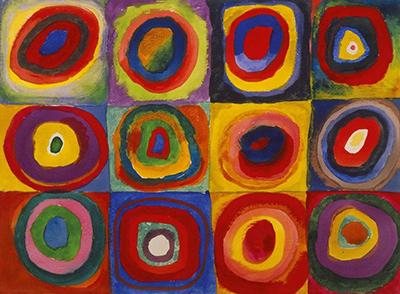
Wassily Kandinsky's Colour Study: Squares with Concentric Circles places twelve differently coloured, ring-like forms in a grid of three rows and four columns. The repeated arrangement makes comparison easy: a red ring can surround blue in one cell and meet yellow in another; a dark edge can make a colour recede while a pale one lets it expand. The work is often reproduced as if it were a large finished painting, but the Lenbachhaus in Munich catalogues Farbstudie – Quadrate mit konzentrischen Ringen as a small 1913 work on paper. Its materials are watercolour, gouache and chalk, not oil on canvas. Recognising that scale and medium makes the sheet more interesting as a vivid experiment in colour relationships. [1].
Watch: Wassily Kandinsky
Five museum videos about Kandinsky’s art, sources of inspiration and the relationship between colour and music.
Vasily Kandinsky: Around the Circle
Curator Megan Fontanella introduces Kandinsky and the Guggenheim collection.
Watch on YouTubeAt a Glance
- Artist:Wassily Kandinsky.
- Original title:Farbstudie – Quadrate mit konzentrischen Ringen; in English, Colour Study – Squares with Concentric Rings.
- Date:1913.
- Classification:drawing/work on paper.
- Materials:watercolour, gouache and chalk.
- Size:23.9 × 31.5 cm.
- Collection:Städtische Galerie im Lenbachhaus und Kunstbau München, Gabriele Münter Foundation 1957, inventory GMS 446.
Where this work sits in Kandinsky’s career
The Blue Rider
1903Composition VII
1913Composition VIII
1923Several Circles
1926Sky Blue
1940Contents
- First look: one sheet, twelve related spaces
- What does “colour study” mean here?
- Squares and circles without perfect geometry
- Colour changes with its neighbours
- Reading across rows and columns
- Watercolour, gouache and chalk on paper
- Kandinsky in 1913
- The Gabriele Münter Foundation and Lenbachhaus
- Is it an optical test or a finished picture?
- Comparison with Several Circles
- How to look without a fixed colour code
- What the grid can and cannot demonstrate
- Why this colour study matters
- Frequently asked questions
- References
First look: one sheet, twelve related spaces
The grid holds four cells across and three down. Each cell has a roughly square area of colour and a set of nested, generally rounded forms. The division is clear enough to orient the eye, but the borders are not perfectly ruled and the circles are not compass drawings. Some rings bulge or narrow; some centres are off-axis; one colour may run broadly into another while a different cell keeps its boundaries sharper. The work combines a repeated plan with a lively hand.
A viewer can begin at the upper left and move row by row, but that is not the only route. A blue centre in one cell can call to a blue band elsewhere. A yellow surround may draw attention diagonally across the sheet. Strong red areas occur in different positions, yet they do not have the same effect each time because their neighbours change. The grid is a stable framework for noticing these shifts, not a story with a fixed reading order.
The format also affects the work's rhythm. Twelve cells are enough to establish a family of variations, but few enough that each remains distinct. The eye can compare adjacent squares quickly and then jump across rows to test a colour relation. Unlike a chart that labels every pigment and reports a measured result, the sheet leaves the comparisons perceptual. What seems warm, bright, heavy or calm depends on the whole local setting. The Lenbachhaus's title, Farbstudie, supports calling this a colour study; it does not document a formal laboratory procedure behind each cell. [1].
What does “colour study” mean here?
A study can be exploratory and complete as an object at the same time. Kandinsky did not need to produce a later oil painting for this sheet to matter. The recorded title announces attention to colour, and the repeated nested forms make changes in colour easier to compare. That is enough to explain the term without claiming to know a specific sequence of trials in his studio. A study need not be a disposable sketch or a direct plan for an identified canvas.
The English route often shortens the title to Squares with Concentric Circles. That familiar phrase emphasizes the shapes. The German Farbstudie – Quadrate mit konzentrischen Ringen begins with the colour question. Its “rings” are not simply twelve targets waiting to be hit at their centres. They create successive boundaries, so a hue is seen in relation to both the one inside it and the one outside it. The centre of a cell may draw the eye, but the surrounding bands condition how it appears.
Calling the work a study also keeps its scale visible. At 23.9 by 31.5 centimetres, it is a sheet that can be inspected close up. A poster or screen image can enlarge it dramatically, making the forms look like a monumental mural. Reproduction can be useful, but it should not quietly change the object's medium or physical presence. The small original allowed Kandinsky to place many local colour experiments within a manageable area. [1].
Squares and circles without perfect geometry
The title describes squares and concentric rings. Looking at the sheet shows a looser reality. The cells are roughly square, but their divisions shift in width and colour. The rings usually share a broad centre, yet some are more oval, angular or uneven than an exact circle. “Concentric” identifies a repeated nesting arrangement, not a claim that every boundary was drawn with a compass from the same mathematical point.
That irregularity matters. A precise geometry might make differences seem to belong only to the chosen colours. Here the edge of a band can widen, narrow, soften or cut into a neighbouring area, so colour and shape vary together. A red surround that is thick on one side has more force there than a thin red line would. A pale band that nearly disappears against a bright square can feel very different from the same hue in a broader area. The study tests relationships as they are painted, not as abstract swatches detached from form.
The repeated framework makes these differences easier to see. If every cell had a different format, the viewer might read the page as a dozen independent pictures. Because the nested plan recurs, deviations become noticeable: a centre shifts, a ring becomes unusually broad, a corner takes on a stronger colour. The work's visual excitement arises partly from this tension between a rule and what the painter does within it.
Colour changes with its neighbours
Choose one hue and follow it across the sheet. Blue appears in a number of roles: as a centre, an intermediate band or part of a coloured square. It may be surrounded by red, meet yellow, or sit against a darker edge. Even if a reproduction makes two blues look alike, their position can make them feel different. A blue centre enclosed by warm rings reads differently from a blue band opening into a cool outer field.
Red is similarly variable. In one cell it can form a broad surrounding area; in another it may be the heart of a nested group. A red ring against deep blue can appear urgent, while red beside orange or pink may blend into a warmer progression. The effect cannot be assigned to the word “red” alone. It depends on width, saturation, edge and adjacency. Kandinsky's study makes such relations visible without needing to label every colour in words.
Yellow and pale tones can act as separators, bright grounds or centres. A light band may create breathing room between dark areas, while a yellow square can make an enclosed dark form stand forward. The eye's response may change under different lighting or reproduction settings, but the compositional question remains. The work asks what happens when similar nested forms are given different colour sequences. It does not prove a single universal psychological meaning for each pigment.
Kandinsky wrote extensively about colour's possible expressive force. Those texts provide context for why such experiments mattered to him, but they are not a coded answer sheet for every cell. Read the painting first: observe how a hue changes according to its neighbours and then consider where Kandinsky's writing may illuminate the question. A theoretical idea cannot replace the actual arrangement of watercolour, gouache and chalk on this page. [6]; [1].
Reading across rows and columns
The top row establishes the idea of variation quickly. Its four cells share the nested structure yet differ in their outer grounds, the weight of warm rings and the colour at the centre. Moving horizontally, the viewer can notice whether a light band separates two strong colours or whether a dark surround compresses the inner area. There is no need to decide that the row forms a progress from “good” to “bad” combinations. The visible evidence supports comparison, not a ranking.
The middle row alters the rhythm. Some cells put a strong pale or yellow area closer to the middle; others use heavier blue, violet or red around it. A viewer who has followed the upper row may find a familiar hue appearing in a new role. That is the advantage of a grid: it encourages repeated questions. What is the largest area in this cell? Does the dark band define the centre or almost swallow it? How much square ground remains around the outer ring?
The lower row can be read as another set of tests, but the eye may also jump vertically. Compare the first column's three cells, then the second column's three. Colour sequences change while the broad format stays recognisable. A diagonal comparison might reveal different affinities from a row comparison. The work does not demand a correct path. It gives the viewer several ways to inspect how local decisions alter the whole sheet.
A careful reading also notices what cannot be established from the image alone. The grid suggests a structured exercise, but the owner record does not tell us the order in which Kandinsky painted the cells. A viewer should not claim he completed one row per day or set out a numbered sequence unless a separate document supports it. The sheet's arrangement is visible; its exact making sequence is not. [1].
Watercolour, gouache and chalk on paper
The Lenbachhaus lists three materials: watercolour, gouache and chalk. Watercolour can give a passage lightness and allow the paper's tone to influence it; gouache can make a colour more opaque; chalk can contribute a different type of mark or boundary. The museum does not map every individual patch to one medium in the short object record, so a small reproduction should not be used to declare that one precise ring was “definitely gouache”. The secure material description applies to the sheet as a whole. [1].
These media are central to why the work should not be called an oil painting. The surface of a small paper study behaves differently from canvas carrying layered oil. A wash can vary in transparency; an opaque colour can cover another; a dry mark can catch the texture of paper. Even when reproduced as a flat image, the visible edges and small irregularities hint at a process of laying colour down and responding to what happened. The record's classification as drawing/work on paper protects that material identity.
Scale and material together shape the kind of looking the study invites. In front of the original, a viewer might step close to compare boundaries, then back to take in the twelve-cell rhythm. A large wall reproduction changes that rhythm and can make individual cells look like separate abstract paintings. Neither experience is illegitimate, but the reproduction must not erase the fact that the object is one 23.9 by 31.5-centimetre sheet.
Kandinsky in 1913
The Lenbachhaus dates the work to 1913, within Kandinsky's Munich period and the final active years of the Blue Rider initiative before the First World War. The museum's Blue Rider history describes colour and simplified forms becoming increasingly independent in works made by Kandinsky, Gabriele Münter and their circle. This sheet belongs to that environment of experimentation, though its object record does not identify it as a project for a Blue Rider exhibition. Context can help locate a work without supplying a missing exhibition history. [3]; [1].
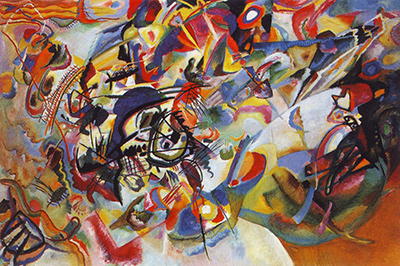
In the same year Kandinsky completed Composition VII, a huge oil on canvas now in the Tretyakov Gallery. The difference in scale, medium and structure is instructive. The large Composition asks the eye to move through a dense, changing field, while this study allows repeated local comparisons within a visible grid. Both depend on colour relationships, but there is no institutional evidence cited here that the grid sheet is one of the preparatory works for Composition VII. It is safer and more useful to let each object have its own documented role. [4]; [1].
The sheet also follows Kandinsky's book On the Spiritual in Art, whose first edition appeared in December 1911 with a 1912 printed date. His writings make colour's expressive possibilities a major concern, but they do not demonstrate that he assigned a hidden meaning to each of these twelve cells. Treat the book and study as related evidence of continuing questions, not as text and illustration that decode one another. [5]; [6].
The Gabriele Münter Foundation and Lenbachhaus
The object record gives the work's credit line as the Städtische Galerie im Lenbachhaus und Kunstbau München, Gabriele Münter Foundation 1957, and lists it as a 1957 gift. The museum's account of the Blue Rider collection explains the larger context: Münter's donation brought many works by Kandinsky and their circle to the Lenbachhaus, including paintings, works on paper and documents. That history is part of why a small experimental sheet can be studied today through a public collection rather than only through reproductions. [1]; [3].
The collection credit does not give every detail of the sheet's ownership before 1957. The record anchors the object in the foundation gift, and the broader museum history explains the importance of that gift. It would go beyond the evidence to invent a continuous display or lending history for this particular study. A small work can pass through many conditions of storage, viewing and reproduction; this page states only what the owner documents.
The Lenbachhaus also supplies an important practical distinction. Its page classifies the object as drawing/work on paper, while some outside listings call it a painting because they use a loose category for famous images. The owner record is the better basis for material and classification. The work can be admired as art without upgrading it into oil on canvas. Its status as a paper study is part of the reason it helps us see Kandinsky's investigative practice.
Is it an optical test or a finished picture?
The grid looks experimental, yet its colour sequences are also engaging as a whole. The two descriptions need not conflict. One can use the sheet to ask how colours affect one another while also enjoying its broad rhythm of twelve related forms. The title Farbstudie directs attention to inquiry; the finished object still has a considered arrangement with varied pace, contrast and balance.
An optical test in a scientific sense would normally specify controlled conditions, labelled variables and reported results. The Lenbachhaus record does not say this sheet was such an experiment. Describing it as a study is enough. It shows recurring forms that make differences perceptible, and the viewer can perform informal comparisons. Calling it “proof” that a particular colour always produces a particular emotion would impose a certainty the object does not supply.
The irregular edges also resist a purely mechanical reading. Kandinsky was working with materials on paper, not filling in printed boxes. The grid can seem orderly from a distance, but at close range each band reveals decisions about width, boundary and colour. Those decisions give the sheet the character of a made object. It can be both a record of investigation and a picture worth sustained looking.
Comparison with Several Circles
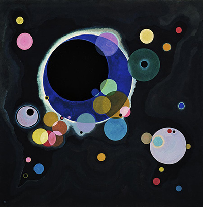
Several Circles, painted in 1926 and now at the Guggenheim, makes a useful later comparison. Both works use round forms, but the 1913 study holds them inside a coloured grid on paper. The 1926 oil scatters circles of very different sizes across a dark field, with overlapping forms and a documented contrast between matte and selected glossy areas. The later picture does not simply enlarge one cell from the earlier sheet. It changes the space, materials and role of repetition. [5]; [1].
In the colour study, repetition makes local comparisons easy because each cell occupies a similar area. In Several Circles, the circle sizes are highly unequal and the viewer must move across dark intervals to relate them. Colour still matters, but scale and apparent depth have a stronger role. Comparing the two helps show how Kandinsky could revisit a basic shape without repeating an identical artistic question.
The comparison should remain object-specific. One is a small 1913 work on paper at the Lenbachhaus; the other is a nearly 1.4-metre oil canvas at the Guggenheim. A web page may display them at similar widths, hiding that physical difference. Their distinct museum records restore the scale and medium needed for a fair reading.
How to look without a fixed colour code
A productive way to begin is to select two cells with a shared hue. Name where that hue occurs in each: centre, middle band, outer ring or square ground. Then compare the colours beside it. Does the shared hue feel equally bright? Does it appear broader in one place because the surrounding band is narrower? Such questions focus attention on relationships rather than on a list of universal colour meanings.
Next compare one row with a column. The grid allows many paths, and each highlights different similarities. A row may emphasize changing centres; a column may reveal shifts in background colour. If an apparent pattern emerges, test it against another cell before declaring it a rule. The sheet rewards this kind of revision. It is not a chart with an answer key hidden off the edge.
Finally return to the whole. The cells are separate enough to compare, but the page also has a larger rhythm of light and dark, warm and cool, broad and narrow bands. A vivid colour in one corner can change how a distant cell registers. That larger effect is why the work is more than a list of twelve isolated samples. Kandinsky used the grid to make differences visible within a single visual field.
What the grid can and cannot demonstrate
A grid gives the impression of a controlled series. It holds each group of rings in a broadly comparable place and gives the viewer a recurring unit. That regularity helps isolate differences one might otherwise miss. For example, a small pale centre may seem particularly bright because its immediate ring is dark, while a similar centre elsewhere loses definition beside another pale tone. The sheet makes those changes easy to notice because the eye can move from one cell to its neighbour without searching a complex scene.
Yet this is not a scientific table in which one variable changes at a time. Kandinsky alters the inner colour, the ring sequence, the surrounding square and the thickness or shape of bands. Those changes can work together. If a centre looks larger in one cell, the cause may be its colour, the breadth of its surround, its irregular outline or all three. A viewer can describe the effect and propose why it occurs; the object alone does not supply a numerical result. Calling it a study respects the inquiry without overstating the method.
The viewer's own conditions also matter. The original is a small sheet intended to be seen in light that falls on paper. A bright screen can intensify some colours; a printed reproduction can mute others. The online image is valuable for locating the twelve cells and comparing broad sequences, but exact judgements about hue should remain modest. A museum record can establish the materials, dimensions and collection even when the reproduction cannot settle every optical impression. [1].
The grid's clarity is therefore a prompt for disciplined looking, not a guarantee of certainty. It asks the viewer to repeat a question across several examples, then revise an initial answer when another cell behaves differently. That experience has an affinity with Kandinsky's larger interest in what colour and form can do independently of a recognisable subject. It remains grounded in this specific sheet: twelve painted fields, irregular nested rings and a set of material choices visible within the Lenbachhaus's documented object.
Why this colour study matters
The work provides a clear, compact way to see Kandinsky testing the relation of colour, shape and placement in 1913. Its twelve repeated structures offer enough consistency for comparison and enough painted variation to prevent the page from becoming mechanical. The medium and scale matter: watercolour, gouache and chalk on a small sheet create effects unlike those of the artist's large oils. The Lenbachhaus's exact record and the Gabriele Münter Foundation credit keep the popular image attached to a specific object. [1].
It also corrects two easy misreadings. The study is not a monumental oil canvas, however large its reproductions become. Nor is it a proven preparatory diagram for any one numbered Composition simply because it shares Kandinsky's 1913 fascination with colour and abstraction. It stands as its own experiment and finished work on paper. Looking closely at its uneven rings and changing colour sequences gives a better account of its importance than either a famous title or a generic claim that Kandinsky invented a universal colour code.
Kandinsky artworks directory
Frequently Asked Questions
The Lenbachhaus dates Farbstudie – Quadrate mit konzentrischen Ringen to 1913. [1].
No. The Lenbachhaus classifies it as drawing/work on paper and lists watercolour, gouache and chalk. It measures 23.9 × 31.5 cm. [1].
It belongs to the Städtische Galerie im Lenbachhaus und Kunstbau München, credited to the Gabriele Münter Foundation 1957, inventory GMS 446. [1].
The sheet shows twelve main cells arranged in three rows of four. Their boundaries and internal rings are painted with visible variation rather than perfect mechanical regularity. [1].
The two works share the year 1913 and an interest in colour, but the Lenbachhaus record does not identify this sheet as a preparation for the Tretyakov's Composition VII. It is best described by its documented colour-study title. [1]; [4].
Discussion
What do you notice first in Colour Study: Squares with Concentric Circles? Share a close observation or a question about the evidence for this work.
Comments are for comparing what we see and what the cited sources establish.
Reader Insights
How does one colour change when it moves from a centre to an outer ring?
What does the small work-on-paper format add to your reading of the twelve cells?
Which cell most challenges an apparent rule you noticed elsewhere in the grid?
Join the Conversation
Add your observation below and tell us which part of the artwork led you to it.
References
- Lenbachhaus, Farbstudie – Quadrate mit konzentrischen Ringen, object record, GMS 446. View source.
- Lenbachhaus, German object record. View source.
- Lenbachhaus, Blue Rider collection history. View source.
- State Tretyakov Gallery, Composition VII object record. View source.
- Solomon R. Guggenheim Museum, Several Circles in Around the Circle press kit. View source.
- Heidelberg University, digitised Über das Geistige in der Kunst. View source.