 by Tom Gurney
Tom Gurney BSc (Hons) is an art history expert with over 20 years experience
Published on June 19, 2020 / Updated on October 14, 2023
Email: tomgurney1@gmail.com / Phone: +44 7429 011000
Between Heaviness and Lightness by Wassily Kandinsky: Introduction
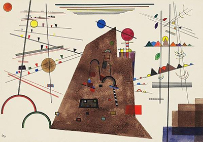
Wassily Kandinsky's Between Heaviness and Lightness sets a broad brown shape among delicate lines, small coloured triangles and circles on largely unpainted paper. The weight suggested by the dark centre is challenged by the white space and forms that seem to hover around it. Kandinsky titled the work Schweres zwischen Leichtem, which Christie's translates as “Heavy between Light.” Its object catalogue records June 1924, gouache, watercolour and India ink on paper mounted on the artist's board, 33.8 × 48.7 cm. [1].
The image already on this page shows the same dense central polygon, open paper, small red and blue disks, long horizontal lines and squared forms described in the auction record. The inherited text was right about the broad year and the presence of several media, but its claim that the work sold in 2012 and has stayed in the same private collection since then is not supported by the cited provenance. The auction catalogue supplies a detailed sequence through a 2007 sale and a later offering; neither establishes the work's owner or display location today. [1].
Watch: Wassily Kandinsky
Five museum videos about Kandinsky’s art, sources of inspiration and the relationship between colour and music.
Vasily Kandinsky: Around the Circle
Curator Megan Fontanella introduces Kandinsky and the Guggenheim collection.
Watch on YouTubeAt a Glance
- Artist and date:Wassily Kandinsky, June 1924.
- German title:Schweres zwischen Leichtem; English Between Heaviness and Lightness or Heavy between Light.
- Medium and size:Gouache, watercolour and India ink on paper laid down on the artist's mount, 33.8 × 48.7 cm.
- Inscription:Monogram and “24” lower left; backboard titled, dated and numbered No. 145.
- Catalogue identity:Kandinsky's handlist no. 145; Barnett watercolour catalogue no. 703.
- Provenance limit:Documented through Christie's catalogue and earlier sales; current owner and display are not established here.
- Image:Existing site reproduction retained; no newly licensed auction photograph added.
Where this work sits in Kandinsky’s career
The Blue Rider
1903Composition VII
1913Composition VIII
1923Several Circles
1926Sky Blue
1940Contents
- The dark form and the open paper
- Watercolour, gouache and ink
- The Weimar Bauhaus setting
- The similarly titled No. 146
- Frequently asked questions
- References
The dark form and the open paper
The most substantial painted area is a sloping brown polygon rising from the lower middle of the sheet. Small coloured and black marks sit within it as though anchored to a surface. Its flat colour and angled top make it feel weighty, yet the edge is irregular enough to resist becoming a single, measured architectural diagram. Christie's reads it as the dense “heavy” element in a formal counterpoint. The title supports that reading, but it does not specify that the polygon is a mountain, building or machine. [1].
Above and beside the brown area, the cream paper remains mostly open. Thin rules, short bars, bright disks and little triangles occupy this space without filling it. A blue circle near the top of the central area and a red one to its right make the upper edge more animated, while yellow and orange accents punctuate the left side. These forms appear light partly because paper separates them, allowing a short line or small shape to register without a large painted ground beneath it. “Heaviness” and “lightness” are thus effects made by colour, density and spacing, not labels pasted onto two fixed halves of the picture. [1].
The lower corners complicate the contrast. Two open semicircular arcs at the left and a low stack of brown and blue blocks at the right sit close to the bottom edge. They give the composition visual anchors outside the central brown mass. Across the top, horizontal lines seem to recede or gather toward a far distance, while small triangles run along other lines. Christie's notes these perspective-like cues. They can make the sheet feel momentarily landscape-like, although its shapes never require an actual horizon or identifiable place. [1].
Watercolour, gouache and ink
The listed materials account for several kinds of mark. Gouache supplies opaque coloured areas, watercolour allows thinner washes, and India ink makes much of the sharp linear structure. The catalogue gives all three on paper laid down on Kandinsky's mount; it does not describe this as an oil painting or canvas. At 33.8 × 48.7 cm, the work is large enough for a dense array of small forms while remaining a portable sheet. The existing 400-pixel reproduction cannot disclose the exact order of layers or the paper's surface under every passage. [1].
Looking closely at the overall design, one sees that narrow straight lines do not behave identically. Some support rows of triangles, some cross the brown centre, and some simply extend into the unpainted field. A dark vertical on the right rises past the tiny coloured shapes near it, while a short red diagonal near the centre is visually caught by the heavier ground. This variety matters more than counting circles or triangles. The same simple geometry can feel suspended, braced or crowded depending on where it sits. That is the visual tension Kandinsky's title invites us to examine. [1].
The strong brown centre does not entirely dominate. Small red accents pull attention outward, a yellow disk near the left balances a blue one higher up, and the lower-left arcs open against the page's blankness. These relationships resist an easy division into a heavy central object and decorative light surroundings. Parts of the large form are pierced by marks; parts of the pale field are held in place by dark rules. The result is a changing sense of balance as the eye moves. This is a close reading of the reproduction, not a claim that Kandinsky assigned each colour a fixed physical weight in a surviving object note. [1].
The Weimar Bauhaus setting
Kandinsky made the sheet while teaching at the Bauhaus in Weimar. The Bauhaus-Archiv describes his and Paul Klee's teaching on form and colour as part of the school's instruction beyond the preliminary course. That institutional setting helps explain why an experiment in the relationships of line, shape, ground and apparent weight could be central to his art in 1924. It does not make this particular drawing a recorded classroom exercise. Christie's calls it an intricate work of formal counterpoint made in June of that year. [3]; [1].
Kandinsky's Point and Line to Plane offers later context for his systematic interest in visual elements. The Guggenheim identifies the German first publication as 1926. The Christie's essay gives 1925, but for the publication date the publisher record is more secure. Either way, the 1924 sheet predates the book. Its shapes can be considered alongside the later ideas without claiming that a particular circle or line directly illustrates a named diagram. [4]; [1].
The work's catalogue trail is unusually useful. Christie's records the monogram and “24” at lower left, and a title, date and No. 145 on the backboard. It connects that number with Kandinsky's own handlist and Barnett's later catalogue raisonné, no. 703. The catalogue also lists exhibitions beginning in Dresden in October 1924. Those facts place the sheet in a recorded sequence of making and display rather than treating its abstract arrangement as anonymous decoration. [1].
The similarly titled No. 146
Another Christie's record is easy to confuse with this one. It also uses Schweres zwischen Leichtem as a heading, but its description lists watercolour, pen and coloured inks, 33.7 × 47.3 cm, and a reverse inscription reading Zwei Bewegangen, No. 146, 1924. The present page's pictured work is No. 145, 33.8 × 48.7 cm, with gouache, watercolour and India ink. The repeated heading may reflect a catalogue inconsistency; it is not permission to merge the two inscriptions, dimensions or media. [1]; [2].
The No. 145 provenance runs from Kandinsky to J. B. Neumann in 1936, then through Galerie Nierendorf, Galka Scheyer and later owners and sales. The auction record says the owner at that listing had acquired it at a Christie's sale in February 2007. It does not support the inherited page's precise “sold in 2012 for nearly $2m” statement. Auction estimates, sale results and present ownership are different things, and a historic lot page cannot settle the last of them. [1].
The existing splash remains in place. The auction and agency reproductions are separately rights managed and do not provide a clear new reuse licence for the planned artist guide. A text-led guide entry can still convey the work's most important verified facts: 1924, mixed media on a small sheet, No. 145, and the calculated contrast between a densely coloured centre and light shapes on paper. The picture's interest lies in how those forces continually rearrange its balance. [1].
Kandinsky artworks directory
Frequently Asked Questions
Christie's dates Schweres zwischen Leichtem to June 1924. The sheet bears a lower-left monogram and “24,” and its backboard is dated 1924. [1].
Gouache, watercolour and India ink on paper laid down on the artist's mount. The listed dimensions are 33.8 × 48.7 cm. [1].
The German Schweres zwischen Leichtem describes something heavy among lighter things. The dark brown central form, sparse coloured shapes and open paper make that visual relationship tangible, without proving a literal landscape or object. [1].
No. Christie's lists a separate No. 146 with a different reverse title, materials and dimensions. This page concerns No. 145, which the artist's handlist and Barnett's catalogue also identify. [1]; [2].
He made it while teaching at the Weimar Bauhaus, where form and colour were part of instruction. The cited records do not establish that this specific sheet was a student exercise or teaching diagram. [3]; [1].
The Christie's catalogue records historic owners and a 2007 sale to the owner who later offered it. It does not verify a current owner or public display location. [1].
Discussion
What do you notice first in Between Heaviness and Lightness? Share a close observation or a question about the evidence for this work.
Comments are for comparing what we see and what the cited sources establish.
Reader Insights
Which small form most changes the apparent weight of the brown centre?
How does the open paper affect the lines and coloured shapes around it?
Which inscription distinguishes this sheet from the similarly titled No. 146?
Join the Conversation
Add your observation below and tell us which part of the artwork led you to it.
References
- Christie's, Schweres zwischen Leichtem, No. 145, lot 5584753. View source.
- Christie's, separately catalogued No. 146, lot 2363949. View source.
- Bauhaus-Archiv, Weimar teaching. View source.
- Guggenheim, Point and Line to Plane publication record. View source.