 by Tom Gurney
Tom Gurney BSc (Hons) is an art history expert with over 20 years experience
Published on June 19, 2020 / Updated on October 14, 2023
Email: tomgurney1@gmail.com / Phone: +44 7429 011000
Sky Blue by Wassily Kandinsky: Introduction
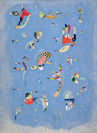
In Wassily Kandinsky's Sky Blue, colourful forms float across a broad, pale blue field. Some resemble tiny creatures, while others look like stripes, fans or curling lines. Their bright details attract attention, yet the blue is the painting's largest and most persistent presence. The work's original French title, Bleu de ciel, directs us towards that atmosphere rather than naming any one figure. The Centre Pompidou owns the 1940 oil on canvas, 100 × 73 cm, inventory AM 1976-862. [1].
A first glance may make the shapes appear playful and randomly scattered. Look longer and their varied sizes begin to guide the eye through the field. Several large forms give the composition its principal movements; smaller shapes answer them and occupy the intervals. A Centre Pompidou teaching guide describes two oblique axes and a shifting oval of curves near the centre. The painting belongs to Kandinsky's late years in France, when forms recalling biology entered his art, but the museum also warns against turning every small sign into a named animal. The question is how these forms make the blue feel alive. Centre Pompidou teaching guide, pp. 3–4; [1].
Watch: Wassily Kandinsky
Five museum videos about Kandinsky’s art, sources of inspiration and the relationship between colour and music.
Vasily Kandinsky: Around the Circle
Curator Megan Fontanella introduces Kandinsky and the Guggenheim collection.
Watch on YouTubeAt a Glance
- Artist:Wassily Kandinsky.
- Original title:Bleu de ciel, commonly translated Sky Blue.
- Date:1940.
- Medium:oil on canvas.
- Dimensions:100 × 73 cm, a vertical format.
- Collection:Musée national d'art moderne, Centre Pompidou, Paris; inventory AM 1976-862.
- Acquisition:donation from Nina Kandinsky in 1976.
- Catalogue reference:number 1111 in the catalogue raisonné cited by the owner essay.
Where this work sits in Kandinsky’s career
The Blue Rider
1903Composition VII
1913Composition VIII
1923Several Circles
1926Sky Blue
1940Contents
- Begin with the blue
- A portrait-format field without a horizon
- The larger floating forms
- Small signs between the larger shapes
- Two diagonal routes through the picture
- Forms that recall life
- Colour inside each figure
- Is the painting calm or busy?
- Kandinsky's final decade in France
- Miró and the question of influence
- Not a numbered Composition
- The title's unresolved nuance
- Nina Kandinsky's gift and the museum record
- A route for close looking
- Why Sky Blue matters
- Frequently asked questions
- References
Begin with the blue
The painting can tempt the viewer to begin counting its colourful inhabitants. Kandinsky's title suggests a different order. Before any small form is identified, a blue expanse establishes the conditions in which it can appear. The colour is not a flat graphic background. In the existing reproduction, subtle lighter and darker passages make it seem atmospheric, while a hazier pale zone gathers near the lower edge. The precise paint texture needs a direct view, but the broad impression of a nuanced blue ground is clear.
Christian Derouet, writing in the Centre Pompidou's collection record, describes this as a milky, varied blue connected to the sky Kandinsky could see toward Mont Valérien from his studio. He argues that the title privileges the ground over the biomorphic figures. That is a curatorial account grounded in the work's context, not proof that the canvas is a literal view through a window. The blue does not contain a painted skyline or architecture. It provides an atmosphere in which imagined forms can hover. [1].
A useful experiment is to cover a cluster of forms with your hand and look only at the remaining blue. It still has visual character. Then uncover the shapes and notice how each one alters the surrounding field. A curved, bright figure can make the blue around it feel open; two forms close together can create a narrow blue passage. The colour is the common element that permits those differences.
A portrait-format field without a horizon
The canvas is taller than it is wide. Its 100 × 73 cm format gives the forms room to extend from top to bottom rather than arranging them in a conventional landscape strip. Nothing marks a horizon, and no cast shadow fixes a creature to a ground plane. The figures can appear suspended because the same blue continues behind and around them. [1].
That does not mean the space is empty. Near the edges, small coloured strokes make the blue feel inhabited beyond the largest figures. The pale lower area changes the field's density and can suggest a cloud without forcing the entire painting to become a picture of the weather. Some forms seem nearer because they are larger or more saturated, but there is no consistent scale that turns them into objects at measurable distances. Kandinsky creates relations of size and emphasis rather than ordinary perspective.
The teaching guide calls the distribution an all-over composition, in the sense that attention is not confined to one central subject. It also describes guiding diagonals. These claims need not conflict. An image can animate its whole field and still have stronger routes through it. The viewer's gaze may travel from one large form to another while smaller signs ensure that the corners and intervals remain active. [3], p. 3.
The larger floating forms
Several figures immediately claim attention. At the upper left, a striped, curved form with a bright red flourish projects into the blue. To the right of centre, a larger shape combines a red patch with pale, banded and dark elements. Lower down, other forms spread fins, arcs or leg-like lines. Their outlines can prompt animal comparisons, but none settles into a naturalistic species. They are best described first by colour, direction and position.
Their size gives them a structural role. If every mark had the same weight, the eye could wander without finding a route. The larger forms create stations through the vertical field. One can move from the upper-left shape to the upper-right area, then down toward the central and lower figures. The route is not a rigid sequence; each large form invites a return to nearby smaller ones. The Centre Pompidou's teaching analysis places the most substantial beings along two oblique lines, a way of describing how an apparently dispersed scene can be organised. Centre Pompidou teaching guide, pp. 3–4.
Look also at the spacing around each major shape. Blue separates the upper-left and upper-right forms enough for them to hold distinct identities. In the centre, curves and counter-curves bring figures into a closer visual exchange. Lower down, more open intervals let a small mark stand alone. These changing distances establish rhythm without a frame of squares or bands.
Small signs between the larger shapes
Little dashes, dots, leaf-like pieces and narrow curves occupy the blue between the large figures. They can be hard to see in a thumbnail. At a larger size, they keep the blue from becoming a passive blank. A tiny yellow stroke near a broad open zone can pull the eye across a distance that its physical size would not predict. A small red accent can answer another red patch much farther away.
The Centre Pompidou teaching guide distinguishes large, medium and almost pointlike elements. It explains that the smallest forms complete the animation of the field and that thin elements toward the outer areas open the space. This is a more precise account than calling the motifs random confetti. It also gives the viewer a test: if one mentally removes the small forms, do the large ones feel more isolated or less connected? Their apparent lightness does not make them expendable. [3], p. 4.
Kandinsky's scale changes prevent a simple hierarchy in which large always means important. Some tiny marks are especially vivid against the blue. Others help one edge of a larger form point toward another. A painting this dispersed asks for repeated looking at different distances: far enough to see the whole distribution, close enough to register the intervals and miniature responses.
Two diagonal routes through the picture
The figures do not line up like items on shelves. The teaching guide describes two diagonal forces traced by the more substantial forms, leading attention toward their meeting near the centre. The layout can be tested without drawing literal lines on the canvas. Start at one prominent figure near the top and move obliquely toward a lower one; then try a crossing route. Notice whether a sequence of medium and small marks eases each transition. [3], p. 3.
At the middle, arcs and counter-arcs make a more concentrated interaction. The guide likens the surrounding shapes to shells and sees their curves producing a turning oval. This is a useful visual description, although the painting offers no shell that needs to be identified as a literal animal specimen. The eye may circle briefly before being pulled out along another coloured extension. This play between a central turn and paths through the whole field keeps the composition mobile.
The diagonals are not strict symmetry. The forms at either end of a route differ in shape and colour, and blue intervals vary. The point is not to find a hidden geometric diagram that explains away the painting. It is to notice that apparent freedom has a pattern of emphasis. Kandinsky can avoid a conventional centre while still making the gaze move with purpose.
Forms that recall life
The museum uses the term biomorphic for shapes that evoke living organisms. In Sky Blue, curved bodies, thin appendages, striped segments and dot-like eyes may remind viewers of microscopic beings, insects or sea life. Such resemblance is part of the painting's invitation. The figures are also assembled from painterly marks that do not obey biological anatomy. A banded curve can be a tail one moment and a sweep of colour the next. [1]; [2].
Derouet's owner essay cautions against the urge to catalogue every little being. That warning protects the painting from a false precision. If a viewer calls one form a fish and another a bird, the names may be vivid personal comparisons, but they do not become an inventory of depicted species. The figures often seem deliberately between categories. They can suggest the possibility of life without representing a complete zoological scene. [1].
The Paris-period interest in biological images also marks a change from Kandinsky's earlier vocabulary. His art did not progress in a straight line from landscape to strict geometry. These small, pliant forms brought a new set of relations into his painting after the Bauhaus years. The blue ground allows them to coexist without being pinned to a laboratory slide or a natural habitat.
Colour inside each figure
The ground's blue is comparatively continuous; the floating shapes are multicoloured and internally divided. Stripes, small red passages, black edges, pale sections and yellow details give each a different pulse. A long figure can change colour several times as the eye follows it. That variety helps distinguish the forms from one another even when their outlines have similar curves.
Red accents are especially noticeable. They appear in separated parts of the canvas and can link distant figures in the viewer's attention. The teaching guide describes these as prompts for a circular movement of the gaze. That is an interpretive account that can be tested: after noticing one red passage, look for another and see whether the eye crosses blue space rather than staying with a single creature. Centre Pompidou teaching guide, pp. 3–4.
A coloured figure may seem solid where several bands sit together and fragile where thin lines extend from it. The shifts keep the figures from becoming stickers pasted onto blue. They have internal directions that interact with the larger routes across the canvas. Looking at the colour within a form is therefore a way of understanding the whole composition, not a detour into decorative detail.
Is the painting calm or busy?
The blue can feel peaceful, while the many small shapes can feel lively. The Centre Pompidou's English monograph reads this as a change from earlier struggles and confrontations of colour towards a lighter, dreamlike freedom. Its colour press kit places the painting against the violence of war and interprets the blue as a calm, hopeful alternative. Those are curatorial readings, not a documented diary entry in which Kandinsky states that he painted to escape a specific event. [2]; [4].
The apparent calm does not depend on stillness. The painting includes curves, pointed details, asymmetrical groupings and colour changes. It can be read as animated without being violent. Much of its energy is held by generous blue intervals. The viewer has time to move from one small event to another. The forms seem to inhabit the same atmosphere rather than collide in one dense mass.
Responses will differ. Some viewers may find the creatures cheerful, others strange. That openness does not make the sources irrelevant; it asks that we distinguish a documented 1940 canvas and its visible organisation from emotional claims made on behalf of all viewers. We can describe the painting's lightness and the museum's optimistic interpretation without insisting that every encounter must feel serene.
Kandinsky's final decade in France
Kandinsky moved to France after the Bauhaus closed in 1933 and spent his final years in the Paris area. The Centre Pompidou's monograph describes his Paris work as rich in forms resembling embryos, larvae and invertebrates. Sky Blue, made in 1940, belongs to that late exploration. Its owner record identifies the Neuilly studio view toward Mont Valérien as a reference for the background's atmospheric colour. [2]; [1].
The date also falls in a time of occupation and restriction. The owner essay notes that the Kandinskys were confined in their Neuilly building, and the museum's press kit interprets the painting's bright cellular world as a response to war. Historical context helps explain why later writers have stressed optimism. It should not force a one-to-one allegory in which each small form stands for a political event. The canvas records no such key. [1]; [4].
In this phase Kandinsky did not simply repeat his earlier methods. The balance between an almost continuous ground and many internally varied small figures differs markedly from the clear geometric constructions often associated with his Bauhaus period. The late work therefore deserves to be seen on its own terms rather than treated as an epilogue to more famous paintings.
Miró and the question of influence
The Centre Pompidou relates Sky Blue to Joan Miró's Constellations and, in its English monograph, to Miró's The Siesta. Its owner page mentions Kandinsky's 1940 visit to Miró in Varengeville-sur-Mer and discusses their shared interest in poetic, biomorphic worlds. These connections offer a useful comparison, especially for forms that seem to float in a wide field. They do not mean that every figure in Kandinsky's canvas was copied from a Miró image. [1]; [2].
Kandinsky had his own long history of making colour and shape carry an expressive charge. The Miró comparison is most helpful when it asks a visual question: how can separated signs create an animated field without a traditional scene? In Sky Blue, a largely continuous blue answers that question differently from a ground filled with lines or stars. The creatures have room to stand apart while still forming a company.
The museum also mentions historical tapestries as part of the late artist's visual environment, and notes later fabric designs with scattered small forms. That is a contextual affinity, not evidence that this 1940 painting was designed as a textile. Its oil-on-canvas medium and particular scale remain important. Repeated motifs across a field can invite a tapestry comparison while still functioning as a singular painting. [1].
Not a numbered Composition
Kandinsky made ten paintings with the numbered Composition title. Sky Blue is not one of them. The Centre Pompidou's teaching guide explicitly makes this distinction while analysing the 1940 painting's careful organisation. A work can be strongly composed without bearing the formal series title. The word "composition" in ordinary description refers to how parts are arranged; the capitalised numbered title identifies particular canvases. [3], p. 3.
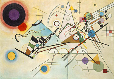
This matters when comparing Composition IX and Composition X. IX, dated 1936, sets small forms against broad diagonal bands. X, dated 1939, suspends coloured forms before a black ground. In Sky Blue, a pale blue field holds many smaller, creature-like figures. The three grounds—banded, black and blue—change the apparent freedom, weight and distance of the forms. [5]; [6]; [1].
The comparison is not a ranking from difficult to easy or from serious to playful. All three use distribution and contrast deliberately. Sky Blue may look lighter because its creatures and blue atmosphere invite a different pace of looking. Its structure still deserves the same scrutiny given to the numbered works.
The title's unresolved nuance
The museum's English dossier notes uncertainty about whether the title's wording arose from a language issue or was a deliberate poetic choice. That small caution is useful. We can reliably use Bleu de ciel as the French main title and Sky Blue as an English translation. We should not claim to know exactly why Kandinsky selected one phrase rather than another. [2].
What the title does for a viewer is more accessible. It names the blue that underlies every colourful form. Had the painting been named for a creature, one might hunt for that figure and treat the rest as supporting detail. Naming the atmosphere opens the whole field. It also allows the viewer to sense sky without searching for clouds, sun or a horizon. The painting's blue can be evocative while remaining a painted surface.
This distinction between title effect and title origin prevents a common leap. The effect can be explored by looking; the origin is a historical question for which the source leaves room. A careful page can say both. The title is a productive guide to attention, but it is not a licence to invent a story of how the artist named the work.
Nina Kandinsky's gift and the museum record
Nina Kandinsky donated the canvas to the Musée national d'art moderne in 1976. The Centre Pompidou records it as AM 1976-862. That direct acquisition fact is more useful than a vague statement that the picture has "always" been at the museum. The painting belongs to a collection that has continued to exhibit and lend Kandinsky's work; an individual loan itinerary can change. [1].
The museum's detailed record includes inscriptions and the 100 × 73 cm dimensions, which distinguish this work from prints, studies and later reproductions. Its essay gives the catalogue raisonné number 1111. Together these identifiers establish the object behind the page. They are particularly helpful because Sky Blue is an English rendering of a French title and because Kandinsky's blue works span different phases and media.
The collection page also labels the artwork public domain while naming a photographer and image distributor. Those are separate layers of rights. The existing site image is enough for the visual discussion here; the museum photograph has not been substituted. Better quality would be welcome if an image with clearly usable terms becomes easy to obtain, but the artwork and page can be understood without that upgrade.
A route for close looking
First look at the painting from a distance and let the blue take up most of your attention. Does it feel uniform or varied? Notice the hazier zone toward the bottom and the open spaces between shapes. Then identify three of the larger forms, perhaps one high at the left, one right of centre and one lower down. Trace a path among them. Ask where medium-sized figures or tiny marks make the movement easier.
Next choose one form and follow every change in its colour and direction. It may begin with a dark edge, turn through a striped section and end in a thin curl. Try to describe those changes before comparing it to an animal. The exercise respects the painting's biomorphic quality while avoiding an invented zoological label. Return to the whole field and see whether that small internal rhythm echoes another figure elsewhere.
Finally compare the blue with the black ground of Composition X or the coloured diagonals of Composition IX. Imagine moving one figure from this canvas onto either ground. Would it seem more luminous, more crowded or more isolated? This thought experiment makes the background's role visible. The small image cannot replace the original painting, but it can support these broad comparisons of colour, scale and spacing.
Why Sky Blue matters
Sky Blue shows how Kandinsky continued to reshape abstract painting late in his life. Its blue field, floating biomorphic forms and varied scales offer a method different from the hard geometry of some Bauhaus works or the black setting of Composition X. The Centre Pompidou's teaching analysis shows that an image with no conventional centre can still have oblique routes, local curves and balanced sizes. Its owner record secures the 1940 date, medium, dimensions and 1976 gift. Centre Pompidou teaching guide, pp. 3–4; [1].
The painting also resists a forced choice between abstraction and living imagery. Its forms invite creature-like associations without settling into a scene of named animals. Its blue can evoke sky without representing a measured view. These tensions keep the work open to repeated looking. What first appears charming or simple becomes a sustained experiment in how a common atmosphere can hold many separate forms in relation.
Kandinsky artworks directory
Frequently Asked Questions
The Centre Pompidou dates Bleu de ciel to 1940. Its detailed record also notes a "VK/40" monogram on the canvas. [1].
It belongs to the Musée national d'art moderne, Centre Pompidou, Paris, inventory AM 1976-862. Its current display or loan status should be checked on the live collection page before a visit. [1].
It is an oil painting on canvas measuring 100 × 73 cm. [1].
They are biomorphic forms that can recall tiny living creatures. The Centre Pompidou cautions against treating every one as a separately identifiable animal. Their varied size and placement also organise the composition. [1]; [3].
No. The Centre Pompidou's teaching guide makes that distinction while explaining that this painting is still carefully arranged. [3], p. 3.
Nina Kandinsky donated the painting in 1976. The museum records it as AM 1976-862. [1].
Discussion
What do you notice first in Sky Blue? Share a close observation or a question about the evidence for this work.
Comments are for comparing what we see and what the cited sources establish.
Reader Insights
Which small mark changes the blue space most strongly for you?
Can you trace the two diagonal routes described by the Centre Pompidou?
How does this blue ground change the effect of forms compared with Composition X?
Join the Conversation
Add your observation below and tell us which part of the artwork led you to it.
References
- Centre Pompidou, Bleu de ciel collection record and Christian Derouet essay. View source.
- Centre Pompidou, English Kandinsky monograph. View source.
- Centre Pompidou, Mon œil explore composition teaching guide. View source.
- Centre Pompidou, English colour exhibition press kit. View source.
- Centre Pompidou, Composition IX collection record. View source.
- Kunstsammlung Nordrhein-Westfalen, Composition X collection record. View source.