 by Tom Gurney
Tom Gurney BSc (Hons) is an art history expert with over 20 years experience
Published on June 19, 2020 / Updated on October 14, 2023
Email: tomgurney1@gmail.com / Phone: +44 7429 011000
Untitled (First Abstract Watercolor) by Wassily Kandinsky: Introduction
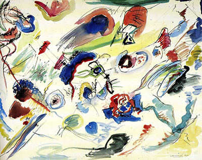
Kandinsky's sheet often called Untitled (First Abstract Watercolor) presents loose patches of blue, red, yellow, green and brown crossed by restless black lines. The marks seem to move independently rather than outlining a stable scene. Its familiar parenthetical name once made it a milestone story: a work supposedly dated 1910 and therefore proposed as the first abstract painting. The Centre Pompidou, which owns it, catalogues the sheet as Sans titre (Untitled) and dates its creation to 1913. It records a 1910 date in an inscription on the work. Those two facts must be held together rather than quietly choosing whichever date makes the stronger headline. [1].
The museum describes the work as graphite pencil, Indian ink and watercolour on paper, 49.6 × 64.8 cm, inventory AM 1976-864. It is a work on paper, not an oil canvas. The Centre Pompidou now relates it to the preparation of Composition VII, completed in autumn 1913, while leaving open exactly when the sheet was first made and why Kandinsky's 1910 inscription appears on it. MoMA's research catalogues it as an Untitled (Study for Composition VII) and examines visible motifs in relation to the final painting. The history of this sheet is therefore as much about the evidence used to date art as about the freedom of its colour and line. [2]; [3], p. 43.
Watch: Wassily Kandinsky
Five museum videos about Kandinsky’s art, sources of inspiration and the relationship between colour and music.
Vasily Kandinsky: Around the Circle
Curator Megan Fontanella introduces Kandinsky and the Guggenheim collection.
Watch on YouTubeAt a Glance
- Artist:Wassily Kandinsky.
- Museum's main title:Sans titre (Untitled).
- Historical or attributed title:Première abstraction, aquarelle ("First Abstraction, Watercolour"); often called First Abstract Watercolor in English.
- Date:catalogued as 1913 by the owning museum; the sheet bears a 1910 inscription.
- Medium:graphite pencil, Indian ink and watercolour on paper.
- Dimensions:49.6 × 64.8 cm.
- Collection:Centre Pompidou, Musée national d'art moderne, graphic arts collection, inventory AM 1976-864.
- Acquisition:donated by Nina Kandinsky in 1976.
Where this work sits in Kandinsky’s career
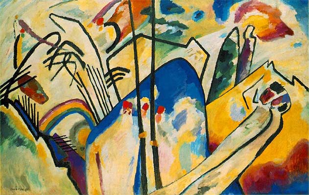
The Blue Rider
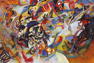
1903Composition VII
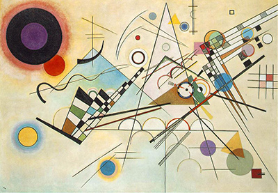
1913Composition VIII
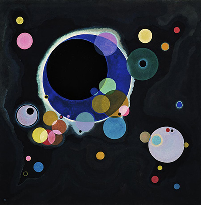
1923Several Circles
1926Sky Blue
1940Contents
- What appears on the paper
- Colour that does not fill the field
- Black lines with their own rhythm
- Why the 1910 date became famous
- Why the museum catalogues 1913
- A study for Composition VII?
- What a preparatory work can be
- Work on paper, not an oil canvas
- Looking for meaning without fixing every mark
- Comparing another Kandinsky watercolour
- The owner record and Nina Kandinsky's gift
- How to read the date responsibly
- A route for close looking
- Why this sheet matters
- Frequently asked questions
- References
What appears on the paper
The sheet has no single horizon, street, interior or central person to identify. Colour patches occupy different areas of a pale paper field. Some are dense and dark; others are thin enough for the paper's lightness to remain present. Black ink marks cross between and through the patches. A blue curve can seem to connect a red form to a neighbouring pale area, then break before it becomes an outline. The viewer keeps shifting between local incidents and the whole loose distribution.
In the existing image, a dark blue group near the upper part and a blue-and-red cluster lower toward the centre are especially forceful. Green, yellow and brown shapes answer them across open white. Thin black strokes supply directions that are often stronger than the edges of the watercolour. The result can feel active without depicting a specific action. Naming a possible boat, figure or trumpet from later scholarship may help a comparison, but a first look need not begin by decoding every form.
The sheet's size is large for a watercolour study but much smaller than the oil canvas to which it has been linked. Its 49.6 × 64.8 cm format permits a broad spread of marks while leaving paper visible among them. A screen reproduction can show that distribution; it cannot fully show how ink sits on or beside transparent watercolour, or how the paper surface takes the washes. [1]; [3], p. 43.
Colour that does not fill the field
The colours do not make a continuous painted wall. They occur as separated touches, blooms and more concentrated masses. White paper remains an active interval between them. A dark patch can carry weight because so much pale space surrounds it. A thin wash can almost disappear into that space until a black stroke or stronger hue draws attention back to it. MoMA describes the sheet as airy and notes that sparse colour stands out against the neutral ground, unlike the tightly packed final Composition VII. [3], p. 43.
This spacing helps explain why the work has been so often reproduced as an emblem of abstraction. Its colours appear liberated from the task of filling recognisable objects. Yet visual freedom does not prove that no subject or larger project lay behind it. The same colour patch can operate openly on this page and later be related by scholars to a motif in a more developed composition. Abstract appearance and preparatory function are not mutually exclusive.
Follow just one hue across the sheet. The blue does not sit in one neat zone, and red does not appear only as its opposite. Different strengths of colour cause the eye to jump rather than move through a fixed sequence. The white intervals make each jump noticeable. This is a practical reason to describe the paper as part of the image rather than a blank background waiting to be filled.
Black lines with their own rhythm
The ink lines are not merely borders drawn around the watercolour patches. Some cross open paper; others cut through colour. They can bend, flick or stop abruptly. The Centre Pompidou's essay points to this independence of line from colour as a sign of Kandinsky's later practice: the lines give rhythmic movement rather than a conventional contour. It argues that this handling became characteristic in his work after 1911, one reason the museum sees a 1913 creation date as more plausible than 1910. [2].
A viewer can test that claim without becoming a dating specialist. Choose a black line and ask whether it encloses a coloured shape. Often it does not. It may cross a wash at an angle or make a free gesture into unpainted paper. Its visual task is then to make a direction or a pause, not to tell us which object the patch represents. Several such strokes establish a tempo across otherwise detached colour areas.
Graphite is also recorded in the medium, though it is harder to distinguish in a small reproduction. The owner does not reduce the sheet to "watercolour" alone. Ink and pencil matter because this work joins drawing to washes. A precise medium line reminds readers that its visual energy depends on several kinds of mark, with differing opacity and control. [1].
Why the 1910 date became famous
The sheet bears Kandinsky's 1910 inscription and a note describing it as an abstract watercolour. For decades, this combination encouraged the claim that it was a decisive first abstract work. The Centre Pompidou explicitly describes that former reception. A handwritten date and label are compelling evidence, especially when the visible image looks distant from conventional representation. They explain why the "first" name attached itself so firmly to the sheet. [2].
But a date written on an object and a museum's assessment of when it was made are different statements. A later inscription, a changed title or a retrospective classification could complicate chronology. The sources here do not establish with certainty when each word was written, and they do not prove a motive for the apparent discrepancy. The responsible account is that 1910 is inscribed and 1913 is the owner's catalogue date, with a scholarly debate about how the two relate.
Calling it the "first abstract painting" introduces another problem. This sheet is a work on paper in watercolour and ink. The broad history of abstraction involves many artists and different definitions of what counts as fully nonrepresentational. The Centre Pompidou's current essay presents the old priority claim as something that was long believed, not as a settled fact. The distinction preserves the work's historical importance without turning a disputed label into an unqualified verdict.
Why the museum catalogues 1913
The Centre Pompidou's argument concerns style and spatial organisation. It sees floating colour in an indeterminate field and ink lines that act independently, rather than colours still structured by remembered images. Its essay says such traits align more closely with Kandinsky's work after 1912. On that basis, the record gives 1913 as the creation date. This is an art-historical judgement made in tension with the inscription, not a denial that the inscription exists. [1]; [2].
The museum also suggests a relationship to Composition VII, the large oil finished in autumn 1913. It frames two possibilities as questions. The sheet might be an early sketch whose ideas were developed much later, or it might have been made nearer the oil and later given the earlier date. The museum does not close the case. A public page should not strengthen its cautious "might" into "was certainly backdated" or "definitely first made in 1910."
MoMA's 1995 catalogue supplies a more specific scholarly proposal. It reports Hideho Nishida's 1978 suggestion that the Paris watercolour is an eighth study for Composition VII. The catalogue describes formal correspondences between sheet and oil. This offers reasons to place it in the 1913 study sequence, but even detailed formal comparison cannot directly witness Kandinsky writing the 1910 date. [3], p. 43.
A study for Composition VII?
Composition VII is a large 1913 oil painting of densely interacting colour and line. MoMA's catalogue places this watercolour among works on paper related to it, calling the sheet Untitled (Study for Composition VII). Its discussion identifies a central oval crossed by an irregular rectangular form, a blue form to the left, a boat with oars below, three oval forms toward the right, two parallel strokes low at left and a red trumpet high at left. These are scholarly identifications made through comparison across studies and the final canvas. [3], p. 43.
A reader should approach that list as a guide to comparison, not a visual quiz with penalties. Some forms are not self-evident in the small site image, and the work's open structure resists one-to-one tracing. A proposed boat shape can be valuable evidence for a study relationship even if a first-time viewer sees only a cluster of colour and line. The final oil transforms and crowds motifs in ways that change their appearance.
The comparison also makes the paper's distinct character clearer. MoMA contrasts its airy white space and sparse colour with the final canvas's tightly organised collision of forms. A study need not be a reduced copy. It may explore possibilities that the final work compresses, revises or leaves behind. Reading this sheet in a study sequence gives it a historical role without making its own visual openness disappear.
What a preparatory work can be
The term "study" can sound like a lesser artwork whose value depends only on a finished painting. This sheet resists that dismissal. Its separate colour patches, active paper and independent black lines form a coherent visual experience. The possibility that it contributed to Composition VII adds a process story. It does not erase the marks on the page or require a visitor to know the later oil before looking at them.
Kandinsky made numerous works on paper while developing his major paintings. Studies could vary in medium and degree of completion. Some test a motif, others the balance of the whole. MoMA's catalogue discusses this watercolour as unusually large among the studies for VII. Its scale and free distribution let it hold more than a single isolated detail, even if it did not settle the final arrangement. [3], p. 43.
A useful comparison is to place a reproduction of the sheet beside Composition VII and ask where relations survive, not just where shapes match. Does a colour cluster balance another across the field? Do dark lines cross light areas in a similar way? What changes when generous paper gaps become a crowded oil surface? Such questions honour both the possible process link and the difference between objects.
Work on paper, not an oil canvas
The legacy phrase "first abstract painting" can blur medium and support. The Centre Pompidou classifies this as a drawing and lists graphite pencil, Indian ink and watercolour on paper. In ordinary English one may speak of watercolour painting, but the object is materially a sheet of paper. It does not have the scale, surface or slow layering of an oil canvas. This distinction is not pedantry: the visible white is mostly paper, and quick, translucent colour marks are central to how the image works. [1].
The materials also allow different kinds of edge. A watercolour wash may soften as water spreads pigment; ink can make a firmer line. Pencil can establish a tentative relation before either. The museum's record identifies all three, though the existing image cannot reveal the exact sequence of every mark. Avoid the tempting claim that a particular line was necessarily drawn before or after a particular wash unless technical evidence establishes it.
The small-scale reproduction likewise cannot prove how fast Kandinsky worked. A loose-looking mark may be quickly executed, but the sheet's relationship to a long study process complicates any simple story of spontaneous creation. We can say what the marks look like and what the museum documents. We cannot infer a stopwatch from the appearance of the watercolour.
Looking for meaning without fixing every mark
The work has often been used as a symbol of painting freed from objects. Yet MoMA's study analysis finds possible boats, figures and a trumpet among its forms. That does not mean the viewer should treat every coloured shape as a disguised illustration. Kandinsky's developing abstraction could transform motifs until their immediate visibility mattered less than their contribution to colour, movement and tension. The exact degree to which this sheet retains identifiable subjects remains an interpretive question. [3], p. 43.
There is a difference between source-backed comparison and invented decoding. The former points to other studies and the final oil, explains how a motif changes, and allows uncertainty. The latter sees a creature or object in every stain and presents it as fact. The Centre Pompidou's account emphasizes the autonomy of line and colour. That is a good starting point before exploring any proposed subject. [2].
A viewer can enjoy the unresolved state. The dark blue curve may be an expressive path and part of a developing motif. A red patch may draw attention before its potential narrative function is considered. Abstraction here need not mean emptiness; it can mean that visual relations no longer depend on a plainly depicted scene.
Comparing another Kandinsky watercolour
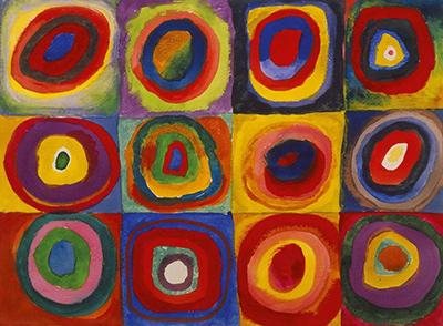
Colour Study: Squares with Concentric Circles was also made on paper in 1913, but it organises repeated colour relationships in a clear grid. The comparison helps prevent the medium from explaining too much. Watercolour can serve a deliberately measured array as well as the open, seemingly floating structure of Untitled. Paper and fluid pigment enable possibilities; Kandinsky's arrangement decides how they are used.
The two works also pose different questions for the viewer. In the grid, repeated cells invite systematic comparison: how does one colour change when moved from a centre to a surrounding ring? In Untitled, the eye has no numbered sequence of compartments. It must find its own path through separated patches and crossing lines. Both ask for careful looking, but in different ways.
A comparison with the final Composition VII adds the dimension of scale and density. A much larger oil can gather forces into a tighter, more monumental field. The watercolour holds air around its parts. Calling them related does not collapse the physical distance between them. The distinction helps explain why MoMA's catalogue values the sheet as a study while also describing its particular airy effect. [3], p. 43.
The owner record and Nina Kandinsky's gift
Nina Kandinsky donated the sheet to the Musée national d'art moderne in 1976. The Centre Pompidou inventory number is AM 1976-864. These stable identifiers matter because "first abstract watercolour" has circulated as a label across reproductions and popular accounts. The owner record anchors that language to one physical object, with its dimensions, materials, inscription and current catalogue date. [1].
The record's primary title is Sans titre. The attributed title preserves an important chapter in reception, but it should not be mistaken for an authoritatively proven rank as the first abstract work. The object was collected, studied and reinterpreted over time. That history is part of what makes it interesting: the catalogue can change its date assessment while retaining the evidence that supported an earlier view.
The owner's page marks the artwork public domain but separately credits its photograph to Audrey Laurans and GrandPalaisRmn distribution. The existing site splash is serviceable for broad close looking. A higher-resolution photograph is optional and has not been substituted without clear rights for that specific file. The work's documented identity does not depend on obtaining a different image.
How to read the date responsibly
A concise label must choose a format. The most defensible line is: "1913 in the Centre Pompidou catalogue; inscribed 1910." It gives the owner assessment and the contradictory object evidence at once. A heading that says only "1910" hides the current catalogue. A heading that says only "1913" conceals why the work became famous and why its chronology remains discussed. [1].
This is not a contest between a museum and the artist in which one side must be accused of error or bad faith. Dates can be applied in complex ways, and the museum itself offers more than one possible sequence. The available sources support a later stylistic reading and a study relationship to Composition VII. They do not provide a definitive eyewitness account of when the inscription was made. We should therefore avoid claiming that Kandinsky knowingly falsified the date.
Nor does uncertainty make every proposed date equally well supported. The museum has made a current cataloguing decision, and MoMA's scholarly comparison adds reasons for seeing the work among 1913 studies. The 1910 inscription remains an important fact. A reader can understand both the weight of the later assessment and the limit of what it proves.
A route for close looking
Begin with the paper. Identify a broad white interval and see which coloured patches it holds apart. Then follow one blue area across the sheet. Is the next blue reached by a line, another wash or a jump across white? This simple route makes the composition's openness clear before any date or title dispute enters the picture.
Next choose a black stroke and ask whether it outlines a colour. If it does not, what direction does it establish? Does it link two areas or interrupt a wash? Repeat with a second line in another part of the sheet. The Centre Pompidou's account of independent line and colour becomes something you can test visually rather than a phrase to accept on authority. [2].
Finally, compare this sheet with Composition VII and its known study context. Seek broad relations first, such as colour weight and spatial rhythm. Then consider MoMA's suggested motifs, allowing some to remain uncertain. Return to this watercolour alone before finishing. It is a historical document in a debate, but it is also a lively arrangement of marks whose effect does not depend on a claim of priority.
Why this sheet matters
Untitled matters because it makes the emergence of Kandinsky's abstraction and the way art history is written visible at once. Its colours and lines seem free from a conventional scene, yet MoMA's study analysis connects several forms to the preparation of Composition VII. Its 1910 inscription gave it a long reputation as a "first," while the Centre Pompidou now catalogues it as 1913 and preserves the debate in its own account. These are not incidental footnotes. They determine how honestly the object can be presented. [2]; [3], p. 43.
The work also shows what a sheet of watercolour, ink and pencil can do. White paper gives colour room to hover; black lines make directions that do not merely enclose patches. A possible preparatory role does not diminish that visual experiment. Seen with its object record and the limits of the evidence clearly stated, the sheet offers a richer account than the old declaration that abstraction began in one moment in 1910.
Kandinsky artworks directory
Frequently Asked Questions
The Centre Pompidou currently catalogues the sheet as 1913, but records a 1910 inscription on it. Its essay explains why scholars relate its style and possible preparatory role to Composition VII of 1913 while leaving the exact sequence open. [1]; [2].
No such priority is established by the cited sources. The sheet was long described that way because of its 1910 inscription, but the owner now catalogues it as 1913 and relates it to a later study sequence. It is also a work on paper in watercolour, ink and pencil, not an oil canvas. [2]; [1].
The owner's main title is Sans titre (Untitled). It also records an attributed title, Première abstraction, aquarelle, which underlies the familiar English "First Abstract Watercolor" label. [1].
It is graphite pencil, Indian ink and watercolour on paper, measuring 49.6 × 64.8 cm. [1].
The Centre Pompidou considers that relationship plausible, and MoMA's catalogue analyses corresponding forms in the sheet and the 1913 oil. The exact timing of the sheet and its 1910 inscription remains unresolved. [2]; [3], p. 43.
It belongs to the Centre Pompidou's Musée national d'art moderne graphic arts collection in Paris, inventory AM 1976-864. Nina Kandinsky donated it in 1976. Check the live museum record for current display. [1].
Discussion
What do you notice first in Untitled (First Abstract Watercolor)? Share a close observation or a question about the evidence for this work.
Comments are for comparing what we see and what the cited sources establish.
Reader Insights
Where does a black line act independently of a colour patch?
How does the white paper change the distance between the coloured forms?
Which evidence would help you weigh the 1910 inscription against the museum’s 1913 catalogue date?
Join the Conversation
Add your observation below and tell us which part of the artwork led you to it.
References
- Centre Pompidou, Sans titre collection record. View source.
- Centre Pompidou, Kandinsky and the birth of abstract art essay. View source.
- Museum of Modern Art, Kandinsky: Compositions catalogue. View source.
- Centre Pompidou, Kandinsky's First Abstract Work? English presentation. View source.