 by Tom Gurney
Tom Gurney BSc (Hons) is an art history expert with over 20 years experience
Published on June 19, 2020 / Updated on October 14, 2023
Email: tomgurney1@gmail.com / Phone: +44 7429 011000
Yellow-Red-Blue by Wassily Kandinsky: Introduction
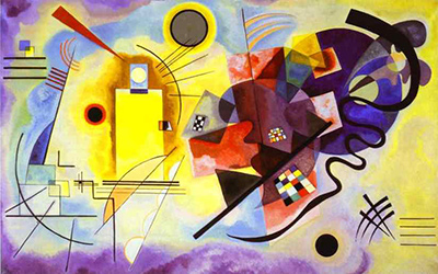
Wassily Kandinsky's Yellow-Red-Blue draws the eye from a luminous yellow arrangement at the left through a crowded red centre to a dark blue circle and curling black line at the right. Its title names three primary colours, yet the painting includes far more: delicate black strokes, pale atmospheric passages, transparent overlaps, checks, arcs and irregular forms. The contrast between orderly geometry and more fluid shapes gives the large canvas its tension. The Centre Pompidou records the work as a 1925 oil painting made in Weimar between March and May, measuring 128 × 201.5 cm. [1].
The painting belongs to Kandinsky's Bauhaus years, when he taught and developed a systematic language of point, line, colour and shape. It can look like a demonstration of a theory, but the Centre Pompidou's detailed teaching essay cautions that its complexity exceeds a simple diagram. The yellow, red and blue do not occupy three tidy boxes. Each affects and is affected by neighbouring colours and forms. A useful way to look is to follow their left-to-right order, then notice every element that interrupts it. [2].
Watch: Wassily Kandinsky
Five museum videos about Kandinsky’s art, sources of inspiration and the relationship between colour and music.
Vasily Kandinsky: Around the Circle
Curator Megan Fontanella introduces Kandinsky and the Guggenheim collection.
Watch on YouTubeAt a Glance
- Artist:Wassily Kandinsky.
- Title:Yellow-Red-Blue, from the German Gelb-Rot-Blau; the French collection title also gives Jaune-rouge-bleu.
- Date and place:March–May 1925, Weimar, according to the owning museum.
- Medium:oil on canvas.
- Dimensions:128 × 201.5 cm.
- Collection:Musée national d'art moderne, Centre Pompidou, Paris; inventory AM 1976-856.
- Acquisition:donation by Nina Kandinsky in 1976.
Where this work sits in Kandinsky’s career
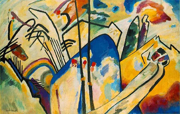
The Blue Rider
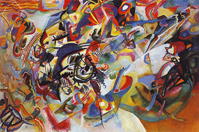
1903Composition VII
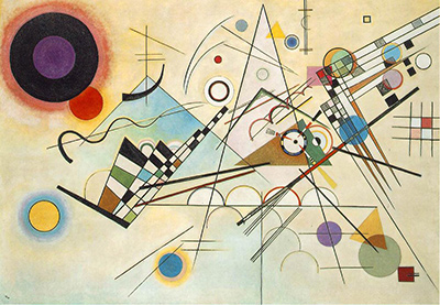
1913Composition VIII
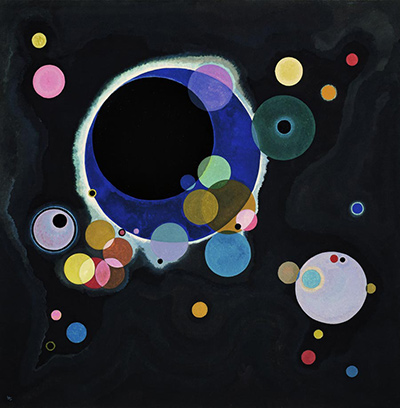
1923Several Circles
1926Sky Blue
1940Contents
- A first route across the canvas
- What the title does and does not name
- Yellow and the angular left
- The dark blue circle and right-hand field
- Why red matters between them
- Straight lines against a winding line
- Checks, rectangles and transparent overlaps
- Opposition and balance
- Bauhaus teaching and the 1925 date
- A theory tested by painting
- Sun, moon and the limits of a reading
- Comparing Composition VIII and Several Circles
- Nina Kandinsky's donation and the owner record
- A route for close looking
- Why Yellow-Red-Blue matters
- Frequently asked questions
- References
A first route across the canvas
Start on the left with the large yellow region. It contains or meets straight black lines, angular forms and a dark circular accent. The surrounding ground is pale, with cooler tones toward some edges. The yellow seems to push forward, partly because its warmth contrasts with that quiet field. The central area becomes denser: reds, small rectangles, coloured checks and less regular shapes gather there. At the right, a large blue circle and darker surrounding forms slow the eye differently.
This route follows the title's sequence, but it is not a reading instruction that exhausts the image. Black lines cross colour boundaries. An arc can carry attention back left, while a small checked patch in the centre can hold it in place. The composition works through crossings as well as succession. The Centre Pompidou describes the left as more luminous and geometric, and the right as darker and more complex; it also says the three primary colours organise the whole from left to right. [1].
At thumbnail size, one may see a yellow half and a blue half divided by red. The canvas is too interwoven for a hard split. Look at the mixed area between the poles, then at lines that refuse to stop at an imagined border. Kandinsky makes the contrast productive by giving the viewer ways to pass between its terms.
What the title does and does not name
Gelb-Rot-Blau is unusually direct. It names yellow, red and blue without giving the viewer a landscape, narrative or object to find. This encourages attention to colour relationships. The words are in the order in which the primary colours have a broad left-to-right presence on the canvas. Yet none is confined to a single strip. Yellow can appear near dark forms, and red is more than one central block. The title points to a pattern, not a literal map with three separate zones. [1].
The other colours matter too. Violet, green, white and black can alter how a primary hue looks. A dark outline may sharpen the yellow; a pale area can give a red patch room; transparent overlaps can make colour seem to change within one form. Kandinsky does not reduce painting to three pure pigments placed side by side. The Centre Pompidou teaching dossier stresses nuance, gradation and the coexistence of distinct formal languages. [2].
The title also does not make this a numbered Composition. Kandinsky used that title for a small series of ten other paintings. Here he named a particular colour relationship. The work is carefully composed, but "composition" as a general description should not be confused with a formal place in the numbered series.
Yellow and the angular left
The left side is bright but not uniform. A large yellow area meets a pale, somewhat atmospheric ground. Straight, thin black lines give this section measured directions; some are horizontal or vertical, others slant across the light. The Centre Pompidou's teaching essay relates the yellow to movement and warmth. It describes a lighter field with cool blue-violet borders that can suggest an open sky. That is a visual analogy, not a claim that Kandinsky painted a specific meteorological view. [2].
The geometry on this side is varied. A dark round accent sits among angular lines; thin marks intersect larger coloured planes. A shape can be closed and stable while a line continues past it. The balance between these two kinds of action is part of the left's vitality. "Geometric" does not mean static. A slanting black line can make the yellow feel as if it radiates or advances.
Look at the spaces between the straight strokes. They prevent the area from becoming a solid wall of paint. Yellow seems expansive partly because pale ground and fine black lines give it edges of different strength. If the colour filled the whole left half without interruption, its effect would be simpler. Kandinsky instead lets it press against marks that measure, redirect and occasionally break it.
The dark blue circle and right-hand field
The large blue circle on the right supplies a strong contrast to the yellow. Its round outline is clear enough to be read immediately, yet the surrounding area is complex. Dark curved forms and a black serpentine line carry movement around and away from the circle. Smaller coloured pieces and layered surfaces complicate the blue's apparent stillness. The Centre Pompidou describes this side as darker and more sinuous, with the blue circle standing out against a lighter field. [2].
Circle and curve are related but different here. A circle encloses a stable area; a free line can escape and change direction. Their proximity keeps the right from becoming merely a single disk. Black arcs can echo the circular boundary without completing another perfect circle. Some marks appear to pass in front of other forms, giving the area a layered quality that contrasts with the more open left.
Kandinsky's colour associations linked blue with coolness and inwardness, but the canvas does not ask us to translate the circle into one fixed emotion. We can first observe what it does: it has weight, anchors the right, and holds its shape among less regular neighbours. Only then is it useful to consider how contemporary writing about colour might enrich a viewer's response.
Why red matters between them
Red is the third term in the title, but it does more than mark a middle position. Red rectangles and related warm passages appear amid other shapes, some of which partly veil or cross them. This makes the centre a place of transition rather than a simple divider. Yellow and blue do not meet along one clean seam. Their contrast is mediated by forms with different textures, directions and degrees of transparency. [2].
The Centre Pompidou's teaching essay draws on Kandinsky's course notes to offer an image of red emerging between yellow and blue. It also frames the left and right as a possible sun-and-moon encounter. Those are interpretive readings tied to the artist's teaching language, not proof that a literal sun, moon and birth scene are depicted. The visual evidence is a strong sequence of primary colours joined by overlapping forms. [2].
Try looking at the red independently. Where is it an opaque area, and where does it seem caught behind another shape? How much of its impact depends on yellow to the left or blue to the right? These questions show why red cannot be reduced to a label in the title. It is a changing participant in the painting's larger balance.
Straight lines against a winding line
Kandinsky brings many line types into one canvas. On the left, a collection of fine straight strokes sets up measured directions. Across the right, a thick black curve bends in ways that resist a ruler. Other arcs, diagonals and short marks fall between those poles. The Centre Pompidou's activity guide asks viewers to distinguish straight, curved, parallel, oblique, thick and thin lines. That simple exercise is a useful beginning for close looking, though it does not itself prove a hidden code of meanings. [3].
Follow one line until it ends or crosses another. A thin stroke may direct the eye across a large area without becoming a shape. A thick line can itself feel like a painted form. A closed curve makes a bounded surface; an open curve can imply continuation beyond its visible end. These differences let Kandinsky vary pace across the painting. Some passages can be scanned quickly; others ask the eye to slow down at an intersection.
The contrast is not simply left equals straight and right equals curved. A circle is a geometric form on the right, and free gestures interrupt the centre and left. The larger tendency is real, but the exceptions help keep the picture connected. A strict division would make two separate compositions; shared line behaviours make this one complex field.
Checks, rectangles and transparent overlaps
Small checkerboard patterns and rectangular pieces enliven the centre. Their repeated units provide a measured beat that differs from a long, sweeping curve. Some checks are coloured; others set black against light areas. The pattern can catch the eye as a compact concentration of order inside a more fluid passage. The Centre Pompidou describes checks alongside red rectangles and biomorphic-looking transparencies. [2].
Transparency is important because it complicates any simple diagram of three colours. A form that seems to show another beneath it creates depth without a conventional room or landscape. A red rectangle may be legible through a neighbouring, softer shape. That relationship can make the central zone feel like several visual events happening at once. The painting offers no single foreground object in front of an obedient background.
The checks also show that repetition need not make a passage mechanical. A patch of squares gains force from its position among irregular neighbours. Move it mentally into the open left field and its effect would change. Here it offers a brief rhythm in the transitional centre before the eye reaches the right's larger circle and sweeping black marks.
Opposition and balance
The Centre Pompidou presents this work as a balance of elements that oppose and complement one another. Light and dark, straight and curved, angular and rounded, warm and cool, open and dense: each pair is visible, but none divides the canvas perfectly in two. The painting's coherence comes from the way these differences answer across distance. The left's luminous yellow needs the right's darker weight; the central overlaps keep them in conversation. [1]; [2].
Cover the right side for a moment. The yellow and straight lines retain interest, but the whole may feel more one-sided. Cover the left and the darker curves can feel crowded without the open luminous counterweight. The centre is not a neutral compromise; its red, checks and transparent forms give the contrast a charged middle. This mental exercise cannot replace the actual whole, but it clarifies how each region acts on the others.
Balance does not require symmetry. The blue circle is not mirrored by an identical yellow circle, and the line systems have different densities. A visual weight can be answered by a colour rather than a matching shape. Kandinsky uses that flexibility to keep the painting from becoming a static chart of equivalents.
Bauhaus teaching and the 1925 date
Kandinsky began teaching at the Bauhaus in 1922. Its environment encouraged him to examine how basic forms, colours and lines might be taught and analysed. Yellow-Red-Blue belongs to that context, and the Centre Pompidou owner essay says it can be seen as a visual illustration of ideas later published in Point and Line to Plane. The book appeared in 1926, after this canvas. It is therefore more precise to say that painting and teaching shared a developing inquiry than that the picture illustrated a book already in print. [1]; [2].
The owner's place line records Weimar, March–May 1925. That specificity is useful because the Bauhaus relocated to Dessau in the same year. The canvas can be discussed as a work of the Bauhaus period without moving its actual making to the later campus. The date also places it between Composition VIII of 1923 and Several Circles of 1926.
The work's size matters in this setting. At more than two metres wide, it extends beyond a small exercise in matching shapes and colours. The teacher and theorist is also a painter making decisions about scale, transitions and unequal visual weights. The Centre Pompidou teaching essay explicitly warns that the work's complexity prevents it from being treated as a mere manifesto or diagram. [2].
A theory tested by painting
Kandinsky associated certain colours and shapes in his teaching: yellow with the triangle, red with the square and blue with the circle. The Centre Pompidou's educational dossier reports these associations and connects them to his broader work on point, line and plane. The canvas includes a blue circle and many angular elements, but it is not a poster with three isolated colour-shape pairings. That mismatch is part of its interest. Theory offered questions and possibilities; painting put them into a changing relationship. [2].
Even a colour that seems stable in a theoretical account shifts when placed beside another colour. Yellow near a dark line can feel more brilliant than yellow against a pale wash. Blue can feel deep within the circle and lighter where it approaches a neighbouring area. A red rectangle can be forceful on its own yet partly veiled by a transparent overlap. These are contingent visual effects, not contradictions of an artist's interest in systematic relationships.
The painting also puts regular geometry beside forms that cannot be named with a schoolroom ruler. The Centre Pompidou characterises the right as more free and complex, and its teaching activities encourage the separation of geometric from invented forms. A viewer can perform that classification and then notice where it breaks down. Kandinsky's work is alive at precisely those transitions. [1]; [3].
Sun, moon and the limits of a reading
The warm yellow left and cool blue right have prompted a sun-and-moon comparison in the Centre Pompidou's teaching essay. It draws on Kandinsky's notes about yellow, blue and the emergence of red between them. The interpretation helps articulate the opposition of light and dark and the movement through the centre. It should be introduced as a reading, not reported as a literal scene that every visitor must find. [2].
There is a dark circular shape and a luminous yellow area; these are visible facts. Whether the yellow is a sun or the blue circle a moon is a step of interpretation. The distinction is useful because it lets a visitor consider the poetic analogy without losing sight of the painting's actual construction. A circle can evoke a celestial body and still act as a circle balancing a group of lines.
The same caution applies to claims that red is literally "born" in the middle. The central red forms do emerge visually between yellow and blue zones. Kandinsky's notes give the metaphor historical weight. Yet a metaphor does not turn the painting into a sequence of events with a single time line. The red is present throughout the viewer's encounter and can be revisited in any order.
Comparing Composition VIII and Several Circles
Composition VIII of 1923 puts circles, lines and other geometry on a much lighter field. Its elements can be inspected as distinct points of tension across an open space. Yellow-Red-Blue keeps geometry, but it also makes colour zones and freer forms interpenetrate. The difference shows that Kandinsky did not settle into one Bauhaus formula after 1923. His 1925 work makes the contrast between measured and unmeasured shapes a central event.
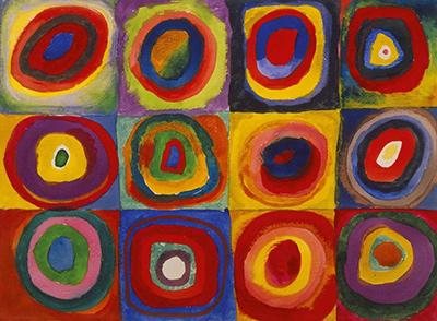
Several Circles of 1926 concentrates on discs against a dark ground. It shows how much variety Kandinsky could draw from a repeated geometric type through scale, placement and colour. In Yellow-Red-Blue, by contrast, the large blue circle is one actor among many kinds of form. Comparing the two helps separate a theory of the circle from a painting in which its effect depends on lines, rectangles and colour fields around it.
These comparisons should not be arranged as a march from loose to strict and back again. The three works use different constraints. One opens a pale field to many geometries; one brings luminous and dark halves into tension; one explores circular relations on black. The shared artist and close dates make the contrasts revealing without reducing each painting to a stage in a simple evolution.
Nina Kandinsky's donation and the owner record
Nina Kandinsky donated Gelb-Rot-Blau to the Musée national d'art moderne in 1976. The Centre Pompidou's inventory is AM 1976-856. The owner's detailed record identifies its medium, size, date, place and inscriptions. Such documentation is especially valuable for a work often reproduced under translated titles. It allows an English page to preserve the German original while identifying the same physical canvas. [1].
The museum's live page may show a temporary exhibition or loan. That is useful for current travel planning, but a lasting article should avoid promising the painting will be hanging in one building on any future date. Museum ownership is the stable fact. The viewer should consult the record directly before a visit.
The existing image here is sufficient to see the left yellow area, red middle, right blue circle and strong black lines. It is small compared with the original, so transparent overlaps and subtle colour gradations are harder to judge. The owner calls the artwork public domain but separately credits its photograph to a named photographer and distributor. Those details do not establish clear reuse terms for a replacement file. The page therefore retains its existing image rather than turning an optional upgrade into a licensing problem.
A route for close looking
Begin by naming only what can be seen: a yellow expanse at left, red elements toward the centre, a blue circle at right, thin straight lines and thick curves. Then follow the title's order across the canvas. Where does the sequence feel clear? Where do black marks, checks or transparent forms interrupt it? This first route tests the museum's description of the three primary colours as an organising succession.
Next follow line types. Choose one long straight line on the left and one winding line on the right. How does each change your pace of looking? Where does it cross a colour boundary or end in open space? The Centre Pompidou's teaching activities suggest classifying line types; the point of the exercise is to return to the whole picture with a sharper sense of their different roles. [3].
Finally look at the centre without treating it as a separator. Find a red rectangle, a checked patch and an overlapping form. Ask whether the middle mixes the languages of left and right or creates a third one. The painting will not yield one mechanical answer. Its achievement lies in making opposites coexist in a richly connected field.
Why Yellow-Red-Blue matters
Yellow-Red-Blue is a large, carefully balanced canvas from the Bauhaus years that shows Kandinsky's theory at work without shrinking painting into a lesson chart. Its Weimar date, dimensions, oil medium and Nina Kandinsky donation are secured by the Centre Pompidou's record. The museum's teaching essay describes a lively tension between the yellow geometric left, blue and dark curved right, and red transitional centre. These facts and observations give the painting an identity beyond its famous three-colour title. [1]; [2].
The work rewards more than one pass. A first look sees contrast, a second sees links, and a third may notice how apparently incompatible forms share one space. Sun-and-moon analogies and colour theory can enrich that looking when kept in their proper place as interpretation and context. The painting remains a particular arrangement of paint on a wide canvas, capable of surprising a viewer who thought the title had already explained it.
Kandinsky artworks directory
Frequently Asked Questions
The Centre Pompidou records the canvas as made in Weimar from March to May 1925. It belongs to Kandinsky's Bauhaus period, but the recorded place is Weimar, not Dessau. [1].
It is an oil painting on canvas measuring 128 × 201.5 cm. [1].
It belongs to the Musée national d'art moderne, Centre Pompidou, Paris, inventory AM 1976-856. Check the live record for current display or loans. [1].
The German title Gelb-Rot-Blau names the three primary colours that broadly organise the canvas from left to right. Other colours and forms complicate that sequence. [1].
It relates to questions Kandinsky taught at the Bauhaus, and the museum suggests a visual analogy. The book was published in 1926, after this 1925 canvas, and the museum's teaching essay stresses that the painting is more complex than a simple theory diagram. [1]; [2].
Nina Kandinsky donated it in 1976. The museum records the work as AM 1976-856. [1].
Discussion
What do you notice first in Yellow Red Blue? Share a close observation or a question about the evidence for this work.
Comments are for comparing what we see and what the cited sources establish.
Reader Insights
Where does the centre connect the luminous left with the darker right?
Which line most changes your pace of looking across the canvas?
How far does the sun-and-moon reading help before it hides the painting’s actual forms?
Join the Conversation
Add your observation below and tell us which part of the artwork led you to it.
References
- Centre Pompidou, Gelb-Rot-Blau (Jaune-rouge-bleu) collection record. View source.
- Centre Pompidou, Jaune-rouge-bleu educational dossier, reading the work. View source.
- Centre Pompidou, Jaune-rouge-bleu educational dossier, teaching activities. View source.