 by Tom Gurney
Tom Gurney BSc (Hons) is an art history expert with over 20 years experience
Published on June 19, 2020 / Updated on October 14, 2023
Email: tomgurney1@gmail.com / Phone: +44 7429 011000
Leichtes (Léger, or Light) by Wassily Kandinsky: Introduction
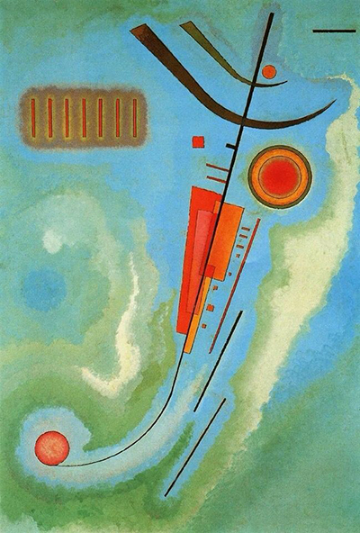
A long, dark diagonal cuts across a field of blue and green in Kandinsky's Leichtes. Small orange and red forms press against it, while softer passages seem to drift around the sharper marks. The work is dated 1930, during Kandinsky's years at the Bauhaus in Dessau. Its title is central to reading it: Leichtes is German for something light; the French title Léger means light or weightless. The unaccented English spelling “Leger” can be mistaken for the surname of the painter Fernand Léger. The Centre Pompidou's record makes clear that this is Kandinsky's study in visual lightness, not a documented tribute to another artist. [1].
Watch: Wassily Kandinsky
Five museum videos about Kandinsky’s art, sources of inspiration and the relationship between colour and music.
Vasily Kandinsky: Around the Circle
Curator Megan Fontanella introduces Kandinsky and the Guggenheim collection.
Watch on YouTubeAt a Glance
- Artist:Wassily Kandinsky (1866–1944).
- Title:Leichtes (German); Léger (French); “Light” is an English rendering.
- Date:1930.
- Medium and size:Ripolin on cardboard, 69 × 48 cm; frame painted by Kandinsky.
- Collection:Centre Pompidou, Paris, AM 1974-16.
- Subject:an abstract arrangement of line, colour and geometric forms.
Where this work sits in Kandinsky’s career
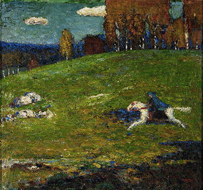
The Blue Rider
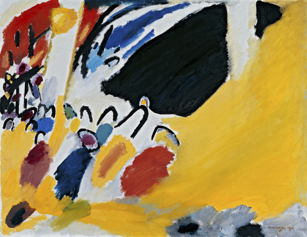
1903Composition VII
1913Composition VIII
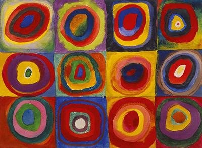
1923Several Circles
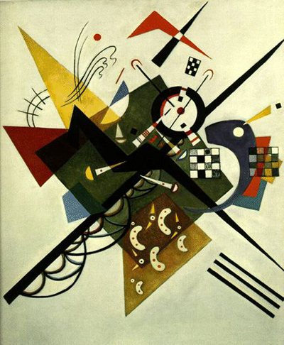
1926Sky Blue
1940Contents
- What makes the picture feel light?
- Kandinsky at the Bauhaus
- What the title does and does not tell us
- Frequently asked questions
- References
What makes the picture feel light?
The first strong line runs upward through the picture on a slant. It is dark and comparatively thin, yet it organises the surrounding shapes. Near it, red-orange bars, a small square and a ring of warm colour become points of attention. Above, two heavier dark forms angle and curve away. These elements do not sit in a regular grid. They seem suspended at different positions, held together by the relationships of their lines rather than by a floor, horizon or single piece of architecture.
The ground is as important as the crisp shapes. Blue, green and pale areas blend across the surface, with soft edges that resist the certainty of a diagram. Against this atmosphere, the narrow marks appear more mobile. The Centre Pompidou describes a dynamic diagonal with small geometric forms around it and a vaporous field beneath. The museum's account connects those choices to an impression of balance and weightlessness. That interpretation begins in the visible picture: gravity is suggested by the long downward and upward directions, yet no object seems firmly planted. [1].
A red disc at lower left helps reveal the painting's play with scale. It is small, but its saturated colour makes it difficult to ignore. Higher up, a larger ring encloses a red centre; unlike the lower disc, it has a halo of surrounding colour. Across from the ring, a row of short red lines sits inside a soft rectangular patch. The three areas set up a loose exchange across the picture. The eye moves among them, then returns to the central diagonal. Kandinsky balances unlike things: circles and straight lines, dense colour and thin black marks, precise edges and hazy transitions.
It would be tempting to name the shapes as objects or assign each one a fixed meaning. The painting gives no secure basis for that. A circle may suggest a sun or eye to one viewer, while another sees it simply as a concentrated colour against a softer field. The title supplies a stronger clue than such guesses. Leichtes asks us to pay attention to how the arrangement feels and behaves: how marks can seem to hover, how a diagonal can set them moving, and how areas of colour can keep them from becoming a rigid system.
Kandinsky at the Bauhaus
When he made Leichtes, Kandinsky was teaching at the Bauhaus in Dessau. The Centre Pompidou places the picture within a visual vocabulary of point, plane and line, and its museum text explicitly links that vocabulary to his teaching period. This does not mean the painting is a classroom exercise. The exact angles, colours and softened ground are decisions in a finished artwork. Kandinsky could use elementary shapes as material while making their relationships particular to this one surface. [1].
The broader setting also helps explain why geometry matters without turning it into a code. The Guggenheim's teaching material describes Kandinsky's Bauhaus investigations into colour and form, including their psychological and spiritual effects. Such concerns were part of his artistic and theoretical life during the 1920s. By 1930, geometry was familiar ground for him, yet Leichtes does not feel like a rigid chart. It pairs fine, directed lines and small sharply defined shapes with a painted atmosphere that changes gradually across the card. [2]; [1].
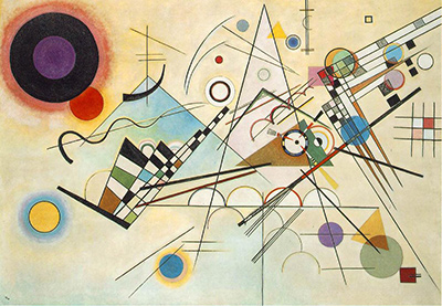
Kandinsky's interest in movement can be seen by comparing the work with Composition VIII, a larger 1923 painting built from circles, lines and other geometric elements. The two should not be collapsed into one formula. Composition VIII spreads its many parts across a broad canvas; Leichtes directs attention through a narrow vertical field, with much of its activity near a single diagonal. The comparison makes the later painting's spareness and gentle, shifting background easier to appreciate. [3]; [1].
What the title does and does not tell us
The German Leichtes and French Léger draw attention to lightness. They do not tell us that a particular circle stands for a balloon or that the diagonal depicts an ascent through the sky. The museum's own description is careful: it speaks of an impression of weightlessness and equilibrium produced by the arrangement. That is a way of looking at what is present, not a claim about a hidden scene. [1].
The title's translation matters because a name can steer the whole article. Read as the surname Léger, it invents a dedication and invites a search for influence from Fernand Léger. Read as the adjective, it sends attention back to Kandinsky's marks. There is no need to deny that both artists belonged to the broad history of modern art. The narrower point is that the museum's object record gives this painting a German title about lightness and provides no evidence for an homage. A description should begin there.
The original painted frame is another reminder that Kandinsky attended to the work as a physical whole. The Pompidou records it but does not say exactly how its colouring should be interpreted. It is enough to note that the artist made it part of the object. A reproduction that shows only the card may therefore leave out something he intended viewers to encounter. [1].
Kandinsky artworks directory
Frequently Asked Questions
The Centre Pompidou titles the painting Leichtes (Léger). In this title, the French léger translates the German word for light; the museum gives no evidence that it names Fernand Léger or documents a dedication to him. [1].
It was made in 1930, while Kandinsky was teaching at the Bauhaus in Dessau. The museum records the date on the front and in an inscription on the reverse. [1].
The Pompidou catalogues the work as Ripolin on cardboard, 69 × 48 cm, with a frame painted by the artist. It should not be described simply as an oil painting on card. [1].
It belongs to the Centre Pompidou in Paris, inventory AM 1974-16. Exhibition loans can change where an object is temporarily displayed, but the holding collection remains the Centre Pompidou. [1].
Discussion
What do you notice first in Leichtes (Léger, Light)? Share a close observation or a question about the evidence for this work.
Comments are for comparing what we see and what the cited sources establish.
Reader Insights
Which lines make Leichtes feel weightless to you?
How does its soft ground change the effect of the sharper Bauhaus forms?
How might Kandinsky’s painted frame affect a view of the whole object?
Join the Conversation
Add your observation below and tell us which part of the artwork led you to it.
References
- Centre Pompidou, Leichtes (Léger) collection record, object details and curatorial description. View source.
- Solomon R. Guggenheim Museum, Kandinsky teaching materials, Bauhaus context. View source.
- Solomon R. Guggenheim Museum, Vasily Kandinsky: Around the Circle press kit, Composition VIII object details for comparison. View source.