
 by
Tom Gurney
Tom Gurney BSc (Hons) is an art history expert with over 20 years experience
Email:
tomgurney1@gmail.com
/ Phone:
+44 7429 011000
Hans Holbein Prints and Woodcuts: Introduction
A colour reproduction of Anne of Cleves and a tiny black-and-white scene from the Dance of Death can both be called a “Holbein print”. Yet they bring us to his art by different paths. The first reproduces a painted portrait. The second belongs to a project conceived for multiplication on paper, in which Holbein's design passed through a blockcutter's hands before reaching the reader. The Metropolitan Museum of Art identifies Hans Lützelburger as the printmaker of its Dance of Death woodcuts, alongside Holbein as artist. [1]
That distinction opens up a substantial part of Holbein's work . On paper, he could organise a book's entrance, give a scholar a compact public likeness, or compress an entire encounter with death into a few centimetres. A raised hand, a piece of furniture or the gap between two bodies could carry the story. Black ink and unprinted paper supplied a vocabulary as exacting as the colours of his portraits.
Looking at these works means following both the image and the object. Who devised the composition? Who cut its printing surface? When was the book published, and when was this particular sheet printed? The answers reveal a collaborative art with several kinds of afterlife: new impressions, new editions, copies made through other techniques and the reproductions familiar today.
At a Glance
- Principal medium discussed Woodcut, a relief process in which the remaining raised surface prints in ink. [2]
- Holbein's role Designer of compositions; the making of a print could involve a separately named blockcutter, printer and publisher.
- Key collaborator Hans Lützelburger, cutter of the principal early Dance of Death blocks. [1]
- Dance of Death chronology About 1526 for the designs and early blocks in the Met's dating; first book publication in Lyon, 1538. [1]
- Other print work Book borders and devices, Old Testament illustrations and portraits of Erasmus. [3] [4] [5]
- Later interpretations Wenceslaus Hollar's Anne of Cleves , 1648, is an etching after Holbein's painted portrait. [6]
- Essential distinction The date of a design, the date of an edition and the date of an individual impression may differ.
Contents
- What makes a woodcut an original print?
- Designing a book, from its border to its smallest letter
- The Dance of Death: a story held in a few lines
- Why one design can carry several dates
- Bible pictures beyond the Dance of Death
- Erasmus: a likeness that travels with a text
- Hollar after Holbein: translating a portrait into etched lines
- Looking at later copies and modern reproductions
What makes a woodcut an original print?
In a woodcut, the dark line is what the cutter leaves behind. Knives and other tools remove the surrounding wood; the raised areas receive ink and transfer it to paper. Movable type also prints from a raised surface, which allowed woodblocks and words to be assembled and printed together. Wendy Thompson's account for the Met explains this practical affinity between woodcut and the illustrated book. [2]
The reversal of ordinary drawing is worth imagining. A drawn line can be made with a single moving point. A printed line must survive as a narrow piece of the block, separated from the neighbouring lines by cut-away spaces. In the Dance of Death , a row of delicate marks can become a sleeve's turning surface; a broader contour can hold the same sleeve clear of a hand. The white intervals do as much work as the ink.
An original print need not be a unique object. Several impressions can come from one printing surface. “Original” here concerns the relationship between the image and the printmaking project, rather than a claim that only one example exists. Holbein's authorship of a composition and Lützelburger's authorship of its cutting can be recognised together. [1]
The printer's task brings the prepared surface into contact with ink and paper. The publisher's name identifies responsibility for issuing the book or print. These roles can overlap, but they answer different questions from the designer's name. A catalogue that names several people is giving a more complete account of the object, rather than offering rival candidates for a single signature.
A modern reproduction of a painted portrait gives access to a work made in a different medium, preserving some of its colour, composition and detail at a new scale. The texture of the reproduced paint is an image of a surface; the inked lines of a historical woodcut are the means by which that surface was first made visible on paper.
Designing a book, from its border to its smallest letter
Holbein's printed work extends beyond pictures that can be lifted out and treated as independent scenes. A book needs openings, divisions, recognisable signs and a relationship between its text and its margins. His work for Basel publishing belongs to this larger field of design.
The British Museum's 1518 volume containing Thomas More's Utopia and epigrams by More and Erasmus brings several makers together. It records borders by Hans Holbein and Urs Graf, illustrations by Holbein's brother Ambrosius, printer's devices after Hans, and initials from alphabets by both brothers. Johann Froben printed the volume in Basel. The famous view of Utopia itself is Ambrosius's contribution; it should not be silently reassigned to Hans because both worked on the book. [3]
On the title page, Hans's border creates a miniature architectural setting around a tall field of type. The central text has room to breathe, while figures and ornament crowd the surrounding framework. Small bodies climb, support and interrupt the decorative structure. The eye can move between the steady rectangular space of reading and the busy life around its edges. At the top, the artist's name is divided between the corners of the design. [3]
This is a different problem from making one central figure dominate a panel painting. A border must attract attention while accommodating words whose lengths and arrangement also matter. Its opening is part of its design. A printer's device, meanwhile, can establish identity within a much smaller space. The same book gives us several scales of attention: the page as a whole, the principal image and the minute signs encountered as reading proceeds.
The bound volume preserves these distinct contributions within a shared object. Looking only for a single celebrated artist's name can conceal the working relationships that made the book possible.
The Dance of Death: a story held in a few lines
The Dance of Death is the clearest place to see how much Holbein could make a small printed image do. The Met gives an approximate image size of 6.5 × 5 centimetres for its series. Enlarged reproductions make the details accessible, but the original scale asks for a much closer encounter. [1]
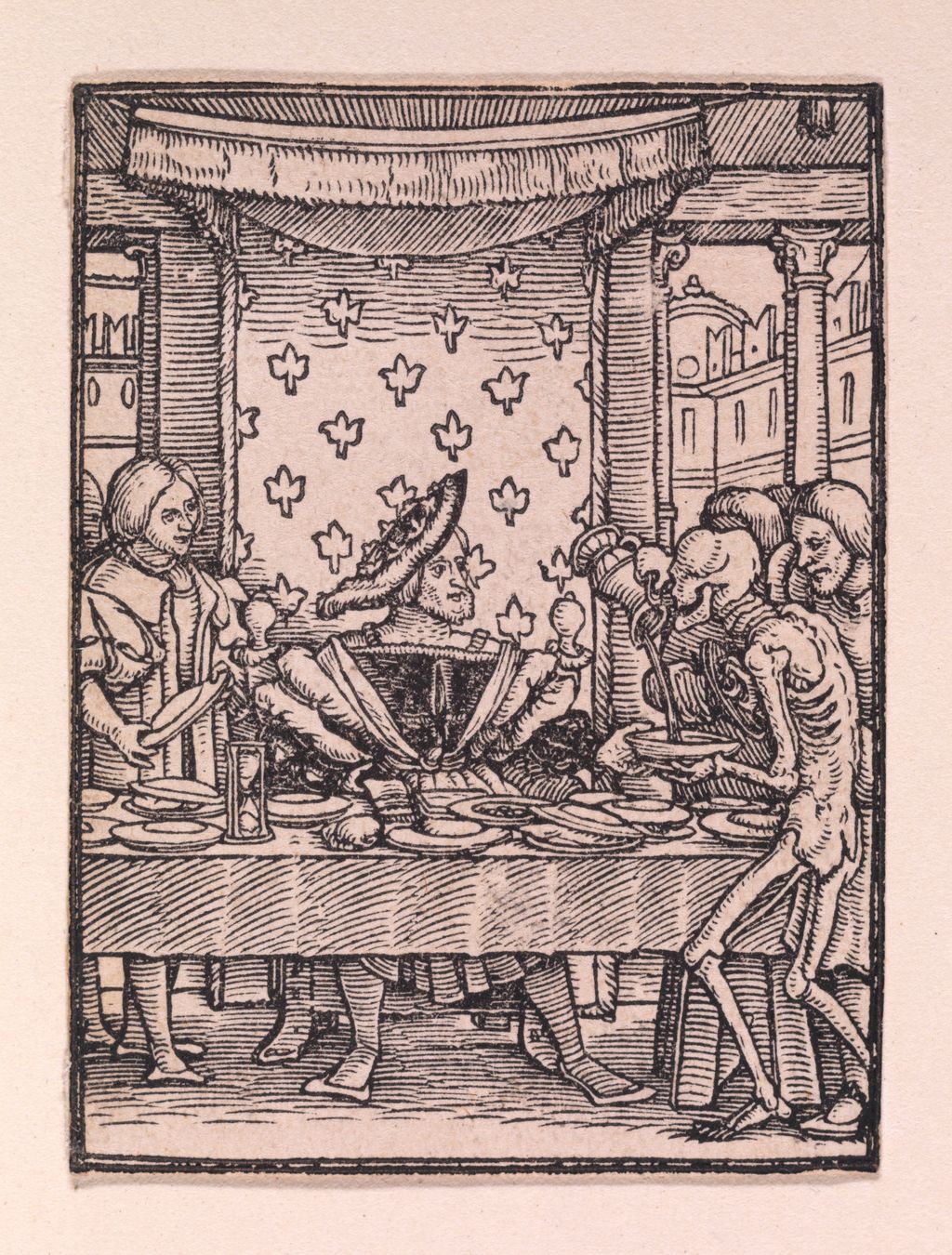
Consider The King . Its composition is built from broad, legible divisions: the canopy overhead, the patterned hanging behind the ruler and the table across the foreground. Within those divisions, fine lines distinguish the canopy's fringe, the vessels and the folds of expensive clothing. Death enters the arrangement as a cupbearer, tipping a vessel towards the king's cup. A familiar act of service becomes the mechanism of the interruption. [7]
The picture works before every detail has been recognised. The canopy says where authority sits; the table establishes a ceremony; the exposed bones disturb its human company. Closer looking then changes the pace. The ruler's ample sleeves fill the centre, while the skeleton's narrow limbs remain visible beside the table. Lines create both the substance of privilege and the lightness with which Death moves through it.
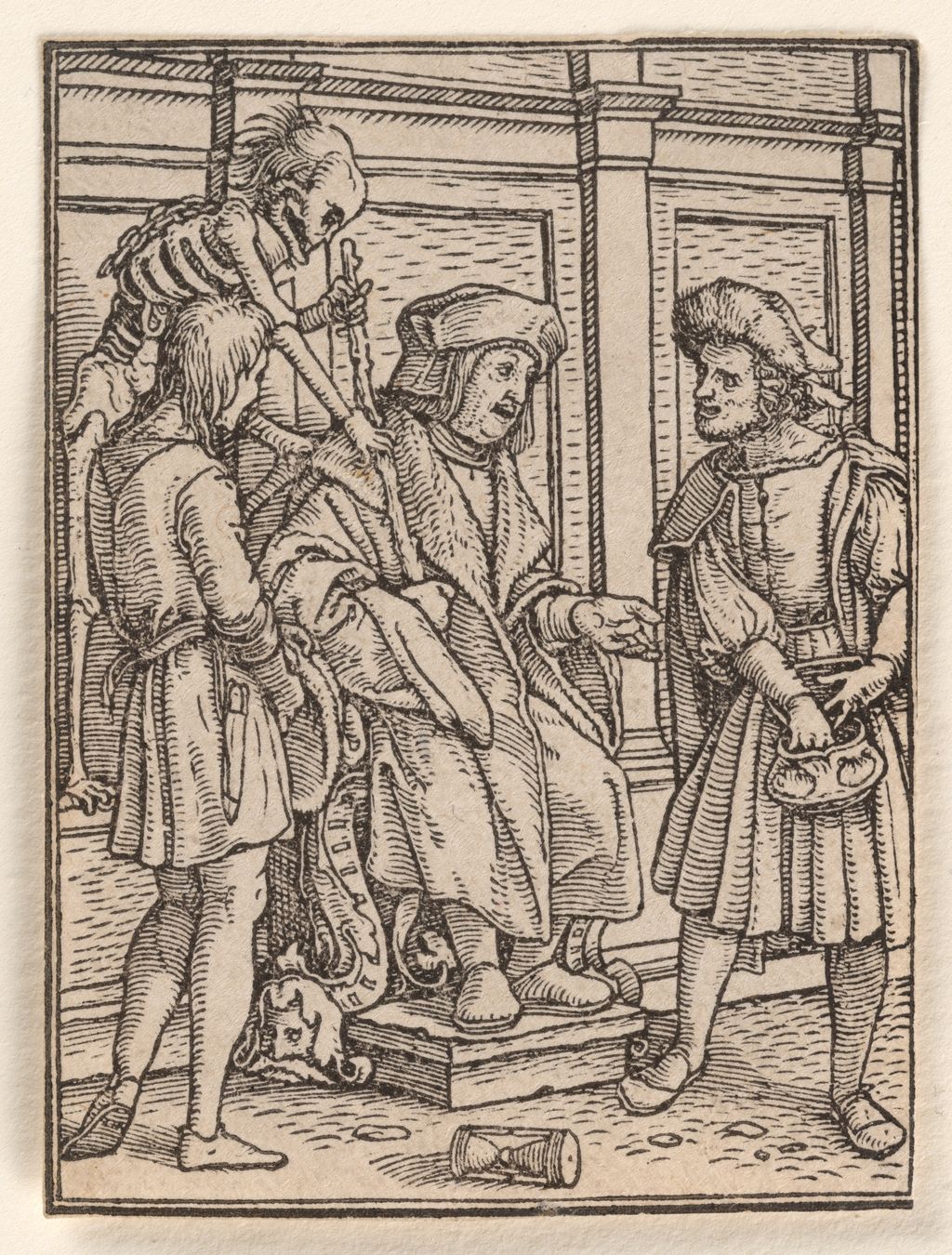
In The Judge , the main action is concentrated around the seated figure's hands and the people on either side. One man reaches towards a purse; the judge extends an open hand. Above them, Death leans across the chair and grasps the staff. The interior's straight divisions hold these competing movements together. Even the overturned vessel in the foreground can be read without confusing it with the feet and platform nearby. [8]
This economy is more revealing than a count of the objects squeezed into the rectangle. The hands establish a transaction, the chair an office, the staff an authority now threatened. Some details describe the room; others make the event happen. Following the sequence of gestures shows how carefully those functions are distributed.
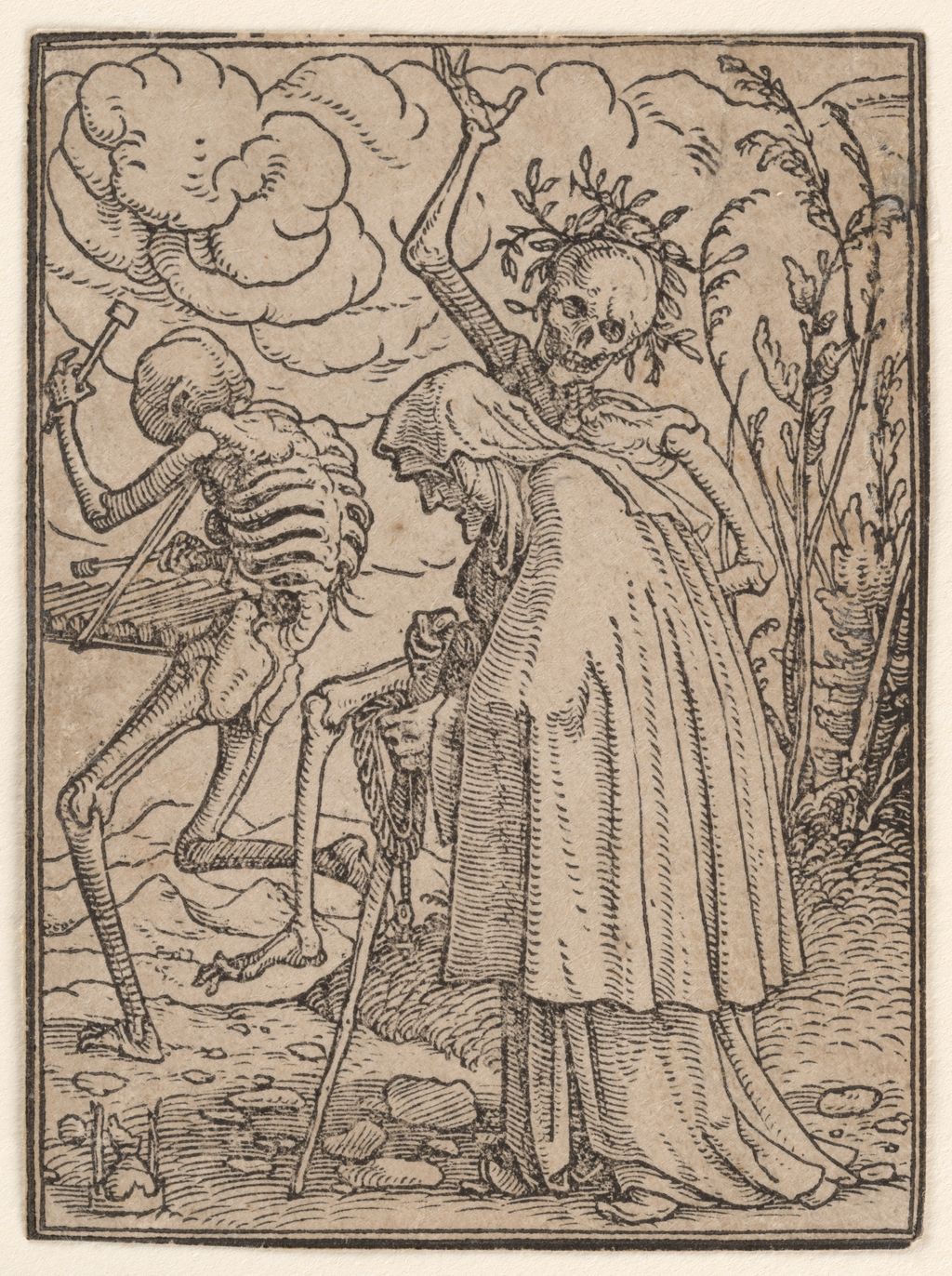
The Old Woman slows the encounter. Her heavy outer garment occupies much of the picture, its long folds drawing the eye towards the ground. She bends forward with her beads, while the skeletal figures around her move with conspicuous freedom. The tree's rough trunk, the uneven path and the cloth all have different rhythms of line. The woman's enclosed body becomes especially tangible beside the open structure of the bones. [9]
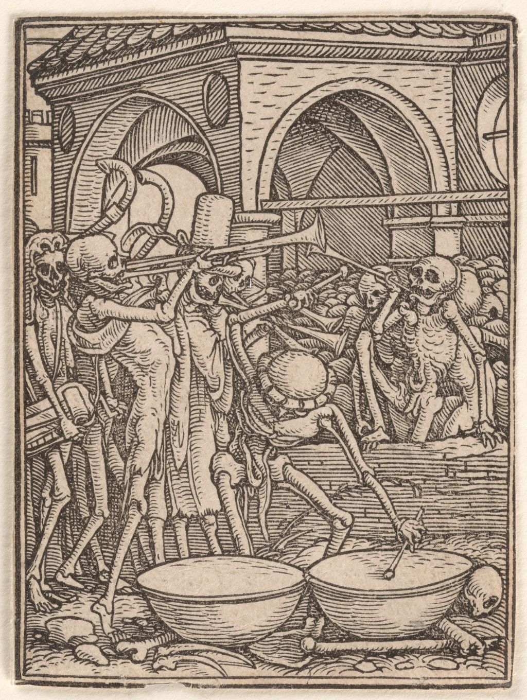
In Skeletons Making Music , those bones themselves fill the scene. Instruments cross in front of an arched building; limbs and ribs overlap; the drummer bends over two large drums in the foreground. The drums' broad pale surfaces give the eye a temporary rest amid the crowded marks. At the lower edge, scattered bones extend the scene almost to its frame. [10]
Together, these four images show several kinds of clarity. A canopy locates power, a hand establishes an exchange, a long fold slows a figure and an open drumhead separates one action from another. The cutter had to preserve those distinctions through inked ridges and empty intervals. Looking at a dark patch alone tells us little; seeing how it meets the light beside it reveals the intelligence of the printed surface.
Watch: Holbein’s portraits and working methods
Explore museum films on Holbein’s drawings, painted portraits and close-looking details.
Hans Holbein at the court of Henry VIII
A Royal Collection Trust film exploring Holbein’s work at Henry VIII’s court.
Watch on YouTubeWhy one design can carry several dates
The Dance of Death makes chronology unusually visible. The Met's label separates about 1526 from publication in 1538. Those dates belong to different stages of the project. A composition could be designed and its block cut before the book in which later readers encountered it. [1]
The first book, Les simulachres & historiees faces de la mort , appeared in Lyon in 1538. It contained 41 woodcuts, accompanied by Latin biblical passages and French verses. Austin Dobson describes that arrangement in his historical introduction to the series. A reader encountered words above and below each scene, so that looking formed part of a larger act of reading. [11]
An edition brings together more than reusable pictures. Its title, language, sequence, captions and other texts shape the experience of the images. Even where a block remains the same, a new setting can draw attention to another aspect of its design. Conversely, the familiar outline of a scene may survive in a copy made from a newly cut block. Similarity of composition cannot settle the identity of the printed object.
An impression is the individual result on paper. Its date must be established from evidence about that sheet or the volume from which it comes. A design dated to the 1520s can appear in a later edition without becoming a newly invented composition. A nineteenth-century copy can reproduce the same scene without becoming a sixteenth-century impression. Keeping these stages separate allows the history to remain intelligible without forcing every object under one convenient date.
Bible pictures beyond the Dance of Death
The Old Testament illustrations known as the Icones offer another major example of Holbein designing for print. The British Museum describes its 1538 first edition as containing 91 illustrations, with one woodcut on each page, a brief caption and identification of the biblical chapter above. It records the Trechsel brothers as publishers in Lyon. [4]
The museum's individual entry for Solomon Praying for Wisdom , illustrating II Chronicles 1, gives a design date of about 1525–26 and an image measuring 60 × 88 millimetres. Its horizontal format differs from the small upright encounters of the Dance of Death . The book asks the reader to move through biblical history in a series of compact visual episodes. [4]
The production was also shared. The British Museum's commentary identifies four blockcutting contributions across the series, naming Lützelburger, Veit Specklin, Hans Weiditz or his circle, and an assistant. That qualification around Weiditz matters: a collective project should not be simplified into one securely identified cutter for every image. [4]
For a reader exploring Holbein's range, the Icones establishes the breadth beyond court portraiture and macabre satire. A biblical illustration has to select a moment that can stand within a longer account. A caption can name it, but the visual arrangement must still make the episode distinct. These books invite a useful change of pace: read the short passage of text, look at the image, then consider what the chosen moment leaves outside its frame.
Erasmus: a likeness that travels with a text
The Rijksmuseum's small circular portrait of Erasmus makes another connection between print and reading. It shows the scholar in profile, wearing a cap, within a round inscribed surround. The museum dates the design to 1533 and gives the sheet's diameter as 65 millimetres. Its catalogue note connects the block with the March 1533 Adagia , published in Basel by Froben's heirs. [5]
The same note adds a valuable caution: the Rijksmuseum impression probably comes from another edition. Here the distinction between a block's first documented use and the date of a surviving sheet is built into the object record itself. “1533” identifies an important point in the design's publishing history; it does not automatically settle the printing date of every impression. [5]
A compact portrait can accompany an author in a way a substantial painted panel cannot. It can bring a face into the physical space of a text, making recognition part of the reader's encounter with the writing. The circular boundary also gives the likeness a self-contained shape. This is a different visual proposition from the hands, books and surrounding space of Holbein's painted portraits of Erasmus .
Nor is there only one Erasmus woodcut. The Rijksmuseum also records a standing portrait beneath an arch with Terminus, dated 1536–40. Its sheet measures 281 × 169 millimetres, and the record names Specklin as blockcutter alongside Holbein. This larger architectural presentation and the small roundel are distinct works, with their own makers' roles and object histories. [12]
Bringing them together reveals how flexible a printed likeness could be. An author might be recognised through a concentrated profile or presented within a more expansive setting. The size and format guide the viewer's attention before any resemblance is considered. “Portrait of Erasmus” names a subject; it does not identify one interchangeable image.
Hollar after Holbein: translating a portrait into etched lines
Holbein's painted portraits also acquired lives in historical prints made by later artists. The National Portrait Gallery's Anne of Cleves , by Wenceslaus Hollar after Holbein, is an etching dated 1648. Its paper measures 244 × 182 millimetres. The name of the original designer and the name of the later printmaker are both needed to describe it. [6]
Placed beside the colour reproduction of Holbein's portrait , Hollar's image shows what translation can involve. The frontal figure and joined hands remain immediately recognisable. The red of the broad sleeves is replaced by changing densities of line. Fine crosshatching turns the dark background into a woven-looking field, while the pale face stands out within it. Folds that colour helps distinguish in the painting must be articulated through light, shade and the direction of marks.
There are also visible differences. In Hollar's image the cross pendant is conspicuous, the headdress's hanging elements have a different arrangement, and an identifying Latin inscription runs beneath the figure. These details encourage comparison without allowing the print to become a substitute for every fact about the painting. The etching is a later object whose choices deserve attention in their own right.
The phrase “after Holbein” is useful here. It credits the earlier work on which the print depends while leaving Hollar responsible for the printed interpretation. A reproduction of Hollar's etching adds another stage. Its subject ultimately comes from Holbein, but the marks being reproduced are Hollar's. Naming both stages preserves a history that a bare “Holbein print” would conceal.
Looking at later copies and modern reproductions
The Dance of Death has a similarly layered history. Dobson's 1903 edition explains that its illustrations were printed from copy blocks made by Bonner and John Byfield for Francis Douce's publication of 1833. These are impressions from nineteenth-century blocks, even though their compositions follow the much earlier series. [11]
That example makes a useful distinction between the age of a design and the age of the object carrying it. A book may be historically interesting because it records a later revival, a new printing technique or a particular reader's encounter with Holbein. Its value as evidence changes when the maker and date become clear. A copy can tell us about reception without telling us exactly how an original impression looked.
When comparing reproductions, begin with the visible area. Is the whole sheet shown, including words and margins, or only the image? Has a small scene been enlarged to fill a page? Does the caption name a collection and identify an individual object? Scale, selection and accompanying text influence how the design is read, even when the composition itself is familiar.
Then return to the marks. In the king's canopy, notice how a few short cuts separate the hanging fringe from the darker space above it. In the musician's drums, notice how much work is entrusted to relatively empty paper. In Hollar's portrait, watch the shading change direction as the sleeves turn. Each rewards attention to a different relationship between a designed image and its printed form.
Artworks directory
Explore paintings, drawings, prints and designs, including works without a separate article. Related studies and versions have their own entries; workshop works and copies are labelled. Print designs and series are grouped rather than repeated for every impression.
Frequently Asked Questions
The earlier date concerns the designs and early blocks in the Met's catalogue. The later date is the first book publication. An individual impression may belong to a particular edition or later printing and must be identified separately. [1]
The woodcuts discussed here use black line and unprinted paper to create their effects. “Holbein print” can also describe a modern colour reproduction of a painting. The medium of the original work and the process used to reproduce it are separate questions.
It identifies Holbein as the source of a composition translated by another maker. Hollar's Anne of Cleves , for example, is an etching of 1648 after Holbein's painted portrait. It is a historical print by Hollar, rather than a woodcut designed for Holbein's own publishing projects. [6]
No. The Rijksmuseum connects its circular portrait's block with the 1533 Adagia but considers its own impression probably to have come from another edition. Design, edition and individual sheet must be kept distinct. [5]
Discussion
Look again at the images and ideas explored in Hans Holbein Prints and Woodcuts. These editorial prompts invite your observations.
Reader Insights
Choose a sleeve in The King and notice where the shading stops. The unprinted gaps help separate cloth, flesh and space.
Imagine reducing one of the enlarged Dance of Death scenes to about 6.5 × 5 centimetres. Which gesture would remain clearest?
Look from the colour portrait of Anne to Hollar's etching. Which part changes most when colour gives way to a pattern of lines?
Join the Conversation
Which form draws you closest to Holbein: the miniature social encounters, the decorated book page, the compact Erasmus likeness or a later etched portrait? Share a detail that helped you understand how the image was made.
References
- The Metropolitan Museum of Art , The Dance of Death , Hans Holbein the Younger and Hans Lützelburger, about 1526, published 1538, object 19.57.1–.42. View source .
- Wendy Thompson, The Metropolitan Museum of Art , “The Printed Image in the West: Woodcut”, October 2003; relief process and book illustration. View source .
- The British Museum , De Optimo Reip. Statu, Deque noua insula Vtopia and accompanying epigrams, Basel: Johann Froben, 1518, object 1904,0206.53; collection record and title-page image. View source .
- The British Museum , Solomon Praying for Wisdom , from the first edition of Historiarum veteris Instrumenti Icones ad vivum expressae , Lyon, 1538, object 1904,0206.86.56; design dated about 1525–26, and curatorial comments on the series and cutters. View source .
- Rijksmuseum , Portret van Erasmus , design dated 1533, RP-P-1920-2646; object record and note on the 1533 Adagia and probable later-edition impression (in Dutch). View source .
- National Portrait Gallery , Anne of Cleves , Wenceslaus Hollar after Hans Holbein the Younger, etching, 1648, NPG D11254; collection information and enlarged image. View source .
- The Metropolitan Museum of Art , The King, from “The Dance of Death” , about 1526, published 1538, object 19.57.8; record and image. View source .
- The Metropolitan Museum of Art , The Judge, from “The Dance of Death” , about 1526, published 1538, object 19.57.18; record and image. View source .
- The Metropolitan Museum of Art , The Old Woman, from “The Dance of Death” , about 1526, published 1538, object 19.57.25; record and image. View source .
- The Metropolitan Museum of Art , Skeletons Making Music (or the Cemetery), from “The Dance of Death” , about 1526, published 1538, object 19.57.5; record and image. View source .
- Austin Dobson , introduction to The Dance of Death by Hans Holbein , New York: Scott-Thaw Company, 1903; “The Book”, “Other Reproductions” and “The Present Issue”, public-domain text at Project Gutenberg. View source .
- Rijksmuseum , Portret van Erasmus staand onder boog met beeld van Terminus , 1536–40, Holbein and blockcutter Veit Rudolf Specklin; current collection record (in Dutch). View source .