
 by Tom Gurney
Tom Gurney BSc (Hons) is an art history expert with over 20 years experience
Published on October 11, 2026 / Updated on October 11, 2026
Email: tomgurney1@gmail.com / Phone: +44 7429 011000
Reading Basquiat: words, anatomy and symbols across his work: introduction
A Jean-Michel Basquiat painting can ask a viewer to read and look at once. A word may name a pictured thing, point toward a source, repeat a public claim or become hard to decipher beneath another mark. A head may resemble a face, mask, skull and anatomical diagram without being only one of them. A crown can recur without carrying the same message every time. These features make his art rewarding to examine, but they also invite overconfident “decoding.” The useful approach is to identify a particular object, notice what is actually on it, and then distinguish a museum record or artist statement from a possible interpretation.[1][2][3]
How to use this guide. Start with the work's title, date, medium and collection record. Read a visible word in its position rather than extracting it as a free-standing slogan. Notice whether an image and a label reinforce one another, disagree or interrupt the path of the eye. When a mark resembles an anatomical part or cultural emblem, ask what evidence connects that specific work to the proposed source. Basquiat used words, diagrams and recurring signs across decades of drawing and painting, but there is no single dictionary that translates all of them.[2][3][4]
Contents
- Language was a material, not an afterthought
- The childhood anatomy-book account
- A body can also be a diagram of attention
- Crossing out can make a word more visible
- A title can open a language problem
- Copying, reversal and layered sources
- When one phrase meets another field
- Crowns and other recurring signs
- A practical way to read an unfamiliar work
Language was a material, not an afterthought
The Brooklyn Museum's Unknown Notebooks research treats language as an early medium for Basquiat. Its exhibition account describes pages containing poems, wordplay, lists, observations, pictograms and drawings. Some forms reappear in larger works, but the museum does not claim that every finished painting can be traced to a surviving notebook page. The total number of notebooks he made is unknown. The notebooks show sustained experimentation with the shapes and uses of words, not just casual notes on the way to a more important canvas.[2]
The earlier SAMO project, made with Al Diaz, used short texts in public space. Its street statements were encountered differently from words enclosed within a gallery painting: they belonged to particular walls, neighbourhoods and moments. The SAMO and street guide follows the shared authorship and site of that work. A line of continuity can be drawn from public writing to notebooks and paintings because language remains central, but the meanings, audiences and material conditions changed. Treating a studio canvas as a wall-sized graffiti tag hides the labour of arrangement and the new questions it asks.[2][5]
Fred Hoffman, who worked with Basquiat on later print projects, describes early 1981 text-image drawings that distilled a word, short phrase or pictured observation into a compact form. This is Hoffman's account of development, not a statement that every later work began as such a drawing. It helps us see that words were being placed, simplified and reworked as compositional material. A letter occupies space; a repeated name creates rhythm; a crossed-out phrase can remain visible and alter the field around it. The writing can operate as image even when it is legible as language.[3]
Written material also came from many sources. Brooklyn's museum research describes notebook subjects ranging from contemporary street life to history and popular culture. The presence of a word from medicine, sport, money or advertising does not mean that Basquiat endorsed the source's point of view. He could copy, juxtapose, question or redirect it. A precise reading starts by locating the word in a work and asking what other figures, colours and terms surround it. A general list of his “symbols” is useful only after those local relationships have been examined.[2][3]
The childhood anatomy-book account
The Basquiat Estate records a 1969 car accident, hospitalization and a copy of Gray's Anatomy given to him by his mother during recovery. It links the book to his later anatomical interests and to the name of the band Gray. This documented biographical episode helps explain an available visual source and a lasting subject. It does not prove that every rib cage, open skull or labelled body in a later work reproduces a particular plate from that copy. The edition, pages and images Basquiat studied would need to be matched for such a claim.[1]
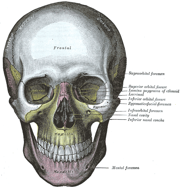
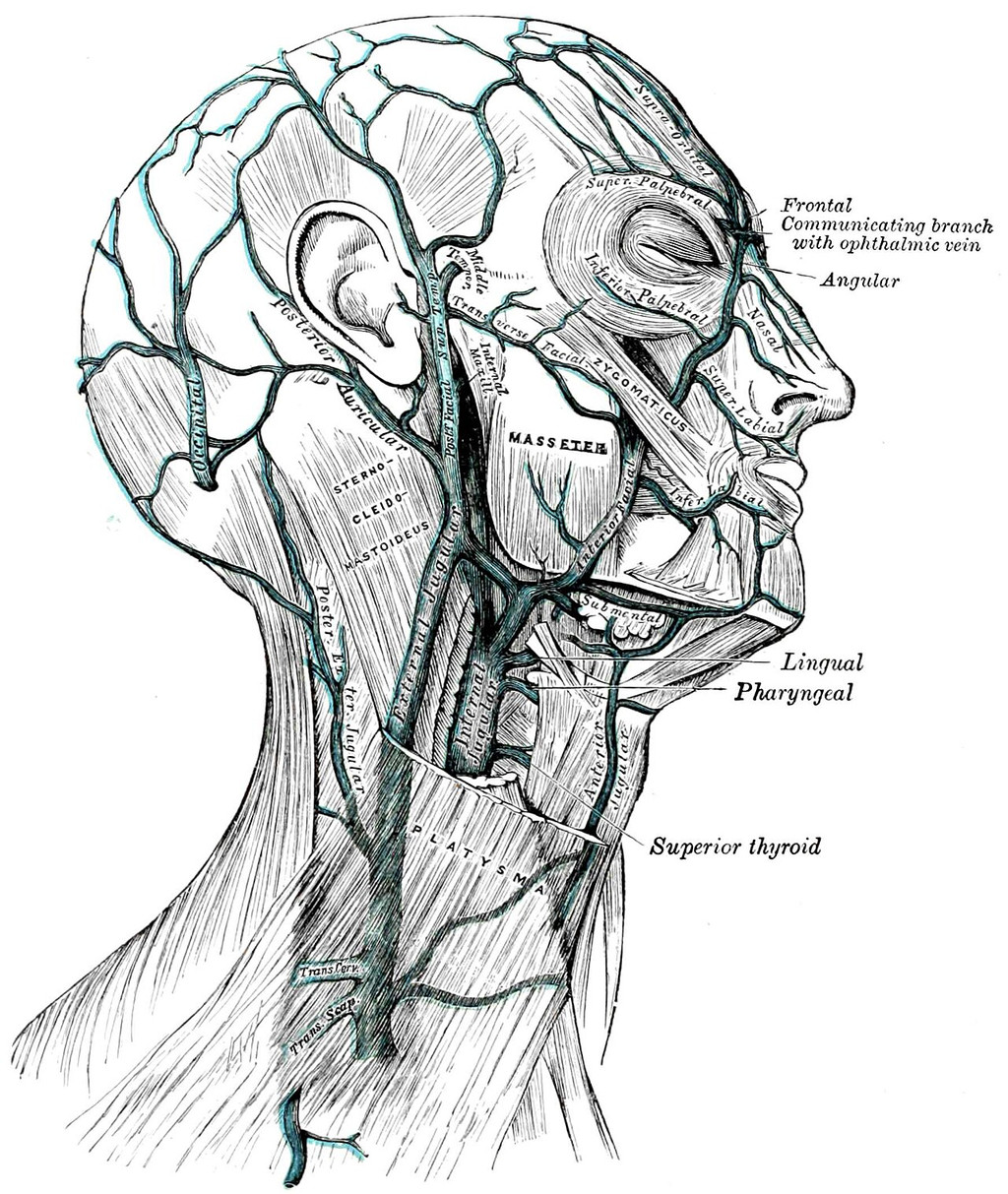
That distinction matters because an anatomical drawing can be used in different ways. A medical illustration ordinarily aims to identify structures consistently so that a student can learn them. Basquiat's bodies may expose bones, organs or diagram-like forms, yet they can also be broken by colour, text, repetition and changes of scale. They do not necessarily become accurate instructional charts. A viewer can recognize the presence of anatomical study while still asking what happens when a body is placed in a picture about a boxer, an artist, a historical name or commercial language.[1][3]
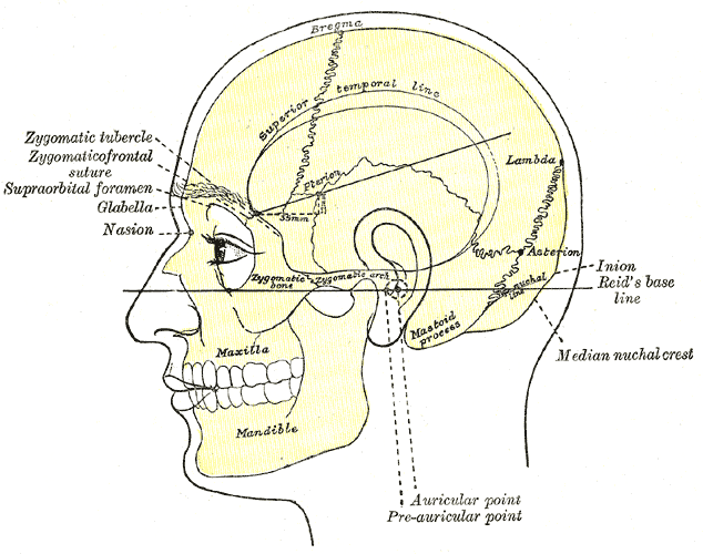
The Estate's chronology gives a concrete print example: Basquiat made an Anatomy portfolio in 1982, consisting of eighteen silkscreens on paper, with printing and publication details supplied there. It was shown in his 1983 Annina Nosei exhibition. The portfolio's title places anatomy explicitly in the work's public presentation. It offers better evidence of the subject than a vague assertion that Basquiat was “obsessed with skeletons.” The number of prints, edition and process also remind us that anatomical images could be developed through controlled printing, not only in single expressive paintings.[6]
The prints guide examines that portfolio's edition evidence, and the drawings guide follows the broader paper practice. An anatomy plate held in a modern image archive may be useful comparison material, but it should be labelled as a historical diagram, with its own author and rights status. It cannot be displayed as “Basquiat's source page” merely because it resembles the general visual language of later works. This guide uses the documented book episode and portfolio while keeping individual visual borrowings open to proof.[1][6]
A body can also be a diagram of attention
Basquiat's Untitled (1982) painting in Rotterdam offers an example of why a diagram-like body should be read carefully. Museum Boijmans' object image shows a central torso crossed by a grid of pale rounded shapes. Guggenheim Bilbao interprets the figure as an anonymous boxer and its radiating head as haloed. The grid may make viewers think of ribs, pads or machinery, but neither institution identifies each circle as a specific organ. The body's construction matters precisely because it lets several associations remain active.[7]
Untitled (Boxer) is a different 1982 painting with a clearer raised-arm silhouette. Its lines make the figure look simultaneously solid and exposed. The comparison can show how Basquiat repeatedly constructed bodies through marks that reveal and interrupt them, without assuming he copied the same anatomy drawing in both. A torso that appears diagrammed can heighten a sense of vulnerability, power or both. Those responses should be tied to what a particular painting shows and to curatorial context, not presented as a medical diagnosis of a painted figure.[7][8]
The same care applies to heads. Hoffman's essay on Untitled (Head), 1981, argues against taking the common label “Skull” as a literal description of a dead head. He points to functioning facial features and reads the image as a living, responsive presence. That is a scholar's close-reading argument, informed by his work with Basquiat, not a rule that a skull-like face can never signify mortality elsewhere. The Skull guide sets his account beside The Broad's object record. It is an example of how an inherited nickname can shape what viewers think they see before they have examined the painting.[3][9]
Crossing out can make a word more visible
The Whitney Museum's collection record for Hollywood Africans, 1983, preserves Basquiat's own explanation that crossing out words could draw viewers toward them. The artist's comment is unusually direct evidence about one technique. In that painting, the title and other terms are repeated, boxed or marked through around Basquiat, Rammellzee and Toxic. The Whitney relates words about commodities and film roles to racist limitations in the entertainment industry. The act of obscuring is therefore not simply a deletion from an otherwise complete sentence; it can increase a reader's effort and attention.[4]
Even with that artist statement, it would be too broad to say every strike-through in every Basquiat work “means” emphasis and nothing else. A crossed word can still be a revision, a visual barrier or part of a layered surface; the source and placement matter. The Whitney's explanation authorizes a way to approach the marks in Hollywood Africans, especially where their lettering remains visible. Another canvas may put a crossed phrase in a different relation to images. The Hollywood Africans guide examines that painting's particular people, title and Los Angeles setting.[4]
Thelma Golden, speaking in the Whitney's audio guide, notes a hierarchy among words in Hollywood Africans: some are circled, some crossed, others highlighted. Her observation helps a reader avoid treating the whole yellow canvas as an evenly distributed field of “text.” Position, colour and visibility direct the eye. The painting can be read at one distance as a grouping of faces and words, then at another as a set of particular names and charged terms. A digital image may make all lettering appear equally small; a close description restores the differences the artist placed on the surface.[4]
Notary (1983) supplies another catalogued example with a different physical setting. Princeton University Art Museum records a three-part canvas on wood supports measuring 180.3 × 401.3 cm, with acrylic, oil stick and paper. Jordana Moore Saggese, writing in its museum record, notes repeated versions of “PLUTO,” some visibly crossed through rather than erased. She connects other parts of the painting to astronomy, African art and commerce, and reports Basquiat's explanation that a labelled drawing of a Roman bronze buckle followed a visit to the Metropolitan Museum of Art. Those are distinct kinds of evidence within one account: catalogued materials and size, curatorial interpretation, and a reported artist explanation of one motif.[14]
The museum's description of exposed bars and nails matters here because the revisions occur on an emphatically built support. A word crossed out on one panel remains visible while the viewer's eye travels across physical joins to other words and images. Saggese proposes that the painting challenges hierarchies between draft and final and between artistic traditions. That argument can be tested against its repeated writing and assembled canvas; it should not become a claim that every strike-through in Basquiat has the same philosophical purpose. The exact object gives the crossing-out discussion a second case beyond the Whitney's Hollywood Africans.[4][14]
A title can open a language problem
In In Italian, 1983, Basquiat sets words from Italian and Spanish near a large head and a field of other signs. Pérez Art Museum Miami identifies sangue as Italian for blood and sangre as Spanish, with the Italian form visibly crossed out beneath the Spanish one. The title seems to offer a language for the whole painting, but the words complicate it. Treating sangre as Latin, as some older writing did, would miss the actual play among two modern languages and the marked term. The owner/exhibition guide supplies a firmer starting point than a guessed translation.[10]
The terms do not settle why blood appears alongside teeth, heads, a heart diagram and monetary or historical references. They encourage movement between reading a word and seeing a shape. A labelled heart is not merely an illustration of the word “heart” if it also sits in a structure of colour, bodies and other writing. Likewise, a title does not have to function as a complete caption. It can place one question before the viewer: why is a Spanish word more legible than the Italian one in a work called In Italian? The painting leaves room to investigate rather than supplying a dictionary entry.[10]
PAMM's current guide also records multiple materials and a two-section support for In Italian. That physical construction matters. Words and diagrams were built into a large object, not typed as a transparent message over a finished picture. A caption that reproduces only isolated terms removes their scale and position. The In Italian guide describes the head, language exchange and source-supported ownership history in more detail. Here it is a case study in why translation alone cannot complete a reading of a painting.[10]
Copying, reversal and layered sources
Words could move between media. Fred Hoffman's first-person account of Tuxedo explains that Basquiat gathered fifteen drawings and one collage, which were photographically reversed for a large white-on-black silkscreen canvas issued in an edition of ten. The original dark-on-light marks became pale writing and images against a dark field. The Paris museum's earlier checklist speaks more broadly of sixteen drawings; the differing descriptions should be disclosed rather than merged into a claim that all sixteen components were drawings. This process is a concrete example of selection, reproduction, transformation and recombination.[11]
The Tuxedo guide explores that print's disputed dating and its large crown above a density of smaller words and images. For this page, the crucial lesson is material. “Text” does not always mean fresh handwriting placed directly on a final surface. It may arrive by photocopy, silkscreen or collage; it may be enlarged, reversed, repeated or partially covered. A viewer who treats each word as if it were written in one pass risks missing the work's built history. Hoffman's participant account gives unusually specific production evidence for this object and should not be stretched into a universal recipe for Basquiat.[11]
Hoffman also reads Per Capita, 1981, as an important step in the integration of a male figure, writing and layered pictorial space. He discusses words connected to the United States and economic comparisons in the painting. His account is an interpretation of how several parts of the image interact, not a proof that a single phrase alone controls its meaning. The named work allows readers to see how written information can have a social and political charge while remaining part of a painted composition. It provides a bridge between a compact phrase and the much denser later works.[3]
The shift across these examples is not simply from “few words” to “many words.” In Per Capita, a public motto and figures about wealth enter a particular image of a person. In Tuxedo, selected text-and-image sources are printed into a vertical field whose black-white reversal changes how they appear. In Hollywood Africans, words interact with portraits and film stereotypes. In In Italian, language itself becomes a visible problem. Each case gives a different reason to read, and the medium determines what kind of mark the reader is looking at.[3][4][10][11]
When one phrase meets another field
The 1981 God/Law drawing makes a useful smaller comparison. Hoffman discusses the image of balancing scales with the two named terms below. He reads the juxtaposition as a tension between artistic freedom and social responsibility, drawing on his knowledge of Basquiat. The words are short and clearly opposed in the described composition, but they are not a full sentence giving a doctrine. The scales make a visual relationship; they do not supply an official verdict about which side wins. This example shows why a diagram can organize a question without closing it. Reading the words and the pictured balance together is more precise than announcing that Basquiat simply preferred one term.[3]
Charles the First, 1982, offers a larger and more difficult case. The original painting joins three canvas panels. A written thought about kings crosses part of the surface, while separate terms, crowns and a circled reference to “CHEROKEE” appear elsewhere. The Estate and Fondation Louis Vuitton place the work among Basquiat's tributes to Charlie Parker. That institutional context can orient the music connection, but it does not make every word a lyric or every crown a direct portrait of Parker. The physically divided support also matters: the reader crosses real panel joins while trying to carry an idea across the writing. Its artwork guide keeps the original painting distinct from later printed versions.[6][13]
These two examples expose opposite risks. A concise pair of words on a drawing can encourage a too-neat moral translation. A crowded triptych can tempt the reader to assemble every mark into one grand hidden story. Both approaches skip the material choices that make the work particular: scale, support, position and the fact that some signs are repeated while others are isolated. One can identify a real conflict in God/Law and a documented Parker association in Charles the First, then leave open the relation among all other marks until stronger evidence supports it.[3][13]
They also show how to compare works without pretending they share one code. The drawing's balance and the painting's crowns both invoke authority, but they do so through different pictured structures. Comparison begins with that difference. A recurring concern can remain visible while each object keeps its own argument, materials and uncertainties.[3][13]
Crowns and other recurring signs
The crown is one of Basquiat's most recognizable signs. It appears with figures and sometimes on its own. It can lend an image dignity, set up a question about status or operate as a distinctive mark, but those are possibilities to test locally. The crowns guide compares documented works instead of assigning a single formula. A small crown in Hollywood Africans has a different setting from the large crown that tops Tuxedo. The Untitled (Crown) guide concerns a separate 1982 work on paper with a black crown over collaged sheets.[4][11][12]
Other repeated forms can create the same temptation to decode. A halo may suggest sanctity, a ladder ascent, a mask transformation, a bone mortality. Those associations can be productive questions, but an association is not automatically an identified source or an artist-approved explanation. The Guggenheim Bilbao reading of the haloed Rotterdam boxer, for instance, belongs to a specific museum interpretation of that painting. Hoffman's reading of arrows and ascent in Tuxedo belongs to another work. Moving the exact meaning of one sign unchanged between them would erase the compositions that give each sign its force.[7][11]
A practical way to read an unfamiliar work
Begin with a trustworthy object record. Similar titles recur in Basquiat's work, especially Untitled, so a date and collection or accession number can prevent one painting's details being applied to another. Look at the medium: a work on paper, silkscreened canvas and acrylic-and-oil-stick painting carry marks differently. Then identify three things you can actually locate—perhaps a word, a figure and a repeated shape—before moving to a broader claim. This does not make looking mechanical. It gives interpretation something solid to answer to.[4][7][9][11]
Next ask what kind of evidence supports the interpretation. An artist's comment about crossing out, a museum's catalogued medium, an eyewitness production account, an exhibition curator's reading and a viewer's own association each have value, but they are not interchangeable. The strongest sentence about a work often says which level it is using: “the museum identifies,” “the artist explained,” “Hoffman argues,” or “the shape can suggest.” Such phrasing allows a reader to revisit the evidence and disagree without being told that an uncertain symbol has been solved.[3][4]
Finally, return to the whole surface. A word can point outward to history, but it also has colour, size and neighbours. An anatomical contour may invite comparison with a medical book, yet it can also divide a body in a painting about achievement or injury. A crown may interrupt one figure and crown another. Reading Basquiat means moving among these relations, not extracting a code from them. The artist guide and paintings overview place the examples in a wider career; the linked artwork guides keep each title, object and interpretation distinct.[2][3][4]
Explore the Basquiat guide
Basquiat artworks in this guide
| Name | Date | Medium |
|---|---|---|
| Bird on Money | 1981 | Acrylic and oil on canvas |
| Boy and Dog in a Johnnypump | 1982 | Acrylic, oil stick and spray paint on canvas |
| Charles the First | 1982 | Acrylic and oil pastel on three canvas panels |
| Defacement (The Death of Michael Stewart) | 1983 | Acrylic and marker on wall-derived support (support records differ) |
| Dos Cabezas | 1982 | Acrylic and oilstick on canvas with wood supports |
| Dustheads | 1982 | Acrylic, oilstick, spray enamel and metallic paint on canvas |
| Eyes and Eggs | 1983 | Acrylic, oilstick and paper collage on hinged cotton drop cloth |
| Flexible | 1984 | Acrylic and oilstick on wood |
| God, Law | 1981 | Drawing; precise materials not established |
| Hollywood Africans | 1983 | Acrylic and oil stick on canvas |
| Horn Players | 1983 | Acrylic and oil stick on three canvas panels mounted on wood |
| In Italian | 1983 | Acrylic, oil stick and marker on canvas mounted on wood |
| Irony of a Negro Policeman | 1981 | Acrylic and oilstick on wood |
| King Alphonso | 1982–83 | Works on paper; suite materials vary by record |
| Obnoxious Liberals | 1982 | Acrylic, oilstick and spray paint on canvas |
| Pez Dispenser | 1984 | Acrylic and oil stick on canvas |
| Riding with Death | 1988 | Acrylic and oil crayon on canvas |
| Self-Portrait with Suzanne | 1982 | Oil pastel on paper (Paris dossier) |
| Self-Portrait | 1984 | Acrylic and oil stick on paper mounted on canvas |
| Untitled (Head), often called Skull | 1981 | Acrylic and oilstick on canvas |
| Slave Auction | 1982 | Crumpled-paper collage, oil pastel and acrylic on canvas |
| Untitled (Sugar Ray Robinson) | 1982 | Acrylic and oil pastel/oil stick on canvas (record terms differ) |
| Untitled (Titian) | 1982 | Oil stick on canvas |
| Trumpet | 1984 | Acrylic and oil paintstick on canvas |
| Tuxedo | 1982–83 | Silkscreen on canvas, edition of ten |
| Untitled (Rotterdam figure) | 1982 | Acrylic paint and oil stick on canvas |
| Untitled (Crown) | 1982 | Acrylic, ink and paper collage on paper |
| Untitled (Boxer) | 1982 | Acrylic and oil paintstick on linen |
| Untitled (Fallen Angel) | 1981 | Acrylic and oil pastel on canvas; aerosol appears in a second record |
Frequently Asked Questions
The Brooklyn Museum's Unknown Notebooks research treats language as an early medium for Basquiat. Its exhibition account describes pages containing poems, wordplay, lists, observations, pictograms and drawings. Some forms reappear in larger works, but the museum does not claim that every finished painting can be traced to a surviving notebook page. The total number of notebooks he made is unknown. The notebooks show sustained experimentation with the shapes and uses of words, not just casual notes on the way to a more important canvas.[2]
The Basquiat Estate records a 1969 car accident, hospitalization and a copy of Gray's Anatomy given to him by his mother during recovery. It links the book to his later anatomical interests and to the name of the band Gray. This documented biographical episode helps explain an available visual source and a lasting subject. It does not prove that every rib cage, open skull or labelled body in a later work reproduces a particular plate from that copy. The edition, pages and images Basquiat studied would need to be matched for such a claim.[1]
Basquiat's Untitled (1982) painting in Rotterdam offers an example of why a diagram-like body should be read carefully. Museum Boijmans' object image shows a central torso crossed by a grid of pale rounded shapes. Guggenheim Bilbao interprets the figure as an anonymous boxer and its radiating head as haloed. The grid may make viewers think of ribs, pads or machinery, but neither institution identifies each circle as a specific organ. The body's construction matters precisely because it lets several associations remain active.[7]
The Whitney Museum's collection record for Hollywood Africans, 1983, preserves Basquiat's own explanation that crossing out words could draw viewers toward them. The artist's comment is unusually direct evidence about one technique. In that painting, the title and other terms are repeated, boxed or marked through around Basquiat, Rammellzee and Toxic. The Whitney relates words about commodities and film roles to racist limitations in the entertainment industry. The act of obscuring is therefore not simply a deletion from an otherwise complete sentence; it can increase a reader's effort and attention.[4]
Discussion
Which documented detail changes how you read Reading Basquiat?
Reader Insights
Start with a visible mark, material or word.
Check date, support and collection before comparing images.
Which reading still needs an object-specific source?
Join the Conversation
Share an observation grounded in the work or its documented history.
References and further reading
- Estate of Jean-Michel Basquiat, 1960s chronology, records the 1969 accident, Gray's Anatomy gift and later anatomical interests.
- Brooklyn Museum, Basquiat: The Unknown Notebooks exhibition account, notebooks, text-image practice, recurrent signs and the limits of surviving evidence. See also the museum's notebook press release for language as an early medium and unknown total notebook count.
- Fred Hoffman, “The Defining Years,” hosted by the Basquiat Estate, early text-image drawings, Untitled (Head) and Per Capita analysis. Hoffman's iconographic conclusions are attributed.
- Whitney Museum of American Art, Hollywood Africans object record and audio guide, Basquiat's explanation of crossing out, object facts and Thelma Golden's interpretation.
- Estate of Jean-Michel Basquiat, 1970s chronology, Basquiat and Al Diaz's collaborative SAMO practice.
- Estate of Jean-Michel Basquiat, 1980s chronology, Anatomy portfolio's 1982 printing and 1983 exhibition.
- Museum Boijmans Van Beuningen, Untitled (1982), accession 3047 (MK), object image and facts; Guggenheim Bilbao teaching guide, attributed boxer/halo reading.
- Christie's original Untitled (Boxer) lot record, separate 1982 painting and object facts.
- The Broad, Untitled (1981) collection record, object identity; Hoffman's essay in note 3 explains the “Skull” naming issue.
- Pérez Art Museum Miami, Basquiat: Figures, Signs, Symbols guide, In Italian object facts and visible Italian/Spanish terms.
- Fred Hoffman, first-person Tuxedo production account in Made on Market Street, pp. 49–52, source drawings, collage and reversal; Musée d'Art Moderne de Paris, 2010 checklist, older component and date wording.
- Brooklyn Museum, 2015 Unknown Notebooks companion PDF, pp. 7 and 10, Untitled (Crown) object label and its relationship to Tuxedo.
- Musée d'Art Moderne de Paris, 2010 Basquiat checklist, Charles the First painting's three-panel object line; Fondation Louis Vuitton, 2018 retrospective, Parker-focused exhibition grouping.
- Princeton University Art Museum, Notary (1983), loan object L.1989.1.3 a–c, medium, size, support and Jordana Moore Saggese's attributed interpretation of words, source material and Basquiat's reported Met visit.