 by Tom Gurney
Tom Gurney BSc (Hons) is an art history expert with over 20 years experience
Published on June 19, 2020 / Updated on October 30, 2026
Email: tomgurney1@gmail.com / Phone: +44 7429 011000
Number 13A: Arabesque: Introduction
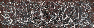
Jackson Pollock’s Number 13A: Arabesque is a long, low painting of 1948, approximately three metres wide. Yale University Art Gallery identifies its medium as oil and enamel on canvas and credits the gift to Richard Brown Baker, B.A. 1935. Its accession number is 1995.32.1. [1]
At a Glance
This work across Jackson Pollock’s career
The Flame
c.1934–38The She-Wolf
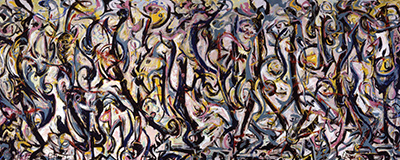
1943Mural
1943Alchemy
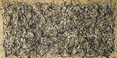
1947Number 1A, 1948
1948Blue Poles
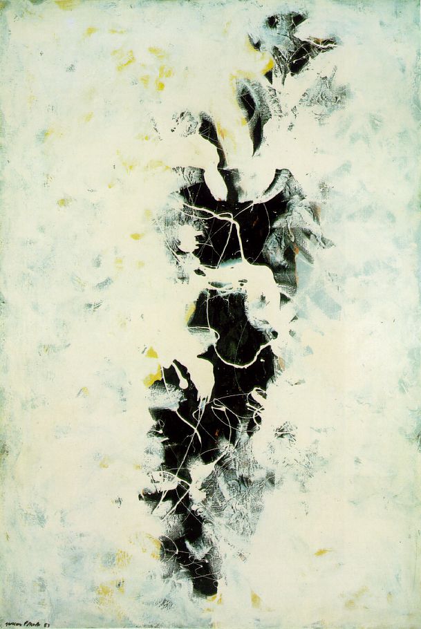
1952The Deep
1953White Light
1954Contents
- The colour starts with the cloth
- A process with room for decisions
- Number, letter and name
- What the long format makes possible
- A painting answered by a poem
The colour starts with the cloth
One of the painting’s most consequential choices preceded the first painted mark. Conservator James Coddington explains that Pollock purchased its sienna-red fabric already coloured; he did not paint that colour onto it. The cloth therefore performs the work of a coloured ground. Coddington describes the resulting reversal of the relationships familiar from natural-coloured canvas: white comes forward while black recedes. The support participates in the picture’s space, so the intervals between painted lines carry colour as actively as the lines themselves. His account also includes Arabesque among poured paintings involving direct contact with the canvas. Its technique accommodated touch as well as paint falling through air. [2]
Bernice Rose’s account of Pollock’s relationship between drawing and painting offers a useful way into this problem. She describes an artist seeking a line that could retain its independence while contributing to a fully painted surface. A poured line could satisfy both needs: it remained a moving trace, yet also deposited actual paint. Her argument makes the distinction between drawing and painting productive. A line need not enclose a recognisable figure to organise a picture; its movement and its relationship with the surrounding field can do that work. [3]
Rose also places weight on the difference between physical paint and optical space. Contrasts of ground and colour can make space seem to extend in front of or behind the surface. Read alongside Arabesque, that general framework encourages attention to two things together: the paint as material on cloth, and the changing depth suggested by colour relationships. The eye’s experience of distance need not correspond to the thickness of a deposit. This is a critical way of understanding Pollock’s surfaces, rather than an account of this canvas’s individual painting stages. [3]
A process with room for decisions
Pollock’s own account of working helps explain why a fluent line should not be mistaken for an absence of decisions. In his statement My Painting, published in the winter of 1947–48, he described fastening unstretched canvas to a hard wall or floor. Resistance mattered to him, and working on the floor allowed him to move around the painting. He named sticks, trowels and knives among his preferred tools, alongside fluid paint and heavy impasto. He also described returning to understand what he had made and being willing to alter or destroy an image. These remarks belong to his practice at the time; they are no diary of Arabesque. They nevertheless make an important distinction available to its viewer: a gesture may happen quickly within a process that includes recognition, adjustment and revision. Movement supplies possibilities that the painter can accept, develop or change. [4]
Watch: Jackson Pollock
Choose a film about Pollock’s paintings and ways of working.
Number, letter and name
The painting’s early exhibition record gives a slightly different title. Francis V. O’Connor’s exhibition chronology lists Number 13 [Arabesque] in Pollock’s second solo exhibition at Betty Parsons Gallery, New York, from 24 January to 12 February 1949. The show contained twenty-six works, all dated 1948, with paintings on canvas and works on paper sharing the numerical system. O’Connor cautions that Pollock’s numbers seldom establish a precise order of production and could be duplicated within a year. Thirteen therefore supplies an identity, rather than a secure place in a sequence of studio actions. His 1967 catalogue also records Arabesque in Richard Brown Baker’s collection. The ownership entry supplies another historical anchor alongside the exhibition list. It locates the canvas in a named collection by the time of that catalogue, without supplying a complete chain of transactions. [5]
The letter A has a practical exhibition history of its own. Elizabeth Levine and Anna Indych’s 1998 chronology explains that, for the November 1949 Parsons exhibition, the dealer added A to titles of unsold 1948 paintings to distinguish them from new works dated 1949. That context helps make sense of the title’s layered form: a number, a later distinguishing letter and a descriptive name. The same catalogue identifies this painting as OT 217 and places it at Yale through Baker’s gift. A reader following older references may therefore encounter Number 13 where a later catalogue gives Number 13A. The change is a reason to check the date and collection alongside the title. The letter records a distinction made for exhibiting paintings together; it supplies no evidence of an earlier version. [6]
What the long format makes possible
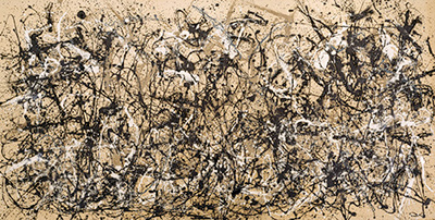
Summertime: Number 9A offers a concrete comparison from the same year. Tate’s historical collection dataset records its canvas support as 84.8 by 555 centimetres, and its medium as oil, enamel and commercial paint. Its width exceeds five and a half metres while its height remains below one metre. Those proportions make a useful comparison with Arabesque: both invite attention to painting extended along a horizontal strip, but the amount of lateral space differs substantially. The Tate measurements identify the support, separately from the frame. They give a firm basis for considering the shape of the object, while leaving the two paintings’ individual colour and material decisions distinct. Their shared date makes the comparison especially useful for exploring his different uses of width. [7]
A later example, Number 7, 1950, makes the connection between shape and action especially clear. MoMA’s gallery label describes Pollock moving from one end of that narrow canvas to the other while flinging paint. It contrasts this movement with his work from four sides on larger, squarer supports. The museum also identifies a prepared rust-orange ground in Number 7. The comparison sharpens two questions to bring back to Arabesque: how does a long support direct the reach of a gesture, and how does its underlying colour affect the marks? MoMA’s description concerns the later painting, so its specific movements cannot be transferred wholesale to the earlier one. Its value lies in showing how format can participate in making a picture. The support’s proportions can help organise the painter’s activity. [8]
Kirk Varnedoe similarly places Arabesque beside Number 2, 1949, identifying recurring structures across comparable formats. At the same time, he stresses the diversity of Pollock’s paintings within a single year. Familiar formats and fresh departures coexist in his account, making a continuously straight path of stylistic development inadequate. [2]
A painting answered by a poem
Yale’s Words for Images brought another kind of attention to the canvas in 2001. Joanna Weber’s commentary identifies figure-eight patterns and reads them as evidence of self-control. David R. Slavitt’s accompanying poem turns towards fame, money and the language of dismissive spectators. John Hollander interprets its voice as ambivalent: familiar attacks on modern painting meet observations that unsettle them, especially when intelligence interrupts apparent randomness. The poem is a particular act of reception, not evidence of Pollock’s motives. Its friction with Weber’s formal reading shows how this carefully identified object can sustain sharply different kinds of attention. [1]
Pollock artworks directory
Explore the distinct works discussed in these guides. This selection is not a complete catalogue. Green Silver and Untitled, 1949 are two guides to the same painting.
Discussion
Look again at the images and ideas explored in Number 13A: Arabesque. These editorial prompts invite your observations.
Reader Insights
Which detail in “The colour starts with the cloth” changes how you understand this work?
What comparison comes to mind after “A process with room for decisions”?
What would you like to discuss about “Number, letter and name”?
Join the Conversation
Share a detail, comparison or question about Number 13A: Arabesque below.
References
- John Hollander and Joanna Weber, eds., Words for Images: A Gallery of Poems (New Haven: Yale University Art Gallery, 2001), pp. 68–71: David R. Slavitt, “Jackson Pollock’s 13A: Arabesque,” and commentaries by Weber and Hollander. View source.
- James Coddington, “No Chaos Damn It,” pp. 103, 110, and Kirk Varnedoe, “Open-Ended Conclusions about Jackson Pollock,” p. 241, in Varnedoe and Pepe Karmel, eds., Jackson Pollock: New Approaches (New York: The Museum of Modern Art, 1999). View source.
- Bernice Rose, Jackson Pollock: Drawing into Painting (New York: The Museum of Modern Art, 1980), pp. 8–9, 17–18. View source.
- Jackson Pollock, “My Painting,” Possibilities 1 (Winter 1947–48), reprinted in Pepe Karmel, ed., Jackson Pollock: Interviews, Articles, and Reviews (New York: The Museum of Modern Art, 1999), pp. 17–18. View source.
- Francis V. O’Connor, Jackson Pollock (New York: The Museum of Modern Art, 1967), pp. 45, 133, entry 33. View source.
- Elizabeth Levine and Anna Indych, chronology, pp. 323, 329, note 32, and plate 145, p. 249, in Kirk Varnedoe with Pepe Karmel, Jackson Pollock (New York: The Museum of Modern Art, 1998). View source.
- Tate, collection dataset, October 2014 snapshot, artwork_data.csv, Summertime: Number 9A, accession T03977; historical support dimensions and medium. View source.
- The Museum of Modern Art, Number 7, 1950, object 719.1993, gallery label for Jackson Pollock: A Collection Survey, 1934–1954 (2015–16). View source.