 by Tom Gurney
Tom Gurney BSc (Hons) is an art history expert with over 20 years experience
Published on June 19, 2020 / Updated on October 30, 2026
Email: tomgurney1@gmail.com / Phone: +44 7429 011000
Yellow Islands by Jackson Pollock: Introduction
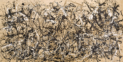
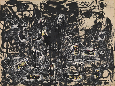
Yellow Islands belongs to the moment when Jackson Pollock brought strong colour back into dialogue with the black painting he had been exploring in 1951. Tate pairs it with Number 8, 1952 as evidence of this renewed use of bright primary colours. Colour enters a language already shaped by flowing black paint and exposed canvas; the relationship between drawing and painting remains open. Tate’s account also stresses the continuing tension between abstraction and representation. These concerns make the work a useful place to reconsider what happened after Pollock’s famous poured paintings of the late 1940s. His methods were still developing, and a change of palette could carry forward problems raised by the black works. [1]
The painting is dated 1952 and measures 143.5 × 185.4 centimetres, a substantial horizontal canvas. Tate’s collection dataset records its medium as oil paint on canvas and identifies it by accession number T00436. It entered the collection in 1961, presented by the Friends of the Tate Gallery through funds supplied by Mr and Mrs H. J. Heinz II and H. J. Heinz Co. Ltd. That acquisition history places a work from Pollock’s later experiments within a British public collection. The museum’s concise medium description provides a starting point for understanding an object whose materials have subsequently received much closer scientific attention. [2]
At a Glance
This work across Jackson Pollock’s career
The Flame
c.1934–38The She-Wolf
1943Mural
1943Alchemy
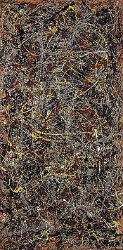
1947Number 1A, 1948
1948Blue Poles
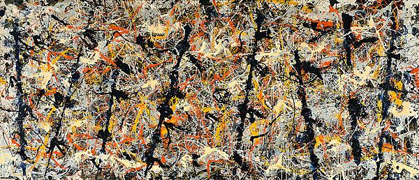
1952The Deep
1953White Light
1954Contents
- Between the floor and the wall
- Several paints within one painting
- Colour, line and the next painting
- A connection with colour-field painting
Between the floor and the wall
Conservator Carol C. Mancusi-Ungaro reconstructs a sequence beginning with black paint poured onto unprimed fabric. Pollock then brushed tube oil colour onto the upright canvas, followed by successive applications of poured and brushed white and a defining black enamel pour. He repeatedly changed the support’s position between horizontal and vertical. Even the finishing black splash was flung while the painting stood upright. That sequence makes the surface a record of successive decisions: earlier forms established conditions to which later applications responded. A flowing line and a brushed passage could belong to different moments and different orientations of the same canvas. The final splash added a further intervention to an already developed painting. Mancusi-Ungaro’s account joins careful local handling to the capacity for a sudden, consequential gesture. [3]
Pollock’s own account of painting helps explain this combination of immediacy and reconsideration. In “My Painting”, published in the winter of 1947–48, he described working against a hard wall or floor and the freedom of approaching a canvas from four sides. He also described a later period of recognising what he had made, during which alteration remained possible. His phrase “I have no fears about making changes” gives revision an explicit place in the process. This statement predates Yellow Islands and supplies a broader account of his practice. It encourages attention to the developing painting as well as the initiating action. An impulsive application could become the condition for further judgement; the result took shape through continued engagement with what was already there. [4]
Several paints within one painting
Scientific study gives the colour another dimension. In Modern Paints Uncovered, Thomas J. S. Learner reports nitrocellulose in the orange paint of Yellow Islands. Harriet Standeven identifies a pentaerythritol alkyd formulated with a semidrying oil; her account contrasts this with the glycerol alkyd found in Pollock’s Number 14 of 1951. These names concern the binding materials that hold pigment in a paint film. They reveal differences within commercial paint, affecting handling and the finished surface. The orange finding concerns a particular colour, while the alkyd identification adds another formulation. Learner also cautions against identifying paint solely by appearance: gloss or texture can mislead. A shiny passage cannot establish a brand, and a familiar colour does not disclose its complete recipe. [5]
A 2020 study by Francesca Rosi and colleagues gathers earlier analyses into a comparative history of Pollock’s binders. Its table lists both oil and oil-modified alkyd in Yellow Islands, associating alkyd with yellow, orange, silver and white. Summarising Francesca Cappitelli’s earlier research, the authors report alkyd in six of seven samples. That fraction describes the sampled material. The chapter stresses that tiny samples, and even measurements at individual points, offer a limited representation of a complex painting. Its table specifically excludes a complete inventory of other possible ingredients. Read together, these findings establish material variety while leaving room for further knowledge of the surface. [6]
Watch: Jackson Pollock
Choose a film about Pollock’s paintings and ways of working.
Colour, line and the next painting
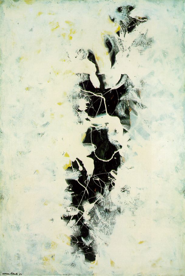
The relationship between drawn line and substantial paint was central to Bernice Rose’s interpretation of Pollock. She traced his repeated efforts to make linear construction and the physical presence of painting work together. Pouring could draw a distinct line while also helping to build an extended painted surface. Applied to Yellow Islands, this framework directs attention towards the relationship between a line’s movement and the paint surface it helps to organise. Rose’s discussion of the following year emphasises renewed investigation of paint and impasto, naming Ocean Greyness and The Deep among its outcomes. Yellow Islands can therefore be approached within a continuing exchange between graphic invention and material experiment. [7]
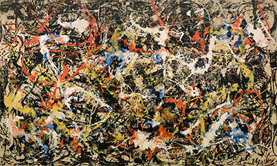
The public setting of 1952 also helps place these experiments. Elizabeth Levine and Anna Indych’s chronology records Pollock’s move from Betty Parsons to Sidney Janis in May, followed by a November exhibition of twelve new paintings, including Blue Poles and Convergence. In January 1953, Artnews voted that exhibition the previous year’s second best, behind a Miró show. Meanwhile, Clement Greenberg’s small Bennington retrospective in November 1952 ended with Echo from 1951. Contemporary audiences thus encountered both a selective account of Pollock’s established development and a new group extending beyond it. Yellow Islands belongs to that productive year, when the question of his direction remained active. The chronology documents recognition for the Janis exhibition without turning its response into a separate verdict on this particular canvas. [8]
A connection with colour-field painting
Yellow Islands also enters a later history of staining. Writing in Tate Papers, Miguel de Baca cites it as an example of Pollock’s 1951–52 practice with thinned enamel on unprimed canvas. His account follows Morris Louis and Kenneth Noland to New York in April 1953. Their hoped-for introduction to Pollock did not happen; Greenberg instead arranged a visit to Helen Frankenthaler’s studio. There, Mountains and Sea demonstrated her adaptation of staining, opening further possibilities for colour. This history gives Yellow Islands a useful connection with the development of colour-field painting through a practice shared and transformed among artists. The documented studio encounter centred on Frankenthaler’s painting. For Louis and Noland, this encounter offered ways of expanding the role of colour in their own painting, through an example that had already transformed Pollock’s innovations. [9]
Pollock artworks directory
Explore the distinct works discussed in these guides. This selection is not a complete catalogue. Green Silver and Untitled, 1949 are two guides to the same painting.
Discussion
Look again at the images and ideas explored in Yellow Islands by Jackson Pollock. These editorial prompts invite your observations.
Reader Insights
Which detail in “Between the floor and the wall” changes how you understand this work?
What comparison comes to mind after “Several paints within one painting”?
What would you like to discuss about “Colour, line and the next painting”?
Join the Conversation
Share a detail, comparison or question about Yellow Islands by Jackson Pollock below.
References
- Tate. “Jackson Pollock Black Paintings (portfolio)”, curatorial description, paragraphs 2–4. Accessed 25 October 2026. View source.
- Tate. Collection dataset, October 2014 snapshot, artwork record 12147, Yellow Islands, accession T00436; support dimensions and acquisition credit. View source.
- Carol C. Mancusi-Ungaro, “Jackson Pollock: Response as Dialogue,” in Jackson Pollock: New Approaches, edited by Kirk Varnedoe and Pepe Karmel. New York: Museum of Modern Art, 1999, pp. 148–149. View source.
- Jackson Pollock, “My Painting,” Possibilities 1 (winter 1947–48), pp. 78–83; reprinted in Jackson Pollock: Interviews, Articles, and Reviews, edited by Pepe Karmel. New York: Museum of Modern Art, 1999, pp. 17–18. View source.
- Thomas J. S. Learner, “Modern Paints: Uncovering the Choices,” pp. 9–11; Harriet Standeven, “‘Cover the Earth’: A History of the Manufacture of Household Gloss Paints in Britain and the United States from the 1920s to the 1950s,” p. 79 and note 13, in Modern Paints Uncovered, edited by Learner, Patricia Smithen, Jay W. Krueger and Michael R. Schilling. Los Angeles: Getty Conservation Institute, 2007. View source.
- Francesca Rosi, Costanza Miliani, John Delaney, Kathryn Dooley, Lena Stringari, Grazina Subelyte and Luciano Pensabene Buemi, “Jackson Pollock’s Drip Paintings: Tracing the Introduction of Alkyds Through Non-invasive Analysis of Mid-1940s Paintings,” in Science and Art: The Contemporary Painted Surface, edited by Antonio Sgamellotti, Brunetto Giovanni Brunetti and Costanza Miliani. Royal Society of Chemistry, 2020, pp. 1–18, especially table 1.1, pp. 7–8, and pp. 15–16. View source.
- Bernice Rose. Jackson Pollock: Drawing into Painting. New York: Museum of Modern Art, 1980, pp. 8–9, 23. View source.
- Elizabeth Levine and Anna Indych, “Chronology,” in Jackson Pollock, Kirk Varnedoe with Pepe Karmel. New York: Museum of Modern Art, 1998, p. 327. View source.
- Miguel de Baca. “The Flat-Footed Boogie-Woogie: Clement Greenberg and the Washington Color School”. Tate Papers 32 (autumn 2019), “The Washington Color School” section. View source.