


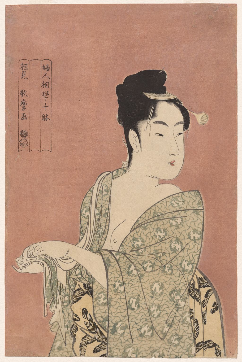
 by Tom Gurney
Tom Gurney BSc (Hons) is an art history expert with over 20 years experience. Updated September 24, 2026.
Introduction
An elegant woman holds a fan, another draws on a pipe, and a girl blows a small glass noisemaker. Their faces are close enough to dominate each sheet, yet hands, garments, objects and printed words make each image particular. Around 1792–93, Kitagawa Utamaro and the publisher Tsutaya Jūzaburō developed a linked group of such half-length colour prints under headings translated as types or classes of women's physiognomy. The surviving prints do not fit the simple idea of a stable, complete ten-sheet series. Two Japanese headings appear on related impressions: 婦人相学十躰 (Fujin sōgaku jittai) and 婦女人相十品 (Fujo ninsō juppin). The same Poppin design survives under both. The Adachi Woodblock Prints research article [1], which compares printed cartouches across collections, presently identifies eight documented designs, while allowing that others may once have existed.
The words “physiognomy” and “types” need explanation before looking at the faces. Early modern physiognomy claimed that appearance could disclose character. It was a historical language that a publisher could invoke to attract buyers; it is not a sound way to judge real people. The British Museum's commentary on a related Utamaro print [2] treats physiognomy as a pseudo-scientific frame and notes that these titles played with other kinds of popular knowledge. The point of this page is to examine what the images and their lettering did in print culture, not to repeat a diagnosis of any woman shown.
Contents
- Introduction
- Explore four details of one impression
- Start with the printed Japanese words
- Eight documented designs, not a completed ten
- Why scholars put 十躰 before 十品
- A later look-alike heading is a different project
- Large-head portraits and the promise of a “type”
- Mica ground and the physical sheet
- Poppin as the bridge between titles
- The parasol sheet and an unresolved block question
- How to use this page's images and sources
The series also raises a practical question: if two museum records give similar English titles, are their sheets the same design, different impressions, or members of a later project? Here the Japanese lettering, publisher sign and object number lead. The eight-design table links each example to a holding institution; the pictured files have their own image rights. The separate Poppin page gives its glass toy, sleeves and surviving title states a full close reading. This page treats Poppin chiefly as the clearest evidence that the series title changed.
At a glance
- How many designs are known?Adachi identifies eight documented designs in this linked early project. “Ten” in a heading is not proof that ten survive or that exactly ten were issued.
- What are the two headings?
婦人相学十躰and婦女人相十品appear on related impressions; Poppin exists with both. - Which came first?Adachi reports that the currently favoured theory places
十躰before十品, using changes in the three-part cartouche; the motive remains uncertain. - Who issued them?The Tsutaya ivy mark appears on documented early sheets; check each object rather than transferring a publisher line automatically.
- What made them striking?Large heads and upper bodies against costly-looking mica grounds, combined with subtle gestures and an explicit promise to read a “type.”
- What is excluded?A later group printed with the similar characters
婦人相学拾躰and issued by other publishers.
Explore four details of one impression
Choose a numbered point and open its enlargement below. Crops come from the retained 8042 × 12022 pixel, 300dpi Cleveland master.
Explore four details of one impression
Choose a numbered point and open its enlargement below. Crops come from the retained 8042 × 12022 pixel, 300dpi Cleveland master.
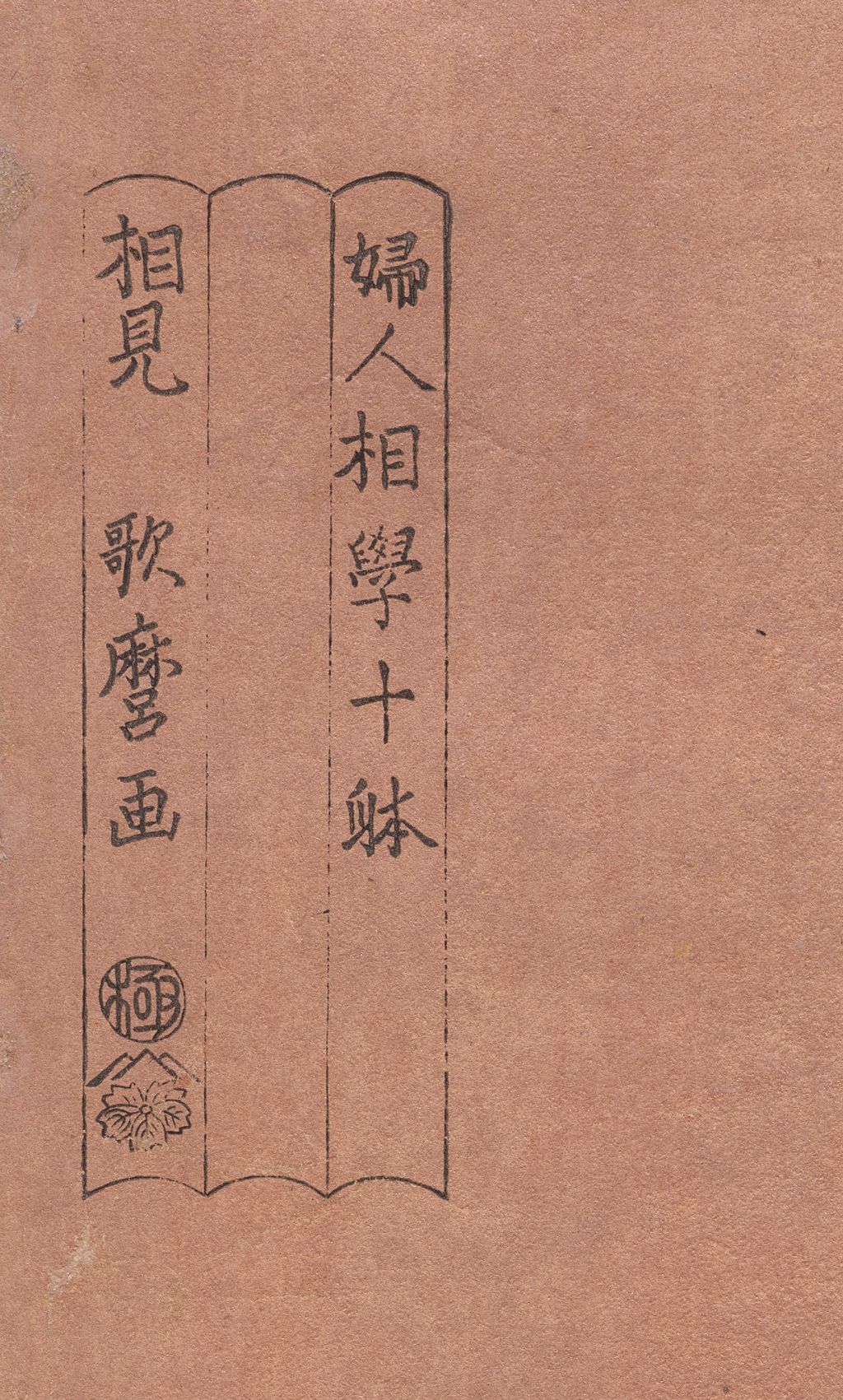
Blank middle panel
The Cleveland sheet has the early series heading, while the expected type phrase is absent from the central panel.
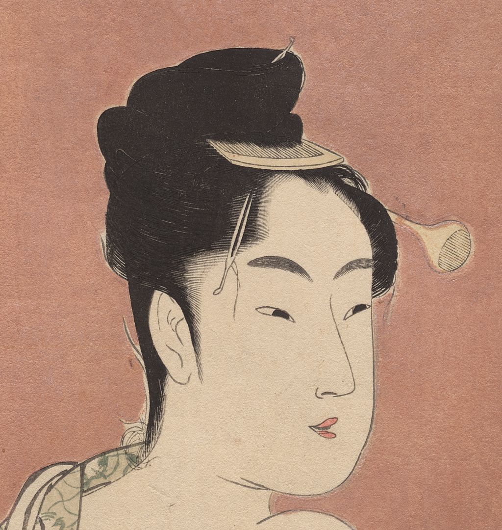
Hair and face
Fine hairlines and a slight turn make the close portrait vivid.
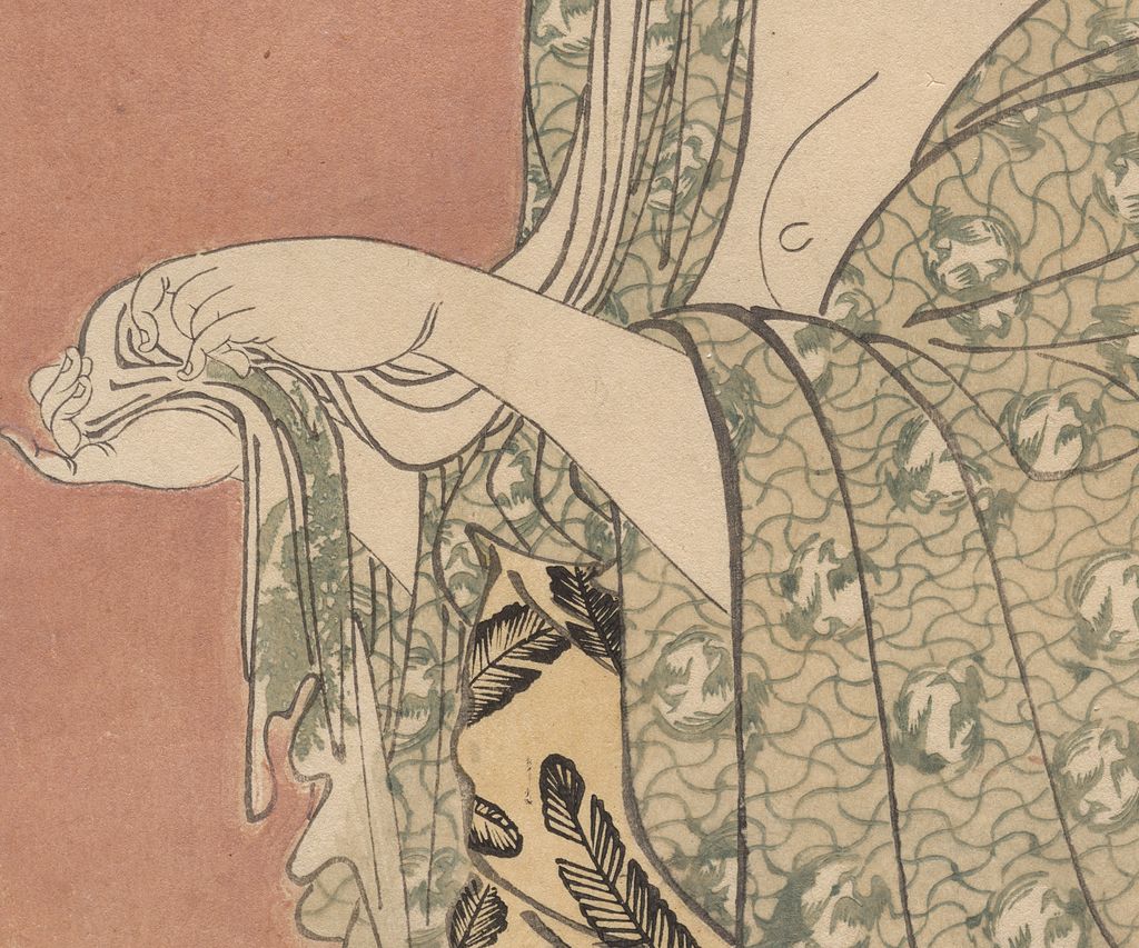
Hands and robe
The hand and patterned robe enrich the pose; they cannot establish a real personality.
Pink mica ground
Cleveland records pink mica on this particular impression.
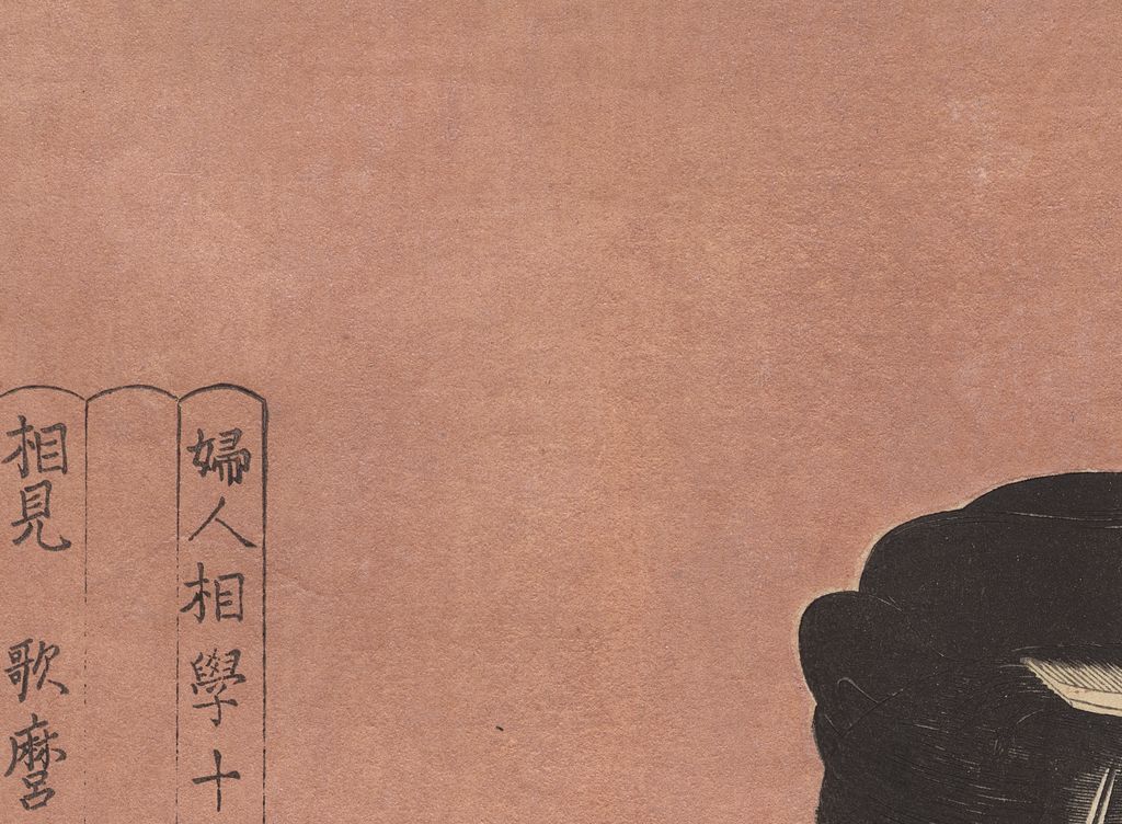
Start with the printed Japanese words
The cartouche is a small piece of a large image, but it can change the whole catalogue identity. Adachi compares the Tokyo National Museum's Poppin impression [3] with a Honolulu Museum of Art impression [4]. The former bears 婦女人相十品/相観 歌麿考画; the latter has 婦人相学十躰/相見 歌麿画. Their central girl and glass toy belong to one design, while the wording of the heading and artist claim differs. A changed English translation cannot explain two different sets of printed characters. The title difference is material evidence on the sheets.
Adachi describes the cartouche as three connected vertical panels. In at least two early designs, the middle panel carried a phrase identifying a supposed “type”: 浮気之相 in a flirtatious-type image and 面白キ相 in an interesting-type image. Other surviving versions leave that middle panel blank. This gives a stronger clue to change than two modern museum titles alone. A block with a phrase can be altered to remove that phrase, leaving an empty space that still reveals what the frame was built to hold. Yet a blank space in an online image does not prove precisely when its sheet was printed. The lines, paper and publisher marks also matter.
The Cleveland Museum of Art provides an especially instructive example. Its Flirtatious Type, 1930.218 [5], is catalogued under the Japanese wording 婦人相学十躰浮気之相, dated around 1793 and released as a CC0 image. In the actual downloadable image, the upper-left cartouche visibly has the 婦人相学十躰 heading and artist/publisher text, but the space where 浮気之相 could stand is blank. The catalogue title identifies the design, while the image records a particular impression with different visible text. A Minneapolis Institute of Art object [6] is an Adachi-linked lead for the wording-bearing version. Its image rights require a separate decision, so the Cleveland file illustrates this page and the Minneapolis record supports comparison without an assumed reusable file.
This one detail keeps us from writing “the print says Flirtatious Type” beneath every reproduction. A title assigned by a museum can be accurate for finding a design even if the photographed sheet lacks those exact characters. An accession number, visible transcription and caption for the downloaded file are therefore all necessary. In the page's close-up, the blank central space is an observation about Cleveland 1930.218, not an assertion that all surviving sheets were printed after a specific restriction.
Eight documented designs, not a completed ten
Adachi's comparison groups eight designs because the Poppin composition connects the two series headings, and the related half-length portraits share a publisher's visual programme. Four further designs are known with the 十躰 wording, three with 十品, and Poppin with both. The result is eight designs, not eight physical sheets. Museums hold more than one impression of some designs, sometimes with altered or missing words. The table is a guided index to one documented example of each design, not a catalogue raisonné of every surviving impression.
| Design or descriptive name | Evidence lead | Printed heading in the linked example / caveat |
|---|---|---|
浮気之相, Flirtatious Type |
Cleveland 1930.218 [5]; Minneapolis example [6] | Cleveland catalogues the design under 十躰浮気之相, but its image has a blank middle panel. The Minneapolis object is a lead for the words-bearing variant. |
面白キ相, Interesting Type |
Art Institute of Chicago 44332 [7] | An early 十躰 design; inspect the middle line on any particular image before quoting it as printed. |
| Woman holding a fan upside down | Museum of Fine Arts, Boston object [8] | An early 十躰 example in Adachi's image map; its convenient descriptive English name is not necessarily a printed sheet title. |
| Woman counting on her fingers | British Museum 1945,1101,0.19 [9] | Another early 十躰 example; distinguish the object from later similarly worded prints. |
| Young woman blowing a poppin | Met JP1662 [10]; TNM ColBase A-10569-546 [3]; Honolulu 4222 [4] | The same design is known with both 十躰 and 十品 headings. The Met records 婦女人相十品 and the word ポペン. |
| Woman reading a letter | Art Institute of Chicago 44329 [11] | A 十品 example in Adachi's map; the object is separate from Toyohina's letter-reading portrait. |
| Woman exhaling pipe smoke | Art Institute of Chicago 8185 [12] | A 十品 example; caption the action and exact sheet rather than assuming a named sitter. |
| Woman with parasol and fan | Met JP2730 [13] | A 十品 example; the Met dates its print around 1792–93 and its image is Public Domain/Open Access. |
There is a reason to leave two places blank rather than filling an imaginary row for each. The characters 十 mean ten, but an announced plan may be unfinished, surviving copies may be lost, or works may remain unrecognised in other collections. Adachi explicitly entertains the possibility that ten were issued without all ten surviving. None of those alternatives is demonstrated for this project. “Eight documented designs” reports what the evidence currently permits. “The ten portraits” implies a complete set that the cited research does not show.
The table also prevents a different numerical confusion. The two Poppin title states do not make Poppin two independent designs. Conversely, two sheets with similar English descriptions may differ in image, inscriptions or publisher. An early designer could revisit a formal idea in a later series. Count designs by composition and evidence, then record individual sheets below that level. A digital directory that counts every image as one “work” would obscure precisely the title change this page is designed to explain.
Why scholars put 十躰 before 十品
The order now favoured in Adachi's account uses the three-panel cartouche and its surviving words. Earlier twentieth-century research had often treated 婦女人相十品 as preceding 婦人相学十躰, partly because another later series with similar characters existed. Shūgō Asano's later proposal reversed the order: first came 十躰 sheets with type words in the central panel; then those words were removed; subsequently the upper and lower texts were changed to the 十品 form. The presence of 浮気之相 and 面白キ相 on early-title designs, along with their missing-word variants, supports the direction of this proposed sequence. The Poppin design's two headings supply a bridge across the change.
This is a reasoned reconstruction, not a surviving order book from Tsutaya's shop. We can observe different printed words and sometimes a blank panel. We can compare whether the key lines and publisher marks suggest alteration of the same blocks. We cannot infer from a single JPEG exactly when every known impression was taken or whether every design passed through every possible intermediate state. The fact that a phrase could be removed by cutting away material from a block makes one proposed change mechanically plausible; it does not, by itself, certify all other steps in the sequence.
Adachi reports Asano's suggestion that complaints from people associated with physiognomy may have prompted the change in terminology and the artist line, leaving 歌麿考画 to mark the pictures as Utamaro's own interpretation. That motive remains a hypothesis. There is no cited complaint letter or official notice that establishes it as the cause. It is possible to explain why the new wording would make sense under such pressure without claiming that pressure is documented. The page's title-state diagram will therefore label observed inscriptions separately from proposed arrows, and it will not turn “censorship changed the series title” into a fact.
A later look-alike heading is a different project
The later 婦人相学拾躰 uses 拾 for ten and can look almost identical in romanisation to the earlier 婦人相学十躰. Adachi distinguishes it by time and publishers. Its sheets were issued by publishers including Tsuruya Kiemon and Yamashiroya Tōemon, while the early project discussed here carries the Tsutaya mark. The Art Institute of Chicago's later pipe sheet, 23938 [14], is a research lead for that later group. It must not be inserted as a ninth early design merely to make an eight-design list look closer to the promise of “ten.”
The visual resemblance is understandable. Portrait-size women, a title about observing faces and a similar series count were attractive ideas beyond one issue. A catalogue search for English “physiognomic study of women” can merge records from both campaigns, especially when punctuation, transliteration and different translations are stripped away. The Japanese characters, publisher seal and specific object record restore the distinction. For readers using the page's gallery, the later project is an explanatory comparator only; its images are not mixed into the numbered early-series sequence.
Large-head portraits and the promise of a “type”
Compare three documented sheets
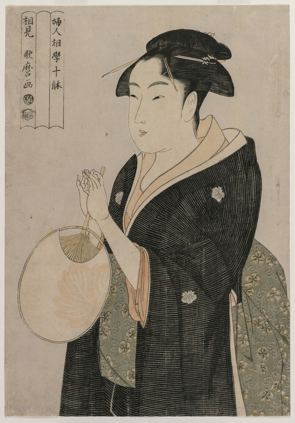
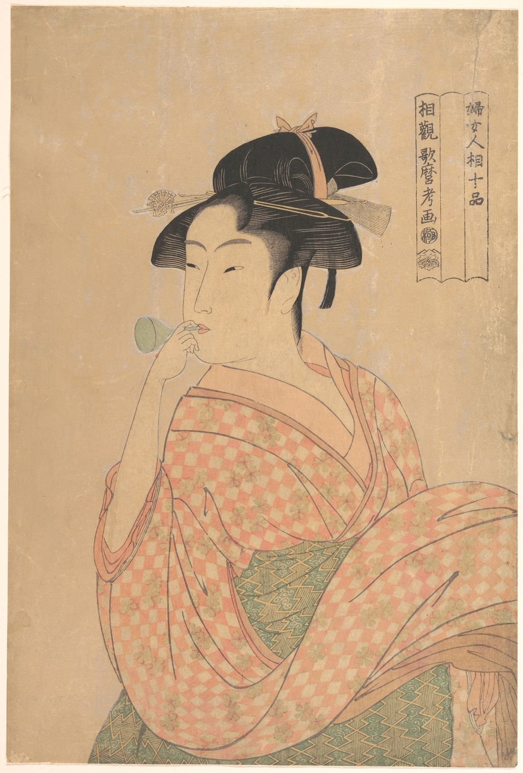
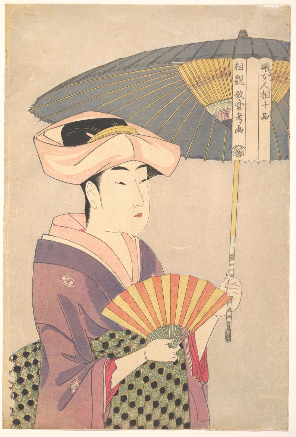
These prints brought the woman's face and upper body close to the viewer. The format had precedents in actor portraiture, but Adachi argues that making a recognisable or intriguing ordinary woman large on a sheet called for a new sales pitch. Physiognomy offered one. A title could promise that a viewer would discern a kind of person from a face. The image itself does more than fulfil that promise. In Cleveland's pink-ground Flirtatious Type, a hand extends towards a cloth, a patterned robe opens around a shoulder, and the head turns subtly. In the Met's parasol sheet, the huge canopy and a fan compete with the figure's face for attention. The object and pose complicate the crude claim that character is simply readable in the eyes.
We should be especially careful with words such as “flirtatious,” “fickle” and “interesting.” They are part of a historical labelling system or later catalogue description, not an assessment of a real woman. The sitters in this group are not securely identified as the named women in Three Beauties of the Present Day. We do not know whether the girl blowing a glass toy was a specific person, an ideal figure or a model whose identity is now lost. The individual print's gestures can be described precisely without claiming a private temperament from her features. The phrase physiognomy is evidence about the print's marketing and period intellectual fashions, not a valid contemporary psychology.
The British Museum's Fickle Type object [2] gives further context for the loose and sometimes playful reach of the physiognomic frame. Its catalogue discusses popular print and erotic-book associations in addition to the facial “type.” Even when a modern viewer does not follow all the period allusions, the record cautions against interpreting these pictures as a straightforward scientific classification. Each composition may put a label and a fleeting gesture in tension. That tension is one reason the group deserves a series-level page rather than eight nearly identical mini biographies of imagined women.
Mica ground and the physical sheet
The Cleveland Museum says that its Flirtatious Type impression [5] has pink mica and notes that only two impressions from the series have such a ground. Its high-resolution open-access file lets us see the warm, fine-grained field behind the figure, though the light-changing sparkle of mica cannot be fully conveyed on a screen. The Met's Poppin sheet [10] has a quieter beige appearance in the available photograph, while its parasol sheet [13] reads differently again. These colour impressions are observations about present digital files. They are not a ranking of early against late printing.
Adachi's research on traditional woodblock technique proposes that the generous mica grounds in Tsutaya's portrait prints may have been laid with a stencil and brush in a glue mixture, rather than applied only by the conventional baren method. This is the workshop's technical inference, not a laboratory finding for every surviving original. It is valuable because it makes visible the labour and expense behind an apparently simple plain ground. A sheet with a shining field, finely registered hair and carefully balanced layers would have felt materially different from an ordinary low-cost image. The publisher, block cutter and printer contributed to that effect along with Utamaro's drawing.
The page's detail crops use a retained high-resolution museum file and preserve its original image alongside the 1024-pixel, quality-80 site copy. A crop can show a blank cartouche panel or a pattern in the robe, but it must not be mistaken for a view of the paper under magnification. The source was photographed, processed and compressed before it reached this page. Any argument about pigment composition, embossing or the exact tool used should rest on conservation study, not on the apparent colour of a JPEG. Where a museum record itself states “pink mica,” we can say so and cite that particular object.
Poppin as the bridge between titles
The Poppin design is the most useful fixed point in the title problem because its central composition is recognisable across the Tokyo National Museum [3], Honolulu [4] and Met [10] records, while the cartouches differ. The Japanese descriptive name itself varies: ポッピン, ポッペン and ビードロ appear in modern discussions. Adachi uses Tokyo's ポッピンを吹く娘 as a practical display name, not as proof that those words are printed on every historic sheet. The Met's JP1662 uses ポペン in its Japanese inscription field and is dated around 1792–93. These spellings deserve cross-reference, but they should not be used to collapse the institution's different title-state records.
On this series page, Poppin shows why a reader must inspect the cartouche before saying which heading an impression carries. The separate work page has a larger image, explains the small glass noisemaker, shows how the woman's sleeves and raised hands guide the eye, and compares a named institutional impression against the owner-supplied public-domain reproduction. Giving the single image its own article is useful because that close reading answers questions the eight-design overview cannot. It does not turn Poppin into a ninth item in the early series.
The parasol sheet and an unresolved block question
The Met's JP2730 [13] records 婦女人相十品 and shows a woman who holds both a parasol and a fan. The parasol enters the top-right space where its cartouche sits, so the inscription is not wholly isolated from the picture. Adachi notes that this entanglement could have made revision of the frame more troublesome than for other designs. The workshop asks whether a three-panel frame for this image might already have been cut before the change of title. It also observes the absence of a censor seal on this design and possible alteration of a crest in the Met sheet. These are leads for physical comparison, not grounds for reconstructing a definite chronology from the photograph alone.
The print illustrates another weakness in the word “type.” A patterned parasol creates a broad geometry over the figure; the open fan creates a second, smaller arc. The woman's face sits between these strong shapes, partly sheltered and partly displayed. Its title can invite the viewer to read a temperament, but the design's drama is also a matter of scale, curves and overlapping objects. We can appreciate this without assigning a named sitter or reducing the portrait to an allegedly measurable facial sign.
How to use this page's images and sources
The page reproduces public-domain Met files and CC0 Cleveland files under their own object names and accession numbers. The Art Institute of Chicago, British Museum, Minneapolis, Boston, Honolulu, Adachi and ColBase links support the eight-design table and title discussion, but an object page is not automatically an image licence. The current site image set therefore illustrates selected rows rather than filling every row with an unverified download. The owner-supplied Poppin reproduction is retained for the separate page, where its physical impression remains unassigned. Each production image has an uncropped master, rights wording, source link, object ID and 1024-pixel quality-80 site file in the ledger.
The visual feature is a table of eight documented designs with links to their records, paired with a simple title-state explanation. The key distinction is between words seen on an image, words recorded in an object catalogue, and a scholarly reconstruction of what changed first. Reading them in that order prevents a surprising number of false claims. It also leaves room for a new impression or newly researched catalogue to refine the series without making this page's foundations collapse.
Frequently asked questions
Eight designs are documented in the cited Adachi study. The title promises ten, but two more have not been established by the evidence used here. They may never have appeared or may not survive; neither possibility is proven.
Related impressions carry 婦人相学十躰 and 婦女人相十品. The Poppin composition survives with both. The favoured reconstruction puts 十躰 first, followed by removal and alteration of text in the cartouche; the precise reason is uncertain.
No 浮気之相 appears in the middle panel of the downloadable Cleveland 1930.218 image, despite its catalogue design title. The blank is a useful reminder to distinguish a design name from an impression's visible words.
No. It was a historical claim that personality could be read from appearance. The page discusses its role in the prints and their marketing; it does not endorse it as a way to judge people.
References
- Adachi Woodblock Prints, “The mystery of the title change in Utamaro's series” (Japanese).
- British Museum, Utamaro Fickle Type, object 1945,1101,0.18.
- Tokyo National Museum, ColBase Poppin object A-10569-546.
- Honolulu Museum of Art, Young Woman Blowing a Glass Pipe, object 4222.
- Cleveland Museum of Art, The Flirtatious Type, 1930.218.
- Minneapolis Institute of Art, Fancy-free Type.
- Art Institute of Chicago, The Interesting Type, object 44332.
- Museum of Fine Arts, Boston, fan design, object 234053.
- British Museum, counting-fingers design, object 1945,1101,0.19.
- Metropolitan Museum of Art, Young Woman Blowing a Popen, JP1662.
- Art Institute of Chicago, Woman Reading a Letter, object 44329.
- Art Institute of Chicago, Woman Exhaling Smoke from a Pipe, object 8185.
- Metropolitan Museum of Art, Woman Holding Up a Parasol, JP2730.
- Art Institute of Chicago, later pipe design, object 23938.
- Cleveland Museum of Art, Woman Holding a Fan, 1940.1031.
- Tokyo National Museum, 2025 Tsutaya exhibition object list (Japanese PDF).
