


 by Tom Gurney
Tom Gurney BSc (Hons) is an art history expert with over 20 years experience. Updated September 24, 2026.
Introduction
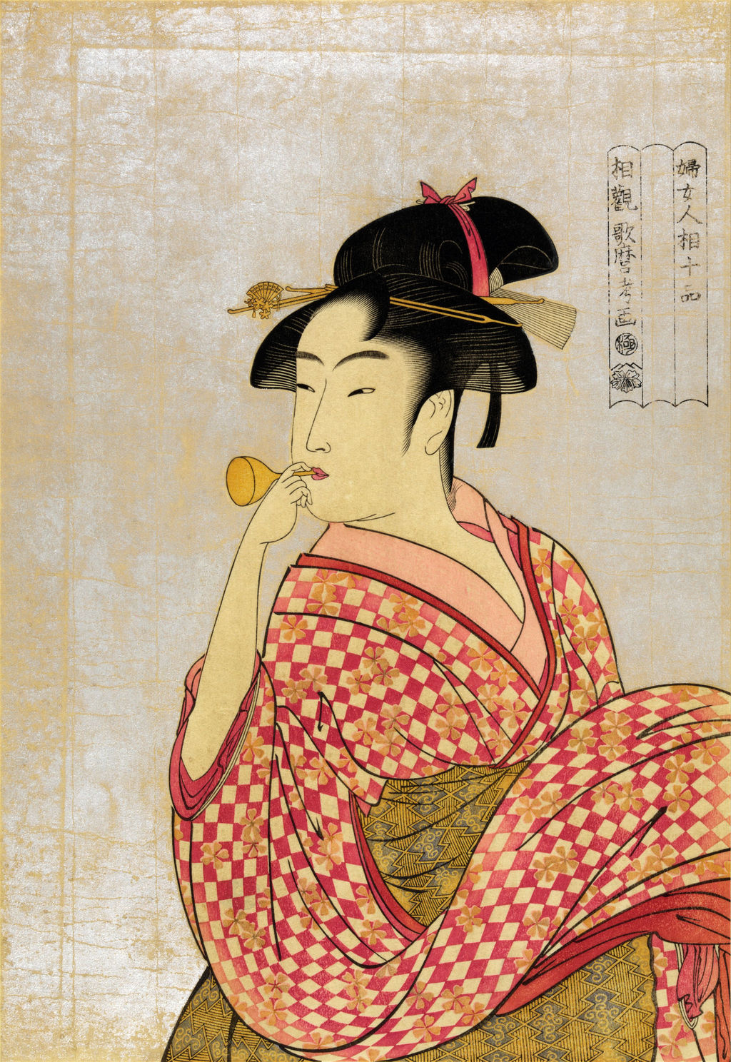
A young woman raises a tiny glass toy to her lips and turns her body as though something outside the picture has caught her attention. Her wide, chequered sleeve moves in the opposite direction from the delicate instrument. Above her head is an elaborate arrangement of black hair, pins and ribbon; to the right, a narrow three-part cartouche gives a series heading but leaves its middle strip empty. This is Kitagawa Utamaro's print commonly called Poppin o Fuku Musume, or Young Woman Blowing a Poppin. The Tokyo National Museum's display name [1] uses ポッピンを吹く娘; the Metropolitan Museum of Art's JP1662 record [2] calls its own impression Young Woman Blowing a Popen and uses ポペン in the Japanese title line.
The woman is neither identified by name nor known to have sat for Utamaro. A viewer can describe what the print shows—glass toy, hand, turn, clothing, hair and inscriptions—without turning the face into a record of her personality. The contemporary series headings promise a study of women's physiognomy, a historical claim that appearance revealed character. Modern scholarship and museum commentary treat that claim as part of the print's marketing and period culture, not as reliable psychology. The British Museum's study of a related Utamaro physiognomy print [3] is useful context for that distinction.
Contents
- Introduction
- Explore five details of Poppin
- The toy at the centre of the action
- Follow the turn of the body
- Hair, ribbon, sleeve and sash
- The three-part cartouche is evidence
- One design, several physical impressions
- How the woodblock image was made
- Why an ordinary action became a memorable image
- A guided image study
The design also survives with more than one printed series heading. The Adachi Woodblock Prints research article [4] places a Tokyo National Museum impression bearing 婦女人相十品 beside a Honolulu Museum of Art impression bearing 婦人相学十躰. This is a difference in lettering on the sheets, not merely two English translations of one title. Looking carefully at a single print thus opens a larger question about production: what could a publisher change on a block, and what can we actually prove from surviving impressions? The page answers that question while keeping the human-scale delight of the image in view.
At a glance
- Artist and publisherKitagawa Utamaro designed the print; the linked early physiognomy project was issued by Tsutaya Jūzaburō, whose ivy mark appears in documented cartouches.
- DateThe Met dates JP1662 to about 1792–93. This is a catalogue date for its sheet, not a day of issue for every impression.
- Medium and sizeMet JP1662: colour woodblock print on paper, 38.9 × 27.5 cm. Other impressions require their own measurements.
- What is a poppin ?A small glass noisemaking toy held to the mouth; Tokyo National Museum calls it
ビードロ(ガラス)細工のおもちゃ. - Why two titles?Related impressions carry
婦人相学十躰and婦女人相十品. The design is a link between the two title states. The reason for changing the wording is not documented. - What does the owner image show?A 300dpi, upscaled public-domain reproduction supplied by the site owner. Its physical source impression is unassigned; its cartouche visibly has
婦女人相十品and an empty middle panel.
Explore five details of Poppin
The detail crops use the owner-supplied 300dpi image, which was upscaled. Choose a point, then open its enlargement below.
Explore five details of Poppin
The detail crops use the owner-supplied 300dpi image, which was upscaled. Choose a point, then open its enlargement below.
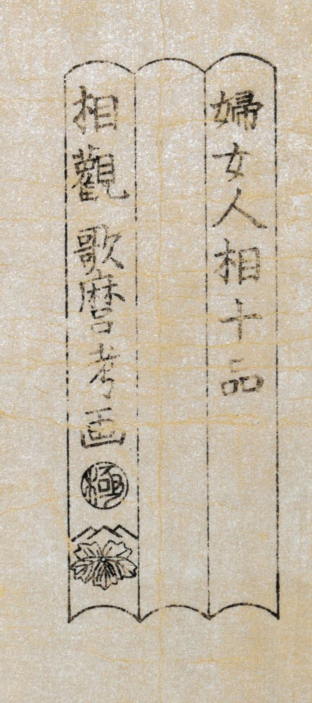
Three-part cartouche
The later series title and blank middle panel are visible; the owner file has no assigned accession.
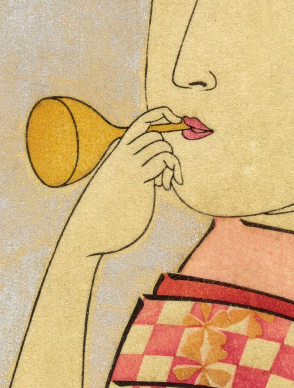
Glass toy and hand
Follow the thin tube from the lips to its small bulb.
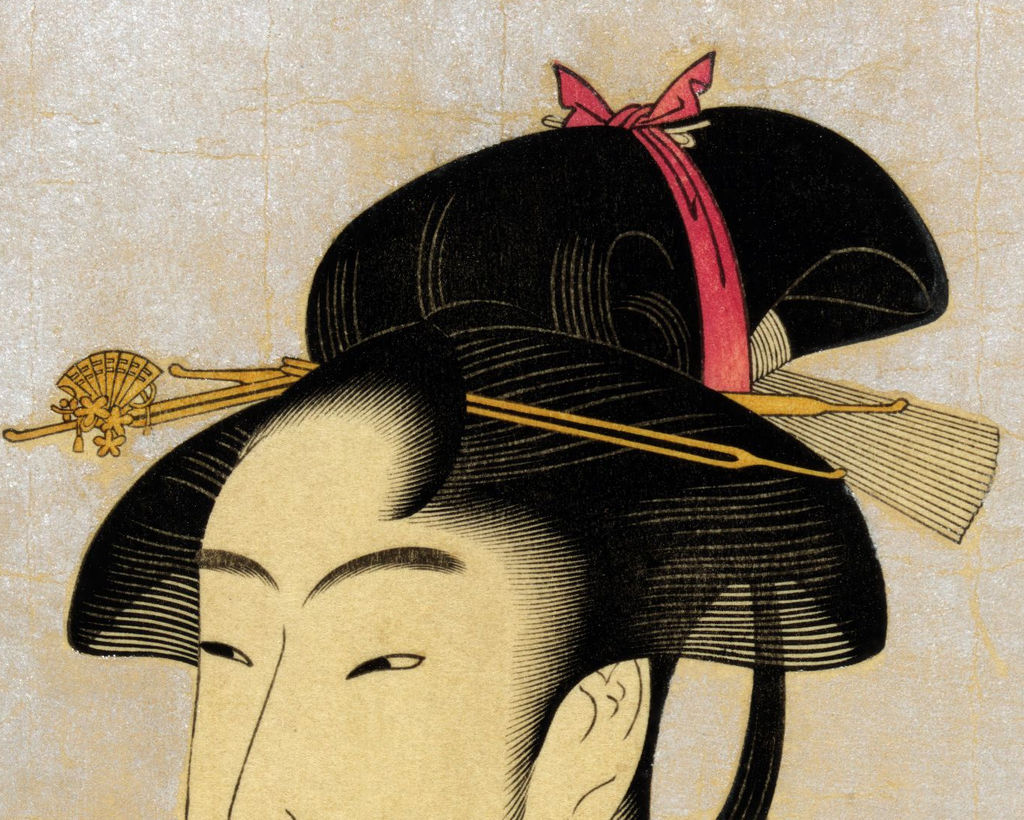
Hair and ribbon
Compare the broad black form with fine hairlines and crossing ornaments.
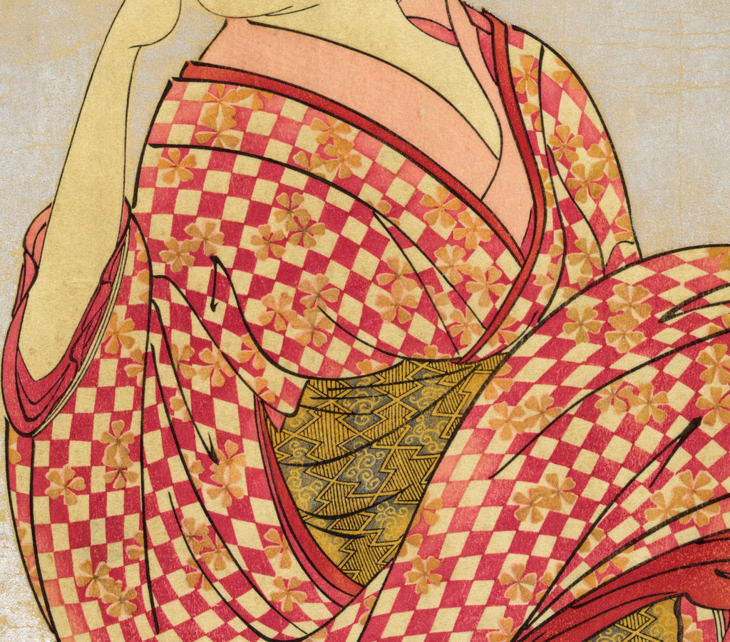
Chequered robe
Watch the grid and flowers bend across the folds.
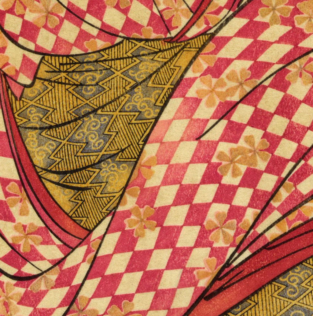
Obi geometry
A smaller, denser pattern contrasts with the robe’s large checks.
The toy at the centre of the action
The object barely occupies any area of the sheet, yet it gives the print its usual name. A long narrow tube touches the woman's mouth; she supports it with a few curved fingers, and a little bulb opens at the other end. The Tokyo National Museum's 2025 exhibition description [5] identifies this as a glass toy called a poppin, or bidoro. The Met object record [2] renders the object “glass noisemaker.” The word directs our attention to an action and an imagined sound, but no surviving sheet records how loud her particular toy was or whether the model blew one while Utamaro drew.
Her lips are modest in scale. The same hand that holds the instrument partially overlaps her face, so the eye has to move through fingers and glass to find the mouth. That small convergence is set against a vast empty ground. In a reproduction it can be easy to read the coloured bulb first, especially when its hue is stronger than the fragile tube. Close looking restores the thin line connecting bulb and face. The glass is not simply a decorative accessory placed alongside a fashionable robe; it is the hinge of a fleeting action. If the girl has just turned in response to someone, as the Tokyo National Museum suggests as an interpretation, we encounter her in the middle of two acts: playing and looking elsewhere.
This suddenness helps explain why the image is memorable. Much of the body is relatively stable on the page, but the neck turns and the sleeve sweeps out to the right, giving an instantaneous feel to a still print. A static ornamental portrait might have presented the woman's clothing symmetrically. Here one arm remains near the mouth while the opposite sleeve swells toward the edge. The posed, highly designed geometry of the robe and the apparent accident of being interrupted coexist. It is more precise to say that Utamaro constructs the effect of an unplanned moment than to claim we have a witnessed scene from a real girl's day.
The variations poppin, poppen, popen and bidoro are useful search terms, not separate depicted toys in this print. The Adachi essay [4] notes that later descriptive titles vary because many ukiyo-e designs did not carry a modern object title on the block. Tokyo's ポッピンを吹く娘 is a sensible Japanese page heading because it is the national museum's display wording. The Met's ポペンを吹く娘 should remain visible in the record comparison. Neither phrase appears in the empty middle strip of the later-title cartouche reproduced here; a convenient catalogue name must not be mistaken for words actually printed on this sheet.
Follow the turn of the body
The face looks back to the left while the torso and abundant cloth seem to continue across and beyond the right-hand edge. This directional split does the work of a small narrative. A reader can almost supply a call or interruption outside the paper, but the Tokyo National Museum's proposed sudden-turn reading [5] remains a reading of the pose, not an identified incident. The viewer never sees the caller or the place. The absence of a room, street or other setting focuses attention on the action without pretending to document where it took place.
Start at the hands. The fingers around the toy are carefully curved, and the raised arm leads back into the sleeve opening. A second contour then takes the eye across the collar and down through the robe. These lines can feel natural because each connects to an intelligible part of a body; their larger arrangement is deliberate. Utamaro holds the toy just left of the face, well within the open field. If he had pushed it against the busy garment, its thin outline would have been harder to see. If the right sleeve were reduced, the turn might lose its momentum. The empty background and patterned fabric are therefore active parts of the storytelling.
Her expression is restrained. The narrow eyes and small mouth have prompted romantic language in later descriptions, but a face alone does not tell us whether she is mischievous, shy, surprised or amused. The visible action supports a more modest account: she is playing with a glass noisemaker, and her posture suggests motion. Early physiognomic titles invited consumers to infer a “type” from facial appearance. This print lets us notice the invitation while resisting it. It presents an event and a carefully composed costume, not a dependable account of character. The difference matters because “young townswoman” in a museum interpretation is a broad social reading of dress and motif, not the name of a documented sitter.
Hair, ribbon, sleeve and sash
The black hair is the strongest dark mass above the pale face. Its contour forms large rounded arcs, while fine carved lines make smaller ridges and combed directions legible. Pins cross this mass, and a bright ribbon breaks its outline. Enlarging the head reveals how the hair has both graphic force and delicate internal work. The pins are not a biographical clue to a named woman. They let the printer and designer separate one surface from another, mark fashionable adornment and create a dense counterweight to the almost bare field at the top left.
The robe takes over the lower half of the sheet. Red and pale squares set up a bold chequerboard, broken by repeated small floral motifs. When the cloth folds, the checks warp and change scale; that distortion suggests volume more effectively than a flat textile sample would. The pattern moves over the shoulder and across a large sleeve, so we can see how the body could twist beneath it. The Tokyo National Museum's exhibition text [5] calls attention to the lively contrast between this checked garment and the softly lit mica field. The British Museum's record for a related print by Chōbunsai Eishi [7] even notes a checkerboard kimono that recalls the Poppin design; that is a useful contemporary visual comparison, though it does not establish which artist borrowed from whom.
Inside the folds, a sash or inner textile brings a denser geometric design. It is not merely another colour. Its narrower repeating elements break the rhythm of large red checks. The eye can follow the broad robe, pause at the intricate obi, then return to the face through the diagonal of the collar. In the annotated image, these regions deserve separate details: one close view for the chequered robe's changing grid and one for the compact sash pattern. Crops help explain why a page-width reproduction can look simple at first glance but contain several distinct systems of carving and registration.
The prints held today vary in colour. The Met's downloadable JP1662 [2] reads paler than the owner's upscaled reproduction displayed here: its toy and robe have quieter hues. Digital colour, paper age, individual impressions and later processing may all affect what the screen shows. Without a technical comparison of the actual sheets, we cannot infer that one image is the “original colour” or that the stronger red proves an earlier pull. The page should make the comparison useful by naming the two files and their different status, while leaving chronology to evidence on the objects rather than attractive colour.
The three-part cartouche is evidence
At the upper right, a frame made of three connected strips looks like a label awaiting three entries. In the owner image, the right strip has 婦女人相十品; the left has 相観 歌麿考画 with marks below; the central strip is empty. The Met photograph of JP1662 [2] shows the same later series heading and a similarly empty middle strip. The owner image is not proven to be JP1662 itself. The two can be compared visually without assigning the owner's file to the museum. The blank is a visible absence, not a licence to supply an invented phrase such as “innocent girl” or “playful type.”
The Adachi comparison [4] gives the earlier title state on a Honolulu Museum of Art impression [6]: 婦人相学十躰/相見 歌麿画. The Tokyo National Museum's later-title state reads 婦女人相十品/相観 歌麿考画. These are not interchangeable strings. The first panel changes its nouns and numerical classifier; the artist line changes too. The visually continuous girl and toy connect the prints as instances of one design, while the words show different states of its publication. This is why a source list containing only English object titles would be too weak for the page's central claim.
The middle strip is instructive even when it has no words. On other designs in the project, phrases such as 浮気之相 and 面白キ相 survive in that position; in some impressions they were removed. Adachi uses these differences to explain a proposed sequence of text changes: an early 十躰 heading with type phrases on some designs, removal of phrases, then a changed 十品 heading and artist wording. The Poppin composition exists with both headings and therefore anchors the bridge. But it does not prove that a lost middle phrase once identified the girl with the toy. The physical blank does not disclose what, if anything, occupied that spot in the earliest block for this particular design.
This distinction between observed inscription and publication hypothesis should guide every caption. A caption can say “the Met JP1662 sheet bears 婦女人相十品.” It can say “Adachi reports an earlier-heading Honolulu impression.” It should not say “the authorities forced Tsutaya to erase a particular phrase on the Poppin plate” as an established fact. Adachi reports Shūgō Asano's suggestion that people associated with physiognomy may have objected to the language. That proposed cause is plausible to discuss but no cited complaint or order demonstrates it. Even the direction of title change is a scholarly reconstruction from surviving states rather than a dated publisher ledger.
One design, several physical impressions
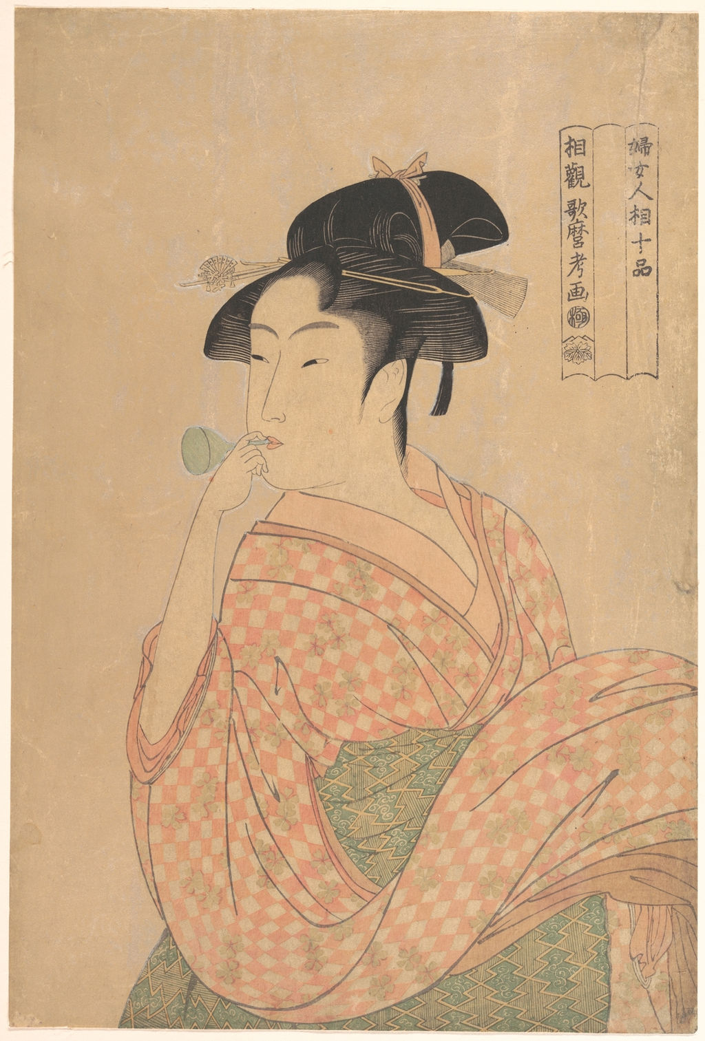
The Met's record for JP1662 [2] supplies an object number, medium, dimensions and provenance for a specific sheet. The Tokyo National Museum's ColBase item A-10569-546 [1] identifies another held sheet. The Honolulu item 4222 [6] is a key comparison for the early heading. The same image design can circulate in more than one printed state and more than one surviving impression. A museum accession is therefore indispensable to a precise statement about paper, printed wording, size or present rights.
The distinction matters when an exhibition or catalogue reproduces an early-heading sheet beside a familiar later-heading one. A shared descriptive name is not enough to transfer a museum's accession or download permission from one to the other. The sound editorial route is to show the available rights-checked later-state images, then link readers to the early-state institutional records rather than constructing a false side-by-side of unidentified files.
Nor is the owner's large reproduction a surrogate accession number. The site owner has supplied a public-domain image and permits its use without a visible credit. Its 2752 × 4000 pixel file has 300dpi metadata and has been upscaled. It is suitable as a large visual base for this article's detail feature, where the reader should be told that the source was upscaled. It is not evidence of the physical sheet's dimensions, current location or printing date. The separately retained Met master is an identified object photograph, albeit at lower pixel dimensions. Its page caption should credit the Met and identify JP1662 when that file is shown.
What an impression comparison can establish
At first glance the owner's image and the Met's JP1662 show the same girl, the same small instrument, the same broad checked clothing and the same later series heading. Those agreements identify a composition and make the two images useful together. They do not by themselves establish that the files were photographed from different sheets. A reproduction can be recoloured, sharpened, cropped or enlarged while retaining the block's outlines. The owner file was explicitly upscaled. A viewer who sees stronger reds or a yellower toy in it should first ask what happened between object and display: lighting, camera, colour correction, paper tone and digital editing can all change the visible result.
Conversely, a genuine difference in printed text can be more probative than a difference in overall brightness. The Adachi comparison of Honolulu and Tokyo impressions [4] transcribes changed characters in the cartouche. A contemporary cataloguer can inspect whether the frame, lettering and image lines align and whether a changed block or alteration of a block best accounts for them. That is a question about material evidence; it should not be answered by laying two differently sized website JPEGs on top of one another and counting misaligned pixels. Paper can stretch, photographs can distort and institutions can crop differently. Our interactive detail feature is for looking, not for certifying a printing sequence.
A good comparison therefore starts with four independent fields: the holding institution and accession, the wording visible on its photographed sheet, the catalogue's interpreted title and date, and the terms governing reuse of that file. The Met record [2] gives all four for JP1662 and explicitly marks its image Public Domain. The Honolulu record [6] and Adachi's analysis support the earlier wording, but the current article has no logged commercial reuse permission for their photos. Leaving an early-state photo out of the page is consequently a rights decision, not a claim that the early state is visually unimportant.
This approach also protects the reader from an easy editorial mistake. If a book reproduces an early-title sheet, a museum site shows a later-title one, and an online marketplace uses an enhanced copy of an uncertain source, all three may be called Poppin o Fuku Musume. A caption that copies the first source's accession onto the third image creates a false provenance. The article's comparison table makes each witnessed record findable, while the image captions stay attached to the actual files used. Future research could identify the owner copy's source and improve that entry without rewriting the series history.
How the woodblock image was made
Utamaro designed an image intended to be translated into carved blocks and printed layers. A keyblock carried outlines and lettering; colour blocks supplied other areas. This general process explains why subtle hairlines, narrow toy outlines and large patterned textiles required coordinated work beyond the designer's drawing. The British Museum's record of 1985 Adachi reconstruction blocks [8] makes block separation tangible, but those modern blocks recreate a different physiognomy design. They are not original blocks from Poppin, and their survival cannot tell us exactly how every colour on the eighteenth-century sheet was applied.
The ground looks quiet on a small screen, yet it was a costly-looking field. The Tokyo National Museum's description [5] names a faintly gleaming mica background, and Adachi's workshop article [4] considers how abundant mica might have been applied. Adachi proposes a stencil-and-brush method with a glue mixture for such grounds rather than assuming ordinary baren printing alone. That is a informed technical inference, not a conservation report on JP1662 or on the unidentified owner reproduction. The point for the viewer is that the apparently empty field was a material surface, changing with light and with the angle of looking. A JPEG cannot reproduce the full sparkle.
The publisher's role is visible in the series identity as well as the paper's finish. Tsutaya Jūzaburō's ivy mark appears below the cartouche lettering in the documented project, linking the image to a commercial campaign. The British Museum reads these large-head portraits in the context of selling and classifying beauty. The format enlarged a face and upper body in a way familiar from actor prints but newly persuasive for women presented through everyday gestures. The title offered a promise of interpretive knowledge; the expensive surface and intricate printing offered immediate pleasure. Calling the effect simply “realism” would understate how carefully a momentary turn has been designed for a market.
Why an ordinary action became a memorable image
The print balances opposing scales. A minute toy determines the action, while a great sleeve and robe occupy most of the paper. One tiny point at the mouth catches the eye; a checkerboard spreads it outward. The curve of a shoulder and the line of the neck lead back up to hair that fills the top. The cartouche is physically separate yet conceptually charged: its words ask the viewer to study a face as a “type,” while the girl seems preoccupied with a toy and an unseen interruption. The print thus offers more to think about than a generic ideal beauty or an illustration of glassware.
The choice of a small noisemaker is particularly effective. It gives a reason for lips, fingers and breath to come together without a theatrical gesture. The viewer imagines a pop, yet the print's stillness makes the sound unavailable. Utamaro uses that gap between an anticipated noise and a silent sheet to keep the moment alive. This is an interpretation of the design's effect, not a historical claim that purchasers described it in those terms. It can be tested by returning to the image: cover the toy, and the figure becomes a turning beauty with patterned sleeves; cover the sleeve, and the action loses its expansive counterweight.
The Tokyo National Museum's exhibition materials [5] present the work as a major example of Utamaro's large-head portraiture, while the Met [2] makes a specific impression available as an open-access image. The prominence of a print in later displays is evidence of reception, not proof of its exact first sales figures. Adachi notes modern shifts in what people call it; the labels Poppin, Popen and Bidoro are part of the print's afterlife. A modern reader will meet the picture through a photograph, a stamp, a book, or a website before seeing a surviving sheet. The article's job is to make that mediation visible without draining the image of its immediacy.
A guided image study
The annotated image uses five points on the owner's large public-domain reproduction. 1. Cartouche: the later 婦女人相十品 heading and blank middle panel belong to the pictured file; the crop is not evidence that the owner copy is a particular museum accession. 2. Glass toy and hand: follow the thin tube from mouth to bulb and notice how few lines establish an action. 3. Hair and ribbon: compare broad black shape with the finer carved hairlines and crossing ornaments. 4. Chequered robe: look for the grid bending across folds and flowers breaking the squares. 5. Obi pattern: distinguish the narrower geometry from the robe's large checks. Each popup enlarges a crop derived from the retained 300dpi, upscaled source, with a short explanation beneath.
A second full image shows the Met's JP1662 [2] as a named institutional comparator. It is more useful to present the two whole images with exact labels than to pretend that a simple screen overlay can register two physical impressions. On the page, the owner file has no visible credit as requested, while the Met file receives its museum name, object number and public-domain status. Early-title comparison is handled by links to Honolulu's item [6] and Adachi's labelled image study [4], whose image reuse permissions have not been assumed.
The page's close reading should end where the evidence ends. A reader can see a woman blowing a glass toy, the turning construction, two layers of textile pattern and a later-title cartouche. Institutional records demonstrate related impressions with a different series title. They do not identify the woman or supply a definite censorship order explaining every revision. That boundary makes the design richer, because its observable details remain available for careful comparison rather than being buried under a dramatic but unsupported story.
Frequently asked questions
Tokyo National Museum identifies it as a small glass toy called a poppin or bidoro; the Met calls it a glass noisemaker. Its thin tube and small bulb are visible beside her mouth.
It is a modern descriptive name. The later-title cartouche shown here reads 婦女人相十品 and leaves its middle strip blank. Museum records use several spellings for the glass toy.
The same composition is recorded under 婦人相学十躰 and 婦女人相十品. Adachi presents a reasoned sequence of revision, but the precise cause of the change has not been documented.
Its accession has not been established. The page identifies the Met image separately and does not transfer that museum's provenance, physical measurements or credit line to the owner copy.
References
- Tokyo National Museum, ColBase, Fujo Ninsō Juppin: Poppin o Fuku Musume, A-10569-546.
- Metropolitan Museum of Art, Young Woman Blowing a Popen, JP1662.
- British Museum, related Utamaro physiognomy sheet, 1945,1101,0.18.
- Adachi Woodblock Prints, study of the two Utamaro series titles (Japanese).
- Tokyo National Museum, 2025 Tsutaya exhibition press release (Japanese PDF).
- Honolulu Museum of Art, Young Woman Blowing a Glass Pipe, object 4222.
- British Museum, Chōbunsai Eishi print, 1922,0213,0.7.
- British Museum, Adachi reconstruction blocks for a different Utamaro physiognomy design, 1985,0121.2.1-3.
