


 by Tom Gurney
Tom Gurney BSc (Hons) is an art history expert with over 20 years experience
Page Created on September 22, 2026 / Page Updated on September 22, 2026
Email: tomgurney1@gmail.com / Phone: +44 7429 011000
Introduction
Marc Chagall’s graphic work was not a secondary, inexpensive version of his painting. It was a sustained field of invention extending from his first serious experiments in Berlin in 1922 to books and portfolios made in his nineties. Museum records count 123 intaglios and woodcuts, more than 1,100 lithographs and thirty-eight illustrated books; the six-volume lithographic catalogue compiled by Fernand Mourlot and Charles Sorlier lists 1,101 lithographs made between 1922 and 1985.[1][2]
That scale requires distinctions. Etching, drypoint, aquatint, woodcut, lithography and monotype impose different kinds of mark and different relations between artist, matrix, printer and paper. A print made by Chagall from a matrix is not the same object as a photomechanical reproduction of a painting.
A sheet “after Chagall”, translated by another lithographer, requires different attribution again. Illustrated books must be read as ordered sequences, not mines from which attractive plates can be detached without loss.
At a Glance
- ArtistMarc Chagall
- SubjectMarc Chagall Lithographs and Prints
- Artistic contexttwentieth-century modern art
- Art formPrintmaking
Contents
- Before Berlin: journals, collective books and reproductive print
- Homage to Gogol : a theatre design beside the printed cycles
- Berlin, My Life and learning to reverse an image
- Ambroise Vollard and Dead Souls
- La Fontaine’s Fables : France seen by an immigrant
- The Bible: gouache, copper and repeated states
- American exile and Four Tales from the Arabian Nights
- Lithography and the Mourlot workshop
- Tériade, Greece and Daphnis and Chloe
- Cirque , Verve and Maeght’s periodicals
- Woodcut, colour etching and Jacques Frélaut
- Monotypes: unique impressions within a print practice
- Collective artist books and multilingual modernism
- Publishers, printers and the livre d’artiste
- Edition, proof, state and suite
- “After Chagall”, posters and attribution
- Prints as solidarity, fundraising and public action
- Conservation and the evidence of use
- How to identify and read a Chagall print
- A central, collaborative body of work
Before Berlin: journals, collective books and reproductive print
Chagall's 1922 encounter with intaglio was a new technical beginning, but it was not his first relation to print culture. Russian avant-garde and Jewish publishing had already placed his images beside poems, stories and arguments. The 1922 third and final Strelets anthology, for example, was a 184-page collective publication with fourteen plates by several artists, not a monographic Chagall portfolio.[17] Authorship in such an object belongs to individual contributions, while sequence and intellectual setting belong to the editor and group.
This distinction also prevents every printed Chagall image from being called an original print. A line block made after a drawing for a periodical transfers the image photomechanically or through a reproductive block; it may be historically authorised and important without being a matrix Chagall drew or cut. Periodical page, printer, caption, typography and issue are evidence.
The graphic career includes reproductive circulation, but its catalogue must label that circulation honestly.
Early print culture was multilingual. Russian and Yiddish literary networks, German art journals and later French publishing did not simply translate the same titles. They changed readers, page design and the institutional meaning of Jewish and avant-garde imagery.
Berlin intaglio should therefore be understood as a decisive expansion within an existing culture of books and journals.
Homage to Gogol: a theatre design beside the printed cycles
The 1917 work usually called Homage to Gogol belongs beside Chagall’s graphic production, but it is not an original print. MoMA catalogues it more precisely as a design for a curtain for a Gogol festival: gouache, watercolour and pencil on paper, measuring 39.4 by 50.2 centimetres. The museum’s medium, dimensions and object type correct a legacy tendency to let any image circulated as a commercial “print” stand in for the object itself.[18]
MoMA has also identified the drawing in installations ranging from its 1945–46 collection display to Revolution: Russian Avant-Garde, 1912–1930 in 1978–79 and Stage Pictures: Drawing for Performance in 2009.[18] Those exhibition settings emphasise different histories: a work on paper within Chagall’s career, a revolutionary-era Russian design, and a plan for an unrealised or ephemeral stage environment. Reproduction history matters, but it does not convert the sheet into a lithograph, an edition or a plate from Dead Souls.
Gogol nevertheless provides a real bridge between theatre and print. Centre Pompidou records that Chagall was approached in 1919 by Petrograd’s Hermitage experimental theatre and Moscow’s Revolutionary Satirical Theatre, and made designs for Gogol’s Marriage, The Gamblers and The Government Inspector.[19] The museum chronology places those designs in 1919–20, whereas MoMA dates Homage to Gogol to 1917. The records should be held together without collapsing their dates or assuming that every Gogol project belonged to one production.
When Vollard commissioned Dead Souls after Chagall returned to Paris, Gogol moved from projected curtain and stage design into a sustained sequence of ninety-six etched images. The connection is literary and imaginative rather than a direct transfer of the 1917 drawing into copper. Both bodies of work exploit disproportion, contorted figures, unstable social roles and the comedy of institutions, yet their material logic differs: a curtain design anticipates enlargement and performance space, while an etched book distributes episodes through sheets, volumes and page turns.[1][18]
This distinction also clarifies what the old “prints” category obscured. Posters, giclée reproductions and photographed paintings may place Chagall’s imagery on paper, but support alone does not establish an original print. A responsible description begins with the object record—medium, matrix if one exists, printer, publisher, edition and provenance—and only then considers the image’s later reproduction and sale.
Berlin, My Life and learning to reverse an image
Chagall reached Berlin in 1922 after leaving Soviet Russia. He carried the manuscript of his autobiography My Life, begun years earlier, and hoped to recover works he had left in Germany before the First World War. Publisher and dealer Paul Cassirer proposed a German edition with original illustrations.
Chagall learned etching with Hermann Struck and also made early black lithographs and woodcuts in Joseph Budko’s workshop.[2]
The proposed translation proved difficult and Cassirer issued the images in 1923 as a portfolio without the autobiographical text. MoMA records twenty drypoints in the cycle and notes that Chagall completed his first etchings within three weeks. His subjects include himself, Bella and Ida, his parents, the family house, a Talmud teacher and remembered incidents in Vitebsk.[1] The missing text did not make the images neutral: they remained a graphic autobiography whose abrupt scale changes, compressed interiors and unstable streets reproduce the logic of recollection.
Intaglio reversed Chagall’s habitual procedure. The image drawn on a plate prints in mirror orientation; lines incised or bitten below its surface retain ink and press it into damp paper. Drypoint scratches copper directly, raising a burr that gives a soft, dark edge but wears under repeated printing.
Etching uses an acid-resistant ground through which the artist draws before acid bites the exposed metal. Aquatint creates tonal fields by biting around particles of resin. Chagall learned to combine these methods rather than treating technique as a fixed recipe.
Berlin also situated printmaking within Jewish publishing networks. Struck and Budko had worked for the German-language Jewish art journal Ost und West, while Chagall’s earlier Russian years included journal, children’s-book and Yiddish literary projects.[2] His graphic career therefore began at the intersection of autobiography, displacement, Jewish print culture and the German esteem for original engraving.
Ambroise Vollard and Dead Souls
Blaise Cendrars told Chagall that Ambroise Vollard wanted to work with him; the prospect helped draw the artist back to Paris in 1923. Vollard, both dealer and publisher, paired modern artists with texts whose character he believed suited them. He first commissioned Chagall to illustrate Nikolai Gogol’s Dead Souls.[2]
Chagall made ninety-six etchings between 1923 and 1927. Gogol’s travelling confidence trickster Chichikov, corrupt officials, grotesque landowners, servants, horses and immense roads allowed him to reconnect a French publishing commission with Russian provincial life. The images are not literal captions.
Caricature enlarges appetite and status; open landscape isolates vehicles; empty paper becomes snow, air or social vacancy. The museum catalogue cites an interpretation of the cycle as Chagall’s way of mourning or relinquishing Russia after exile.[2]
The publication history matters. Vollard accepted the plates but did not issue the book. When he died in 1939, it was among twenty-five unfinished publishing projects.
Chagall recovered the plates from Vollard’s brother Lucien after the Second World War, and Tériade published the two-volume French edition in 1948, with Henri Mongault’s translation and printing by Louis Fort. MoMA’s copy is one of an edition of 368.[1] Consequently, catalogue dates often span 1923–48: the plates belong to the interwar period while the book as a published object belongs to Chagall’s post-exile return to France.
An isolated plate may carry the date of its design, its printing or the publication. Supplementary suites were also issued apart from the text, sometimes on different paper. The correct record therefore identifies plate title and number, book or suite, technique, printer, publisher and issue rather than assigning “1948” to every stage.
La Fontaine’s Fables: France seen by an immigrant
Vollard’s next commission, begun in 1925, was one hundred illustrations for La Fontaine’s Fables. Entrusting a canonical French text to a recently arrived Russian Jewish artist provoked criticism tinged with antisemitism, yet Chagall’s one hundred preparatory gouaches sold when exhibited at Bernheim-Jeune. Bella read the French texts to him, and landscapes observed during travel in France entered the imagery.[2]
The project brought cultural translation into the open. Chagall’s foxes, wolves, lions, donkeys and labourers do not simply dress humans as animals. Their bodies carry appetite, fear, force and vulnerability, while farms and villages mix French observation with memories of Russia.
The black etched line translates gouaches originally conceived in colour. Chagall was dissatisfied enough with that loss that, when Tériade finally published the two-volume book in 1952, he personally added gouache to all one hundred plates in each of the eighty-five deluxe copies.[2]
The National Gallery of Art holds a complete suite of one hundred mixed etchings on japon nacré, without the book text.[3] That object differs from a standard bound edition even though it uses the same matrices. It permits comparison of consecutive images at full sheet scale, while the book coordinates image, typography, paper and page turn. Neither format is simply superior; each constructs a different encounter with the cycle.
The Bible: gouache, copper and repeated states
Vollard’s third great commission began in 1930, at Chagall’s own urging. Rising antisemitism in France and Germany gave the return to the Hebrew Bible contemporary urgency. Chagall travelled in 1931 to Palestine, Egypt and Syria, then produced forty gouaches that served as points of departure for copper plates made in Maurice Potin’s workshop.[2]
Work continued until Vollard’s death in 1939 and the war. After Chagall returned from American exile and recovered the plates, Tériade resumed the project. Existing etchings were joined by a second group produced between 1952 and 1956 and printed by Raymond Haasen.
The final two-volume Bible, published in 1956, contained 105 etchings. Chagall again hand-coloured the plates in one hundred deluxe copies.[2]
The Musée national Marc Chagall preserves all 105 impressions with their copper plates and forty preparatory gouaches, including designs not translated into engraving.[4] This pairing makes visible the path from colour model to monochrome intaglio. Chagall studied old-master engraving, especially Rembrandt, and combined acid-bitten line with drypoint to convert chromatic differences into density, pressure, cross-hatching and open paper.
Proofs show that conversion was neither automatic nor final at the first pull. Chagall annotated margins and ordered successive changes. The museum catalogue describes as many as ten states before approval.
In The People of Israel Leave the Land of Egypt, Moses changes from a nearly back-facing secondary figure to a frontal leader at the head of the people.[2] A “state” is therefore evidence of thinking through the matrix, not merely a collector’s variant.
A 2011 exhibition in Paris's national museum of Jewish art and history reconstructed that process materially by bringing together twenty-one gouaches, fourteen preparatory drawings and prints, 105 hand-coloured etchings, three engraved copper plates and five books.[15] Placing matrix, study, impression and bound volume in one room demonstrated that “the Bible” is not one object. It is a network of designs, altered states, plates, standard and deluxe issues, related lithographs and later display histories.
The exhibition's Jewish institutional context also matters. Its account treated Torah as a repeated image of cultural survival amid pogrom and persecution rather than dissolving Biblical figures into general spirituality.[15] That interpretation should be tested plate by plate, but it restores the Hebrew Bible and twentieth-century Jewish danger to a cycle too often described only as timeless sacred art.
The Bible also generated related publications. Verve 33–34 reproduced the 105 etchings in photogravure and added eighteen colour and twelve black lithographs with essays by Meyer Schapiro and Jean Wahl. The final issue, Verve 37–38 in 1960, gathered Biblical subjects excluded from the original selection.[2] These lithographs belong to Chagall’s Biblical graphic work but are not extra plates of the etched Bible; medium and publication must remain distinct.
American exile and Four Tales from the Arabian Nights
Colour lithography became decisive during Chagall’s American exile. Four Tales from the Arabian Nights, published by Pantheon Books in New York in 1948, contained twelve colour lithographs. At the Metropolitan Museum, individual sheets are catalogued by their long translated narrative phrases as well as their portfolio title.[5]
The project’s technical history exposes the distance between gouache and printed colour. Albert Carman separated Chagall’s preparatory designs by hand. When the printed colours lost some of the originals’ intensity, Chagall added concentrated colour shapes to strengthen them.[6] The result was not facsimile reproduction but revision within the print process.
It established a method in which black structure and colour could remain partly independent rather than obeying a filled-in outline.
The cycle also complicates a simple France-centred history. A Russian-born Jewish artist displaced by Nazi persecution worked with an American publisher and printer on tales transmitted through Arabic, Persian and European literary traditions. Its saturated colour marked both a technical turning point and a product of exile.
Lithography and the Mourlot workshop
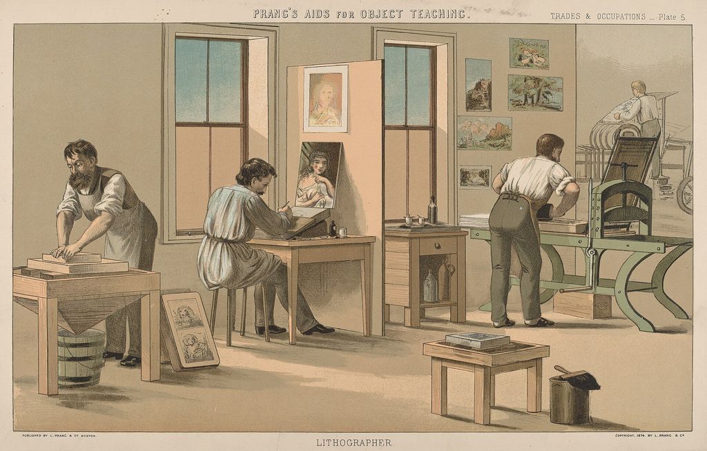
Lithography is planographic: image and non-image occupy the same flat stone or metal plate and are separated chemically by the incompatibility of grease and water. The artist can draw with greasy crayon or liquid tusche in a manner close to drawing on paper. Each colour normally requires another matrix and pass through the press.
Registration aligns them, while purposeful or accidental displacement can animate edges.
Chagall returned to the process intensively in France through the Mourlot workshop, which helped revive artists’ lithography in the twentieth century. He worked especially closely with Charles Sorlier. Mourlot and Sorlier later compiled the six-volume catalogue listing 1,101 lithographs across more than sixty years.[2]
The division of work varied. Chagall drew key passages and evaluated proofs; a chromiste or specialist lithographer could separate colours, redraw an authorised image on stones, prepare matrices and supervise printing. A museum-hosted recollection stresses the importance of Chagall’s direct black drawing as the structural “skeleton” of an image.[7] Sorlier’s 1988 gift of 184 lithographs to the Nice museum includes artist’s proofs that Chagall approved, rejected or revised, allowing sequences of decisions to be reconstructed.[2]
For the 1968 Vision of Moses, later proofs differ strongly from the first state; Man with the Torah began in black and white and acquired a gold ground.[2] Such examples prevent collaboration from being misdescribed as passive reproduction. The printer’s technical authorship and the artist’s approval operate together, but catalogues must still disclose when Sorlier made a lithographic interpretation “after” a Chagall painting rather than printing a matrix directly drawn by Chagall.
Tériade, Greece and Daphnis and Chloe
Tériade—born Stratis Eleftheriadis on Lesbos—was critic, editor of Verve and one of Chagall’s most consequential publishers. He secured the Vollard projects, welcomed Chagall back to southern France and introduced him to Greece after the artist’s marriage to Valentina Brodsky. Those journeys in 1952 and 1954 informed the forty-two colour lithographs for Longus’s pastoral romance Daphnis and Chloe, published in 1961 and printed at Mourlot.[2][8]
Forty-two preparatory gouaches made between 1954 and 1956 survive at the Musée national d’art moderne.[2] Their relation to the lithographs again involves translation rather than copying. Successive stones build vegetation, bodies, sea, night and heat; transparent overlap produces colours unavailable in a single ink. Black drawing sometimes anchors the scene and sometimes yields to chromatic atmosphere.
The Centre Pompidou record for The Lesson of Philetas preserves its place as plate seventeen in volume one and identifies graphite, gouache and ink on paper, unsigned and undated, acquired in the 1988 dation.[16] Its account separates two stages: Chagall first responded to the Mediterranean in black ink and drawing, then developed a new colour through the Greek commission. That sequence cautions against describing the lithographs as colour impressions of already complete gouaches; black-and-white thought and chromatic layering evolved together.[16]
The sequence follows two foundlings through pastoral childhood, desire, separation, danger and recognition. Chagall connected ancient Lesbos with contemporary Mediterranean light and his own long vocabulary of lovers, animals and music. When plates are displayed separately, their intensity can obscure the book’s pacing: calm landscapes prepare crises, repeated bodies accumulate intimacy, and colour changes across a page turn.
The illustrated book, portfolio suite and individual signed impression are related but bibliographically different objects.
Cirque, Verve and Maeght’s periodicals
Tériade’s last major collaboration with Chagall was Cirque, published in 1967 with Chagall’s own prose, twenty-three colour lithographs and fifteen in black and white. The edition comprised 270 copies plus twenty hors commerce.[2] Its acrobats, riders, musicians and clowns belong to a lifelong subject, but the book format converts spectacle into alternations of text, colour, pause and entrance.
Periodicals offered another structure. For Verve 24 in 1950, twenty-six black-and-white lithographic reproductions interpreted Chagall’s washes for Boccaccio’s Decameron. Aimé Maeght’s Derrière le miroir used an original Chagall lithograph on issue 27–28 for his first Maeght Gallery exhibition in 1950; later Chagall issues appeared in 1964, 1969, 1972, 1977, 1979 and 1981.[2] A cover, insert or double-page spread is designed around typography, fold and readership.
Removing it from the journal can erase part of its intended form.
Maeght also published Jacques Lassaigne’s Chagall in 1957 with fifteen lithographs and Aragon’s Celui qui dit les choses sans rien dire in 1976 with twenty-four colour engravings.[2] These collaborations show that “illustrated by Chagall” covers very different quantities, processes and degrees of integration. A proper bibliographic description specifies which elements are original prints and which are reproductions.
Woodcut, colour etching and Jacques Frélaut
Chagall did not abandon relief and intaglio after lithography became prominent. Gérald Cramer, a Geneva publisher and dealer, encouraged him to make twenty-four colour woodcuts for Poèmes, published in 1968 in 238 copies. The poems had been written between 1930 and 1964.
Chagall and printer Jacques Frélaut used the grain of the block within backgrounds and flat colour rather than disguising it.[2]
Frélaut first worked with Chagall on ten colour etchings for Jean Paulhan’s De mauvais sujets in 1958. Their later collaboration included trial states, colour aquatints and two books made when Chagall was over ninety. MoMA’s 1979 exhibition documented the block, black proof and bon à tirer for individual Poèmes pages, demonstrating that the authorised final impression emerged through proofing rather than from a solitary act of carving.[6]
For Psaumes de David, Chagall drew on copper plates prepared years earlier. Frélaut etched and proofed them; Chagall marked corrections and coloured proofs; Cramer coordinated translation, typography, paper, binding and edition. Chagall chose a warm sand-coloured aquatint behind the black lines.
The 1979 book contained thirty colour etchings, while a larger suite on Japan paper included two further compositions.[6]
This late work also corrects the idea of declining technical engagement. Chagall was making forceful scratched plates after his ninety-first birthday, arguing over tones and withholding approval until he could sign a satisfactory bon à tirer—the proof authorising the edition.
Monotypes: unique impressions within a print practice
Cramer suggested monotype in 1961. Chagall painted oil-based ink directly and rapidly onto a polished copper plate, which had to be printed while still workable. The pressure transferred nearly all the image to paper, ordinarily producing one principal impression.
Across seven working sessions with Frélaut between 1961 and 1975, he made 368 monotypes.[6]
Their thin, translucent colour differs from both lithographic layering and opaque painting. Occasionally enough ink remained for a second, paler pull, which Chagall could develop by hand. A monotype is therefore a print because a press transfers an image from a matrix, but it is not a multiple in the ordinary editioned sense.
Descriptions should not call it a lithograph or imply an edition when only one strong impression exists.
Collective artist books and multilingual modernism
Chagall also contributed to books whose identity did not centre on him. Ilia Zdanevich's Poésie de mots inconnus (1949) brought together several techniques and artists around experimental poetry; Chagall's in-text plate is an etching and aquatint accompanying poems by Velimir Khlebnikov, printed by Paul Haasen in an edition of 115.[11] The plate's meaning includes Russian futurist language, émigré publishing and the page on which it appears.
Paul Éluard's Un Poème dans chaque livre assembled Chagall with Arp, Braque, Ernst, Giacometti, Léger, Miró, Picasso and others. Its edition of one hundred combined etching, aquatint, drypoint, engraving, roulette, woodcut and lithography through several printers.[12] Chagall's double-page The Lover crosses the gutter, so disbinding it into two framed leaves would materially interrupt the composition.
These books complicate artist-centred counting. “Thirty-eight illustrated books” does not mean thirty-eight uniform Chagall cycles. Some are conceived almost entirely around his images; others contain one contribution within a deliberate plurality. Bibliographic description must name author, editor, collaborating artists, printer, publisher, edition and the number and placement of Chagall's works.[11][12]
Publishers, printers and the livre d’artiste
Chagall’s illustrated books were collective objects. Cassirer introduced the autobiographical portfolio; Vollard chose texts and commissioned enormous cycles; Tériade rescued and completed them; Mourlot and Sorlier developed colour lithography; Maeght joined gallery, periodical and book publishing; Cramer and Frélaut reopened woodcut, monotype and etching. André Sauret published the six lithographic catalogues as well as books including Jean Leymarie’s Stained Glass Windows for Jerusalem with seven lithographs and Shakespeare’s The Tempest in 1975.
Léon Amiel published The Story of Exodus.[2]
That network does not reduce Chagall’s authorship. It identifies the conditions under which his images became books. Typeface, paper, margins, binding, sheet folding, placement and sequence determine how image and language meet.
Publishers obtained rights, financed production and fixed editions; printers made technical proposals and maintained consistency across many impressions; Chagall revised, approved and sometimes hand-coloured them.
Paper is an active material. The official catalogue notes Chagall’s use of Japanese, vellum, laid, rag and tracing papers and his responsiveness to thickness, grain, texture and colour.[9] Deluxe issues might use Japan paper or include separate suites; standard issues could use Arches or other wove stocks. These differences affect absorption, plate embossment, colour saturation and handling as well as rarity.
Edition, proof, state and suite
An edition is the authorised group printed from the matrices. The numbered fraction on a sheet normally indicates impression number over edition size, but does not by itself prove authenticity. Artist’s proofs, printer’s proofs and hors-commerce impressions can sit outside the numbered edition.
A trial proof records work in progress; a bon à tirer is the approved model for printing. A cancelled plate bears marks intended to prevent further normal impressions.
A state records a deliberate change to the matrix. Different states can reveal figures enlarged, lines strengthened or colour matrices added. A suite presents a book’s images without its text and may use another paper or sheet size.
A restrike is pulled later from the original matrix; a facsimile uses reproductive technology; an offset-lithographic poster is not automatically an original artist-drawn lithograph.
Signatures also require context. Some original book plates are unsigned because authorisation belongs to the numbered colophon. A signed reproduction does not become an original lithograph.
Conversely, the absence of a pencil signature does not make a plate from a documented bound edition false. Catalogue raisonné numbers, colophon, printer and publisher records, paper, dimensions, watermark and provenance must be considered together.
Library catalogues supply another control because they record responsibility and issue structure rather than only image. The Bibliothèque nationale de France describes the 1924 lithograph L'Ange with Chagall as lithographer, Galerie Jeanne Bucher as commercial publisher, and a stated division of one hundred impressions into eighty and twenty.[14] It cross-references both the Mourlot/Sorlier lithograph catalogue and the Kornfeld intaglio/woodcut catalogue. Such records help distinguish a period edition from a later sheet carrying the same title, though the physical impression must still be examined.[14]
“After Chagall”, posters and attribution
Sorlier and other master printers produced authorised lithographic interpretations after Chagall paintings or designs. Such a sheet may be a genuine period lithograph, printed by Mourlot and approved by Chagall, while still not being a matrix Chagall drew himself. The wording “lithograph by Charles Sorlier after Marc Chagall” preserves that distinction.
Omitting the translator’s name overstates direct authorship.
Posters create further ambiguity. Some contain an original lithographic component designed for the event; others reproduce an existing artwork photomechanically, sometimes with separately printed lettering. Catalogue entries should specify process rather than infer it from appearance or the word “Mourlot”.
The official online catalogue raisonné, begun in 2019, is research in progress and notes that provenance, exhibitions and bibliography may be updated.[10] For lithographs, the established Mourlot/Sorlier volumes and Patrick Cramer’s illustrated-book catalogue remain essential controls alongside institutional records.
Prints as solidarity, fundraising and public action
Editioned print could place Chagall inside collective political action as well as literary publishing. The portfolio Flight was made for the International Rescue Committee: MoMA records Chagall's 1968 lithograph as an artist's proof before an edition of 300, printed by Mourlot and published in New York in 1971 within a portfolio of eleven lithographs and one screenprint.[13]
The institutional connection is unusually charged because emergency rescue networks had helped Chagall escape occupied France in 1941. A later portfolio supporting refugee work does not erase the inequality of his own celebrity-assisted route, but it turns a repeatable graphic object towards an organisation concerned with displacement. Publisher and beneficiary are therefore part of the work's historical description, not external charity trivia.
Collective portfolios also demand attribution discipline. The presence of Chagall's sheet does not make every image his, and a portfolio edition need not equal the edition of each separately circulated proof. Complete-object records should preserve wrapper, title page, colophon, artist list and sequence so that later sales do not convert a collaborative intervention into unrelated signed commodities.[13]
Conservation and the evidence of use
Paper records both production and damage. Light can fade colour lithographs and discolour acidic mounts; pressure-sensitive tape stains fibres; trimming removes deckles, watermarks, inscriptions and sometimes image margins. Foxing, cockling and abrasion alter surfaces.
Bound books may protect colour from prolonged display but suffer at the spine when opened flat. Loose suites can be shown more easily while losing their original order.
Conservation should preserve bibliographic evidence as well as image quality. A colophon can prove edition and publisher; a wrapper can be an original lithograph; an annotated trial proof records decision-making. Separating plates from a complete book may increase their saleability while destroying a designed object and its provenance.
The Nice museum’s holding of copper plates, gouaches and Sorlier’s proofs is especially valuable because it preserves sequences instead of only pristine final impressions.[2][4]
How to identify and read a Chagall print
Begin with a complete object description: title and variants, date or date span, process, matrix, support, image and sheet dimensions, series or book, plate number, printer, publisher, edition, proof status, catalogue number and provenance. Inspect the colophon when a book is involved. Distinguish an original print, a named printer’s authorised interpretation, a later restrike and a photomechanical reproduction.
Then ask what the process contributes. Intaglio line is pressed into paper and can shift from incisive etching to velvety drypoint. Aquatint builds tone.
Lithographic crayon retains the grain of the stone; tusche produces washes and reticulation; separately printed colours overlap and may resist black contours. Woodcut makes the pressure of carving and the block’s grain visible. Monotype transfers a rapidly painted, essentially unique image.
Finally restore sequence and context. Read neighbouring plates from Dead Souls, the Fables, Bible, Daphnis and Chloe or Cirque. Compare a bound book with suite impressions where possible.
Treat translated titles cautiously and separate the date of a design from the date of publication. The aim is not only to authenticate an object but to understand how its matrix, press, collaborators and page order created meaning.
A central, collaborative body of work
Printmaking allowed Chagall to revisit autobiography, Russian satire, French fable, Hebrew scripture, Arabic tales, Greek pastoral, poetry, circus and dream across six decades. It multiplied images, but multiplication was never merely mechanical. Every medium changed the relation of line, colour, pressure and support; every serious book required editorial and workshop intelligence.
The graphic work is central because it makes Chagall’s method unusually visible. Gouache becomes etching; a black proof acquires coloured aquatint; one figure moves forward over ten states; a publisher rescues plates stranded by war; a printer interprets colour and waits for approval; a reader turns a page and changes the rhythm. These histories replace the misleading category of “prints after the paintings” with a far larger achievement: an original, collaborative art made through matrices, editions and books.
Discussion
Which piece of evidence most changes the way you read Marc Chagall Lithographs and Prints?
Reader Insights
Which visible detail most changes your reading of Marc Chagall Lithographs and Prints?
How do medium, setting and documented history shape the encounter?
What remains uncertain when documented fact is separated from interpretation?
Join the Conversation
Share your reading of Marc Chagall Lithographs and Prints below.
References
- Museum of Modern Art, “Marc Chagall, Les Âmes mortes (Dead Souls)”, View Source
- Musée national Marc Chagall, Chagall et le livre, 2012, View Source
- National Gallery of Art, “The Fox and the Grapes — Associated Artworks”, View Source
- Musée national Marc Chagall, “La collection du musée”, View Source
- Metropolitan Museum of Art, “Then He Spent the Night with Her Embracing…”, View Source
- Riva Castleman, Marc Chagall: Prints, Monotypes, Illustrated Books, Museum of Modern Art, 1979, View Source
- Musée national Marc Chagall, extract from Gravés dans ma mémoire, View Source
- Marc Chagall official website, “Biography”, View Source
- Marc Chagall official website, “Paper in Marc Chagall’s work”, View Source
- Marc Chagall official website, “Catalogue raisonné de l’œuvre de Marc Chagall”, View Source
- Museum of Modern Art, Chagall plate from Poésie de mots inconnus, 1949, View Source
- Museum of Modern Art, Un Poème dans chaque livre, 1953–56, View Source
- Museum of Modern Art, Chagall lithograph from Flight, 1968, published 1971, View Source
- Bibliothèque nationale de France, “L’Ange: estampe / Marc Chagall”, View Source
- Musée d’art et d’histoire du Judaïsme, Chagall et la Bible, exhibition record, View Source
- Centre Pompidou, “La leçon de Philetas”, View Source
- Museum of Modern Art, Strelets: Third and Final Collection, 1922, View Source
- Museum of Modern Art, “Marc Chagall, Homage to Gogol. Design for curtain for Gogol festival”, 1917, View Source
- Centre Pompidou, “Marc Chagall — Œuvres reçues en dation”, 1988, View Source