 by Tom Gurney
Tom Gurney BSc (Hons) is an art history expert with over 20 years experience
Published on June 19, 2020 / Updated on July 30, 2026
Email: tomgurney1@gmail.com / Phone: +44 7429 011000
Crucifixion Diptych / Philadelphia Crucifixion: Introduction
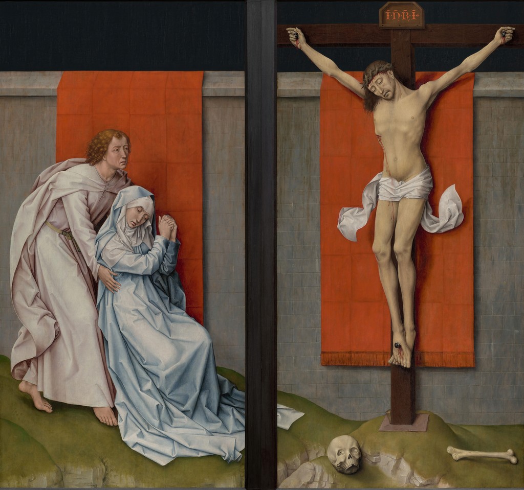
The Crucifixion Diptych, often called the Philadelphia Crucifixion, is one of Rogier van der Weyden's starkest late works. It reduces the Passion to a few enormous presences: Christ on the Cross, the grieving Virgin, Saint John and a flat field of intense colour. Compared with the crowded emotional choreography of the Prado Descent from the Cross, this work feels almost stripped bare.
The two panels are in the Philadelphia Museum of Art's John G. Johnson Collection. Scholarship has debated whether they formed a self-contained diptych, part of a larger triptych, or shutters from a carved altarpiece. [1] [2] That uncertainty is part of the object's history rather than a flaw.
The page is important because it shows a late Rogier who has not lost emotional power, but has changed the means by which that power is delivered. Instead of filling the picture with witnesses, he lets scale, silence, colour and frontal design do the work.
At a Glance
- ArtistRogier van der Weyden
- TitleCrucifixion Diptych / Philadelphia Crucifixion
- DateUsually around 1460, with some scholarly variation
- MediumOil on panel
- Current locationPhiladelphia Museum of Art, John G. Johnson Collection
- SubjectChrist on the Cross with the Virgin and Saint John
Contents
- Introduction
- At a Glance
- Annotated Details
- A Late Passion Image
- Diptych, Shutters Or Lost Whole?
- Grief Against A Field Of Colour
- Scale And Presence
- Comparing Rogier's Passion Images
- Conservation And Interpretation
- Carthusian And Monastic Associations
- Why It Matters
- FAQs
- Discussion
Annotated Details from Crucifixion Diptych
The Philadelphia Crucifixion is unusually stark. These annotations focus on the red cloth, the divided panel structure, the figures of Mary and John, and the way Rogier turns the Passion into a monumental image of grief and contemplation.
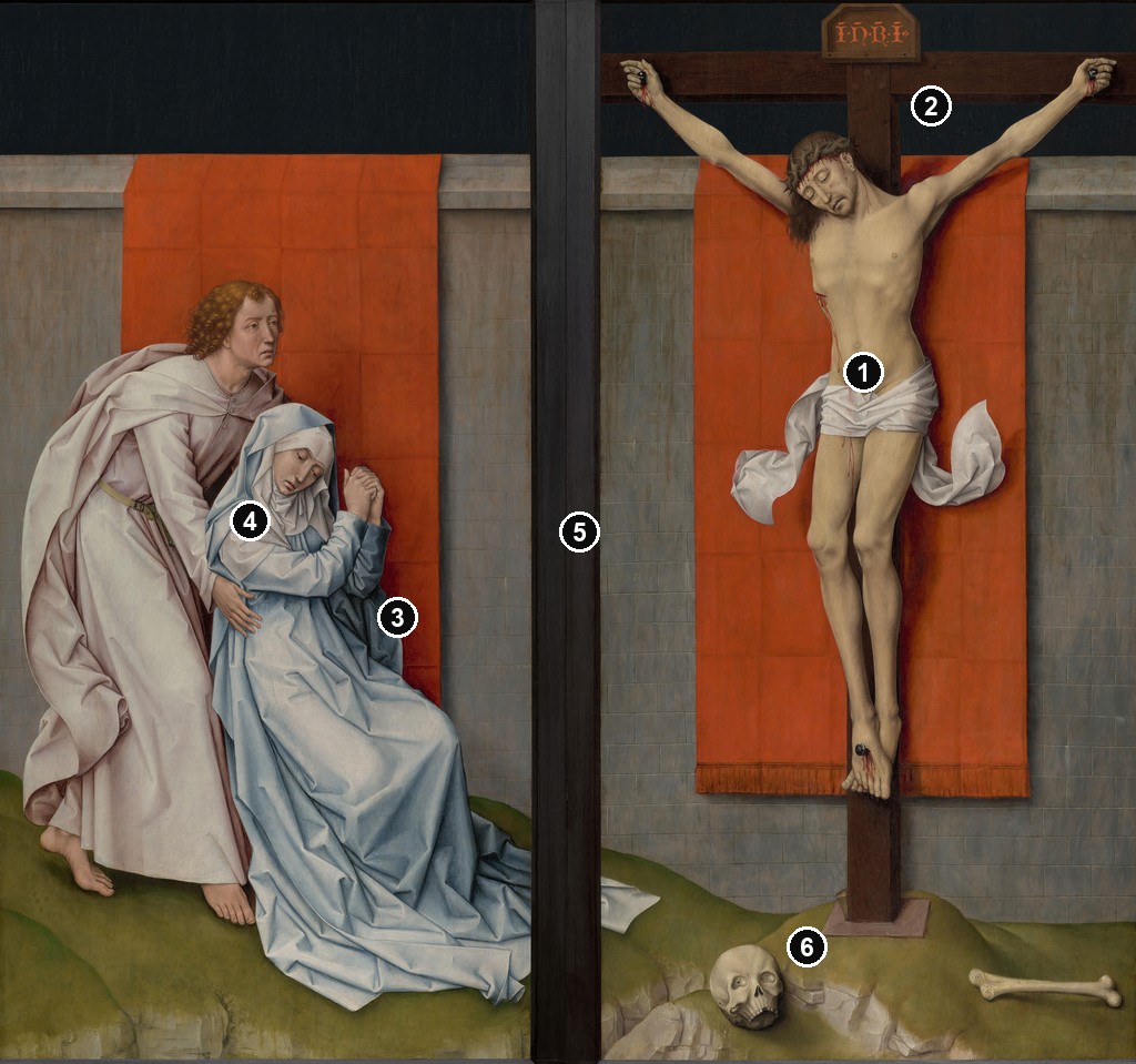
Details from CRUCIFIXION DIPTYCH
The detail crops show how the diptych's power comes from a small number of forceful visual decisions: colour, separation, scale, gesture and silence.
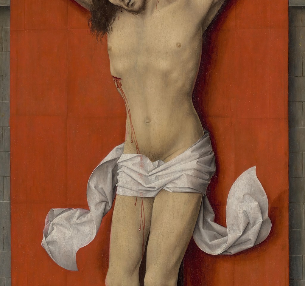
Christ against the red cloth
Christ's body is set against a suspended red field rather than an open landscape. The cloth heightens the body's pallor and gives the scene a severe devotional intensity.
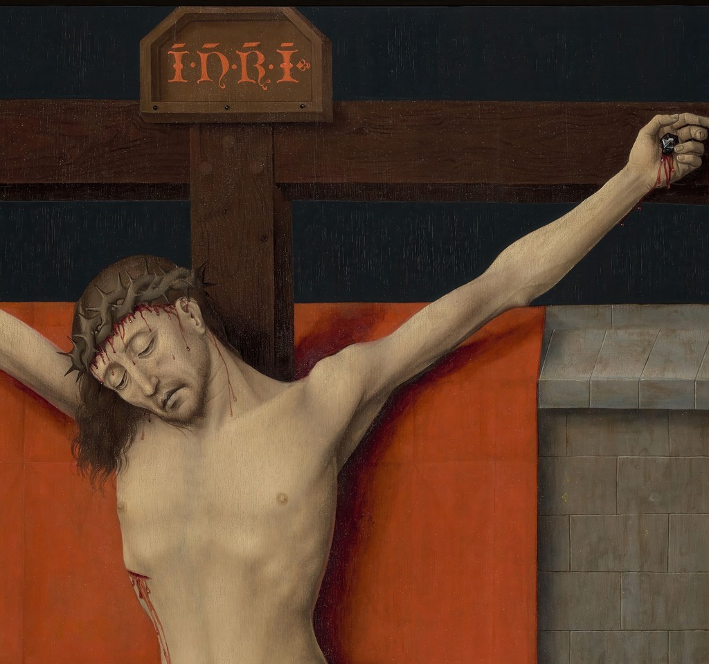
The cross and inscription
The cross rises through the right panel with almost architectural force. The inscription and dark upper band keep the viewer's attention fixed on the event rather than on narrative surroundings.
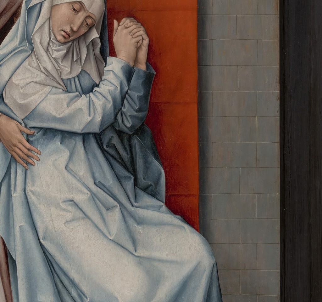
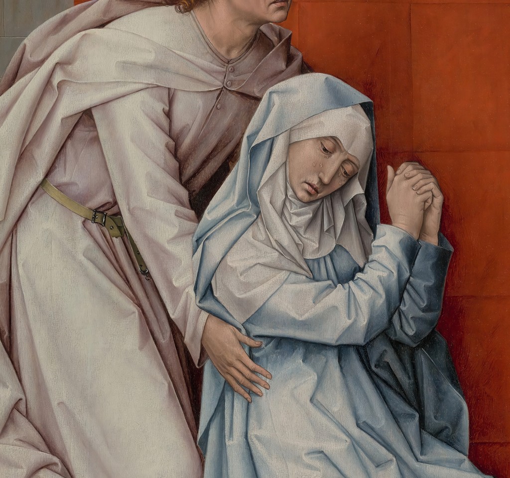
Mary's collapsed body
Mary's folded body concentrates grief into weight, cloth and downward movement. Rogier makes sorrow physically legible without crowding the image.
Saint John supporting Mary
Saint John's supporting arm creates one of the painting's main emotional bridges. His body turns care into structure, holding the left panel together.
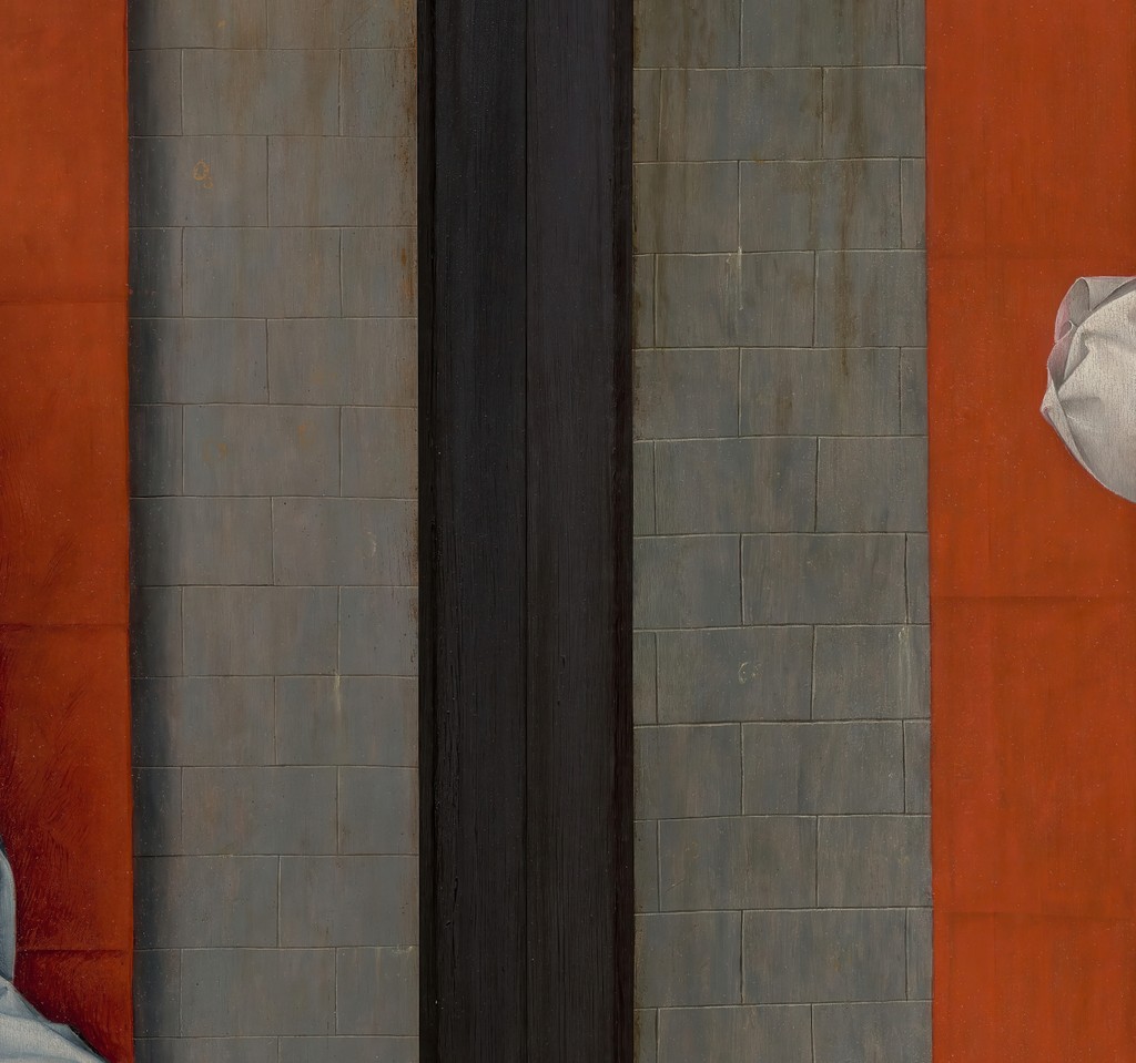
The central division
The dark vertical join makes the image feel like two shutters or panels brought into tense relation. It separates witnesses from Christ while also binding the diptych visually.
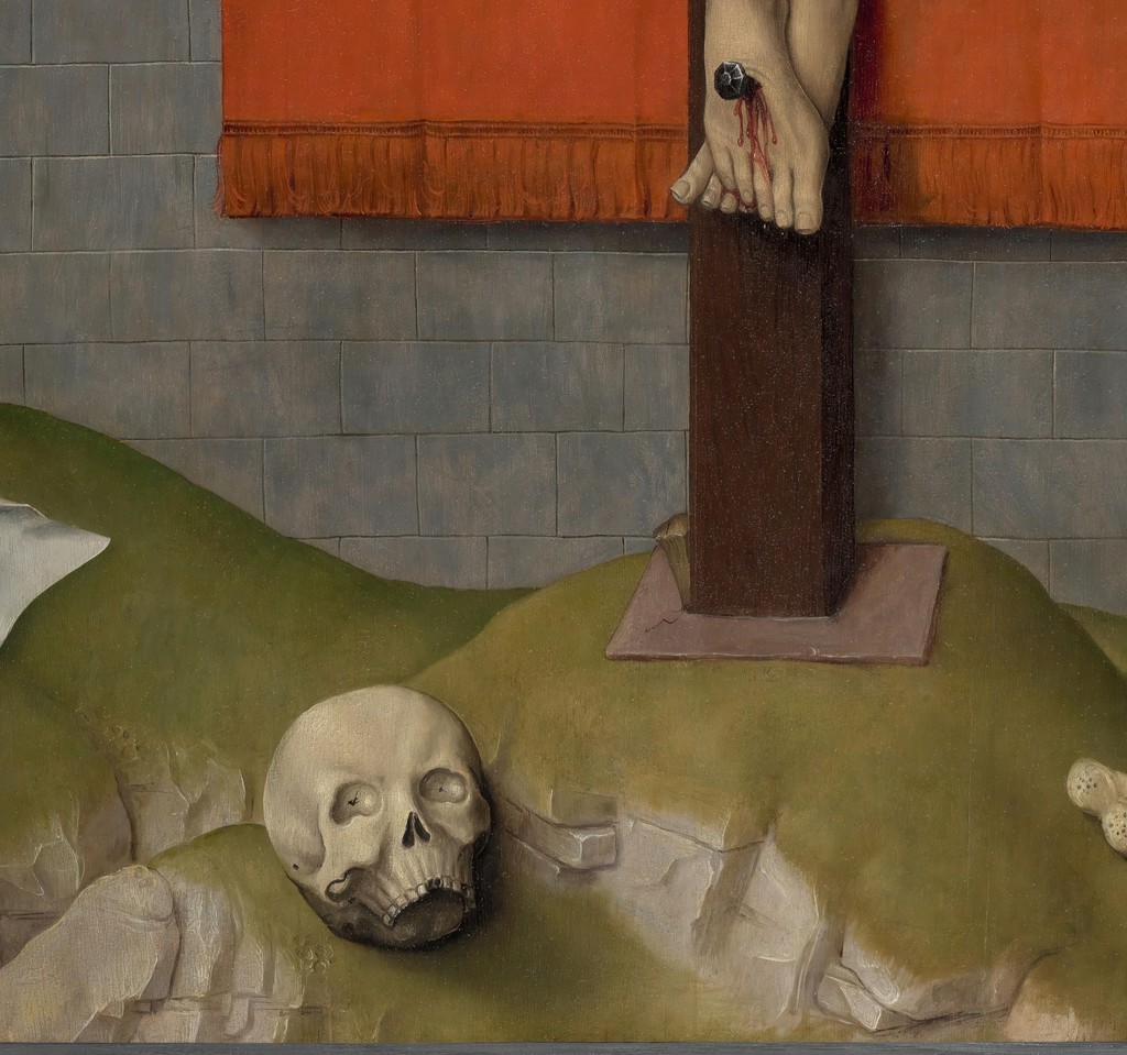
Skull and bone at Golgotha
The skull and bone anchor the scene at Golgotha and recall death beneath the Cross. They are small, but they sharpen the painting's meditation on mortality.
A Late Passion Image
Rogier returned to the Crucifixion throughout his career, but the Philadelphia panels are unusually austere. The background does not open into a detailed landscape. The figures do not stand inside a crowded narrative field. Instead, the image presses the viewer toward a few large shapes and emotional contrasts.
The Virgin and Saint John occupy one side of the composition; Christ hangs on the Cross in the other. Their scale gives the work an almost bodily immediacy. It is not a small anecdote about sacred history. It is a devotional encounter.
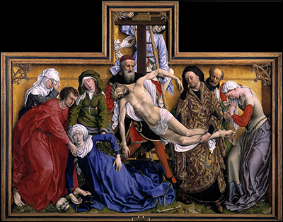
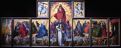
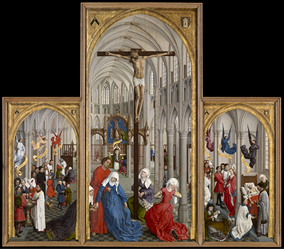
This makes the diptych a useful comparison with The Descent from the Cross, the Seven Sacraments Altarpiece and the Vienna Crucifixion Triptych. Together, they show how Rogier reshaped Passion imagery across different formats and devotional uses.
The Philadelphia work is not less ambitious because it is sparse. Its ambition lies in reduction. Rogier removes secondary incidents and decorative detail so that the viewer is held before the essential scene: the dead Christ and the grief that answers him.
Diptych, Shutters Or Lost Whole?
The function of the panels has been debated. The best approach is to explain the possibilities and why they matter.
If the panels were shutters or part of a larger object, the surviving image is only a fragment of a more complex structure. If they functioned as a diptych, their starkness may have been the point: two panels meant for focused contemplation. Either way, the present work teaches readers that surviving old-master paintings often reach us as altered objects.
That caution is important for Rogier. Many pages in this cluster deal with fragments, copies, workshops or split works. The Philadelphia Crucifixion is a powerful reminder that the painting now seen in a museum is not always identical to the object as it was first used.
Grief Against A Field Of Colour
The emotional force comes partly from the restricted setting. Rogier removes distractions and makes the figures carry the meaning. The Virgin's grief echoes Christ's suffering, while Saint John becomes both witness and support.
The flatness of the background also matters. It refuses the kind of deep, atmospheric space associated with Jan van Eyck and some later Netherlandish portrait traditions. Rogier chooses pressure over recession. The viewer is not invited to wander through a landscape. The viewer is held before the Cross.
The red hanging behind the figures is not simply a background. It intensifies the bodies placed before it. The colour makes grief theatrical, but the figures remain controlled. This is one of Rogier's characteristic paradoxes: emotion becomes stronger because it is disciplined.
Scale And Presence
The scale of the figures helps explain why the work feels so severe. Christ's body is not absorbed into landscape or narrative. It stands before the viewer with a clarity that approaches sculpture. The Virgin and Saint John are likewise monumental, almost architectural in their placement.
This monumentality links the diptych to Rogier's lifelong interest in making painted figures behave like carved or staged presences. In the Descent, the shallow gold field makes the figures feel like sculpture in a box. In the Philadelphia Crucifixion, the large bodies and flat field create a different kind of pressure, quieter but no less direct.
Comparing Rogier's Passion Images
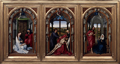
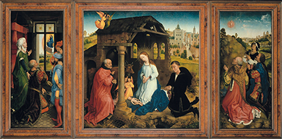
The Philadelphia panels are especially useful when read beside the Descent from the Cross, the Crucifixion Triptych and the Seven Sacraments Altarpiece. All four works turn Christ's death into a devotional image, but each uses a different structure.
The Descent is crowded and sculptural. Its emotional force comes from mirrored bodies and compressed space. The Crucifixion Triptych opens into a multi-panel field with donors and witnessing saints. The Seven Sacraments Altarpiece places the Crucifixion inside a church interior, connecting the Passion to ritual life. The Philadelphia work removes almost everything except the Cross, the mourners and the field of colour.
That comparison prevents the diptych from being treated as merely "simple." Its simplicity is active. Rogier uses reduction as a theological and emotional tool. The work asks what remains when narrative detail is removed, and the answer is presence: Christ's body, Mary's grief, John's witness and the viewer's attention.
This is also why the page is a strong bridge to the style-and-technique page. It shows that Rogier's formal decisions are not surface effects. Scale, colour, emptiness and figure placement shape the devotional meaning of the image.
The comparison also helps with chronology. A reader can see Rogier not as a painter repeating one Passion formula, but as an artist who repeatedly rethinks how viewers should meet the Crucifixion. Across the cluster, he can stage grief as a crowded descent, a ritual centre, a donor triptych or a severe two-panel confrontation. The Philadelphia work is the most concentrated of these solutions.
Conservation And Interpretation
The painting's modern history includes conservation questions around the sky, background and earlier restoration. [1] [2] Those changes matter because restoration can affect not only the surface of an old-master painting, but also the emotional atmosphere a viewer encounters.
A cooler or darker background, a revealed layer, or a changed sense of surface can alter how severe the painting feels. Conservation history therefore belongs in the interpretation of the work, especially for a painting so dependent on colour, flatness and atmosphere.
Carthusian And Monastic Associations
Scholarship has discussed possible Carthusian associations for the diptych and for Rogier's late devotional world. [2] This connection must remain cautious, but it is worth introducing. The starkness of the image fits a mode of concentrated, disciplined devotion.
Rogier's late career was not only a matter of style. It was also shaped by networks of devotion, patronage, family and religious institutions. The Philadelphia panels should be read as part of that world of prayer and image-use, not as isolated museum objects.
Why It Matters
The picture shows a late Rogier at his most severe: monumental, compressed and experimental.
It shows how Rogier could move from complex narrative triptychs toward a more concentrated form of devotional drama. The page also helps readers understand why attribution, format and conservation matter. The painting's meaning depends not only on what it shows, but also on how the surviving panels relate to a possible original object.
It is also one of the best pages for explaining that visual austerity can be emotionally intense. The work has fewer figures than the Descent and less architectural richness than the Seven Sacraments Altarpiece, yet its narrowed focus makes it one of Rogier's most demanding Passion images.
FAQs
It is in the Philadelphia Museum of Art, in the John G. Johnson Collection. [1]
Possibly, but scholars have also discussed whether the panels were part of a larger altarpiece or functioned as shutters. [1] [2]
The work uses a restricted setting, large figures and strong colour contrasts to focus attention on Christ's death and the grief of the Virgin and Saint John.
The Prado Descent is crowded, sculptural and narrative. The Philadelphia Crucifixion is sparse, frontal and meditative.
Discussion
How does the Crucifixion Diptych change when read as a near-monumental devotional image rather than only as a Passion scene?
Reader Insights
The diptych's large figures make grief feel severe and unavoidable, with less narrative crowding than the Descent.
Rogier's restraint is crucial. The image is intense because its grief is clarified rather than scattered.
Compare the Crucifixion pages with the Descent to see two different solutions to Passion devotion: isolation and crowded compassion.
Join the Conversation
Have a thought or observation about Crucifixion Diptych / Philadelphia Crucifixion? Share it below. Thoughtful responses may be added to this section as the Rogier van der Weyden cluster develops.
References
- Philadelphia Museum of Art, The Crucifixion, with the Virgin and Saint John the Evangelist Mourning, collection object page, accessed 2026-07-11. https://www.philamuseum.org/collection/object/102845
- Philadelphia Museum of Art digital scholarly catalogue entry, The Crucifixion, with the Virgin and Saint John the Evangelist Mourning, accessed 2026-07-11. https://publications.philamuseum.org/entries/102845
- The National Gallery, London, artist page for Rogier van der Weyden, accessed 2026-07-11. https://www.nationalgallery.org.uk/artists/rogier-van-der-weyden
- Dirk de Vos, Rogier van der Weyden: The Complete Works, 2000.