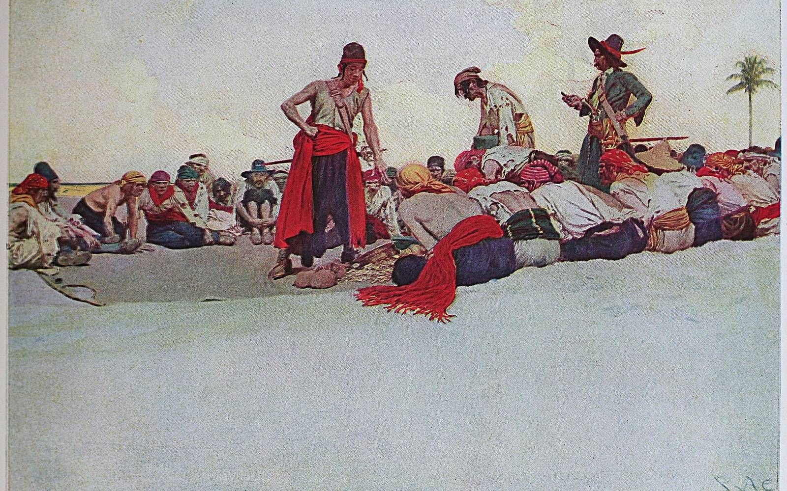
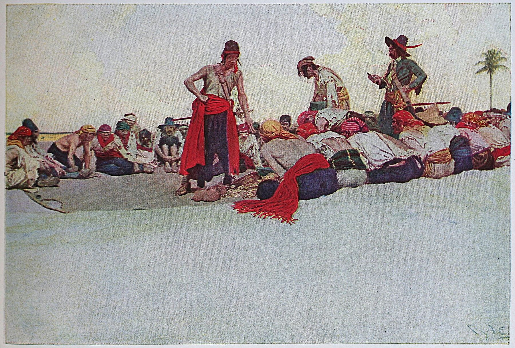
Image reference: Howard Pyle’s Pirates Dividing the Treasure.
At a Glance
- Core periodc. 1880–1930, with important foundations from the 1840s onward
- Principal centresLondon, New York, Philadelphia, Wilmington, Boston and Chicago
- Major mediaillustrated books, magazines, newspapers, posters and advertising
- Key processeswood engraving, lithography, chromolithography and halftone
- Leading figuresGustave Doré, Walter Crane, Aubrey Beardsley, Arthur Rackham, Edmund Dulac, Howard Pyle, N. C. Wyeth, Jessie Willcox Smith, Elizabeth Shippen Green, Charles Dana Gibson, Maxfield Parrish and J. C. Leyendecker
- Known fornarrative compression, designed pages, fantasy, dramatic character, recognisable graphic styles and images made for mass reproduction
Contents
- Where it fits
- Why reproduction mattered
- Original and published image
- Four stages
- Illustrators to know
- Howard Pyle
- Women and professional community
- Essential works
- Where to see
- Artist directory
Where the Golden Age of Illustration fits
Gustave Doré
Principal activityWalter Crane
Principal activityHoward Pyle
Principal activityAubrey Beardsley
Principal activityArthur Rackham
Principal activityJessie Willcox Smith
Principal activityN. C. Wyeth
Principal activityJ. C. Leyendecker
Principal activityThe Golden Age of Illustration was the period in which images made for reproduction became one of the most widely encountered forms of art. Its boundaries vary according to country and medium, but a useful core runs from about 1880 to 1930. In those decades, illustrated books, magazines, newspapers, posters and advertisements reached immense audiences in Britain and the United States. The Library of Congress uses approximately these dates for its Cabinet of American Illustration, a collection containing thousands of drawings and prints by hundreds of artists.[1]
The name can be misleading. This was not an organised movement with a manifesto, and its leading artists did not share one style. Aubrey Beardsley's severe black shapes, Arthur Rackham's nervous fairy-tale line, Jessie Willcox Smith's tender colour, Howard Pyle's historical drama and J. C. Leyendecker's polished commercial figures do not resemble one another. What joins them is a publishing ecology: growing literacy and leisure, expanding book and magazine markets, new printing processes and a professional class of artists who learned to design images that would travel.[2]
That last point is crucial. Illustration was not simply painting reproduced badly, nor was it merely decoration added after a text was complete. The original drawing or painting, the printing process, the page, the editor, the publisher, the advertiser and the reader all participated in the final meaning. A picture could be made for rapid reduction, for a luxurious plate protected by tissue, for a magazine cover glimpsed at a newsstand or for an advertisement that had to establish a brand in seconds. The Golden Age was an art of translation and circulation.
Why reproduction created a Golden Age
Illustrated periodicals had flourished before 1880. In the middle decades of the nineteenth century, publications such as the Illustrated London News, Illustration in Paris, the Illustrirte Zeitung in Leipzig and Harper's Weekly in New York made pictorial journalism a regular part of modern life. Wood engraving allowed images to be printed on the same press as movable type, so news, fiction and pictures could share a page.[3] These papers established the appetite and distribution systems on which later illustrators depended.
The technologies were never merely mechanical. In relief processes, an artist's drawing might be transferred to a block and interpreted by specialist engravers. Lithography allowed an image to be drawn on a prepared stone or plate, while photolithography used photography to transfer it. Commercial halftone, introduced during the 1880s, broke continuous tones into dots that could be printed in ink.[4] Each method rewarded different kinds of mark and altered what the public saw.
Wood engraving favoured structured lines and could convey remarkable detail, but it often placed an engraver between the artist and the printed result. Halftone could reproduce wash, charcoal and painting photomechanically. It therefore made tonal originals far easier to publish, although screen, paper, ink, reduction and press speed still changed their appearance.[5] Once printers could reproduce continuous tone efficiently, photographs and artists' originals rapidly filled books and journals with more images.[6]
Colour demanded another level of planning. Chromolithography printed successive colours from separate stones. A celebrated demonstration made for Louis Prang's Prize Babies required nineteen stones and thirty-eight progressive proofs. It sold as a comparatively affordable colour print, yet its low retail price concealed a dense sequence of skilled operations.[7] The example makes one of the period's central paradoxes visible: an image could feel immediate and inexpensive because a complex industrial collaboration stood behind it.
Lithography consequently connected worlds that museums have often separated. It served artists, publishers, advertisers, political satirists, poster designers and book producers because it multiplied images economically and could carry both drawing and colour.[8] Wood engraving likewise supported international illustrated journalism rather than one national school.[9] The Golden Age is best understood as a network of originals, blocks, stones, plates, proofs and printed objects, all of which preserve different stages of an image's life.[10]
The original is not the published image
An illustration begins with a destination. The artist needs to know whether the image will occupy a whole page or a narrow column, appear in colour or monochrome, sit beside text or interrupt it, and be viewed at the size of a book or the scale of a poster. A large oil painting can become a modest colour plate; a fragile charcoal drawing can reach a million readers; a pen drawing can be reduced until its black-and-white pattern becomes tighter and more forceful.
This does not make the original a mere preliminary. Many Golden Age drawings and paintings are independent works of extraordinary finish. Yet looking only at the original removes part of their intelligence. Reduction may intensify a silhouette. A page turn may create suspense. A caption can redirect an expression. A cover competes with every other cover around it. The printed image is therefore not a damaged substitute but another historical object, produced by translation.
The distinction also helps explain style. Beardsley's flat blacks reproduced cleanly because he made reproductive clarity expressive. Elizabeth Shippen Green modified charcoal, fixative and colour media for halftone. N. C. Wyeth organised large paintings in broad masses that survived reduction. The technology did not dictate their art, but neither did their art exist outside it.
Editorial work belongs inside this account as well. An art editor assigned a subject, approved sketches, negotiated revisions and positioned the result among headlines, advertisements and other images. A publisher decided whether colour was affordable and whether an artist's name could help sell an edition. In magazines, the illustrator might receive a manuscript only shortly before a deadline and still be expected to identify its emotional centre. In books, a sequence could be planned across many gatherings, but cost might limit the number of full-page plates. These practical decisions affected which characters appeared, how often readers encountered an image and whether a scene had to carry information or atmosphere.
The page or opening is therefore a meaningful unit. A framed reproduction in a gallery encourages prolonged comparison with nearby works, while an illustration may be encountered after several minutes of reading and then disappear at the next turn. It can confirm what a reader has imagined or productively disturb it. Endpapers, title pages, vignettes and decorated initials also guide entry into a fictional world before a principal scene appears. Golden Age artists designed time as well as surface.
Follow the Golden Age through four stages
–1879
Illustrated publishing builds its audience
Wood engraving joins image and movable type, illustrated journalism expands, and Doré demonstrates the international illustrator as visual author.
–1899
New reproduction makes style portable
Commercial halftone, mass magazines and literary publishing reward images designed for reduction, from Beardsley's black shapes to Gibson's instantly recognisable social types.
–1914
Gift books and magazines reach a mature visual culture
Colour plates, professional teaching and large-circulation periodicals support distinct British fantasy and American narrative traditions without forcing them into one style.
–1930
War and new media alter the system
Wartime publishing redirects illustration, while photography, cinema, advertising and economic change reshape rather than extinguish the art after 1914.
Doré and the illustrated book before 1880
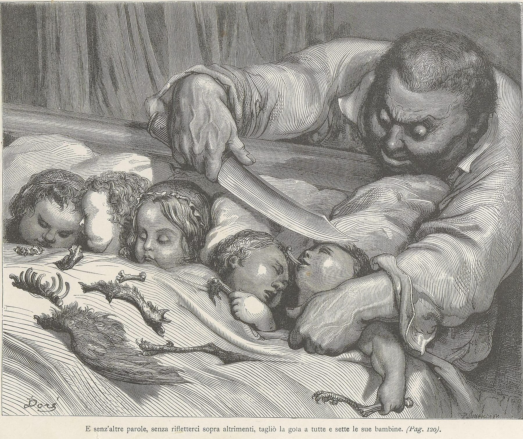
Gustave Doré belongs mainly to the generation before the conventional Golden Age, but he established the international illustrator as a visual author. His projects were vast, his productivity legendary and his designs translated by teams of wood engravers. Research into his edition of Perrault's fairy tales shows how correspondence, drawings, prints and successive editions can reconstruct a collaborative publishing history rather than a solitary act of inspiration.[14]
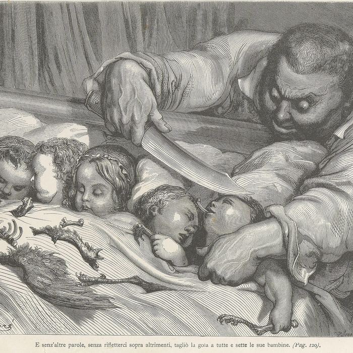
The large folio Contes de Perrault, published in 1862, transformed familiar tales through images of unusual scale and darkness. In scenes from Sleeping Beauty, architecture and forest appear older and more powerful than their human occupants. In Puss in Boots and Bluebeard, crowded interiors turn social hierarchy into spectacle. Doré does not just identify a moment in the story; he builds a world whose stone, shadow and distance enlarge danger. The plates became durable components of the tales' collective visual memory.[15]
His Bible of 1866 travelled even further. Editions circulated across Europe and the United States, and the images entered preaching, dioramas, lantern display and eventually cinema.[16] This afterlife demonstrates why illustration cannot be confined to the book in which it first appeared. Once reproduced, a composition becomes a portable store of gestures, costumes, lighting effects and ideas about history. Later artists, theatre designers and filmmakers can inherit it without encountering the original drawing.
Doré's fame also exposes the division of credit. The public remembered his name, while engravers converted his designs into printable surfaces. The Golden Age would reduce that mediation through photomechanical processes, but it never abolished collaboration. Printers, colour separators, editors and art directors continued to shape what readers received.
Crane, Morris and the designed page
In Britain, Walter Crane, Randolph Caldecott and Kate Greenaway helped transform children's books during the 1860s, 1870s and 1880s. Their images depend on sequence: a figure runs across several openings, a border turns type into ornament, or blank paper creates a pause. The book is not a container for detachable pictures but a designed experience.
Crane and William Morris connected this concern to the Arts and Crafts movement. Their reform of the book belonged to a larger argument about labour, materials and beauty in everyday life. Morris's dense pages and Crane's integrated borders rejected careless industrial ugliness, although their finely made objects could be costly.[12] The contradiction between democratic ideals and luxury production would persist throughout the Golden Age.
These artists also crossed media. Designs associated with Crane, Greenaway and Caldecott moved from books into wallpapers and domestic decoration, finding customers on both sides of the Atlantic.[13] A child could inhabit a room whose walls extended the visual world of a picture book. Illustration therefore participated in the making of taste, childhood and the modern interior.
Golden Age illustrators to know
Gustave Doré
Doré enlarged fairy tale, scripture and literary illustration into ambitious visual worlds translated by teams of engravers and circulated across media.
Aubrey Beardsley
Beardsley made reproductive clarity expressive, using black shape, asymmetry and blank space to contradict, parody and outgrow the text.
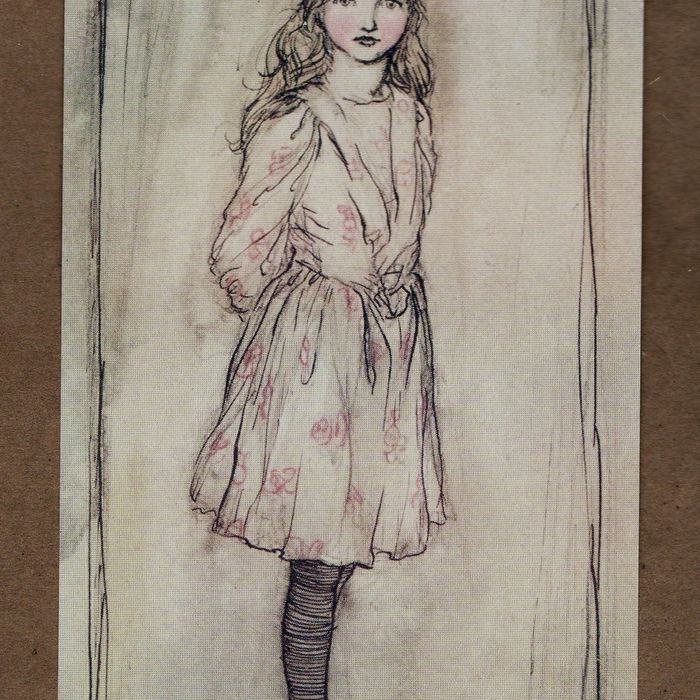
Arthur Rackham
Rackham's nervous line and restrained colour helped define the luxury gift book while exhibitions and translated editions carried his reputation internationally.
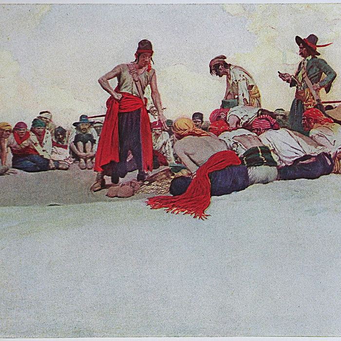
Howard Pyle
Pyle professionalised American illustration through decisive narrative moments, historical research and a teaching system whose influence continued through his students.
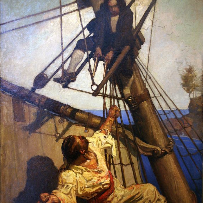
N. C. Wyeth
Wyeth organised large oils through broad masses, dramatic light and legible gesture so their force survived translation into printed plates.
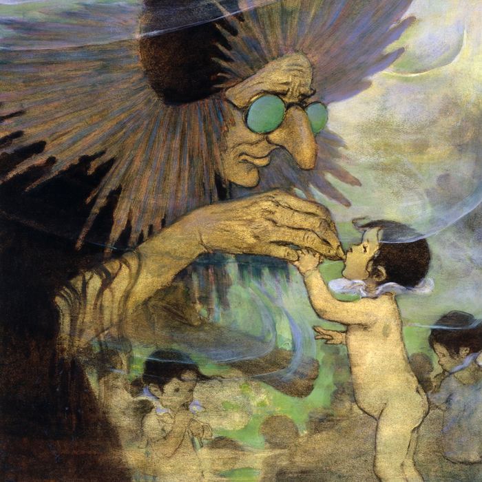
Jessie Willcox Smith
Smith used mixed media, scale and emotional concentration to make childhood an imaginative viewpoint rather than a merely sentimental subject.
Beardsley makes black and white dangerous
Aubrey Beardsley made the limitations of inexpensive black-and-white reproduction feel radical. His early designs for Le Morte Darthur combine medievalising ornament with pagan, comic and erotic interruptions. They acknowledge the example of Morris's Kelmscott books while refusing their moral seriousness. The page becomes a place where text, border, empty space and insinuation compete.
Japanese prints and stencils encouraged Beardsley's use of broad unmodulated shapes, asymmetry, cropping and active emptiness. The connection is best understood as selective transformation rather than imitation of a single artist such as Hokusai. Beardsley absorbed graphic principles into a metropolitan language of theatre, fashion and sexual ambiguity.
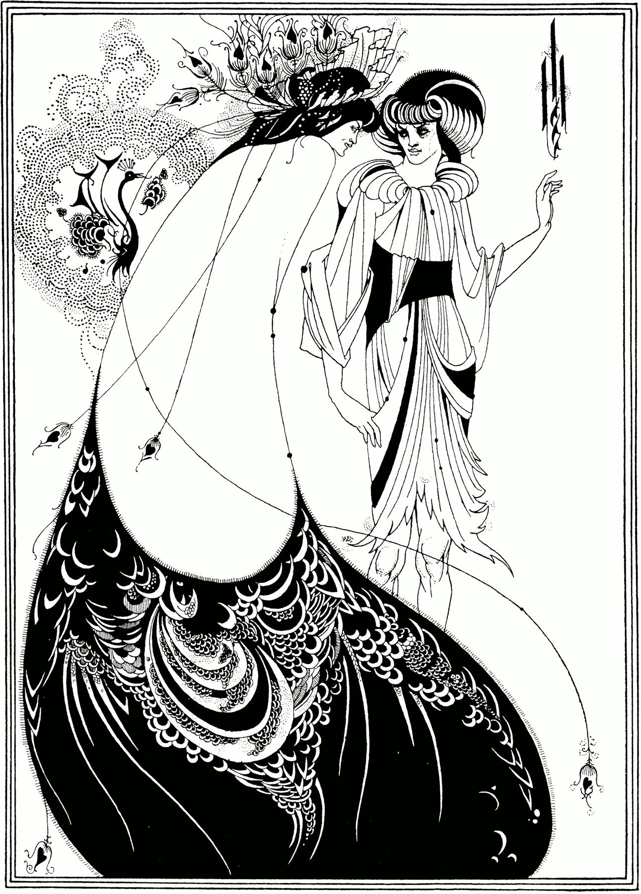
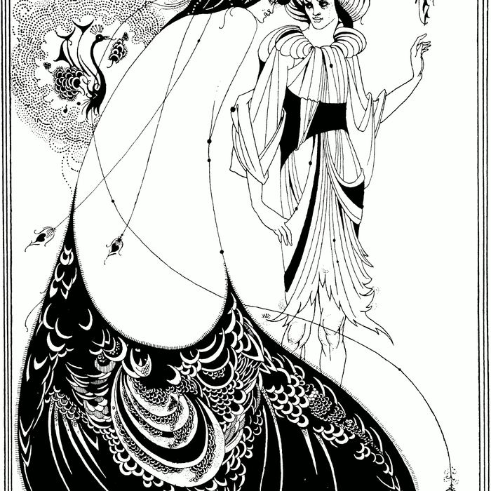
His illustrations for Oscar Wilde's Salomé are famously independent of the text. In The Peacock Skirt, patterned garments, hair and blank space make looking itself the subject. The figures appear less to enact a narrated incident than to stage rival performances of display. In The Climax, Salomé bends toward the severed head of John the Baptist while black hair, droplets and a circular moon organise desire and death into an emblem. The line is precise, but the meaning remains unstable. French scholarship emphasises the mixture of medieval, Pre-Raphaelite and Japanese sources through which Beardsley freely reinvented literary subjects.[17]
His career also reveals how fragile editorial freedom could be. He worked for publishers including J. M. Dent and John Lane, became art editor of The Yellow Book, and was dismissed after Wilde's arrest despite having no connection to the alleged offences. He later contributed to The Savoy and worked with Leonard Smithers.[18] The scandal did not simply happen outside the art. It affected commissions, distribution and the public meanings attached to black-and-white style.
Beardsley's early death at twenty-five intensified his legend, but his importance does not rest on biography. He showed that an illustration need not explain a text obediently. It could contradict, parody or outgrow it, turning mass reproduction into an arena for autonomous visual thought.
Rackham, Dulac and the colour gift book
The British colour gift book is one of the most recognisable products of the period. Improved three- and four-colour halftone processes made it possible to reproduce watercolour and wash with greater subtlety. Publishers issued substantial volumes as seasonal gifts, often with colour plates tipped onto separate sheets and protected by tissue. Exhibitions of the original drawings promoted the artist while book sales carried the images into homes.
Arthur Rackham moved from newspaper work into editions of the Grimm tales, Rip Van Winkle, Peter Pan in Kensington Gardens, Shakespeare and Wagner. His brown line coils through roots, joints and drapery, while thin washes make the supernatural seem embedded in ordinary matter. He also exhibited originals and remained highly productive through the 1910s and 1920s.[19]
Edmund Dulac favoured broader areas of saturated colour and distant, jewel-like spaces. Kay Nielsen pushed figures into elongated silhouettes and theatrical arrangements. Ivan Bilibin framed Russian subjects with ornamental systems drawn from vernacular sources. A survey of fantasy illustration therefore reveals an international field, not a single British house style.[20] Rackham's German editions of fairy tales and ghost stories further show that his reputation depended on translation and circulation beyond English-speaking markets.[21]
The First World War damaged the gift-book economy. Paper, printing labour and high-quality colour materials became harder to obtain, and luxury demand contracted. Illustration did not stop: artists contributed to patriotic and charitable publications. King Albert's Book assembled Rackham, Dulac, Nielsen, Parrish, Gibson, Crane and many others in support of Belgium.[22] But the material conditions that had sustained lavish annual volumes were altered. The war is therefore a turning point in infrastructure, not an abrupt stylistic ending.[11]
Howard Pyle and a school for visual storytelling
In the United States, expanding magazines created an enormous market for story illustration. Publishers sought images that could seize attention, clarify character and make a serial episode memorable. This market reflected the tastes of educated white middle-class readers even as it offered professional opportunities to both men and women.[23]
Howard Pyle became its central teacher. He wrote and illustrated books, worked for major magazines and argued that illustration was an art with its own demands. At Drexel Institute, in summer classes at Chadds Ford and later at his Wilmington studio, he trained students to imagine themselves inside a scene. His archive preserves correspondence, teaching records and exhibition material that make his institutional influence unusually visible.[24]
Pyle encouraged research into costume and setting, but accuracy was never the ultimate aim. A scene had to feel emotionally inevitable. Students were told to find the decisive instant and organise every gesture around it. This approach shaped a group now called the Brandywine School, including N. C. Wyeth, Frank Schoonover, Harvey Dunn, Jessie Willcox Smith, Elizabeth Shippen Green and Violet Oakley.[25]
Pyle's The Coming Tide, published in Harper's Monthly in 1909, demonstrates narrative compression. An older man and woman, once lovers, have been stranded by the rising sea. Their isolation forces an encounter with the life they did not share. A younger eloping couple approaches by boat, bringing rescue and an image of the choice the older pair failed to make. Pyle places bodies, rock and water so that past regret and imminent action occupy one climax. Preparatory studies show that the seeming spontaneity was carefully constructed.[26]
His pirates, medieval warriors and colonial scenes became popular memory. Their authority came from costume, weapons, dramatic light and bodily conviction, yet those details did not guarantee historical neutrality. Pyle made the past emotionally available to contemporary readers, which also meant selecting heroes, conflicts and viewpoints for them. Commercial storytelling could naturalise a national myth as powerfully as it animated adventure.
The international reach of American magazines complicates any claim that illustration was culturally secondary. The Delaware Art Museum preserves a letter in which Vincent van Gogh admired Pyle's work in Harper's. An image commissioned for a mass American periodical could enter the visual education of a European painter. Fine and commercial art were not sealed domains.
N. C. Wyeth and Treasure Island
N. C. Wyeth studied with Pyle and inherited his demand for narrative identification. For the 1911 edition of Robert Louis Stevenson's Treasure Island, he produced seventeen oil paintings on an unusually large scale. The paintings use forceful colour, broad light-dark divisions and legible gestures, qualities that survived reduction into book plates. Their popular and critical success established Wyeth's career, even as he remained troubled by illustration's lower status in the art world.[27]
The endpapers turn pirates into a procession. Dark silhouettes advance across a pale field, connected as a group but differentiated by hats, weapons, gait and bodily outline. Before the story begins, the book offers a compact theatre of menace and appetite. In All Day He Hung Round the Cove, Billy Bones stands against sea and cliff, his telescope extending watchfulness into the landscape. Jim Hawkins Leaves Home makes a doorway and backward glance carry the emotional cost of adventure.
Wyeth's compositions do not simply duplicate Stevenson's sentences. They establish character types and atmospheres that later stage, film and digital adaptations could reuse. Exhibitions of the full set have traced that continuing visual influence.[28] Their afterlife makes clear that an illustration can become a parallel version of a literary work, remembered even when readers forget the passage it first accompanied.
Wyeth worked as illustrator, muralist and painter, and his frustration with categories belongs to the period's hierarchy of prestige. A commission was often treated as compromise regardless of its invention. Modern scholarship has productively reunited these practices while also examining his generalised images of Native peoples. Objects and costumes could lend an appearance of authenticity while diverse cultures were compressed into a type designed for a national audience.[29]
Women build professional communities
Women were central to Golden Age illustration, not an exceptional supplement to a male story. The growing press needed images of fashion, fiction, domestic life, childhood, work and public events. Illustration could be more accessible than academy painting, but women still faced unequal training, restricted access to studios and models, and male-controlled publishers and professional organisations.[35]
Elizabeth Shippen Green, Jessie Willcox Smith and Violet Oakley met through Pyle's teaching and lived together for years at the Red Rose Inn and later Cogslea. The nickname “Red Rose Girls” can sound quaint, but their household was a serious professional infrastructure. Shared domestic arrangements, models, reference materials and mutual support helped three women maintain demanding careers. Green's exclusive contract with Harper's in 1901 placed her among the most successful American illustrators.[32]
Green's technique was inseparable from reproduction. For black-and-white halftone she developed richly worked charcoal drawings. For colour commissions she could fix the charcoal and add watercolour or oil. She maintained costumes and photographic or drawn references, and she adjusted her process to strict publishing deadlines.[33] The resulting images often feel unhurried because the labour behind them was highly organised.
Such adaptability was a form of authorship. It required the artist to predict what a screen would preserve, how a soft passage might close up in ink and where a contour needed strengthening. The often-repeated contrast between inspired fine art and compromised commercial work misses this anticipatory intelligence. Green was not merely supplying subject matter to a machine. She was composing through knowledge of what the machine, printer and paper would do.
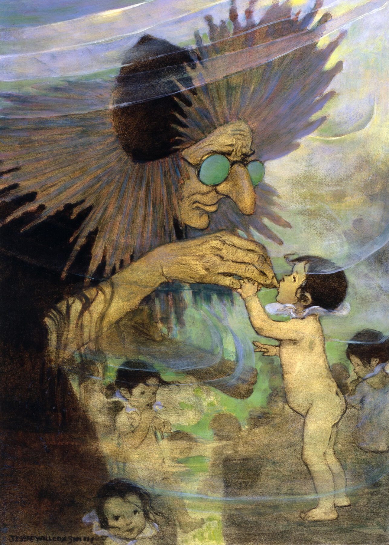
Smith specialised in childhood without treating children as small adults or sentimental symbols. In her 1916 illustrations to Charles Kingsley's The Water-Babies, she used mixed media and a child's visual scale. One plate places a small seated child beneath an immense yellow moon. The surrounding landscape is dark and spare; the moon seems close enough to become a face and companion. Rather than illustrate fantasy through crowded incident, Smith constructs an intimate exchange between child and cosmos.[30]
The twelve original colour illustrations survive together at the Library of Congress. Comparison with the published book reveals shifts of surface, colour and scale, reminding us that the lavish original and the printed plate are related but distinct works.[31] Smith's gift also preserves a production archive that ordinary readers rarely saw.
Women illustrated far more than children's literature. Alice Barber Stephens and Green worked for adult magazines; Mary Hallock Foote represented Western life; Violet Oakley made historical and civic subjects; Nell Brinkley drew an active popular heroine and wrote as well as illustrated. Library of Congress research shows women working across commerce, history, fashion, public life and political cartooning.[34] Their subjects should not be reduced to a supposedly feminine domestic sphere.
Even childhood images could carry public arguments. They defined the protected child, the adventurous child and the imaginative child for an expanding consumer culture. Clothes, rooms, books and toys located childhood within class. Smith's ability to make a child's bodily scale determine an entire landscape is formally sophisticated, but it also asks who is allowed time for wonder and who purchases the volume in which that wonder appears. Genre is not the opposite of social history.
Nor did professional success erase structural difference. Women often navigated editorial expectations about which subjects they could handle, how they should appear publicly and whether marriage was compatible with sustained work. Collective households could be practical answers to those conditions. The Red Rose Girls matter because their art was excellent and because their way of living exposed the support systems a career required.
The Gibson Girl: freedom as a marketable type
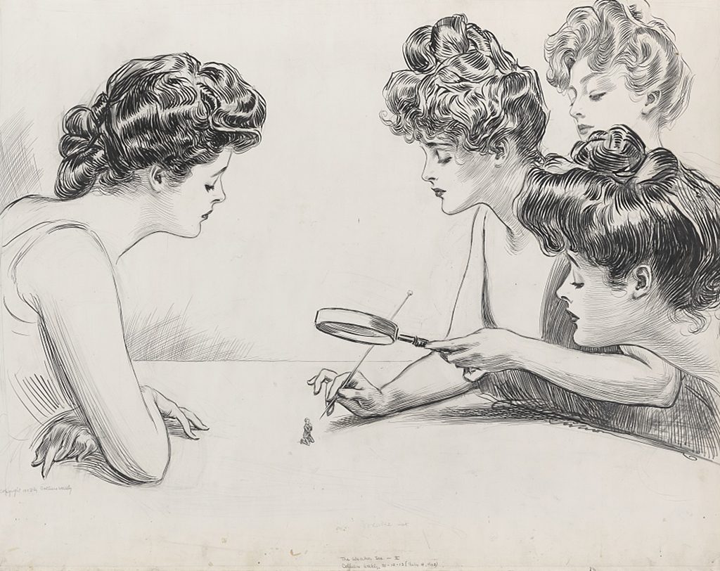
Charles Dana Gibson's drawings demonstrate the power of a reproducible social type. His confident pen line suited magazine printing, and the Gibson Girl became a recurring figure in Life, Collier's and other publications. Tall, composed, athletic and socially assured, she embodied aspects of the “New Woman” while moving easily through comedy, courtship and consumer culture.[36]
Her agency was genuine within the fiction. She attended college, played sport, travelled, judged men and often controlled the social encounter. Close examination of Gibson's originals also reveals extensive underdrawing beneath apparently spontaneous ink, a reminder that effortless modernity was carefully manufactured.[37]
Yet the type was both liberating and disciplinary. She prescribed whiteness, height, youth, fashionable dress and upper-middle-class leisure as the visible norm of American womanhood. Repeatability made the ideal commercially useful. Songs, plays, advertisements and products circulated it far beyond the magazine page.
Gibson did not own the entire field. Howard Chandler Christy, Harrison Fisher, Coles Phillips and John Held Jr. developed other beauty types, while Nell Brinkley's women could be more energetic and emotionally expressive. Women artists participated in and complicated this succession.[38] The imagery changed with fashion, but the business logic remained: a recognisable body could establish a publication's personality and target a consumer.
That targeting excluded as much as it invited. Scholarship on “American Beauty” images shows how class-coded ideals addressed consumers while working-class women and women of colour remained largely absent from glamour except as servants, caricatures or contrasts.[39] Collection records make women visible across occupations and stereotypes, but they also reveal which forms of labour rarely received heroic pictorial attention.[40] The popular image was never a neutral mirror of modern life.
Parrish and colour as a brand
Maxfield Parrish turned luminous colour, architectural fantasy and theatrical distance into an instantly recognisable identity. He worked for books, magazine covers, calendars, advertising and prints. Deep blue skies, amber light and carefully posed figures created a world that seemed removed from industrial production, even though sophisticated reproduction made its circulation possible.
His poster for Free to Serve: A Tale of Colonial New York is instructive because the object retains the chain behind its apparent magic: artist, author, publisher, printer and colour-lithographic process. The image was both literary invitation and commodity.[45] Parrish's brand was not simply a palette residing inside one painter. It was a repeatable agreement between design, printing and public recognition.
Like the gift-book artists, Parrish understood that colour had to survive translation. Clear silhouettes, staged depth and controlled contrasts remained legible when reduced. Reproductions then detached his imagery from its first commission, entering calendars and homes where viewers might know the visual world better than the story or product that had paid for it.
Leyendecker: magazine ritual and ideal masculinity
J. C. Leyendecker made magazine illustration into ritual. His hundreds of Saturday Evening Post covers attached images to holidays, seasons and national events, while his advertising transformed the Arrow Collar Man into a model of modern masculinity. Broad, crosshatched brushstrokes gave clothing and skin a polished sculptural presence. Charles Beach, Leyendecker's longtime companion, frequently served as model.[42]
The partnership complicates easy readings of the Arrow man. The figure is a commercial construction of affluent, disciplined heterosexual appeal, made in part through a queer domestic and artistic relationship. That does not mean every gesture contains a hidden code. It means the making of public ideals can involve private lives that the ideal itself excludes.
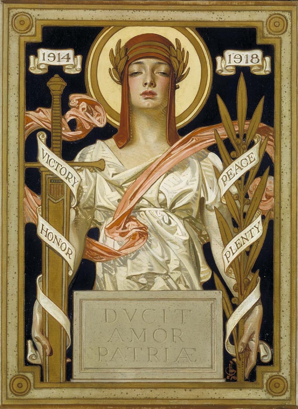
Leyendecker's 1918 Great War Victory image converts a magazine cover into civic allegory. A monumental figure, victory symbols and emphatic design address the viewer with the force of a poster.[43] Illustration here does not retreat from public history; it helps provide the symbolic form in which the event is consumed.
A 1922 clothing advertisement offers a harsher structure. A Black Pullman porter assists a white couple whose travel and clothing signify aspiration. The porter's service helps produce their ease, placing racialised labour inside the image of consumer success.[44] Technical brilliance does not sit apart from this hierarchy. It makes the hierarchy appear polished, natural and desirable.
Norman Rockwell inherited Leyendecker's ability to compress a story into a cover but shifted toward softer everyday comedy and sentiment. In Homecoming of 1924, a battered traveller and an ecstatic dog turn reunion into an instantly readable event.[46] Rockwell shows why the Golden Age does not end because a generation vanishes. Its narrative systems continued while their markets and tones changed.
Race, empire and national memory
Adventure, fairy tale and historical illustration offered readers forms of travel. They made remote landscapes, imagined medieval worlds and colonial encounters available at the breakfast table. Research into costume and weaponry could produce persuasive detail, but detail was not the same as neutral history. The images often invited white middle-class audiences to possess other times and places through vision.
Native peoples were frequently reduced to generic warriors, guides, threats or vanishing figures. An illustration of travellers filling water jars by Gayle Hoskins offers a revealing case. The source story rests on Euro-American stereotypes and eventually values a Native boy through white ancestry. Hoskins modified some sensational elements and represented reservation hardship, but the image could not escape the narrative framework it served.[41] Illustration may negotiate with a text without becoming independent of its politics.
Historical research can make this problem harder to notice. A convincing buckle, rifle, sail or garment creates trust, and the reader may extend that trust to the entire narrative. Yet material precision cannot answer who controls the scene, whose testimony is absent or why a conflict has been framed as adventure. The period's most effective storytellers understood how detail stabilised invention. Modern viewers can admire that skill while separating documentary information from ideological viewpoint.
British fantasy and historical books also operated within imperial culture. Eastern textiles, architecture and costume could become generalized signs of splendour or danger. Art Nouveau images made metropolitan femininity available as a consumable type. Wartime books converted artists from several nations into emblems of solidarity. None of this cancels formal beauty. It explains some of the social work beauty performed.
The term “Golden Age” should consequently be used with care. It describes a concentration of opportunity, skill and circulation, but opportunity was uneven. Publishers controlled access, deadlines could be severe, and repeated ideals of gender, race and class shaped who appeared as protagonist, consumer, labourer or background. A fuller history asks not only how compelling an image is, but for whom its world was designed.
Mucha, Riquer and international exchange
The Golden Age overlaps with Art Nouveau without being identical to it. Alphonse Mucha worked across posters, theatre publicity, calendars, magazines and decorative panels. Posed photographs helped him establish figures before drawing transformed hair, fabric, flowers and ornament into a continuous graphic system.[47] His practice shows that illustration could inhabit the street and stage as readily as a book.
Art Nouveau posters introduced new images of women to metropolitan public space while joining entertainment, advertising and commodity culture.[48] Their scale differed from the magazine page, but they shared the problem of immediate recognition. A passer-by and a newsstand reader both had to be stopped by shape, colour and type.
Alejandro de Riquer connects Barcelona's illustrated books, magazines, posters and ex-libris to British Pre-Raphaelite art and The Studio. His career makes exchange visible as an active process of reading, collecting and adaptation rather than passive “influence.”[49] Similar networks carried Rackham into German editions and brought artists of different national backgrounds into collaborative publications.
Even the name Art Nouveau changed from place to place. Italian conservation literature maps related terms across national traditions and emphasises magazines, books, posters and exhibitions as vehicles of diffusion.[50] No single capital owned this graphic language. Reproduction let motifs travel, while local publishers and artists changed their meanings.
War, 1930 and the afterlife
The First World War disrupted the British gift book through shortages, costs and the redirection of labour. It also gave illustrators new civic roles in posters, relief publications and patriotic allegory. In the United States, magazine cover culture remained powerful through the 1920s. Advertising continued to require ideal bodies, serial characters and stories compressed into a glance.
Around 1930, several conditions shifted together. Photography increasingly supplied news and advertising; cinema competed for visual narrative; economic depression changed publishing and luxury markets; new forms of graphic simplification altered page design. These changes justify a period boundary, but not a story of artistic death.
Illustration continued in magazines, comics, animation, pulp and paperback covers, advertising, concept art and children's books. Later artists inherited the Golden Age's lessons in silhouette, sequence, character and reproducibility. Museums also detached originals from commercial contexts and displayed them as drawings and paintings, which raised their status but could hide the printed page that made them socially powerful.
Digital collections now make another reunion possible. A reader can place a preliminary study beside the finished original, a progressive proof, a first edition and a later adaptation. This does not recreate the historical act of reading, but it exposes decisions that a single framed work conceals. It also changes attribution: engravers, printers, editors and publishers emerge from the margins of catalogues as participants in meaning.
The strongest definition of the Golden Age is therefore neither a list of beautiful fantasy books nor a claim that illustration was better before photography. It is a historical concentration of artists, industries and audiences. Reproductive technology expanded what an image could do, while the image in turn helped readers imagine childhood, gender, history, nation and desire.
How to look at Golden Age illustration
Begin by identifying the commission. Was the picture made for a novel, magazine story, cover, advertisement, poster or independent print? Its purpose establishes the audience and the kind of attention it expected.
Next, compare original and reproduction whenever possible. Note the original medium and size, then ask how reduction, cropping, paper and colour separation altered it. An oil painting may depend on broad value masses in print; a charcoal drawing may lose texture but gain tonal unity; a black-and-white design may become stronger when reduced.
Study the selected narrative instant. Illustrators rarely show an entire plot. They choose recognition, departure, danger, rescue or aftermath and use gesture to imply what came before and what follows. Look beyond the frame for the absent event.
Examine the relationship between text and image. Does the picture explain a sentence, contradict its tone, add a viewpoint or create a parallel fantasy? Beardsley often resists obedience; Pyle compresses; Smith changes scale by seeing with a child.
Notice the publication's rhythm. A plate after a page turn can delay revelation. An endpaper prepares a world before the first chapter. A magazine cover must tell enough of a story without any adjacent paragraph. A poster merges type and figure for distant viewing.
Identify collaboration. The illustrator may be the most visible name, but engraver, printer, colour separator, designer, editor and publisher contributed. Production records and progressive proofs make this collective labour tangible.
Finally, ask who is addressed and who is represented. Does the image assume wealth, whiteness, leisure or imperial access? Who acts, who consumes and who serves? Formal analysis becomes richer, not poorer, when style and social structure are read together.
Essential works of Golden Age illustration
Pirates Dividing the Treasure
Howard Pyle · published 1921 · A ring of bodies, glances and treasure turns historical costume into immediate narrative action, exemplifying Pyle's influence on American adventure imagery.
Le Petit Poucet
Gustave Doré · design first published 1862 · Monumental scale and an engulfing landscape transform Perrault's tale into a durable architecture of danger and childhood vulnerability.
The Peacock Skirt
Aubrey Beardsley · 1893–1894 · Pattern, black shape and active emptiness refuse obedient illustration and make display itself the visual drama.
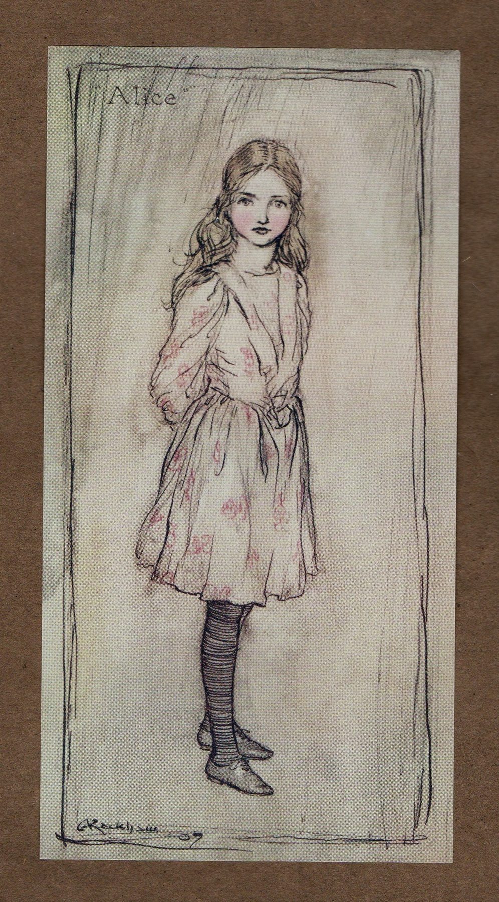
Alice
Arthur Rackham · 1907 · Coiling line, muted wash and an uncanny figure show how Rackham made the supernatural feel rooted in ordinary matter.
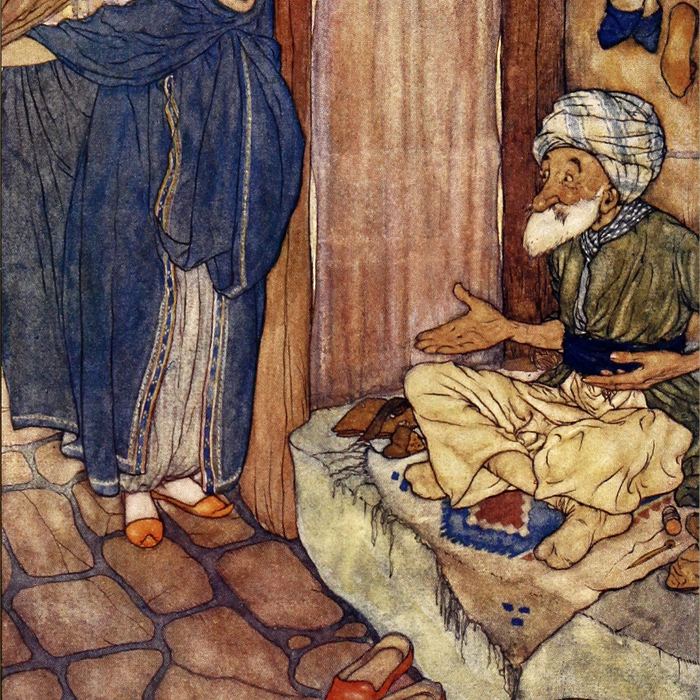
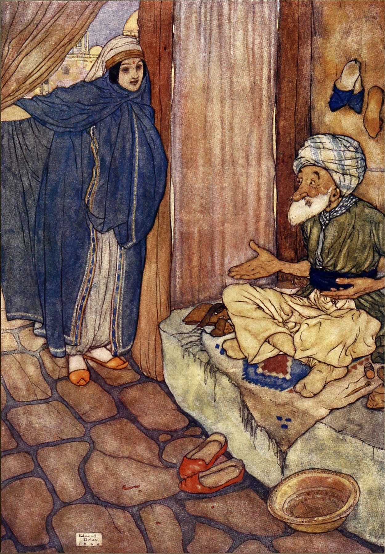
Illustration for Stories from the Arabian Nights
Edmund Dulac · 1907 · Broad colour zones and distant, jewel-like space demonstrate the visual luxury of the early twentieth-century gift book.
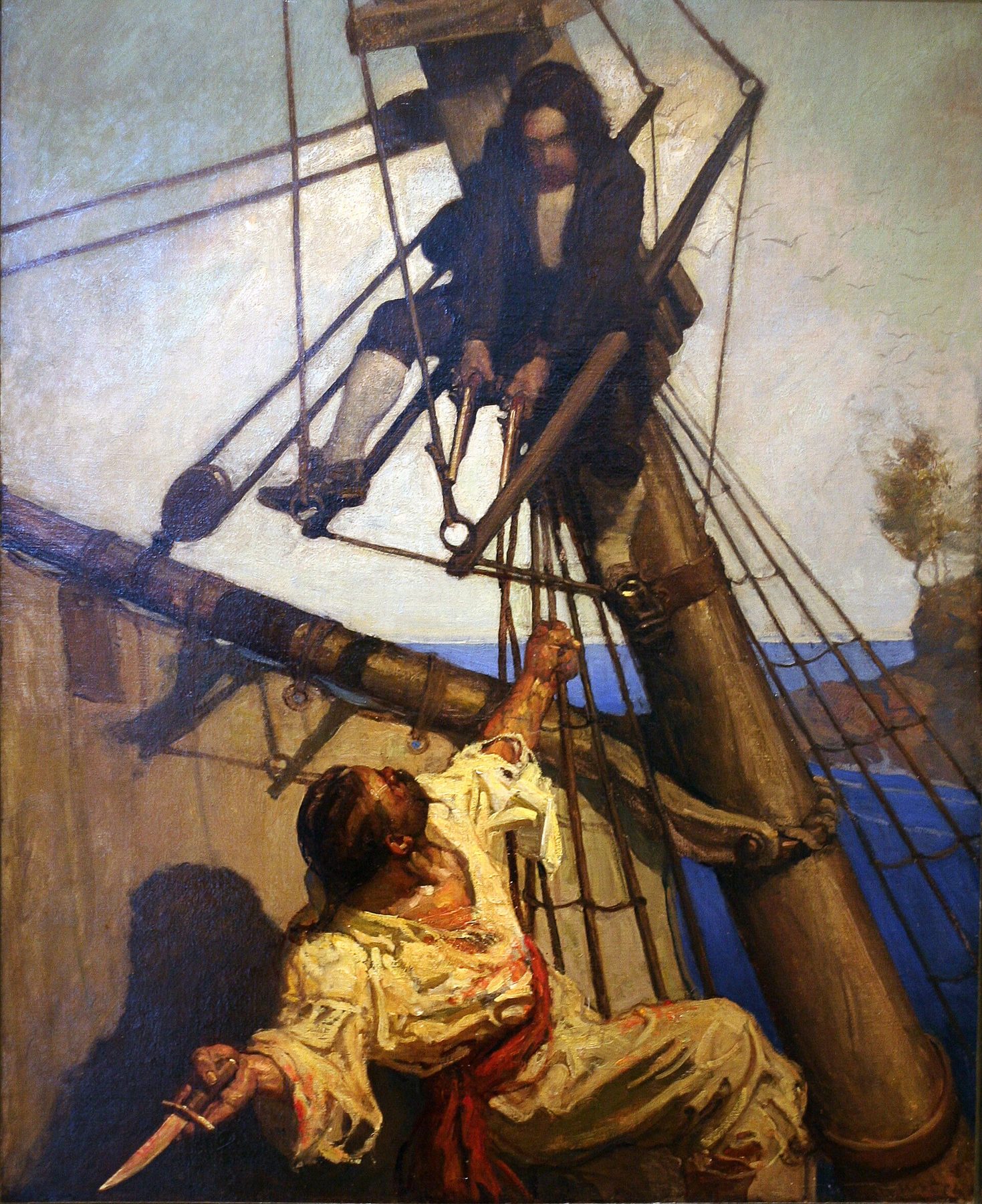
One More Step, Mr. Hands
N. C. Wyeth · 1911 · Forceful silhouette, directional light and a decisive confrontation preserve heroic scale after reduction to the printed plate.
Mrs. Bedonebyasyoudid
Jessie Willcox Smith · c. 1916 · Mixed media, bodily scale and intimate fantasy exemplify Smith's refusal to treat the child as a miniature adult.
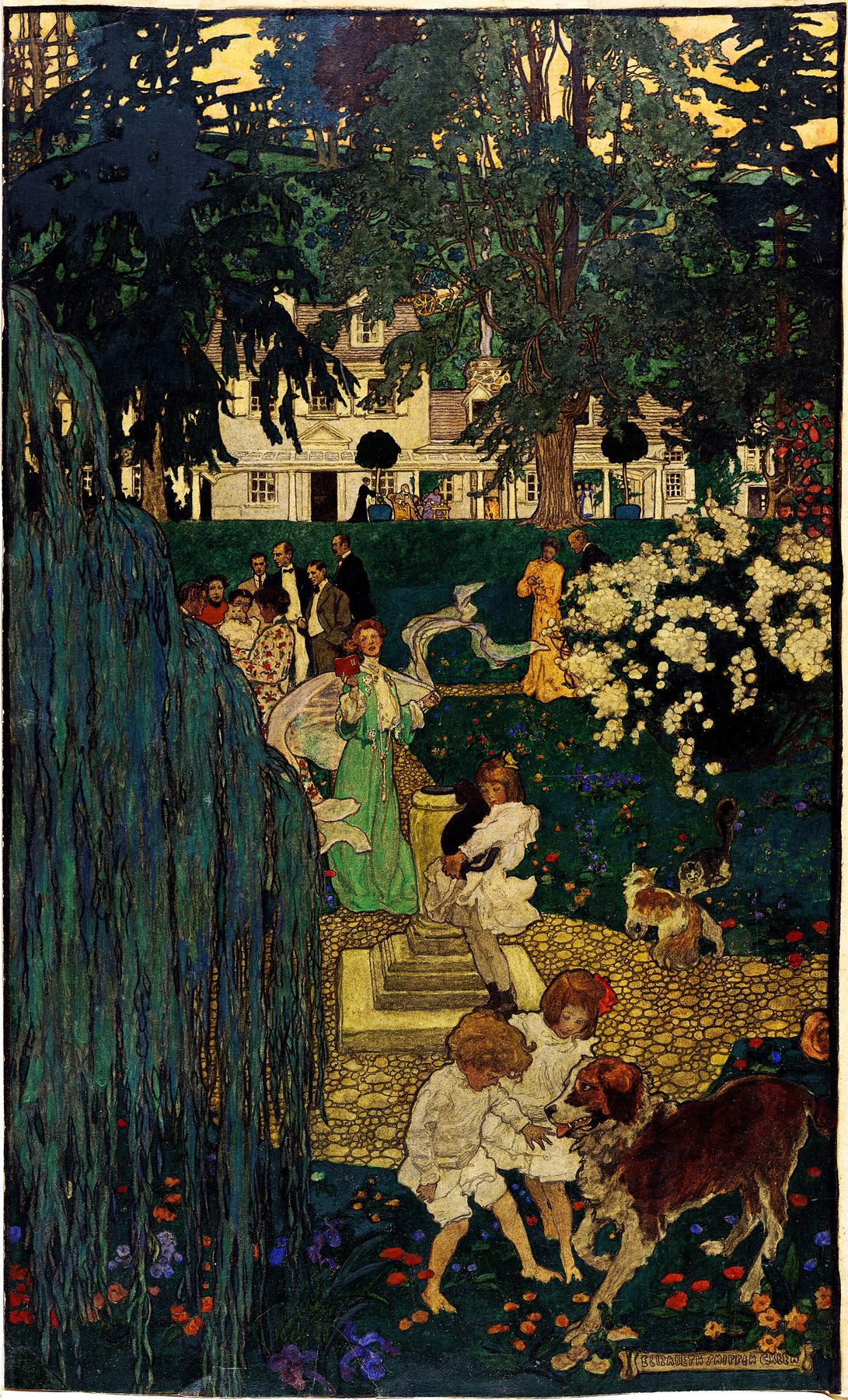
Life Was Made for Love and Cheer
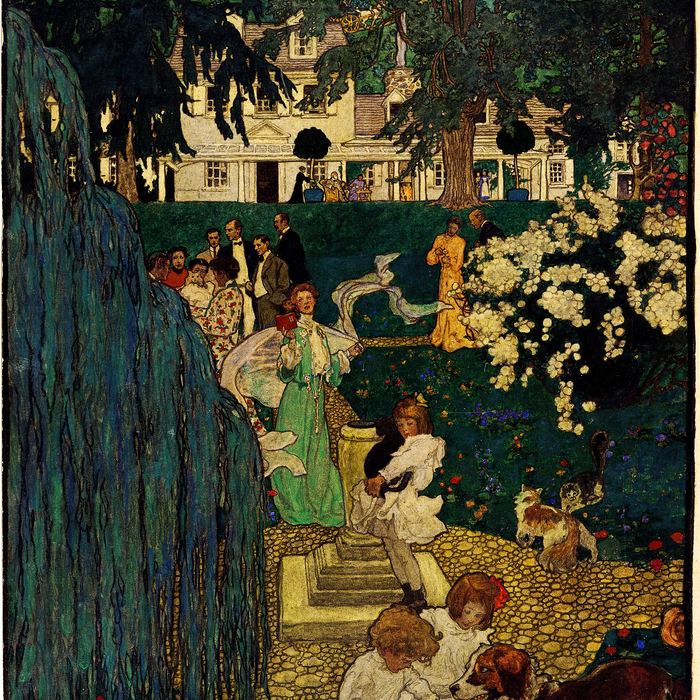
Elizabeth Shippen Green · 1904 · Green represents the Red Rose professional community in a work whose apparent ease depended on materials chosen for reproduction.
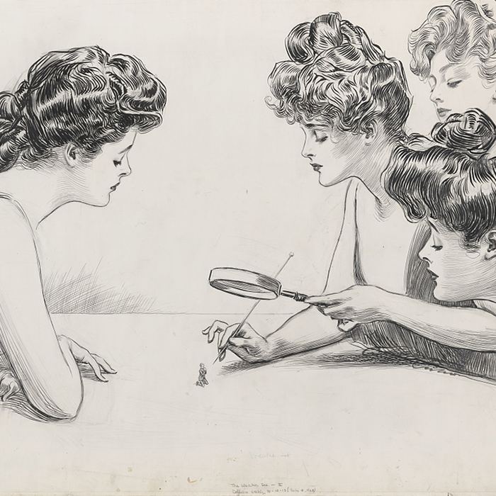
The Weaker Sex II
Charles Dana Gibson · 1903 · Confident pen line and social comedy turn the Gibson Girl into both an active participant and a repeatable consumer type.
Great War Victory Illustration
J. C. Leyendecker · 1918 · Crosshatched brushwork and monumental allegory convert a magazine cover into a patriotic public address.
Where to see Golden Age illustration
Delaware Art Museum, Wilmington. The essential destination for Howard Pyle and American illustration, with major works, manuscripts and artists connected to his teaching.
Brandywine Museum of Art, Chadds Ford. Holds major work by N. C. Wyeth and the Wyeth family and interprets the Brandywine tradition in the landscape where it developed.
Library of Congress, Washington, D.C. Its Cabinet of American Illustration and dedicated collections for Smith and Green unite original drawings with publishing research.
Norman Rockwell Museum, Stockbridge. Particularly useful for understanding how magazine narrative continued beyond the usual Golden Age boundary.
Victoria and Albert Museum, London. Strong for British book illustration, original drawings, printed books, design reform and the relation between image and decorative art.
British Museum, London. Important holdings and records for Beardsley, Rackham and the history of graphic art.
Musée d'Orsay, Paris. A valuable setting for Beardsley and the wider exchanges among illustration, Symbolism, print culture and fin-de-siècle design.
National Museum of American Illustration, Newport. Focuses on American illustration as an art and preserves significant work by Leyendecker and his contemporaries.
Displays change, and many illustrations remain light-sensitive. Check current galleries and exhibitions before travelling. Digital collections are especially valuable because they can reunite originals, printed editions and archival records that cannot always be shown together.
Where to see Golden Age illustration
Displays rotate and many works are light-sensitive. Check current galleries and exhibitions before travelling.
- 01
Delaware Art Museum
Wilmington, USA
The essential destination for Howard Pyle and American illustration, with major works, manuscripts and artists connected to his teaching.
Howard Pyle and American illustrationVisit collection website - 02
Brandywine Museum of Art
Chadds Ford, USA
Major N. C. Wyeth holdings place the Brandywine tradition in the landscape and teaching network where it developed.
N. C. Wyeth and the Brandywine traditionVisit collection website - 03
Library of Congress
Washington, D.C., USA
The Cabinet of American Illustration and dedicated Smith and Green collections unite original drawings with publishing research.
Original art and publishing archivesVisit collection website - 04
Norman Rockwell Museum
Stockbridge, USA
Its collection clarifies how magazine narrative continued beyond the conventional Golden Age boundary.
Magazine illustration after 1920Visit collection website - 05
Victoria and Albert Museum
London, UK
British book illustration, original drawings, printed books and design reform can be studied across object types.
British illustration and designed booksVisit collection website - 06
British Museum
London, UK
Important Beardsley and Rackham holdings connect individual sheets to the longer history of graphic art.
Beardsley, Rackham and graphic artVisit collection website - 07
Musée d'Orsay
Paris, France
A valuable setting for Beardsley and wider exchanges among illustration, Symbolism and fin-de-siècle design.
Fin-de-siècle graphic exchangeVisit collection website - 08
National Museum of American Illustration
Newport, USA
A specialist collection treating American illustration as art, with significant work by Leyendecker and his contemporaries.
American illustration and LeyendeckerVisit collection website
Suggested books
Walt Reed, The Illustrator in America, 1860–2000. A broad reference history of American practitioners, useful for tracing careers across changing publishers and markets.
Susan E. Meyer, A Treasury of the Great Children's Book Illustrators. A generously illustrated route through major book artists and the relation between style, story and production.
Martha H. Kennedy, Drawn to Purpose: American Women Illustrators and Cartoonists. An important corrective to male-centred histories, spanning professional conditions, subjects and graphic fields.
Douglas Allen and Douglas Allen Jr., N. C. Wyeth: The Collected Paintings, Illustrations, and Murals. A substantial catalogue for following Wyeth beyond a handful of famous adventure images.
Alice A. Carter, The Red Rose Girls: An Uncommon Story of Art and Love. A focused account of Green, Smith and Oakley and the professional community that sustained their work.
Major artists of the Golden Age of Illustration
| Name | Nationality | Key Works |
|---|---|---|
| Alejandro de Riquer | Spanish | bookplates · posters and illustrated books |
| Alice Barber Stephens | American | The Women of the French Salons · adult magazine illustration |
| Alphonse Mucha | Czech | Job Cigarettes · theatre posters and decorative panels |
| Arthur Rackham | British | Alice's Adventures in Wonderland · Rip Van Winkle |
| Aubrey Beardsley | British | The Peacock Skirt · The Climax |
| Charles Dana Gibson | American | The Weaker Sex II · Gibson Girl drawings |
| Coles Phillips | American | Fadeaway Girl magazine and advertising images |
| Edmund Dulac | French-British | Stories from the Arabian Nights · The Tempest |
| Elizabeth Shippen Green | American | Life Was Made for Love and Cheer · Harper's illustrations |
| Frank Schoonover | American | adventure and historical magazine illustration |
| Gayle Hoskins | American | They Stopped at a Water-Hole and Filled the Ollas |
| Gustave Doré | French | Contes de Perrault · La Sainte Bible |
| Harrison Fisher | American | American beauty and magazine-cover imagery |
| Harvey Dunn | American | The Prairie Is My Garden · wartime illustration |
| Howard Chandler Christy | American | Christy Girl · wartime posters |
| Howard Pyle | American | The Coming Tide · Book of Pirates |
| Ivan Bilibin | Russian | Vasilisa the Beautiful · Russian fairy-tale books |
| J. C. Leyendecker | German-American | Great War Victory · Arrow Collar Man |
| Jessie Willcox Smith | American | The Water-Babies · children's-book plates |
| John Held Jr. | American | Jazz Age and flapper magazine imagery |
| Kate Greenaway | British | Under the Window · A Day in a Child's Life |
| Kay Nielsen | Danish | East of the Sun and West of the Moon · In Powder and Crinoline |
| Mary Hallock Foote | American | Western life in books and magazines |
| Maxfield Parrish | American | Free to Serve · Dream Castle in the Sky |
| N. C. Wyeth | American | Treasure Island · Robin Hood |
| Nell Brinkley | American | Brinkley Girl newspaper narratives |
| Norman Rockwell | American | Homecoming · Saturday Evening Post covers |
| Randolph Caldecott | British | The Diverting History of John Gilpin · picture books |
| Violet Oakley | American | civic murals · historical illustration |
| Walter Crane | British | The Baby's Opera · illustrated books and page design |
Frequently Asked Questions
A practical international date range is about 1880 to 1930. British accounts sometimes concentrate on the colour gift-book boom from the 1890s to the First World War or the 1920s. American accounts often extend through the magazine culture of the 1920s. Earlier artists such as Doré, Crane, Caldecott and Greenaway created essential foundations.
Not in the strict sense. It had no common manifesto, membership or visual style. It is a retrospective period category describing artists who worked within related publishing markets and reproductive technologies. Calling it a movement can be convenient, provided that diversity is made clear.
Growing literacy, leisure and national publishing markets created demand, while photomechanical halftone made tonal drawings and paintings easier to reproduce. The date is approximate because wood-engraved illustrated papers and major book projects had already developed the audience.
A halftone translates continuous tones into dots of different sizes or densities. Viewed at normal distance, the dots merge into shades. The process allowed photographs, charcoal, wash and painting to be printed on commercial presses, but paper, screen and ink still affected the result.
Illustration is usually made for reproduction in relation to a text, publication, event or product. That purpose does not determine quality or medium: an illustration may be a large oil painting or highly finished drawing. “Fine art” and “commercial art” were status categories as much as descriptions of artistic practice.
No. Children's books were highly visible, especially in Britain, but illustrators also worked on adult fiction, history, news, satire, fashion, magazine covers and advertising. Some artists moved freely among several fields.
Elizabeth Shippen Green, Jessie Willcox Smith and Violet Oakley were former Pyle students who lived and worked together near Philadelphia. Their shared household supported three major professional careers at a time when women faced unequal access to training and institutions.
The term describes Howard Pyle and artists shaped by his teaching around Philadelphia, Chadds Ford and Wilmington. It is known for dramatic narrative, strong character and researched historical settings. It was a network and teaching tradition, not a style every student followed identically.
Japanese prints offered European and American artists alternatives to academic modelling: flat shapes, active negative space, asymmetry, cropping and emphatic contour. Beardsley is a particularly clear example, but artists adapted these devices selectively within different publishing contexts.
Deluxe gift books made colour illustration a seasonal commodity and a prestigious artistic field. Separate plates, handsome bindings and exhibitions of originals promoted illustrators as named creators. Their cost also reveals the tension between mass circulation and luxury design.
Photography changed news, advertising and documentation, but it did not eliminate illustration. Cinema, economic depression and new graphic styles also changed markets. Illustration continued in magazine covers, comics, animation, paperbacks, children's publishing and advertising.
The period produced extraordinary work and broad opportunities, but its prosperity was unequal. Publishers held power, deadlines were demanding, and mass images often repeated narrow ideals of race, class, gender and empire. The label is useful when it describes historical concentration rather than universal benefit.
Discussion
Which Golden Age illustration has stayed with you most strongly: a book plate remembered from childhood, a magazine cover, a poster or an original drawing seen in a museum? Consider what changed when it moved from the artist's hand into print, and whether the reproduced image or the original now feels like the primary work.
Reader Insights
Place the image back beside its text, caption, advertisements or page turn and ask which meanings disappear when the original is framed alone.
Compare drawing or painting with the printed image, noting what reduction, screen, paper, ink and colour separation preserve or alter.
Identify who acts, consumes or serves, and whether narrative confidence depends on repeated ideals of gender, race, class or empire.
Join the Conversation
Which illustrated book, magazine cover or poster first made you notice that reproduction can be an artistic condition rather than a loss?
References
- Cabinet of American Illustration: Introduction, Library of Congress, View Source
- American Illustration and the Art of Howard Pyle, Delaware Art Museum, View Source
- Illustrated English Language Periodicals, Library of Congress, View Source
- Picture Processes: A Chronology, Library of Congress, View Source
- Illustrated Book Study: Printed Illustrations, Library of Congress, View Source
- Illustrated Book Study: Halftone Conversion, Library of Congress, View Source
- Prang's Prize Babies, Metropolitan Museum of Art, View Source
- Lithography in the Nineteenth Century, Metropolitan Museum of Art (Portuguese and English; consulted in Portuguese and English), View Source
- The Metropolitan Museum of Art Guide to the Collections: Prints, Metropolitan Museum of Art, View Source
- Illustration: Explore the Collections, Victoria and Albert Museum, View Source
- Wartime Fairy Tales, Victoria and Albert Museum, View Source
- Arts and Crafts: An Introduction, Victoria and Albert Museum, View Source
- Wallpapers for Children, Victoria and Albert Museum, View Source
- Les Contes de Perrault illustrés par Gustave Doré: research programme, Bibliothèque nationale de France (French; consulted in French), View Source
- Contes illustrés par Doré, Bibliothèque nationale de France (French; consulted in French), View Source
- La Sainte Bible selon la Vulgate avec les dessins de Gustave Doré, Bibliothèque nationale de France (French; consulted in French), View Source
- Aubrey Beardsley 1872–1898, Musée d'Orsay (French; consulted in French), View Source
- Aubrey Beardsley, British Museum, View Source
- Arthur Rackham, British Museum, View Source
- Illustration and Fantasy, Metropolitan Museum of Art, View Source
- Arthur Rackham, Deutsche Digitale Bibliothek (German; consulted in German), View Source
- King Albert's Book, Metropolitan Museum of Art, View Source
- American Illustration, Delaware Art Museum, View Source
- Howard Pyle Manuscript Collection, Delaware Art Museum, View Source
- Howard Pyle, Delaware Art Museum, View Source
- The Coming Tide, Delaware Art Museum, View Source
- N.C. Wyeth Biography, Brandywine Museum of Art, View Source
- N.C. Wyeth's Treasure Island, Brandywine Museum of Art, View Source
- N.C. Wyeth: New Perspectives, Brandywine Museum of Art, View Source
- Seeing with a Child's Eyes, Library of Congress, View Source
- The Water-Babies: Illustrations by Jessie Willcox Smith, Library of Congress, View Source
- About Elizabeth Shippen Green, Library of Congress, View Source
- Elizabeth Shippen Green: Working Methods, Library of Congress, View Source
- Golden Age of Illustration, Library of Congress, View Source
- Drawn to Purpose, Library of Congress, View Source
- The Gibson Girl's America: Overview, Library of Congress, View Source
- The Gibson Girl as the New Woman, Library of Congress, View Source
- American Beauties: Overview, Library of Congress, View Source
- The Marketing of the American Beauty, Library of Congress, View Source
- Cabinet of American Illustration: American Women, Library of Congress, View Source
- They Stopped at a Water-Hole and Filled the Ollas, Delaware Art Museum, View Source
- J.C. Leyendecker, National Museum of American Illustration, View Source
- Great War Victory Illustration for The Saturday Evening Post, Smithsonian American Art Museum, View Source
- Advertisement Featuring a Pullman Porter, National Museum of African American History and Culture, View Source
- Free to Serve: A Tale of Colonial New York, Metropolitan Museum of Art, View Source
- Homecoming, Smithsonian American Art Museum, View Source
- Study for a Decorative Panel, Metropolitan Museum of Art, View Source
- Art Nouveau, Metropolitan Museum of Art, View Source
- Alejandro de Riquer, Museo Nacional del Prado (Spanish; consulted in Spanish), View Source
- Glossario del libro: Art Nouveau, Ministero della Cultura (Italian; consulted in Italian), View Source
- Golden Age of Illustration image records, Wikimedia Commons: Pirates Dividing the Treasure (Public domain; Wikimedia Commons), Le Petit Poucet (Public domain; Wikimedia Commons), The Peacock Skirt (Public domain; Fogg Art Museum; Wikimedia Commons), Alice (Public domain; Wikimedia Commons), Illustration for Stories from the Arabian Nights (Public domain scan; Wikimedia Commons), One More Step, Mr. Hands (Public domain; New Britain Museum of American Art; Wikimedia Commons), Mrs. Bedonebyasyoudid (No known restrictions; Library of Congress; Wikimedia Commons), Life Was Made for Love and Cheer (Public domain; Library of Congress; Wikimedia Commons), The Weaker Sex II (Public domain; Library of Congress; Wikimedia Commons), Great War Victory Illustration (Public domain; Smithsonian American Art Museum; Wikimedia Commons).