 by Tom Gurney
Tom Gurney BSc (Hons) is an art history expert with over 20 years experience
Published on August 14, 2026 / Updated on August 14, 2026
Email: tomgurney1@gmail.com / Phone: +44 7429 011000
Paul Gauguin: Style and Technique: Introduction
Gauguin's style is often compressed into a handful of recognisable traits: strong outlines, broad areas of colour, little conventional depth and a matte, decorative surface. Those features matter, but they describe an appearance rather than a working method. Technical examination reveals an artist who varied paint thickness, wiped and scraped layers, shifted figures by tracing and transfer, tested motifs in several sketchbooks, and remade images through print, clay and carved wood. [1]
At a Glance
- ArtistPaul Gauguin
- GuidePaul Gauguin: Style and Technique
- FocusStyle and Technique
- Key topicsColour and contour construct the space; Surfaces made by adding and taking away; Drawing, transfer and the travelling motif; Prints are made objects, not copies
- OverviewGauguin's style is often compressed into a handful of recognisable traits: strong outlines, broad areas of colour, little conventional depth and a matte, decorative surface.
Contents
- Paul Gauguin: Style and Technique: Introduction
- Colour and contour construct the space
- Surfaces made by adding and taking away
- Drawing, transfer and the travelling motif
- Prints are made objects, not copies
- Clay and movement between media
- How to look at a Gauguin surface
Works for Close Looking
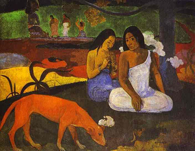
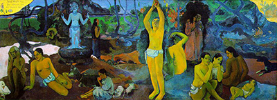
There is no single recipe behind a Gauguin painting. One surface may look dry and restrained; another contains raised paint and broken texture. A composition that seems spontaneous may depend on an older drawing, a reversed print or a figure carried from another work. Even the apparently simple contour can be the final edge of repeated adjustment. Looking closely at how the objects were made replaces the myth of instinctive simplicity with a practice based on selection, reuse and material experiment.
Colour and contour construct the space
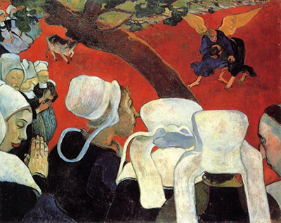
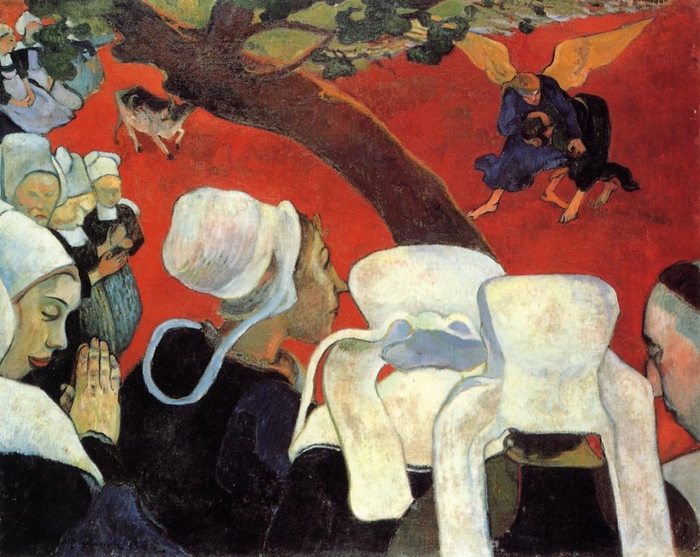
Gauguin increasingly used colour as a structural force rather than a finish applied after drawing. In Vision after the Sermon, the red ground does not describe the natural colour of a Breton field. It makes the imagined wrestling match occupy a distinct pictorial zone while tying that vision to the worshippers crowded across the foreground. The diagonal tree is at once a recognisable trunk, a border and a device that holds the compressed scene together. [12]
This kind of colour works through relation. A red appears more intense beside dark clothing and pale bonnets; a green or blue can separate one shape from another without gradual shading. Pronounced contours reinforce the divisions, yet they do more than enclose flat patches. Their width, rhythm and direction guide the eye, lock figures into a pattern or make one form push against the next.
The same tools could reorganise an ordinary subject. In Still Life with Three Puppies, blue outlines, repeated pattern and abrupt changes of scale make the tabletop difficult to read as stable space. The puppies, fruit, vessels and cloth remain identifiable, but their proportions and positions follow the design of the picture instead of a consistent viewpoint. [13] Gauguin could therefore reduce conventional modelling without abandoning observation. He selected from what he had seen, then altered colour and spatial logic to control emphasis.
Describing these pictures as merely “flat” misses an important tension. Many retain hints of volume, overlap and recession, but these cues do not agree perfectly. A body may have weight while the ground behind it rises steeply; a dark contour may make a figure project and simultaneously bind it to the surface. Gauguin's construction is powerful because recognisable things and assertive design remain in friction.
Surfaces made by adding and taking away
The physical surfaces are even less uniform than reproductions suggest. Conservation study of Te raau rahi records passages containing textured lead white, changes in brush handling and effects produced through thicker paint, tapping or dabbing, and wiping. [2] Paint can stand in relief, break into granular marks or become thin enough for lower material to influence the colour. What appears from a distance as one broad zone may be a varied record of pressure and removal.
Technical evidence from Mahana no atua identifies another range of decisions. Gauguin used a palette knife in parts of the painting, spreading or flattening paint with a metal blade alongside brushwork. The examination also reveals transferred or traced elements and revisions to the arrangement. [3] The completed frieze-like order was thus reached through movement and correction. Its clarity does not mean that the entire design arrived at once.
In Merahi metua no Tehamana, analysis links a waxy, beeswax-containing surface coating to aspects of the painting's matte appearance. The catalogue also records wiping and scraping in the worked surface. [4] These findings are specific to the object. They should not be turned into a rule that every Tahitian-period painting received the same coating or that matte paint carried one fixed meaning. They do show how finish can result from several operations: the absorbency of the ground, the thickness of the paint, material removed during work and coatings added over it.
Scraping and wiping are creative acts as well as subtractions. Dragging material away can expose an underlayer, soften a transition or disturb a solid area. A palette knife can level one passage while leaving an edge or ridge elsewhere. Gauguin used such differences to prevent large colour shapes from becoming inert. Surface variation gives the eye small changes to register even where the composition reads in bold blocks.
This evidence also warns against reading facture as a direct measure of emotion. A rough patch is not automatically anger; a smooth one does not prove calm. Technical study can establish materials and sequence more securely than it can recover a private state of mind. Interpretation begins with what the object supports.
Drawing, transfer and the travelling motif
Drawing was not confined to a preliminary sketch made before a painting. Art Institute of Chicago research identifies at least seven sketchbooks that Gauguin used concurrently. A figure or pose could pass among a sketchbook, monotype, transfer drawing, canvas or carving, changing direction, scale and setting as it travelled. [6] The sequence was often a network rather than a straight route from study to finished work.
A transfer drawing titled Seated Female makes that mobility visible. Its figure connects through an intermediary source to a work by Delacroix, while Gauguin's process carried and altered the motif again. [5] Transfer allowed an existing outline to become new working material. Reversal, pressure and redrawing could distance the later image from its source without erasing the relationship.
This practice changes the meaning of repetition. When a figure returns, it need not indicate that the artist ran out of ideas or assigned the body one permanent symbolic role. Reuse offered a way to test what happened when a pose entered a different scale, colour structure or narrative. The same contour could serve a study of movement in one object and become part of a densely symbolic arrangement in another.
Traced or transferred forms also coexist with revision. The technical record for Mahana no atua shows that moving a motif onto the canvas did not finish the decision. [3] Edges could be shifted and surrounding relationships rebalanced. Mechanical assistance and handwork are not opposites here: transfer established a possibility that paint could confirm, modify or partly conceal.
The material of the drawing matters too. A work such as Seated Breton Woman uses laid paper whose ribbed texture affects the marks above it. Some drawing media are friable—loosely bound and easily disturbed—so the surviving sheet carries both Gauguin's handling and the history of its preservation. [11] Paper is not an invisible carrier. Its colour, tooth, thickness and vulnerability participate in what viewers see.
Prints are made objects, not copies
Printmaking expanded this interest in reuse because one matrix could yield related but non-identical results. Gauguin could cut, draw, ink, press, retouch and print again. A “state” records a stage after the matrix has been altered; an “impression” is an individual sheet pulled from it. Paper, ink, pressure and hand additions can distinguish one impression from another even when they share a matrix.
Human Miseries is a zincograph: a lithographic image made from a zinc plate rather than a stone. Gauguin worked with greasy lithographic crayon and tusche, a liquid material capable of wash-like tone, and printed on chrome-yellow paper. The Art Institute catalogue describes the granular result with the workshop phrase peau de crapaud, or “toad skin.” [7] The coloured support and broken marks are active parts of the image, not neutral packaging around it.
The Noa Noa print Te po (The Night) provides further evidence of unconventional printing and transfer on selected paper. [8] Variation belongs to the work's identity. An online image that represents one sheet cannot silently stand for every state and impression; exact object records are necessary when discussing ink, colour, additions or condition.
This experimental approach helps explain why prints should not be treated as lesser versions of paintings. The resistance of a block or plate, the reversal produced by printing and the behaviour of ink created effects unavailable on canvas. Repetition became transformation. MoMA's Gauguin: Metamorphoses accordingly placed prints and transfer drawings at the centre of a practice that also encompassed painting and sculpture. [10]
Clay and movement between media
Gauguin's work with Ernest Chaplet from 1886 brought him into another set of material negotiations. The ceramics could be built by joining coils or flattened slabs of clay, allowing forms that deliberately avoided perfect regularity. Slips—liquid clay coatings—and glazes fused during firing created contrasts of colour and finish. The iron-rich body and deliberately handled walls remained visible parts of the object. [9]
Chaplet's role matters. Ceramic work depends on workshop knowledge, drying and firing as well as on the person who models or decorates a form. Attributing every technical result to Gauguin alone would repeat the lone-maker story that also distorts his collaborations in painting and print. [9]
Clay encouraged designs that changed as an object was turned in the hand. A contour that reads as a boundary in a painting can become an actual ridge; a face can project from a vessel; glaze can pool in recesses and thin over raised areas. Carving offered related transitions between image and object. Motifs could move across these media, but the receiving material altered them each time. [1] [10]
That cross-media movement is one of the most consistent features of Gauguin's technique. He did not simply invent a composition, preserve it in a painting and reproduce it elsewhere. He treated an existing image as a store of possibilities. Transfer, reversal, pressure, carving, firing and new colour relations could make it unfamiliar again.
How to look at a Gauguin surface
A useful close reading begins before interpretation. Notice whether a contour is even or changes pressure; whether a broad colour area is truly uniform; whether paint sits high, sinks into the support or has been wiped back. Look for repeated poses and ask what changed in scale, direction and setting. With a print, identify the state and impression. With ceramic work, follow the form around its sides and distinguish clay body, slip and glaze.
Scale and light also matter. A screen image can make raised paint look flat, suppress the difference between gloss and matte passages, and hide the weave or grain of a support. Enlarging a detail solves only part of the problem: it may reveal a scraped edge while removing its relation to the whole composition. Catalogue photography, technical imaging and conservation reports are therefore companions to direct looking, not replacements for it. [1] Moving between overall view and detail is especially useful with Gauguin because bold designs often depend on quiet changes inside apparently simple areas.
These questions do not turn viewing into laboratory work. They reconnect visual effect with physical choice. Gauguin's colour can be immediate, but the objects resist the legend of effortless instinct. Their force comes from a restless practice of making, removing, carrying across and making again.
Related Pages
Frequently Asked Questions
Gauguin's style is often compressed into a handful of recognisable traits: strong outlines, broad areas of colour, little conventional depth and a matte, decorative surface.
This practice changes the meaning of repetition.
These questions do not turn viewing into laboratory work.
Discussion
Gauguin's style is often compressed into a handful of recognisable traits: strong outlines, broad areas of colour, little conventional depth and a matte, decorative surface.
Reader Insights
Gauguin's style is often compressed into a handful of recognisable traits: strong outlines, broad areas of colour, little conventional depth and a matte, decorative surface.
Transfer allowed an existing outline to become new working material.
Their force comes from a restless practice of making, removing, carrying across and making again.
Join the Conversation
Share the visible detail or source that most changed your reading.
References
- Gloria Groom and Genevieve Westerby, eds., Gauguin Paintings, Sculpture, and Graphic Works at the Art Institute of Chicago, Art Institute of Chicago, 2016 View source
- Art Institute of Chicago, “Te raau rahi,” catalogue and technical entry View source
- Art Institute of Chicago, “Mahana no atua (Day of the God),” catalogue and technical entry View source
- Art Institute of Chicago, “Merahi metua no Tehamana,” catalogue and technical entry View source
- Art Institute of Chicago, “Seated Female,” transfer-drawing entry View source
- Art Institute of Chicago, “Gauguin's Sketchbooks,” catalogue entry View source
- Art Institute of Chicago, “Human Miseries,” catalogue and technical entry View source
- Art Institute of Chicago, “Te po (The Night),” Noa Noa print entry View source
- Art Institute of Chicago, “Gauguin's Ceramics and Ernest Chaplet,” catalogue entry View source
- Museum of Modern Art, “Gauguin: Metamorphoses.” View source
- Art Institute of Chicago, “Seated Breton Woman,” drawing entry View source
- National Galleries of Scotland, “Vision of the Sermon (Jacob Wrestling with the Angel).” View source
- Museum of Modern Art, “Paul Gauguin: Still Life with Three Puppies.” View source
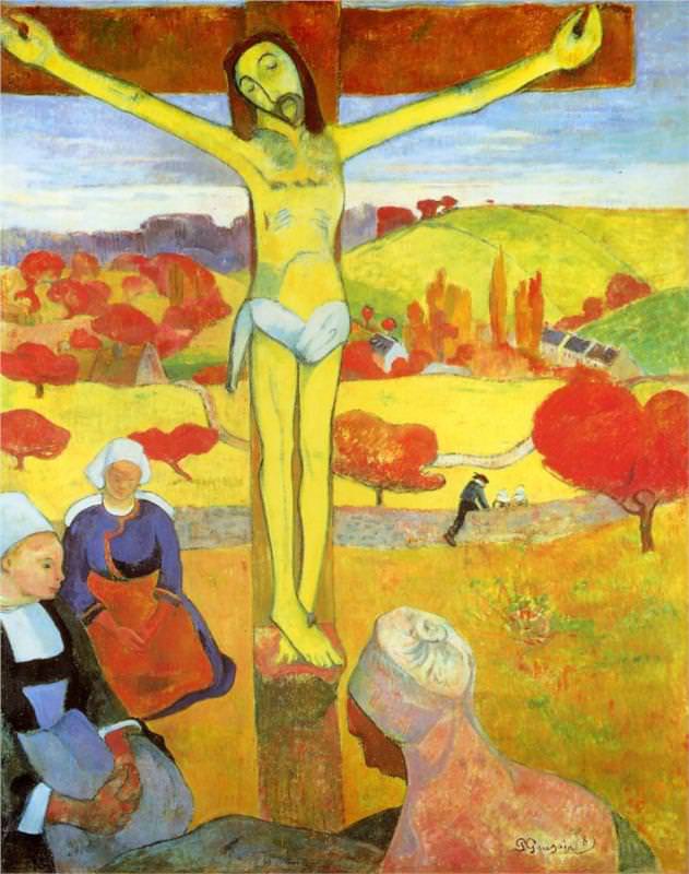
 Paul Gauguin.jpg)