 by
Tom Gurney
Tom Gurney BSc (Hons) is an art history expert with over 20 years experience
Written on November 8, 2026 / Updated on November 8, 2026
Email:
tomgurney1@gmail.com
/ Phone:
+44 7429 011000
Rocks on the Mediterranean Coast
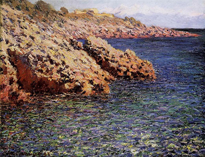
Claude Monet’s Rocks on the Mediterranean Coast sets warm, projecting land against a broad field of blue water. Three promontories organise the view, while short foreground marks and a narrow sky give the scene its particular proportions. The 1888 canvas belongs to the Columbus Museum of Art, where it is also identified as The Mediterranean (Cap d’Antibes). Catalogued as Wildenstein 1185 and inventoried as 47.93, it is a distinct painting within Monet’s Antibes work, with its own composition and documented history.[1][2]
At a Glance
The Columbus painting
The Columbus Museum of Art identifies this 1888 painting as The Mediterranean (Cap d’Antibes), a work received through the bequest of Frederick W. Schumacher. Its inventory number is 47.93. Wildenstein catalogues it as W1185, records a signature and date at the lower left, Claude Monet 88, and gives dimensions of 65 by 81 centimetres. These details connect the familiar descriptive title to a particular canvas.[1][2]
A coastline title can cover several different views, so the composition remains an important part of that identification. Here warm, projecting rocks enter from the left, deep blue water opens to the right, and a narrow band of sky runs above them. The catalogue describes three promontories on the western side of the Cap d’Antibes. Their successive projections give the painting a structure that can be followed from near to far.[1]
Three promontories and the shape of the view
The first effect is one of unequal occupation. The land presses into the image from the left, while the water occupies the broader open field beside it. This arrangement gives the rocks a strong direction: they project towards the sea rather than standing as isolated objects in its middle. The coastline is understood through the points where the solid shapes advance and the blue surface bends around them.
The three promontories create a rhythm of nearer and more distant forms. Their outlines allow the viewer to compare scale and overlap, while changes in colour keep the rocks from becoming one continuous block. A projection can appear substantial through its edge and shadow even when the marks within it are broken. The coast therefore combines a clear overall structure with a surface that remains lively.
The right-hand water gives these projections room to be seen. Its expanse is not simply leftover space around the principal subject. It establishes the distance between the viewer and the further rocks, and makes the irregular land edge more distinct. Following that edge brings the eye in and out of the coast, while looking across the sea produces a broader movement towards the open side of the canvas.
The view also balances recognisable geography with the limits of a painted frame. A promontory continues into surrounding land, yet the image allows only a selected stretch to appear. The spectator encounters the coast through this choice of boundaries. Its large forms can be compared with one another without requiring a complete panorama of the cape or a map-like account of every inlet.
Warm rock and blue water
Orange and ochre passages give the rocks a warmth that stands out against the more intense blue of the water. The contrast helps separate surfaces, but it also moves the eye between them. A warm accent near a cool field can seem especially emphatic, while a darker passage within the rock restores weight to the larger form. Colour describes the coastline and organises its visual force at the same time.
The rocky surfaces are varied. Short marks break them into smaller changes of tone rather than presenting a uniform brown shape. Some passages appear brighter, others more recessed, and their differences suggest an uneven surface. The overall silhouette remains available as a guide, so the viewer can move between recognising the promontory and noticing the separate strokes through which it has been made visible.
The sea is equally active, although its dominant colour differs. Blue passages are interrupted by smaller touches that prevent the water from reading as a flat sheet. Near the foreground, the accumulated marks are especially conspicuous. They make the surface seem changeable and bring the act of painting close to the viewer, while the larger expanse beyond remains sufficiently continuous to carry the scene into the distance.
This relationship is more specific than a general description of Mediterranean brightness. Light is distributed between separate planes, edges and patches of colour. The warm rocks do not remove the darker intervals that give them depth, and the blue sea does not become a single unvarying tone. The picture’s vividness depends on differences within each area as well as the stronger contrast between land and water.
The foreground and the narrow sky
The nearest part of the scene is built from a concentrated pattern of coloured marks. Their proximity gives them a different role from the more distant coastline. They supply an immediate painted surface through which the viewer looks towards the sea. The shift between this busy foreground and the more legible projecting forms beyond it creates a sequence of attention rather than one equally detailed plane.
Above the coast, the sky is comparatively narrow. It provides a lighter interval and a boundary against which the upper land forms can be read, but it leaves the principal space to rock and sea. The proportions matter: enlarging the sky would alter the weight of everything below it. In the existing arrangement, the viewer remains closely engaged with the meeting of the coast and the water.
The painting can consequently be read in two directions. One follows the coastline’s recession through overlapping projections; the other passes between foreground marks, the blue expanse and the slim opening above. These movements make the view more than an inventory of coastal features. Monet gives the spectator a way of looking through the place, with changing distances expressed through the distribution of shapes and touches.
Antibes in 1888 and the related works
Monet’s 1888 stay at Antibes supplies the wider context. Museum Barberini’s account of a separate painting, The Fort of Antibes, places his working visit between January and May. That account helps locate this phase of his coastal work, while the particular Columbus painting is identified through its own date, catalogue entry and composition. A shared visit links the works without assigning them all one viewpoint or one day of execution.[3]
The works around W1185 in the catalogue include other Mediterranean views. W1184 bears a related Mediterranean title, while W1181 concerns the mistral; W1182 and W1183 are further distinct canvases. Their proximity makes comparison useful, particularly for seeing how a familiar coast could become a different arrangement of sea, rock and sky. Each painting nevertheless has its own dimensions, composition and historical record.[1]
The same care helps when comparing the Columbus coast with the Fort of Antibes. A building gives that other picture a different focal structure, whereas the projecting land and open water organise this view. The comparison reveals the range of the visit more effectively than treating every Antibes picture as a variation of one architectural scene. Here the shapes of the coast carry the composition’s principal movement.[1][3]
The recorded history and the museum collection
Wildenstein’s provenance includes early Boussod and Goupy references and an 1898 sale with indications of uncertainty. Those qualifications belong with the historical record. Later documented points include Durand-Ruel entries in 1899 and 1913, a Cummings ownership reference in 1933 and a Parke-Bernet auction in 1942, lot 43. This selected sequence distinguishes the history of W1185 from similarly titled neighbouring paintings.[1]
The catalogue also records an exhibition history extending from Düsseldorf in 1904 to Durand-Ruel in New York in 1921. Selected appearances include London’s Grafton Galleries in 1905 and the Minneapolis Institute of Arts in 1915. These entries show the painting moving through different exhibition settings before its later museum history. They belong to this specific catalogue record, and give a historical dimension to a view whose coastal forms can otherwise appear removed from the circumstances of collecting and display.[1]
The picture entered the Columbus collection through Frederick W. Schumacher’s bequest in 1947. Both the catalogue’s museum identification and the Columbus museum’s own collection caption connect this canvas with that bequest. The collection credit gives the painting a documented institutional setting, while earlier sale and exhibition references describe preceding stages of its history. The museum’s title, The Mediterranean (Cap d’Antibes), is another useful way of finding the same object.[1][2]
The canvas’s lasting interest lies in the way its physical elements remain distinct yet interdependent. Three projecting land forms structure the view; blue water opens it; foreground marks bring the painted surface forward; the narrow sky keeps attention close to the coast. The Mediterranean becomes a particular relationship of colour and space, rather than a general promise of warmth or a detached scenic emblem.
Frequently Asked Questions
Wildenstein identifies three promontories on the western side of the Cap d’Antibes. Warm rocks and open blue water give this particular view its structure.[1]
Discussion
Look again at the projecting rocks, blue water and narrow sky in this painting. These editorial prompts invite your observations.
Reader Insights
Follow the outlines of the three promontories into the distance.
Compare the marks in the nearest foreground with the more continuous water beyond.
How does the narrow strip of sky affect the weight of rock and sea?
Join the Conversation
Share a detail, comparison or question about Rocks on the Mediterranean Coast below.
References
- Daniel Wildenstein / Wildenstein Plattner Institute — Monet, volume III, 1996, entry 1185, printed pages 450–451 (digital viewer 94–95): identity, composition, provenance and Columbus collection. View source
- Columbus Museum of Art — Curatorial discussion record identifying The Mediterranean (Cap d’Antibes), 1888, oil on canvas, bequest of Frederick W. Schumacher. View source
- Museum Barberini — Claude Monet, The Fort of Antibes: institutional account of the 1888 working visit; separate painting used for historical context. View source