 by Tom Gurney
Tom Gurney BSc (Hons) is an art history expert with over 20 years experience
Published on August 14, 2026 / Updated on August 14, 2026
Email: tomgurney1@gmail.com / Phone: +44 7429 011000
Introduction
A Precise Starting Point
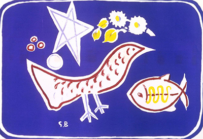
At the Samuel Dorsky Museum of Art, Georges Braque's The Bird begins with a useful fact: its year remains open. The museum records the work as undated lithography under accession 1995.001.002.[1] That concise identity directs attention toward what the print securely offers—three recognisable forms, a concentrated range of colour and a striking economy of means.
An uncertain date can sharpen an encounter. It prevents one event in Braque's career from becoming an automatic explanation and places greater weight on the relationships within the work. The Dorsky describes a flattened abstract white bird, a fish and a star against a clear night sky, with lapis-lazuli blue and white and yellow accents.[1] These few elements provide the print's entire visual vocabulary.
The recorded medium matters. Lithography allows drawn shapes and a broad colour field to meet on a printed surface. Here, the process supports a language of compression: each subject sheds naturalistic volume while preserving enough identity to be named. The result is a colour lithograph whose simplicity carries sustained visual tension.
At a Glance
- ArtistGeorges Braque[1]
- TitleThe Bird[1]
- DateUndated[1]
- MediumColour lithograph[1]
- Object typeWork on paper[1]
- CollectionSamuel Dorsky Museum of Art[1]
- Accession1995.001.002[1]
- SignificanceThe blue-field colour lithograph through its bird, fish, star and reduced signs
Contents
- Introduction
- A Precise Starting Point
- Three Signs in One Field
- Blue as Setting and Structure
- White, Yellow and the Work of Contrast
- Flatness without Disappearance
- One Work within a Recurring Motif
- An Economy Shared with Matisse and Picasso
- What an Open Date Clarifies
Three Signs in One Field
The title gives the bird first importance, yet the fish and star prevent it from standing alone. Together, the three forms create a compact vocabulary. They belong to different imagined realms—air, water and sky may come to mind—while the museum's description places them within one blue field.[1] Their unity is pictorial before it becomes symbolic.
This distinction keeps the print open. A bird, fish and star could invite an elaborate allegory, but their force begins with recognition. Each has been reduced enough to function as a sign. Each also retains a different identity. Braque could therefore create variety with very little descriptive information.
The forms ask the eye to move between naming and seeing. The title settles the main subject quickly. The fish and star widen the field, encouraging attention to difference, spacing and association. A small set of signs becomes sufficient to suggest a world without describing that world in detail.
Their coexistence also changes the bird. Flight becomes one possibility within a wider relation among creatures, atmosphere and distance. The bird remains central, yet its meaning grows through company. The fish introduces another mode of movement; the star adds a measure of remoteness. These associations remain provisional, sustained by the three named forms and open to continued looking.
Blue as Setting and Structure
The Dorsky characterises the field as a clear night sky and calls its blue lapis lazuli.[1] This language gives colour two jobs. Blue establishes a setting, allowing the signs to inhabit an atmosphere, and it provides the dominant visual structure against which the lighter elements register.
Lapis lazuli carries a sense of depth and intensity even when the printed surface remains flat. The field can therefore feel expansive without relying on conventional recession. Space arises through colour and contrast. A broad blue area offers the imagination distance while keeping every mark close to the sheet.
The museum's night-sky description also gives the star a natural setting, while the fish introduces a productive displacement. A fish within a field read as sky loosens ordinary categories. It can still be recognised, yet its surroundings free it from a literal habitat. Braque's economy creates room for that visual ambiguity.
The blue has a unifying role as well. Bird, fish and star share one chromatic environment, so their differences remain connected. The field behaves as more than background. It holds the print together and gives the reduced forms a common pressure.
White, Yellow and the Work of Contrast
Against the blue, the museum's white and yellow accents create immediate separation.[1] The white bird gains clarity through this contrast. Its identity depends less on modelled anatomy than on the force with which a light shape registers against a dark, saturated field.
Yellow adds a second bright value. The museum gives no positional map for these accents, so their safest significance lies in relation: blue dominates, while white and yellow interrupt and activate it. Colour difference performs work that modelling might once have done. It distinguishes, energises and guides attention.
This economy makes every element consequential. A naturalistic scene could distribute interest across feathers, water, atmosphere and distant light. Braque compresses those possibilities into a few colour events. The print gains intensity because its means are limited. Blue, white and yellow become enough to sustain setting, contrast and rhythm.
Colour also helps the forms avoid becoming neutral pictograms. Their reduction is severe, but the lapis field gives them atmosphere and emotional temperature. The image stays balanced between sign and sensation: readable at once, yet richer than a diagram.
Flatness without Disappearance
The Dorsky's description of the bird as flattened and abstract identifies the central formal tension.[1] Flattening removes the expectation of rounded volume. It lets the bird occupy the same surface world as the fish, star and colour field. Yet abstraction stops short of erasing the subject. The bird remains a bird.
That survival of identity was one of Braque's enduring strengths. A form could be compressed, simplified or detached from ordinary space while continuing to invite recognition. In The Bird, the process becomes unusually clear because the inventory is so small. The viewer can follow the threshold at which shape becomes sign and sign still carries the memory of a living thing.
The fish and star reinforce this principle. They differ from the bird, though all three belong to the same reduced language. Braque creates distinction without returning to naturalistic description. Recognition depends on selected cues and on the mind's readiness to complete them.
Flatness therefore becomes active. It brings unlike forms into equality on the surface, strengthens the authority of colour and encourages quick shifts between subject and shape. The print offers a world in which a creature, another creature and a celestial sign can meet through shared pictorial terms.
One Work within a Recurring Motif
The Dorsky situates The Bird within Braque's frequent return to birds during the 1950s, mentioning variants in which a bird appears alone, in a flock or in flight.[1] The Phillips Collection dates his renewed experiments with birds in flight from 1949 and holds a separate 1956 Bird painted in oil on paper mounted on canvas.[2]
That broader activity helps explain the motif's flexibility while leaving the Dorsky sheet's date open. Braque could carry a bird from painting into lithography and alter its company, scale and surrounding field. Repetition supplied a method of thought. The familiar subject gave him a stable point from which to test fresh relations.
The Dorsky example has a distinct place within this practice. Its bird shares the field with fish and star, and its lithographic identity joins colour to a particularly concise language of signs. A recurring motif becomes newly specific through medium and companionship.
What an Open Date Clarifies
The undated status of The Bird leaves one part of its history unresolved, but the work's artistic proposition is unusually clear. Three named forms survive radical simplification. Lapis blue creates atmosphere and structure. White and yellow establish contrast. Flattening brings creature and sign into close contact.
The print's power lies in this concentration. Braque gives the eye enough information to recognise a bird, fish and star, then allows colour and spacing to keep those identities active. The viewer moves between the familiar and the abstract without needing a final symbolic answer.
Uncertainty about the year ultimately places the emphasis where the work is strongest: on reduction as a creative act. The Bird shows how an image can lose volume, detail and ordinary habitat while gaining clarity, mobility and imaginative reach.
Related Pages
Frequently Asked Questions
At the Samuel Dorsky Museum of Art, Georges Braque's The Bird begins with a useful fact: its year remains open.
At the Samuel Dorsky Museum of Art, Georges Braque's The Bird begins with a useful fact: its year remains open.
Uncertainty about the year ultimately places the emphasis where the work is strongest: on reduction as a creative act.
Discussion
At the Samuel Dorsky Museum of Art, Georges Braque's The Bird begins with a useful fact: its year remains open.
Reader Insights
At the Samuel Dorsky Museum of Art, Georges Braque's The Bird begins with a useful fact: its year remains open.
Colour also helps the forms avoid becoming neutral pictograms.
Uncertainty about the year ultimately places the emphasis where the work is strongest: on reduction as a creative act.
Join the Conversation
Share the visible detail or source that most changed your reading.