 by Tom Gurney
Tom Gurney BSc (Hons) is an art history expert with over 20 years experience
Published on August 14, 2026 / Updated on August 14, 2026
Email: tomgurney1@gmail.com / Phone: +44 7429 011000
Introduction
A sheet can be original while belonging to a group of near-identical impressions. That apparent paradox is the key to Georges Braque's printed work. A printmaker works a plate, stone or block, then transfers its design to paper. Each authorised impression belongs to the artwork. A reproduction follows a completed work made elsewhere; an original print begins with a matrix created for its own transfer.[1]
Braque's prints also resist a single date. Fox carries 1911 for making and 1912 for publication. Bass carries 1911 for the plate and 1950 for the surviving impressions discussed here. Théogonie joins designs of 1932 to a volume issued in 1955. These dates record successive acts in the life of a work.
Names matter just as much. Kahnweiler, Delâtre, Visat, Galanis, Maeght, Mourlot, Fequet et Baudier and Broder appear in the credits. They reveal a practice shared among artist, printer and publisher. Braque supplied artistic authorship; skilled collaborators helped matrices become impressions and editions.
At a Glance
- ArtistGeorges Braque
- GuidePrints
- FocusOriginal printmaking across drypoint, etching, lithography, aquatint and woodcut, with reproductions kept distinct.
- Key topicsOriginality in a repeatable medium; Fox: a Cubist design made for transfer; Bass and the return of a 1911 plate; A wider engagement in 1932
- OverviewA sheet can be original while belonging to a group of near-identical impressions.
Contents
- Introduction
- Originality in a repeatable medium
- Fox: a Cubist design made for transfer
- Bass and the return of a 1911 plate
- A wider engagement in 1932
- Lithography and the Mourlot workshop
- Etching, aquatint and relief in one impression
- Woodcut and the printed leaf
- Scale with room for revision
- How to read a Braque print
Originality in a repeatable medium
The Victoria and Albert Museum defines a print as a design transferred from one surface to another through a repeatable process. The transferred work is itself the original. The matrix is the means by which several impressions can exist.[1] Originality therefore rests in a design conceived for transfer, while scarcity remains a separate question.
Three broad process families help to place Braque's choices. Woodcut is a relief method: ink lies on the raised surface of a carved block. Etching and drypoint are intaglio methods: ink settles into lines recessed in a metal plate. Lithography is planographic, drawing from a flat stone or prepared metal surface. Aquatint also belongs to intaglio, while embossing introduces relief into the sheet.[1]
Those terms describe physical operations: drypoint cuts directly into metal and retains the burr raised by the tool. Etching uses acid to bite lines exposed through a resistant ground. Lithography depends on the relation between grease and water across a flat matrix. One artist can move among these procedures because each offers a different relation between gesture, reversal, pressure and repetition.
An edition gives repetition a production frame. A number such as 20/50 identifies a particular impression within the stated edition, though it cannot carry the whole burden of authorship or history. Printer, publisher, paper, medium, date and institutional record remain integral parts of the object's identity.
The crucial distinction concerns the work's point of origin. A photomechanical or digital reproduction translates a completed painting, drawing or print into another object. Braque's drypoint, etched, lithographic and woodcut compositions originate in matrices prepared for transfer. Their capacity to produce several sheets is part of their conception. An authorised impression may therefore be one of fifty or one hundred while retaining the status of an original work.
This framework also separates originality from uniqueness. A painting normally exists as one object. An editioned print distributes one matrix-driven composition across several objects, each with its own paper, inking, marks and history. The edition joins them conceptually; the individual sheet carries the event of transfer. That dual identity explains why museum catalogues record both the composition and a specific impression.
Fox: a Cubist design made for transfer
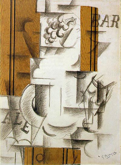
MoMA dates Fox to 1911 and its publication to 1912. The large drypoint was printed in Paris by Eugène Delâtre, published there by Daniel-Henry Kahnweiler and issued in an edition of one hundred. Its plate measures 54.5 by 38 centimetres.[2] Scale and edition already make it more than a small graphic afterthought.
Kahnweiler commissioned the work during Braque's close Cubist exchange with Picasso. MoMA describes a café still life broken into short lines and cross-hatching. The drypoint needle makes fragmentation a physical event: each stroke enters the plate, holds ink and reappears under pressure on another surface.[2]
Words pass through the same process. MoMA connects “FOX” with an English-style bar and “Old Tom Gin” with a bottle in the still life.[2] Letters retain their verbal force while joining the field of cut marks. The plate transfers language and form together, so a commercial name can operate as both reference and structure.
MoMA places Fox within a group of ten Cubist prints by Braque. Its account says that only Fox and one companion were issued in editions at the time; the remaining eight appeared during the 1950s. The statement defines an early group, while MoMA's much broader estimate reaches about three hundred printed compositions across the career.[2]
Bass and the return of a 1911 plate
Two institutional impressions of Bass make delayed production unusually clear. The Art Gallery of New South Wales (AGNSW) dates the work to 1911 and the printing to 1950. It catalogues drypoint and etching, with its sheet numbered 49/50 from an edition of fifty plus six hors commerce impressions.[3]
Princeton also gives 1911 and 1950, yet its record calls the medium drypoint. Its impression is numbered 20/50. Princeton names George Visat as printer and Fondation Maeght as publisher.[4] The two records preserve their own medium strings and edition fields. Their differences belong to the individual holdings and deserve visibility.
The contrast between AGNSW's “drypoint and etching” and Princeton's “drypoint” is itself instructive. A broad career label would flatten these records, while an invented compromise would detach the medium from both holdings. Keeping each catalogue string beside its impression shows where knowledge is exact and where institutional descriptions differ.
Princeton explains the long interval. Bass was among the uneditioned plates found in Braque's studio during the late 1940s. Visat then printed the edition and Maeght published it in 1950.[4] The plate had stored a design for almost four decades. Printing activated that earlier matrix; the two dates describe conception and renewed production.
The interval changes how the word “late” functions. The impressions belong to a late demand for Braque's work, while their design belongs to his early Cubist practice. A 1950 collection date alone would obscure the plate's history. A 1911 date alone would conceal the conditions under which these particular sheets came into being.
A 1993 MoMA brochure adds a typographic reading. Wendy Weitman identifies the fragments “VIN,” “CAFE” and “JO” in Bass, and relates “BASS” to the typeface of the ale label.[5] The observation remains a historical interpretation, yet it sharpens the print's medium-specific logic. Commercial lettering becomes a set of incised marks carried through the press.
A wider engagement in 1932
MoMA's collection overview describes a return to printmaking in the 1930s.[2] One concise anchor is its Still Life of 1932, catalogued as a lithograph.[6] The flat matrix offered another way to transfer drawn decisions, distinct from the incised plate of the early drypoints.
The same year brought Braque's work for Hesiod's Théogonie. MoMA catalogues a set of sixteen etchings, some with drypoint, plus one further etching absent from the published book. Galanis printed the group in black on cream laid paper, in an edition of fifty.[7] Several processes and object counts converge in that one institutional record.
The NGA catalogues a different unit in its collection. Its Théogonie is an unbound volume published in 1955, comprising twenty-one prints on Auvergne paper after designs from 1932. The record names Hesiod as author and Ambroise Vollard as publisher.[8] The twenty-one-print volume and MoMA's seventeen-part holding answer different cataloguing questions.
Its inventory specifies an etched cover in five colours, a colour frontispiece combining etching, aquatint and drypoint, sixteen full-leaf etchings with drypoint, an etched chapter title, an etched cul-de-lampe and an intaglio contents leaf.[8] The total follows the structure of that particular volume. MoMA's count follows the structure of its separately held set.
This distinction protects the chronology. Braque worked on the designs in 1932. A later volume brought them into another material and editorial form in 1955. The publication date records completion of that object, while the earlier date remains attached to the designs. Counts, bindings and dates gain meaning only when tied to the unit being described.
Lithography and the Mourlot workshop
Braque's shift toward lithography unfolded in stages. The British Museum links his experiments from the 1930s with the Mourlot printer.[9] A historical MoMA account from 1949 gives a finer sequence: brief colour-lithography trials in 1922 and 1933, followed by serious exploration from 1944 with Fernand Mourlot.[10]
The 1932 Still Life sits between the trial years named in that retrospective. Together, these records make a single “return” date too blunt. Braque touched the medium, revisited it, and later pursued it with greater concentration. The chronology describes a commitment built in stages.
William S. Lieberman's 1949 essay says that Braque and Mourlot used four to six stones to achieve the colours of a single print during the postwar phase.[10] Each added matrix demanded registration with the others. Colour emerged through coordinated passes, joining Braque's decisions to the printer's command of stone, ink and press.
Collaboration here is part of the work's structure: the artist's design remains central, while the printer's knowledge enables repeatable colour. The division resembles the early relation between Braque and Delâtre, yet lithography changes the technical problem. Incised line gives way to a flat matrix and successive registered runs.
The partnership reaches a precise late marker in Braque lithographe of 1963. The National Gallery of Art names Braque, Francis Ponge and Fernand Mourlot together. Its material record includes two lithographs for the cover and frontispiece, plus a lithographic emblem on the title leaf.[14] Even a compact credit line reveals artistic, literary and technical roles meeting in one production.
Etching, aquatint and relief in one impression
Later prints expanded the combination of procedures. The National Gallery of Art catalogues Oiseau de passage of 1962 as an embossed colour etching and aquatint, published by Fondation Maeght. Its plate measures 59 by 41 centimetres.[11] The medium line itself carries the essential argument.
Etching and aquatint belong to the intaglio family, while embossing changes the physical relief of the paper. Their conjunction turns one impression into a meeting of recessed ink and raised surface. “Print” therefore names a field of material possibilities, far beyond a flat copy of a painting.
The publisher's presence also extends the pattern established by Kahnweiler and Maeght. An artist-made design enters a network of technical production and distribution. Credits preserve that network without diluting Braque's authorship. They show how the work moved from matrix to impression and from studio to edition.
Woodcut and the printed leaf
Braque's woodcuts bring the logic of relief into view. The National Gallery of Art records Le tir à l'arc, published in 1960, as a suite of five woodcuts including its wrapper, printed on japan nacre paper.[12] Here the suite is the relevant unit, and the wrapper belongs to its registered structure.
A separate example comes from Si je mourais là-bas. One 1962 leaf is a colour woodcut on wove paper, printed by Fequet et Baudier and published in Paris by Louis Broder.[13] The credit divides artistic design, technical transfer and issue into distinct roles. Its place within a literary volume adds context, while the woodcut process remains the concern here.
The two woodcut records also clarify the unit being counted. One catalogue entry covers a five-sheet suite with its wrapper; another identifies a single leaf within a larger volume. “Work” can therefore mean a suite, a component or one impression. Medium, paper and credits establish which unit the number describes.
Relief printing reverses the relation found in etching. The raised surface receives ink; cut-away areas remain clear. Braque's movement from metal plate to flat stone and wooden block therefore involved more than changes of appearance. Each matrix reorganised the physical path by which a mark reached paper.
Scale with room for revision
MoMA’s estimate places Braque’s output at about three hundred compositions, nearly two hundred of them for illustrated books.[2] Those figures convey substantial scale, especially beside the ten Cubist prints discussed in the same account. Their approximate wording matters. They orient the reader while leaving catalogue boundaries open.
The need for that caution becomes vivid in the 1949 MoMA retrospective. Its print essay counted forty-five individual works at that historical moment, two thirds intended as book illustrations.[10] Braque lived and worked for another fourteen years. The two totals belong to different dates, purposes and definitions, so each retains its own horizon.
Scale is most useful when it returns attention to production. Hundreds of compositions mean hundreds of decisions about matrices, papers, editions, collaborators and issue dates. A lifetime total can summarise that labour, though selected objects explain it more clearly.
How to read a Braque print
Matrix identity provides the first reading question. Was the design scratched into metal, bitten by acid, drawn on stone or cut into wood? The answer establishes drypoint, etching, lithography or woodcut as a material process. Compound descriptions, such as the etching, aquatint and embossing of Oiseau de passage, preserve several operations at once.
Dates come next. One date may describe the design, another the printing, and another the publication. Fox, Bass and Théogonie each demonstrate a different relation among those stages. The latest year cannot absorb the earlier work, and the earliest year cannot describe every surviving impression.
The individual sheet then needs its own fields. Edition and impression numbers, paper, dimensions, signature, printer, publisher and institutional identity belong together. The two Bass records show why details stay attached to their holdings. Similar titles and shared dates still allow distinct catalogue descriptions.
Finally, the credits reveal authorship as a coordinated act. Braque designed for transfer; printers controlled plate, stone, block, ink and press; publishers organised editions and circulation. Repeatability and originality coexist within that structure. The matrix carries Braque's decision, and each authorised impression gives that decision a material life of its own.
Related Pages
Frequently Asked Questions
A sheet can be original while belonging to a group of near-identical impressions.
The Victoria and Albert Museum defines a print as a design transferred from one surface to another through a repeatable process.
Finally, the credits reveal authorship as a coordinated act.
Discussion
A sheet can be original while belonging to a group of near-identical impressions.
Reader Insights
A sheet can be original while belonging to a group of near-identical impressions.
The NGA catalogues a different unit in its collection.
Finally, the credits reveal authorship as a coordinated act.
Join the Conversation
Share the visible detail or source that most changed your reading.
References
- Victoria and Albert Museum, “What is print?” — https://www.vam.ac.uk/articles/what-is-print
- Museum of Modern Art, Fox — https://www.moma.org/collection/works/77364
- Art Gallery of New South Wales, Bass — https://www.artgallery.nsw.gov.au/collection/works/196.1979/
- Princeton University Art Museum, Bass — https://artmuseum.princeton.edu/art/collections/objects/13441
- Museum of Modern Art, Reading Prints — https://www.moma.org/documents/moma_catalogue_389_300063077.pdf
- Museum of Modern Art, Still Life — https://www.moma.org/collection/works/60470
- Museum of Modern Art, THÉOGONIE — https://www.moma.org/collection/works/22091
- National Gallery of Art, Théogonie — https://www.nga.gov/artworks/165833-theogonie
- British Museum, Georges Braque — https://www.britishmuseum.org/collection/term/BIOG20746
- Museum of Modern Art, Georges Braque (1949 retrospective catalogue) — https://assets.moma.org/documents/moma_catalogue_1963_300086866.pdf
- National Gallery of Art, Oiseau de passage (Bird of Passage) — https://www.nga.gov/artworks/47587-oiseau-de-passage-bird-passage
- National Gallery of Art, Le tir à l'arc — https://www.nga.gov/artworks/50166-le-tir-larc
- National Gallery of Art, Si je mourais là-bas (If I Died Over There), Page 47 — https://www.nga.gov/artworks/174300-si-je-mourais-la-bas-if-i-died-over-there-page-47
- National Gallery of Art, Braque lithographe — https://www.nga.gov/artworks/165815-braque-lithographe