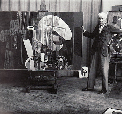
 by Tom Gurney
Tom Gurney BSc (Hons) is an art history expert with over 20 years experience
Published on August 14, 2026 / Updated on August 14, 2026
Email: tomgurney1@gmail.com / Phone: +44 7429 011000
Introduction
A wood grain in a Georges Braque picture can occupy several states at once. It may be paint arranged to resemble timber. It may be a strip of wallpaper: real paper bearing a machine-printed imitation of wood. Within the composition, that strip may suggest a table, a wall or a frame, even though it never stops being flat paper. Braque's technique is richest at precisely these points of overlap, where a material tells the truth about itself while pretending to be something else.
That productive ambiguity extends beyond faux bois. Braque used colour to organise landscapes, facets to loosen the boundaries of objects, charcoal and oil to vary the density of a surface, letters to introduce a different kind of certainty, and sand to make paint act like another substance. The balance among those elements changed markedly from the Fauvist years to the late paintings. There is no single formula called “the Braque style.” What persists is a method of testing how much information a picture needs, which parts of it can remain provisional, and how the physical means of art can participate in representation.
At a Glance
- ArtistGeorges Braque
- GuideStyle and Technique
- FocusColour, faceting, shallow space, lettering, faux bois, pasted paper, sand and cross-media working methods.
- Key topicsA trained hand, reactivated; Building space without fixing it; Charcoal, ground and oil; Letters, stencils and imitation wood
- OverviewA wood grain in a Georges Braque picture can occupy several states at once.
Contents
- Introduction
- A trained hand, reactivated
- Building space without fixing it
- Charcoal, ground and oil
- Letters, stencils and imitation wood
- When imitation became an actual material
- Texture after the Cubist breakthrough
- Translation across media
A trained hand, reactivated
Braque grew up around the decorative building trade. His grandfather and father were housepainters, and he trained in the family business in Le Havre before continuing with painter-decorators in Paris. That work involved practical knowledge of surfaces and of imitating materials such as wood, marble and stone. The Metropolitan Museum of Art notes that Braque did not establish himself professionally in the trade, although the skills remained available to him.[1][3]
The distinction matters. Decorative training did not contain Cubism in embryo, waiting to be released. For years Braque's development proceeded through landscape painting, museum study, exhibitions and exchanges with other artists. Craft procedures became visibly useful in his avant-garde painting only when he had reasons to disturb the hierarchy between an artist's touch and a tradesman's device, between a unique painted passage and a repeatable commercial pattern.[3]
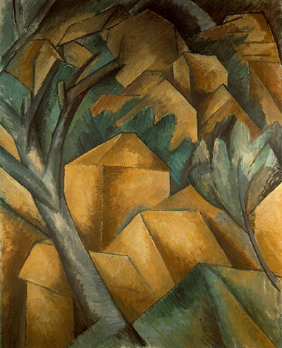
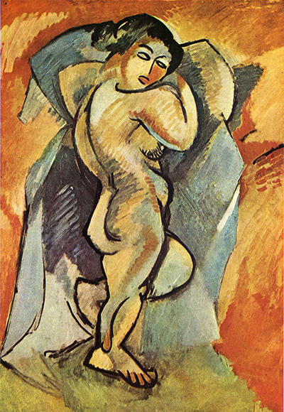
His earliest mature colour already shows technique serving structure. In the Fauvist landscapes of 1906–07, strong hues do more than report local appearances. Contrasts can separate adjoining forms, pull distant zones forward or bind earth, foliage, buildings and sky into a common rhythm. The openly worked paint keeps the picture active across its whole extent. Colour is therefore both sensory and constructive.[1]
Braque's turn towards Cézannian structure changed that balance. From 1907 into 1909, the palette narrowed, forms became more compact, and buildings, trees and slopes were layered into an increasingly shallow field. This was not the disappearance of colour. Restricted hues allowed differences of value, direction and edge to carry more of the spatial argument. The result could suggest solidity while denying the easy recession of conventional perspective.[1][2]
Building space without fixing it
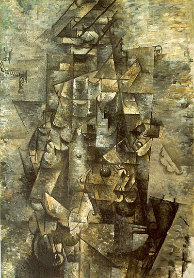
Cubist space is often described as flat, though Braque's paintings rarely behave like perfectly flat diagrams. Their depth is compressed and unsettled. A plane can appear to advance because of a dark edge, then join the background when that contour breaks. Short parallel strokes may model a volume in one area and continue as a rhythm across a neighbouring one. Overlaps offer shallow recession, while incompatible angles prevent that recession from becoming a stable room.[2]
“Multiple viewpoints” is useful shorthand for this instability, provided it is not taken to mean that every side of an object has been inventoried. Braque distributed cues that cannot be reconciled from one fixed position. A curve may suggest an instrument; a straight edge may belong to a table; a small piece of modelling may briefly turn a plane into a bottle or a glass. Recognition arrives locally and can be revised as the eye moves. The viewer does not decode a hidden naturalistic scene so much as negotiate between competing possibilities.[2]
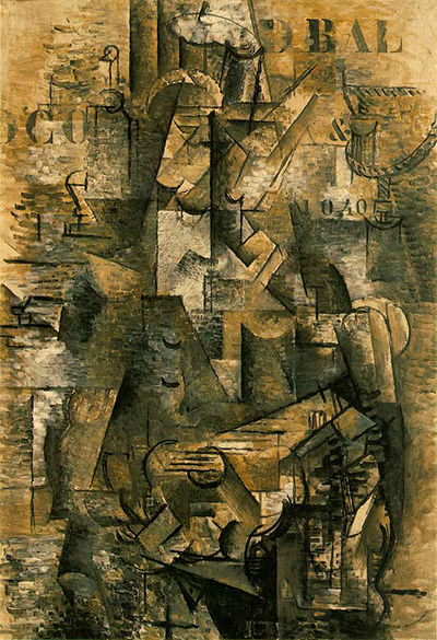
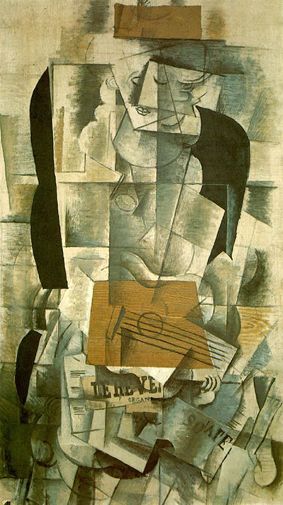
During the phase commonly called Analytic Cubism, roughly 1910–12, Braque and Pablo Picasso often used overlapping planes and restrained browns, greys and blacks. The limited palette increased the importance of tonal shifts, broken contours and hatching. Familiar subjects—musical instruments, bottles, glasses, newspapers and figures—remained present, although only selected features might become legible at any one moment.[2]
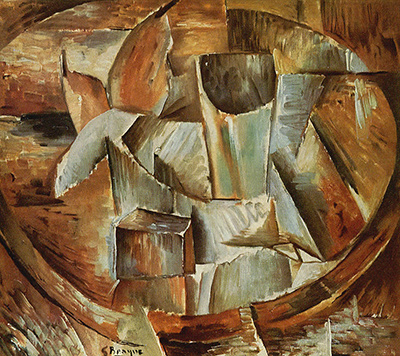
The names “Analytic” and “Synthetic” help describe tendencies, not two airtight technical recipes. MoMA notes that scholars have questioned a simple opposition in which the early works only take things apart and the later works only assemble them. Both operations can occur in either phase. Braque's technical history is better understood as a changing distribution of tasks: at one moment a faceted tonal field carries most of the work; at another, cut shapes, printed patterns and broader colour areas do so.[2]
Charcoal, ground and oil
A conservation study of Bottle of Marc Vieux reveals how materially varied one apparently restrained 1912 painting can be. The findings belong to that object rather than every canvas Braque made, yet their precision is instructive. He coated a fine-weave canvas with a thin white ground containing barium sulphate, lead white, gypsum and linseed oil, producing a smooth support comparable to the wove paper favoured by Braque and Picasso at the time.[4]
Braque then set out major forms in fine charcoal and reinforced selected passages with thin oil paint. Examination shows charcoal beneath, beside and on top of painted areas. Some zones retain the exposed white ground; elsewhere washes are barely perceptible or paint becomes substantially denser. Drawing and painting therefore do not follow one another as separate, complete stages. They interleave, and their different densities help a form emerge, recede or remain uncertain.[4]
The surface also preserves evidence of a tool. The dark letter “B” was made by applying umber and black through a stencil. An indentation and smudge above it record physical contact with the device.[4] This is more than a stylistic resemblance to commercial lettering: in this painting, conservation evidence identifies the procedure itself.
The case clarifies why reduced colour need not mean reduced incident. White preparation, friable charcoal, transparent or thin oil, thicker pigment and untouched ground respond differently to light and carry different visual weights. Braque could obtain contrast through the condition of matter as well as through hue. The painting's shallow space is built from these minute differences, not simply imposed by an abstract scheme.
Letters, stencils and imitation wood
Letters introduced another order into Cubist painting. A fragment of a bottle or instrument can waver between possible identities, while a stencilled character remains emphatically flat and readable. Yet lettering is not immune to ambiguity. It may complete a word, identify a café setting, interrupt a form, supply a rhythmic interval or call attention to the canvas as a surface carrying marks. Its mechanical appearance also sits pointedly beside passages valued as individual brushwork.[2][3]
Braque began introducing lettering and passages of faux bois into his Cubist paintings in 1911–12. A decorator's graining comb could pull through wet paint to produce repeated lines resembling timber. The result is illusionistic and openly artificial at once: convincing enough to name wood, patterned enough to expose the means of the deception.[3]
MoMA identifies Homage to J. S. Bach, painted in the winter of 1911–12, as the work in which Braque introduced imitation wood grain into Cubism. Its compressed space and restricted tan-and-grey palette retain intermittent signs of a violin, while the faux-bois passage and stencilled letters bring two craft-derived procedures into the field.[5] The claim is specific. Braque did not invent wood graining; he made an established decorative technique perform a new job inside Cubist painting.
That job involved more than adding a clever effect. Academic culture had often separated the intellectual prestige of fine art from the supposedly manual skill of decoration. Braque's use of a comb or stencil refused the separation. A repeatable trade procedure could become a means of advanced pictorial thought, while a deliberately counterfeit surface could test what viewers accept as real. The technique enters the argument of the painting rather than serving as ornament.[3]
When imitation became an actual material
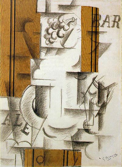
In September 1912 Braque shifted the problem by introducing manufactured wallpaper into his work. In the Met's record, Fruit Dish and Glass, made at Sorgues that autumn, is a charcoal drawing on paper augmented with gouache and pieces of printed wallpaper, then attached to paperboard. According to Braque, it was his first papier collé. The faux-bois paper had been purchased in Avignon.[6]
The wallpaper embodies a chain of substitutions. Machine printing offered an inexpensive alternative to wood grain painted by a professional decorator; painted graining was itself a less costly substitute for oak panelling. Braque took this commercial simulation and placed it within a fine-art drawing.[3][6] There is no actual wood in the result. There is, however, actual paper, carrying a pattern that refers to wood and occupying shapes that can acquire further pictorial identities.
This changed what a contour could do. The edge of a cut sheet arrives already precise; it does not need to be drawn. Its colour and pattern precede the artwork, yet the artist controls its selection, shape, position and relation to charcoal. A printed strip can sit on the surface as an undeniable piece of matter while helping to construct a fruit dish or architectural boundary. Drawn lines may continue across it, stop at its edge or persuade the eye to reinterpret it. Flatness and illusion intensify each other rather than cancelling one another.[1][3][6]
Pasted paper also altered the status of colour. In an oil painting, even an unmodulated area has been mixed and applied. A wallpaper fragment imports colour as something selected from the world. Its hue is inseparable from printing, price, repetition and manufacture. Braque could now compose with a ready-made coloured plane while preserving the visible difference between that plane and a hand-drawn mark.[3][6]
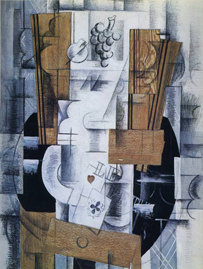
By early 1914 the combinations had grown more elaborate. Bottle, Glass, and Newspaper uses found printed newspapers and wallpaper with charcoal and gesso on board. Two differently grained faux-bois pieces can suggest wall and tabletop; actual newsprint appears beside letters drawn to invoke a newspaper.[7] The support, preparation, printed sheets and charcoal each offer a distinct kind of evidence. Some elements are materially what they appear to be, some simulate another material, and some name absent things through signs.
These developments are associated with Synthetic Cubism, in which shapes often became larger and clearer, palettes broader, and printed or found materials more prominent.[2] Greater legibility did not restore the old agreement between picture and world. A bottle could be built from partial contours and letters; “wood” might be painted or printed paper; a newspaper could be both a physical fragment and a represented object. Braque replaced one difficult spatial language with a more varied set of material contradictions.
Texture after the Cubist breakthrough
Sand belongs to the same history of making paint carry more than colour. Mixed into a binding medium, particulate matter can alter how a brush moves, how densely a passage covers the support and how the dried surface receives light. It can evoke stone or another rough substance, although its pictorial function varies from work to work. The Met connects Braque's early use of sand with his knowledge of decorative practice, while broader career accounts show textured matter recurring after the prewar experiments.[1][3][9]
A late example gives that recurrence a precise purpose. Centre Pompidou records the 1944 Le Billard as oil and sand on canvas. Its catalogue describes the sand-bearing paint as at once rough and soft, a pictorial equivalent to the felt covering a billiard table.[8] Here the additive does not merely announce the physicality of paint. It helps the material surface answer the represented surface.
The example also shows why Braque's later technique cannot be treated as Analytic or Synthetic Cubism prolonged unchanged. The scale, subject, colour and spatial folding of the billiard paintings belong to another historical moment. An earlier question nevertheless returns in a new form: how can the substance of a picture resemble something without disappearing behind the resemblance? Sand remains visibly granular while helping paint assume the tactile character of felt.[8][9]
No single meaning follows from roughness. A granular passage may slow the brush, dull a colour, catch illumination or create an association with stone, plaster, earth or cloth. Interpretation has to begin with the material record and the particular work. Texture is an active variable, not Braque's private symbolic code.
Translation across media
Drawing and printmaking further demonstrate that Braque's method was not tied to one substance. In drawings, broken outlines and angled pencil can create openness, grey value and shallow layering without paint. In etching, incised lines and intersecting hatchings perform related spatial work, while plate tone can vary the atmosphere of an individual impression.[1] The operation is translated rather than copied: paper, pencil, metal plate and ink each resist and register the hand differently.
That distinction helps define Braque's technical intelligence. He did not collect novel materials for their own sake, nor did he use every device simultaneously. He decided which component would carry which information. Colour might join a landscape; a broken edge might keep a guitar incomplete; charcoal might hover over a ground; a stencil might deliver a flat sign; wallpaper might supply shape, pattern and manufactured colour; sand might make painted matter answer to felt.
Across those changes, resemblance remains a negotiation between what is shown and what the artwork physically is. Braque's most consequential procedures do not ask the material to vanish in service of an image. They allow ground, line, pigment, print and grit to remain legible as things in their own right. The picture becomes convincing through that tension: it can name the world while exposing the means by which the naming is done.
Related Pages
Frequently Asked Questions
A wood grain in a Georges Braque picture can occupy several states at once.
Braque grew up around the decorative building trade.
Across those changes, resemblance remains a negotiation between what is shown and what the artwork physically is.
Discussion
A wood grain in a Georges Braque picture can occupy several states at once.
Reader Insights
A wood grain in a Georges Braque picture can occupy several states at once.
Braque began introducing lettering and passages of faux bois into his Cubist paintings in 1911–12.
Across those changes, resemblance remains a negotiation between what is shown and what the artwork physically is.
Join the Conversation
Share the visible detail or source that most changed your reading.
References
- Kunstsammlung Nordrhein-Westfalen, Georges Braque: Inventor of Cubism, institutional resource on Braque's training, early technical sequence, graphic methods and everyday materials. https://www.kunstsammlung.de/en/braque/
- Sabine Rewald, “Cubism,” Metropolitan Museum of Art; and Museum of Modern Art, “Analytic and Synthetic Cubism,” current institutional accounts of shallow space, viewpoints and qualified phase terminology. https://www.metmuseum.org/fr/essays/cubism ; https://www.moma.org/collection/terms/cubism/analytic-and-synthetic-cubism
- Metropolitan Museum of Art, Cubism and the Trompe l'Oeil Tradition, visiting guide and exhibition overview on painter-decorators, stencils, faux bois, sand, wallpaper and real/simulated materials. https://www.metmuseum.org/fr/exhibitions/cubism-trompe-loeil/visiting-guide ; https://www.metmuseum.org/press-releases/cubism-2022-exhibitions
- Isabelle Duvernois, “Georges Braque's Bottle of Marc Vieux, 1912,” Metropolitan Museum of Art, conservation study. https://www.metmuseum.org/perspectives/georges-braque-bottle-of-marc-vieux
- Museum of Modern Art, “Georges Braque: Homage to J. S. Bach,” object record and gallery interpretation. https://www.moma.org/collection/works/116275
- Metropolitan Museum of Art, “Georges Braque: Fruit Dish and Glass,” object record and essay. https://www.metmuseum.org/art/collection/search/490612
- Metropolitan Museum of Art, “Georges Braque: Bottle, Glass, and Newspaper,” object record and essay. https://www.metmuseum.org/art/collection/search/500399
- Centre Pompidou, “Georges Braque: Le Billard,” collection record and catalogue analysis. https://www.centrepompidou.fr/fr/ressources/oeuvre/cAzRAE
- Guggenheim Museum Bilbao, Georges Braque, institutional retrospective research dossier. https://prensa.guggenheim-bilbao.eus/src/uploads/2014/05/Dossier-Braque-EN.pdf