 View the object record
at the Getty
J. Paul Getty Museum, 88.GC.55. Open-content public-domain image via Wikimedia Commons.
 by Tom Gurney
Tom Gurney BSc (Hons) is an art history expert with over 20 years experience
Published on June 19, 2020 / Updated on August 29, 2026
Email: tomgurney1@gmail.com / Phone: +44 7429 011000
Longships Lighthouse, Land's End at the Getty
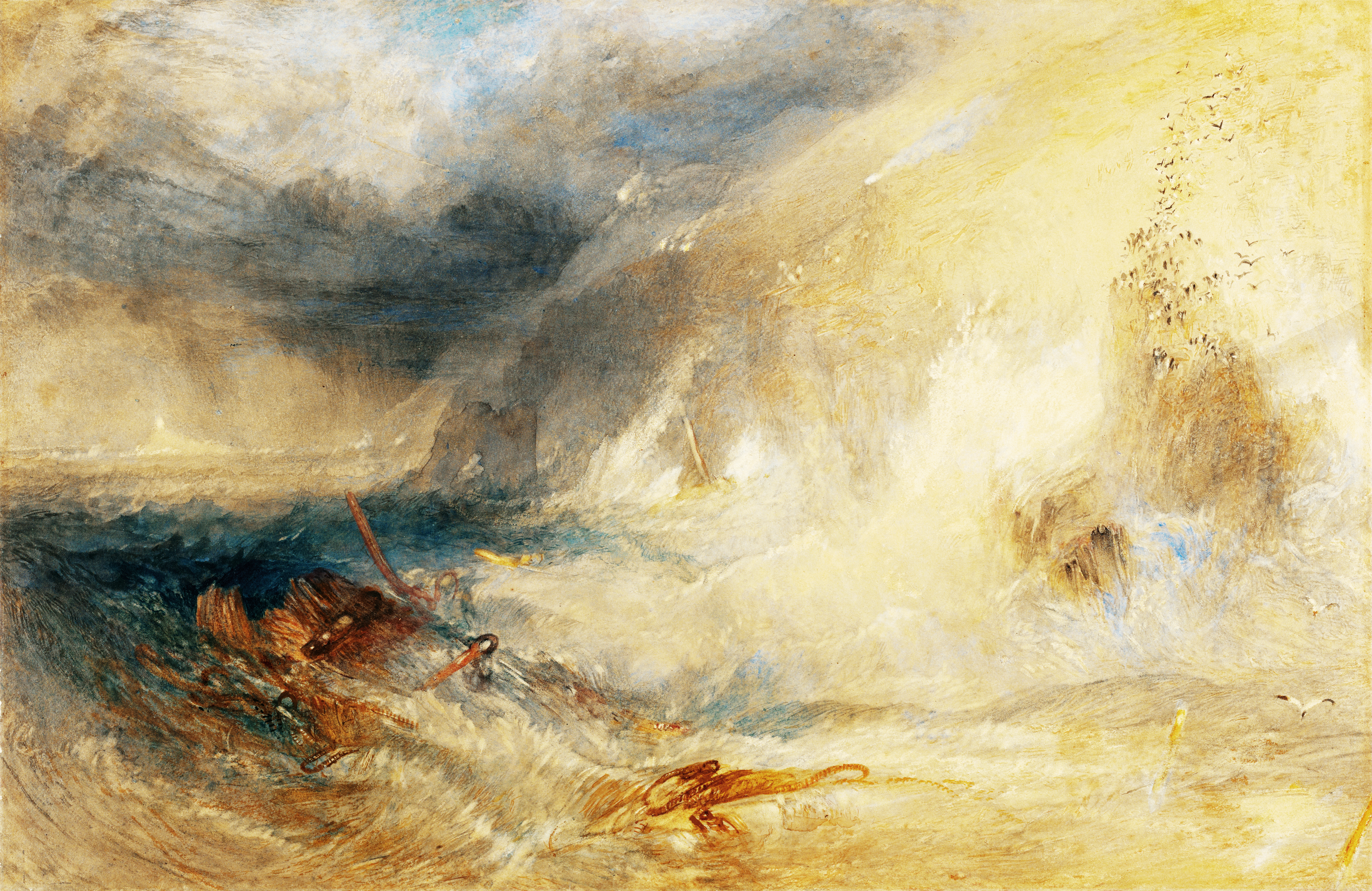
J. M. W. Turner's Longships Lighthouse, Land's End is a finished watercolour made about 1834-35 for Picturesque Views in England and Wales. Turner worked in watercolour and gouache on paper and scraped into the surface. The sheet measures 28.6 by 44 centimetres, or 11 1/4 by 17 5/16 inches, and belongs to the J. Paul Getty Museum as 88.GC.55.[1] Its modest size contains a remarkably extended drama of distance, wreckage and weather.
The subject lies at the extreme south-west of the British mainland. A tiny lighthouse stands on the Longships rocks beyond Land's End, while a wrecked vessel occupies the near-left water and an immense breaker strikes a cliff at right. Dark cloud, rain, illuminated vapour, birds and conflicting waves turn a topographical view into a scene of emergency. Turner preserves enough geographical structure to identify the place, but he does not offer a chart-like record of a particular accident.
This distinction matters. No named ship, documented casualty or dated storm has been securely connected with the work. The broken hull establishes catastrophe, yet the image withholds the narrative information that would convert it into reportage. Its people, if any remain visible, are almost erased by distance and handling. The viewer confronts consequences rather than a recoverable story.[2][3]
The lighthouse is equally exact and elusive. Turner represents Samuel Wyatt's low tower, first lit in 1795, not the taller granite structure that has occupied the reef since 1875.[6] The pale building survives as a few marks at the far-left horizon. It identifies the coast and embodies an organised system of warning, but it cannot rescue the wreck already thrown into the foreground.
The finished drawing was translated by William Richard Smith into an etching and line engraving published in 1836. That plate belonged to Part XX of England and Wales and carried the historic form Long-Ships Light House, Lands End.[11] The Getty watercolour therefore had two lives from the beginning: it was an independent object of unusually rich colour and touch, and it was the model for a black-and-white image intended to circulate more widely.
Turner's achievement depends on holding those functions together. Place is recognisable, the sea is materially observed, and the lighthouse has a real history. At the same time, every stable fact is subjected to unstable vision. A tower becomes a pin of white, timbers lose their ship, the sky divides into darkness and glare, and water refuses one direction. The result is not vagueness. It is precision about a coast where warning can remain visible while safety disappears.
The Minute Tower on the Far Horizon
The lighthouse is easy to overlook. It stands at the far left, a squat pale interruption between dark sea and brown-grey atmosphere. Its scale is so reduced that a viewer may first notice the foreground wreck, the central cloud or the white explosion at right. Only then does the small vertical form resolve into the object named by the title.[1][5]
That delayed recognition controls the image. A conventional lighthouse view might enlarge the tower, clarify its masonry and organise radiating beams around it. Turner does the reverse. The navigation mark is nearly absorbed by the conditions it was built to negotiate. Its light is less a theatrical ray than a concentrated interval of pale paper and wash.
Getty examination identifies blotting or lifting among the means by which Turner recovered brightness in this area.[2] Removing colour is particularly apt for the lighthouse. Its visibility depends not on a heavy deposit but on an absence opened inside the storm. The building appears frail, though the mark remains tenaciously distinct.
The tower's remoteness also establishes extraordinary depth. The wreck lies against the lower edge, close enough for planks, spars and cords to be separated. Between it and the lighthouse, dark water advances in broken planes. Turner makes the distance between wreck and warning feel both geographical and temporal: the ship has passed beyond the stage at which a signal could keep it clear of danger.
Nothing in the watercolour proves why that happened. The lamp may have been visible too late, misunderstood, obscured by weather or entirely irrelevant to an imagined sequence. A lighthouse marks a hazard and guides navigation; it is not a rescue machine. Treating the tower as evidence of institutional failure would supply a cause Turner does not give.
Its persistence is nevertheless meaningful. Human order has not been eliminated from the horizon. The tower stands, the light or pale body registers, and the title insists on its identity. Nature dominates the sheet without achieving a world from which technology and labour have vanished.
The contrast becomes sharper when the historic tower is understood. Wyatt's structure was lower than its successor, and storm seas could pass over it and obscure its lantern.[6] Turner therefore did not need to invent vulnerability from nothing. He transformed a known practical weakness into a visual relation, but the relation remains poetic rather than documentary.
The lighthouse can consequently sustain two thoughts at once. It is an important achievement on an exceptionally dangerous reef, and it is minute beside Atlantic force. Its value is not cancelled by its smallness; smallness defines the scale of the task. The tower does not conquer the sea. It maintains a sign within it.
Contents
- Longships Lighthouse, Land's End at the Getty
- The Minute Tower on the Far Horizon
- Wreckage in the Spectator's Water
- Cliff, Breaker and Rising Birds
- Storm Light and the Difficult Hour
- Waves in Contrary Motion
- The Longships off Land's End
- Samuel Wyatt's First Lighthouse
- Warning, Rescue and the Wrecking Myth
- Cornwall in the 1811 Journey
Wreckage in the Spectator's Water
The wreck occupies the lower-left foreground as a damaged structure rather than a complete vessel. Warm brown planking catches light against a black-green body. Red-brown spars cross at different angles, ropes or rigging make dark linear tangles, and loose timbers continue into the central water. Turner gives enough information to establish break-up while denying a stable reconstruction.[2][3]
One long spar climbs diagonally from left toward the centre. Another lies more horizontally across the lower field, and a smaller mast-like piece rises among pale surf. These intersecting lines resist the sea's broad movements. They once belonged to an engineered system of hull, mast and rigging; after wreck, they become separate vectors carried by water.
The distinction between vessel and debris is central. A ship has direction, purpose and internal order. Wreckage has lost those relations. Turner paints the moment after coherence has failed, when useful parts remain visible but no longer function together. The lighthouse on the horizon is still a whole structure; the ship near the viewer is not.
No secure ship type can be read from the fragments. It would be possible to imagine a merchant vessel working the western approaches, but rig, cargo and nationality are not sufficiently described. Nor is there evidence for a particular historical wreck. The broad category lets the coast's accumulated danger enter one invented event. A related Turner shipwreck watercolour confirms how readily he could reorganise broken vessels and turbulent water without documenting one named loss.[10]
Human presence is even less certain. The Getty catalogue describes figures as nearly obliterated, and direct inspection does not disclose a reliably identifiable survivor, corpse or rescuer.[2] Dark accents around the hull may prompt the eye to search for bodies, but search is not identification. Turner makes the absence of a legible crew part of the catastrophe.
That absence alters the viewer's position. A clearly painted survivor would provide an emotional centre and a possible rescue narrative. Here attention remains dispersed among broken wood, deep troughs, white water and remote light. Sympathy has no single face. The spectator must recognise disaster from damaged things.
The foreground is not a secure beach. Water reaches the bottom edge, placing the imagined viewpoint beyond the first shoreward breakers. Ruskin later identified this kind of station in Turner's wild-coast imagery: the viewer appears among contrary motions rather than safely outside them.[16] The wreck therefore shares our unstable pictorial space.
Turner also refuses picturesque decay. The planks are not an old hulk resting quietly in sand. Their oblique pressure, partial submergence and surrounding foam make destruction present. Even if the accident itself is past, the sea continues the work of disassembly.
The wreck gives human scale to a scene without requiring visible people. Its timbers were cut, joined and sailed; their failure carries the measure of bodies and labour. Against them, the lighthouse is not simply another building. It represents a second technical response to the same hazardous coast, still intact but agonisingly far away.
Cliff, Breaker and Rising Birds
The right side is dominated by a steep rock or cliff close to the viewer. It must not be confused with the distant lighthouse reef. Brown and grey vertical marks articulate its face, while a huge white breaker strikes the base and rises in a burst that merges with air.[1][5]
This collision supplies a second focus to balance the wreck. At left, dark water gathers around broken timber; at right, pale water detonates against solid land. The two events are linked by a broad middle field of yellow-grey and blue waves. Catastrophe is not confined to the ship. It belongs to the whole shore.
The breaker is not drawn as a simple curling profile. White, cream, cold grey and pale blue overlap, so that the eye cannot identify one continuous contour. Spray rises while water falls back; a darker fold appears beneath a bright shelf; the next surge already presses forward. Several moments of impact are compressed into one surface.
Birds animate the air above the rock. Small dark marks rise in loose flocks, with further isolated forms crossing lower passages near the water.[2] Their direction and dispersal make the invisible pressure of wind legible. They also give scale: the cliff becomes larger because the birds remain minute against it.
The species need not be named. Turner uses seabirds as mobile accents rather than ornithological specimens. Some marks approach calligraphic strokes, yet their irregular spacing avoids decoration. They seem driven from a resting place by spray or disturbance.
Because the birds can move through air while wreckage is trapped in water, they offer a limited contrast of freedom and danger. That contrast should not become a sentimental allegory. The flock is itself agitated, and flight in a storm is no guarantee of ease. Its chief function is physical: the marks connect cliff, breaker and cloud through upward motion.
Small warm accents around the distant coast have been read as warning fires.[2] They may imply people on rocks or headlands, but the open-content image does not support a precise inventory of flames and figures. Their uncertainty is productive. Human response remains present as a possibility at the edge of visibility, much like the lighthouse itself.
The right-hand brightness can initially look like an opening or release from the dark cloud. The breaker complicates that impression. Light reveals violence rather than ending it. Turner's luminous passages are not synonymous with safety; they make water's forms more intensely visible.
The rock anchors the composition without providing refuge. It is too steep, too exposed and too continuously assaulted to become a stable shore. Between wreck at left and impact at right, every near surface belongs to the storm.
Storm Light and the Difficult Hour
The sky changes character across the width. Brown-grey vapour weighs on the far left. A deep blue-black rain cloud expands through the upper centre, while cream and yellow light opens at right. Pale blue intervals near the upper edge suggest thinner cloud or remoter sky.[1][4]
A diagonal pale plume runs from the central mass toward the luminous upper right. It may read as rain, illuminated vapour or a torn opening. It should not be fixed as a lightning bolt. Smith's engraved plate makes a star more explicit, but the watercolour's source of light remains deliberately difficult.[11][12]
That difficulty prevents a secure clock time. The contrast could suggest sunset, a storm-darkened day or a transitional hour in which low light breaks through rain. Turner gives meteorological relations rather than a timetable. Brightness has direction and colour, yet it does not settle the narrative.
The central cloud behaves as a volume under pressure. Its underside is dense and dark; its edges break into rubbed and diluted passages. Smaller wreaths seem to detach without losing connection to the main system. Ruskin later praised Turner's capacity to keep individual forms of rain cloud distinct while making one storm govern them.[16]
Ruskin's account is reception rather than evidence of Turner's private intention. It remains useful because it directs attention to structure inside apparent turbulence. The cloud is not an undifferentiated stain. Darker cores, softer fringes, diagonal rain and illuminated vapour have different roles.
The sky also redistributes colour below. Black-blue weather reinforces the dark water around the wreck. Yellow light enters the right-hand sea, where it mingles with cream foam and grey-green depth. The division is not absolute: warm brown crosses the left, and cold blue punctures the bright half. Turner builds atmospheric continuity through exchange.
No single ray spotlights the wreck. Illumination is broader and less theatrical, leaving parts of the damaged hull difficult to parse. That partial concealment aligns form with subject. Broken objects appear through broken visibility.
The small lighthouse mark occupies the darkest end of this weather sequence. Its pale interval is therefore especially concentrated. At the other end, brilliant atmosphere cannot protect the cliff from impact. Light performs opposite tasks across the sheet: it preserves a sign and exposes force.
The resulting hour feels suspended. The storm may be arriving or passing, and the wreck may be recent or already abandoned. Turner refuses the temporal clues that would close the event. What persists is an unstable present in which cloud, surf and debris continue to move.
Waves in Contrary Motion
The sea does not advance in orderly parallel bands. At left, black-green water turns around the hull and spars. Across the centre, broad pale planes appear to flatten, collide and recoil. At right, a major surge meets rock and is thrown upward. The surface has several directions at once.[2][5]
This complexity separates Turner's marine from a diagram of incoming breakers. Shore, reef, wreckage, wind and returning water interrupt any uniform run. A crest may travel landward while foam beneath it is drawn sideways; water rebounding from rock can meet the next incoming mass. Turner uses conflicting brush directions to keep these forces visible together.
Ruskin found in such passages an “anarchy of enormous power.”[16] The phrase is effective because anarchy does not mean random paint. It describes the loss of one governing direction when waves are divided by promontories, beaten back by rocks and driven against one another. Local motions remain intelligible even though the whole cannot be simplified.
He also distinguished Turner's broad, weighty water from the repeated leaping contours used by weaker marine painters.[16] Longships supports that distinction. The principal forms extend laterally, carry mass and change slowly across their breadth. Smaller hooks and sharp highlights articulate their surfaces without turning the sea into a row of identical peaks.
The spectator's implied position intensifies the disorder. Seen from a high cliff, the currents could become a pattern. Turner lowers the relation until foreground water nearly shares the viewer's level. The first visible breaker is not a distant stripe but part of the space occupied by wreckage.
Colour contributes to contrary motion. Dark blues and greens feel deep and pulling; cream and yellow marks ride higher as foam or reflected light. Grey mediates between them, while exposed paper creates flashes too sharp to read as continuous substance. The eye moves among layers rather than across one smooth plane.
Edges repeatedly fail. A pale wave dissolves into spray, which merges with sky; a dark trough runs into the hull; foam covers the boundary of the right rock. This is not carelessness. Water's force becomes visible through its capacity to erase the outlines by which objects are normally known.
The wreck provides rigid diagonals against the mobile field. Each spar briefly measures a current before being visually engulfed. The sea does not merely surround a narrative object; it breaks the syntax through which that object could be reconstructed.
Turner thus makes observation and the sublime inseparable. The sea overwhelms because its motions have been differentiated, not because all detail has been replaced by blur. Magnitude emerges from many comprehensible forces acting without a single stable resolution.
The Longships off Land's End
The Longships are a group of jagged rocks roughly 1.25 miles west of Land's End. Carn Bras, the largest, rises about twelve metres above high water and supports the lighthouse.[6] The reef meets Atlantic swell at the western Cornish approaches, where poor visibility, submerged hazards and severe weather have long made navigation dangerous.
Land's End is commonly treated as an ultimate point, but geographic language should remain exact. It is the extreme south-western headland of the British mainland, not unambiguously the westernmost place in England under every definition. Turner's title depends on cultural and navigational recognition rather than a cartographic superlative.
The name itself establishes distance. From the high granite coast, the Longships tower appears offshore, separated from the viewer by a hazardous channel. Turner's perspective transforms that relation. The near cliff at right seems to belong to Land's End, while the low lighthouse remains far left across open water. The arrangement is imaginative but geographically grounded.
The coast carried several overlapping meanings by the 1830s. It was a working maritime boundary, an obstacle and guide for shipping, a place associated with wrecks and salvage, and a destination for travellers seeking powerful coastal scenery. Turner does not choose one identity. Wreck, tower, cliff and atmospheric spectacle make them coexist.
Topography is compressed to support that coexistence. Relative position matters more than measurable distance. The lighthouse must be remote enough to appear powerless beside the foreground wreck, while the cliff must be close enough to receive an immense breaker. A literal survey could not produce the same psychological field.
The sheet nevertheless preserves local specificity. The lighthouse is not a generic tower inserted into invented weather, and the right-hand geology is not an interchangeable romantic crag. The relation between offshore warning and abrupt Cornish coast gives the drama its particular structure.
Contemporary and later titles vary between Longships, Long Ship's and Long-Ships Light House.[1][11] These differences reflect historic usage and cataloguing rather than separate subjects. The Getty's current title provides the controlling identity for the watercolour; source forms remain appropriate when naming the related print or an earlier record.
Turner's place is therefore both exact and transformed. Anyone approaching the sheet as a map will find omissions and manipulated scale. Anyone treating it as fantasy will miss the lighthouse's history and the coast's practical danger. Its force arises between those positions.
Samuel Wyatt's First Lighthouse
Trinity House sought authority for a Longships light in 1791 and leased the undertaking to Lieutenant Henry Smith. Samuel Wyatt, architect to Trinity House, designed a circular tower of three storeys on Carn Bras. The light was first shown on 29 September 1795.[6] Some older art references give 1797, but the lighthouse authority's date is the stronger control.
The interior converted a small exposed structure into a workplace and dwelling. Water and stores occupied the lower room, living space filled the middle level, and keepers slept below the wood-and-copper lantern. Eighteen parabolic reflectors and Argand lamps were arranged in two tiers, with landward windows blocked so the signal addressed the sea.[6]
The lantern stood about twenty-four metres above the water. Four keepers served the station, two at a time, changing in month-long turns. They cooked in the lantern and received an annual wage of £30, with food provided while on the rock. These facts replace the abstract idea of “the lighthouse” with a regime of fuel, cleaning, watching, confinement and relief.
Turner does not show this labour at visible scale. Yet every pale mark of the tower presupposes people maintaining lamps in conditions that could isolate and engulf them. The apparent point of order is itself a place of risk.
Smith was eventually declared incapable of managing the enterprise. Trinity House took control while remitting profits to his family, and legislation in 1836 enabled the corporation to buy out the remaining privately operated lights.[6] The year of Smith's engraving was therefore also a significant moment in the institutional consolidation of British lighthouse administration.
Wyatt's design had a decisive physical weakness. Because the rock is low, storm seas could sweep over the tower and obscure the lantern. The fixed light could consequently become difficult to distinguish in precisely the weather when it was most needed.[6] That limitation does not prove the cause of Turner's wreck, but it explains why his minute tower was more than a romantic conceit.
The present Longships lighthouse belongs to a later engineering solution. Sir James Douglass designed the thirty-five-metre granite tower completed in 1875.[6] Its taller tapered silhouette must not be projected into Turner's watercolour. He painted the older, squatter structure after it had served for roughly four decades.
Knowing the difference sharpens the visual reading. The small mark is historically proportionate to a tower repeatedly overwhelmed by weather, not an arbitrary miniaturisation of the modern building. Turner reduces it further through distance, making actual design and pictorial purpose reinforce one another.
The lighthouse remains an achievement despite these limits. Establishing and supplying a station on Carn Bras required sustained institutional and individual effort. Turner measures that achievement honestly: not by pretending it commands the Atlantic, but by showing how little visible order can persist within enormous exposure.
Warning, Rescue and the Wrecking Myth
Lighthouses prevent some disasters by marking position and danger. They do not launch boats, recover cargo or pull people from breaking water. In Longships, this difference between warning and rescue is spatially absolute. The tower is far away, while wreckage enters the foreground.
The Cornish coast has often been surrounded by stories of “wreckers” using false lights to lure vessels ashore. National Maritime Museum Cornwall cautions that such claims were frequently exaggerated or distorted.[19] Coastal communities did salvage goods, and some people benefited from materials cast up by wrecks, but salvage is not evidence of deliberately causing an accident.
Turner's image can encourage the old story because small warm marks may resemble fires and because wreckage lies near land. That visual possibility does not identify criminals. The figures and lights are too uncertain, and no documentary source ties the scene to a named act of false signalling.
The ethical distinction is important. People living near a wreck might watch helplessly, attempt rescue when conditions allowed, recover abandoned material, or exploit legal and customary rights. These actions cannot be collapsed into one melodramatic category. Turner leaves human conduct largely unreadable.
Nor does the sheet establish that keepers extinguished or neglected the lamp. The real tower could be obscured by storm seas, but an institutional vulnerability is not proof of a depicted failure. Cause remains absent: the vessel may already have been disabled, driven off course or caught beyond warning.
This uncertainty makes the lighthouse more compelling. If Turner had illustrated a simple technical failure, the work would invite diagnosis and correction. Instead he shows the limit between information and force. A signal can be functioning while a ship is already lost.
The wreck also resists a heroic rescue narrative. No lifeboat, organised shore party or surviving crew can be securely identified. That omission should not be filled with invented despair. The image's severity lies in what remains materially visible after human narrative has become inaccessible.
Warning fires, if those distant accents are indeed fires, introduce another ambiguity. They could mark danger, signal assistance or simply identify human presence along the shore. Their relation to the lighthouse is visual rather than documented. Multiple small lights would scatter human intention across a field dominated by water.
Turner therefore avoids a clean opposition between benevolent technology and malign nature, or between innocent sailors and criminal coast dwellers. He gives a functioning warning structure, a destroyed vessel, possible witnesses and an overwhelming sea. Responsibility cannot be assigned from those elements alone.
Cornwall in the 1811 Journey
Turner travelled through Dorset, Devon and Cornwall in the summer of 1811, gathering material for Picturesque Views on the Southern Coast of England. The journey took him over difficult roads and around a long sequence of harbours, castles, cliffs, fishing settlements and working shores.[8][9]
At Land's End he drew the relation between coast and offshore lighthouse in the Cornwall and Devon sketchbook, Turner Bequest CXXV a, folio 27.[2] This pencil record supplied the topographical beginning for the Getty watercolour more than twenty years later.
The interval is essential. Turner did not stand before the finished storm in 1811 and copy it. He accumulated a place memory, returned to it through studio materials and transformed the headland into an invented wreck scene about 1834-35. Field observation and imaginative reconstruction are stages of one practice.
The south-west journey exposed him to a coast where work and danger were inseparable. Fishing, pilotage, shipping, fortification and salvage appeared alongside celebrated views. Christie's records for related Fowey and Pendennis watercolours show how Turner repeatedly joined precise Cornish sites to shipping and aftermath.[8][9]
These comparisons do not prove that every wreck motif came from direct witness. They establish a durable regional archive from which he could select. A broken hull at Longships belongs to Turner's sustained understanding of the coast, not to a single authenticated accident.
The 1811 purpose must also be kept distinct from the later publication. Southern Coast generated one body of designs; Picturesque Views in England and Wales began under a different agreement in 1825. The same sketches could cross those projects because Turner's visual archive was not exhausted by its first use.
Such reuse was creative rather than economical in the narrow sense. A rapid pencil outline records relative masses and landmarks; a finished watercolour requires colour, weather, incident and a composition legible enough for an engraver. The distance between them allowed Turner to ask what a remembered place could mean under new conditions.
Travel also changed status during those decades. Improved routes, publications and illustrated series expanded access to British scenery. A remote headland became increasingly available through printed images even to viewers who never approached it. Turner worked within that circulation while refusing the calm clarity expected of a tourist prospect.
The finished storm is thus rooted in travel but not reducible to travel illustration. It records how memory can outgrow the sketch that preserved it. Cornwall returns as a field where a lighthouse, wreck and headland organise a meditation on warning at the edge of visibility.
From Field Sketch to Colour Study
Between the 1811 pencil drawing and the Getty sheet lies a larger compositional and colour study now in the Turner Bequest, Tate D25165. Made about 1834, it measures 35.2 by 51.1 centimetres, larger than the finished watercolour, and develops the principal storm arrangement.[7]
Calling it a miniature sketch would therefore be misleading. Its scale allowed Turner to establish the division between dark left and luminous right, the weight of the cloud and the broad action of the water before concentrating the design in the smaller finished sheet.
The study demonstrates that apparent spontaneity was constructed. Turner could begin with thin washes and underpainting, test masses, alter intervals and carry selected relations forward. The finished effect of a storm seized in motion emerged from sustained preparation rather than one uncontrolled performance.
Another Turner Bequest sheet, D25163, has sometimes been associated with the wreck motif. The relationship remains tentative.[2] It is safer to treat it as possible supporting evidence than as a formally identified first state of the Getty composition.
The final work differentiates objects more sharply than the colour beginning. Wreck timbers gain exact diagonals, the lighthouse becomes a concentrated pale sign, birds articulate the right-hand air, and the cliff receives a more forceful breaker. The broad atmospheric opposition is retained while narrative pressure increases.
Condensation changes the viewer's encounter. On the smaller Getty sheet, every major incident presses closer to the others. The wreck, central cloud and right-hand impact compete within forty-four centimetres of width. Density makes the image feel larger because the eye must continually revise its scale.
The development also refutes a false choice between topography and invention. The 1811 sketch holds place; the 1834 study reorganises atmosphere; the final drawing fuses both with a wreck. Each stage solves a different problem. None is simply less finished evidence of the same visual instant.
Turner commonly preserved sketches over long periods and activated them when a commission provided a new context. That practice gave memory material form. He did not need to reproduce the sensations of 1811 intact; he could subject the recorded coast to later technical knowledge and thematic concerns.
The sequence matters for attribution of detail. The lighthouse's historical identity originates in the location, but the storm and wreck belong to studio invention. Recognising both protects the work from being treated either as eyewitness journalism or as placeless fantasy.
Picturesque Views in England and Wales
Turner agreed with publisher Charles Heath in 1825 to provide watercolours for Picturesque Views in England and Wales. The enterprise became his most ambitious mature topographical engraving project. Ninety-six plates appeared between 1827 and 1838 out of a proposed 120.[13][14][15]
The series ranged across cities, ruins, harbours, roads, industry, agriculture, historic associations and severe weather. “Picturesque” did not guarantee repose. Turner used the national survey to examine modern work and danger as readily as scenic variety.
Each finished watercolour had to satisfy several conditions. It needed to stand as a desirable drawing, supply sufficient structure for translation into line, and generate an image compelling enough to sustain serial publication. These demands could conflict. Subtle colour effects might resist engraving, while excessive linear clarity could diminish the original.
Heath coordinated a large team of skilled engravers. Institutional records for related plates such as Stone Henge and Colchester show a process in which designs, proofs and corrections moved between artist, publisher and printmaker.[13][14] Turner remained closely engaged rather than surrendering the image after delivery.
The project was financially unsuccessful despite its artistic ambition. Ninety-six issued views represent substantial achievement, but not completion of the planned 120.[15] Longships, published in 1836, belongs near the end of that long effort, when Turner had decades of experience designing for reproduction.
Its dark marine character expands the idea of national scenery. England appears not as a stable inventory of monuments but as a coast exposed to weather and international navigation. A lighthouse gives institutional specificity, while the wreck makes geographic extremity consequential.
The watercolours also developed independent market lives. Collectors valued the drawings before and after engraving, and their ownership histories separated from the bound publication. The Getty sheet's long exhibition record confirms that it was never merely an expendable workshop model.[1][2]
At the same time, print purpose shaped composition. Wreck, tower, cliff and birds occupy distinct positions that could survive translation. Strong tonal division supports monochrome structure even where colour carries much of the atmosphere. Turner makes reproductive legibility coexist with liquid handling.
The series can therefore be understood as collaborative without diminishing authorship. Smith's burin and etching needle produced a new material object; Turner's proof corrections steered that translation. Authorship operated across stages rather than ending at the watercolour's edge.
Longships condenses the project's larger ambition. It names a precise British place, draws on earlier travel, treats contemporary infrastructure, stages the sublime and enters mass circulation through engraving. National topography becomes an inquiry into what systems of representation and warning can make visible.
Watercolour, Gouache and Scraped Light
Turner used transparent watercolour in the sky, denser gouache or bodycolour through water and rock, lifted or blotted passages, added highlights and scraped into the sheet.[1][2] These methods do not form a list of decorative effects. Each controls a different state of atmosphere or matter.
Wet wash, opaque bodycolour and incised accents
Broad washes let cloud colour spread without a hard boundary. Brown-grey, deep blue and yellow meet through veils, blooms and rubbed transitions, making moisture seem suspended through the paper. Darker additions consolidate the central rain mass while leaving its margins mobile.
Opaque colour gives the sea another density. Cream and grey bodycolour can sit above darker washes as foam, while cooler colour remains visible beneath. This layering allows one small area to register depth, surface and reflected light simultaneously.
Scraping produces sharper interruptions. Around the wreck and waves, incised or abraded marks expose pale support and cut through softer paint. Their abruptness is suited to spray, glancing light and the hard edge of a timber momentarily caught in water.
Blotting works by subtraction. The lighthouse's brightness appears partly recovered from applied wash rather than simply painted on top.[2] That technique gives the distant sign a dry, vulnerable clarity unlike the thick white burst at the right-hand cliff.
Linear accents have separate tasks. Dark strokes become ropes, spars and birds because their direction and context differ. A line dragged diagonally through foam reads as wreckage; a short hooked mark suspended in luminous air becomes a bird. Economy depends on exact placement.
Turner also varies finish across the field. The wreck invites close decoding, but large areas of cloud remain broadly rubbed. The right rock lies between them, its vertical marks legible enough to establish geology while its edges vanish into spray. Different degrees of description make the eye change distance.
The Getty has compared the freer passages to modern abstraction.[2] The analogy can illuminate their autonomy as colour and mark, but it is retrospective. Turner was constructing a specific storm marine for an engraver and a nineteenth-century audience, not abandoning subject matter.
Indeed, technical freedom serves identification. Without the tiny pale tower, broken hull and birds, the atmospheric opposition would lose its geographic and human stakes. Without the broad washes, those objects would become an anecdotal wreck scene. Material handling and narrative depend on each other.
The sheet's small dimensions intensify this economy. A few millimetres can shift from paper white to lantern, foam, rain or sky according to surrounding colour. Turner's virtuosity lies less in minute imitation than in making each kind of mark carry several kinds of information.
The Sublime as a Historical Coast
The sublime is often described as a confrontation between vulnerable humanity and overwhelming nature. Longships plainly supports that relation: a ship is broken, a tower is dwarfed and water exceeds stable vision. Yet the sheet is more historically specific than the formula suggests.
The lighthouse belongs to an administrative network. The wreck once belonged to maritime commerce. Engraving links the scene to publishing and a national market. Land's End was approached through travel infrastructure and understood through accumulated coastal histories. Nature's force appears inside these systems rather than outside society.
That specificity makes the imbalance more severe. Turner does not oppose a generic person to a generic storm. He places two engineered structures at different stages of survival. The ship has lost coherence; the tower retains it. The sea tests both without becoming an allegorical judge.
The near absence of people also changes sublime spectatorship. There is no prominent figure who safely performs awe for the viewer. Wreckage occupies that role materially, while the spectator is positioned among unstable water. The experience is less an emotion observed in another person than a difficulty imposed on vision.
Scale operates through attention rather than measurement alone. The lighthouse is physically substantial but pictorially tiny; the cliff may not be immense in absolute terms but becomes monumental through proximity; a small sheet suggests a sea extending beyond its boundaries. Turner converts relative placement into magnitude.
The work also complicates moral consolation. A visible beacon might symbolize hope, yet it is too remote to repair the foreground loss. Luminous sky might suggest deliverance, yet its brightest passage reveals a violent breaker. Birds can escape the rock, but their agitation keeps flight from becoming serene release.
None of this requires a pessimistic conclusion. The tower persists, signs remain readable, and the artist's own control over unstable media is conspicuous. Human making has limits, but it is not meaningless. Turner finds dignity in the maintenance of form without pretending to victory.
Historical danger further restrains abstraction. Storms did obscure Wyatt's low tower, and the Longships reef did endanger shipping.[6] These facts do not authenticate the imagined wreck, but they keep terror connected to practical knowledge. The sublime is credible because it begins in a coast sailors had reason to fear.
At the same time, the image cannot be reduced to a lesson in lighthouse improvement. Its unresolved time, unidentified vessel and contrary sea exceed engineering explanation. Infrastructure enters art as one measure of force among others.
Turner's historical sublime therefore includes work, technology, memory and publication. It does not erase society to reveal pure nature. It shows how limited human systems continue to operate inside conditions they cannot fully command.
Ruskin and the Sea's “Enormous Power”
John Ruskin returned to Land's End in Modern Painters, using Turner's sea and rain cloud to define standards of truthful representation.[16] His close attention became one of the work's most important episodes of nineteenth-century reception.
For Ruskin, waves near rocks could not be painted as regular ridges jumping toward a beach. Headlands divide them, rebound throws them against incoming water, and wind acts upon already conflicting currents. The resulting “anarchy of enormous power” described organised complexity rather than shapeless confusion.[16]
The Getty sheet rewards that analysis. Its left-hand water is interrupted by hull and spars, middle bands turn across one another, and the right surge strikes a near-vertical barrier. No repeated contour could account for all three. Turner changes scale, breadth and edge as local force changes.
Ruskin also valued weight. Broad waves must seem to carry volume, not merely draw animated outlines on the surface. Turner's pale central planes extend enough to imply heavy moving masses. Their relatively low profiles make the sudden rise of spray at right more violent.
His observation about viewpoint is equally important. Turner's spectator often seems placed beyond the first breakers, where shoreward order has already dissolved.[16] In Longships, water reaches the bottom edge and wreckage lies inside it. The viewer has no visible dry platform from which to inspect danger.
Ruskin's discussion of cloud emphasised unity among separate wreaths. The central mass contains edges, openings and trails, but one storm binds them. That reading helps distinguish atmospheric structure from generalized darkness.
His language should not be mistaken for Turner's explanation of his own intentions. Modern Painters was written after the watercolour and served Ruskin's larger defence of Turner. It tells us how an exceptionally committed Victorian viewer looked, not what the artist privately meant.
Modern criticism has also questioned Ruskin's confidence that visual complexity could be quantified or fully reconciled into unity.[17] That challenge is useful. The watercolour may preserve contradictions that no verbal system can master, including uncertainty about distance, direction and causal narrative.
Ruskin nevertheless provides a disciplined alternative to vague praise. He asks where water comes from, what interrupts it, how breadth differs from contour and how cloud parts belong to a weather system. His empirical attention can be retained without accepting every general claim.
The painting survives his account because it contains more than natural form. Lighthouse administration, wreck history, publication and Cornish travel sit beyond his chosen emphasis. Reception enriches the object when it remains one layer rather than a final key.
Bell Rock Lighthouse as a Controlled Comparison
Turner had addressed a storm-bound lighthouse before Longships. He designed Bell Rock Lighthouse during a Storm from the North East for Robert Stevenson's Account of the Bell Rock Light-house, published in 1824. John Horsburgh engraved the frontispiece.[20][21][23]
Bell Rock was an engineering narrative. Stevenson's volume documented the design and construction of a major offshore light, and Turner's image contributed drama to that achievement. The tower stands prominently amid ships, waves and lightning, remaining a commanding vertical form.[22][23]
Longships reverses that visual hierarchy. Its tower is a pin on the horizon, while wreckage and near water command the field. The comparison does not show that Turner abandoned faith in engineering; it shows how commission and subject could reorganise the same elements.
In the Bell Rock frontispiece, the lighthouse is the book's protagonist. Its visibility confirms the project whose history follows. In the Getty drawing, the title names a tower that the eye must search to find. The delay turns navigation into a problem of perception.
The seas differ accordingly. Bell Rock's storm frames the structure's endurance and the labour celebrated by Stevenson's account. Longships distributes force through broken timber, contrary currents, a cliff impact and cloud. No single object gathers the composition into an engineering triumph.
The comparison also clarifies medium. Horsburgh's print is already a monochrome translation designed for a technical publication, while the Getty watercolour uses colour as a principal agent before Smith's later engraving. Dark blue rain and yellow atmosphere can oppose each other in ways line alone must reinterpret.
Both images prevent a simplistic claim that Turner rejected modern infrastructure. He repeatedly found lighthouses worthy subjects because they condensed engineering, exposure, labour and vision. Their meaning changes with scale and context.
Nor should the two works be forced into an optimistic-to-pessimistic chronology. A prominent tower can still appear endangered; a tiny tower can still embody persistence. Each arrangement produces tensions rather than a single verdict.
Rosemary Hill's account of lighthouse culture and Turner's maritime imagination places such structures within a wider fascination with dangerous coasts and engineered light.[24] That context makes Bell Rock and Longships related investigations, not matching illustrations.
Together they reveal Turner's range. He could magnify a lighthouse as the result of collective construction, then reduce another until it almost disappears, using both scales to ask what a fixed signal means in moving water.
Smith's Engraving and the Corrected Proof
William Richard Smith translated the watercolour into an etching and line engraving published in 1836 as Part XX, number 4 of Picturesque Views in England and Wales, Rawlinson 288.[11] The plate is a new object, not a mechanical copy.
Colour had to become line, density and reserved paper. The blue-black cloud required networks of dark marks; yellow atmosphere had to appear through openness and tonal contrast; wreckage needed sufficient contour to remain legible within engraved water. Smith converted material differences into a unified printed language.
The British Museum preserves a proof touched by Turner in white and graphite, accession 1894,0226.108.[11] It demonstrates that supervision continued after the initial design. Turner could assess how the plate handled light, wave rhythm and separation once the watercolour's colour was absent.
A recorded instruction asks for the water to be filled with work so as to break an equal width and make the lights dashing and sharp.[11] The wording belongs to the proof process, not to the Getty sheet. It shows Turner thinking about differentiation: a broad undivided band could flatten the sea, while worked interruption restored energy.
Queensland Art Gallery preserves another unfinished engraver's proof.[12] Multiple states make development visible. Etching established part of the design, engraving deepened and refined it, corrections redirected emphasis, and final printing stabilised one solution.
The published plate clarifies several motifs. The lighthouse, wreck, cliff, birds and star become easier to enumerate in monochrome. Greater legibility does not mean greater fidelity in every respect. The star, for example, may fix a light source that remains more ambiguous in the watercolour.
Smith's task was interpretive because line has its own behaviour. Parallel strokes can indicate tone and direction; cross-hatching can deepen cloud; white paper must serve lighthouse, foam and sky according to surrounding work. Engraving does not possess a transparent equivalent for wash.
Turner's intervention supports a collaborative understanding of the series. Smith's technical skill made circulation possible, while Turner's corrections defended the design's internal forces. Neither contribution is well described by calling the plate a facsimile.
The proof also reveals that the sea's apparent disorder was actively managed. Requests to break equal width and sharpen lights concern rhythm, not random turbulence. The printed water had to preserve the controlled inequality already fundamental to the drawing.
For many nineteenth-century viewers, the engraving rather than the private watercolour was Longships. Its reproducibility carried the remote Cornish subject across Britain and into bound collections. The plate extended the lighthouse's function metaphorically: another system of signals made a dangerous place visible at distance.
Titles, Versions and Object Identity
Several related objects can be confused under the Longships title. The controlling work is the Getty's finished watercolour of about 1834-35. It differs from Turner's 1811 pencil sketch, the circa-1834 Tate colour study, Smith's touched proof, other proof states and the final 1836 plate.[1][7][11][12]
Each has a different material purpose. The field sketch records topographical information in a travel book. The colour study tests composition and atmosphere on a larger sheet. The finished watercolour resolves the design for ownership and reproduction. Proofs expose stages of translation. The published engraving enters serial circulation.
Dates follow those functions. Calling the Getty sheet an 1811 work would collapse more than two decades of development. Calling the print an 1834 watercolour would erase Smith's contribution and the 1836 publication event.
Titles also vary. The Getty uses Longships Lighthouse, Land's End. Historic print records use forms including Long-Ships Light House, Lands End and Long Ship's Lighthouse. Apostrophe, hyphen and spacing do not create separate places. They belong to changing cataloguing practice.
Medium language requires similar care. The Getty object is watercolour and gouache, with scraping by Turner.[1] It is not an oil painting, and its opaque passages do not change its classification into one. The engraved version combines etching and line engraving, often printed on chine colle in proof impressions.[11]
Dimensions help separate study from finish. The Getty sheet measures 28.6 by 44 centimetres; Tate D25165 is approximately 35.2 by 51.1 centimetres.[1][7] The larger object is preparatory, so size alone does not establish finality.
The current lighthouse introduces a further identity risk. Photographs of Longships usually show Douglass's 1875 tower. Turner's tiny building is Wyatt's lower 1795 structure.[6] Substituting the familiar modern silhouette would anachronistically alter the picture.
Object discipline is not clerical detail. Each distinction changes interpretation. A field record implies direct observation; a finished commission implies selection; a proof implies collaboration; a later tower implies engineering conditions Turner never saw at this date.
Finberg's early catalogue tradition remains valuable for tracing titles and related material, but current museum records control the physical object.[18][25] Historic descriptions can preserve reception without overriding revised attribution or measurement.
Keeping the sequence intact reveals the work's richness. Longships is not one image frozen in one form. It is a chain of observations and transformations in which every state makes different information visible.
Collectors and the Watercolour's Provenance
The Getty's documented ownership history begins securely with Frederick Craven of Bakewell. His sale at Christie's on 18 May 1895 included the watercolour as lot 38.[1][2] Earlier ownership has been reported inconsistently, so an unbroken first-owner story should not be invented.
John Edward Taylor later owned the sheet and sold it at Christie's on 5 July 1912 as lot 42.[1] Taylor's collection contained major British watercolours, placing Longships within a connoisseurial history distinct from the serial publication for which it had been made.
The drawing subsequently passed through C. Morland Agnew and Gerald Agnew, then through Vice-Admiral Sir William Agnew and his widow. It later belonged to Charles C. Cunningham Jr. of Williamstown, Massachusetts, returned to the London market and was acquired by the J. Paul Getty Museum in 1988.[1][2]
This path links private British collecting, the art trade, an American collection and a public museum. It also explains why the original could acquire a reputation independent of the much more widely distributed engraving.
The Getty accession transformed access. As 88.GC.55, the sheet entered a collection where conservation, cataloguing, photography and open-content policy allow its material detail to be studied at high resolution.[1][5] The digital image does not replace the object, but it makes scraping, wash and minute motifs available beyond the gallery.
Collector history also intersects with preservation. Watercolour is sensitive to prolonged light exposure, so works on paper cannot remain continuously displayed under the conditions expected for many oil paintings. Periodic exhibition and high-quality reproduction provide complementary forms of access.
The sheet's market history confirms the independent status of Turner's finished designs. It was never simply discarded after Smith completed the plate. Its colour, touch and singular surface retained value that the print could disseminate but not duplicate.
No owner changes its origin as a reproductive model, and no publication purpose diminishes its autonomy. The two histories coexist: a private object travelled through collections while its engraved counterpart circulated through books.
That double circulation is characteristic of Turner's mature practice. Scarcity and reproducibility were not opposites but linked outcomes of one design process.
The watercolour's later public life extends that ownership history into exhibition and criticism.
The watercolour appeared in major exhibitions long before it entered the Getty. Recorded showings include London in 1862, Leeds in 1868, Manchester in 1887, the Royal Academy in 1891, the Guildhall in 1899, Wembley in 1924 and the Royal Academy again in 1934.[1][2]
Agnew's displayed it in 1951 and 1967. It travelled to the Museum of Modern Art and other American venues in 1956-57, entered bicentenary activity in 1968-69 and later appeared in international Turner exhibitions.[1] This long record repeatedly returned a small, light-sensitive sheet to public view.
Exhibition changes context. In an England and Wales volume, Longships follows a serial rhythm and shares scale with other engraved places. In a watercolour display, its surface can be compared with other finished drawings. In a broad Turner retrospective, it becomes evidence for a career-long engagement with sea, weather and reproduction.
Ruskin's writing supplied another form of exhibition by directing readers toward particular passages. His analysis taught audiences to see contrary waves, breadth and cloud structure.[16] Later formal accounts could then find in the same marks an approach to modern abstraction.[2]
These frames overlap without becoming identical. A Victorian defence of natural truth differs from a modern museum's interest in material freedom. Both depend on close attention, but they select different historical meanings.
Early watercolour criticism also helped establish Turner as more than a topographical recorder. Finberg's account placed the work within a tradition whose techniques and ambitions had expanded dramatically by the nineteenth century.[18] The sheet's gouache and scraping make that expansion tangible.
The engraving had its own afterlife. Bound sets, separate impressions and proof collections preserved variants across institutions such as the British Museum, Courtauld and Morgan Library.[11][14][15] Public familiarity could therefore develop without contact with the original colour.
Modern open-content access adds a further layer. The Getty and Wikimedia image allow viewers to move from whole composition to tiny lighthouse and scratched foam.[1][5] Digital enlargement can reveal details difficult at normal viewing distance, though it can also distort the work's compact physical scale.
The best reception keeps both scales active. Magnification helps identify birds and timbers; awareness of the forty-four-centimetre sheet restores the speed and compression with which Turner assembled them.
Long exhibition history does not prove one stable interpretation. It proves the opposite: the same surface has supported arguments about topography, natural truth, the sublime, technique, technology and abstraction because none exhausts its organised complexity.
A Lighthouse That Cannot Command the Sea
The image's central relation is not simply nature against humanity. It is the unequal distance between several kinds of human making. The lighthouse remains whole and remote; the ship is broken and near; the engraving will later reconstruct both through lines. Each structure negotiates disorder differently.
Warning operates before catastrophe. Once the vessel has entered breaking water, a fixed beacon cannot reverse wind, restore steering or join shattered timbers. Turner makes that temporal limit visible through space. The tower belongs to the far horizon, the wreck to the immediate present.
Yet the lighthouse is not mocked. Its whiteness persists in the darkest area, and the title directs attention toward it. Viewers who initially miss the tower repeat a navigation problem in miniature: they must find a small sign amid competing weather.
The wreck demonstrates what is at stake in that act of seeing. Its fragments are not generic memento mori symbols detached from maritime life. They are the remains of transport, labour and embodied knowledge. The Atlantic has interrupted a working technology.
The right-hand cliff supplies a third condition. Unlike ship and tower, it is geology rather than construction, but it is not inert. Water makes its resistance visible through impact, while birds translate its exposure into flight. Coast and sea define one another dynamically.
Light passes through all three. It marks the tower, catches broken wood and turns spray brilliant against rock. Illumination therefore refuses a simple symbolism of hope. It is a means of knowledge that reveals survival and destruction with equal intensity.
Turner's own procedure offers a quieter answer to disorder. Wash spreads, opaque paint covers, blotting removes and scraping cuts, but every operation is placed. The sheet represents forces beyond command through exceptionally controlled material decisions.
Smith's later proof work extends this paradox. To preserve turbulent water in print, artist and engraver had to regulate line, interrupt equal widths and sharpen lights.[11] Manufactured order makes visual anarchy transmissible.
The result remains open because control never becomes conquest. The tower cannot dominate the sea; technique cannot explain the wreck; scholarship cannot name its crew. Limits are acknowledged rather than repaired with story.
That restraint gives Longships Lighthouse, Land's End its lasting force. A tiny beacon, a broken ship and an immense weather system occupy one compact sheet. Turner does not ask which will win. He shows what human signs look like when they continue to matter inside powers larger than their reach.
Discussion
How does Turner make a functioning lighthouse remain meaningful when wreckage and contrary seas dominate the spectator's space?
Reader Insights
How does the minute far-left tower change the scale of the wreck and the breaking sea?
Where do waves collide, recoil or rise instead of advancing in one direction?
What is the difference between a lighthouse marking danger and rescuing a vessel already among breakers?
Join the Conversation
Share a close observation or a source-based question for other readers.
References
- J. Paul Getty Museum, “Longships Lighthouse, Land's End,” 88.GC.55, https://www.getty.edu/art/collection/object/103R2V
- Nicholas Turner and Lee Hendrix, *European Drawings 2: Catalogue of the Collections*, Getty Museum, no. 144, https://www.getty.edu/publications/resources/virtuallibrary/0892362197.pdf
- J. Paul Getty Museum Education, “Longships Lighthouse, Land's End,” https://www.getty.edu/education/teachers/classroom_resources/curricula/stories_in_art/downloads/sia_longships_lighthouse.pdf
- Google Arts & Culture, Getty Museum, “Long Ship's Lighthouse, Land's End,” https://artsandculture.google.com/asset/long-ship-s-lighthouse-land-s-end-joseph-mallord-william-turner/MwEoL2D64BkyMw
- Wikimedia Commons, Getty open-content image, https://commons.wikimedia.org/wiki/File:Long_Ship%27s_Lighthouse,_Land%27s_End,_by_Turner,_Getty_Museum.jpg
- Trinity House, “Longships Lighthouse,” https://www.trinityhouse.co.uk/lighthouses-and-lightvessels/longships-lighthouse
- National Gallery of Australia, “Compositional, colour and underpainting study for Longships Lighthouse,” Tate D25165, https://digital.nga.gov.au/archive/exhibition/turner/default.cfm?irn=230437&bioartistirn=18113&mystartrow=25&realstartrow=25&mnuid=3&galid=5&viewid=2
- Christie's, Turner, “The Entrance to Fowey Harbour, Cornwall,” 2016, https://www.christies.com/lot/lot-5970533
- Christie's, Turner, “Pendennis Castle and the Entrance to Falmouth Harbour: Scene after a Wreck,” 2025, https://www.christies.com/en/lot/lot-6541838
- Sotheby's, Turner, shipwreck watercolour, lot 76, 2007, https://www.sothebys.com/en/auctions/ecatalogue/2007/old-master-paintings-evening-sale-l07033/lot.76.html
- British Museum, Smith after Turner, “Long-Ships Light House, Lands End,” touched proof 1894,0226.108, https://www.britishmuseum.org/collection/object/P_1894-0226-108
- Queensland Art Gallery/Gallery of Modern Art, unfinished proof 2:0385, https://collection.qagoma.qld.gov.au/objects/131
- British Museum, “Stone Henge,” *Picturesque Views in England and Wales*, 1850,0112.15, https://www.britishmuseum.org/collection/object/P_1850-0112-15
- Courtauld Gallery, “Colchester,” *Picturesque Views in England and Wales*, G.2007.XX.2, https://gallerycollections.courtauld.ac.uk/object-g-2007-xx-2
- Morgan Library & Museum, *Picturesque Views in England and Wales*, PML 312315, https://www.themorgan.org/printed-books/312315
- John Ruskin, *Modern Painters*, volume I, Project Gutenberg, https://www.gutenberg.org/files/29907/29907-h/29907-h.htm
- George P. Landow, “John Ruskin's Modern Painters I: Quantification, Multiplicity, and Unity,” Victorian Web, https://victorianweb.org/authors/ruskin/williams.html
- A. J. Finberg, *Early English Water-Colour Drawings of the Great Masters*, Project Gutenberg, https://www.gutenberg.org/cache/epub/65259/pg65259-images.html
- National Maritime Museum Cornwall, “Neglectful or Worse,” https://nmmc.co.uk/publication/neglectful-or-worse/
- National Galleries of Scotland, Horsburgh after Turner, “The Bell Rock Lighthouse,” P 2865, https://www.nationalgalleries.org/art-and-artists/22616
- British Museum, Horsburgh after Turner, “Bell Rock Light House,” 1891,0617.47, https://www.britishmuseum.org/collection/object/P_1891-0617-47
- National Library of Scotland, “Building the Bell Rock Lighthouse,” https://digital.nls.uk/scientists/biographies/robert-stevenson/index.html
- Robert Stevenson, *An Account of the Bell Rock Light-House*, Project Gutenberg, https://www.gutenberg.org/files/44362/44362-h/44362-h.htm
- Rosemary Hill, “Old Father Thames,” *London Review of Books*, https://www.lrb.co.uk/the-paper/v36/n22/rosemary-hill/old-father-thames
- A. J. Finberg, “Longships Lighthouse, Land's End,” catalogue entry reproduced in *Early English Water-Colour Drawings of the Great Masters*, https://www.gutenberg.org/cache/epub/65259/pg65259-images.html