by Tom Gurney
Tom Gurney BSc (Hons) is an art history expert with over 20 years experience
Page created on September 2, 2026 / Page updated on September 13, 2026
Email: tomgurney1@gmail.com / Phone: +44 7429 011000
From Silverpoint Precision to Charcoal's Movable Dark
A drawing medium is the substance that makes the mark: graphite, charcoal, chalk, metalpoint, ink, watercolour or pastel, for example. A pencil, pen or brush is a tool. Hatching, stumping and wash are techniques. Paper, vellum and prepared grounds are supports. The terms interact, but separating them makes both looking and choosing materials much clearer.
The same medium can produce very different drawings. Getty’s collection ranges from spontaneous sketches to carefully finished compositions, while the Met’s materials display separates graphite, ink and wash, chalk, watercolour and pastel from the techniques used to apply them.[1][2] “Pencil style” or “charcoal style” therefore tells only part of the story. Pressure, tool shape, support texture, dilution, erasure and the purpose of a sheet determine what the material actually does.
This guide compares seven major families through eight documented works. It is not an exhaustive or global taxonomy. Its practical aim is to help you ask four useful questions: what edge and value range do I need; how quickly must I work; how much correction should remain possible; and what support will let the medium behave as intended?
At a Glance
- Dry or fluidGraphite, charcoal, chalk, metalpoint and pastel are used dry; ink, watercolour and gouache move through a liquid vehicle.
- EdgeA point or nib favours a defined line; a broad stick, wash or loaded brush can establish mass quickly.
- CorrectionLoose charcoal and light graphite usually lift more readily than metalpoint, dense ink or heavily worked pastel.
- SupportPaper tooth, sizing, colour and any prepared ground materially change how a drawing medium deposits and reflects light.
- First testCompare point, side, pressure, dilution and erasure on the actual support before beginning the finished sheet.
Contents
How the Main Drawing Media Behave
This comparison is a practical orientation, not a ranking. Grade, binder, dilution, pressure and paper can move any medium beyond its most familiar behaviour.
| Medium | Characteristic mark | Correction | Support question |
|---|---|---|---|
| Graphite | Precise line to layered grey tone; dense passages may reflect light. | Light deposits often erase; pressure can indent or polish paper. | How much tooth is needed without breaking the line? |
| Charcoal | Powdery line, broken contact and broad matt mass. | Loose layers lift readily; compressed darks can resist. | Will the surface hold particles without excessive shedding? |
| Chalk | Dry coloured line and mass, often heightened on toned sheets. | Varies with binder, pressure and paper tooth. | Does the ground colour serve as a middle value? |
| Metalpoint | Fine, controlled line that develops on a prepared ground. | Little direct erasure; planning and repeated hatching matter. | Is the ground sufficiently even and receptive? |
| Pen and ink | Decisive line, hatching, stipple and wash. | Dried marks are difficult to remove cleanly. | Will sizing control spread, bleed and wash edges? |
| Pastel | Opaque dry colour, optical mixture and velvety mass. | Can be lifted or layered, but the surface remains vulnerable. | Is there enough tooth for the intended number of layers? |
| Watercolour | Transparent wash with visible paper light. | Lifting depends on pigment, sizing and drying. | Can the sheet tolerate wetting without unwanted buckling? |
| Gouache | Opaque or semi-opaque wash and light-over-dark revision. | Can be reactivated, though thick layers may crack or shift. | Is the support stable enough for the paint load? |
Graphite: control, range and reflection
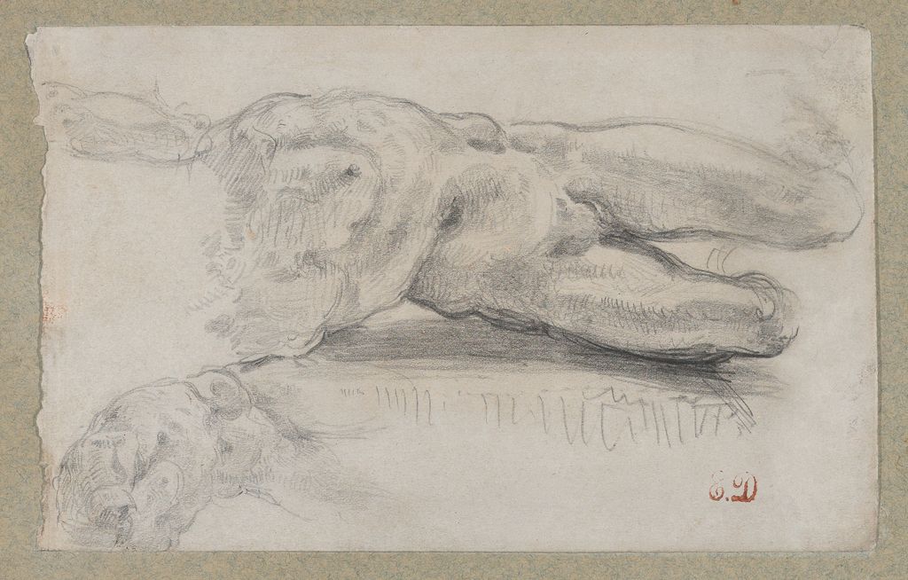
Graphite can travel from a pale construction line to a dense, polished dark. A sharp point makes a controlled edge; the side of the lead covers broader areas; repeated hatching can build tone without blending. Harder grades generally hold a point and stay lighter, while softer grades deposit more graphite and darken sooner. Heavy graphite can reflect light, so the darkest patch in a photograph may not look equally dark when the sheet is tilted.
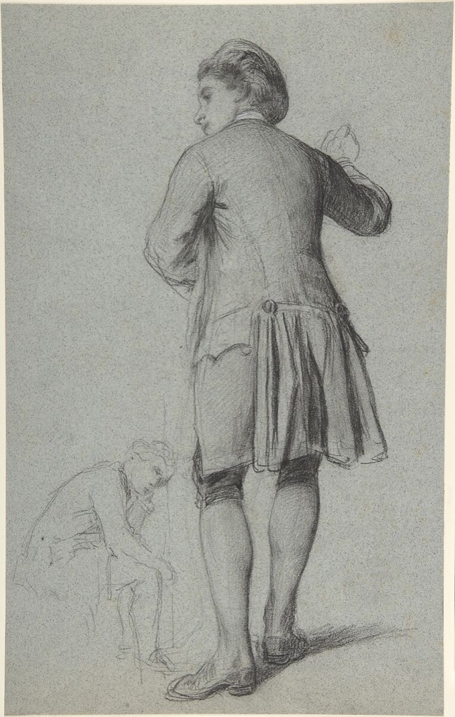
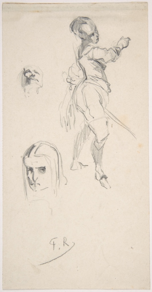
Félicien Rops’s undated Figure study is a useful evidence boundary as well as a material example. The Met securely records graphite, a sheet measuring 18.7 by 9.5 centimetres and accession 1980.1138.11, but it does not provide a date or extended interpretation.[3] We can compare its thin searching lines with broader grey passages without inventing a sitter or a stage in a project. Material description is strongest when it does not pretend to answer questions the record leaves open.
For a practical test, use one pencil on smooth and rough paper. Draw five adjacent bands with the point, then five with the side, keeping pressure as consistent as possible. Tilt both sheets under a lamp. The experiment separates three variables—lead, paper tooth and viewing angle—that a screen reproduction often collapses. The dedicated pencil drawing guide develops grading, layering and erasure in detail.
Charcoal: movable darks and lifted light
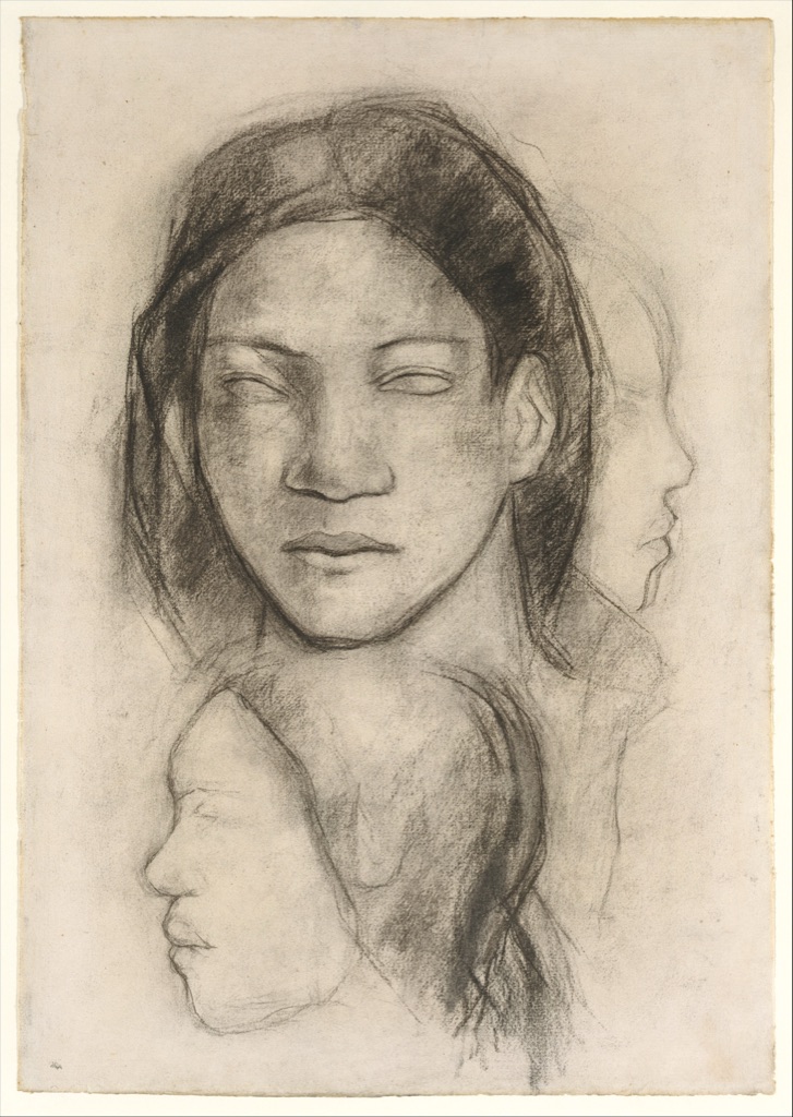
Charcoal is carbonised material whose particles sit relatively loosely on the surface. It can make a crisp stroke, a granular veil or a velvety dark, depending on hardness, pressure and paper. Because the deposit can be smudged and lifted, charcoal is especially responsive to stumping, wiping and erasure. That mobility is both an advantage and a handling problem: an unfixed drawing can offset or abrade.
Paul Gauguin’s Tahitian Faces (Frontal View and Profiles), made around 1899, shows the material moved after application. The Met describes charcoal contours smudged by stumping to model the head and considers the sheet likely preparatory for the left-hand figure in Two Tahitian Women.[4] The blank eyes and joined views create a sculptural, mask-like effect. The work also requires critical context: Gauguin’s images of Tahiti were made within a colonial situation and shaped by his own exoticising constructions. Naming the material does not make that history neutral.
The Getty’s ongoing Noir project offers a further caution. Charcoal, natural and fabricated chalks, Conté and lithographic crayons can appear remarkably similar; researchers use technical examination and imaging to discriminate between them.[5] On a museum label, prefer the catalogued medium. At home, compare rather than guess: make the same mark with vine charcoal, compressed charcoal and a soft graphite pencil, rub each once and erase each once. Record the differences before applying fixative. The charcoal drawing guide covers these working choices more fully.
Chalk: coloured earth, fabricated sticks and toned paper
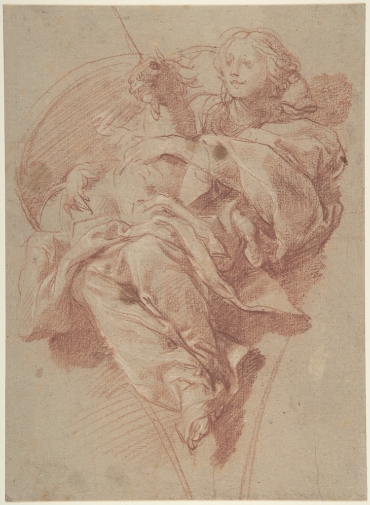
Historic “chalk” may refer to naturally occurring material or a fabricated drawing stick; black, red and white varieties behave differently. The nineteenth century brought an expanded range of manufactured black media, which is one reason appearance alone can be deceptive.[6] Chalk usually produces a more matt, particulate surface than graphite. On a coloured support, the paper can serve as a middle value while dark and light chalks move in opposite directions.
Baldassarre Franceschini’s 1650 Allegorical Figure of Purity with a Unicorn uses red chalk heightened with white chalk on thick beige paper; its verso carries a red-chalk drapery study.[7] The support is not an empty background waiting to be filled. It supplies a warm middle value. Red chalk builds contours and modelling below that value, while selected white strokes add light above it.
To understand this three-part system, choose grey or tan paper and restrict yourself to one dark chalk, one white chalk and the untouched support. Establish shadows first, leave the broad middle tones alone, then add white only to planes that face the light. If white spreads everywhere, it stops functioning as heightening and becomes another all-over layer.
Metalpoint: a prepared ground and an unforgiving line
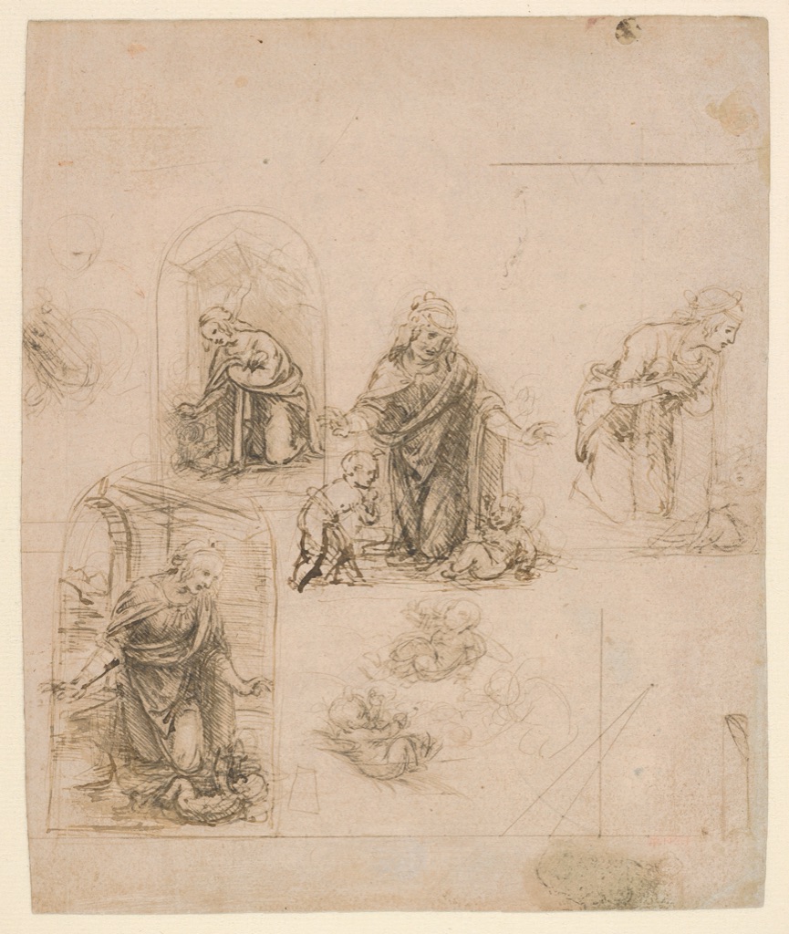
Metalpoint draws a metal stylus across an abrasive prepared surface, leaving a fine trace. Silverpoint is one metalpoint medium. Its narrow value range and resistance to ordinary erasure encourage careful placement, but historic artists also worked over, beside and on top of it with other materials.
Leonardo da Vinci’s Compositional Sketches for the Virgin Adoring the Christ Child, 1480–85, is silverpoint on pink prepared paper, partly reworked with pen and dark-brown ink.[8] Leonardo tested several arrangements of the Virgin, Christ Child and infant Saint John. At lower right, ruled metalpoint lines investigate perspective. The Met notes that he strengthened silverpoint shadows with ink to gain deeper tonal contrast.[8]
The sheet prevents two misconceptions at once. Metalpoint need not produce a slow, isolated portrait; Leonardo used it for rapid alternatives and geometry. Nor did choosing silverpoint forbid revision through another medium. If you try a modern metalpoint ground, prepare several small shapes in graphite first, then redraw them with the stylus without erasing. Add ink to only one version. The comparison reveals how an irreversible pale line changes planning and how a second medium changes hierarchy.
Pen and ink: decisive edges, accumulated density
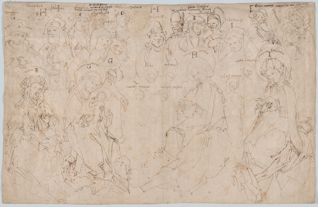
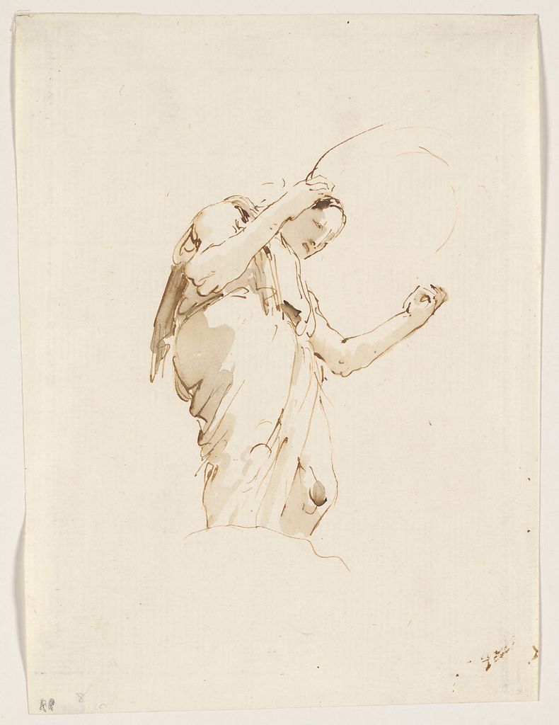
Ink is a fluid colourant; a pen is one delivery tool. Nib shape, flow and paper absorbency affect the edge. Lines can remain crisp, swell with pressure, pool at a pause or feather into fibres. Unlike loose charcoal, dried ink cannot usually be lifted back to clean paper, so corrections tend to remain visible or require an opaque addition.
The Master of the Drapery Studies’ Holy Kinship, about 1480, is pen and brown ink.[9] The Met distinguishes delicate but vigorous original drawing from sketchier central figures and darker additions made by a later hand. Those differences are not merely iconographic. Ink colour and density help reveal a sheet’s physical history: marks made at separate moments can coexist on the same support.
Make an ink test before a finished sheet. Draw slow and fast lines, cross them after ten seconds, and place a wash beside them. Note bleeding, drying time and whether the pen catches fibres. That small chart is more useful than assuming every brown-ink museum drawing was born brown; composition, ageing and conservation can complicate colour. See the ink drawing guide for pens, brushes and wash.
Pastel: dry pigment, coloured ground and optical mixture
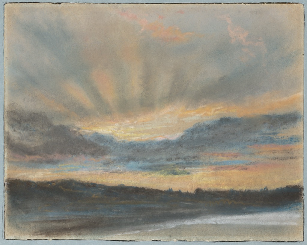
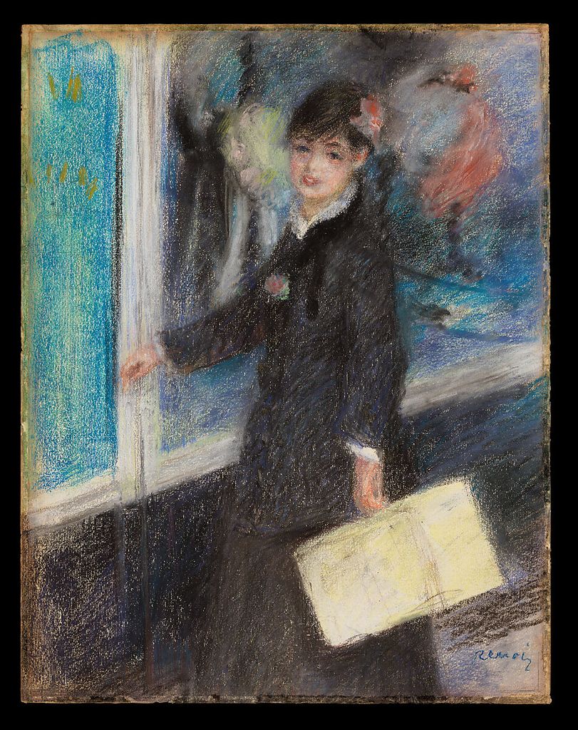
Pastel contains pigment held in a stick with a comparatively small amount of binder. It can make a narrow line, broken stroke, broad opaque layer or blended transition. Because pigment remains near the surface, colour can look intense, but the drawing is vulnerable to rubbing. The support’s tooth catches particles, and a coloured paper can remain visible as an active component.
Eugène Delacroix’s Sunset, about 1850, is pastel on blue laid paper.[10] Around 1849–50, he became absorbed in cloud light, producing his largest cohesive group in the medium. The blue sheet does not merely save labour. It establishes a pervasive cool field against which yellow and orange light can intensify, while darker clouds organise depth. The Met connects this investigation to Delacroix’s thinking about the ceiling of the Louvre’s Apollo Gallery.[10]
Try the support before buying many colours. Place the same three pastel strokes on white, grey and blue paper, leaving gaps between them. From a distance, the ground optically joins the marks and changes the apparent temperature of the set. Do not blend every gap away. The pastel drawing guide covers layering, edges and safe handling.
Watercolour and gouache: transparent and opaque water media
Watercolour usually describes pigment bound for dilution with water and used transparently enough for the support to contribute light. The V&A notes that artists can lift wet or re-wetted colour and scratch into a surface to recover highlights.[11] Gouache is an opaque watercolour: instead of relying chiefly on white paper shining through, it can place a light shape over a darker one.
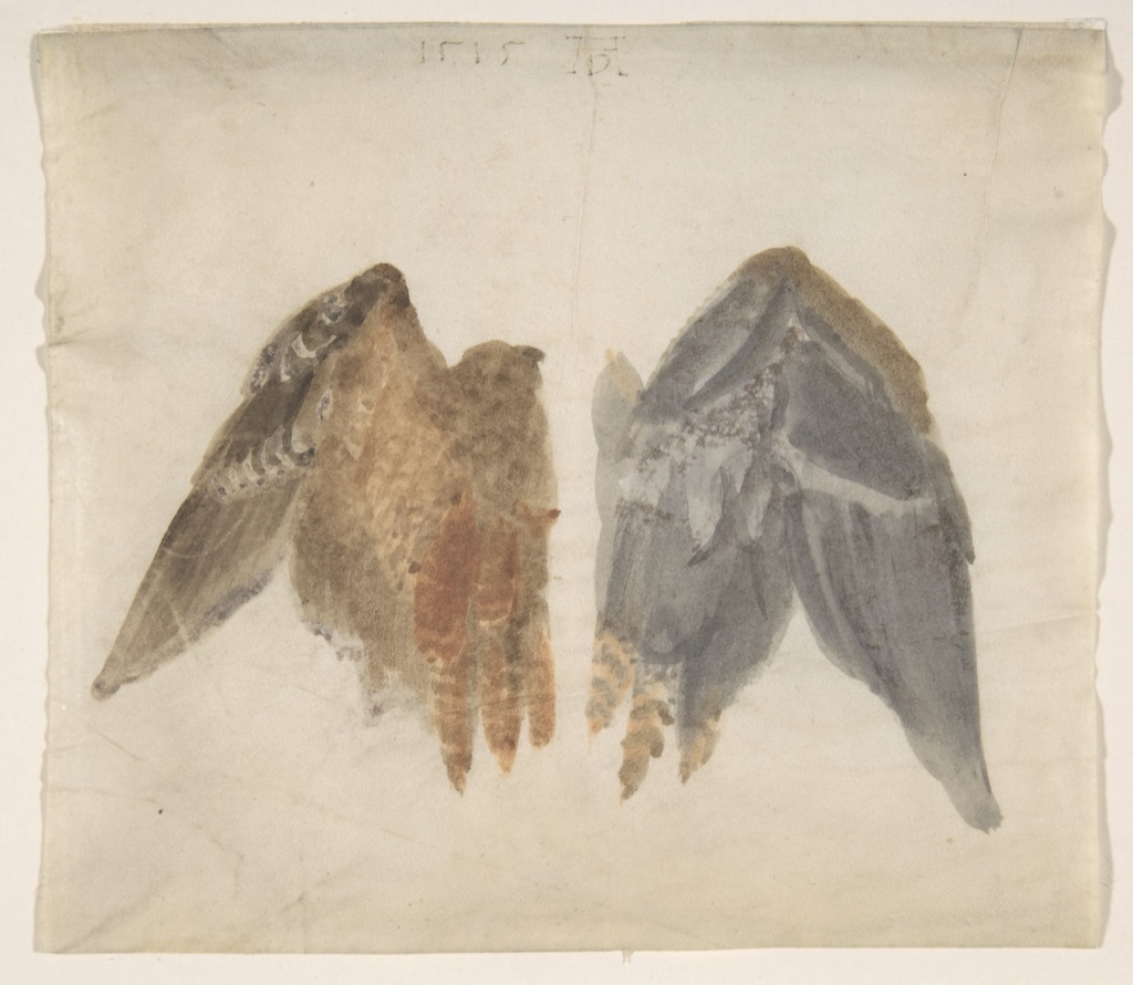
Albrecht Dürer’s Bittern’s Wings: study showing both sides of 1515 is watercolour on vellum.[12] The paired wing surfaces demand shifts in feather direction, pattern and edge. The Met record gives the title, date, material and object history but does not document a scientific commission, so close observation should not be inflated into a modern scientific purpose. Vellum also matters: watercolour on prepared animal skin does not behave exactly like colour on absorbent rag paper.
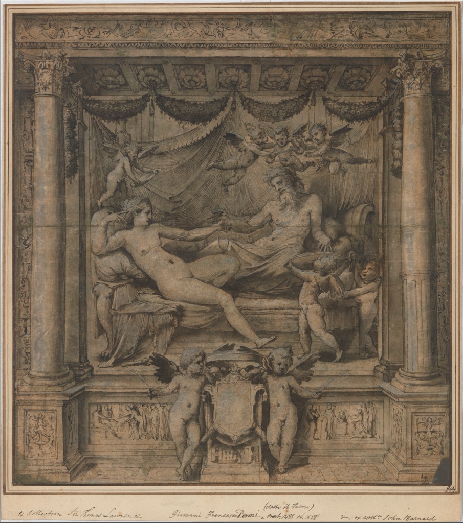
Perino del Vaga’s Jupiter and Juno, about 1532–35, combines pen and dark-brown ink, brown and grey wash, and white gouache.[13] It was a study for a now-lost tapestry series commissioned by Andrea Doria. Its large size, surrounding borders, finish and lack of visible changes lead the Met to suggest that it functioned as a presentation drawing.[13] Transparent washes create broad modelling; opaque white restores highlights; pen carries the detailed framework. “Mixed media” here is not an admission that identification failed. It describes a designed sequence of complementary behaviours.
Choosing and combining a medium
Begin with the task. For pale, measured construction and easy adjustment, graphite is practical. For broad movable darks, charcoal gives range but requires careful handling. Chalk works particularly well with a toned support. Metalpoint rewards deliberate fine line on a prepared ground. Ink offers decisive line and flowing wash. Pastel supplies dry, saturated colour; watercolour supplies transparent colour; gouache can add opacity.
Then test compatibility. A waxy or heavily polished layer may resist water. Fragile dry colour can be disturbed by later brushing. Very thin paper can buckle under wash. Fixative can darken or desaturate some passages. Historic museum sheets are evidence of possibilities, not recipes whose materials are automatically safe or chemically identical to modern products.
Finally, label what you actually used. A note such as “graphite, compressed charcoal and white chalk on grey laid paper” is more informative than “mixed pencils”. It helps you repeat a successful combination and trains the same material attention used in collection records. When looking at art online, accept the museum’s qualified terminology: Getty’s research demonstrates that even specialists may need instruments to separate visually similar black media.[5]
Make a useful medium test sheet
A swatch is most useful when it records behaviour rather than colour alone. Divide one sheet into columns for point, side, layered dark, blend, erasure and overlap. Across the rows, test each dry material you are considering. On a separate piece of the same support, test a fine ink line, a broad ink stroke, pale and dark watercolour wash, and opaque gouache. Write the tool, brand or grade and support beside the result.
Let wet tests dry completely before judging them. Record whether a second layer lifts the first, whether an eraser returns the support to clean light, and whether a dry material transfers to a facing sheet. These observations translate directly into decisions. A graphite that erases cleanly may suit initial construction; a charcoal that lifts readily may suit drawings developed by subtraction; an ink that feathers on one paper may be unusable for small detail but expressive for foliage.
The test also exposes false comparisons. A soft charcoal stick and a fine metalpoint cannot fairly be judged by which produces the darkest square: they are designed for different ranges. Compare how well each performs its intended job. Keep the sheet with the finished drawing, especially when several black materials look alike later.
Looking after works on paper
Historic drawings survive because materials and supports have been managed carefully, not because every “permanent” label guarantees safety. Getty rotates displays of drawings in part to limit light exposure.[1] At home, avoid touching friable charcoal or pastel surfaces and do not spray an unfamiliar fixative over a completed work without testing it first. Store clean interleaving so that loose material does not transfer, keep liquid media away from damp, and use archival guidance for anything you intend to preserve seriously.
These precautions are not separate from creativity. The fragility of pastel encourages direct placement; the irreversibility of ink changes rehearsal; the limited erasure of metalpoint makes preparation part of the mark. Care begins with understanding the material, not only after the drawing is finished.
Medium is not a style applied after the drawing is designed. It sets conditions—how quickly a mark arrives, how far it can be moved, how the support participates and how the finished sheet must be handled. Understanding those conditions lets material choice serve the drawing’s purpose.
Watch Drawing Media Move from Material to Mark
Choose technical reconstruction, close object study or a museum-led studio demonstration.
Drawing with Charcoal: Historical Techniques
See nineteenth-century French black drawing materials, preparation and handling reconstructed from technical research.
Watch on YouTubeFrequently Asked Questions
The medium is the substance that makes the mark, such as graphite or ink. The tool carries or shapes it, a technique describes how it is handled, and the support is the surface that receives it.
Graphite is a practical first choice for controlled lines and tonal exercises, while vine or willow charcoal is useful for broad masses and lifting. The best choice still depends on the task and paper.
Graphite can hold a precise point and may become reflective when densely layered. Charcoal is usually more matt, powdery and responsive to broad massing and lifting.
Yes. Museum drawings combine charcoal, chalk, ink, wash, watercolour and opaque white, but order and compatibility should be tested because liquid can move dry particles or disturb paper.
Avoid rubbing the image surface, use suitable archival interleaving and mounts, control light and humidity, and seek a paper conservator for valuable or unstable works.
Discussion
Which medium changes your decisions most clearly: the speed of charcoal, the precision of graphite, the permanence of ink or the colour of pastel and wash?
Reader Insights
Separate medium, tool, technique and support before judging the result.
Repeat one mark on smooth, rough, white and toned paper to see what actually changes.
Keep a labelled swatch sheet recording grade, pressure, dilution and erasure.
Join the Conversation
Share a useful medium test, museum drawing or combination that changed how you work below.
References
- J. Paul Getty Museum, “Drawings”: source.
- The Metropolitan Museum of Art, “Selections from the Department of Drawings and Prints: Materials and Techniques”: source.
- The Metropolitan Museum of Art, Félicien Rops, Figure study, 1980.1138.11: source.
- The Metropolitan Museum of Art, Paul Gauguin, Tahitian Faces, 1996.418: source.
- J. Paul Getty Museum, “Noir: Technical Examination and Analysis of 19th-century Black Drawing Materials”: source.
- J. Paul Getty Museum, “Getty Presents Noir”: source.
- The Metropolitan Museum of Art, Baldassarre Franceschini, Allegorical Figure of Purity with a Unicorn, 69.115: source.
- The Metropolitan Museum of Art, Leonardo da Vinci, Compositional Sketches for the Virgin Adoring the Christ Child, 17.142.1: source.
- The Metropolitan Museum of Art, Master of the Drapery Studies, The Holy Kinship, 2018.119: source.
- The Metropolitan Museum of Art, Eugène Delacroix, Sunset, 2014.732.4: source.
- Victoria and Albert Museum, “What is watercolour?”: source.
- The Metropolitan Museum of Art, Albrecht Dürer, Bittern’s Wings, 19.184: source.
- The Metropolitan Museum of Art, Perino del Vaga, Jupiter and Juno, 2011.36: source.