by Tom Gurney
Tom Gurney BSc (Hons) is an art history expert with over 20 years experience
Page created on September 2, 2026 / Page updated on September 13, 2026
Email: tomgurney1@gmail.com / Phone: +44 7429 011000
Preserve Light by Managing Tooth, Pressure and Every Layer
Pastel puts almost pure colour directly in the hand. A stick can leave a narrow saturated stroke, a broad veil broken by paper texture or loose powder that can be spread and lifted. That immediacy is paired with fragility: the colour remains particulate, so pressure, blending, fixing and storage all affect the finished surface.
The Met describes pastel as finely ground pigment with a white filler and a very small amount of binder, rolled into sticks firm enough to hold yet able to crumble against a support.[1] It is opaque and reflects light from countless powder particles. This guide develops practical control while treating every modern product’s label as the authority for composition and safety.
Eight illustrated works are Public Domain through Met Open Access.[12] They show pastel alone, with charcoal or chalk, on coloured, joined and tracing papers. Their material records prevent “pastel” from becoming a single soft-focus look.
At a Glance
- Test pastel and support togetherHardness, binder, paper tooth, colour and fixative interact; record a sample before the finished work.
- Give tip and side separate jobsThe tip selects edges and accents; the side lays broader masses without filling the surface too soon.
- Limit colours by roleChoose lights, middle values, darks and temperature shifts before chasing every local hue.
- Blend only for a reasonOptical layering preserves vibration; physical blending can unify a passage but may quickly dull it.
- Protect the fragile surfaceTest fixative, use interleaving and frame with a spacer so loose pigment is not pressed or rubbed.
Contents
Choose the Pastel Control That Protects Colour and Structure
Pastel changes quickly as pigment fills the support. Decide whether the next action should create coverage, preserve tooth, sharpen an edge, mix colour or protect the surface.
| Control | What it changes | Useful choice | Risk to watch |
|---|---|---|---|
| Stick hardness | Deposit, edge and resistance. | Harder material for construction; softer for broad final colour. | Assuming maker labels form one universal scale. |
| Tip or side | Line width, coverage and directional rhythm. | Tip for selected accents; side for larger masses. | Using the tip to fill broad passages and clogging the tooth. |
| Pressure | Density, adhesion and remaining capacity. | Begin lightly and reserve firm deposits for decisive layers. | Burnishing the surface before colour relationships are resolved. |
| Optical layering | Vibration and temperature interaction. | Let broken upper marks reveal the colour below. | Adding too many similar layers until the passage turns muddy. |
| Physical blending | Continuity and softened transition. | Blend one selected passage with a clean tool or controlled touch. | Rubbing every area into the same texture and dullness. |
| Fixative and storage | Handling stability and surface appearance. | Test the exact product; interleave and frame with a spacer. | Assuming fixative is invisible or makes the work abrasion-proof. |
Build a product and paper test
Pastels are sold as soft, medium, hard, pencils and pans, but grades are relative to each maker. A softer stick generally releases colour readily and fills tooth sooner; a harder one can produce controlled lines. Record brand and colour number on a swatch card instead of assuming two products labelled “soft” behave alike.
The paper needs enough texture, or tooth, to catch particles.[1] Test three supports with the same four marks: tip line, side stroke, three light layers and one blended patch. Note when the surface stops accepting clean colour. A coarse tooth leaves sparkling gaps; a smoother surface can give precision but may saturate quickly.
Tap loose dust into a controlled area rather than blowing it. Follow the manufacturer’s current handling guidance, especially for pigments or airborne powder. Keep food and drink away from the table and clean without sweeping particles into the air.
Use tip, side and pressure separately
The tip makes defined, saturated strokes; the broad side produces lighter passages that reveal the support.[1] A broken corner adds irregular accents. Change contact before increasing pressure. Heavy pressure can pack the tooth and make later layers slide or turn glossy.
Make a nine-square chart. Across the top use tip, side and broken edge; down the side use light, medium and firm pressure. Use one colour throughout. The chart identifies whether darkness comes from contact, pressure or repeated deposit.
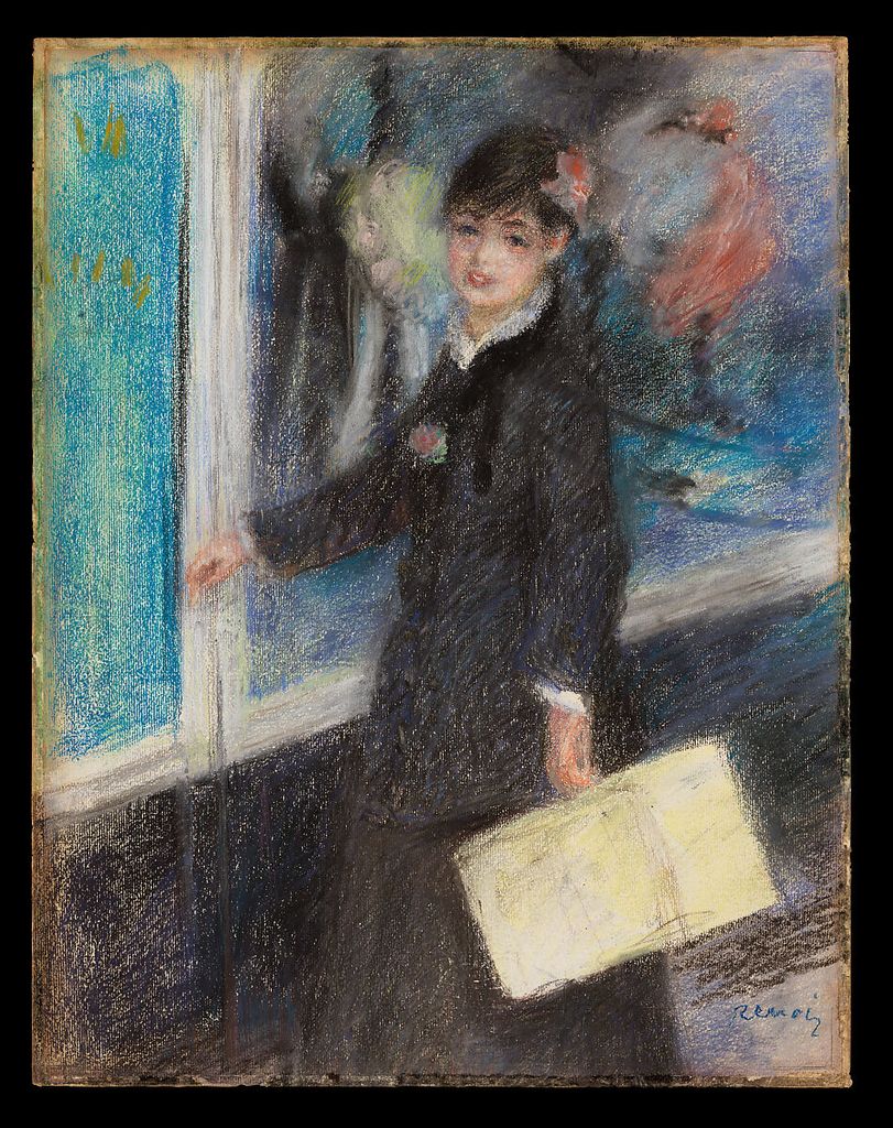
Auguste Renoir’s The Milliner, about 1879, is catalogued as pastel on paper.[2] The record supports a direct pastel example without specifying every technique. Use it to study how a limited group of colour shapes can identify figure and setting before facial detail.
Choose a limited palette by role
Begin with six to ten sticks selected by value and temperature, not by matching local names. Include a light warm, light cool, middle warm, middle cool, dark warm, dark cool and one or two high-chroma accents. Make a value strip in monochrome, then place colour swatches beside equivalent steps.
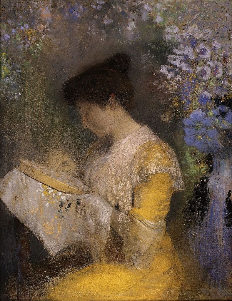
Odilon Redon’s 1901 Madame Arthur Fontaine is pastel on paper.[3] Its documented identity and medium support portrait comparison, but not a reconstruction of his entire sequence. For a head study, assign the darkest and sharpest contrast to a small focal region, and let surrounding colour remain broader.
A limited palette exposes relationships. If a skin, wall or cloth cannot be matched exactly, compare whether it is warmer, cooler, lighter, darker, duller or more saturated than its neighbour. Relative colour can produce coherence without a stick for every observed hue.
Layer without filling the tooth too soon
Apply early layers lightly so the support can accept later corrections and accents. Let some paper remain visible. Cross one directional stroke with another rather than grinding them immediately into a uniform paste. Step back: separated particles may mix optically at viewing distance.
The Met warns that excessive blending and mixing diminish pastel’s brilliance, while adjacent contrasting hues can remain vivid.[1] Make two orange passages: blend red and yellow physically in one, and interweave separate red and yellow strokes in the other. Compare them nearby and from across the room.
Reserve the softest sticks for late broad colour or accents if they overwhelm the surface early. If a layer will not adhere, adding pressure may damage the support; move to a fresh area of tooth, simplify the passage or accept the saturated state.
Blend with a defined purpose
Stumps, soft tools and fingers have all been used to spread pastel, but blending should have a job: soften an edge, join a turning plane or establish an underlayer. Keep tools separated by colour family and test for oil or residue. A dirty stump can neutralise a passage unexpectedly.
Blend one transition, leave the adjacent strokes distinct, then redraw a selected edge. Compare the surface languages. If the entire page is blended, differences of focus, material and depth become harder to express.
Pastel powder can also be manipulated wet or with a brush in historical practice, as the NGA survey notes.[4] Do not assume every stick or support tolerates water. Test the specific product, allow it to dry, and observe whether colour, adhesion or paper cockling changes.
Coordinate charcoal and pastel
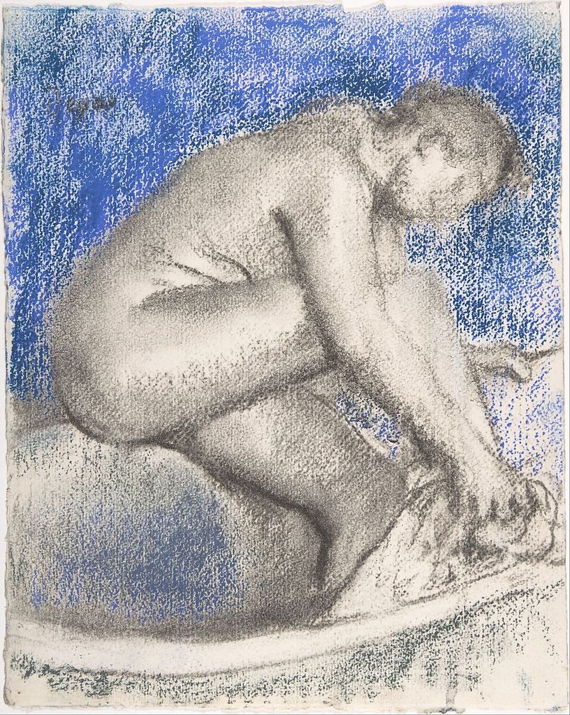
Edgar Degas’s The Bath, dated 1895 or before, combines charcoal and pastel on heavy wove paper.[5] Charcoal can establish a dark structure before colour, but excessive loose black may contaminate every later stick. Keep the underdrawing spare and remove surplus powder before layering.
Draw a figure as five charcoal masses, then add three pastel colours without covering all the black. Decide which material carries contour, value and temperature. If both repeat every boundary, the mixture becomes redundant.
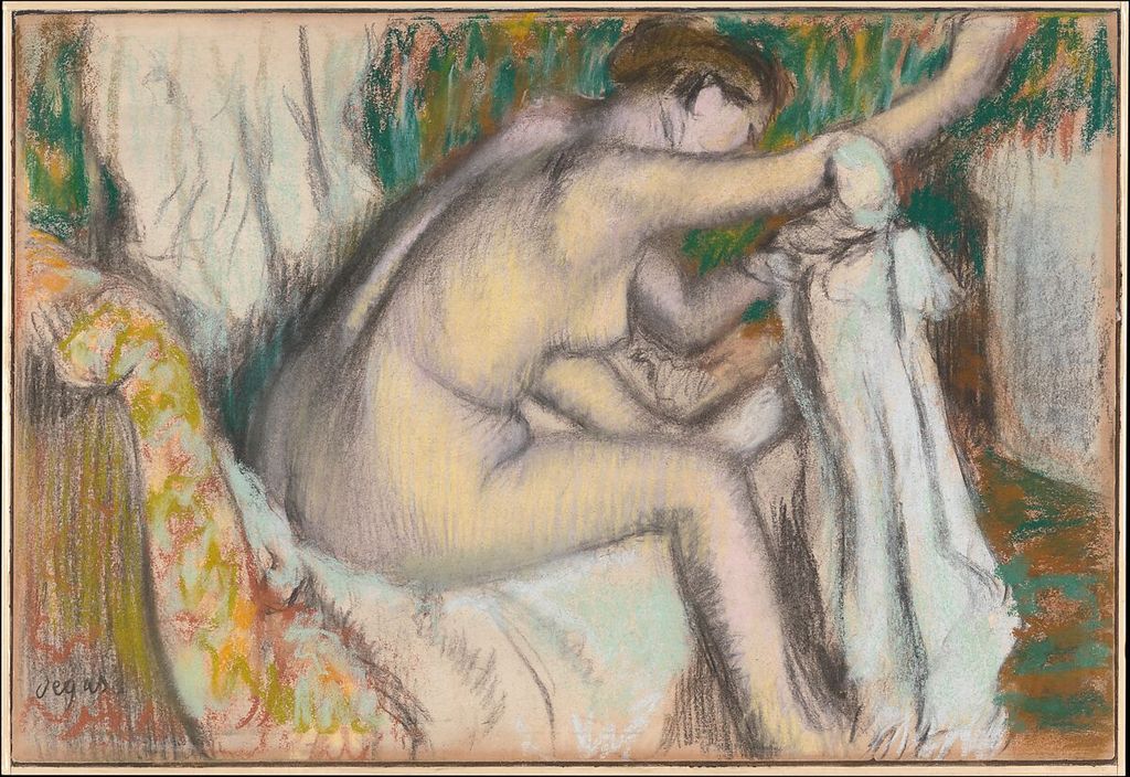
Degas’s Woman Drying Her Arm, from the late 1880s or early 1890s, uses pastel and charcoal on light pink paper.[6] The Met identifies it as one of eighteen variants. Repeating a composition can therefore be a development method. Make two versions with the same pose but reverse which material dominates.
Let a coloured ground participate
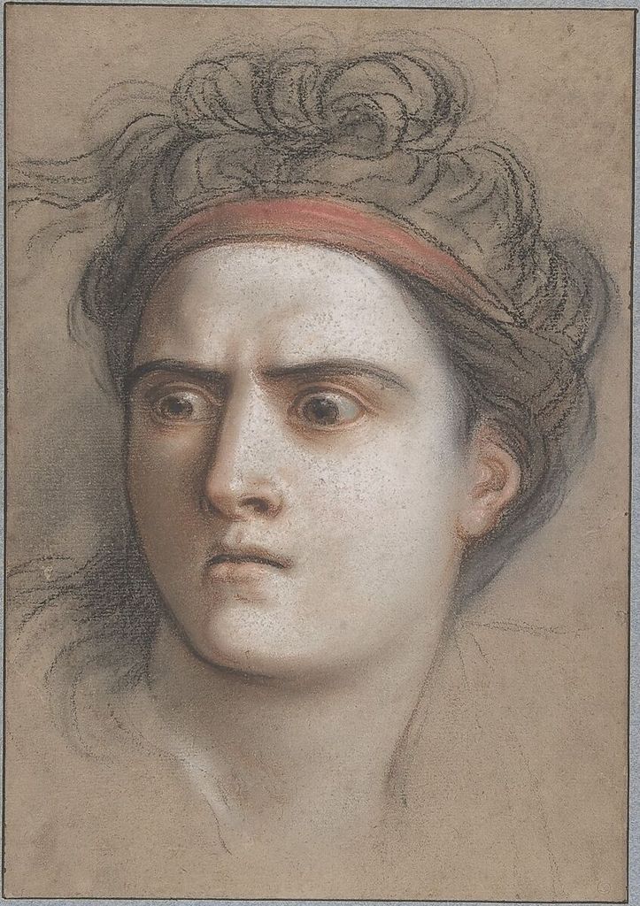
Charles Antoine Coypel’s Medea, about 1715, is pastel on brown paper with framing lines in brown ink.[7] A middle-toned ground reduces the amount of pastel needed to span light and dark. Choose a paper that relates to the intended temperature, then reserve it across substantial areas.
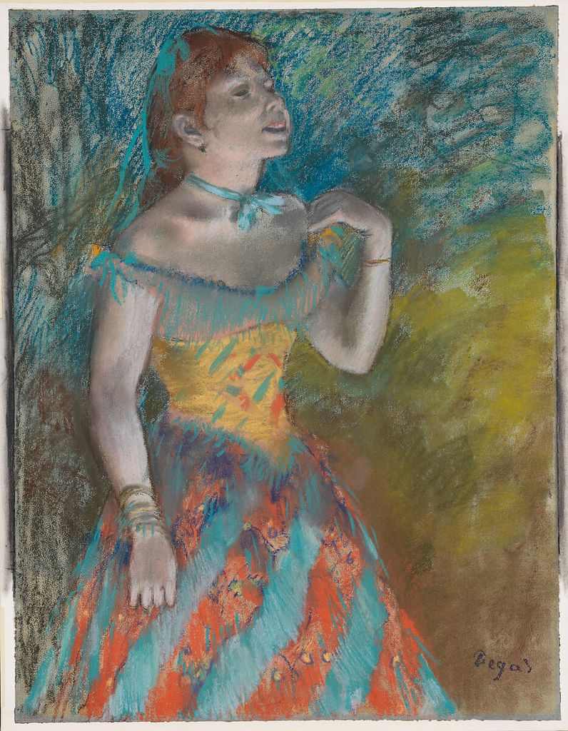
Degas’s The Singer in Green, about 1884, uses pastel on light blue laid paper.[8] Compare how a blue ground affects yellow, orange and green swatches. The same stick can appear warmer or duller depending on its surround.
Build a portrait using ground, one dark family, two middle colours and one light. Do not cover the paper merely to prove the drawing is finished. The untouched support can unify scattered strokes and keep the surface breathable.
Revise composition physically and visually
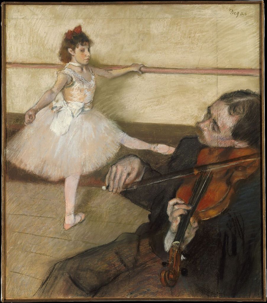
Degas’s The Dance Lesson, about 1879, uses pastel and black chalk on three pieces of wove paper joined together.[9] The Met reports adjustments and added strips. This object-specific evidence shows that revision could expand the support; it does not recommend attaching arbitrary paper without conservation knowledge.
For practice, use removable paper strips around a thumbnail to test a taller, wider or shifted crop. Photograph each arrangement. Redraw the chosen proportion on one sound sheet rather than permanently joining unsuitable materials.
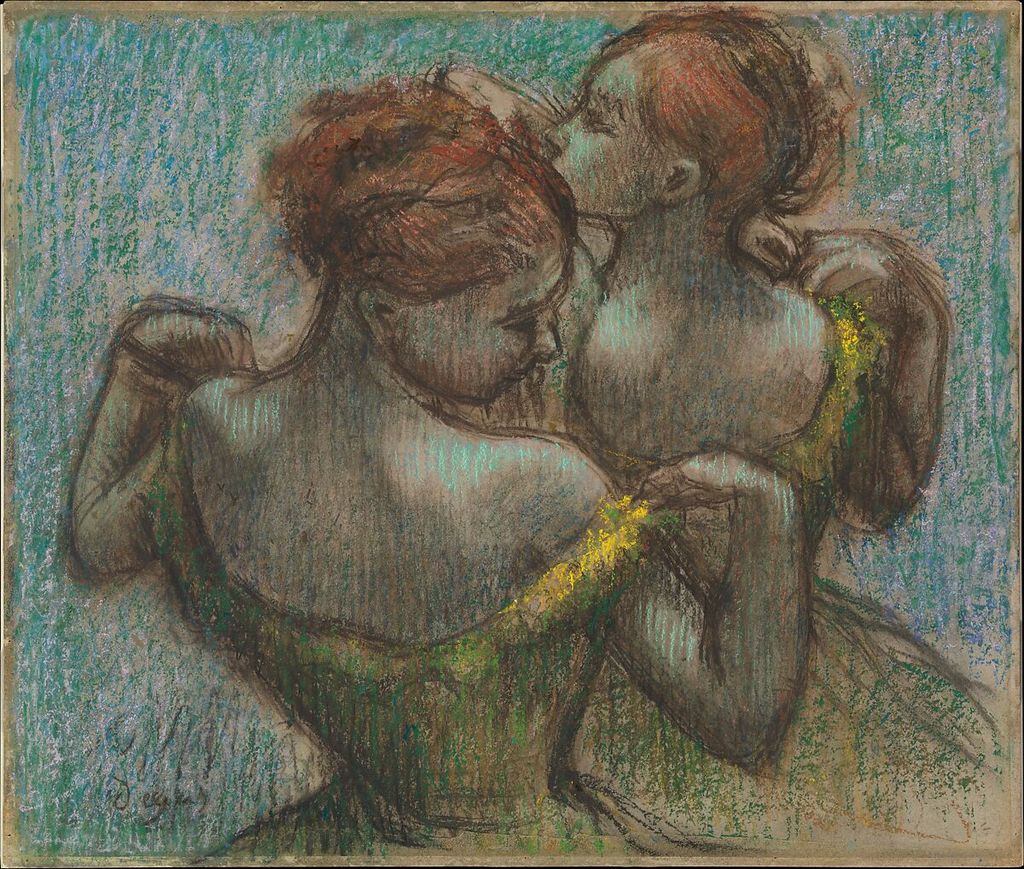
Two Dancers, Half-length combines pastel and charcoal on tracing paper with a joined strip, laid on cardboard.[10] Tracing can repeat or reposition forms, but historic mount structures are not templates for home mounting. Use archival advice for finished work and treat the record as process evidence.
Organise value, temperature and edge
Colour does not replace value. Squint or photograph the setup in greyscale to check whether the large light and dark groups remain clear. Use temperature shifts inside a value family instead of darkening every turn.
Create a sphere with four values and two temperatures. Keep the lit side warmer and the shadow cooler, then reverse the relationship in a second study. Preserve one hard cast-shadow edge, one soft turning edge and one lost contour. The exercise separates colour organisation from local imitation.
Pastel excels at broken edges. Drag a side lightly so tooth interrupts the stroke, then overlap a neighbouring colour without blending. Use a firm tip only at the focal boundary. An edge can change because of pressure, hue contrast, value or texture; test which variable is doing the work.
Diagnose muddiness and weak colour
If colour turns grey, check whether too many complementary hues were physically mixed, whether the stump is dirty, or whether the tooth is full. Scraping or rubbing may harm the support. A safer response on a practice sheet is to stop, identify the cause and begin a fresh swatch with fewer layers.
If everything is equally bright, reduce surrounding saturation rather than making the focal colour thicker. If lights look chalky, compare their temperature and opacity with the ground. If darks shed, determine whether the stick is too soft for the surface or the deposit too heavy.
Keep the failed area. Label its layer order and products. Material knowledge grows faster from a documented muddy passage than from repeatedly hiding it beneath more powder.
Sharpen and protect pastel pencils
Pastel pencils support smaller accents, but their cores may be brittle. Follow the maker’s sharpening guidance and test a hand sharpener, blade or abrasive block only where safely appropriate. Catch the dust rather than blowing it away. A long exposed point is not useful if it breaks before reaching the page.
Use pencils to clarify a few junctions after broad sticks have established colour. If every passage is redrawn with a pencil, the study can lose the scale and energy of its earlier marks. Store sharpened tools so their tips do not strike one another, and keep colour numbers legible for later replacement.
Treat fixative as a tested material
Fixative may compress powder, darken colours and reduce reflected light; the Met notes that few artists have relied on surface coatings for this reason.[1] A spray is not a neutral “save” button. Use only a product intended for the materials, follow its ventilation and distance instructions, and test on a duplicate swatch.
Photograph and scan the dry test before fixing it. Apply the proposed number of passes, allow the stated drying time, then compare value, hue, sheen and adhesion. A workable fixative between layers and a final coating may behave differently; consult the actual product information.
Historical accounts of alternating pastel and fixative illuminate artists’ processes, not universal studio advice. Conservation requirements vary with pigment, binder, support, mount and environment.[11]
Store and move fragile work
Pastel surfaces are vulnerable to abrasion, smudging, vibration and unsuitable light.[11] Do not slide another sheet across the face. Use an appropriate interleaf for short-term portfolio storage and keep the work supported. Finished framing requires a spacer so glazing does not touch the pastel.
Static, mounting adhesives and environmental conditions complicate long-term display. For valuable work, use a qualified paper conservator or framer familiar with pastel. Museum recommendations describe collection care and cannot simply be copied into every home situation.
Carry an unframed study flat and face up when possible. Secure it against shifting without pressing the surface. Record the materials and any fixative on the reverse or a separate document so future handling decisions are informed.
Complete a controlled pastel study
Choose a simple subject on a coloured ground. Spend five minutes on a hard-pastel or charcoal structure, five mapping three values, ten placing limited colour families, and five adjusting edges. Blend only two transitions and reserve the softest accent until the end.
Review at near, middle and far distances. Check whether the ground still participates, the value pattern survives without colour, the focus differs in edge and saturation, and loose powder is controlled. Write down the layer order before packing the work.
The eight museum sheets reject a single pastel formula. Renoir and Redon demonstrate direct colour; Coypel and Degas use coloured grounds; charcoal joins pastel in several works; tracing and joined papers record revision; repeated compositions support development. The consistent lesson is restraint: preserve tooth, separate strokes when brilliance matters, test blending and fixing, and protect the particulate surface.
See charcoal drawing for black dry-media massing, pencil drawing for graphite structure, or figure drawing for sustained studies of the body.
Watch Dry Drawing Materials Build Edge and Tone
Choose a Getty reconstruction of historical charcoal practice, a curator-led reading of Sargent's charcoal portraits or a National Gallery Singapore studio demonstration as useful dry-media comparisons.
Drawing with Charcoal: Historical Techniques
Getty conservators and artists show how preparation, pressure, fixing and erasure shape a dry drawing surface—directly useful when testing pastel handling.
Watch on YouTubeFrequently Asked Questions
Pastel drawing uses dry sticks or pencils made from pigment with enough binder to hold a usable form. The marks remain close to the brilliance of dry pigment but create a fragile surface.
Muddiness often comes from filling the paper tooth too early, physically blending every layer or repeatedly adding similar colours. Begin lightly, keep roles clear and reserve dense soft pastel for later accents.
Only when a specific passage needs that effect. Fingers can compress pigment, transfer oils and flatten texture; clean tools, controlled scumbling or optical layering may preserve more colour vibration.
Not always. Fixative can darken or shift colour and does not make the surface immune to abrasion. Test the exact product and application on the same paper and pigments first.
Keep it flat or securely mounted, protect the face with suitable interleaving without rubbing, and frame behind glazing with a spacer so the surface does not touch the glass.
Discussion
Which pastel work becomes more legible when you separate the roles of ground, optical layering, blending and final accents?
Reader Insights
Every firm layer reduces the surface available for later pigment.
It changes colour, edge and texture and should answer a defined visual need.
Testing fixative and planning storage are material decisions, not afterthoughts.
Join the Conversation
Share one pastel study in which lighter pressure, a visible ground or less blending made the colour more luminous.
References
- The Metropolitan Museum of Art, “Pastel”: source.
- The Metropolitan Museum of Art, Auguste Renoir, The Milliner: source.
- The Metropolitan Museum of Art, Odilon Redon, Madame Arthur Fontaine: source.
- National Gallery of Art, “The Touch of Color”: source.
- The Metropolitan Museum of Art, Edgar Degas, The Bath: source.
- The Metropolitan Museum of Art, Edgar Degas, Woman Drying Her Arm: source.
- The Metropolitan Museum of Art, Charles Antoine Coypel, Medea: source.
- The Metropolitan Museum of Art, Edgar Degas, The Singer in Green: source.
- The Metropolitan Museum of Art, Edgar Degas, The Dance Lesson: source.
- The Metropolitan Museum of Art, Edgar Degas, Two Dancers, Half-length: source.
- The Metropolitan Museum of Art, “The Rise of Pastel in the Eighteenth Century”: source.
- The Metropolitan Museum of Art, Open Access: source.