by Tom Gurney
Tom Gurney BSc (Hons) is an art history expert with over 20 years experience
Page created on September 2, 2026 / Page updated on September 13, 2026
Email: tomgurney1@gmail.com / Phone: +44 7429 011000
Replace the Named Object with Relationships You Can Test
Observational drawing is the practice of comparing a visible subject with marks on a page. It is not a contest to name the object or reproduce a photograph. The useful questions are relational: how wide is one interval beside another, which angle rises more steeply, where does an edge disappear, and how large is a dark shape within the whole?
The National Gallery of Art uses everyday objects to develop direct looking and drawing decisions.[1] This guide turns that principle into a repeatable session using sighting, negative space, proportion, perspective, value and review. Its eight historical examples are Public Domain images supplied through the Met’s Open Access programme.[10]
At a Glance
- Compare before describingSet the envelope, main axis, width-to-height ratio and large intervals before details.
- Use several checksAngles, alignments, negative spaces and proportional units expose different kinds of error.
- Draw what is visibleA familiar symbol for a hand, cup or room is not evidence of the form in front of you.
- Group values broadlyEstablish light, middle and dark families before modelling local texture.
- Correct diagnosticallyName whether an error comes from angle, interval, alignment, value or edge before redrawing it.
Contents
Choose the Measuring Check That Reveals the Error
No single check solves every drawing. Compare the type of mismatch you see with the relationship most likely to expose it, then correct the larger structure before surface detail.
| Check | Best question | How to use it | Common trap |
|---|---|---|---|
| Envelope | Is the whole subject too wide, tall or tilted? | Box the extreme top, bottom and sides with a main axis. | Fitting details inside an already incorrect boundary. |
| Proportional unit | How large is one part relative to another? | Choose a stable unit and repeat it across the subject. | Changing the unit unconsciously between comparisons. |
| Angle | Does a slope rise or fall by the right amount? | Compare it with horizontal or vertical, not with a named object. | Rotating the measuring tool away from the picture plane. |
| Alignment | Which landmarks sit above, below or beside one another? | Drop an imagined vertical or horizontal through key points. | Checking only neighbouring details and missing the whole. |
| Negative space | Is the gap between forms the right shape? | Draw the empty interval as a positive, bounded shape. | Returning to object symbols instead of measuring the gap. |
| Value family | Is form being lost because light and dark groups are fragmented? | Squint and reduce the subject to broad light, middle and dark masses. | Copying local texture before the large value pattern works. |
Arrange a subject you can compare
Begin with two or three objects whose shapes overlap: a mug, box and piece of fruit are enough. Place them below eye level under one light. Mark the feet of the chair and objects with removable tape so an interrupted session can be reconstructed. A changing viewpoint changes every alignment, so sit where your head can return to the same place.
Choose the page orientation from the subject’s overall envelope. Before drawing, trace that envelope in the air: top, bottom, left, right and the largest diagonal. Decide how much surrounding space belongs in the composition. A generous margin makes proportion errors easier to see than a subject squeezed against the edges.
Spend one minute only looking. Identify the biggest light, darkest dark, longest straight interval and most important overlap. These observations become priorities. Detail noticed early is not automatically detail that should be drawn early.
Establish an envelope and axis
An envelope is a simple boundary around the entire subject or group. Place its height and width lightly, then add an axis for the dominant direction. Divide the envelope only after its proportions agree with what you see. This prevents a carefully rendered first object from forcing every later object into the remaining space.
Hold the pencil at arm’s length and keep the elbow straight. Use the pencil’s visible length to compare height with width; do not record the measurement as an absolute unit. If the group appears one and a half times wider than high, test whether the page envelope carries the same relationship.
Make corrections while lines are pale. A shifted boundary is evidence that comparison is working. Do not erase each attempt immediately; keeping two faint alternatives can show which alignment fits the other measured points.
Sight angles and alignments
For an angle, hold the pencil horizontally or vertically, then rotate it until it matches the observed edge. Transfer that inclination without changing wrist angle. Check slopes against one another rather than describing them as “nearly diagonal.” Small errors become visible when two measured edges should converge or remain parallel in the view.
Vertical alignments are equally useful. Drop an imagined plumb line from the rim of a cup and notice what it crosses below. Compare the left edge of one object with the centre of another. Horizontal checks can locate tops, bases and changes of plane.
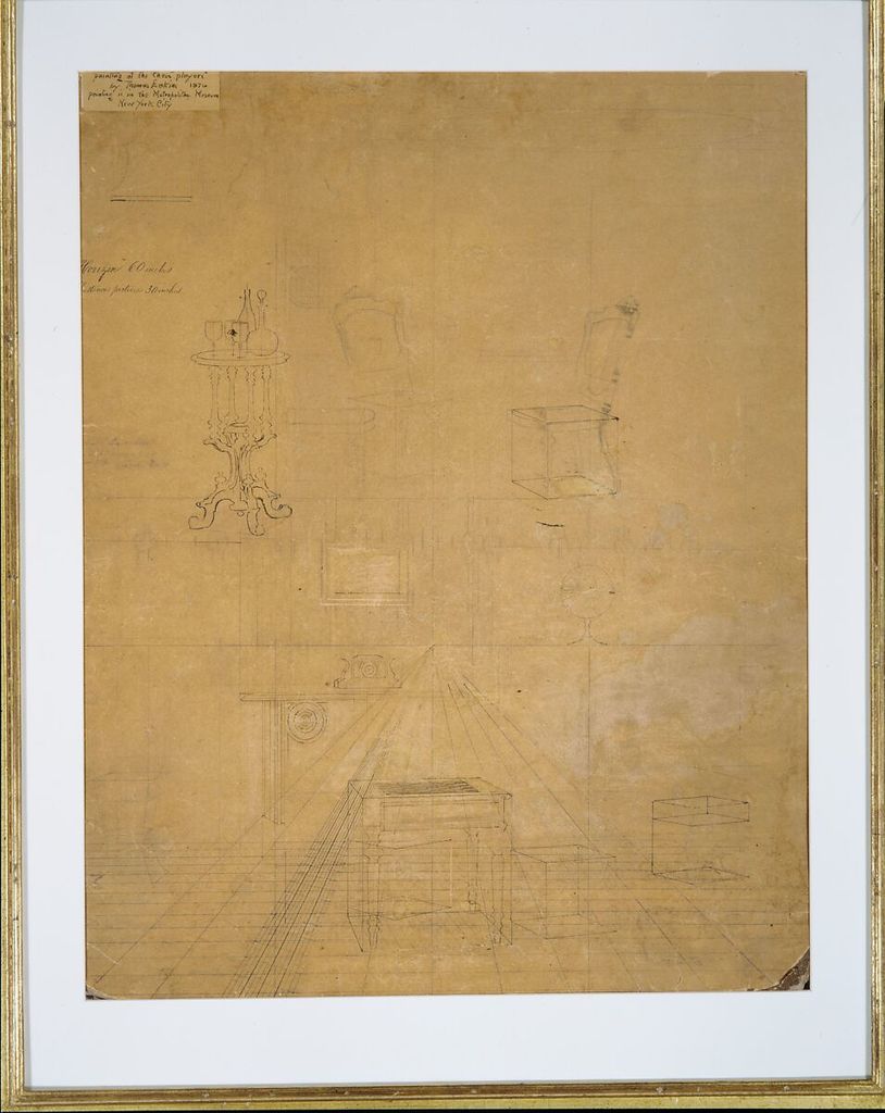
Thomas Eakins’s Perspective Drawing for the “Chess Players”, 1875–76, uses graphite and ink on cardboard.[2] The title and material establish a constructed study linked to a painting. It is a reminder that observational information and geometric organisation can cooperate. Build the room broadly, then use perspective lines only where repeated edges demand them.
Draw negative spaces as shapes
Negative space is the visible interval around or between subjects. Treat it as a positive shape with measurable corners. The triangular gap between a handle and cup, the strip of wall between two objects, and the wedge beneath an arm may be easier to compare than the named forms that surround them.
Outline three negative spaces before completing the objects. Ask whether their widths and angles agree. If one gap is too narrow, correct the neighbouring positive forms rather than decorating them. This reverses the habitual tendency to draw what an object is believed to look like.
The NGA’s drawing overview separates contour, hatching and crosshatching as useful approaches.[3] Negative-space checking can support all three: contour fixes the interval, hatching sets its tonal boundary, and crosshatching can distinguish the depth beyond it.
Compare hands through repeated studies
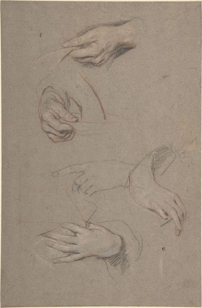
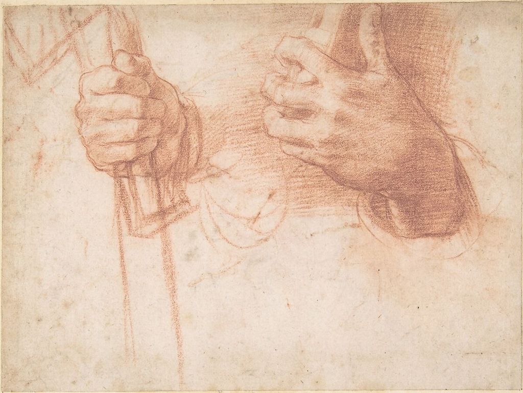

Hands are difficult because familiarity supplies a powerful symbol. Hide most of the hand behind a card and draw only one joint or the meeting of two fingers. Compare the widths of the intervening spaces, then reveal more. Work from the specific pose rather than assembling five remembered fingers.
Sir Peter Lely’s Studies of Hands, dated 1630–80, combines red, black and white chalk.[4] The Met explains that such studies informed workshop portrait production and describes a sequence of red contour, black accents and white highlights. Repeat one hand three times: first for envelope, second for joints and overlap, third for value. Do not expect one attempt to solve every problem.
Andrea del Sarto’s Studies of Hands, about 1517, uses red chalk.[5] Eugène Delacroix’s Study of a Left Arm and Hand uses graphite on laid paper.[6] Their different media discourage the idea that observation has one correct finish. Compare articulation: wrist-to-knuckle direction, finger-length ratios and the negative wedges between digits.
Use toned paper as part of the observation
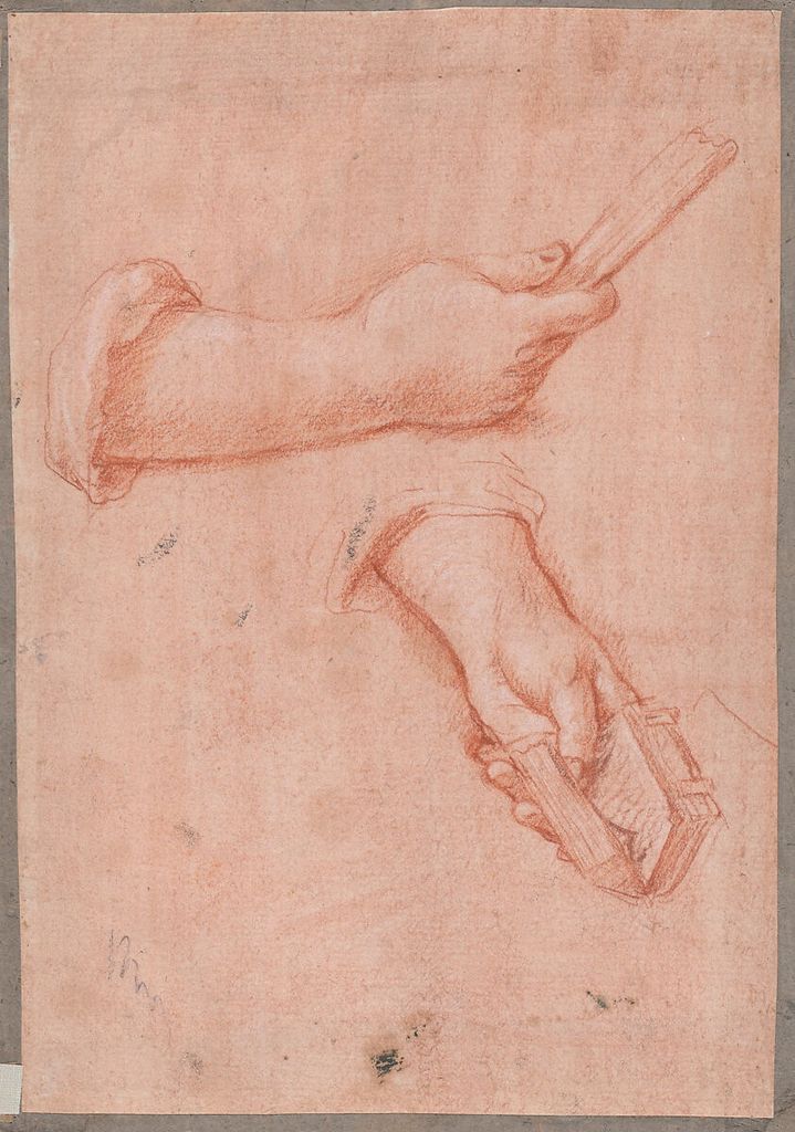
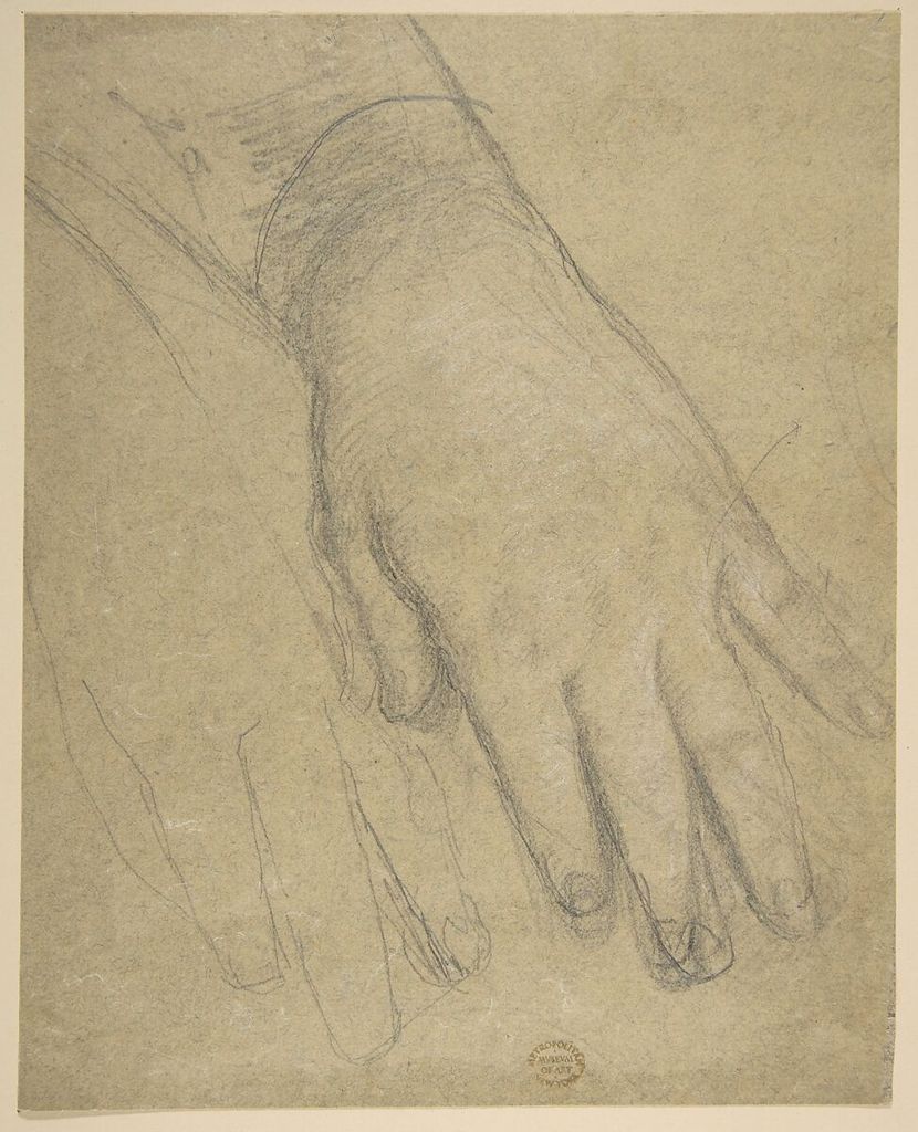
A toned ground supplies a middle value, allowing dark and light marks to work in opposite directions. Jacob de Wit’s Study of Two Hands, about 1720–50, uses red chalk with touches of white on pink-tinted paper.[7] An anonymous nineteenth-century French Study of a Hand combines graphite and white.[8]
On grey or tan paper, draw a hand using only three values: ground, one dark and one light. Reserve much of the paper. If the hand does not turn with three families, more gradations may disguise rather than solve the structural problem.
Test the white medium first. Its opacity and colour may change across papers, and heavy application can overpower quiet dark marks. Add white to planes facing the light, not automatically along every upper edge.
Construct interiors from observed intervals
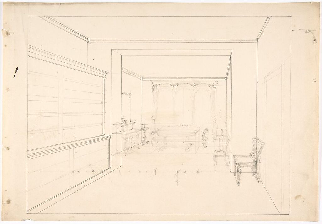
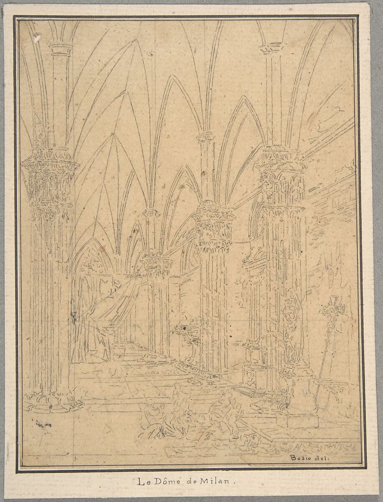
An anonymous early nineteenth-century Perspective Drawing of an Interior is catalogued in graphite.[9] Pietro Bosio’s eighteenth-century Perspective of a Church’s Interior is also graphite.[11] Their records support identity, material and subject; they do not prove one universal construction method.
In your room, first draw the rectangular field and eye level. Mark where floor and ceiling edges meet the page boundary. Extend only the strongest receding lines lightly to see whether they approach a shared region. Real rooms contain irregularities, so observed endpoints should correct a diagram rather than be forced into it.
Measure repeated bays, windows or tiles as diminishing intervals. Compare each interval with its neighbour. Avoid drawing a perfect grid from theory and then fitting furniture inside. Observation begins with what occupies the view; perspective explains relationships that are already being checked.
Make a thumbnail that contains only five line families: vertical, horizontal, left-receding, right-receding and curved. This classification exposes a leaning wall or inconsistent table before tone makes the drawing harder to revise.
Group values before shading surfaces
Squint or use a small viewing aperture to simplify the subject into light, middle and dark. Outline the largest shadow shape across object boundaries. A cast shadow may join several forms into one compositional mass. Fill it evenly at first, then distinguish internal variation only if it changes the reading.
Build a five-step scale beside the study. Match observed areas to those steps rather than continuously inventing new greys. Reserve the darkest step for a small region and the paper for the clearest light. This creates a controlled range that can be reviewed.
Hatching direction may follow a plane, cut across it, or remain parallel for a graphic effect. Choose deliberately. If strokes become a decorative texture unrelated to form, return to the large value comparison.
Separate an edge from an outline
An observed edge may be hard, soft or lost. It may belong to the subject, a cast shadow, a change of plane or a contrast with the background. Drawing a dark line around every object replaces those differences with a symbol.
Choose one focal edge to sharpen, one turning edge to soften and one boundary to lose. Look at the background value immediately beside each. A light object against light space may require no line, while a dark overlap can establish itself with one decisive accent.
Move your gaze between subject and drawing at a steady rhythm. Long periods staring at the paper increase invention. A useful cycle is two seconds looking, one mark, then another comparison. Slow drawing does not mean slow looking.
Diagnose proportion errors
When a drawing feels wrong, avoid redrawing the most detailed area first. Recheck the total envelope, dominant axis, widest interval and major negative spaces. Compare landmark triangles: choose three points and assess the shape they make. A triangle is harder for memory to simplify than a named feature.
Turn the drawing upside down or view it in a mirror while keeping the subject upright. The change weakens recognition and reveals tilts or unequal spaces. Photographing both subject and drawing from the fixed viewpoint can help review, but do not trace the photograph and call that direct observation.
Record the first failed comparison in writing: “left gap too narrow,” “eye level too high,” or “shadow boundary too sharp.” Specific language directs the next session. “Looks bad” does not.
Observe curved forms without symbols
Circles seen at an angle appear as ellipses, but an observed ellipse should not be dropped into the page as a memorised almond shape. Locate its widest axis, compare height with width, and check whether the near and far halves join smoothly. Draw through the hidden portion lightly when that helps alignment, then select the visible edge.
Stack two cups or bowls at different heights. Their openings may share an orientation but differ in apparent degree because the eye level changes their view. Compare the visible inside area rather than applying one ellipse everywhere. Check the vertical centre of each vessel and the symmetry of its negative spaces.
Organic curves require the same discipline. Instead of naming a leaf, trace its change of direction from base to tip and mark where curvature tightens. Use three landmarks along each side, then connect them with a continuous movement. Comparison gives the curve specificity; extra outline pressure does not.
Use short studies to isolate variables
A long drawing can conceal uncertainty because every problem is tackled at once. Make a page of six ten-minute studies, each devoted to one variable: envelope, angle, negative space, value mass, edge or texture. Keep subject and viewpoint stable. At the end, circle the study that reports its chosen variable most clearly.
On another page change only the distance from the subject. A closer view increases apparent size and may alter perspective; a farther view compresses small intervals. Record the approximate viewing distance. These notes reveal why copying measurements from yesterday can fail even when the objects have not moved.
Finally, alternate dominant and non-dominant hand for two one-minute sketches. The unfamiliar hand slows habitual symbols and may make looking more continuous. It is not automatically more accurate, but it exposes whether the eye is directing the mark or the hand is repeating a familiar shape.
Run a complete forty-minute study
Use five minutes for setup and looking, five for the envelope and axis, ten for measured contours and negative spaces, ten for three value families, and five for edge hierarchy. Spend the final five comparing rather than adding. Mark corrections in a different colour on a tracing sheet if you want to preserve the drawing.
Make a second study from a viewpoint moved thirty degrees. Reuse the same objects and time limit. The changed overlaps prove which forms were truly observed and which were copied from the first page. Keep both, with date, viewpoint and material noted.
The historical examples model focused problems rather than a single style: repeated hands, a lone arm, toned-paper value, an anonymous close study, two interiors and a perspective plan. Their lesson is procedural. Observation improves when large relationships are placed early, evidence is checked often, and correction remains visible long enough to teach the next decision.
Continue with contour drawing for edge exercises, figure drawing for sustained work from the body, or pencil drawing for graphite control.
Watch Observation Become a Controlled Drawing
Choose a Getty reconstruction of historical drawing practice, a curator-led reading of Sargent's economical portraits or a National Gallery Singapore studio demonstration.
Drawing with Charcoal: Historical Techniques
Getty conservators and artists show how material preparation, pressure, fixing and erasure support a controlled observational process.
Watch on YouTubeFrequently Asked Questions
Observational drawing records measurable visual relationships from a present subject—proportion, angle, interval, edge and value—rather than relying on a remembered symbol.
Establish the whole envelope and axis first, then compare parts with one consistent proportional unit, align landmarks and check negative spaces before adding detail.
The gap beside or between objects shares their boundary. Measuring that unfamiliar shape can reveal proportion errors that remain hidden when you think only in named objects.
Correct them when correction improves the structural record, but first diagnose the cause—angle, alignment, interval, value or edge. Keeping some search lines can also show how the drawing developed.
Mix short studies that isolate one variable with longer drawings. A forty-minute study can move from envelope and measurement through values and selective detail, with checks at every stage.
Discussion
Which drawing becomes more accurate when you compare its negative spaces or alignments rather than its named parts?
Reader Insights
Width, angle and interval are more testable than the idea of what a hand or room should look like.
An envelope, alignment and negative space can confirm—or challenge—the same proportion.
Diagnosing the failed relationship prevents repeated surface repairs.
Join the Conversation
Share one study in which an alignment, negative-space check or value grouping revealed an error you had not noticed.
References
- National Gallery of Art, “Drawing Everyday Objects”: source.
- The Metropolitan Museum of Art, Thomas Eakins, Perspective Drawing for the Chess Players: source.
- National Gallery of Art, “Explore the Basics of Drawing”: source.
- The Metropolitan Museum of Art, Sir Peter Lely, Studies of Hands: source.
- The Metropolitan Museum of Art, Andrea del Sarto, Studies of Hands: source.
- The Metropolitan Museum of Art, Eugène Delacroix, Study of a Left Arm and Hand: source.
- The Metropolitan Museum of Art, Jacob de Wit, Study of Two Hands: source.
- The Metropolitan Museum of Art, Study of a Hand: source.
- The Metropolitan Museum of Art, Perspective Drawing of an Interior: source.
- The Metropolitan Museum of Art, Open Access: source.
- The Metropolitan Museum of Art, Pietro Bosio, Perspective of a Church’s Interior: source.