by Tom Gurney
Tom Gurney BSc (Hons) is an art history expert with over 20 years experience
Page created on September 2, 2026 / Page updated on September 13, 2026
Email: tomgurney1@gmail.com / Phone: +44 7429 011000
Build Value by Pressure, Layer and Direction—not Grade Alone
Pencil drawing usually means graphite held in wood or a mechanical holder. Graphite can make a pale construction line, a sharp dark accent, repeated hatching or a broad rubbed tone. It is only one drawing medium: charcoal, black chalk and fabricated crayons may look similar on a screen, and Getty’s technical project shows that specialists sometimes need microscopy or spectroscopy to distinguish them.[1]
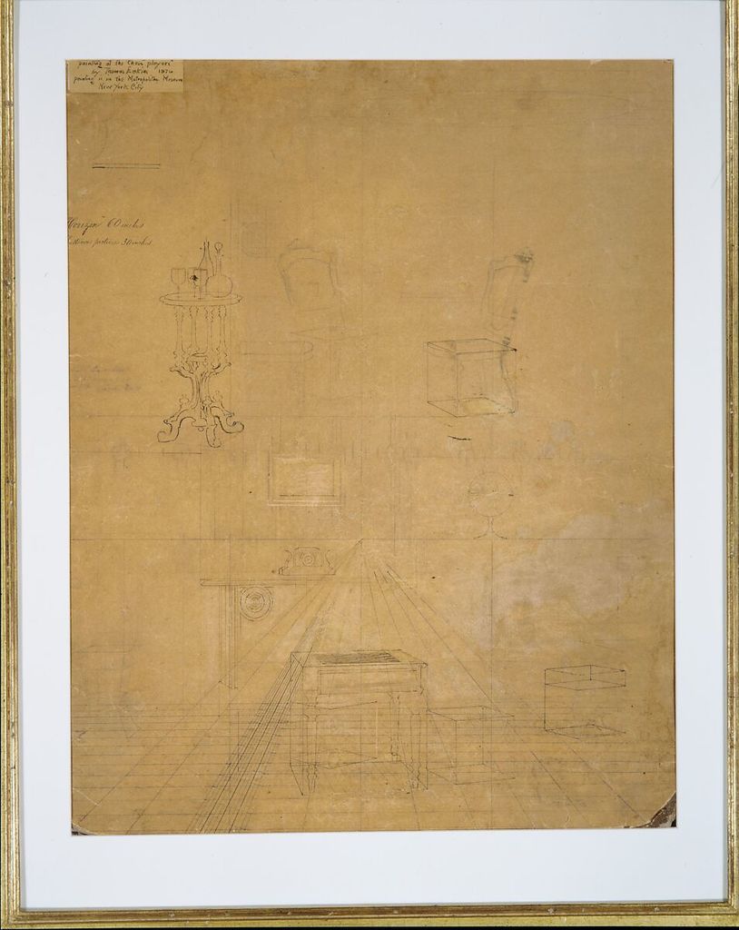
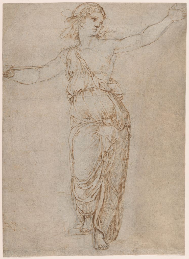
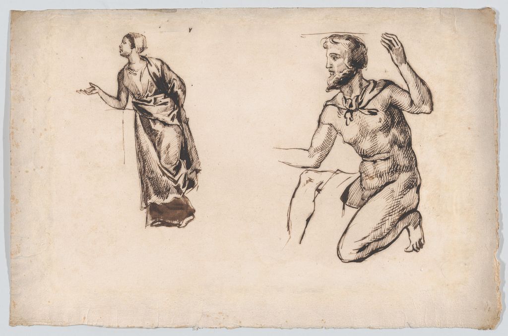
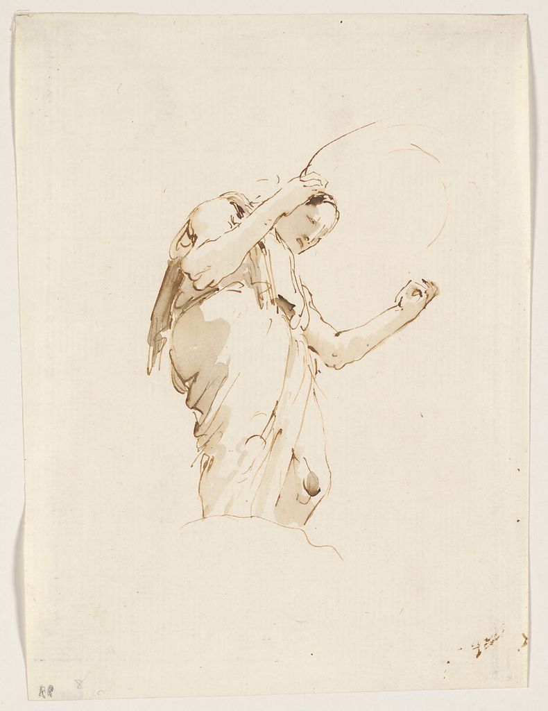
This guide concentrates on graphite. It explains grades without pretending every manufacturer is identical, then turns point, pressure, paper and erasure into a set of repeatable tests. Eight museum sheets show how graphite can serve anatomy, portraiture, movement, drapery, measurement, architecture and landscape.[2] Their images are marked Public Domain and supplied through the Met’s Open Access programme.[14]
At a Glance
- Treat grades as a rangeH pencils resist darkening, B pencils deposit more graphite, but pressure and paper change every result.
- Use the point and sideA point finds edges and detail; the side lays broader directional masses.
- Layer before forcing darksRepeated light passes offer more control and reduce grooves or reflective graphite sheen.
- Erase constructivelyLift, revise and draw back into light rather than treating the eraser only as a repair tool.
- Match paper to purposeTooth, sizing and colour affect line, value, blending, correction and the visibility of the support.
Contents
Choose the Pencil Control Before Reaching for Another Grade
A grade label predicts relative hardness, not a fixed darkness. Test how grade, pressure, point, stroke and paper combine, then choose the smallest change that solves the drawing problem.
| Control | What it changes | Useful choice | Risk to watch |
|---|---|---|---|
| Grade | Hardness, deposition and achievable value range. | Harder for pale construction; softer for broader darks. | Assuming one grade produces the same value on every paper. |
| Pressure | Line weight and graphite density. | Layer light passes before increasing force. | Grooving the paper or creating shiny compressed darks. |
| Point or side | Width, edge character and surface coverage. | Point for selected edges; side for broad value masses. | Using a sharp point to fill every large passage. |
| Stroke direction | Surface turn, rhythm and continuity. | Follow the form or choose a consistent structural direction. | Crossing marks mechanically without describing volume. |
| Paper tooth | Brokenness of line, blending and maximum dark. | Smoother for fine detail; more tooth for layered deposits. | Fighting the surface instead of adapting the mark. |
| Erasure | Revision, highlights and edge softening. | Lift gradually with a clean tool and redraw selectively. | Damaging fibres through repeated hard rubbing. |
Understand pencil grades
The H–B scale is relational. H pencils are generally harder and lighter; B pencils softer and capable of a darker deposit; HB sits between. The number indicates a stronger tendency within that family, but an 4B from one maker may not match another. Paper, sharpening, pressure and layering can change the result as much as the printed grade.
Make a value scale before a long drawing. Use one pencil to create seven adjacent steps from paper white to the darkest layer you can make without crushing the surface. Keep pressure light at first and build the darker steps through repeated passes. Make a second scale with a harder or softer pencil. The test tells you whether changing grade actually expands the range.
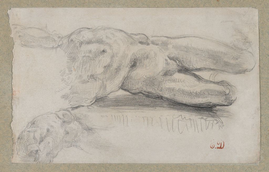
Eugène Delacroix’s Two Studies of a Male Torso, 1818–20, fits twice on a sheet only 10.5 by 17 centimetres.[3] The Met record is metadata-led, so the page cannot claim a precise academy assignment. Visually, repetition allows comparison of placement, contour and tone. Use the same economy: draw one simple object twice, once by increasing pressure and once by layering light strokes. The two darks will not have the same surface.
Point, side and stroke direction
A sharp point is useful for measured construction, small edges and hatching. The side covers a wider area and lets paper texture break the deposit. Rotate the pencil as you draw to keep a point, or allow a flat to develop when a broader stroke is useful. Do not press harder merely because the point has become blunt.
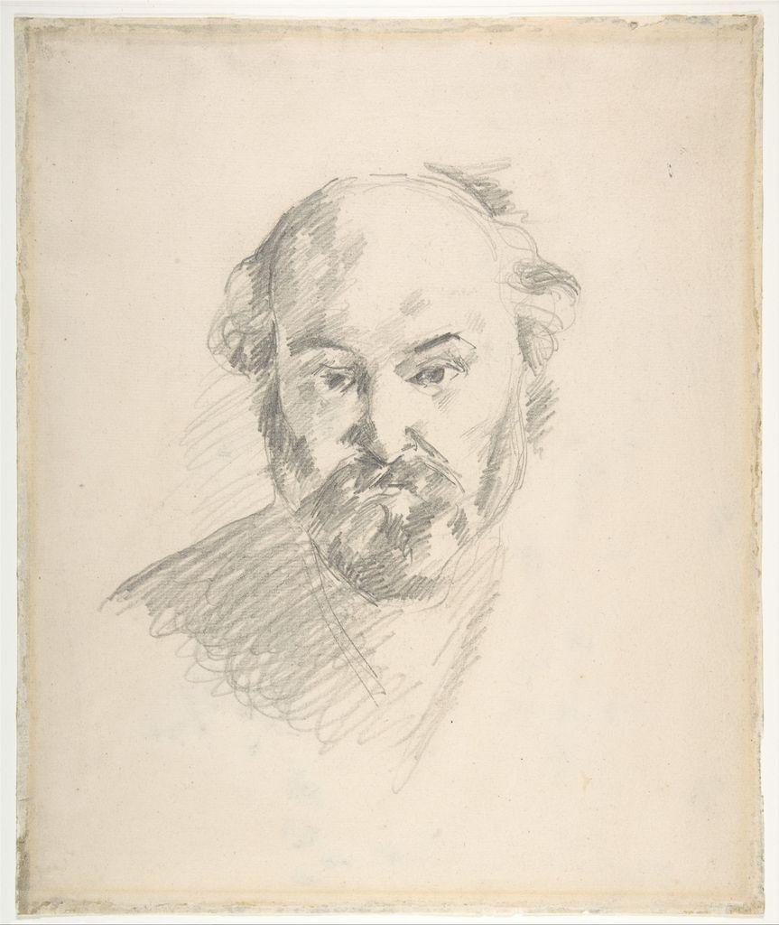
Paul Cézanne’s Portrait of the Artist, about 1880, is graphite with a fragmentary landscape on the verso.[4] Directional strokes do more than fill the face: their angle helps turn planes and distribute emphasis. A self-portrait exercise can adopt that logic without imitating the artist. Use vertical strokes on one plane, diagonal strokes on another and cross only where a deeper value is needed.
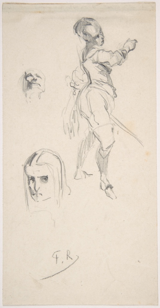
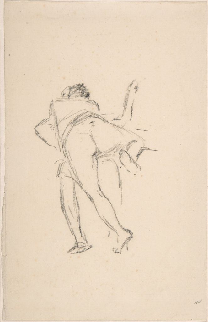
Félicien Rops’s Study of two figures, one lunging at the other, about 1870, demonstrates a different priority.[5] The object record supplies identity, date and graphite but no long interpretation. The rapidly changing directions organise two bodies before finish. Begin a moving pose with the side of a pencil for two main masses, then sharpen only the decisive overlaps. Point and side become stages of thought.
Pressure, layering and graphite sheen
Pressure changes darkness, edge and the amount of graphite pressed into the paper. Heavy pressure can flatten tooth and create a shiny patch that looks lighter from some angles. Getty’s Paper and Light exhibition foregrounds the physical relationship between drawing surface and illumination.[6] Judge a dark by tilting the page, not only from one viewpoint.
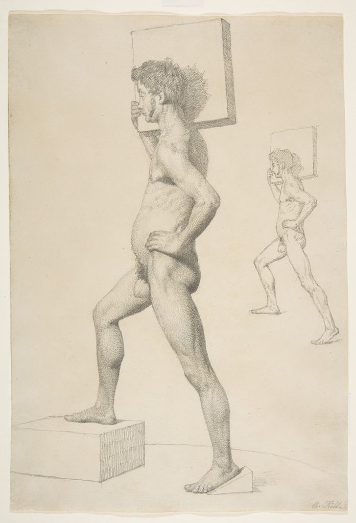
Christen Købke’s Study of a Male Nude Shouldering a Wooden Block, about 1832, makes weight a structural problem.[7] In graphite, firmer accents can clarify the bearing shoulder and critical overlaps, while lighter construction keeps alternative positions subordinate. Do a five-minute load study: mark the carried object as one mass, find the support through the body, and reserve your darkest pressure for three bearing junctions.
Layering usually gives more control than forcing a dark in one pass. Work in alternating directions so gaps close gradually. Stop before the surface becomes slick. If you need a matt black beyond graphite’s comfortable range, that may be evidence to choose charcoal—not permission to damage the paper. The charcoal drawing guide explains that different material.
Hatching instead of smudging
Hatching uses separate parallel strokes; crosshatching adds another direction. The National Gallery of Art distinguishes both from contour and shows how spacing and pressure affect tone.[8] Hatching preserves the history and direction of the hand. Blending unifies a tone but can fill the paper tooth and remove directional structure.
Draw a sphere three times. Build the first with straight parallel hatches that follow one direction, the second with curved strokes that travel around the form, and the third with blended tone. Keep the same light source. Compare which method explains volume, which emphasises surface and which produces the cleanest light.
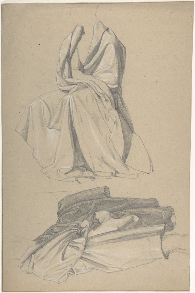
Alfred Rethel’s Drapery Study combines graphite and white heightening on brown paper.[9] The support acts as a middle value, so graphite does not need to create the entire tonal range. Follow folds with hatching that clarifies their direction; use white only where a plane turns towards light. On toned paper, leaving the ground visible is an active decision.
Measure, square and transfer
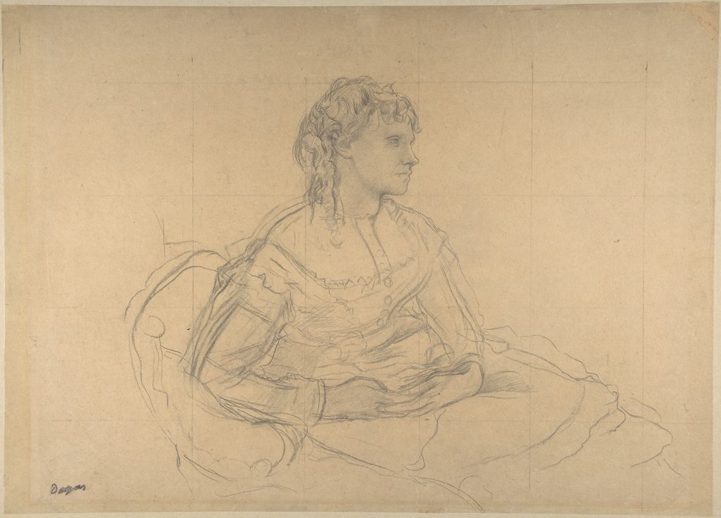
Graphite’s erasability and controlled point make it useful for measurement. Edgar Degas’s 1869 Study for “Madame Théodore Gobillard” is graphite squared in graphite.[10] The grid divides the design into comparable intervals. It does not replace looking; it makes discrepancies easier to locate and supports enlargement or transfer.
Draw a thumbnail, overlay a four-by-four grid and reproduce it at twice the size. At each intersection, compare where important contours enter and leave the square. Erase the grid lightly only after the structure works. The test is whether the larger drawing preserves the relative gaps and angles, not whether every square is copied as a separate picture.
Indentation is another kind of transfer. Pressing hard can score paper and leave a groove that catches later graphite. Sometimes artists exploit that; often it is accidental. Keep early measuring lines light enough to erase without a channel. Place a spare sheet under your hand so pressure does not emboss pages beneath.
Erasing as revision and drawing
An eraser can remove construction, lift a light from tone or reshape an edge. It cannot always return the support to untouched white. Hard pressure, soft paper and smeared graphite may leave a stain or polish. Getty notes that historic artists could lift dry particles with bread or scrape a surface with a knife; those facts are context, not advice to use food or blades on a modern drawing.[11]
Test a kneaded and a firm eraser on the actual paper. Lay down three layers, lift one area by dabbing and cut another edge with the firmer eraser. Label how many passes were removed. Use a clean scrap under your hand and brush crumbs away without rubbing them into the sheet.
Negative drawing uses the erased or reserved light as a shape. Cover a small rectangle with light graphite, then lift a leaf vein, strand of hair or reflected edge. Surround it with slightly darker tone. The light should be designed through its width and direction, not treated as a generic shine.
Choose paper by behaviour
Smooth paper supports fine edges, small hatching and clean mechanical-pencil work, but repeated soft graphite may become slick quickly. A medium tooth breaks broad strokes into a visible grain and holds more layers. Very rough paper exaggerates that broken texture and can make a sharp point skip. Paper colour also changes the available value range: on white, graphite chiefly moves darker; on a middle-toned sheet, graphite can work with white heightening as Rethel did.
Cut three small samples rather than judging a pad by touch. On each, draw the same sharp line, broad side stroke, four-layer dark and erased light. Write the paper name and weight. Examine them both close up and from two metres away. A grain that looks intrusive at desk distance may unify into a useful tone farther back.
Size affects handling too. A short pencil movement that describes a whole arm in a small sketch becomes a finger or wrinkle on a large sheet. Practise one subject at postcard size and again at twice that scale. Do not add more detail to the larger version; enlarge the movement of each stroke. The comparison shows whether your mark vocabulary expands with the page or merely multiplies.
Protect the working surface from the hand. Begin at the upper left if that suits your drawing hand, use a clean barrier sheet, and lift rather than drag it. Smudging can be an intentional technique, but accidental hand transfer usually dulls lights and makes later erasure harder to control.
Build edges, not just values
Two areas can have the correct average value and still describe form poorly if every transition has the same softness. A hard edge attracts attention and can mark an overlap or cast shadow. A soft edge can describe turning form, atmosphere or an out-of-focus passage. A lost edge occurs when adjacent values meet so closely that no line is needed.
Make a five-step value drawing of an egg or cup, then revise only the boundaries. Sharpen the cast shadow near contact, soften it as it moves away, lose part of the lit contour against the background and keep one focal edge crisp. Do not add a sixth value. The exercise proves that focus can be organised without making the darkest area darker.
In Cézanne’s self-portrait, directional graphite and selected density prevent the face from becoming an evenly shaded diagram. In Delacroix’s arcade, repeated architectural edges need hierarchy so that recession remains legible. Rethel’s white accents can sharpen a light-facing fold while the brown support carries quieter transitions. Pencil control is therefore as much about where a mark stops as how dark it becomes.
Diagnose common pencil problems
If a drawing looks pale despite heavy pressure, make a grade-and-paper test before pressing harder. The chosen graphite may have reached its range. If shadows look metallic, reduce burnishing and view the sheet from another angle. If the surface looks dirty, distinguish deliberate blended tone from hand smears and keep reserved lights protected.
If hatching resembles hair laid over a form, change stroke direction to follow or deliberately cut across the plane. If the outline is uniformly dark, keep construction pale and strengthen only overlaps and focal edges. If erasure leaves grooves, pressure was too high before the decision was secure. If several grades produce no visible difference, simplify the kit and learn the range of one pencil.
Keep failed tests. A page labelled with pressure, grade, paper and number of layers is a material record, not wasted practice. Compare it with the next session under the same lighting. Improvement becomes specific: a cleaner lift, a broader midtone, a less reflective dark or a better transition—not a vague wish to shade more realistically.
Architecture and landscape in graphite
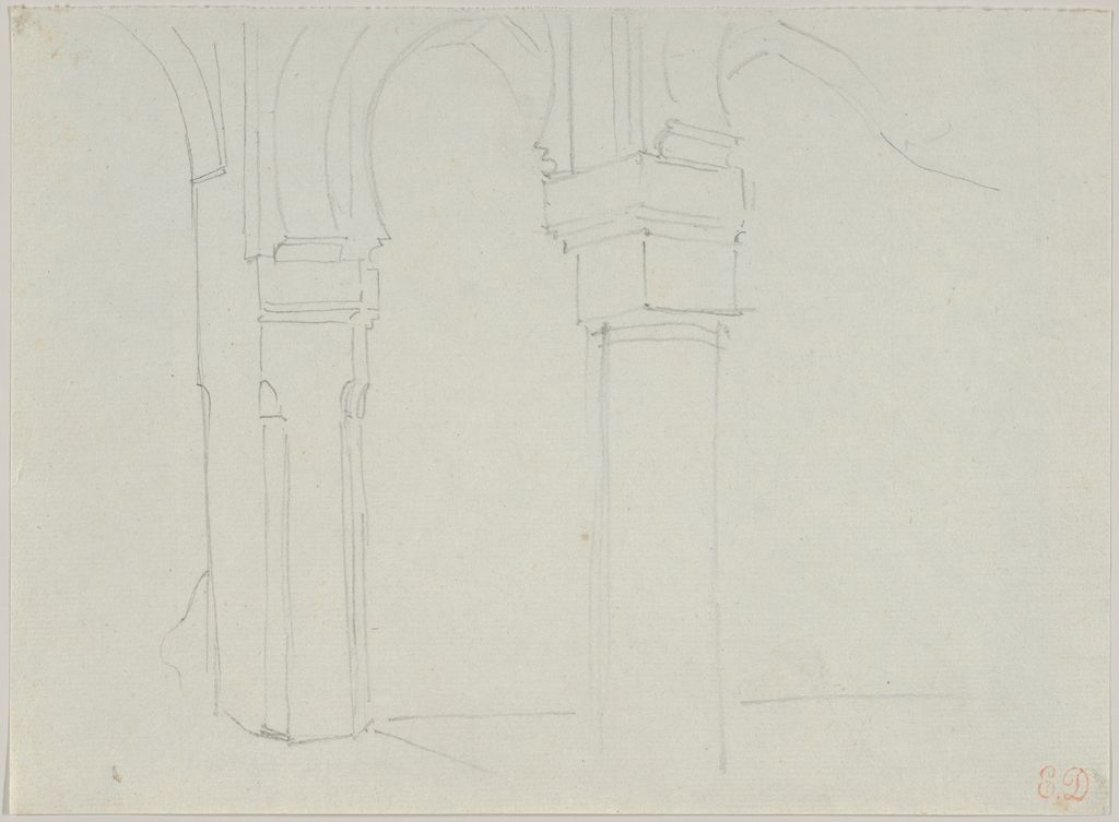
Delacroix’s Study of a Moorish Arcade, Spain, dated May 1832, is graphite on laid paper.[12] Its architecture demands repeated openings, alignment and recession while retaining the speed of travel observation. Begin an architectural study with the largest bounding rectangle, central axis and repeated intervals. Details belong only after those relationships agree.
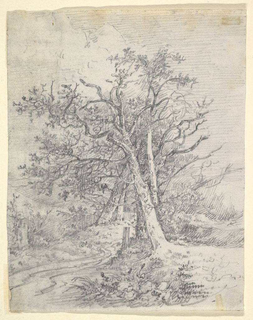
John Crome’s Study for Tree Trunks and Lane, about 1812, places graphite on the recto and a soft-ground etching on the verso.[13] The pairing shows drawing alongside a process capable of translating drawn texture into print. In a tree study, avoid outlining foliage leaf by leaf. Use broad value masses, varied trunk edges and directional gaps that lead into the lane.
Make two landscape thumbnails. In the first use only line weight; in the second use only four value masses. Combine them in a third drawing, preserving the clearest spatial cue from each. Graphite is well suited to this revision because structure can remain pale until the value pattern is chosen.
A complete pencil exercise
Choose one object under a single light. Spend two minutes on a pale envelope and axis, five on measured contour and negative space, ten on three large value families, and five on edges and accents. Use at least two grades only if your test scale showed a real benefit. Reserve the darkest dark and sharpest edge for a small focal area.
Review the page under two light angles. Check for reflective graphite, indented construction, muddy blending and equal outlines. Write the pencil grades, paper and erasers on the back. Material notes make improvement repeatable and prevent memory from turning every drawing into “just pencil”.
The historical objects do not present a single pencil look. Delacroix repeats a torso and records architecture; Cézanne builds a face through directional strokes; Rops abbreviates action; Købke studies load; Rethel uses a brown ground and white; Degas squares a portrait; Crome links landscape drawing and print. Graphite is versatile because its variables can be controlled, not because it automatically makes a drawing precise.
For the broader material comparison, see drawing mediums. Contour drawing develops edge selection, and observational drawing develops measured looking across subjects.
Watch Drawing Move from Graphite-like Control to Broad Tone
Choose a Getty reconstruction of historical drawing practice, a curator-led reading of Sargent's economical charcoal portraits or a National Gallery Singapore studio demonstration.
Drawing with Charcoal: Historical Techniques
Getty conservators and artists show how pressure, preparation, fixing and erasure build a drawing—useful comparison with graphite's layered control.
Watch on YouTubeFrequently Asked Questions
There is no universal best grade. Use a harder pencil for pale construction or fine control and a softer one for broader darks, then adjust for the paper and pressure you actually use.
H grades are relatively harder and usually lighter; B grades are softer and deposit more graphite; HB sits between them. The scale is comparative and varies somewhat by maker.
Build several light, overlapping layers with a consistent stroke direction and a suitable paper. Increase pressure gradually and avoid pressing hard too early.
Neither is always better. Hatching preserves direction and edge control; blending can create continuous tone. Choose according to the surface and form rather than using either automatically.
Do not compress very soft graphite with excessive pressure. Build darks in layers, vary stroke direction carefully and consider a paper with enough tooth to hold the deposit.
Discussion
Which pencil drawing becomes easier to understand when you separate the effects of grade, pressure, point and paper?
Reader Insights
Pressure, point, stroke and support can change the result as much as the pencil label.
Several light passes preserve revision and reduce grooves or reflective darks.
Lifting graphite can construct light and edge rather than merely remove a mistake.
Join the Conversation
Share one graphite study in which changing pressure, paper or stroke direction solved more than changing pencil grade.
References
- J. Paul Getty Museum, “Noir: Technical Examination and Analysis of 19th-century Black Drawing Materials”: source.
- The Metropolitan Museum of Art, “Materials and Techniques”: source.
- The Metropolitan Museum of Art, Eugène Delacroix, Two Studies of a Male Torso: source.
- The Metropolitan Museum of Art, Paul Cézanne, Portrait of the Artist: source.
- The Metropolitan Museum of Art, Félicien Rops, Study of two figures: source.
- J. Paul Getty Museum, “Paper and Light”: source.
- The Metropolitan Museum of Art, Christen Købke, Study of a Male Nude Shouldering a Wooden Block: source.
- National Gallery of Art, “Explore the Basics of Drawing”: source.
- The Metropolitan Museum of Art, Alfred Rethel, Drapery Study: source.
- The Metropolitan Museum of Art, Edgar Degas, Study for Madame Théodore Gobillard: source.
- J. Paul Getty Museum, “Seeing the Light”: source.
- The Metropolitan Museum of Art, Eugène Delacroix, Study of a Moorish Arcade, Spain: source.
- The Metropolitan Museum of Art, John Crome, Study for Tree Trunks and Lane: source.
- The Metropolitan Museum of Art, Open Access: source.