by Tom Gurney
Tom Gurney BSc (Hons) is an art history expert with over 20 years experience
Page created on September 2, 2026 / Page updated on September 13, 2026
Email: tomgurney1@gmail.com / Phone: +44 7429 011000
Make Every Permanent Mark Carry a Clear Job
Ink records a decision with exceptional clarity. A loaded pen can produce a hairline, a swelling stroke or a broken dry mark; a brush can mass a shadow or spread a transparent wash. Because many inks cannot be cleanly erased, good ink drawing depends less on bravado than on preparation, material tests and a clear order of work.
Historically, “ink” names several materials rather than one formula. The Met identifies four traditional groups used for drawing—carbon-based ink, iron-gall ink, bistre and logwood—and notes that artists used both pen and brush.[1] Modern bottles add different pigments, dyes, binders and claims of water resistance. Use the manufacturer’s current instructions for permanence, ventilation, skin contact and cleaning; do not reconstruct a historic recipe for routine practice.
The Met's wider materials overview also locates ink among several distinct drawing media.[12] The eight museum works here are Public Domain images supplied through Met Open Access.[13] Their records show line combined with brown or grey wash, black chalk, graphite, white gouache and watercolour. They are evidence that ink drawing is a family of processes, not a single black outline style.
At a Glance
- Test the whole systemInk, tool, paper, dilution and drying time interact; make a swatch sheet before the finished drawing.
- Separate line from washUse contour, hatching and wash for distinct structural or tonal purposes.
- Plan permanenceA light underdrawing and a deliberate order of work reduce correction without suppressing experiment.
- Reserve the lightProtect paper white, lift only when the materials permit it and add opaque heightening knowingly.
- Clean according to materialWater-soluble and waterproof inks need different handling; follow the maker's safety and disposal guidance.
Contents
Match the Ink Method to the Visual Decision
Choose the mark by the information it needs to carry. A drawing becomes easier to read when contour, hatching, wash and correction do not all compete for the same role.
| Method | Best use | Control point | Common failure |
|---|---|---|---|
| Dip-pen contour | Selected edges, overlaps and changing emphasis. | Load, angle, pressure and pause before a pooled turn. | Equal dark outline around every form. |
| Quill or reed line | Broad-to-fine rhythm and broken expressive marks. | Tool rotation, speed and ink flow. | Forcing the tool to imitate a uniform fineliner. |
| Directional hatching | Value, surface turn and material distinction. | Spacing, direction and the order of layers. | Crossing strokes mechanically without following form. |
| Flat wash | Large value grouping and silhouette. | Mix enough ink, keep a wet edge and work top to bottom. | Returning into a partly dried passage and creating blooms. |
| Graded wash | Atmosphere and controlled value transition. | Dilution sequence, paper angle and brush load. | Trying to repair every variation while the wash is drying. |
| Reserve or heightening | Paper light, correction and selective accent. | Decide what stays white before the darkest passage. | Using opaque white to conceal planning rather than clarify light. |
Test ink, tool and paper together
Before a finished sheet, make a test card. Write the ink name, pen or brush, paper and date. Draw slowly and quickly, press lightly and firmly, cross one dry stroke with another, add a wash beside it, and brush clean water over a fully dried sample. The card reveals feathering, bleed-through, drying time and whether the line re-dissolves.
A “waterproof” label matters when wash will cross line, but even then the stated curing time and paper affect the result. A re-soluble line can be useful when you want it to merge into tone. Neither behaviour is automatically superior. The failure is discovering it midway through a drawing.
Size the test to the intended work. A nib that feels expressive on a small sheet may look timid on a large one; absorbent paper may drain a fine pen before a long contour is complete. Check the reverse for bleed and hold the dry card at an angle for sheen. Keep successful cards as a practical library.
Load and control a dip pen
Dip only enough of the nib to fill its reservoir, then touch excess ink to the inside of the bottle or a scrap. Begin each session with test strokes away from the artwork. A sudden blob usually comes from overloading, dried residue, damaged tines or pressing beyond the nib’s designed flex.
Pressure, angle, speed and direction work together. Increased pressure may spread a flexible nib, but many drawing nibs are not designed for extreme flex. A more upright angle can feel scratchy; a lower angle may glide but catch on an upward push. Pulling strokes are generally safer than forcing the point into the fibres. Rotate the page when a contour demands an awkward direction.
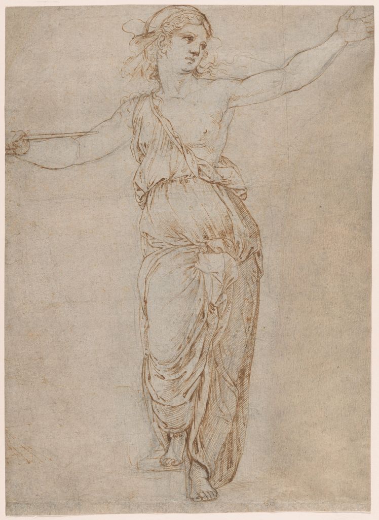
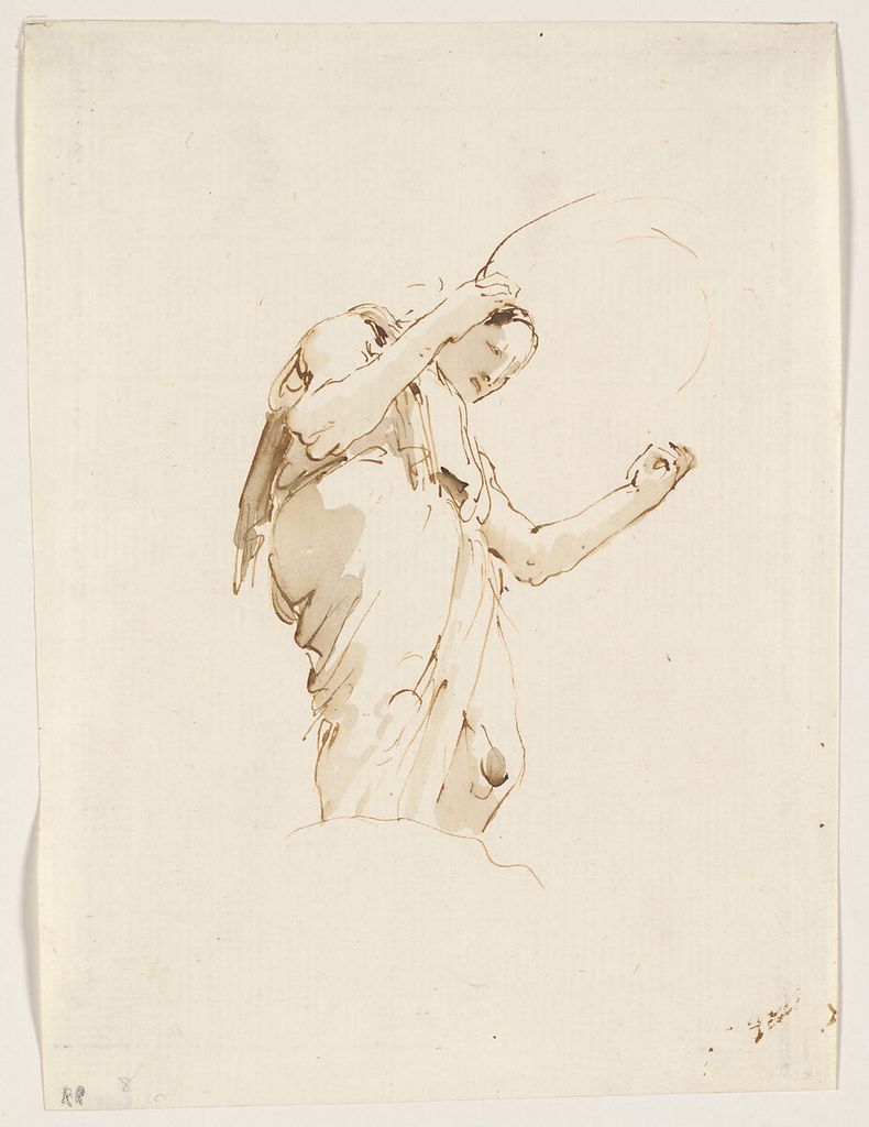
Giovanni Battista Tiepolo’s Standing Woman Holding a Hoop, about 1742–57, uses pen and brown ink with brown wash.[2] Its compact scale makes it a useful prompt for economy. Draw a standing figure using ten lines, then add only two wash shapes. If the pose fails before wash, tone will not rescue its structure.
Quill, reed and modern nib
Before steel nibs, fountain pens and felt tips, artists used broad and narrow quill and reed pens.[1] Tool names help explain mark character, but a digital image cannot always prove which edge or pressure produced a stroke. Follow the museum medium statement and describe visible behaviour cautiously.
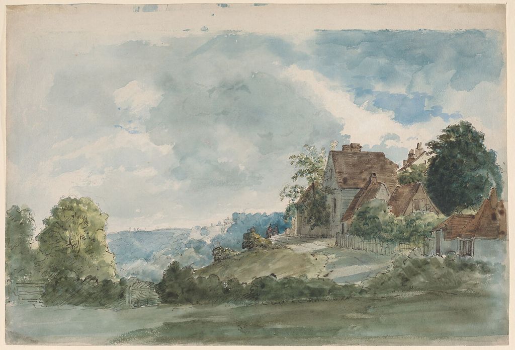
William Henry Hunt’s Cottages in an extensive landscape, from the late 1820s, is documented as reed pen, ink and watercolour over traces of graphite.[3] The Met explains that reed lines define architecture within freely applied washes. Try a cut reed or broad modern equivalent on a separate card: make a vertical, horizontal, curve and dot, then use its changeable width to distinguish near structure from distant texture.
A fine metal nib is suited to measured hatching and small intervals. A reed’s broader, less uniform contact can integrate line with wash. A brush carries the widest range, from pointed calligraphic stroke to flat mass. Learn each tool through a limited exercise rather than swapping whenever a passage becomes difficult.
Build contour without outlining everything
Ink contour becomes heavy when every boundary receives equal width and continuity. Select the edges that explain overlap, weight or focus. Let some contours break where light meets light or where a wash already separates adjacent shapes. Vary density through spacing before making every line thicker.
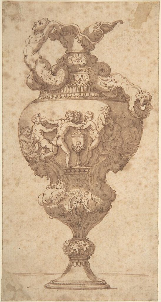
An anonymous eighteenth-century Italian Drawing after an Antique Vase uses pen and brown ink with brown wash.[4] The record does not name the draftsman, so anonymity must remain visible rather than being replaced with a guess. Set up a symmetrical vessel, mark a centre line and widest points in pencil, then use ink to describe alternating segments. Compare left and right negative spaces instead of tracing the silhouette continuously.
For a contour exercise, draw a shoe with three line weights. Use the lightest for construction that will remain visible, a middle line for most boundaries, and the darkest only at overlaps or contact with the ground. Add no wash. The constraint reveals whether hierarchy can be carried by line alone.
Hatch for direction and value
Hatching builds tone through repeated separate strokes. Spacing, thickness and overlap affect darkness; direction can reinforce the turn of a form or deliberately create a flat graphic field. Crosshatching adds a second or later direction. Avoid filling small areas mechanically before the larger value plan is decided.
Make five squares with the same pen. Change only spacing in the first three, add a crossing direction in the fourth, and layer irregular short strokes in the fifth. Do not increase pressure. This isolates density from nib width and produces a scale you can apply without guessing.
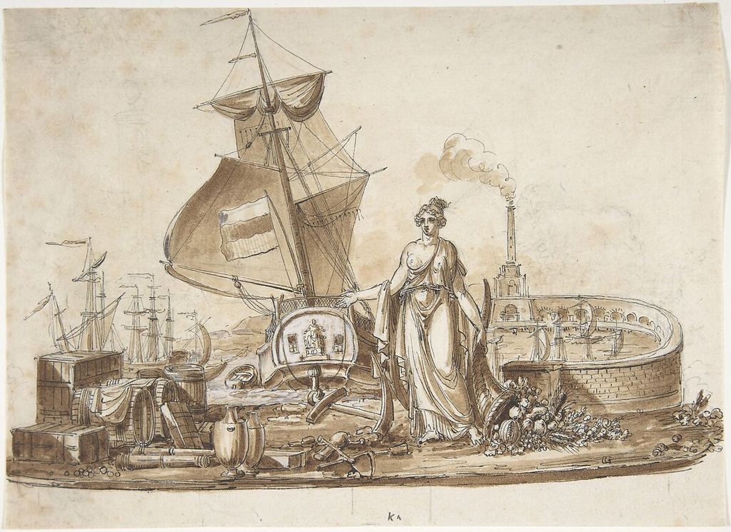
Charles Percier’s Allegory of Shipping combines black pen ink, brown wash, white heightening and graphite underdrawing.[5] The mixture separates planning, outline, tone and light. In your own study, assign each stage a job: graphite locates, ink selects, wash groups, and opaque white—if used at all—restores a limited accent rather than correcting the entire page.
Make flat and graded washes
Ink diluted with water produces lighter washes.[1] Mix enough for the passage before touching the sheet. For a flat wash, tilt the paper slightly, maintain a wet bead and overlap each band while it remains wet. For a graded wash, add clean water progressively. Returning to a half-dry edge often creates a bloom or stripe.
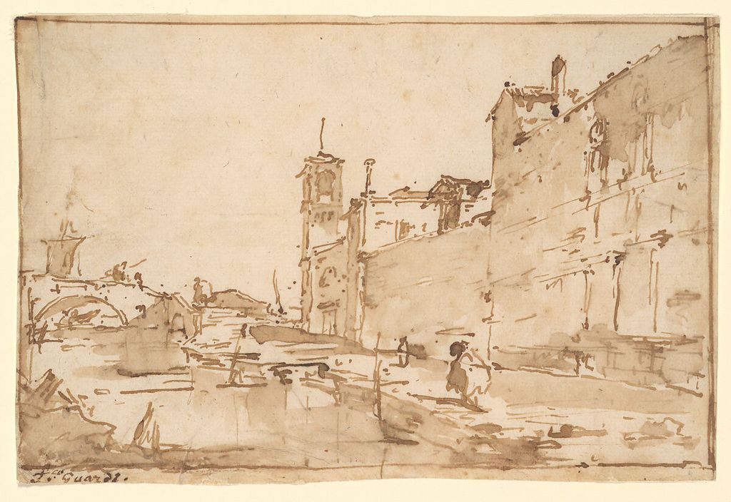
Francesco Guardi’s A Venetian Capriccio: A Rio Leading to a Bridge, about 1780–85, uses pen and brown ink with brown wash.[6] Its modest dimensions show how line and a few tonal areas can establish architecture and water without exhaustive rendering. Reduce a street view to three washes—paper, middle, dark—and add pen only where an edge carries spatial information.
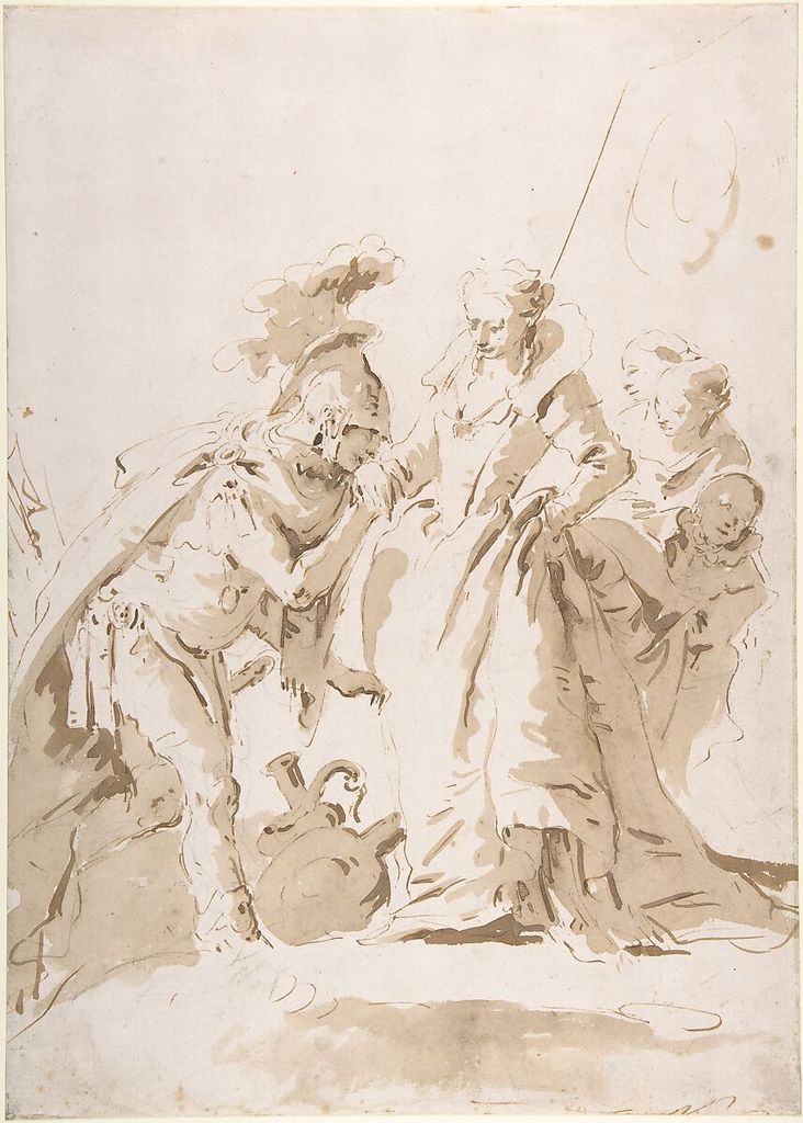
Giovanni Battista Tiepolo’s The Meeting of Anthony and Cleopatra uses pale and dark brown wash over black chalk as well as pen.[7] Prepare separate light and dark mixtures rather than trying to dilute each stroke on the page. Place the broad pale pattern first, reserve the paper’s light, and add the darker wash only after the composition reads.
Plan with an underdrawing
Graphite or chalk beneath ink is not a sign of failure. It can establish proportion, repeated intervals and the largest value boundaries while remaining subordinate. Use a hard enough graphite and light enough pressure that it does not groove the paper or muddy the wash. Erase only after the ink is fully dry and the test card confirms that rubbing will not disturb it.
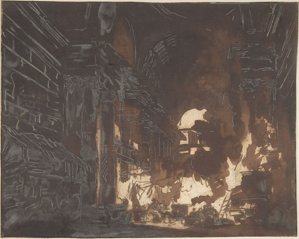
Hubert Robert’s Washerwomen in a Ruined Gallery, about 1760, is pen and brown ink, broad brown wash, white gouache and graphite.[8] The Met’s detailed record describes rapidly laid dark washes over a loose underdrawing and later light-on-dark architectural features. This is unusually specific evidence; it supports a sequence for that sheet, not a rule for every Robert drawing.
Sketch an interior using only a bounding rectangle, horizon, main verticals and two figure positions. Lay one broad shadow wash. When dry, return with a fine brush and opaque light to recover just three structural accents. The limitation tests whether revision clarifies the design or merely decorates it.
Reserve, lift and heighten light
Transparent ink wash ordinarily relies on untouched paper for its brightest light, a principle also central to transparent watercolour.[9] Plan these reserves before laying a large wash. Masking materials can damage or stain some papers, so test them. Clean water may lift a still-wet re-soluble wash; dry permanent ink may resist or leave a tide mark.
Opaque white changes the logic because it places light over dark. Use it when the chosen process calls for a positive light, as Robert and Percier did, but do not assume it will match the paper colour. A repaired patch often becomes more visible as paper and paint age differently.
The Met notes that artists could scrape ink from paper to make highlights.[1] Treat that as historical technique, not permission to attack an unfamiliar sheet with a blade. Scraping cuts fibres and is irreversible. For contemporary practice, reserve paper, lift a tested wash or use a compatible opaque medium with appropriate care.
Organise ornament and repeated forms
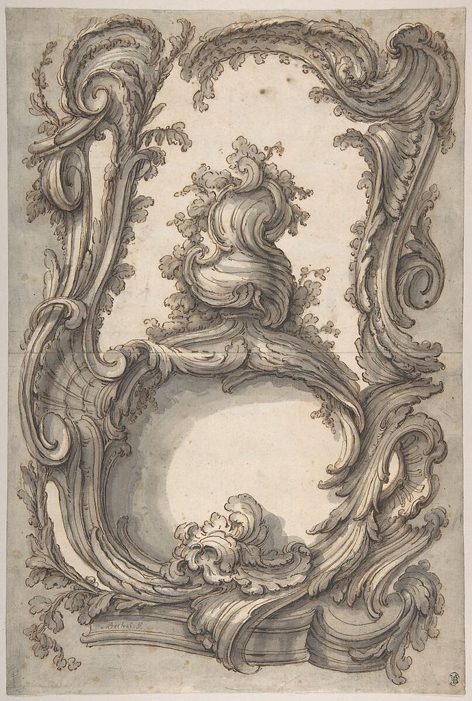
Pierre Edmé Babel’s mid-eighteenth-century Study for a Cartouche uses pen and brown ink with brown and grey washes.[10] Ornament can become confusing when every curl receives equal attention. Find the central axis, outer envelope and largest opposing curves first. Use one wash family to group the principal volume and the other to distinguish recess or cast shadow.
Draw a symmetrical decorative shape in four passes: axis and bounds in pencil, main rhythm in pen, one flat wash, then selected secondary lines. Turn the sheet upside down before the last pass. Imbalance and tangencies become easier to see when the motif is no longer read as an object.
Repeated windows, posts or leaves need variation within order. Measure the interval, then allow line weight and wash to respond to depth. Mechanical sameness can flatten space; random difference destroys structure. A useful compromise is regular placement with selective emphasis.
Correct without hiding the process
Ink correction begins before the mistake: leave construction light, work from large to small, and keep absorbent tissue and clean water ready for the tested material. If a wet blob occurs, blot vertically rather than wiping it across fibres. When dry, decide whether to integrate it, crop the study, or begin again.
Do not scrub a permanent line until the paper pills. A visible correction can be less damaging than an abraded pale scar. On a practice sheet, turn an accidental drop into three different solutions: a shadow mass, a repeated motif, and a deliberate untouched record. The point is to expand judgement, not pretend every error disappears.
Ink drawing is not the same process as etching, lithography or another print method, even though prints also use ink. Printing transfers ink from a prepared matrix; the V&A outlines relief, intaglio and planographic families.[11] This page concerns ink applied directly to the drawing support.
Clean tools and close the session
Never leave a dip nib resting in a bottle. Wipe and clean it according to the ink and nib maker’s directions, then dry metal parts to limit corrosion. Keep brushes used for shellac-based or waterproof products separate if their cleaning needs differ from water-soluble ink. Cap the bottle before moving the drawing.
Review the dry sheet under even light. Check whether line hierarchy survives, wash edges support the form, reserved lights remain intentional and underdrawing competes. Label the reverse or a process note with ink, dilution, paper and tools. A failed wash becomes useful evidence when its causes can be repeated or avoided.
The museum examples show multiple viable orders. Guardi coordinates economical brown line and wash; Hunt adds reed definition to watercolour; the Tiepolos range from compact figure shorthand to layered dramatic tone; Percier and Robert combine underdrawing, wash and white; Babel structures ornament; the anonymous vase study uses measured line and wash. Ink becomes flexible through staged decisions, not through pretending it is erasable.
For adjacent skills, use contour drawing to refine edge selection, pencil drawing for erasable construction, and observational drawing for measuring directly from a subject.
Watch Drawing Materials Move from Line to Tone
Choose a Getty reconstruction of historical drawing materials, a curator-led reading of economical charcoal portraits or a National Gallery Singapore studio demonstration.
Drawing with Charcoal: Historical Techniques
Getty conservators and artists demonstrate how material preparation, pressure, fixing and erasure shape a drawing's final surface.
Watch on YouTubeFrequently Asked Questions
Ink drawing uses liquid or prepared ink with tools such as pens, quills, reeds and brushes to build line, hatching, wash and sometimes opaque heightening.
A light underdrawing can establish proportion and sequence before permanent marks. It is optional, but useful when accuracy or a complex arrangement matters.
Prepare enough diluted ink, use suitable paper and brush, keep a wet edge and avoid repeatedly entering a passage as it begins to dry.
Hatching builds value from separate directional lines; wash lays a continuous diluted tone. They can work together but should retain clear jobs.
Some can be reduced through blotting, careful lifting, scraping on robust paper or opaque heightening, but each method alters the surface. Test first and let some revisions remain visible when they clarify the process.
Discussion
Which historical sheet becomes clearest when you separate the work done by its contour, hatching and wash?
Reader Insights
A small swatch reveals feathering, drying shift and the range of a nib or brush.
Line, hatch and wash read best when each carries distinct information.
Underdrawing, reserve, lifting and heightening make ink a planned sequence rather than a single irreversible gesture.
Join the Conversation
Share one ink study in which changing the paper, dilution or tool made the structure easier to read.
References
- The Metropolitan Museum of Art, “Ink”: source.
- The Metropolitan Museum of Art, Giovanni Battista Tiepolo, Standing Woman Holding a Hoop: source.
- The Metropolitan Museum of Art, William Henry Hunt, Cottages in an extensive landscape: source.
- The Metropolitan Museum of Art, Drawing after an Antique Vase: source.
- The Metropolitan Museum of Art, Charles Percier, Allegory of Shipping: source.
- The Metropolitan Museum of Art, Francesco Guardi, A Venetian Capriccio: source.
- The Metropolitan Museum of Art, Giovanni Battista Tiepolo, The Meeting of Anthony and Cleopatra: source.
- The Metropolitan Museum of Art, Hubert Robert, Washerwomen in a Ruined Gallery: source.
- Victoria and Albert Museum, “What is watercolour?”: source.
- The Metropolitan Museum of Art, Pierre Edmé Babel, Study for a Cartouche: source.
- Victoria and Albert Museum, “What is print?”: source.
- The Metropolitan Museum of Art, “Materials and Techniques”: source.
- The Metropolitan Museum of Art, Open Access: source.