 by Tom Gurney
Tom Gurney BSc (Hons) is an art history expert with over 20 years experience
Published on August 14, 2026 / Updated on August 14, 2026
Email: tomgurney1@gmail.com / Phone: +44 7429 011000
Introduction
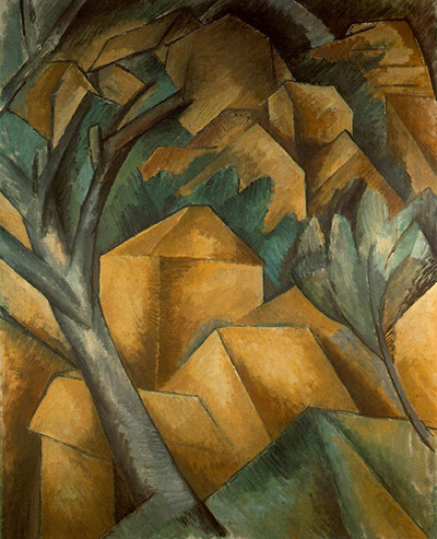
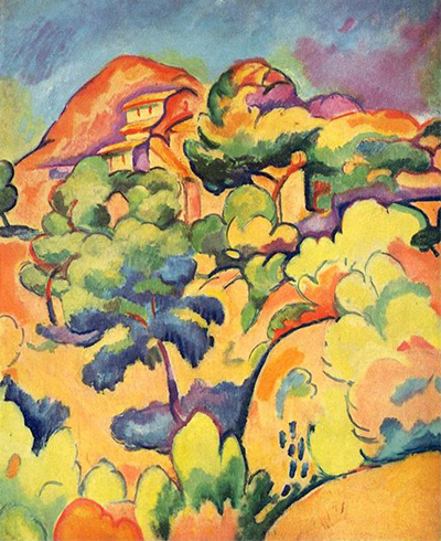
Georges Braque's Landscape at La Ciotat turns distance into a climb. Landscape elements rise towards a high horizon, yet they seem to accumulate in successive levels instead of steadily withdrawing from the picture surface. A historical Museum of Modern Art catalogue describes them as gaining mass as they ascend.[2] MoMA's gallery label gives the larger effect a concise name: flattened space.[1]
This pressure on depth belongs to a canvas still charged with Fauvist colour. Strong contours define the landscape; broad, unmodulated areas carry chromatic weight; predominant yellow suggests a countryside filled with sunlight.[2] Line and colour are equally active. One keeps forms together and the other intensifies their relations, while neither settles into the subordinate role of outline or fill.
The painting is an oil on canvas made at La Ciotat in summer 1907. It measures 71.7 by 59.4 centimetres and is held by MoMA as object 373.1975.[1] Its upright format, exact date and object number distinguish it from several other Braque landscapes whose French or English titles also name La Ciotat.
At a Glance
- ArtistGeorges Braque[1]
- TitleLandscape at La Ciotat[1]
- Datesummer 1907[1]
- MediumOil on canvas[1]
- Dimensions71.7 × 59.4 cm[1]
- CollectionMuseum of Modern Art[1]
- Accession373.1975[1]
- SignificanceThe summer 1907 MoMA landscape's emphatic colour and the pressure of structure within the Fauvist surface
Contents
- Introduction
- A landscape arranged in levels
- What the contours do
- Yellow, sunlight and chromatic construction
- The La Ciotat summer with Friesz
- One place, several pictorial solutions
- The painting's path to MoMA
- Colour and structure in the same present tense
A landscape arranged in levels
MoMA's current description identifies heavy outlines, flattened space and intense, harmonic colours as the painting's defining means.[1] Each term clarifies the others. Flattening retains landscape depth while placing it under pressure from the physical surface: one level rises behind another, but their mass remains insistently present.
The museum's historical account makes this organisation more precise. The horizon is high, and the elements approaching it appear to climb the canvas in tiers. Their increasing height has only a limited relation to greater distance. They seem stacked, with each zone retaining enough weight to be felt as part of the painted field.[2]
That distinction changes the task assigned to perspective. A conventional recession might invite the eye to pass through the foreground towards an opening beyond. Braque instead makes ascent and overlap carry much of the spatial work. The route into the landscape is compressed into a set of relations among levels. Depth survives, although it can never detach itself from the vertical support on which it is painted.
The result is rigorous without becoming diagrammatic. MoMA's catalogue emphasises internal organisation, line and structure alongside colour.[2] Rigour arises from the way these means cooperate: contours give limits, massed levels give weight, and the high horizon keeps the whole arrangement taut.
What the contours do
An outline in this painting is more than a boundary around a recognisable thing. Because MoMA describes the contours as heavy, they can be understood as active divisions within the surface.[1] They contain coloured areas, separate neighbouring zones and prevent intense hues from dispersing into an undifferentiated field.
The historical catalogue also identifies undulating curvilinear elements as a means of holding the composition together.[2] Their value lies in connection as well as separation. A contour can enclose one area while continuing the movement of another. It can moderate chromatic exuberance without making the colour passive.
This mutual dependence defeats the idea that line supplies a sober structure and colour arrives afterwards as decoration. The visible order is made through both. Strong contours give coloured zones definition; those zones give the contours pressure and consequence. Remove either term conceptually and the particular tension of the painting weakens.
The same interaction explains why the landscape can feel flattened yet substantial. Contour holds forms near the surface, while the massing of successive levels prevents them from becoming weightless patterns. Braque builds a shallow pictorial world in which every stage of recession continues to assert its material presence.
Yellow, sunlight and chromatic construction
MoMA's historical catalogue calls yellow the painting's predominant colour and connects it with a countryside suffused by sun and light.[2] This interpretation of the canvas's chromatic effect remains distinct from any report of a precise hour or literal map of local colour. Yellow establishes an overall condition from which other colour relationships can operate.
The current gallery label describes the colours as both intense and harmonic.[1] Harmony in that pairing remains compatible with force. Strong colours work as a related system: one area's intensity is conditioned by the zones around it, and the whole remains organised despite the high chromatic pitch.
Large areas of flat, unmodulated colour reinforce this structural role.[2] A broad colour zone has shape, scale and position. It can carry one of the painting's levels, press against a contour or balance another part of the surface. Colour therefore does spatial work even when it loosens its obligation to imitate the apparent hue of the landscape.
This was one of Fauvism's central freedoms. The Fauves were a loosely shaped group with no definitive programme, but they shared an interest in high-keyed colour, visible paint and alternatives to traditional three-dimensional space. The Metropolitan Museum of Art describes a picture space that could be defined through the movement of colour planes.[4] Braque had joined this broad practice in 1906; by the following summer, his La Ciotat work was making chromatic planes answer to increasingly forceful internal organisation.
The La Ciotat summer with Friesz
Braque worked at La Ciotat beside Othon Friesz during summer 1907.[3] Their shared journey continued a sequence of southern and maritime campaigns: Antwerp in 1906, L'Estaque from that autumn and La Ciotat the next year. Familiar landscapes and ports gave Braque repeated opportunities to alter the balance among colour, touch, contour and depth.
Kunstsammlung Nordrhein-Westfalen treats the La Ciotat campaign as the closing part of Braque's brief Fauvist phase.[3] The phrase marks a historical position across a period of experiment, with no single instant when one style switched off and another began. Landscape at La Ciotat remains wholly intelligible as a Fauvist painting: intense colour and a liberated relation to observed nature are central to its construction. At the same time, line and mass acquire enough force to prevent colour from becoming the only organising agent.
Paul Cézanne's example already mattered to this development. MoMA's historical account relates the tightening of Braque's composition during the preceding L'Estaque work to Cézanne's influence.[2] The major posthumous Cézanne retrospective and Braque's autumn return south came later in 1907, when more elementary forms, a restricted palette and relief-like spatial construction became increasingly prominent.[3] The chronology preserves the summer canvas as a moment with its own equilibrium and avoids treating it as the completed product of a later event.
One place, several pictorial solutions
Braque's La Ciotat titles can create the impression of one composition circulating in variant form. The institutional records reveal a group of separate objects and, more importantly, different answers to the same broad landscape problem.
At the National Gallery of Art, a different canvas titled The Port of La Ciotat is dated to spring 1907. It measures 64.77 by 80.96 centimetres and carries accession 1998.74.6.[6] Its horizontal format and maritime subject already distinguish it from MoMA's upright summer landscape. The NGA's essay describes open ground and sky maintaining coherent deep space, even while non-descriptive colour and autonomous contours complicate the scene.[6] MoMA's canvas places recession under stronger pressure through its high horizon and stacked, flattened levels. This comparison charts variation within the campaign without turning the two paintings into successive states of one image.
Centre Pompidou's Petite baie de La Ciotat offers another solution. Painted in June 1907, it measures 36 by 48 centimetres and carries inventory number AM 4298 P.[5] Pompidou describes its small landscape through Pointillist touches, softened contrasts and pink half-tones.[5] Those properties stay with the Paris canvas. Together, however, the records demonstrate how closely dated works could move between small divided touches, retained depth, flat colour and heavy contour.
Kunstsammlung Nordrhein-Westfalen holds a third title-neighbour, Paysage de La Ciotat, also dated 1907 but measuring only 38 by 46.2 centimetres.[3] Its dimensions and collection rule out any identification with 373.1975. A place-name describes the campaign more readily than it identifies an individual canvas.
The painting's path to MoMA
MoMA's provenance begins with Braque and records Daniel-Henry Kahnweiler as owner by 1914. After the French government's wartime seizure of Kahnweiler's stock, the painting appeared in the 1921 Hôtel Drouot sale. It later passed through Mayor Gallery, Douglas Cooper and Acquavella Galleries before entering MoMA in 1975 through the Katherine S. Dreier and Adele R. Levy Bequests.[1]
That history anchors the current identity beneath the cluster of similar titles. Landscape at La Ciotat is the vertical summer canvas now numbered 373.1975, with an ownership trail separate from the Washington harbour, the small Pompidou bay and the Düsseldorf landscape.
Colour and structure in the same present tense
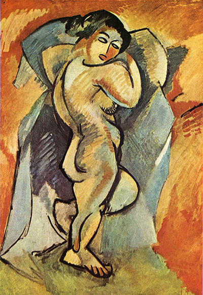
It is tempting to make every firm contour in a 1907 Braque landscape announce Cubism. Landscape at La Ciotat supports a more exact reading. Its outlines, high horizon and compressed levels matter because of what they do inside an intensely coloured Fauvist surface.
Predominant yellow establishes an expansive sensation of light. Flat chromatic areas gain breadth. Heavy and curving contours divide those areas, bind them and give them weight. The landscape rises in levels that suggest distance while remaining close to the canvas. These are structural operations whose force continues to depend upon colour.
The later move towards elementary geometry and a narrower palette would reorganise Braque's priorities. In summer 1907, however, line and colour still press upon one another with neither term cancelled. The painting's achievement lies in that active balance: a landscape can remain radiant, legible and emphatically Fauvist while every contour and interval makes its internal construction felt.
Related Pages
Frequently Asked Questions
Georges Braque's Landscape at La Ciotat turns distance into a climb.
MoMA's current description identifies heavy outlines, flattened space and intense, harmonic colours as the painting's defining means.
The later move towards elementary geometry and a narrower palette would reorganise Braque's priorities.
Discussion
Georges Braque's Landscape at La Ciotat turns distance into a climb.
Reader Insights
Georges Braque's Landscape at La Ciotat turns distance into a climb.
Large areas of flat, unmodulated colour reinforce this structural role.
The later move towards elementary geometry and a narrower palette would reorganise Braque's priorities.
Join the Conversation
Share the visible detail or source that most changed your reading.
References
- Museum of Modern Art, “Landscape at La Ciotat,” current record for the summer 1907 identity, medium, dimensions, object number, acquisition, provenance and gallery-label account of heavy outline, flattened space and intense harmonic colour. https://www.moma.org/collection/works/79554
- Museum of Modern Art, French Landscape: The Modern Vision, 1880–1920, p. 97, for the exact historical interpretation of predominant yellow, sunlight, high horizon, massed levels, strong contours, large flat colour areas and chromatic/structural organisation. https://assets.moma.org/documents/moma_catalogue_3062_300198569.pdf
- Kunstsammlung Nordrhein-Westfalen, “Georges Braque,” current resource for the summer 1907 Friesz/La Ciotat campaign, its separate Paysage de La Ciotat and the later structural boundary. https://www.kunstsammlung.de/en/braque/
- Metropolitan Museum of Art, “Fauvism,” on the loose affiliation, lack of a definitive programme, Braque's 1906 entry and picture space organised through colour planes. https://www.metmuseum.org/essays/fauvism
- Centre Pompidou, “Petite baie de La Ciotat,” current French record for the separate June 1907 canvas AM 4298 P and its small-scale Pointillist, softened-contrast solution. https://www.centrepompidou.fr/fr/ressources/oeuvre/cnydKK
- National Gallery of Art, “The Port of La Ciotat,” current record and essay for the separate spring 1907 harbour, accession 1998.74.6, and its retained-depth organisation. https://www.nga.gov/artworks/106383-port-la-ciotat