by Tom Gurney
Tom Gurney BSc (Hons) is an art history expert with over 20 years experience
Page created on September 2, 2026 / Page updated on September 13, 2026
Email: tomgurney1@gmail.com / Phone: +44 7429 011000
From Purpose and Process to a Recognisable Visual Language
“Drawing style” sounds as though it should name a tidy set of categories. In practice, lists of styles often mix together several different questions. Charcoal is a medium. Figure drawing is a subject. Contour drawing is a method. Cubism is a historical movement. A preparatory study describes what a drawing was made to do. All can affect how a drawing looks, but they are not equivalent.
Museums classify drawings along several overlapping axes. The Metropolitan Museum of Art, for example, groups works by artist, technique, style, period and subject, while the V&A’s collection ranges from studies for paintings to textile and fashion designs.[1][2] There is no single official list that every drawing fits. A more useful way to find your own style is to look at choices you can actually see and practise: how much work is done by line or tone, whether edges are crisp or lost, how quickly marks change direction, how proportion is checked, what information is selected, and whether the sheet is exploratory or intended as a complete work.
This guide compares six broad approaches—contour-led, tonal, gestural, measured, wash-led and mixed. They are lenses, not boxes. One drawing may move between several of them. The historical examples also show why “study” does not mean careless and “finished” does not mean highly detailed.
At a Glance
- Begin with purposeA sketch, study, diagram, presentation sheet and independent drawing can use similar marks for different jobs.
- Separate the axesMedium, subject, method, function and historical language overlap but should not be treated as synonyms.
- Read relationshipsLine, tone, edge, interval, pressure and direction matter through the way they work together.
- Use evidenceIdentify the actual sheet, materials, date and collection before assigning a broad stylistic label.
- Develop deliberatelyRepeat one subject through contour, tone, gesture and construction, then keep the choices that serve it.
Contents
Five Questions Behind Any Drawing-Style Label
Before calling a drawing “contour”, “gestural”, “architectural” or “finished”, establish which kind of classification the label is making.
| Question | What it identifies | Examples | Common mistake |
|---|---|---|---|
| What is it for? | Function or stage in a larger process. | Idea sketch, preparatory study, transfer drawing, autonomous work. | Treating every loose sheet as unfinished. |
| What makes the mark? | Medium and tool. | Graphite pencil, charcoal stick, chalk, metalpoint, pen and wash. | Calling a material a style. |
| How is it built? | Method and visual organisation. | Contour, tonal mass, gesture, measured construction, wash. | Reducing a complex sheet to one visible effect. |
| What does it study? | Subject or practice. | Figure, anatomy, botany, architecture, landscape, observation. | Assuming subject determines method. |
| Where and when? | Historical, cultural and institutional language. | Workshop convention, movement, school, period or regional practice. | Using a modern category as a timeless universal. |
Start with purpose, not a label
Before choosing a style, ask what the drawing needs to accomplish. Are you trying to understand a pose, remember changing light, design a building, record the construction of a garment or make an independent picture? Purpose changes what is worth describing.
In a sketchbook, incomplete thoughts and mistakes can remain useful. The V&A describes architects’ sketchbooks as places for observation, design, analysis and measurement—not simply polished presentation.[3] On another sheet, an artist may resolve every relationship for exhibition. These are different working conditions, yet either could contain loose marks or precise ones.
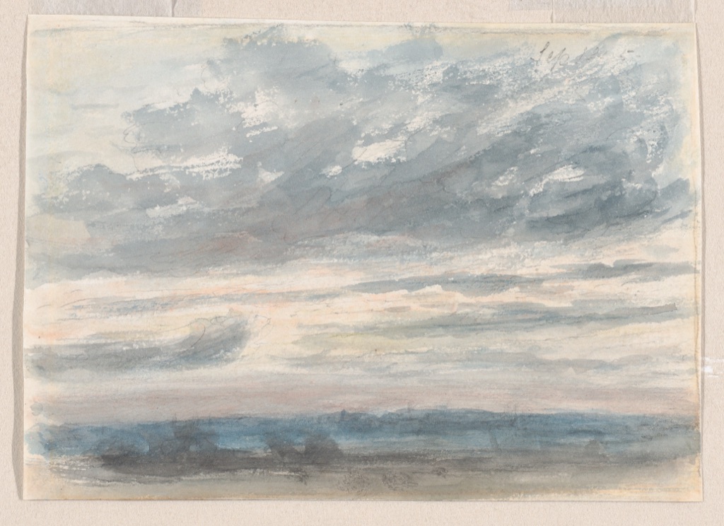
John Constable’s small Cloud study of 1830–35 makes this distinction tangible. It is watercolour over graphite on a sketchbook page only 12.7 by 15.2 centimetres. The Met relates it to Constable’s systematic recording of weather, though the exact subject and date of this particular sheet are not fully settled.[4] The graphite is a light framework; transparent washes establish the cloud masses and the intervals of sky. It does not catalogue every vapour edge. Its selectivity is what allows it to register a passing condition.
That economy is an observational style, but it is not the only form observation can take. The important question is what Constable chose to preserve: broad light, changing mass and atmosphere. A beginner can test the same priority by making four five-minute sky studies. Use one pale line to place the largest cloud, then no more than three values of wash. Comparing the four sheets will teach more about selection than labouring over one “finished” cloud.
Contour-led drawing: let edges carry the description
Contour-led drawing uses boundaries to explain form. Those boundaries may be the outer silhouette, overlaps, folds or interior changes of plane. Contour does not require one unbroken outline, nor does it mean pressing equally hard everywhere. A line can strengthen where one form passes in front of another, fade where light dissolves an edge, or restart after the eye checks a difficult turn.
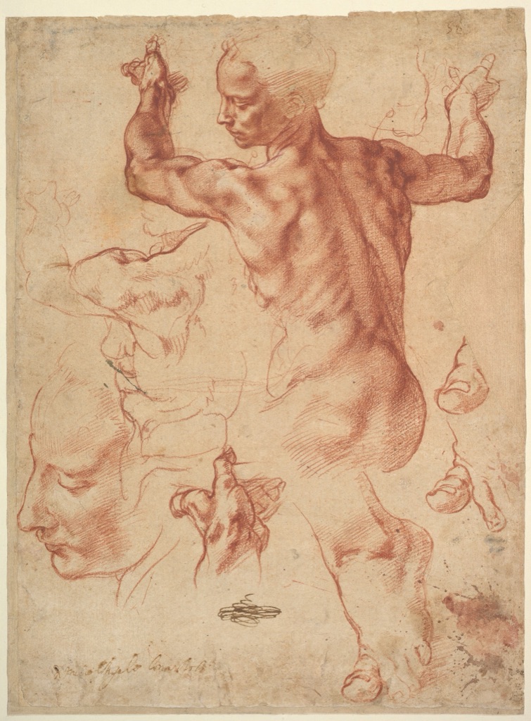
Michelangelo’s Studies for the Libyan Sibyl, made around 1510–11, shows contour as part of a larger construction process. The principal red-chalk figure is a direct study for the Sibyl on the Sistine Chapel ceiling. A young male studio assistant modelled the pose, and smaller studies of hands and feet solve particular articulations.[5] The page is not arranged as an autonomous scene. Repetition is functional: the artist can investigate a whole pose, then give a troublesome extremity more space.
Within the main study, sharpened chalk defines selected contours and hatching, while strokes made with the side of the chalk broaden into modelling.[5] This is why “line drawing” and “tonal drawing” are not mutually exclusive styles. Contours establish the pose’s turns; parallel marks make the body occupy space. White-chalk accents are sparse rather than a complete layer of highlights.
Try the sheet’s logic rather than copying its appearance. Draw a seated pose at about hand height. Next to it, enlarge only one hand or foot. On the second study, vary pressure at overlaps and use a few hatches to explain which plane turns away. The exercise has a testable purpose: after covering the shading, the pose should still read from the directional contours; after covering the outer silhouette, the internal overlaps should still explain the articulation.
For a fuller treatment of edge selection and line weight, continue to the contour drawing guide. The point here is that contour is one family of visual decisions, not a synonym for every drawing made with a linear tool.
Tonal drawing: build with connected light and dark
A tonal drawing gives value masses the leading role. Instead of enclosing every object, it may allow a light shape to meet the paper with no explicit border, or merge several objects into one shadow. The central skill is not smooth shading; it is judging which lights and darks belong together.
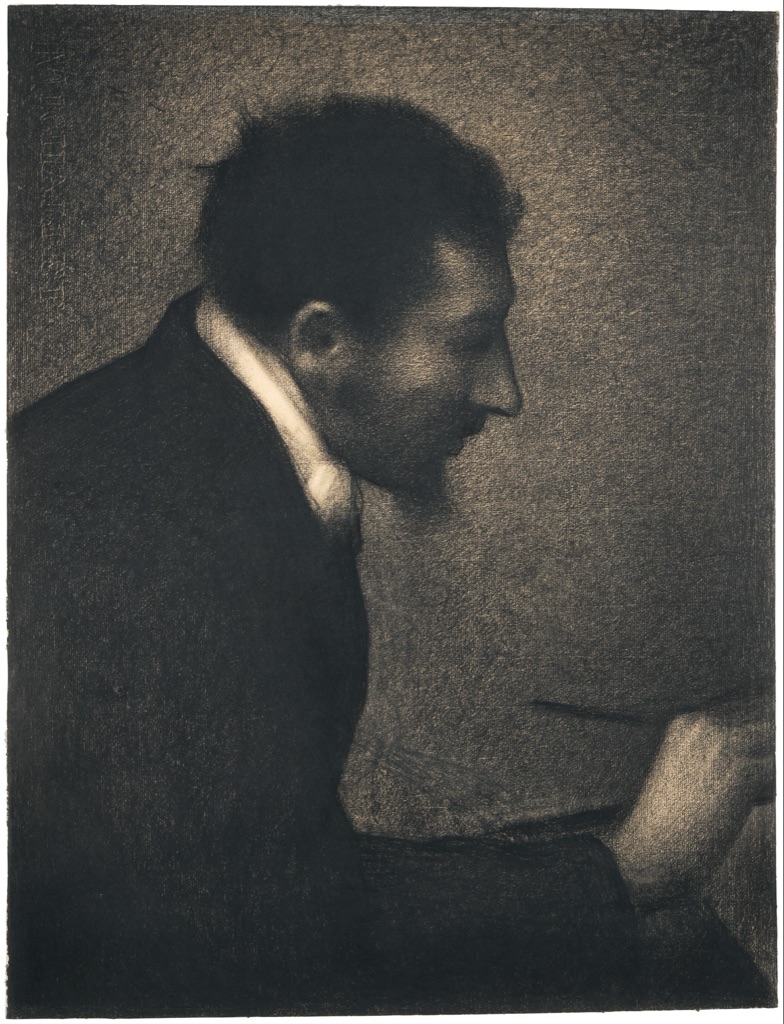
Georges Seurat’s Aman-Jean (Portrait of Edmond François Aman-Jean), 1882–83, is especially useful because it overturns an easy assumption. This large Conté-crayon sheet is an independent, finished drawing, not preparation for a painting. It appeared at the Salon of 1883 as Seurat’s first exhibited work.[6] Yet its surface is granular and many boundaries remain soft. The tooth of Michallet paper breaks the crayon into countless flecks, contributing to the work’s luminosity and tonal unity.[6]
“Finished”, then, describes the drawing’s status and resolution, not the absence of visible paper or rough texture. Seurat concentrates darks around the sitter’s head and upper body while quieter transitions let the form emerge gradually. The limited value language holds the portrait together more strongly than additional local detail would.
To practise this mode, use textured paper and one dark crayon or soft pencil. Squint at the subject and identify four value families: paper light, light grey, middle grey and dark. Join neighbouring patches whenever their values are close. Do not outline first. At the end, ask whether the largest light and dark shapes describe the pose from across the room. If they do not, eyelashes and buttons will not rescue it.
Gestural drawing: organise direction and weight
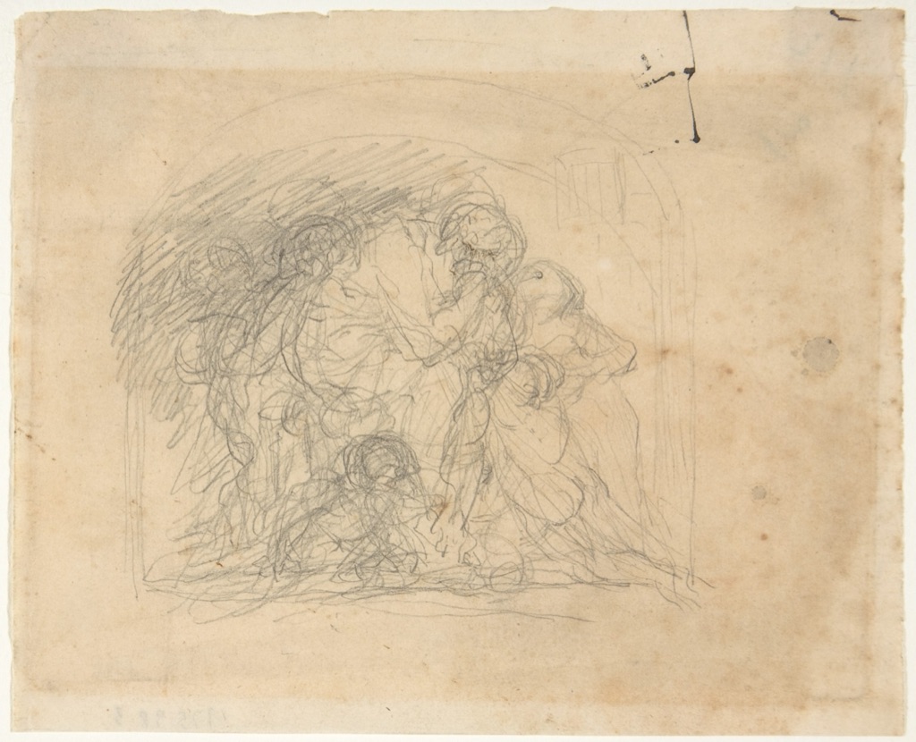
Gesture is often confused with speed. A fast drawing can still be a collection of hesitant outlines; a deliberate drawing can carry powerful movement. Gesture means that marks communicate action, balance and the directional relationship between parts.
Jean-Baptiste Carpeaux’s small graphite Study for the Ugolino Group compresses several overlapping figures into a knotted composition.[7] The Met’s record securely establishes the title, medium, dimensions and accession but does not supply a detailed account of the sheet’s stage in Carpeaux’s process. It would be irresponsible to invent one. What can be seen is enough for the present lesson: searching graphite lines accumulate around a compact mass, and the group’s combined direction matters before any individual figure is fully described.
Use this as a compositional gesture exercise. Choose a multi-figure subject and work no larger than your palm. Give yourself ninety seconds to place one enclosing mass, three principal directions and the centre of weight. Do not draw faces. Repeat twice, shifting the dominant diagonal. The strongest version is not necessarily the neatest; it is the one in which the group’s balance remains legible when viewed very small.
The dedicated gesture drawing guide develops this into timed figure practice. Here, Carpeaux’s sheet demonstrates a broader point: gesture can organise a whole composition, not only describe a single moving body.
Measured and constructed drawing: make checking visible
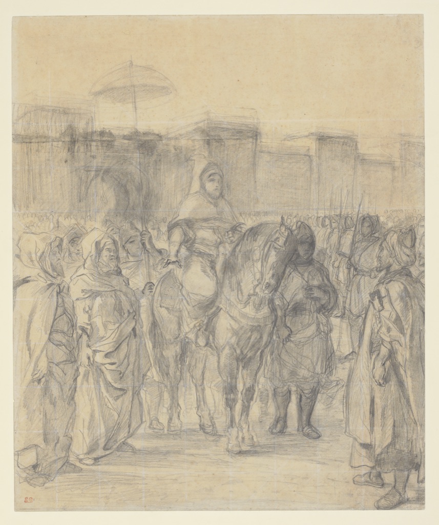
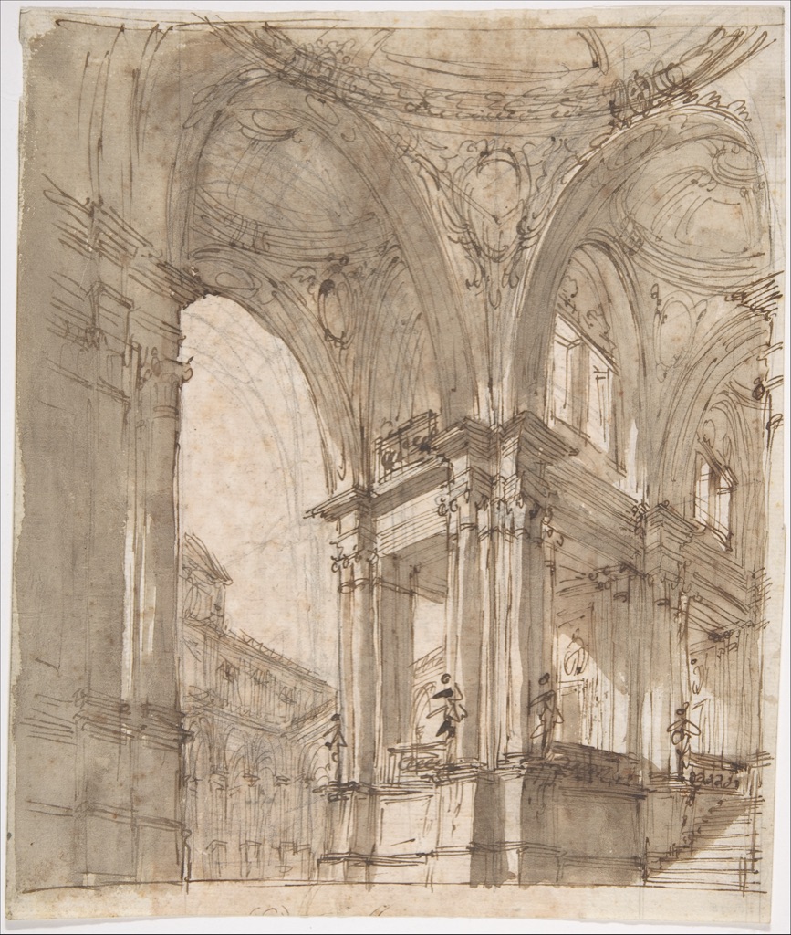
Expressive and accurate are not opposites. A measured drawing uses proportion, geometry or repeated comparison to stabilise relationships. Construction may remain visible, especially when the drawing is a stage in a larger work.
Eugène Delacroix’s 1845 Study for “The Sultan of Morocco and His Entourage” is drawn in graphite and squared in white chalk.[8] The grid is working equipment. It helps transfer or enlarge the composition while preserving relative positions. The Met connects the sheet to Delacroix’s largest painting based on his North African journey, shown at the Salon of 1845. The final design omitted the French delegation, moving the image away from a literal diplomatic record and towards a composition centred on the ruler.[8]
That change matters. A measured study is not merely a mechanical copy waiting to become larger. It can be a site of editorial revision. The grid secures relationships so that the artist can alter emphasis without losing the architecture of the whole.
Filippo Juvarra’s Architectural Study offers another kind of construction. Pen and brown ink and brown wash sit over graphite.[9] The museum record does not identify a particular executed building, so the page should not be treated as proof of one. Visually, however, its sequence is clear enough to be useful: erasable graphite supports the design, ink commits selected edges, and wash tests depth and shadow. Control and exploration coexist.
Practise those layers on a simple façade. First place the overall width, centre line and major levels in pale graphite. Second, commit only the edges that define the design. Third, add a single-direction wash to separate projections from recesses. Photograph each stage. If the design collapses after stage one, the problem is proportion; if it collapses after stage three, the value pattern is contradicting the structure.
Wash-led drawing: mass before detail
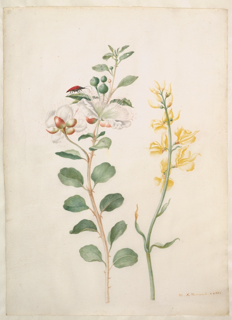
Wash uses diluted ink or pigment to establish broad value or colour shapes. Transparent watercolour depends on light reflecting from the paper; artists can also lift colour or scratch back to recover lights.[10] These material behaviours strongly affect appearance, but “watercolour” itself is still a medium rather than a style. It can serve a rapid cloud note, a precise botanical study or a highly worked exhibition picture.
Maria Sibylla Merian’s Study of Capers, Gorse, and a Beetle of 1693 makes that range clear. Watercolour and white gouache are applied to vellum. According to the Met, the autonomous sheet was probably made for sale while Merian raised funds for her journey to Suriname. It recomposes motifs from her 1680 flower book, and technical analysis has identified vermilion and red lake.[11] The observation is exacting, but the arrangement is also designed: turns of stem, open intervals and the small beetle distribute attention across the page.
This is not mechanical copying disguised as science. Nor should a modern scientific purpose be imposed on it without qualification. Merian’s sheet joins empirical attention, material knowledge and an independent decorative composition. Fine contours identify leaves and thorns; transparent colour describes their surfaces; opaque white can supply a different kind of light.
For practice, bring one safe plant specimen to the table. Make three contour notes of how leaves attach before using colour. Then arrange—rather than merely centre—the plant’s main direction on a fresh sheet. Reserve one small area for an associated detail such as a seed case or insect. Limit the first wash to two transparent values, adding opaque light only where it describes a distinct surface. The exercise tests whether observation and composition can support each other.
Mixed approaches: give each mark a job
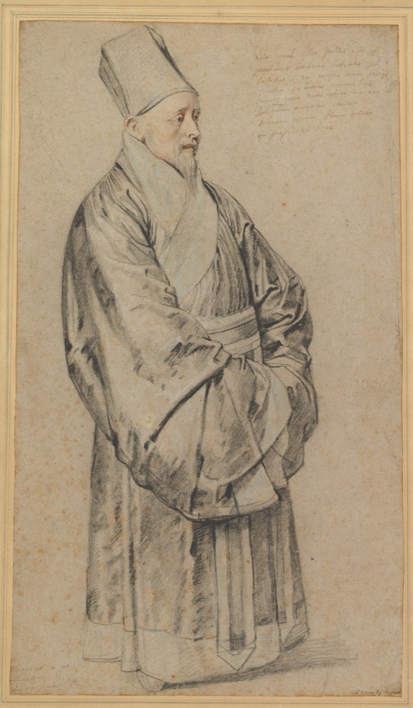
Many compelling drawings are mixed not only in medium but in visual role. Peter Paul Rubens’s 1617 Portrait of Nicolas Trigault in Chinese Costume combines black, red and white chalk, blue pastel, and brown and black ink on light-brown paper.[12] The Met describes it as both a costume study and an affecting portrait of the Jesuit missionary. Rubens records the cut, texture and weight of the robe, and a Latin inscription preserves colour information.[12]
The mixture is not variety for its own sake. Different marks store different kinds of knowledge: structural darks establish the figure, coloured accents distinguish materials, and written notation carries information that the image may not fully specify. At the same time, the face prevents the costume record from becoming impersonal.
Make a similar information hierarchy with a clothed sitter or garment on a hanger. Use one neutral tool for proportion, one colour for a material distinction and no more than three written notes. Before changing tools, state its job. If two tools do the same work, remove one. This makes mixed media coherent rather than decorative.
The same principle applies even when only one medium is used. Line weight, hatching, rubbing and erasure can behave like separate instruments. The drawing media guide compares the physical options; style comes from how deliberately those options are assigned.
How to recognise your developing style
Personal style is better observed after work than declared before it. Lay out ten recent drawings and mark recurring decisions. Do you begin with a scaffold or an outer edge? Do shadows join into large masses or break into hatching? Are the strongest marks at overlaps, at the centre of interest or everywhere? Do you omit backgrounds? Do you revise openly or erase the search?
Then change one variable at a time. Translate a contour-led drawing into four values. Redraw a tonal subject using only weighted line. Enlarge a thumbnail with a grid. Rework a careful observation as a ninety-second directional study. These comparisons reveal which choices are habits, which serve the subject and which you want to cultivate.
Historical labels can still be valuable when studying a period or artist, but they should not replace looking. The eight sheets here do not form a universal ladder from loose to finished. Constable’s quick weather record is precise about atmosphere. Michelangelo’s repetitions are purposeful design. Delacroix’s grid enables revision. Seurat’s grain belongs to a finished drawing. Rubens uses several media as an information system. Carpeaux compresses a group into directional mass. Juvarra layers construction and wash. Merian combines empirical attention with composition.
The practical conclusion is simple: style is not an effect sprinkled over a drawing at the end. It is the visible result of priorities sustained through the work. Choose what the drawing must discover or communicate; decide whether line, tone, direction, measurement or wash can do that work most clearly; and judge the result against that purpose.
Watch Drawing Style Emerge from Material and Purpose
Move from technical material evidence to a distinctive historical hand and a contemporary studio process.
Drawing with Charcoal: Historical Techniques
Technical reconstruction shows why the physical behaviour of black drawing media changes the appearance of a line or mass.
Watch on YouTubeFrequently Asked Questions
A drawing style is a consistent visual language created by relationships among line, tone, edge, direction, material, subject and purpose. It is not simply the name of a medium or subject.
Contour drawing is primarily a method that gives descriptive responsibility to edges and internal boundaries. Repeated use can contribute to a recognisable style, but the terms are not interchangeable.
Gestural drawing prioritises direction, weight, rhythm and action, while tonal drawing organises connected areas of light and dark. A single sheet can combine both.
Start with the object record, medium, date and function, then describe specific relationships among marks. Compare securely attributed works before applying a school, period or artist label.
Repeat meaningful subjects through different methods, keep labelled studies, compare what consistently serves the idea, and let durable choices emerge through practice rather than forcing a signature look.
Discussion
Which drawing choice feels most characteristic in work you admire: contour, tonal mass, gesture, measurement, wash or a controlled mixture?
Reader Insights
Ask whether a label describes function, medium, method, subject or history.
Redraw the same subject while changing only contour, tone or gesture.
Keep the decisions that repeatedly clarify your purpose instead of adding mannerisms.
Join the Conversation
Share a securely identified drawing whose marks make its purpose unusually clear below.
References
- Victoria and Albert Museum, “Drawing”, collection overview: source.
- The Metropolitan Museum of Art, “Selections from the Department of Drawings and Prints: Materials and Techniques”: source.
- Victoria and Albert Museum, “Architects and their sketchbooks”: source.
- The Metropolitan Museum of Art, John Constable, Cloud study, accession 2016.589: source.
- The Metropolitan Museum of Art, Michelangelo Buonarroti, Studies for the Libyan Sibyl, accession 24.197.2: source.
- The Metropolitan Museum of Art, Georges Seurat, Aman-Jean, accession 61.101.16: source.
- The Metropolitan Museum of Art, Jean-Baptiste Carpeaux, Study for the Ugolino Group, accession 1975.98.3: source.
- The Metropolitan Museum of Art, Eugène Delacroix, Study for “The Sultan of Morocco and His Entourage”, accession 61.202: source.
- The Metropolitan Museum of Art, Filippo Juvarra, Architectural Study, accession 35.115: source.
- Victoria and Albert Museum, “What is watercolour?”: source.
- The Metropolitan Museum of Art, Maria Sibylla Merian, Study of Capers, Gorse, and a Beetle, accession 2012.83: source.
- The Metropolitan Museum of Art, Peter Paul Rubens, Portrait of Nicolas Trigault in Chinese Costume, accession 1999.222: source.