 by Tom Gurney
Tom Gurney BSc (Hons) is an art history expert with over 20 years experience
Email: tomgurney1@gmail.com / Phone: +44 7429 011000
Jasper Cropsey’s Style and Technique: Introduction
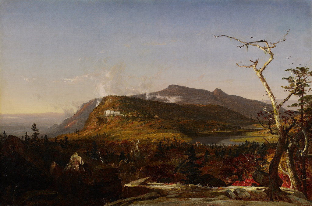
Jasper Cropsey organised landscapes through strong foreground forms, extensive distances and changing light. His architectural training gave him an early discipline in drawing, while his 1855 essay Up among the Clouds describes a sustained interest in atmosphere. The paintings bring those concerns together in different ways, from a small woodland board to a large river panorama. [1] [2]
His technique also varied between objects. The NGA’s published examinations record different grounds, paint layers and handling in three important canvases. Those findings make it possible to discuss particular methods alongside the visible compositions, while avoiding a single recipe applied to his entire career. [1]
At a Glance
- Artist: Jasper Francis Cropsey, 1823–1900
- Principal concerns: Landscape structure, atmospheric space, seasonal colour and architecture
- Early training: Architectural apprenticeship with Joseph Trench
- Important written statement: Up among the Clouds, 1855
- Technical evidence discussed here: NGA catalogue examinations published in 1996
- Works compared: Autumn—On the Hudson River, Warwick Castle, The Spirit of War, Trees and a Stream, Summer, Lake Ontario
Contents
- The frame of a landscape
- Architecture and geometric order
- Clouds as form and atmospheric space
- Near detail and distant air
- Seasonal colour within the composition
- Three canvases, three recorded preparations
- Glazing, scumbling and highlights
- Observation and composite scenes
- A varied manner and Luminist effects
- Annotated details
The frame of a landscape
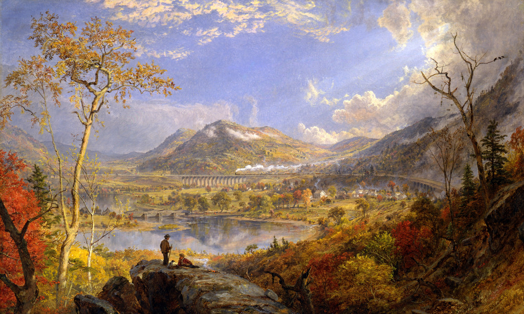
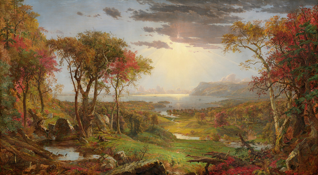
In Autumn—On the Hudson River, the foreground trees do more than decorate the edges. Their height and mass establish a place near the viewer, while the opening between them carries the eye toward the river. The panorama depends on the contrast between those substantial near forms and the paler distance.
Cropsey varies the frame across the width. One group contains several dense crowns and dark trunks; another includes pale bark and stronger red foliage. Their unequal shapes keep the two sides active while allowing the central opening to remain clear.
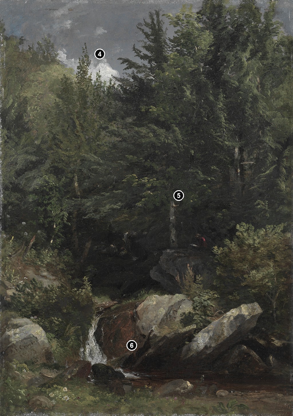
In Trees and a Stream, the framing works differently. The vertical board is largely filled by woodland. Water moves among nearer rocks and foliage, and the space does not open into a broad distant horizon. The Cleveland Museum of Art dates the work 1853 and identifies it as oil on board, probably painted during a summer stay in Massachusetts. [3]
The comparison shows why scale and format matter. In one picture, near trees prepare a long outward view. In the other, woodland contains the main experience within a much more enclosed space. Similar landscape materials can support different ways of looking.
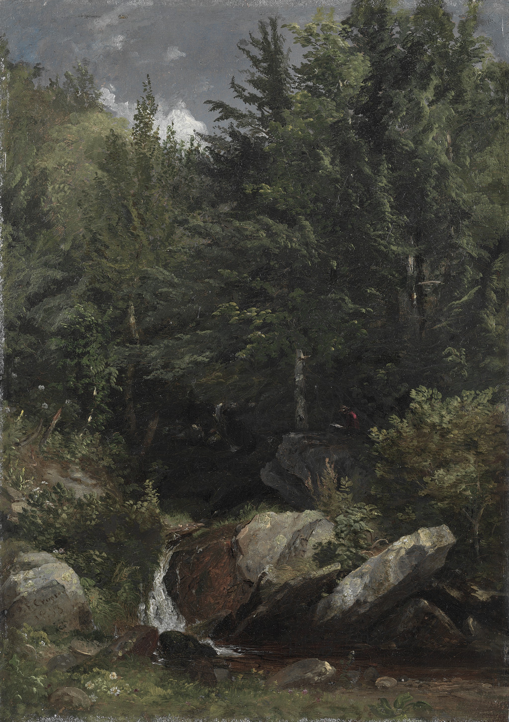
Jasper Francis Cropsey, Trees and a Stream, 1853. Cleveland Museum of Art, 1977.118. Oil on board, 33.9 × 23.9 cm. A contrasting enclosed woodland composition. Jasper Francis Cropsey / Cleveland Museum of Art. Image source. CC0 1.0. Proportionally resized only; full carrier, margins and native appearance retained.
Annotated Details from Jasper Cropsey’s Style and Technique
The numbered points identify visible features discussed in this article. Return from each detail to the whole composition. The captions keep each work’s identity, date and medium separate.
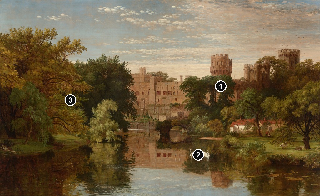
Warwick Castle
Jasper Francis Cropsey, Warwick Castle, England, 1857. Oil on canvas, 81.1 × 132.3 cm. National Gallery of Art, Washington, 1991.142.1. Gift of Mr. and Mrs. Norman Hirschl, in Honor of the 50th Anniversary of the National Gallery of Art. Jasper Francis Cropsey / National Gallery of Art, Washington. Image source. CC0 1.0. Separate resized overview with numbered points; details cropped from the original, without recolouring, retouching or enlargement.
Trees And A Stream
Jasper Francis Cropsey, Trees and a Stream, 1853. Oil on board, 33.9 × 23.9 cm. Cleveland Museum of Art, 1977.118. A separate work, probably made during a summer stay in Massachusetts. Jasper Francis Cropsey / Cleveland Museum of Art. Image source. CC0 1.0. Separate resized overview with numbered points; details cropped from the original, without recolouring, retouching or enlargement.
Details from JASPER CROPSEY’S STYLE AND TECHNIQUE
Compare the cropped details with the complete images above. Notice how their colours, shapes and positions contribute to the larger compositions.
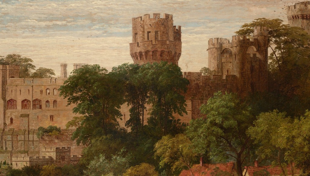
Warwick Castle
Towers and the river facade
Battlemented towers and the long facade rise above the river. Warm stone contrasts with the surrounding green foliage.
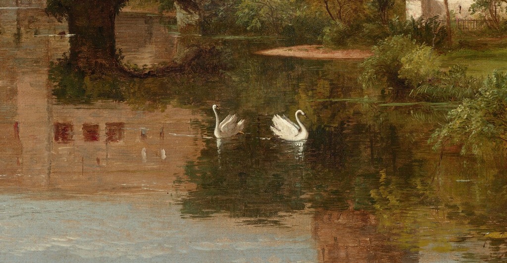
Swans beside the reflection
Two pale swans float beside the reflected building. Their small bright forms punctuate the darker river surface.
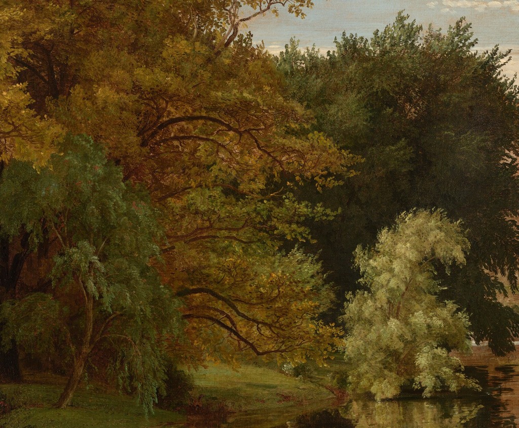
Trees enclosing the left bank
Several differently coloured tree masses fill the left bank. Their overlapping foliage provides a soft counterweight to the castle’s straight edges.
Trees And A Stream
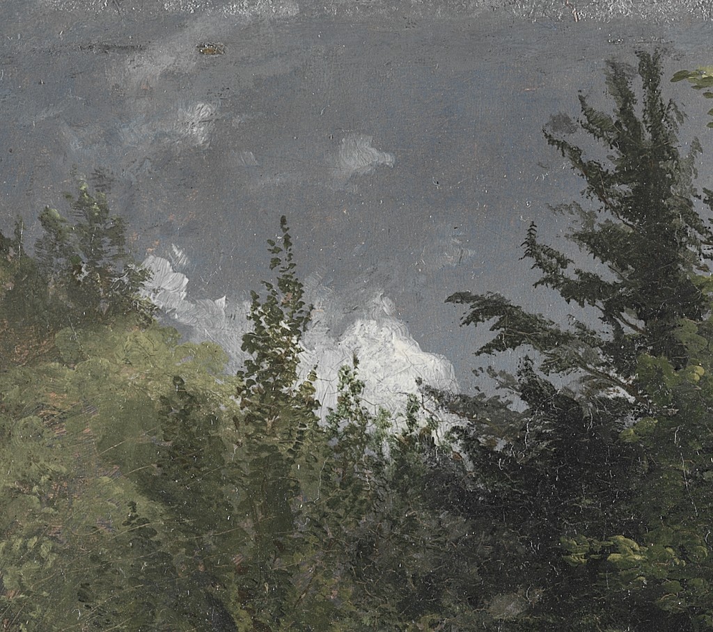
Pale opening above the woodland
A pale sky opening appears above layered dark foliage. The small opening gives contrast to the enclosed wooded scene.
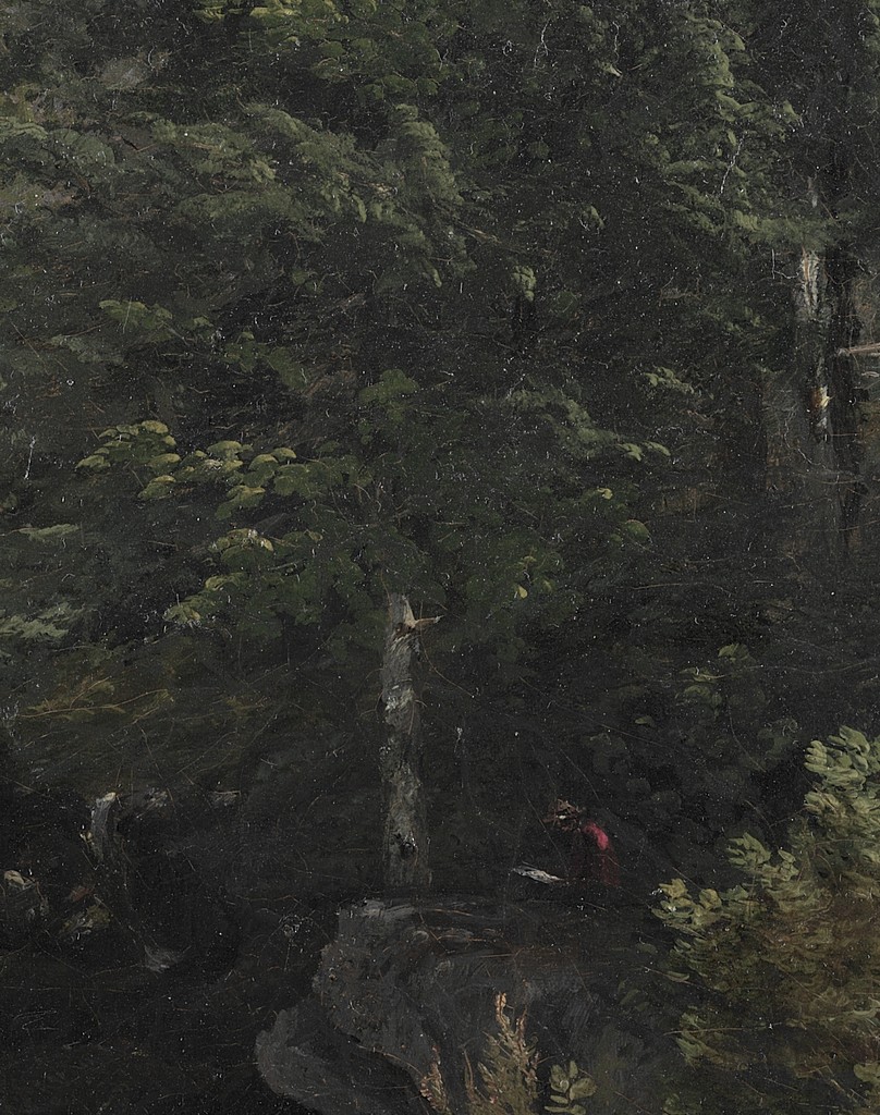
Trunks within the shaded foliage
Narrow trunks emerge unevenly through the shaded foliage. Differences of tone separate their forms without requiring a tree-species identification.
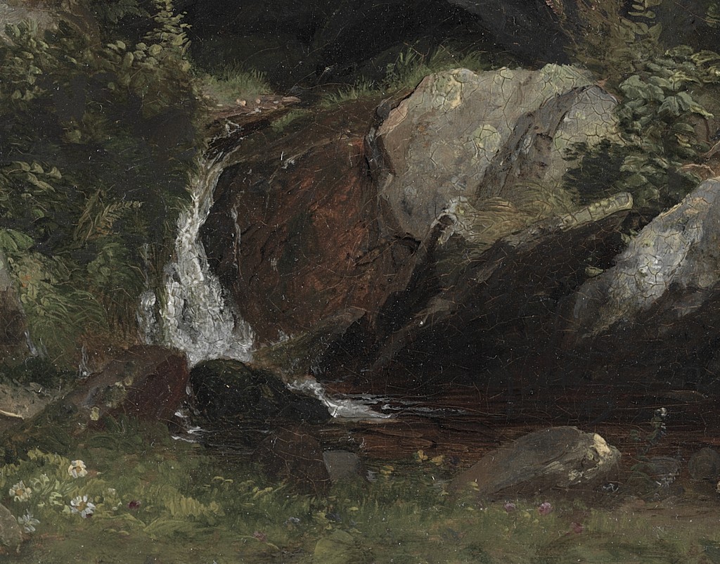
Stream passing between near rocks
A pale stream passes between irregular near rocks into darker water. Light marks along its edge make its descent visible.
Architecture and geometric order
Cropsey’s apprenticeship with Joseph Trench began in 1837. Chotner describes the responsibility he acquired for finished architectural renderings and the drawing skills developed during that training. He continued to accept architectural work at different stages of his life. [1]
Buildings therefore deserve close attention within his landscapes. In Warwick Castle, connected walls and towers establish a series of definite edges. Trees partly cover them, and reflections repeat them in a softer form below. The structure remains legible while belonging to a fuller river setting.
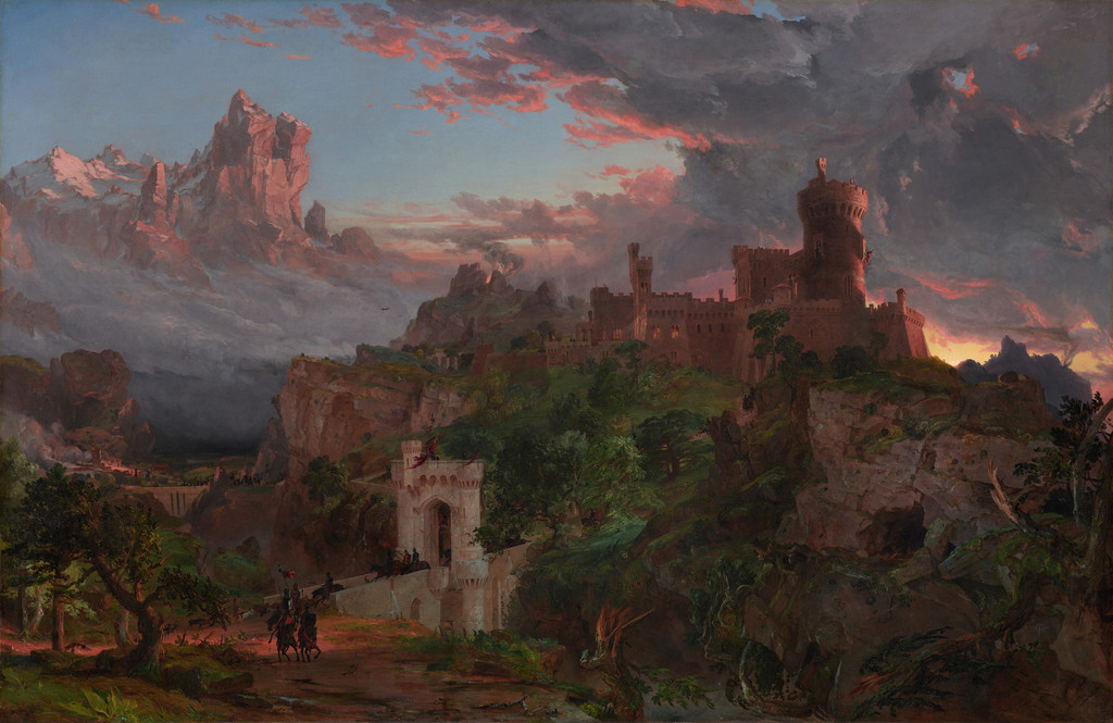
The architecture can also carry a moral argument. The Spirit of War uses an imagined medieval fortress whose defensive route and irregular skyline contribute to the scene’s tension. Chotner distinguishes that composite building from Cropsey’s identifiable castle subjects. [1]
Architectural order is therefore one resource among several. It can supply a landmark, a route, a contrast with vegetation or a narrative meaning. The value of the early training is evident in the attention given to built forms, without making every landscape the direct result of architectural practice.
Clouds as form and atmospheric space
In Up among the Clouds, Cropsey urges attention to more than attractive cloud outlines. He discusses their changing forms, the intervals around them and the depth they give to the sky. His phrase “infinity, variety, air, and space” expresses that wider field of interest. [2]
This way of looking treats the sky as a space within the picture. A cloud has an edge and a mass, but it also creates relations with the atmosphere before, behind and around it. Those relations affect the apparent distance of hills, trees and buildings beneath it.
The essay also warns against repeating “the same agreeable sky over and over again.” The wording supports a concern with variety rather than one signature cloud pattern. Cropsey considers delicate high formations, more rounded clouds and dramatic weather within that discussion. [2]
The two paintings of war and peaceful country make this range visible. A heavy, unsettled upper field contributes to the fortress scene’s threat; broader light and softer cloud passages support the river panorama’s opening. Neither sky is merely a neutral background.
The essay is a statement about observation and artistic aims. It does not provide a complete list of pigments, brushes or working stages for each canvas. Reading it with the paintings helps explain what Cropsey attended to, while the technical examinations answer more specific questions about material construction.
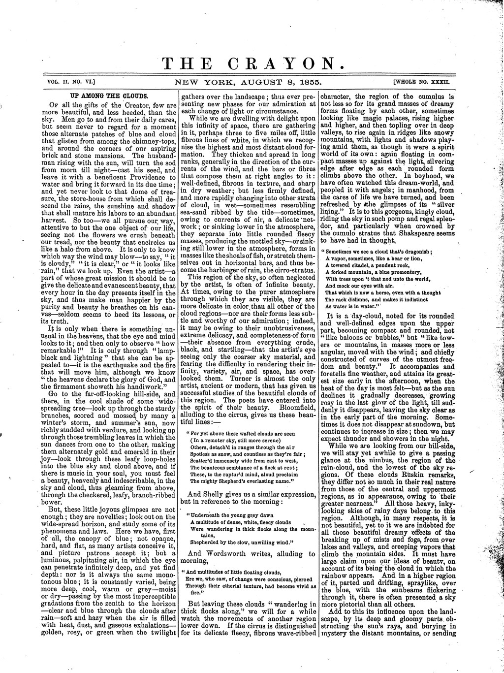
The opening of J. F. Cropsey’s Up among the Clouds on page 79 of The Crayon, 8 August 1855. The full page retains surrounding journal content; the essay continues on page 80. The Crayon,8August1855,p.79 / Internet Archive, Wikimedia Commons. Image source. Public domain. Proportionally resized only; full carrier, margins and native appearance retained.
Near detail and distant air
Cropsey often gives the foreground a denser set of distinguishable forms than the horizon. Bark, roots, stones and individual leaves invite attention at one scale. Farther away, fields and hills gather into softer bands and larger relationships of colour.
This difference lets the viewer experience depth through more than a sequence of overlapping shapes. Contrast and definition change as well. A pale building can remain a landmark in the middle distance, while an even farther ridge becomes less distinct against the sky.
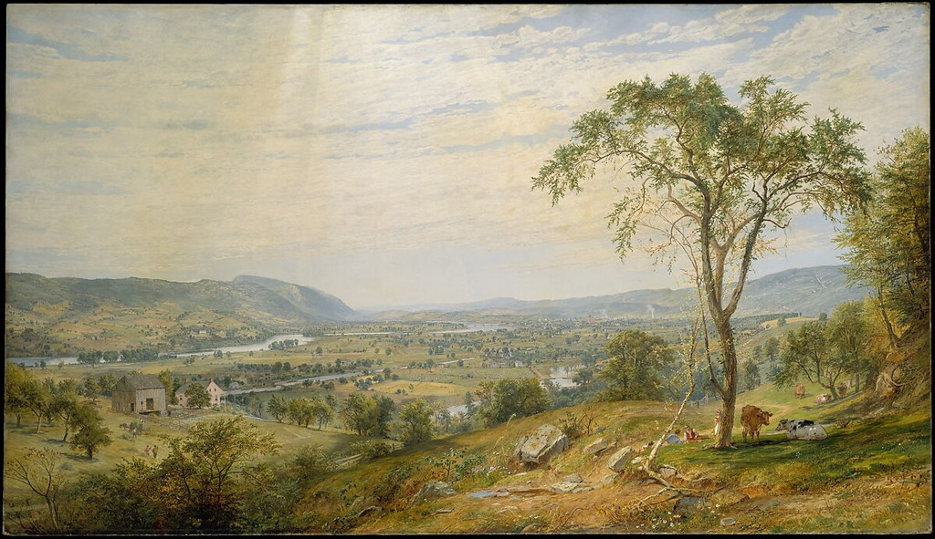
Water provides another way to join these scales. The small stream in the Cleveland board has broken light and movement among near rocks. The larger surface in Summer, Lake Ontario offers a more continuous interval toward the distant hills.
Comparing the whole images makes those differences clear before any detail is enlarged. A close view can show how one passage works, but its role depends on the surrounding composition. Near foliage has one meaning in an enclosed woodland and another when it frames a wide lake.
Seasonal colour within the composition
In the Hudson panorama, strong autumn colour is concentrated in the near tree groups and distributed more broadly through the country beyond. The reds and golds help establish distance because their intensity changes across the view. Colour describes the season while also organising space.
The remaining greens matter too. They give contrast to the warmer leaves and prevent the foreground from becoming one unbroken red field. The tree groups remain differentiated through shape, value and colour together.
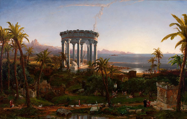
Cropsey’s landscapes should not all be reduced to that autumn palette. The woodland board has a more enclosed green-dark character, and the 1857 Newfields summer picture develops its openness through luminous water and atmosphere. The museum describes the latter as an idealised composition combining motifs from several places. [4]
Those examples make seasonal colour one part of a larger manner. The relation between foreground, light and distance persists across different palettes, but it is adjusted to the kind of scene each picture presents.
Watch: Jasper Cropsey
Look closely at Cropsey’s Mount Jefferson, then explore the wider Hudson River School tradition.
Summer or Autumn? Picturing the American Republic
Smarthistory discusses Cropsey’s seasonal landscape and the image of the American republic.
Watch on YouTubeThree canvases, three recorded preparations
The NGA catalogue’s examination of The Spirit of War records a thin red ground on a lined twill-weave support, with paint applied in a moderately substantial paste and relatively free, low brushwork. The observation belongs to that canvas and the report published in 1996. [1]
Warwick Castle has a different documented construction. Its entry records a warm rosy-buff ground, thin paint, scumbling in sky and water, and transparent layers in foliage and architecture. It also describes a brown wash beneath darker areas and an intervening white layer beneath the architecture. [1]
In Autumn—On the Hudson River, the catalogue records a very thin whitish ground, washes followed by thicker applications, and many impasto passages in foliage. The entry notes that some raised paint had been flattened, probably through lining. [1]
The differences are instructive. Ground colour, paint thickness and layering vary among paintings that belong to the same artist. The evidence supports a flexible practice in particular objects rather than one uniform procedure.
It also separates visible effect from material diagnosis. A reproduction can show a bright tree crown or a softened reflection. The examination provides the more specific account of what lies beneath or how the surface was recorded. Colour alone cannot identify a particular pigment or establish the full sequence of layers.
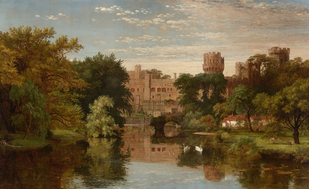
Jasper Francis Cropsey, Warwick Castle, England, 1857. National Gallery of Art, 1991.142.1. Its particular paint construction is recorded in the museum’s 1996 catalogue. Jasper Francis Cropsey / National Gallery of Art, Washington. Image source. CC0 1.0. Proportionally resized only; full carrier, margins and native appearance retained.
Glazing, scumbling and highlights
The Warwick entry offers a useful case for understanding several terms. Transparent glazing allows an underlying colour to remain involved in the visible result; scumbling gives a different effect through a thinner, more broken or veiling application. The report identifies both kinds of handling in the painting. [1]
Its foliage is especially varied in the published account. Darker passages appear above a brown wash, while lighter leaves have an ochre-toned base beneath coloured layers. Small raised highlights provide another kind of emphasis. These are not interchangeable methods applied indiscriminately across the canvas. [1]
The broad image lets a reader see why different handling might be useful. A stone wall, a dense tree and a reflected sky have different visual demands. Cropsey’s arrangement makes them coherent in the whole view, while the recorded construction preserves distinctions among their painted passages.
Observation and composite scenes
The Newfields label’s composite interpretation of Summer, Lake Ontario is a reminder that geographical titles do not always certify one complete surveyed viewpoint. Motifs gathered from different locales can be joined through a shared light and spatial structure. [4]
Chotner’s account of Warwick supplies a more particular drawing relationship: a dated 1856 study closely corresponding with the 1857 oil, though the swans were added in the painting. The two examples show different kinds of evidence for moving from landscape material to a finished composition. [1]
Neither case requires a choice between attention to nature and artistic arrangement. An artist can observe forms carefully, select among them and revise their relationships. The result can be convincing as a landscape without functioning as a mechanical record of one instant.
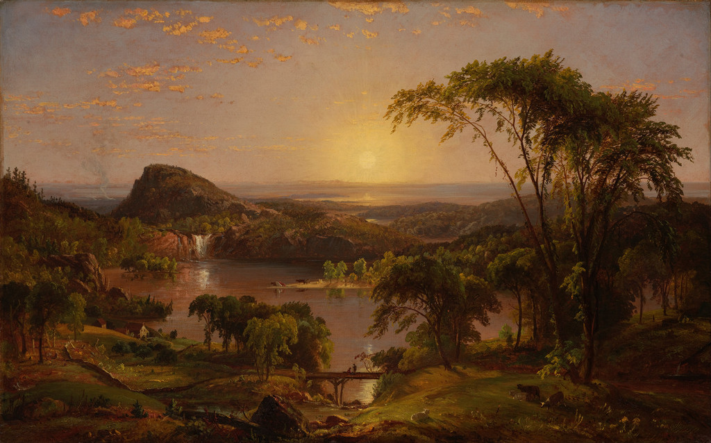
Jasper Francis Cropsey, Summer, Lake Ontario, 1857. Indianapolis Museum of Art at Newfields, 71.13. The museum describes an idealised composition combining motifs from different locales. Jasper Francis Cropsey / Indianapolis Museum of Art at Newfields, via Google Art Project. Image source. Public domain. Proportionally resized only; full carrier, margins and native appearance retained.
A varied manner and Luminist effects
The Thyssen museum’s biography describes a combination of panoramic landscape with light and tonal gradations reminiscent of Luminism. That comparison is useful for some effects in Cropsey’s work, particularly quiet water and extensive atmosphere. It is a curatorial description rather than a claim that all his pictures share one fixed category. [5]
The threatening castle, enclosed woodland and broad summer lake already demonstrate a wider range. Each uses different proportions, contrasts and kinds of activity. Looking across them makes Cropsey’s style more specific than a reputation for autumn colour alone.
His landscapes are strongest when those relations are considered together. Foreground detail establishes a place to stand; architecture can order or disturb it; water and cloud open different distances; colour gives the whole its seasonal and atmospheric character. The documented paint layers add evidence of how particular surfaces were built to support those effects.
Artworks directory
A selected directory of 18 paintings, two drawings and three architectural projects. Repeated subjects retain distinct object identities. Links lead to a companion article where available, otherwise the consulted institutional record. Unillustrated objects remain searchable; this is not a complete catalogue raisonné.
Frequently Asked Questions
The three NGA entries discussed here record different grounds: red for The Spirit of War, rosy buff for Warwick Castle and thin whitish preparation for Autumn—On the Hudson River. They are specific object findings published in 1996. [1]
It discusses observation, cloud form, atmosphere and artistic aims. It does not provide a complete material recipe for each landscape. [2]
Discussion
Look again at the images and ideas explored in Jasper Cropsey’s Style and Technique. These editorial prompts invite your observations.
Reader Insights
How does the same kind of tree change its role between woodland and panorama?
Which painting makes water most important to its sense of depth?
What does the technical evidence add to what you can see in the whole images?
Join the Conversation
Share a detail, comparison or question about Jasper Cropsey’s Style and Technique below.
References
- Deborah Chotner, Cropsey biography and entries, American Paintings of the Nineteenth Century, Part I, National Gallery of Art (1996), printed pp.109–122. Architectural training, particular drawing relationships and dated technical reports for War, Warwick and Autumn. View source
- J. F. Cropsey, Up among the Clouds, The Crayon, II, no. VI, 8 August 1855, pp.79–80. Complete essay, with two short phrases checked against the actual original scans. View source
- Cleveland Museum of Art, Trees and a Stream, accession 1977.118. 1853 oil on board and qualified Massachusetts context. View source
- Indianapolis Museum of Art at Newfields, Summer, Lake Ontario, accession 71.13, museum record supplied through Google Arts & Culture. Exact 1857 work and composite interpretation. View source
- Museo Nacional Thyssen-Bornemisza, Jasper Francis Cropsey. Curatorial comparison of panoramic composition and Luminist light effects. View source
- Splash image source.
Jasper Francis Cropsey, Autumn—On the Hudson River, 1860. National Gallery of Art, 1963.9.1. Strong foreground trees frame a much paler river distance. Jasper Francis Cropsey / National Gallery of Art, Washington. CC0 / Public domain. Proportionally resized only; full carrier, margins and native appearance retained.
View source