


 by
Tom Gurney
Tom Gurney BSc (Hons) is an art history expert with over 20 years experience
Email:
tomgurney1@gmail.com
/ Phone:
+44 7429 011000
John Steuart Curry Drawings and Prints: Introduction
Drawing runs through John Steuart Curry’s career, connecting his early illustration work with paintings, circus subjects and public murals. His sketchbooks contain observations and developing ideas alongside more finished work. Lithography gave selected compositions another life as pictures that could be printed in editions and bought for the home.
These activities reward attention on their own terms. A study helps explain how a composition developed; an independent drawing offers a complete encounter with a subject; a lithograph makes its effects through ink and paper. Their relationship to Curry’s paintings is close, but each object has its own materials, scale and history.
Explore lithographs and related subjects
At a Glance
- Artist John Steuart Curry, 1897–1946.
- Drawing materials Graphite, crayon, pen and ink, watercolour and gouache occur in his work.
- Important holding Worcester Art Museum’s sketchbooks and loose drawings.
- Principal print process discussed here Lithography.
- Publisher Associated American Artists issued several of Curry’s lithographs.
- Selected subjects Circus animals, the rural landscape, self-portraiture, agriculture and racial violence.
- Key distinctions Execution date, publication date and the date of an individual impression need separate attention.
- Scope Selected documented drawings and editions; no complete lifetime inventory is implied.
Contents
- The sketchbook as a place of work
- Drawing for itself and for paintings
- Bodies and movement at the circus
- What changes in lithography
- Associated American Artists and circulation
- Self-portrait and rural identity
- Prints as public argument
- Titles, dates, impressions and versions
- Annotated details
The sketchbook as a place of work
Worcester Art Museum’s 2002 exhibition Collective Images: The Sketchbooks of John Steuart Curry brought together material ranging from childhood to the end of his life. The museum emphasized the sketchbook’s mixture of drawings, casual marks, notes and references. Its account describes work in several media, including graphite, crayon, pen and ink, watercolour and gouache. The variety matters because drawing supported several different kinds of attention. [1]
A quick notation can preserve a gesture or an arrangement before it disappears. A more sustained study can investigate the weight of a body, the turn of a head or the relationship between figures. A note beside a drawing may record information that an image alone cannot supply. Reading a sketchbook therefore involves the relationships between its parts, as well as the quality of a single attractive sheet.
The Archives of American Art’s finding aid helps trace the material’s history. It records that sketchbooks lent for microfilming were returned to Kathleen Curry, who later gave sketchbooks to Worcester in 1999. That distinction separates a record of a drawing from the original object and explains why related research material can be encountered in different institutions. [2]
The finding aid also describes correspondence, photographs, project files and technical notes. These categories remind us that an artist’s working knowledge extends beyond a sequence of finished pictures. They provide routes into research, although the presence of a document in an archive does not by itself establish what it says about a particular drawing.
Annotated Details from Two lithographs: figure and surrounding space
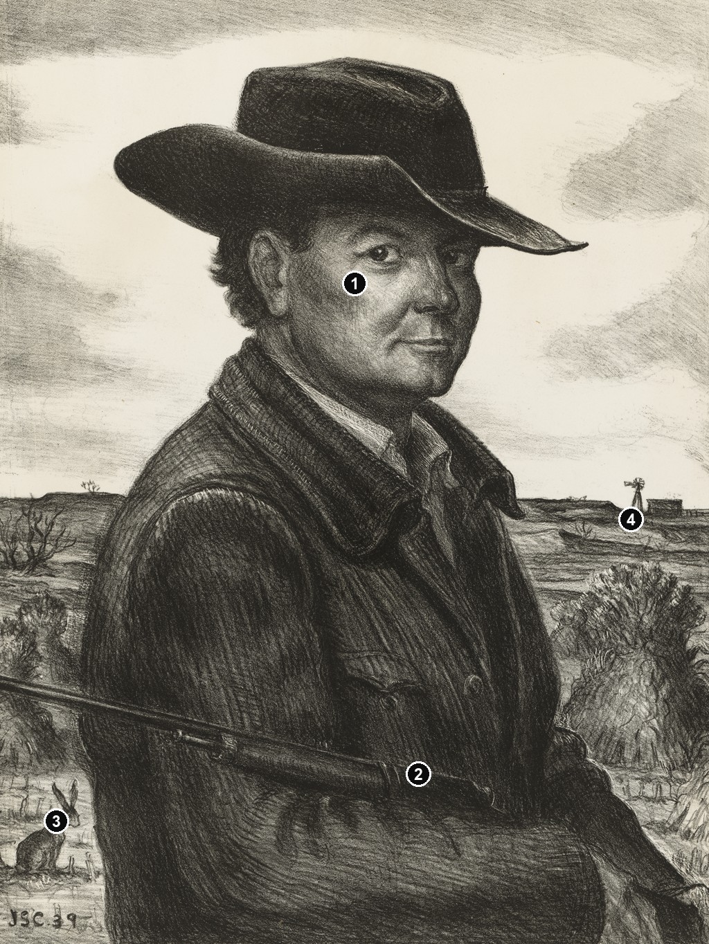
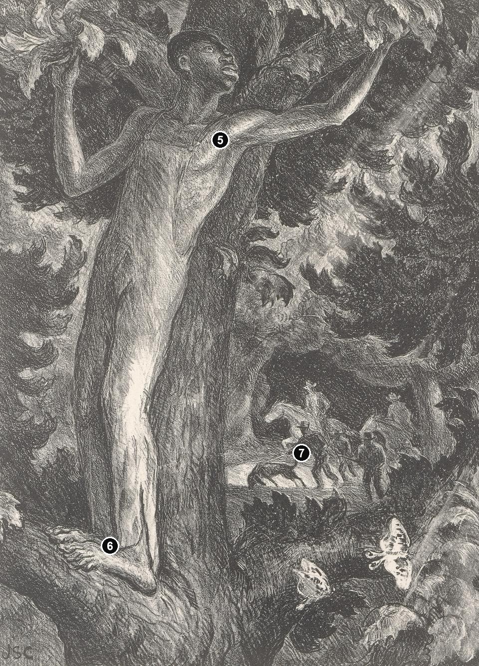
The numbered points identify visible features discussed in this article. Return from each detail to the whole composition. The captions keep each work’s identity, date and medium separate.
Self-Portrait - 1939 lithograph
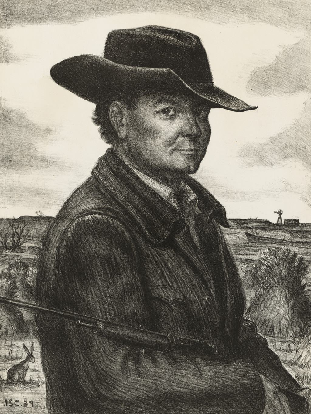
John Steuart Curry, Self-Portrait, 1939, lithograph. National Portrait Gallery, Smithsonian Institution, NPG.85.33. Image source. CC0 / public domain; US copyright not renewed. Editorial numbers added to the overview; detail crops retain the source image’s appearance.
The Fugitive - 1935 lithograph
John Steuart Curry, The Fugitive, 1935, lithograph. Smithsonian American Art Museum, 1972.41. Image source. CC0 / public domain. Editorial numbers added to the overview; detail crops retain the source image’s appearance.
Details from TWO LITHOGRAPHS: FIGURE AND SURROUNDING SPACE
Compare the portrait and The Fugitive as separate lithographs. Follow the placement of bodies, surrounding landscape and areas of printed tone.
Self-Portrait - 1939 lithograph
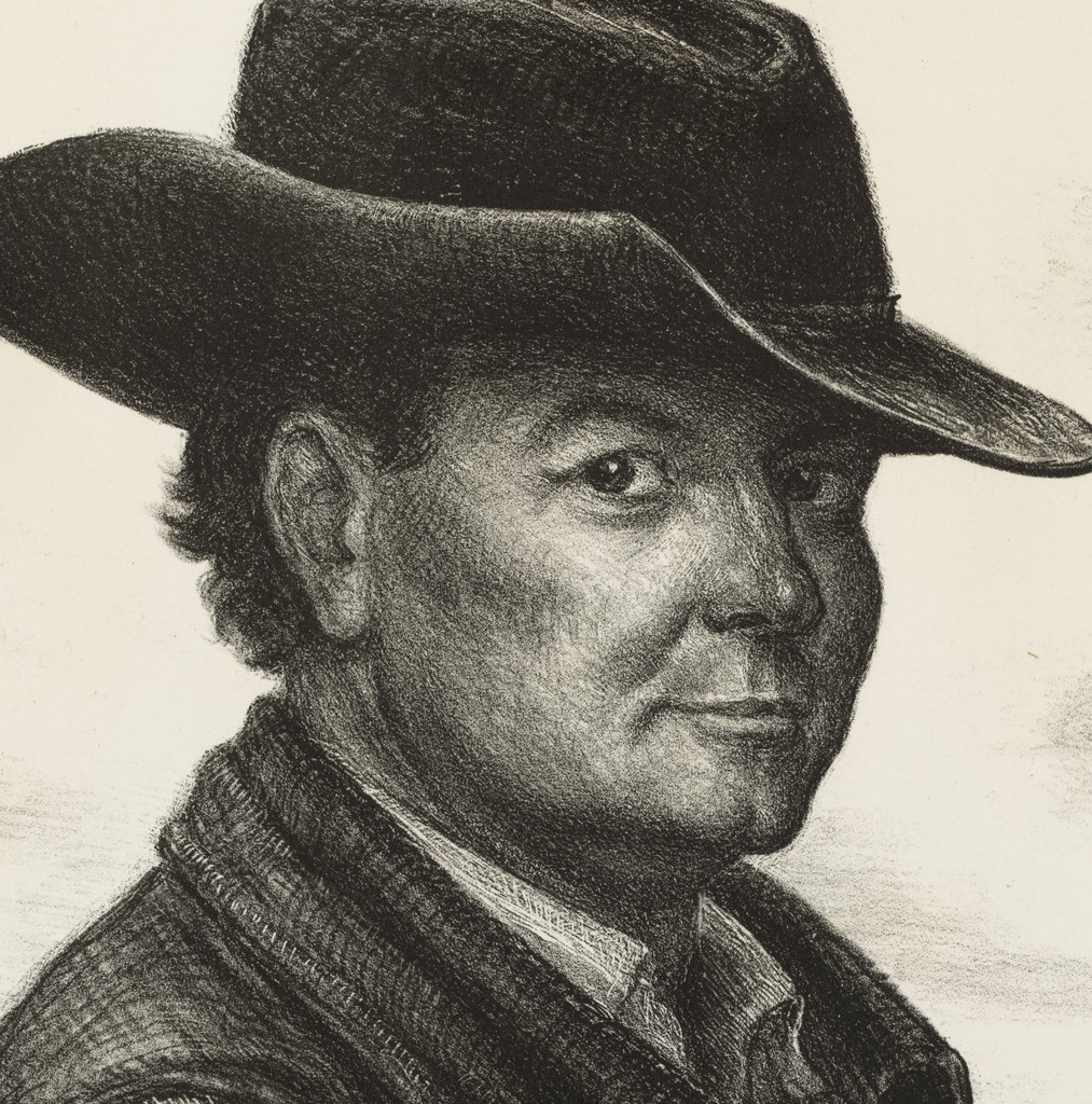
The face beneath the hat brim
The hat creates a dark upper boundary around the face, while lighter areas draw attention to the eye, cheek and mouth. The gaze turns towards the viewer from within this strong outline.
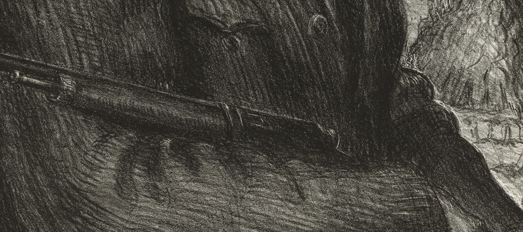
The rifle crosses the dark coat
A rifle crosses the lower body. That long diagonal interrupts the coat’s darker mass and adds a conspicuous rural and hunting association to the portrait.
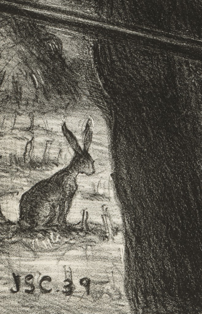
The jackrabbit beside the figure
The small jackrabbit occupies an open patch beside the much larger human body. Its thin outline and raised ears give the foreground a different kind of presence from the heavily shaded coat.
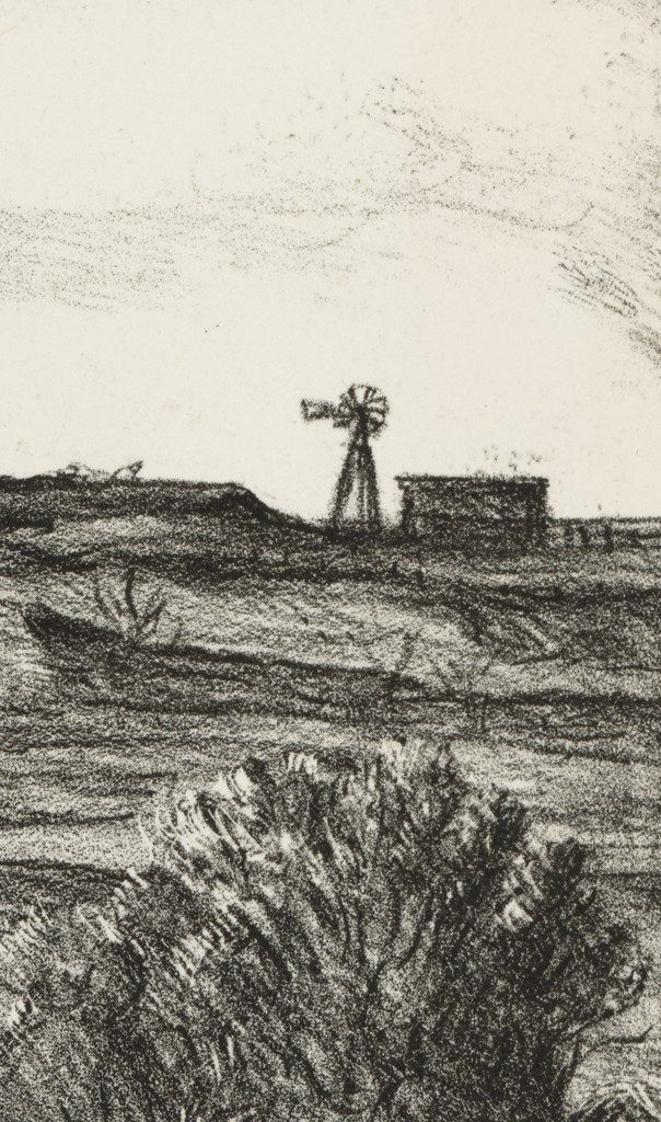
A farmstead beyond the shoulder
A small building and windmill sit near the distant horizon. Their reduced scale places a rural setting around the artist’s large, closely framed figure.
The Fugitive - 1935 lithograph
Face, arms and surrounding leaves
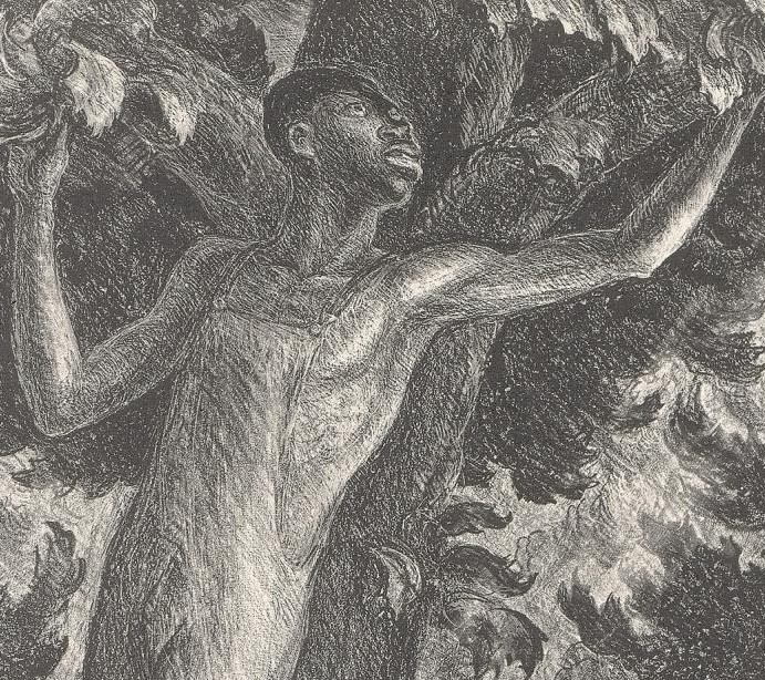
The lifted arms extend into the branches as the man turns his face to one side. Light passages across the torso set the exposed body against the darker surrounding foliage.
Bare feet gripping a branch
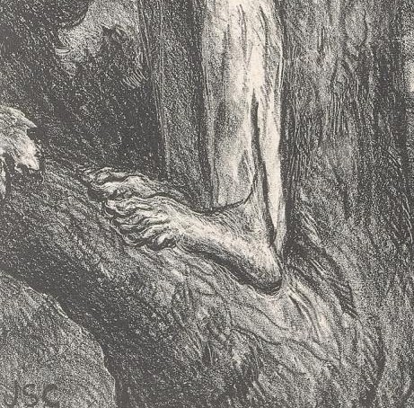
The bare feet press against the branching tree. Their close contact with the wood makes the effort of holding a precarious position physically visible.
The smaller pursuers and dogs below
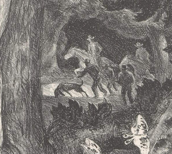
Men and dogs occupy a much smaller area beneath the raised figure. Their scale establishes distance while keeping the threat connected with the man’s position among the branches.
Drawing for itself and for paintings
Curry’s early work as an illustrator made the organization of figures and narrative action a professional concern. The finding aid documents his magazine illustration career before his wider recognition as a painter. Worcester’s exhibition follows drawing across that changing career, presenting it as a continuing activity rather than a stage he simply left behind. [2] [1]
Preparation is one part of this history. A study can test where a figure belongs or how a gesture works within a larger design. Its omissions may be purposeful: a lightly indicated background can leave attention concentrated on a hand, head or pose. The useful comparison asks what the study investigates and what changes when the composition becomes larger or more elaborate.
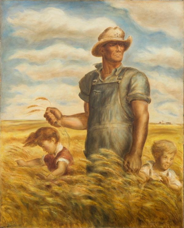
Our Good Earth offers a clear material distinction. The Smithsonian American Art Museum holds a 1942 watercolour on illustration board, described as a study for the painting that was reproduced for a war-bond poster. Chazen Museum of Art records the large 1942 painting as oil on hardboard. The watercolour, oil and poster belong to a connected project, but their separate media and purposes remain essential to understanding it. [3] [4]
Drawing could also produce an independent work. Worcester’s exhibition includes a Baby Ruth dated 1933 and identified as gouache. A title shared with another picture does not make the two interchangeable. The date, support, medium and collection record help establish which object is being discussed, particularly when a familiar circus subject appears in more than one form. [1]
Bodies and movement at the circus
The circus gave Curry a concentrated field of human and animal subjects. Robert Torchia’s National Gallery of Art essay describes his travels with the circus in the spring of 1932 and the sketches that supported subsequent work. For Circus Elephants , Torchia identifies preparatory work in watercolour and in charcoal with conté crayon, alongside the 1932 oil painting. Observation could feed several different material treatments. [5]
The sequence continued into print. The Smithsonian’s Circus Elephants is a lithograph dated 1936, published by Associated American Artists. Torchia records an edition of 250, a figure also given in the Beach Museum’s illustrated index. That edition belongs to the print, rather than to the unique painting or its studies. [6] [5] [7]
The individual artwork study considers the subject in greater depth. Across the different objects, the central questions concern how bodies occupy space: the elephants’ bulk, the intervals between them and the arrangement beneath the tent. Comparing media adds another question about how those relationships survive or change when colour gives way to printed tone.
What changes in lithography
Lithography can preserve a strong relationship with drawing. In the National Gallery’s explanation, a greasy drawing material is applied to a prepared stone or metal plate. The treated surface uses the different behaviour of grease and water to determine where ink adheres. A press transfers the inked image to paper. This describes the general process, rather than the precise workshop procedure for every Curry print. [8]
In a monochrome lithograph, light and shade must carry relationships that a painting may also express through colour. A pale sky can remain open against a dark hat; dense marks can give clothing weight; changes in the direction of a line can separate a body from its surroundings. The paper participates in those effects wherever the image leaves it visible.
The Princeton impression of Our Good Earth makes these relationships easy to follow. The farmer’s upright body rises above the lower figures and the moving wheat. Dark overalls give him solidity, while the lighter areas of shirt, face and sky help distinguish his outline. The composition retains a monumental agricultural figure while organizing the scene through a range of printed greys. [9]
The sheet also extends beyond the rectangular image. Princeton records separate image and sheet measurements, and distinguishes a signature in the printing surface from a graphite signature below the picture. Those details belong to the print as a physical object. A reproduction cropped to the image alone can conceal evidence that matters when comparing impressions. [9]
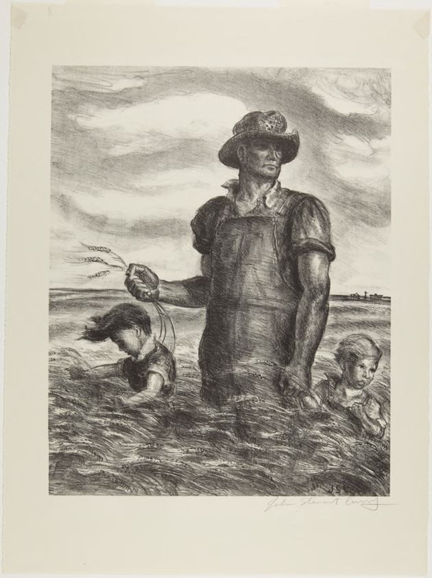
John Steuart Curry, Our Good Earth, lithograph, catalogued 1938. Princeton University Art Museum, 1995-296. This is the print, distinct from the later oil painting.
Image source
.
Public domain
. Proportionally resized; original appearance retained.
Associated American Artists and circulation
Associated American Artists connected Curry’s printmaking with a commercial system reaching beyond gallery visitors. The Beach Museum’s account of the company identifies mail-order catalogues as a principal means of selling prints by Curry, Thomas Hart Benton and Grant Wood. Its research also places that activity within a wider business involving other artists, advertising, ceramics and textiles. [10]
This distribution history changes the setting in which the pictures were encountered. A subject developed through observation and studio work could become an edition offered to buyers at home. Publisher, printer and artist had different responsibilities within that process. The printed image joined artistic decisions to the practical work of producing, advertising and selling multiple impressions.
Gail Windisch and Sylvan Cole Jr.’s Index of AAA Prints identifies George C. Miller in New York as printer for several Curry editions, including Circus Elephants and Our Good Earth . The index separates publication information, edition size, printer and catalogue appearances. These fields make it possible to follow circulation more precisely than the broad statement that Curry made popular prints. [7]
Edition figures also need individual attention. Although the index lists 250 for several Curry subjects, its entry for Prize Stallions gives 183. A familiar number should therefore never replace the evidence for a particular edition. The records describe distinct publishing histories within the same commercial enterprise. [7]
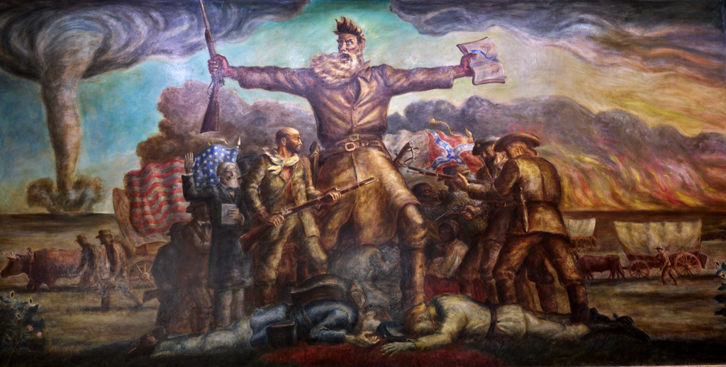
The index’s Curry entries extend from The Missed Leap , published in 1934, to The Plainsman and Valley of the Wisconsin , both published in 1945. Between them are John Brown and Summer Afternoon , issued in 1940, and Sanctuary , issued in 1944. This selected publishing record follows his subjects across more than a decade. Its John Brown entry also connects the graphic work with the abolitionist central to Tragic Prelude , while retaining the distinction between a lithographic edition and the Kansas wall painting. The range gives readers several directions to pursue beyond the best-known agricultural image; AAA’s Curry list is only one part of his larger graphic output. [7]
Watch: John Steuart Curry
Choose a film to explore the artist’s work, its interpretation and its wider setting.
Look at This: John Steuart Curry at MOWA
An exhibition interview with Graeme Reid considers Curry’s work and life in Wisconsin.
Watch on YouTubeSelf-portrait and rural identity
The 1939 lithographic Self-Portrait associated with the National Portrait Gallery places Curry against an open rural background. A broad hat and dark clothing fill much of the image; a long firearm crosses the foreground. The distant windmill and buildings occupy a much smaller scale. The picture connects a recognizable face with a deliberately arranged setting. [11]
The relationship between face and clothing deserves close attention. The brim casts a deep band of shadow, while lighter marks describe the cheek and side of the head. The clothing’s dense texture gives the torso a substantial presence. Curry turns toward the viewer, but the landscape remains visible around his shoulders and beside the hat.
This is a useful place to consider self-portraiture as an act of presentation. The combination of person, clothing, equipment and countryside offers a particular public image of the artist. It need not be read as an unplanned record of one day outdoors. Beside his biography , it raises questions about how a career spanning Kansas, the East Coast, Paris and Wisconsin could be represented through a rural persona.
The medium contributes to that presentation. Face, fabric and sky receive different densities of marks, allowing the head to remain legible within a dark silhouette. The print’s effects depend on those relationships as much as on the identifying details of hat and landscape.
Prints as public argument
The Fugitive shows how far Curry’s graphic subjects extend beyond pastoral reassurance. The Smithsonian dates its lithograph to 1935. A Black man is concealed within a tree while pursuers and a dog appear in a smaller opening below. The difference in scale brings the threatened person close to the viewer and makes the distant search consequential. [12]
The tree’s curves draw the man into the surrounding forms. Raised arms, branches, leaves and overlapping dark areas create an uneasy relationship between concealment and exposure. His body is partly sheltered by the setting, yet the whole composition makes us acutely aware of his vulnerability. The tension comes from the arrangement of the scene before any violence is shown.
The Smithsonian’s Oh Freedom! interpretation places the print within the history of racist mob violence. It records that Curry contributed this lithograph and two oil paintings to the NAACP’s 1935 exhibition An Art Commentary on Lynching . The print participated in an organized public intervention, with an immediate historical purpose beyond its formal construction. [13]
The Smithsonian emphasizes the endangered man’s emotional condition and the way Curry avoids making the assault itself the spectacle. That interpretation helps connect the print’s close bodily presence with its political subject. It also complicates a view of Regionalist imagery concerned only with secure farms and familiar communities. [13]
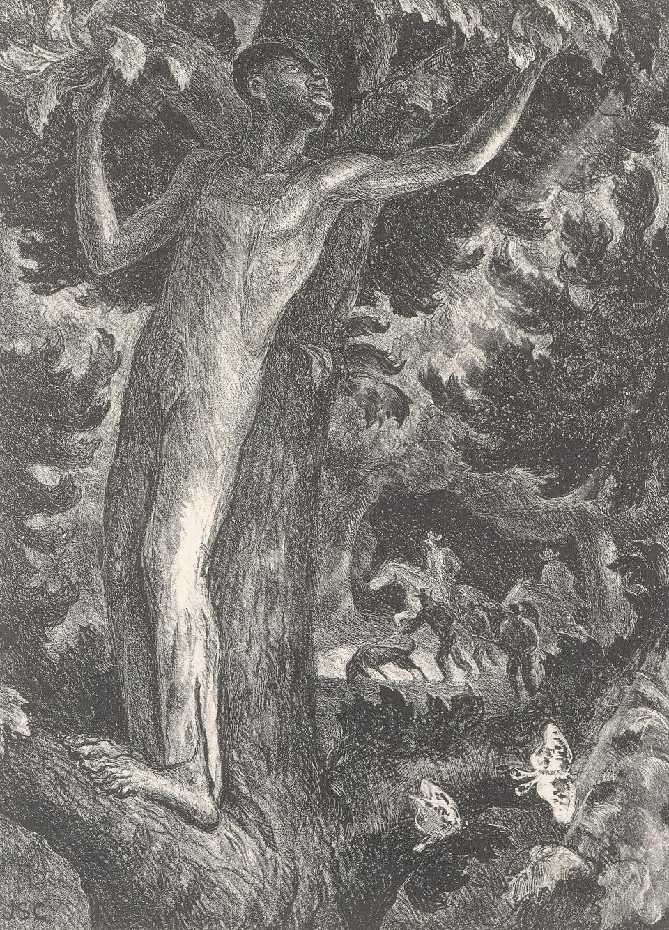
John Steuart Curry, The Fugitive, 1935, lithograph. Smithsonian American Art Museum, 1972.41.
Image source
.
CC0 / public domain
. Proportionally resized; original appearance retained.
Titles, dates, impressions and versions
Print dates can refer to different events. The Beach Museum index defines its publication date as the year AAA first offered a print for sale, or, when that information is unavailable, the year of acquisition by the publisher. Its user guide explains that execution and publication could be separated by a delay. The date of a related painting adds another event to the sequence. [7]
For Our Good Earth , Princeton catalogues its lithograph as 1938, while the AAA index records publication in 1942. These are the dates supplied by the respective records; the publication entry alone does not explain or settle the earlier museum date. The Smithsonian’s watercolour study and Chazen’s oil are both dated 1942. Keeping those labels attached to their objects prevents a proposed chronology from being mistaken for a documented one. [9] [7] [3] [4]
The index also separates original prints from colour reproductions. Its Line Storm entry records a Gelatone published in 1951, after Curry’s death. That is a reproduction history, not a new execution date for the painting. Likewise, a signature reproduced as part of a printed image needs to be distinguished from a signature added by hand. [7]
For a rewarding comparison, begin with the exact title, medium, dimensions and collection number. Then look at the image and its margins. Together, those details connect what the picture shows with the kind of object it is, preserving the differences through which Curry’s drawing and printmaking become most interesting.
Books and further reading
These resources place Curry’s prints within the wider history of Associated American Artists.
Art for Every Home: Associated American Artists, 1934–2000. Edited by Elizabeth G. Seaton, Jane Myers and Gail Windisch. Marianna Kistler Beach Museum of Art, 2015; distributed by Yale University Press. ISBN 9780300215793.
A wider account of the publisher that brought Curry’s prints into American homes, useful for understanding the relationship between art, commerce and domestic display. Museum publication details.
Art for Every Home: An Illustrated Index of Associated American Artists Prints, Ceramics, and Textile Designs. Gail Windisch, Sylvan Cole and Karen J. Herbaugh. Marianna Kistler Beach Museum of Art, 2016.
A free reference index for AAA publications, useful for separating publication dates, editions and printing records. The repository links to a large PDF of about 399 MB. Open the university repository record.
Artworks and versions directory
Browse 84 selected object, version, edition and reproduction records. Several concern related images or different impressions; this is not a complete lifetime catalogue or a count of unique compositions. Search also finds prints, photographs and reproductions; the medium filter groups paintings and drawings.
Frequently Asked Questions
No. Edition sizes require individual verification. The AAA index gives 250 for Circus Elephants and 183 for Prize Stallions . [7]
Discussion
Look again at the images and ideas explored in John Steuart Curry Drawings and Prints. These editorial prompts invite your observations.
Compare the Self-Portrait , Our Good Earth and The Fugitive . How does each image use the surrounding landscape to give a central figure a different kind of presence?
Reader Insights
How does the self-portrait’s setting affect your understanding of the artist?
What can the separate impressions of a lithograph reveal about its circulation?
Which contrasts of line and dark tone most strongly direct your attention in The Fugitive?
Join the Conversation
Share a detail, comparison or question about John Steuart Curry Drawings and Prints below.
References
- Worcester Art Museum , Collective Images: The Sketchbooks of John Steuart Curry , 2002 exhibition essay. View source
- Megan McShea , A Finding Aid to the John Steuart Curry and Curry Family Papers , Archives of American Art; collection overview, administrative history and scope notes, printed pp. 1–4. View source
- Smithsonian American Art Museum , Our Good Earth , 1942, watercolour on illustration board, 2001.4. View source
- Chazen Museum of Art , Our Good Earth , 1942, oil on hardboard, 3.1999.1. View source
- Robert Torchia , Circus Elephants , National Gallery of Art online collection essay, 17 August 2018. View source
- Smithsonian American Art Museum , Circus Elephants , 1936, lithograph, 1979.98.64. View source
- Gail Windisch and Sylvan Cole Jr. , “Index of AAA Prints,” in Art for Every Home: An Illustrated Index , Beach Museum of Art, 2016; user guide, selected Curry entries and artist finding aid. The printed page numbers are one lower than the PDF page positions. View source
- National Gallery of Art , Printmaking Basics , lithography subsection. View source
- Princeton University Art Museum , Our Good Earth , object data, 1995-296, catalogued 1938; lithograph, signature and dimensional fields. View source
- Beach Museum of Art , Art for Every Home: Associated American Artists , exhibition overview. View source
- National Portrait Gallery’s 1939 Self-Portrait , image and object metadata on Wikimedia Commons, NPG.85.33. View source
- Smithsonian American Art Museum , The Fugitive , 1935, lithograph, 1972.41. View source
- Smithsonian American Art Museum , Oh Freedom! John Steuart Curry , interpretation and 1935 exhibition context. View source
- Splash image source.
John Steuart Curry, Self-Portrait, 1939, lithograph. National Portrait Gallery, Smithsonian Institution, NPG.85.33. CC0 / public domain; US copyright not renewed . Proportionally resized; original appearance retained.
View source
More CURRY Paintings
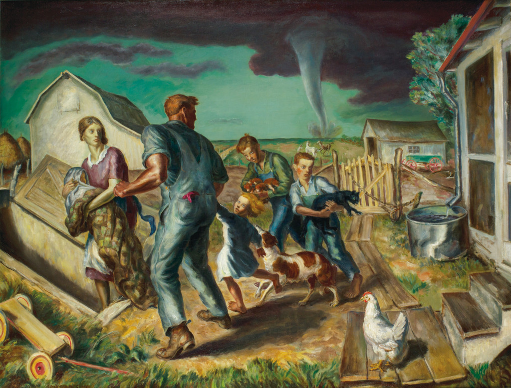
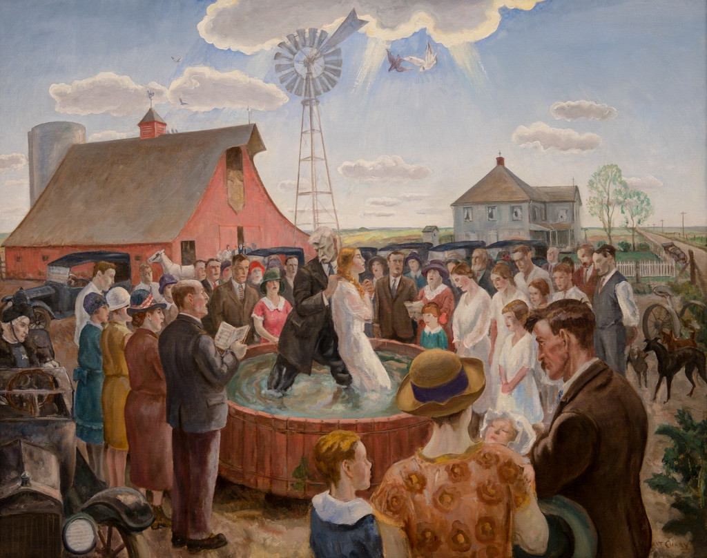
Our Good Earth
1942 painting and its related prints and wartime imagery.
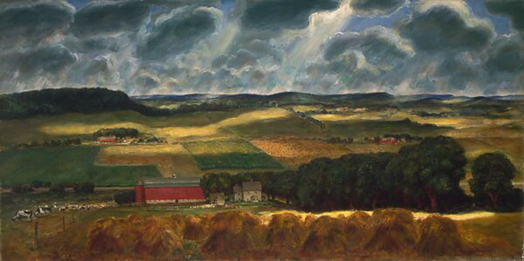
Wisconsin Landscape
1938–39 panorama of working farmland, held by The Met.


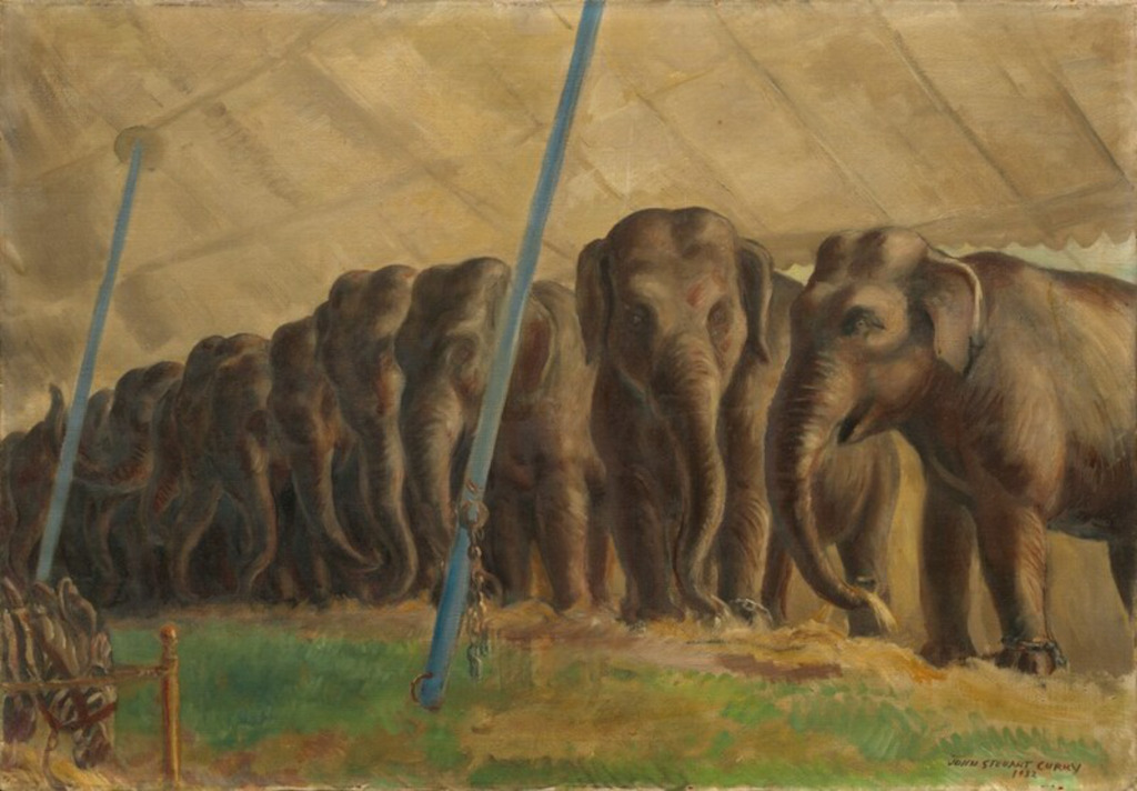
Circus Elephants
1932 painting of elephants, handlers and the work behind the circus.