 by Tom Gurney
Tom Gurney BSc (Hons) is an art history expert with over 20 years experience
Email: tomgurney1@gmail.com / Phone: +44 7429 011000
George Inness Drawings and Watercolours: Introduction
George Inness’s Italian works on paper reveal a painter thinking through line, colour and the shape of a landscape together. Two sheets at the Metropolitan Museum of Art, Across the Campagna of 1872 and Olive Trees at Tivoli of 1873, combine watercolour, gouache and graphite. They offer a useful route into his practice because their small scale and mixed materials make the relationship between graphic structure and atmosphere particularly clear. Each is a specific surviving object, rather than evidence that all his paintings began with the same kind of drawing.[1][2]
Selected George Inness drawings and watercolours
At a Glance
- Illustrated worksAcross the Campagna (1872) and Olive Trees at Tivoli (1873)
- Recorded materialsWatercolour, gouache and graphite
- SupportsOff-white and blue wove paper
- ScopeTwo identified Met sheets, considered beside the oil paintings
Contents
- A small, mixed-media selection
- Across the Campagna: space held by a low horizon
- Olive Trees at Tivoli: trunks, rock and the open plain
- Watercolour, gouache and graphite together
- From observation to another kind of picture
- Comparing the two sheets
- What this selection can establish
- Annotated details
A small, mixed-media selection
The Met describes fewer than fifty Inness watercolours and reports that he did not exhibit or sell them. That is the museum’s account of the medium’s place in his career, rather than an independent census assembled here. It makes these sheets especially useful for considering work beyond his better-known oils, while leaving room for the limits of the surviving record.[2]
“Drawing” and “watercolour” are not interchangeable labels for the two objects. Graphite is part of each documented medium, but so are transparent and opaque water-based colours. Describing the materials together preserves the character of the work. A visible linear passage belongs within a coloured composition, while a wash can help establish a form rather than merely decorate an outline.
The sheets also differ in their supports. Across the Campagna is on off-white wove paper; Olive Trees at Tivoli is on blue wove paper containing coloured fibres. These are recorded material facts. A digital reproduction can show the overall appearance, but it cannot independently identify each fibre or determine which tool made every small line.[1][2]
Annotated Details from George Inness Drawings and Watercolours
The numbered points identify visible features discussed in this article. Return from each detail to the whole composition. The captions keep each work’s identity, date and medium separate.
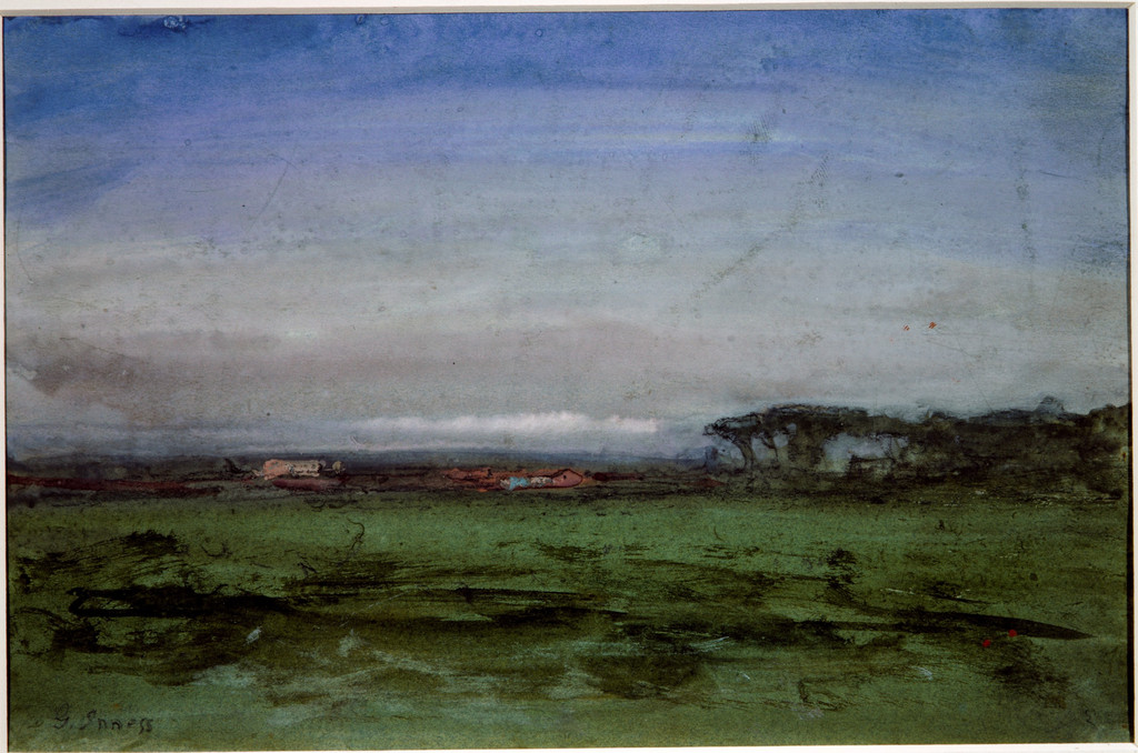
Across the Campagna (1872)
George Inness, Across the Campagna, 1872. Watercolour, gouache and graphite on off-white wove paper. Met, 67.55.145. Bequest of Susan Dwight Bliss, 1966; Metropolitan Museum of Art. Image source. Public domain.
.jpg)
Olive Trees at Tivoli (1873)
George Inness, Olive Trees at Tivoli, 1873. Gouache, watercolour and graphite on blue wove paper with coloured fibres. Met, 1989.287. Morris K. Jesup Fund, 1989; Metropolitan Museum of Art. Image source. Public domain.
.jpg)
Details from GEORGE INNESS DRAWINGS AND WATERCOLOURS
Compare the cropped details with the complete images above. Notice how their colours, shapes and positions contribute to the larger compositions.
Across the Campagna (1872)
Broad sky
The sky occupies much of the small sheet. Its extensive washes contrast with the compressed line of land below.
 Detail 01 broad-sky.jpg)
Low buildings
Small buildings lie close to the horizon. Their limited height allows the sky and ground to remain the dominant areas.
 Detail 02 low-buildings.jpg)
Foreground divisions
Darker linear marks cross the nearer green ground. Their greater emphasis contrasts with the quieter colour and smaller forms at the horizon.
 Detail 03 foreground-divisions.jpg)
Olive Trees at Tivoli (1873)
Twisted olive trunks
Irregular trunks and branches occupy the near left landscape. Their changing direction gives the coloured forms a strong linear character.
 Detail 04 twisted-olive-trunks.jpg)
Foreground rocks
Broad rocks anchor the nearer right side. Their more continuous surfaces contrast with the complicated tree forms.
 Detail 05 foreground-rocks.jpg)
Pale route into the plain
A pale route moves through the cultivated distance. Its lighter line offers a path for attention beyond the near vegetation and rock.
 Detail 06 pale-route-into-the-plain.jpg)
Across the Campagna: space held by a low horizon
Across the Campagna measures 17.3 × 26.2 cm and is dated 1872. The sky occupies much of the sheet. Below it, a low succession of buildings and dark trees marks the horizon, while more emphatic linear strokes divide the nearer green ground. The composition asks the viewer to notice a broad relationship before concentrating on the individual structures.[1]
The scale of the sky is central to the effect. It keeps the small buildings low and distant, preventing architecture from taking over the scene. The trees become darker interruptions along an extended boundary. Their spacing helps the eye move across the sheet, while the more open intervals allow the sky and ground to remain the dominant masses.
In the foreground, darker horizontal marks provide a firmer structure. They contrast with the less definite colour above them. This gives the composition two kinds of emphasis: the closer ground is articulated through lines and divisions, while the sky feels extensive and less easily measured. A very small sheet can therefore hold a substantial sense of distance.
The Met connects the work with Inness’s longer Italian residence and the support of Boston dealers who paid him a salary for pictures destined for the American market. It also notes his interest in experiments that did not depend on conspicuous landmarks. The sheet’s significance lies partly in that independence: Italy supplies the setting, yet a famous monument is not required to organise the view.[1]
Olive Trees at Tivoli: trunks, rock and the open plain
The following year’s Olive Trees at Tivoli is slightly wider, at 17.8 × 31.4 cm. Its nearer forms are more assertive. Twisted trunks occupy the left and central area, while large rocks anchor the right foreground. Between and beyond them, the view opens into a cultivated plain crossed by a pale route.[2]
The trees bring a graphic energy different from the low horizon of Across the Campagna. Their trunks change direction, divide and rejoin the surrounding masses of foliage. The eye follows their irregular shapes before moving into the more open distance. The rocks provide a useful counterweight: broad, relatively solid forms interrupt the complicated branching lines.
The pale route through the plain creates a second movement. It leads away from the near vegetation and rock, drawing attention towards smaller structures. Its lightness makes it legible within the flatter surrounding colours. The space seems to extend beyond the nearest objects even though those objects remain strongly present.
The Met proposes that a tiny distant dome probably represents St Peter’s in Rome. The qualification is important. The form is small, and the painting’s title does not make every building immediately identifiable. Treating the dome as a probable museum identification allows it to enrich the view without turning uncertainty into a precise architectural claim.[2]
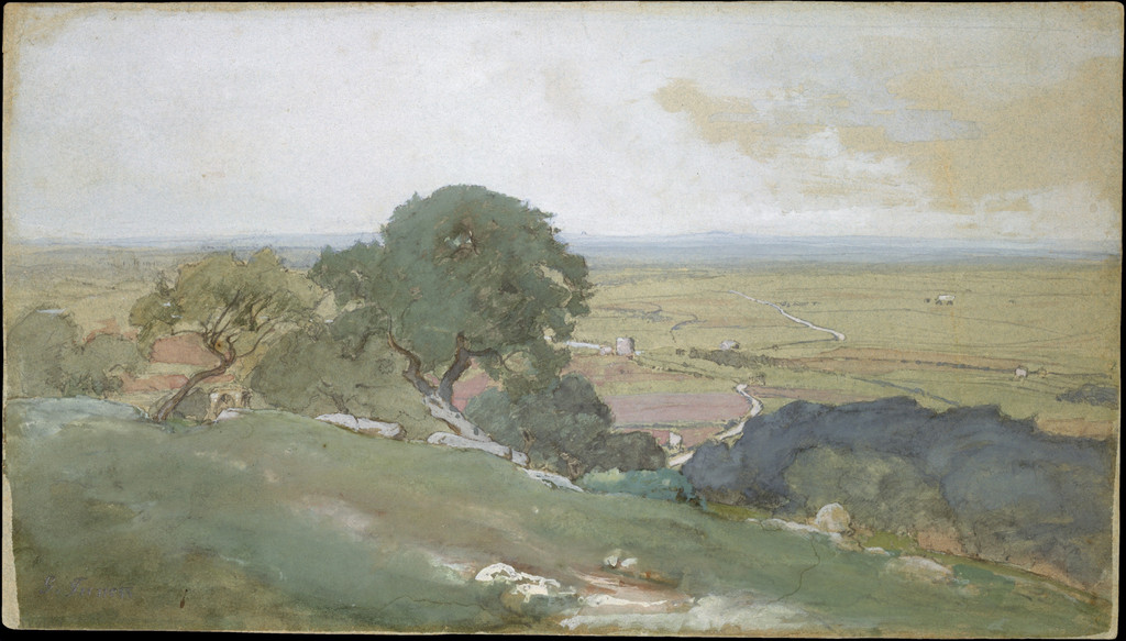
George Inness, Olive Trees at Tivoli, 1873. Gouache, watercolour and graphite on blue wove paper with coloured fibres, 17.8 × 31.4 cm. Met, 1989.287. Morris K. Jesup Fund, 1989; Metropolitan Museum of Art. Image source. Public domain.
Watercolour, gouache and graphite together
Watercolour and gouache offer different possibilities for the relation between paper and colour. A transparent passage can allow the underlying support to remain active; an opaque passage can give a shape greater density. Graphite adds another way to establish direction and boundary. In these sheets, the recorded combination of materials makes it sensible to consider all three functions rather than expecting one uniform kind of surface.[1][2]
The blue paper in Olive Trees at Tivoli is especially worth remembering while looking. The support is part of the object before any mark is applied. It provides a different starting condition from the off-white paper of Across the Campagna. The two pictures can consequently share a general range of landscape colours without having begun from an identical material ground.
This does not permit a detailed reconstruction of their making from photographs alone. A dark line might be conspicuous without its precise application being clear. An apparently opaque area could be affected by lighting, photography or the interaction of layers. The safest close reading joins the documented mixed medium to the visible arrangement, while reserving technical claims about sequence for examination of the actual sheets.
Watch: George Inness
Choose a film to explore the artist’s work, its interpretation and its wider setting.
The Montclair Art Museum's George Inness Gallery
Visit the George Inness Gallery at the Montclair Art Museum in this State of the Arts feature.
Watch on YouTubeFrom observation to another kind of picture
The Philadelphia Museum of Art’s 2011 exhibition labels compare a watercolour View of Cadore of 1873 with a related oil. That published comparison supplies a specific example of material being reconsidered across media. It does not establish that either Met sheet became a particular oil painting, or that the finished oil simply enlarges an unchanged study.[3]
Moving between paper and canvas changes the choices available to an artist. Size alters how far a viewer may stand from a picture. Different materials allow different densities, transitions and kinds of revision. A useful comparison therefore asks what a composition retains and what it transforms, rather than assuming that a small work serves only as an incomplete version of a large one.
Inness’s Pine Grove of the Barberini Villa, dated 1876, offers another way to think about Italy’s continuing role after his residence there. The oil’s repeated umbrella-shaped crowns and tall trunks build a spacious grove. It is a related Italian subject and a later composition, not a documented enlargement of Across the Campagna or Olive Trees at Tivoli.[4]
Comparing the two sheets
Place the images beside one another and begin with the division between sky and ground. Across the Campagna gives the sky a broad field above a low horizon. Olive Trees at Tivoli introduces more forceful near forms and a route leading into the plain. The difference is visible before a viewer identifies a building or considers the paper colour.
Then follow the lines. In the Campagna view, horizontal divisions and small distant marks establish a restrained structure. At Tivoli, branching trunks and irregular rock outlines bring attention closer. Neither arrangement depends on exhaustive description of every leaf or stone. Selective marks provide the relationships necessary for a landscape to become readable.
Finally, consider the scale. These are intimate objects, but their pictorial spaces are not merely miniature inventories. The nearer forms, open intervals and distant boundaries make each sheet feel larger than its physical dimensions might suggest. Their value within Inness’s career lies in this concentrated exploration of structure and atmosphere, as well as in the particular Italian places named by their titles.
What this selection can establish
Two securely identified works on paper can show differences in composition, support and handling. They cannot represent every drawing Inness made or provide a complete record of his preparations for painting. Their exact titles, dates, media and collection identities make them a dependable starting point; the Italy article places them within the two separate European episodes of his career.
The style and technique article considers how these experiments relate to oils and to documented accounts of studio work. Keeping those questions connected, while preserving the identity of each object, makes the drawings and watercolours useful evidence for a varied practice rather than a single formula.
Artworks directory
A collected selection of 46 individually identified museum objects: 43 paintings and three watercolours. This is not a complete catalogue raisonné. Repeated titles identify separate objects where their institutions or accessions differ. Links lead to a companion article where available, otherwise to the museum record. Unillustrated entries remain included; the original lost New Jerusalem is represented by its three transformed survivors.
| Name | Date | Medium |
|---|---|---|
| Crossing the Ford | 1848 | Oil on canvas |
| The Old Mill | 1849 | Oil on canvas |
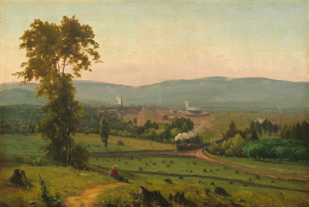
| The Lackawanna Valley by George Inness | c. 1856 | oil on canvas |
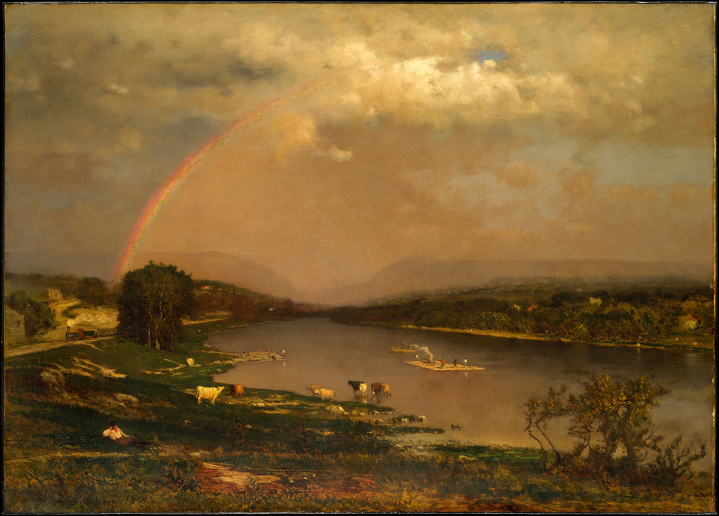
| Delaware Water Gap | 1861 | Oil on canvas |
| Delaware Valley | c. 1865–75 | Oil on artist's board |
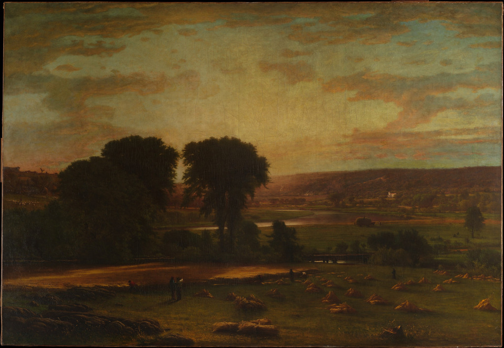
| Peace and Plenty | 1865 | Oil on canvas |
| Evening Landscape | 1867; later reworked | Oil on canvas |
| Summer in the Catskills | 1867 | Oil on canvas |
| The Valley of the Olives | 1867; reworked after 1880 | Oil on canvas |
| The Valley of the Shadow of Death | 1867 | Oil on canvas |
| Visionary Landscape | 1867/1880 | Oil on canvas |
| Catskill Mountains | 1870 | Oil on canvas |
| Across the Campagna | 1872 | Watercolor, gouache, and graphite on off-white wove paper |
| Olive Trees at Tivoli | 1873 | Gouache, watercolor, and graphite on blue wove paper with colored fibers |
| A Marine | c. 1874–75 | Oil on canvas |
| Twilight in Italy — Art Institute of Chicago (1911.44) | 1874 | Oil on panel |
| Pine Grove of the Barberini Villa | 1876 | Oil on canvas |
| The Storm | 1876 | Oil on canvas |
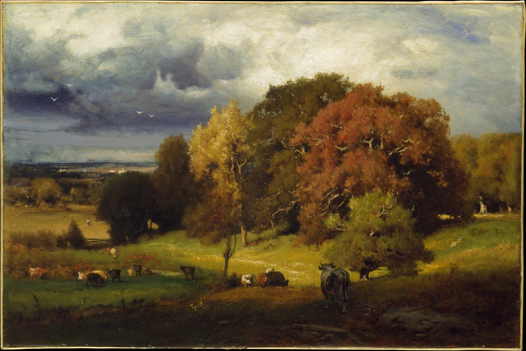
| Autumn Oaks | ca. 1878 | Oil on canvas |
| The Sisters | 1882 | Oil on millboard |
| Harvest, Montclair, New Jersey | 1884 | Oil on canvas |
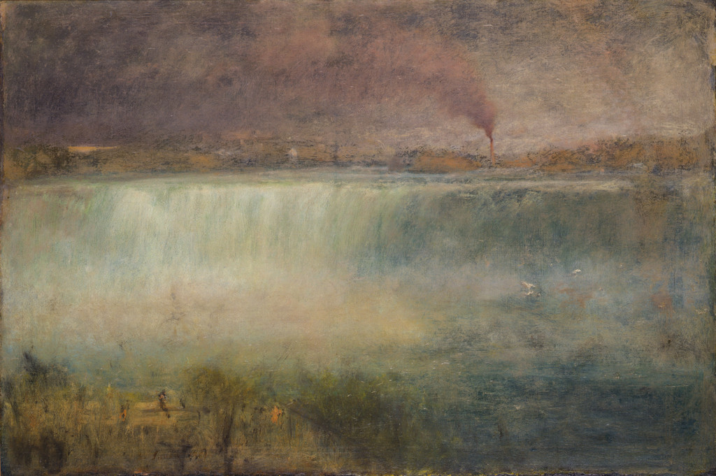
| Niagara Falls | 1885 | Oil on wood |
| A Silver Morning | 1886 | Oil on canvas |
| Landscape, Sunset | 1887–89 | Oil on canvas |
| September Afternoon | 1887 | Oil on canvas |
| Sunrise | 1887 | Oil on canvas |
| The Mill Stream, Montclair, New Jersey by George Inness | c. 1888 | Oil on canvas |
| Niagara by George Inness | 1889 | oil on canvas |
| The Mill Pond | 1889 | Oil on canvas |
| Sunset in the Valley | 1890 | Oil on canvas |
| The Moon at Night | 1890 | Oil on canvas |
| Twilight in Italy — Art Institute of Chicago (1911.42) | 1890 | Oil on canvas |
| Autumn Woods | 1891–94 | Oil on canvas |
| Moonrise | 1891 | Oil on canvas |
| Spring Blossoms, Montclair, New Jersey | ca. 1891 | Oil and crayon or charcoal on canvas |
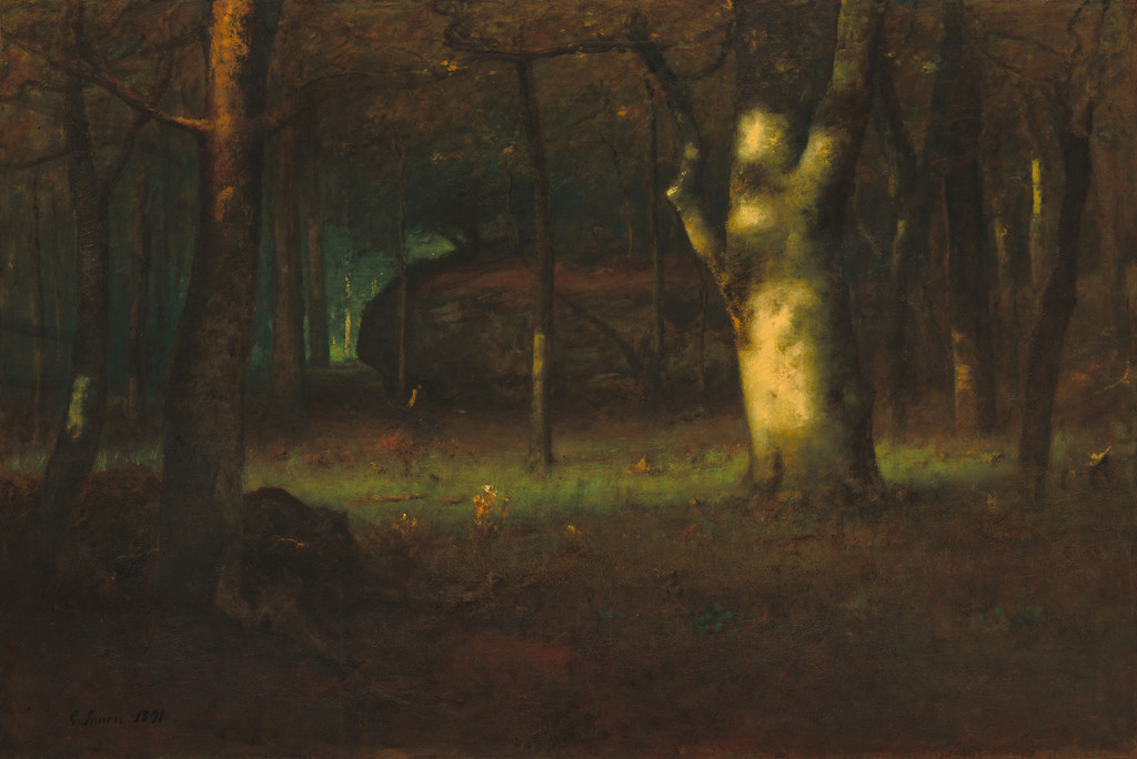
| Sunset in the Woods by George Inness | 1891 | oil on canvas |
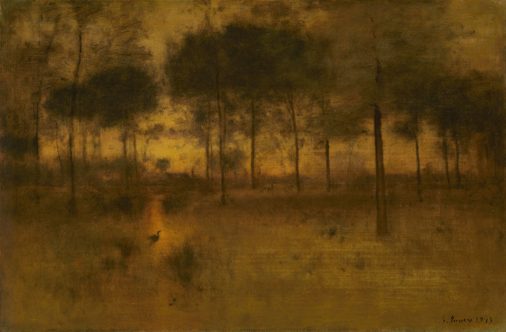
| The Home of the Heron — Princeton University Art Museum (y1943-93) | 1891 | Oil on canvas |
| Threatening | 1891 | Oil on canvas |
| Early Morning, Tarpon Springs | 1892 | Oil on canvas |
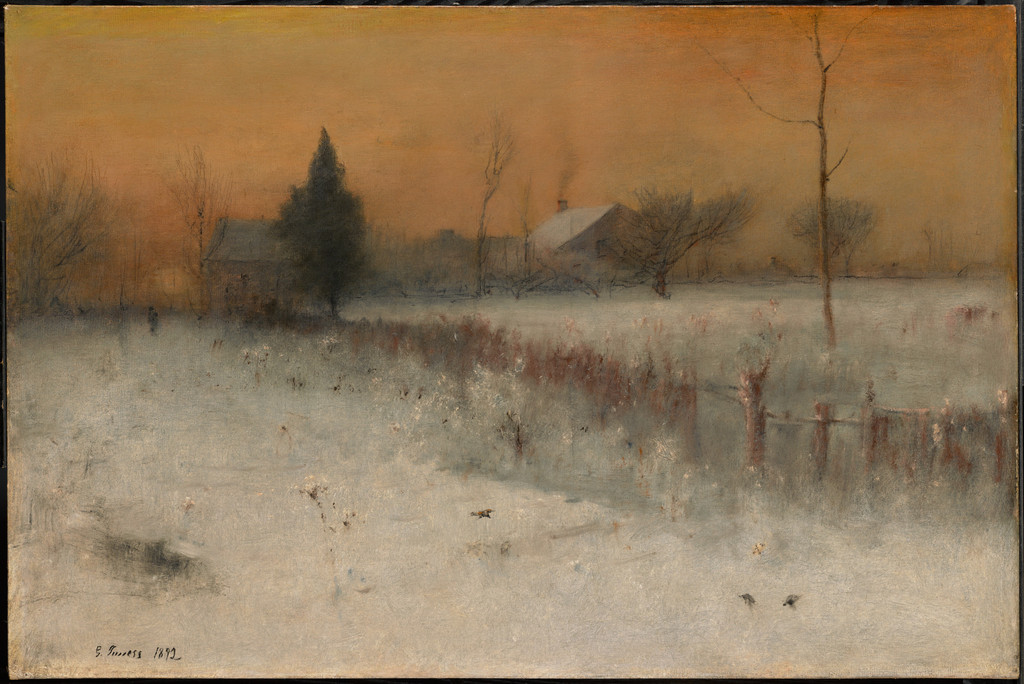
| Home at Montclair by George Inness | 1892 | oil on canvas |
| The Lonely Farm, Nantucket | 1892 | Oil on canvas |
| Afterglow | 1893 | Oil on canvas |
| Sunlit Valley | 1893 | Oil on canvas |
| The Home of the Heron — Art Institute of Chicago (1911.31) | 1893 | Oil on canvas |
| After a Summer Shower | 1894 | Oil on canvas |
| Landscape | n.d. | Watercolor with scraping on ivory wove paper |
Frequently Asked Questions
The Met describes that identification as probable. It should retain that qualification.[2]
No such derivation is established by the sources used here. The 1876 oil is a useful comparison in Italian subject matter and spatial arrangement.[4]
Discussion
Look again at the images and ideas explored in George Inness Drawings and Watercolours. These editorial prompts invite your observations.
Compare the amount of sky in the two sheets, then follow the near and distant lines. Which image gives you a stronger sense of standing close to a particular object? Consider how much of that effect comes from the arrangement rather than the number of details.
Reader Insights
Where do the graphite passages give the coloured scene its structure?
How does the broad sky of Across the Campagna compare with the foreground trees at Tivoli?
What can a reproduction reveal about these different papers, and what still requires a material record?
Join the Conversation
Share a detail, comparison or question about George Inness Drawings and Watercolours below.
References
- Metropolitan Museum of Art, Across the Campagna, accession 67.55.145. Current object details and wall text.
- Metropolitan Museum of Art, Olive Trees at Tivoli, accession 1989.287. Current object details and wall text.
- Philadelphia Museum of Art, George Inness in Italy, exhibition labels (2011). Selected labels, including the View of Cadore comparison; the full exhibition catalogue was not consulted.
- Metropolitan Museum of Art, Pine Grove of the Barberini Villa, accession 98.16.
- Splash image source.
George Inness, Across the Campagna, 1872. Watercolour, gouache and graphite on off-white wove paper, 17.3 × 26.2 cm. Met, 67.55.145. Bequest of Susan Dwight Bliss, 1966; Metropolitan Museum of Art. Image source. Public domain.