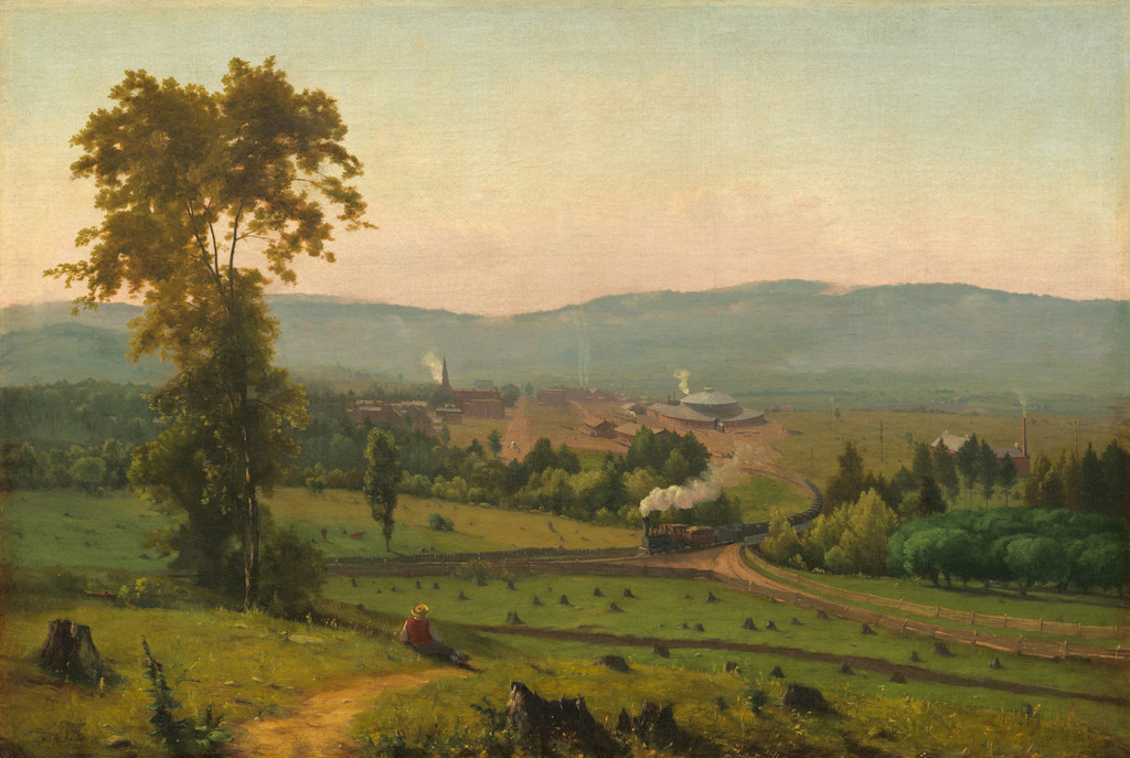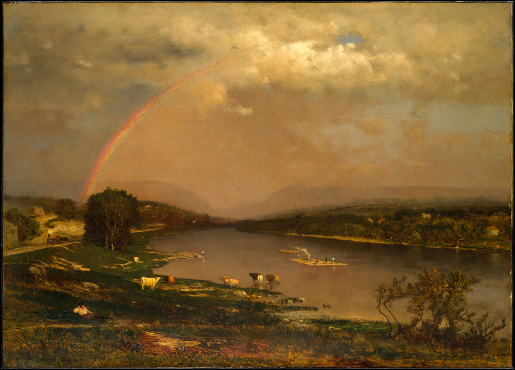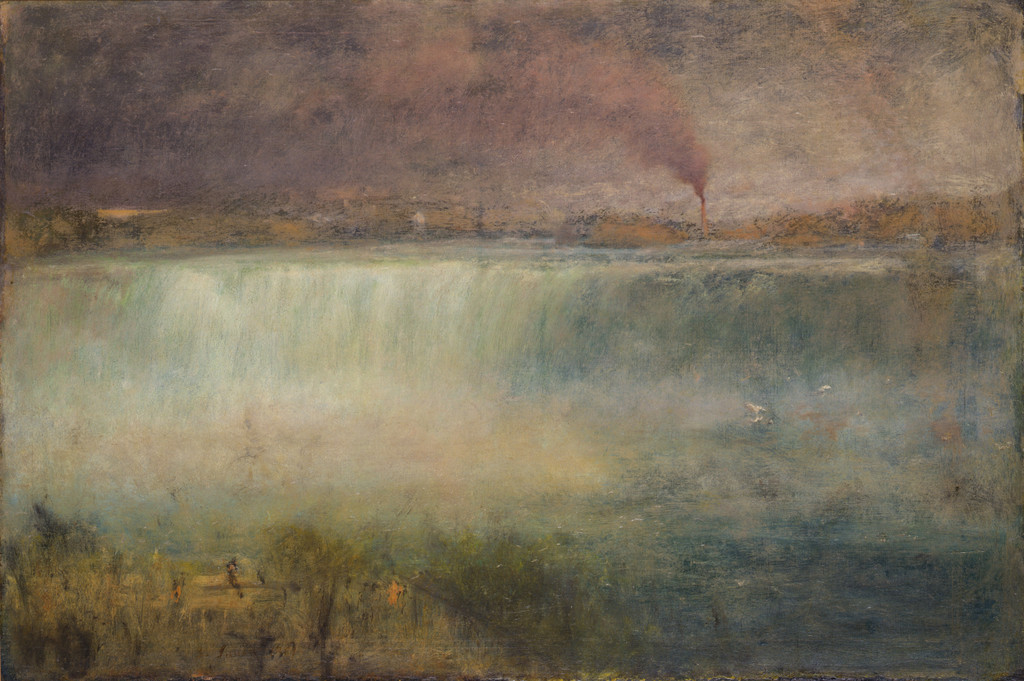
 by Tom Gurney
Tom Gurney BSc (Hons) is an art history expert with over 20 years experience
Email: tomgurney1@gmail.com / Phone: +44 7429 011000
George Inness: Style and Technique: Introduction
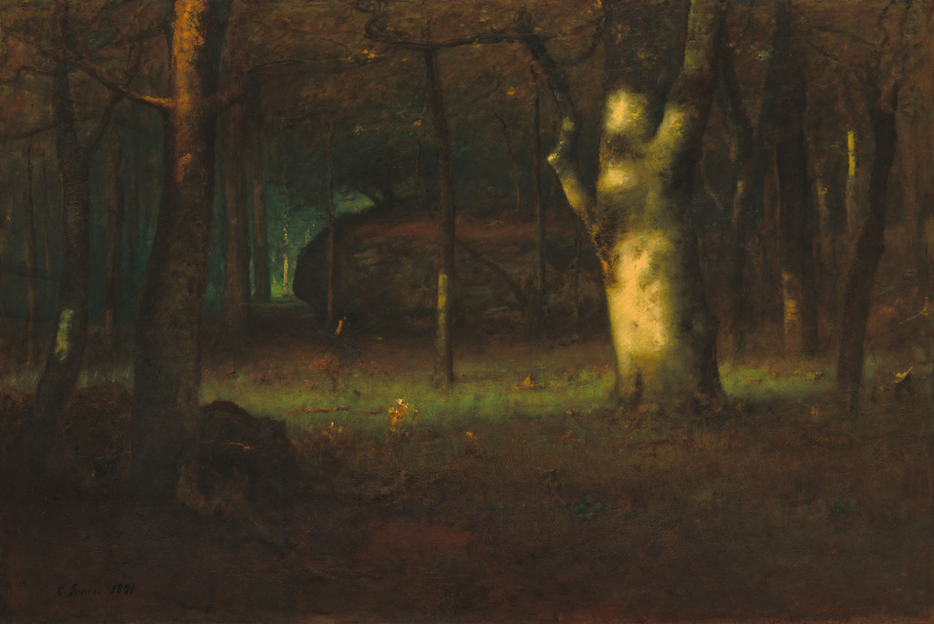
George Inness built landscapes through relationships between shapes, light, colour and degrees of clarity. His late paintings can seem immediately present, even where individual objects are softly defined. That apparent ease should not hide the work involved. His son describes repeated glazing, scumbling and repainting, while examination of Sunset in the Woods records a mixture of thin transparent passages and thick opaque strokes. Understanding his technique therefore requires both close looking and evidence about particular objects, rather than a single recipe applied to a long and varied career.[1][2]
At a Glance
- EvidencePublished words, museum records and technical examination
- MaterialsOils and mixed-media works on paper
- Close lookingShape, light, colour and degrees of clarity
- Technical accountsAttached to their particular sources and objects
Contents
- A varied career rather than one formula
- European models and an ordinary landscape
- Choosing details that serve the composition
- Form beneath softened edges
- Grey colour, richness and a sense of air
- Glazing, scumbling and repeated work
- What examination of Sunset in the Woods establishes
- Works on paper and remembered landscapes
- Tonalism, impressions and spiritual attention
- Annotated details
A varied career rather than one formula
Inness’s earliest cultivated landscapes and his later atmospheric pictures do not organise attention in exactly the same way. The change is substantial, but it did not take place through the sudden abandonment of every earlier concern. Buildings, people, water and worked land recur across his career, while their prominence and handling vary from painting to painting.
Adrienne Baxter Bell’s specialist account connects his development with European landscape models, his engagement with Swedenborg and the later paintings associated with Montclair and Florida. Italy and France offered different possibilities for composition and brushwork; familiar American surroundings remained available for transformation. The chronology provides a framework, while individual works show how varied the results could be.[3]
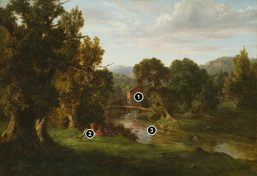
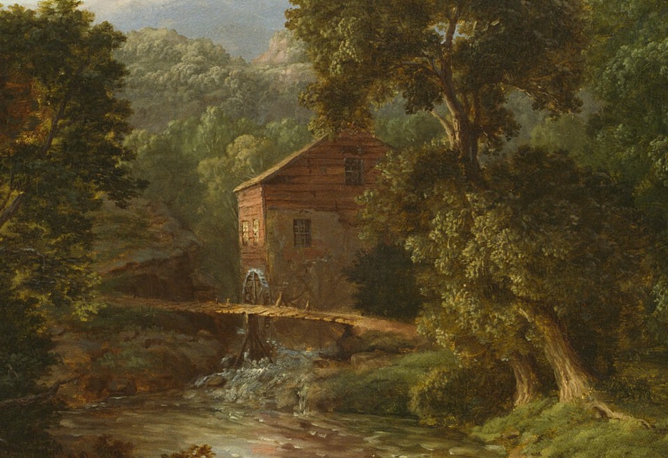
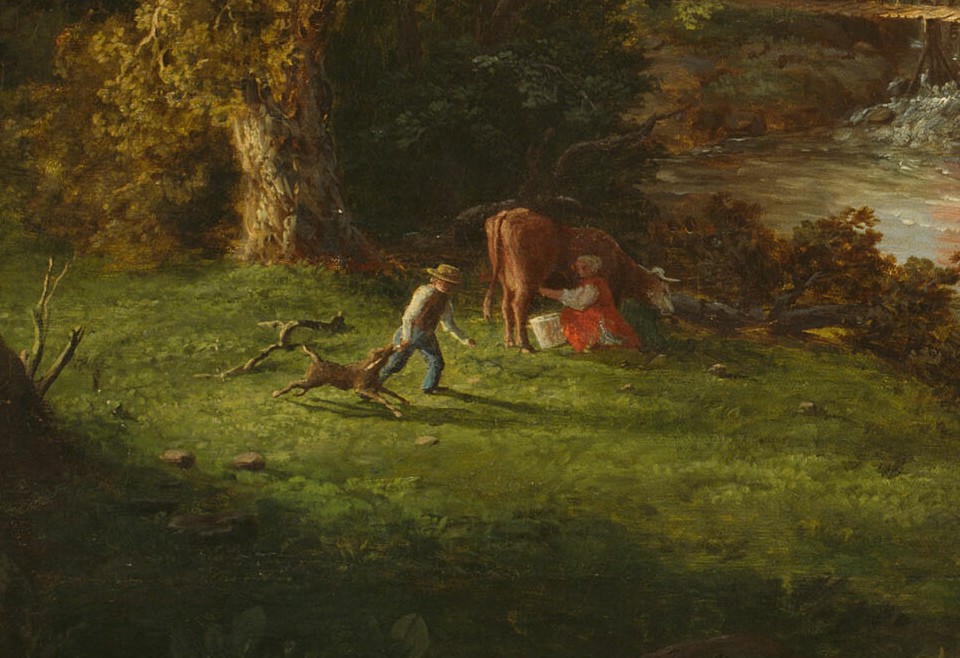
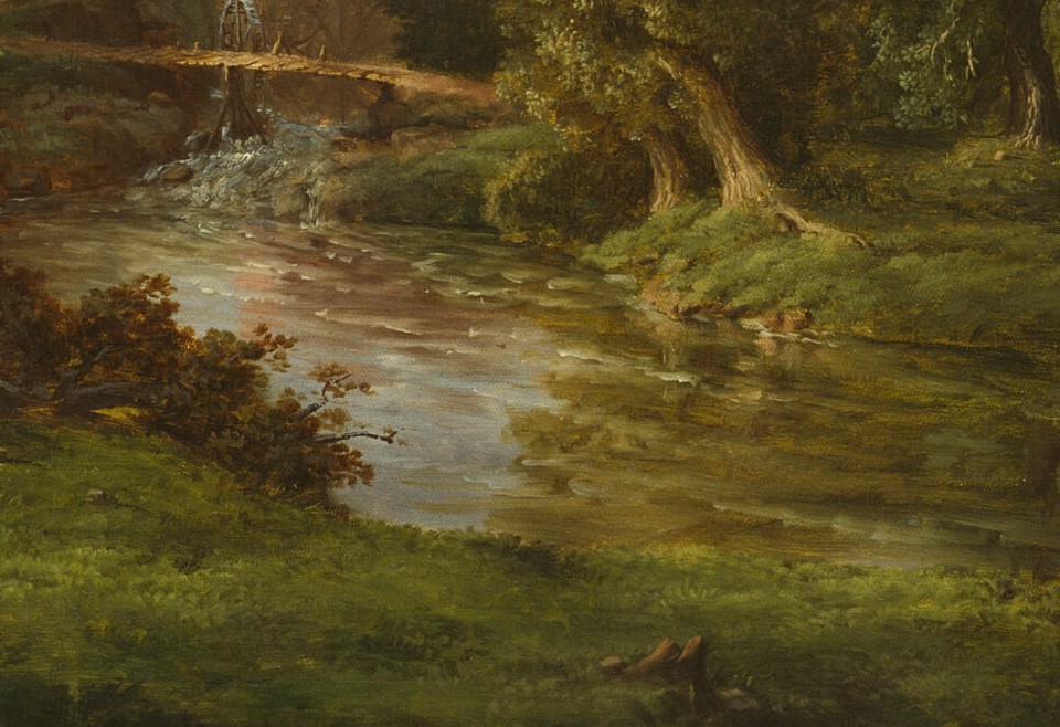
The Chicago Old Mill of 1849 makes a useful early example. A building and small foreground encounter are comparatively legible within a dark wooded setting. The trees, stream and mill establish connected spaces, yet the viewer can also attend to particular structures and activities. Inhabited landscape already matters; the work does not depend on presenting nature as empty of human use.[4]
Later paintings often ask the eye to recognise fewer sharply separated objects before responding to the overall atmosphere. That difference can be described without treating early detail as a mistake the artist needed to correct. Each composition makes its own demands, and an account of style is strongest when it explains those demands rather than arranging the entire career into a simple ladder of improvement.
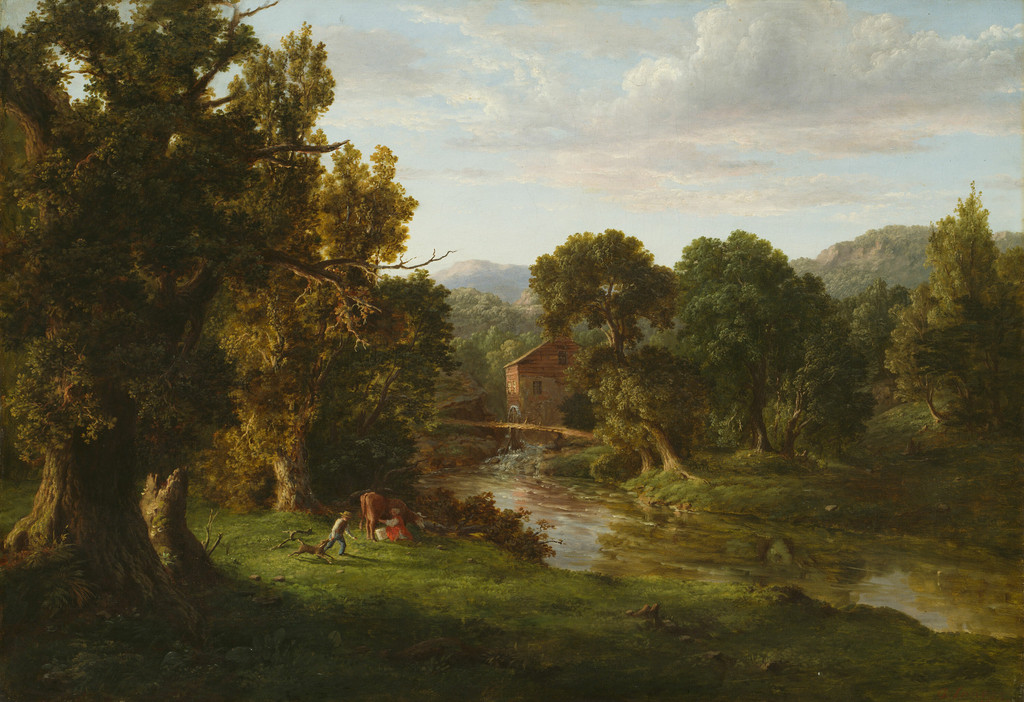
George Inness, The Old Mill, 1849. Oil on canvas. Art Institute of Chicago, 1939.388. The William Owen Goodman and Erna Sawyer Goodman Collection; Art Institute of Chicago. Image source. Public domain.
Annotated Details from George Inness: Style and Technique
The numbered points identify visible features discussed in this article. Return from each detail to the whole composition. The captions keep each work’s identity, date and medium separate.
The Old Mill
George Inness, The Old Mill, 1849. Oil on canvas, 75.9 × 107 cm. Art Institute of Chicago, 1939.388. The William Owen Goodman and Erna Sawyer Goodman Collection; Art Institute of Chicago. Image source. Public domain.
Pine Grove of the Barberini Villa
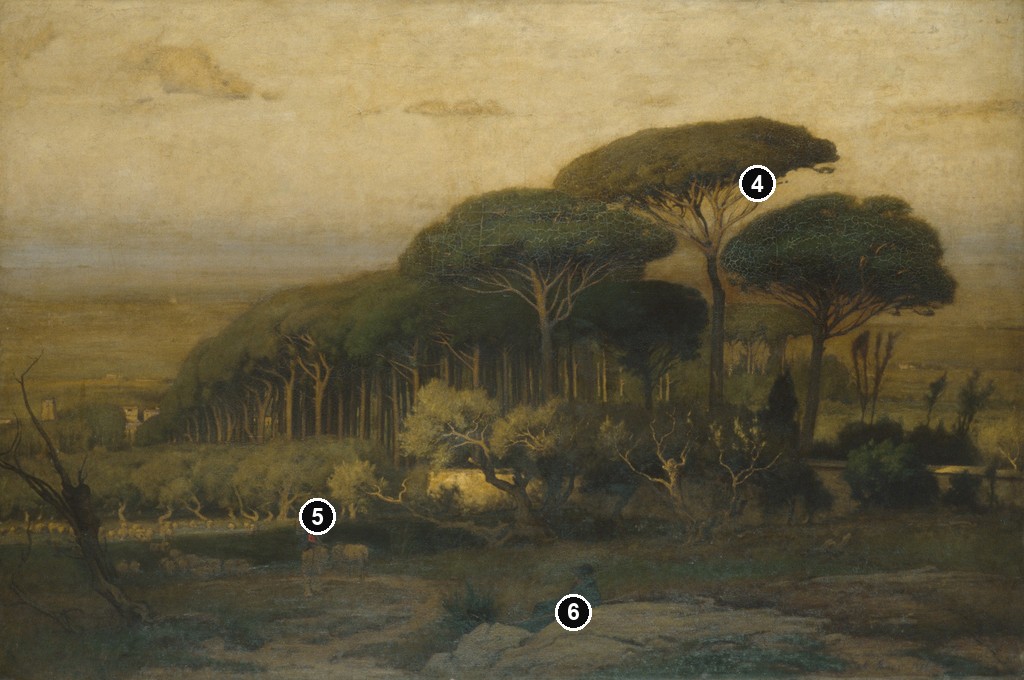
George Inness, Pine Grove of the Barberini Villa, 1876. Oil on canvas. Met, 98.16. Gift of Lyman G. Bloomingdale, 1898; Metropolitan Museum of Art. Image source. Public domain.
Home at Montclair
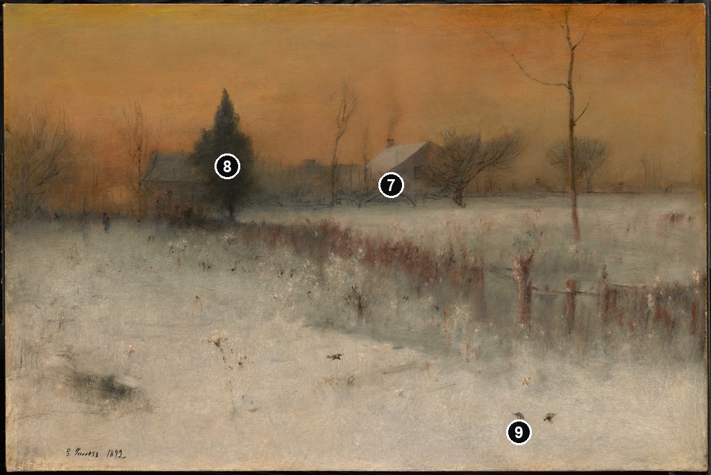
George Inness, Home at Montclair, 1892. Oil on canvas. Clark Art Institute, 1955.10. Sterling and Francine Clark Art Institute. Image source. Public domain.
Across the Campagna (1872)
George Inness, Across the Campagna, 1872. Watercolour, gouache and graphite on off-white wove paper. Met, 67.55.145. Bequest of Susan Dwight Bliss, 1966; Metropolitan Museum of Art. Image source. Public domain.
.jpg)
Details from GEORGE INNESS: STYLE AND TECHNIQUE
Compare the cropped details with the complete images above. Notice how their colours, shapes and positions contribute to the larger compositions.
The Old Mill
Mill building
The warm brown building appears among the trees beyond the stream. Its modest size keeps it within a broader inhabited landscape.
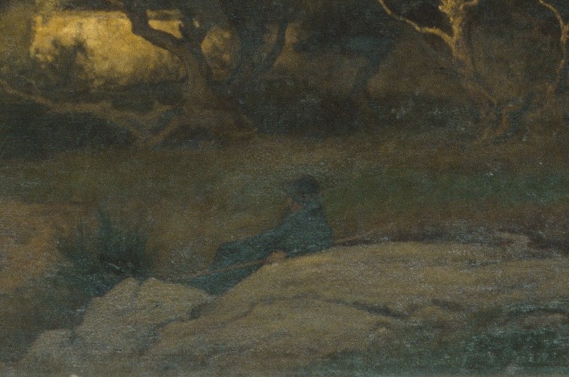
Foreground encounter
Small people and an animal occupy a clearing near the stream. Their concentrated activity contrasts with the much larger surrounding trees.
Opening stream
The water leads away from the building towards the lower right. Its brighter, more open passage connects different parts of the wooded setting.
Pine Grove of the Barberini Villa
Umbrella-shaped crowns
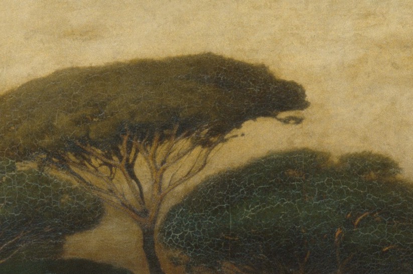
Broad tree crowns overlap above slender trunks. Their repeated shapes organise a grove that recedes across the composition.
Standing figure
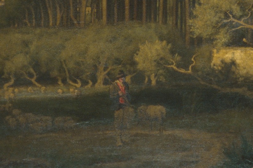
A small red-accented figure stands among the low growth. The colour makes the person noticeable within the darker lower landscape.
Seated foreground figures
Seated figures lie close to the lower edge. Their nearer scale differs from the standing person farther inside the grove.
Home at Montclair
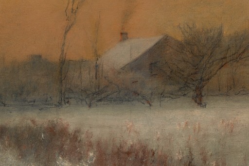
Low houses
The houses gather along a low horizon. Their warm walls and roofs remain small above the broad cool field.
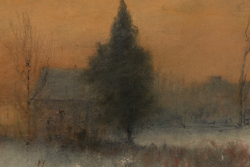
Evergreen and bare branches
A dense evergreen stands beside thin bare trees. The different kinds of silhouette organise the quiet middle distance.
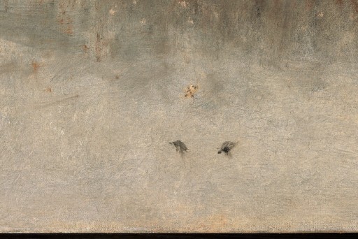
Birds on the snow
Small dark birds interrupt the pale snow. They provide points of recognition within a field that otherwise occupies a large continuous area.
Across the Campagna (1872)
Broad sky
The sky occupies much of the small sheet. Its extensive washes contrast with the compressed line of land below.
 Detail 10 broad-sky.jpg)
Low buildings
Small buildings lie close to the horizon. Their limited height allows the sky and ground to remain the dominant areas.
 Detail 11 low-buildings.jpg)
Foreground divisions
Darker linear marks cross the nearer green ground. Their greater emphasis contrasts with the quieter colour and smaller forms at the horizon.
 Detail 12 foreground-divisions.jpg)
European models and an ordinary landscape
Bell connects Inness’s European encounters with Dutch landscape and the Barbizon painters, particularly Théodore Rousseau. She describes his attraction to their loose handling and emotional character, alongside his continuing interest in an immaterial force within nature. These relationships help explain an alternative to landscape organised principally around precise description or spectacular scenery.[3]
An ordinary grove or field can sustain attention through the way it is painted. The artist need not introduce a famous mountain, a dramatic ruin or a large narrative event to make the place matter. Changes in light, the relation of a dark tree group to an opening, and the viewer’s uncertain distance from a form can become substantial subjects in themselves.
This does not make observation dispensable. A convincing tree still needs a shape that can be recognised; an open field needs relationships that suggest ground extending away. The difference concerns emphasis. The painter selects enough information to create a felt encounter, while allowing the overall atmosphere to carry attention beyond the identification of separate objects.
European influence is consequently most useful as a comparative framework. It helps a reader ask why certain subjects and kinds of handling appealed to Inness. It should not make each American landscape a copy of an unverified foreign model. A claim about a specific source painting requires its own documentation, just as a claim about a particular technique does.
Choosing details that serve the composition
The son remembers Inness advising, “Never put anything on your canvas that isn’t of use.” The remark appears in the memoir’s account of studio practice, rather than a dated surviving letter. It directs attention towards selection: a painted detail should contribute something to the picture in which it appears.[1]
That contribution can take several forms. A tree may establish height or interrupt an otherwise continuous horizon. A small figure can make a field feel extensive through scale. A light opening can connect foreground and distance without requiring a carefully described road. Usefulness concerns relationships within the composition, as well as the recognisability of an isolated object.
The principle is particularly helpful when looking at a painting that seems vague at first. Ask where the strongest dark forms lie, where the broadest light area begins and which small mark becomes recognisable first. These questions often reveal an arrangement that is more specific than the softness of its outlines initially suggests.
They also prevent “less detail” from becoming an explanation on its own. Omitting a branch or a wall is not automatically expressive. The remaining forms need to carry the composition. Inness’s paintings reward attention to what has been retained, how it has been placed and how much clarity it has been given.
Form beneath softened edges
Pine Grove of the Barberini Villa, dated 1876 by the Met, shows how strong spatial organisation can coexist with atmospheric handling. Tall trunks establish a sequence through the grove, while umbrella-shaped crowns create repeated masses above them. The more open left distance differs from the denser trees at the right.[5]
Those differences help the eye find a route. Repetition does not make every tree identical; the gaps, changes in height and interruptions by figures keep the space varied. The crowns can remain broad forms while the trunks supply a more definite rhythm. Clarity and generalisation work together rather than cancelling one another.
The Met also describes heavy impasto in the tallest tree, followed by stippling with a stiff brush. This is useful object-specific evidence because it complicates an easy association between atmosphere and uniformly thin paint. A picture can contain substantial material handling while still producing a broadly unified effect.[5]
Looking at the whole work and then at a detail answers different questions. The first reveals the relation between grove, figures and distance. The second may make particular surface marks more noticeable. Neither scale should replace the other: an energetic passage has meaning partly through the larger form it helps create.
Grey colour, richness and a sense of air
In a letter to his wife dated July 22, 1881, Inness described several current pictures as painted with “very gray colors,” yet rich and “full of air.” The complete sentence is reproduced in the son’s memoir. Its reference to those particular pictures should remain attached to the date, rather than becoming a universal description of all his colour.[1]
The remark makes sense when colour is considered relationally. A restrained warm area can feel luminous beside a cooler or darker passage. A distant shape may seem farther away when its contrast with the surrounding atmosphere decreases. Richness need not depend on applying the most saturated possible colour to every part of a canvas.
Home at Montclair, painted in 1892, offers a useful visual example of restraint. A broad blue-grey snowfield lies below a warmer orange and peach sky. Trees and low buildings give the field a setting without breaking it into an inventory of equally emphatic details. The Clark describes winter twilight and thinly applied paint; those claims belong to this particular work.[6]
The painting should not be presented as one of the pictures discussed in the 1881 letter. It is later. Bringing the two together creates a looking question about atmosphere and colour, rather than a documented connection between that letter and this canvas. This distinction allows an artist’s words to illuminate a work without rewriting its chronology.
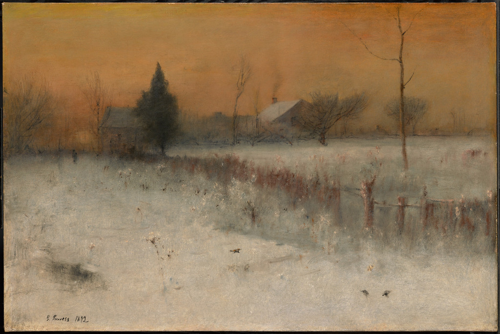
George Inness, Home at Montclair, 1892. Oil on canvas, 76.5 × 114.3 cm. Clark Art Institute, 1955.10. Sterling and Francine Clark Art Institute. Image source. Public domain.
Glazing, scumbling and repeated work
On printed pages 252–254 of the memoir, the son describes a method involving transparent glazes, opaque scumbles, drying and further repainting. He also acknowledges departures from the method. The account is valuable testimony from an artist close to his father’s practice, but it is a retrospective description rather than a scientific examination of every canvas.[1]
Glazing uses transparent colour to modify an existing painted passage. Scumbling introduces a relatively opaque layer or broken film over what lies beneath. In the son’s account, these operations alter tone and bring parts of a picture into relation. They are not interchangeable terms for any loosely applied brushstroke.[1]
The repeated work is as significant as the named operations. A surface can be reconsidered after it has dried; an earlier passage can become the basis for another relationship. The resulting image may suggest a moment of twilight while the object itself records decisions made over a much longer interval.
This helps explain the son’s remembered quotation, “If I could only paint without paint!” The surrounding discussion concerns a wish to conceal technique and create a convincing experience. It does not imply a literal absence of materials or a refusal to work carefully. A painting that seems effortless to the viewer may have required extensive revision.[1]
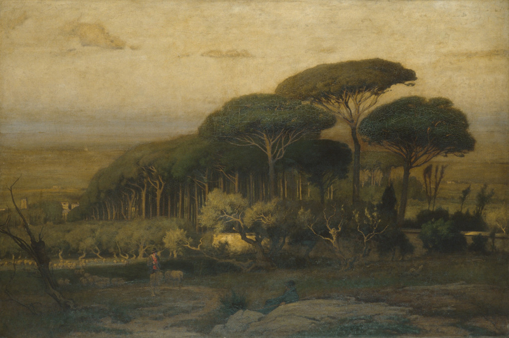
George Inness, Pine Grove of the Barberini Villa, 1876. Oil on canvas. Met, 98.16. Gift of Lyman G. Bloomingdale, 1898; Metropolitan Museum of Art. Image source. Public domain.
Watch: George Inness
Choose a film to explore the artist’s work, its interpretation and its wider setting.
The Montclair Art Museum's George Inness Gallery
Visit the George Inness Gallery at the Montclair Art Museum in this State of the Arts feature.
Watch on YouTubeWhat examination of Sunset in the Woods establishes
Lance Mayer’s 2005 examination of Sunset in the Woods, published in the Corcoran scholarly apparatus, supplies independent evidence for a particular object. It describes thick opaque strokes and very thin multilayer glazes, with both wet applications and paint dragged over dried layers. The support has a commercial cream-coloured ground on plain-weave canvas and a replacement stretcher.[2]
These findings give the son’s general account a useful point of comparison. They do not prove that every other Inness received the same layers. Within this canvas, the examiner identifies varied material behaviour; the artist’s practice was capable of combining methods rather than keeping each work uniformly transparent or opaque.
The reported later treatments need their own chronology. A 1971 lining and varnish intervention differs from the surface coating described in a 1973 note. Possible palette scrapings and a possibly early varnish or glaze remain qualified in the examination. They should not become firm discoveries merely because a public explanation benefits from simple wording.[2]
For the viewer, the pale trunks, dense canopy and small greenish opening provide a way to bring material findings back to the image. Their positions organise an enveloping woodland scene. The photograph helps explain where those forms act within the composition; it cannot independently identify a pigment, date a coating or reveal the entire sequence of work.
Works on paper and remembered landscapes
Inness’s Italian works on paper offer another perspective on structure. The Met’s Across the Campagna of 1872 combines watercolour, gouache and graphite on off-white wove paper. A broad sky sits above a low horizon, while darker strokes articulate the nearer ground. The recorded mixed medium and visible arrangement need to be considered together.[7]
Olive Trees at Tivoli, dated 1873, uses the same three named materials on blue wove paper with coloured fibres. Its stronger near trees and rocks lead towards an open plain. Comparing the sheets shows that a change in support and composition can produce a different relationship between line and atmosphere within a closely related phase of work.[8]
The Philadelphia Museum of Art’s 2011 exhibition labels also compare a Cadore watercolour with an oil and discuss paintings completed after the Italian residence. They provide examples of observation being developed and remembered. The comparison does not establish a single transfer procedure for every work, or make each small sheet an incomplete version of a known canvas.[9]
Memory can preserve a motif while allowing its surroundings to change. A grove can be rearranged for a later composition; distance can become more open; light can take a different role. The relevant question is what a documented comparison establishes about two particular works. General statements about studio practice should not manufacture an unrecorded relationship between them.
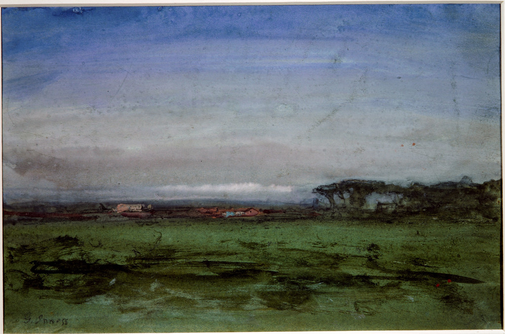
George Inness, Across the Campagna, 1872. Watercolour, gouache and graphite on off-white wove paper. Met, 67.55.145. Bequest of Susan Dwight Bliss, 1966; Metropolitan Museum of Art. Image source. Public domain.
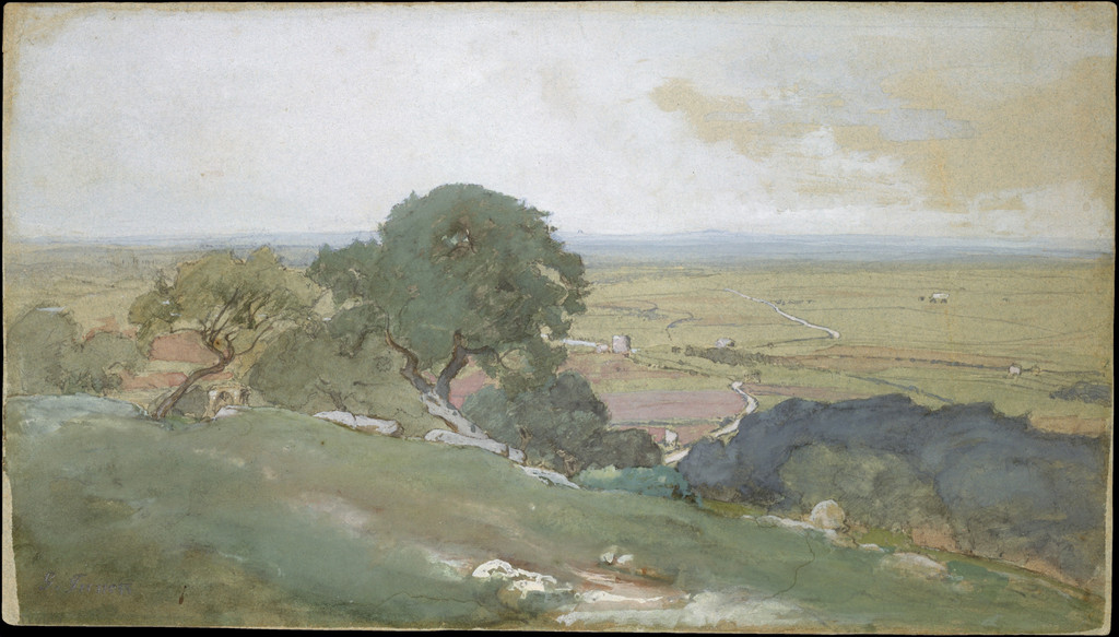
George Inness, Olive Trees at Tivoli, 1873. Gouache, watercolour and graphite on blue wove paper with coloured fibres. Met, 1989.287. Morris K. Jesup Fund, 1989; Metropolitan Museum of Art. Image source. Public domain.
Tonalism, impressions and spiritual attention
Tonalism offers a useful framework for Inness’s later emphasis on related colour, atmosphere and mood. Bell places his work within that context while stressing his particular religious interests. The label helps locate a historical tendency; it does not supply a complete account of every landscape he produced.[3]
His own undated reply to “Editor Ledger,” reproduced by his son, rejects an Impressionist classification while discussing the impressions people receive and convey. The son says that the newspaper identity was lost. A description such as “impressionistic” should therefore be used carefully: it can concern an effect, while affiliation with French Impressionism is a separate historical claim.[1]
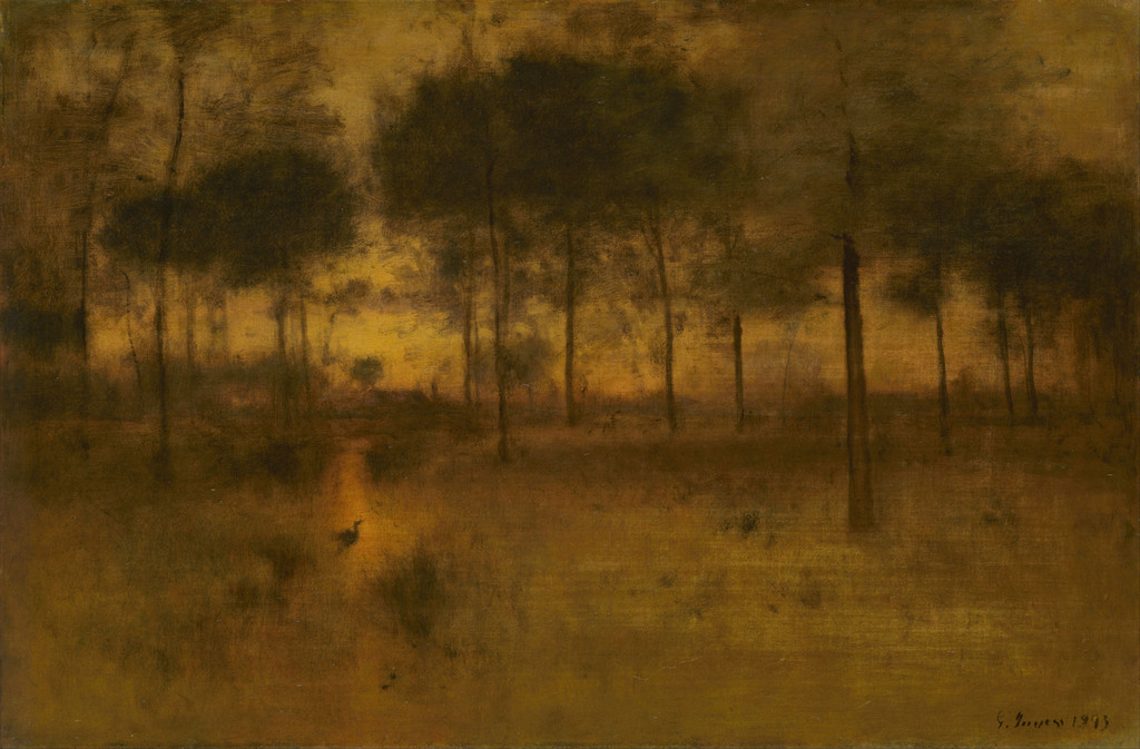
Spiritual purpose also requires precision. A painting’s softened boundaries may encourage reflection, but a hazy tree does not automatically become a coded religious sign. In The Home of the Heron, the small bird gives a point of recognition within warm, less definite surroundings. Its compositional role can be described securely without assigning it an unequivocal Swedenborgian identity.[10]
The same care helps preserve differences among late pictures. A snowfield, woodland interior and Florida bird scene do not produce atmosphere through identical arrangements. Taking the artist’s ambitions seriously means looking closely at those differences, rather than treating each work as another illustration of an all-purpose spiritual formula.
A practical way to look
Begin at the scale of the whole painting. Find the broadest areas of light and dark, the horizon or principal opening, and the forms that carry your eye between them. Then look for the small recognisable accents: a figure, bird, building or boat. Ask how their scale and clarity affect the surrounding space.
Return to the surface only after understanding that arrangement. A visible thick stroke may be important, but it should be related to the shape it creates and the evidence available for that particular object. This order joins composition with material attention while avoiding a false technical diagnosis from a reproduction.
Finally, compare a genuinely different work. The early mill and late winter field reveal continuity in inhabited landscape alongside changes in emphasis. The Italian sheets and large grove show different materials serving spatial experiments. Inness’s technique becomes easier to understand through these precise relationships than through a fixed list of colours or a supposedly universal sequence of steps.
Artworks directory
A collected selection of 46 individually identified museum objects: 43 paintings and three watercolours. This is not a complete catalogue raisonné. Repeated titles identify separate objects where their institutions or accessions differ. Links lead to a companion article where available, otherwise to the museum record. Unillustrated entries remain included; the original lost New Jerusalem is represented by its three transformed survivors.
| Name | Date | Medium |
|---|---|---|
| Crossing the Ford | 1848 | Oil on canvas |
| The Old Mill | 1849 | Oil on canvas |
| The Lackawanna Valley by George Inness | c. 1856 | oil on canvas |
| Delaware Water Gap | 1861 | Oil on canvas |
| Delaware Valley | c. 1865–75 | Oil on artist's board |
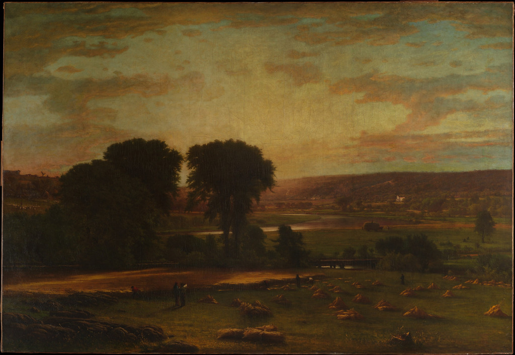
| Peace and Plenty | 1865 | Oil on canvas |
| Evening Landscape | 1867; later reworked | Oil on canvas |
| Summer in the Catskills | 1867 | Oil on canvas |
| The Valley of the Olives | 1867; reworked after 1880 | Oil on canvas |
| The Valley of the Shadow of Death | 1867 | Oil on canvas |
| Visionary Landscape | 1867/1880 | Oil on canvas |
| Catskill Mountains | 1870 | Oil on canvas |
| Across the Campagna | 1872 | Watercolor, gouache, and graphite on off-white wove paper |
| Olive Trees at Tivoli | 1873 | Gouache, watercolor, and graphite on blue wove paper with colored fibers |
| A Marine | c. 1874–75 | Oil on canvas |
| Twilight in Italy — Art Institute of Chicago (1911.44) | 1874 | Oil on panel |
| Pine Grove of the Barberini Villa | 1876 | Oil on canvas |
| The Storm | 1876 | Oil on canvas |
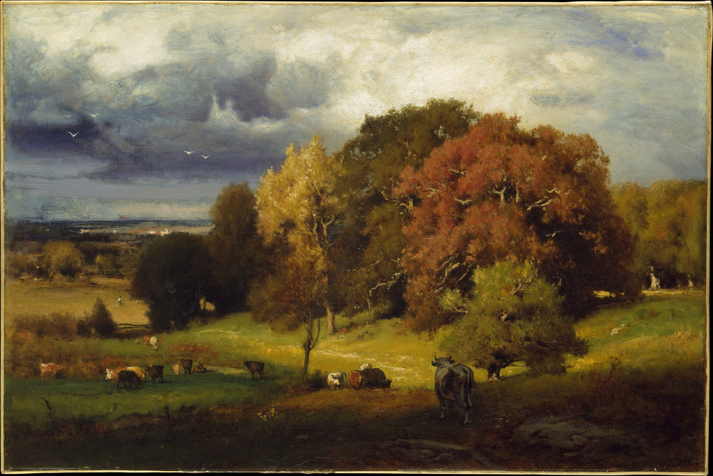
| Autumn Oaks | ca. 1878 | Oil on canvas |
| The Sisters | 1882 | Oil on millboard |
| Harvest, Montclair, New Jersey | 1884 | Oil on canvas |
| Niagara Falls | 1885 | Oil on wood |
| A Silver Morning | 1886 | Oil on canvas |
| Landscape, Sunset | 1887–89 | Oil on canvas |
| September Afternoon | 1887 | Oil on canvas |
| Sunrise | 1887 | Oil on canvas |
| The Mill Stream, Montclair, New Jersey by George Inness | c. 1888 | Oil on canvas |
| Niagara by George Inness | 1889 | oil on canvas |
| The Mill Pond | 1889 | Oil on canvas |
| Sunset in the Valley | 1890 | Oil on canvas |
| The Moon at Night | 1890 | Oil on canvas |
| Twilight in Italy — Art Institute of Chicago (1911.42) | 1890 | Oil on canvas |
| Autumn Woods | 1891–94 | Oil on canvas |
| Moonrise | 1891 | Oil on canvas |
| Spring Blossoms, Montclair, New Jersey | ca. 1891 | Oil and crayon or charcoal on canvas |
| Sunset in the Woods by George Inness | 1891 | oil on canvas |
| The Home of the Heron — Princeton University Art Museum (y1943-93) | 1891 | Oil on canvas |
| Threatening | 1891 | Oil on canvas |
| Early Morning, Tarpon Springs | 1892 | Oil on canvas |
| Home at Montclair by George Inness | 1892 | oil on canvas |
| The Lonely Farm, Nantucket | 1892 | Oil on canvas |
| Afterglow | 1893 | Oil on canvas |
| Sunlit Valley | 1893 | Oil on canvas |
| The Home of the Heron — Art Institute of Chicago (1911.31) | 1893 | Oil on canvas |
| After a Summer Shower | 1894 | Oil on canvas |
| Landscape | n.d. | Watercolor with scraping on ivory wove paper |
Frequently Asked Questions
The undated “Editor Ledger” reply rejects that classification. Describing impressions or loose handling does not by itself establish an affiliation with French Impressionism.[1]
A photograph supports looking at colour relationships. Object-specific material identifications need technical examination, such as the published work on Sunset in the Woods.[2]
Discussion
Look again at the images and ideas explored in George Inness: Style and Technique. These editorial prompts invite your observations.
Compare a whole painting with one enlarged detail. Which relationships become clearer, and which disappear when the detail is isolated? Consider why a thickly worked passage and a softly defined image can belong to the same composition.
Reader Insights
Where do distinct edges and softer passages work together?
How does the mixed-media sheet compare with a large oil painting?
Which account of handling is supported by examination of one particular object?
Join the Conversation
Share a detail, comparison or question about George Inness: Style and Technique below.
References
- George Inness Jr., Life, Art, and Letters of George Inness (1917), printed pp.46, 156–157, 168–169, 245–246 and 252–254. Selected printed scans checked; remembered speech and reproduced letters distinguished.
- Corcoran Gallery of Art: American Paintings to 1945, scholarly apparatus (2011), printed pp.296–299. Selected Sunset in the Woods entry: Lance Mayer’s examination and Dare Hartwell’s treatment history.
- Adrienne Baxter Bell, “George Inness (1825–1894),” Metropolitan Museum of Art (2012).
- Art Institute of Chicago, The Old Mill, accession 1939.388.
- Metropolitan Museum of Art, Pine Grove of the Barberini Villa, accession 98.16.
- Clark Art Institute, Home at Montclair, accession 1955.10.
- Metropolitan Museum of Art, Across the Campagna, accession 67.55.145.
- Metropolitan Museum of Art, Olive Trees at Tivoli, accession 1989.287.
- Philadelphia Museum of Art, George Inness in Italy, exhibition labels (2011). Selected labels read; full exhibition catalogue not consulted.
- Art Institute of Chicago, The Home of the Heron, accession 1911.31.
- Splash image source.
George Inness, Sunset in the Woods, 1891. Oil on canvas, 122.2 × 183.2 cm. National Gallery of Art, 2014.79.43. Corcoran Collection; National Gallery of Art. Image source. CC0 / Public domain.