


 by Tom Gurney
Tom Gurney BSc (Hons) is an art history expert with over 20 years experience
Published on October 11, 2026 / Updated on October 11, 2026
Email: tomgurney1@gmail.com / Phone: +44 7429 011000
No. 10 (1950): Introduction
No. 10 is a 1950 oil painting by Mark Rothko in the Museum of Modern Art, New York. MoMA records it as a gift of the architect Philip Johnson, object 38.1952, measuring 229.6 × 145.1 cm (90⅜ × 57⅛ inches).[1] Its broad areas of yellow, blue, white and grey show Rothko arriving at the large, simplified arrangement that would become central to his mature work. The title is deceptively plain: Rothko made other paintings called No. 10, so the date, collection and object number are essential parts of this painting's identity.
At a Glance
- ArtistMark Rothko
- Date1950 [1]
- MediumOil on canvas [1]
- Dimensions229.6 × 145.1 cm [1]
- CollectionMoMA, 38.1952 [1]
This work in Rothko’s career
Contents
- Colour planes that seem to move
- A turning point around 1950
- Philip Johnson and MoMA
- Why the number needs a date
- Looking closely without an image
Colour planes that seem to move
MoMA describes three dominant horizontal planes that merge softly rather than meeting at ruler-straight borders.[1] Warm and cool passages alter how the surface is perceived. Yellow may seem to come forward, while blue and grey can seem to recede; MoMA relates this effect to the “push/pull” account of colour associated with Hans Hofmann. The painting remains flat oil on canvas, but its areas do not behave like a printed graphic. Their transitions, different tonal weights and unusually large scale make viewing an active process.
The effect is easiest to understand by refusing to reduce the painting to a list of colours. An area that appears pale at a distance can contain slight shifts in paint and temperature when approached. A coloured field can seem open in one part and more bounded in another. The eye travels across the canvas as the colour relationships change. MoMA's recent gallery label stresses that Rothko wanted the viewer to look at the work from close enough to feel enveloped by it.[1] The dimensions help explain that intention: a painting over two metres high occupies much more of a person's visual field than a page or screen image.
A turning point around 1950
The years immediately before No. 10 were years of major change. Rothko had worked with figures, mythic subjects and then increasingly ambiguous areas of colour. By 1949–50, the broad, softly edged fields were becoming more settled as a format. MoMA's label describes No. 10 as a result of simplifying the Surrealist-inspired compositions of earlier years.[1] Simplification did not mean that his aims became merely decorative. The museum connects his formal choices to the emotional experience he sought from a painting.
This is why No. 10 is useful in a career account. It gives a dated example of the mature language taking shape, yet its arrangement remains particular. Its upper and lower passages have a different proportion and tone from the bands in White Center, also dated 1950. A reader can compare those canvases to see Rothko testing the expressive consequences of changing colour and scale without treating either as a formula repeated unchanged for twenty years.
Philip Johnson and MoMA
MoMA's archive preserves curator Dorothy C. Miller's notes from a 1951 gallery visit made while she was preparing the 1952 exhibition Fifteen Americans. Her note “#10 - MMA?” marked this painting as a potential acquisition. MoMA explains that Philip Johnson bought it from the Betty Parsons Gallery and gave it to the museum in March 1952; it became the first Rothko painting to enter MoMA's permanent collection.[2] The sequence connects a contemporary gallery viewing, a collector's gift and the museum's early institutional recognition of Rothko's new work.
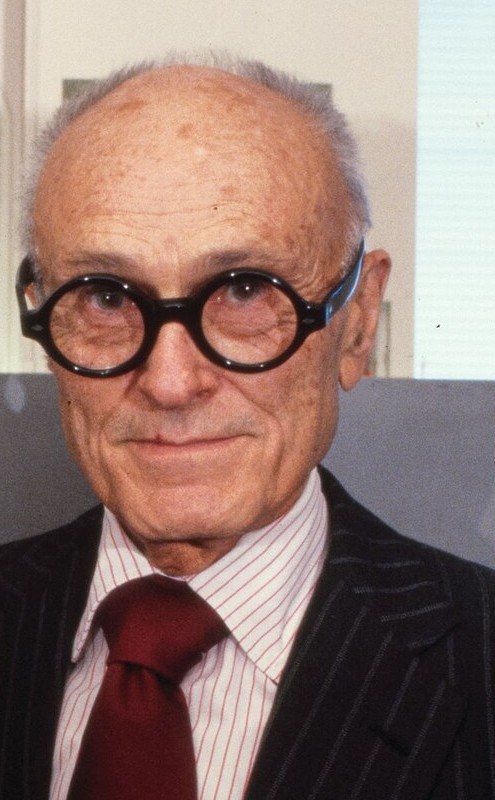
Philip Johnson in a later 1970s portrait detail. His gift of No. 10 in March 1952 made it the first Rothko painting in MoMA’s permanent collection.
Library of Congress, Prints & Photographs Division. Photograph: Bernard Gotfryd. LC-DIG-gtfy-01796. Faithful portrait crop; no retouching or colour changes. [10]
The painting's exhibition life continued after that gift. A MoMA catalogue for The New American Painting, the travelling exhibition shown in European countries in 1958–59, lists Number 10 (1950) as a loan from the museum.[3] The 1970 MoMA tribute to Rothko also listed it among the works displayed.[4] Those records show that it was more than an acquisition kept in storage: it helped represent Rothko to audiences in the United States and abroad. Display arrangements change, so a current gallery location should always be checked with MoMA rather than inferred from historical records.
Miller's archive page supplies more context for the 1952 presentation. Fifteen Americans gave each of its painters and sculptors a separate gallery, and its catalogue printed statements by the artists.[2] Rothko's statement argued that the development of a painter's work moves toward clarity by reducing obstacles between idea, painting and observer. It is a contemporary expression of purpose, not an instruction to decode the yellow or blue in No. 10 as a symbol. The acquisition and exhibition put a newly made painting into a room where viewers could test that idea at its intended scale.
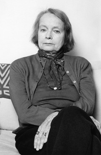
Betty Parsons in a 1977 portrait detail by Lynn Gilbert. Her gallery was part of the earlier acquisition history that brought Rothko’s No. 10 (1950) into MoMA.
Photograph: Lynn Gilbert, 1977. Photograph and portrait crop remain CC BY-SA 4.0. Faithful portrait detail crop; no retouching or colour changes. [11]
MoMA's current object page identifies this very work in installation views from Fifteen Americans (1952), later Philip Johnson gift exhibitions, the 1970 Rothko tribute and more recent collection displays.[1] Those identifications add a visible exhibition trail to the written checklists. They also make clear that a 1950 painting has accumulated many different neighbours and settings. The colour relations on its own canvas remain constant as an object identity, while the comparative experience offered by each gallery changes.
Why the number needs a date
Rothko's numbered titles can cause genuine confusion. The National Gallery of Art holds different paintings titled No. 10 from about 1948; their collection records give different measurements, colours and provenance.[5] A separately documented No. 10 from 1958 also appears in an auction record. Christie's gives its inscription, measurements and Anfam catalogue number 617.[6] These are not alternate dates for MoMA's 1950 object. A reliable reference to this painting identifies the 1950 date and, when exactness matters, MoMA object 38.1952.
The Guggenheim Bilbao collection records another numbering trap. Its enormous 1952–53 Untitled was apparently called No. 10 in materials for Rothko's 1954 Art Institute of Chicago exhibition. Bilbao notes that Anfam regarded the exhibited work as most likely its canvas, catalogue no. 483.[8] The Bilbao painting measures 299.5 × 442.5 cm: it is dramatically wider than MoMA's 229.6 × 145.1 cm No. 10 of 1950. Historical display labels may serve a particular exhibition sequence and should not override museum accessions, dimensions or dates. These two works are separate even if a visitor to Chicago in 1954 saw the same short number printed nearby.
The old markrothko.org archive itself has both /no-10-1950/ and /no-10/ pages. One describes the MoMA work while the other calls its subject a 1958 painting. They cannot be combined into a single object account simply because their titles look alike. The 1950 painting discussed here is the one governed by MoMA's collection record and acquisition history.
Looking closely without an image
Start with the three large planes and ask where one seems to end. Notice whether the boundary remains constant across its width. Then consider how the lighter passages change the apparent weight of the cooler colours around them. Step back to let the painting occupy a wider field of view, and come closer to see where paint density changes. Such shifts do not reveal a hidden story; they reveal how carefully Rothko made a small number of elements carry a complex experience.
MoMA's account of the work also places Rothko's aim beyond colour relationships alone. In a 1943 statement made jointly with Adolph Gottlieb, the artists insisted on the importance of subject matter even when painting had moved away from conventional representation.[1] No. 10 does not illustrate that statement as a literal scene, but it belongs to the later effort to make abstraction emotionally consequential. The meaning is not supplied by its number. It develops as a viewer spends time with the painting's scale and colour.
Related works
The paintings overview traces Rothko's wider development. No. 3/No. 13 is a 1949 canvas at MoMA near this transition; No. 14, 1960 provides a later comparison in a different palette and proportion.
Rothko works in this guide
| Name | Date | Medium |
|---|---|---|
| Entrance to Subway | 1938 | Painting |
| Hierarchical Birds | 1944 | Painting |
| Slow Swirl at the Edge of the Sea | 1944 | Painting |
| No. 3/No. 13 | 1949 | Painting |
| Untitled (Violet, Black, Orange, Yellow on White and Red) | 1949 | Painting |
| White Center | 1950 | Painting |
| No. 10 | 1950 | Painting |
| No. 6 (Violet, Green and Red) | 1951 | Painting |
| Untitled | 1952 | Painting |
| No. 61 (Rust and Blue) | 1953 | Painting |
| No. 1 (Royal Red and Blue) | 1954 | Painting |
| Untitled (Yellow and Blue) | 1954 | Painting |
| Orange and Yellow | 1956 | Painting |
| Light Red over Black | 1957 | Painting |
| Four Darks in Red | 1958 | Painting |
| Black on Maroon | 1958 | Painting |
| No. 14 | 1960 | Painting |
| Orange, Red, Yellow | 1961 | Painting |
| Untitled (brown and gray) | 1969 | Painting |
| Untitled (Red on Red) | 1969 | Painting |
| Untitled (Black and Gray) | 1970 | Painting |
| Tentacles of Memory | 1945–46 | Drawing |
Frequently Asked Questions
It is MoMA’s 1950 oil painting on canvas, object 38.1952, measuring 229.6 × 145.1 cm. Rothko used the number for other paintings, so the date and collection are necessary to identify this canvas accurately.[1]
MoMA describes three dominant horizontal planes and softly merging transitions. Yellow, blue, white and grey create changing warm and cool relationships. Their proportions, tonal differences and boundaries matter as much as the list of colours.[1]
Philip Johnson bought the painting from the Betty Parsons Gallery and gave it to MoMA in March 1952. The museum’s archive connects it with Dorothy C. Miller’s 1951 acquisition notes. It became the first Rothko in MoMA’s permanent collection.[2]
No. Guggenheim Bilbao’s account identifies that exhibition’s No. 10 as most likely its much wider Untitled of 1952–53. The Bilbao canvas and MoMA’s 1950 painting have different dimensions and collection identities.[8]
The canvas is over two metres high. MoMA connects its close viewing with Rothko’s wish to involve the observer in the painting’s scale. Moving attention between the whole arrangement and its softly changing boundaries can reveal relationships reduced in a small reproduction.[1]
Discussion
What changes when you look at No. 10 (1950) as a physical painting rather than a small reproduction?
Use the questions below to compare the work with its neighbours in Rothko’s career.
Reader Insights
Which edge or interval asks you to slow down?
How does this painting differ from the earlier and later works linked here?
What remains uncertain after reading the museum record and looking closely?
Join the Conversation
Share an observation grounded in the work or its documented history.
References
- Museum of Modern Art, No. 10 (1950), object 38.1952, object record and 2023 gallery label.
- MoMA Archives, Dorothy C. Miller's notes on Rothko, 1951.
- MoMA, The New American Painting (1958–59) catalogue.
- MoMA, 1970 Rothko tribute checklist.
- National Gallery of Art, No. 10 (1948), accession 1986.43.136.
- Christie's, No. 10 (1958) sale record, a different painting; its literature line cites Anfam, catalogue no. 617.
- David Anfam, Mark Rothko: The Works on Canvas—Catalogue Raisonné (National Gallery of Art and Yale University Press, 1998). The detailed entry was not accessible; no catalogue number is assigned here.
- Guggenheim Bilbao Museoa, Untitled (1952–53) collection note, including the historical No. 10 exhibition identification and indirect Anfam no. 483 citation.
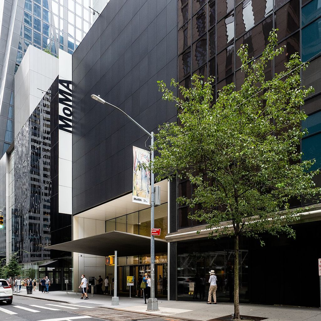
- The Museum of Modern Art exterior in 2021. MoMA owns No. 10 (1950); the building photograph is not an image of the painting. Photograph: ajay_suresh; source record; CC BY 2.0. Resized to 1024px without cropping.
- Philip Johnson, architect, with AT&T model.jpg. Library of Congress, Prints & Photographs Division. Photograph: Bernard Gotfryd. LC-DIG-gtfy-01796. Faithful portrait crop; no retouching or colour changes. Source · Public domain; LOC donor release.
- Betty Parsons, portrait detail. Photograph: Lynn Gilbert, 1977. Photograph and portrait crop remain CC BY-SA 4.0. Faithful portrait detail crop; no retouching or colour changes. Source · CC BY-SA 4.0.

_(51395759113).jpg)
