 by Tom Gurney
Tom Gurney BSc (Hons) is an art history expert with over 20 years experience
Published on June 19, 2020 / Updated on October 11, 2026
Email: tomgurney1@gmail.com / Phone: +44 7429 011000
Rothko’s paintings: Introduction
Rothko's paintings are often introduced by a few large canvases of floating colour, but his career contains a much wider sequence: urban and figurative work, mythic and Surrealist images, transitional abstraction, mature colour fields, architectural commissions and late works on both canvas and paper. The National Gallery of Art's chronology traces these developments across more than four decades.[1] This guide follows a documented selection of works through those stages and the research that makes them better understood. David Anfam's Works on Canvas is the major scholarly catalogue for the canvases; the NGA is separately compiling a works-on-paper catalogue.[2]
Browse Rothko’s paintings
21 paintingsChoose a painting to explore its colours, scale and history, or continue to the paintings guide.
At a Glance
- ArtistMark Rothko (1903–1970) [1]
- SubjectsCity scenes, mythic imagery and colour fields [1]
- MediaOil and acrylic on canvas and paper [2]
- Major commissionsSeagram, Harvard and the Rothko Chapel [1]
Contents
- The 1930s: people and city space
- The 1940s: myth and unstable forms
- 1947–50: colour takes the lead
- The 1950s: range within a recognisable language
- How the mature paintings organise an encounter
- Murals and site
- Surfaces, supports and viewing
- The 1960s and late work
- What later exhibitions reveal about the sequence
- Collections offer different encounters with the same career
- Catalogues, titles and the evidence for a painting
- A closer looking sequence
- Using the artwork directory
The 1930s: people and city space
Rothko's early exhibitions included landscapes, portraits, nudes and city scenes. He also painted subway subjects while working in New York.[1] Entrance to Subway of 1938 belongs to this period. Its figures and architecture are recognisable, but the work already asks how people occupy shared space and how built surroundings affect their isolation. The later paintings are not simply the same subject with figures removed; they involve a long series of changes in Rothko's means of expression.
The NGA’s Untitled (subway) and Entrance to Subway are separate objects. Their dimensions and collection histories keep them identifiable even when a short caption simply calls each a subway painting. The Entrance to Subway guide follows that particular canvas through its documented exhibition history.
Portraiture and the scale of an early canvas
The Jewish Museum’s Untitled (Portrait of Edith Sachar), dated about 1932, supplies an intimate counterpart to the city scenes. It is oil on canvas mounted on board, measuring only 35.6 × 27.9 centimetres. The museum characterises its approach as both naturalistic and expressionistic.[19] The portrait concerns a particular person, Rothko’s first wife, while its handling places it within his early experiments in painting. Its compact support also reminds us that the physical scale associated with the mature artist was a choice developed over time.
An early portrait can be studied on its own terms. How much space does a head occupy? How does a painted person relate to the surrounding field? Which passages receive concentrated attention? These questions allow a small figurative work to remain a complete encounter while connecting it to the larger problem of how Rothko organised a picture around human presence.
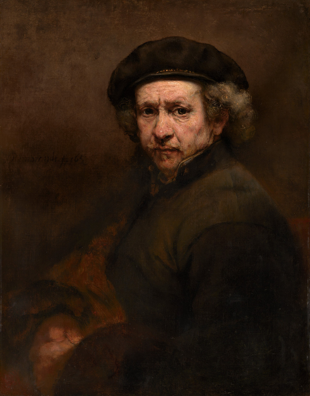
Rembrandt, Self-Portrait, 1659. The National Gallery of Art compares this painting with Rothko’s 1936 self-portrait when discussing his admiration for the older artist.
National Gallery of Art, Washington, Andrew W. Mellon Collection, 1937.1.72. [40]
The 1940s: myth and unstable forms
In the 1940s Rothko used Greek myth, Surrealist approaches and ambiguous figures. Hierarchical Birds and Slow Swirl at the Edge of the Sea are both dated 1944 but show distinct ways forms can emerge and dissolve.[3][4] Their titles suggest stories or places without fully fixing them. The ink and watercolour Tentacles of Memory adds a paper example from about 1945–46.[5]
Rothko and Adolph Gottlieb's jointly authored 1943 statement defended serious subject matter in modern painting.[6] That collaboration belongs to the context of these mythic works. It should not be turned into a solo Rothko quotation or a simple explanation for every shape. The 1940s are important precisely because many visual possibilities coexisted before the later format stabilised.
A religious subject before the Chapel
The Jewish Museum also holds Crucifix, an oil canvas of 1941–42, measuring 68.6 × 58.4 centimetres. Its collection record associates it with a religious symbol and the Holocaust.[20] The record establishes an object that belongs to the wartime years and carries a charged subject. It does not supply a full account of the artist’s intention. The painting nevertheless complicates any account in which religious questions suddenly enter Rothko’s career with the Houston commission.
The distinction between a depicted religious subject and an abstract environment is useful. A title such as Crucifix gives the viewer a point of reference before looking. A Chapel panel offers no comparable narrative title. Across that distance lie changes in Rothko’s practice and a different relation between painting and place. Following the changes requires attending to the actual works, rather than assuming a single religious programme stretched unchanged across three decades.
1947–50: colour takes the lead
The National Gallery chronology places Rothko's removal of mythic and Surrealist imagery in the later 1940s and the mature stacked format by about 1950.[1] MoMA's No. 3/No. 13 and the Guggenheim's long-titled Untitled are two separate 1949 canvases at this threshold. Both use broad colour relationships, but their titles, proportions and collections differ. White Center and MoMA's No. 10 then show how varied the new format could be in 1950.
The soft edge is central but not universal in effect. In one work a field may seem to float away from the ground; in another it can appear heavier or more enclosed. Scale changes the relation again. Anfam's 2007 essay on White Center asks readers to attend to shifts in ground colour and differences between one boundary and another.[7] It is a reminder that a painting made of broad areas is not necessarily a simple painting to see.
Rothko's looking at Matisse offers a concrete comparison. The National Gallery records his sustained attention to The Red Studio (1911).[37] One of the paintings represented inside that studio scene is Le Luxe II (1907–08), now at SMK in Copenhagen.[38][39] Its figures remain legible even as broad blue, green and terracotta areas organise the surface. SMK records glue distemper on canvas, a different medium from the oils of many Rothko canvases. Looking at this painting within a painting helps clarify what a historical comparison can show: a relation between represented bodies, colour and the surrounding pictorial field. Rothko's documented encounter concerns The Red Studio; the surviving Le Luxe II supplies one part of that work's internal world.
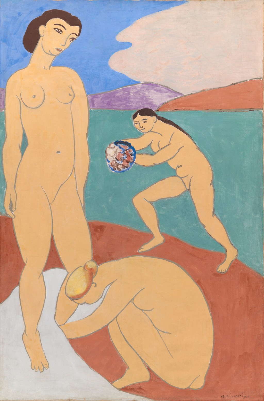
Henri Matisse, Le Luxe II, 1907–08, glue distemper on canvas; SMK, KMSr76. This is one of the paintings depicted within The Red Studio, the Matisse work Rothko studied at MoMA.
Henri Matisse, Le Luxe II; SMK – National Gallery of Denmark; KMSr76. Resized without cropping. [41]
What the multiforms made possible
Canberra’s Multiform of 1948 offers a particularly useful transitional example. The National Gallery of Australia’s essay describes irregular colour areas that seem to extend and withdraw, with gradual tonal shifts leaving spatial depth unsettled. Larger rectangular areas point towards the format that would become characteristic.[21] Looking at the transitions inside one work is more revealing than using “1948” as a sharp border between two styles.
The same essay gives the word multiform a history. It says the term first appeared in a published catalogue at the 1970 Venice Biennale; a later account from the Marlborough Gallery suggested Rothko had used it more generally in conversation.[21] The category is therefore useful for describing a group, but its title history differs from a name written by the artist on the reverse of a specific canvas.
The visual changes invite close comparison. In a transitional painting, one can ask how many areas still behave as separate shapes and where they begin to merge with the surrounding ground. In an early classic-format work, one can ask how an apparently more ordered arrangement retains instability through colour and edge. The movement towards fewer forms creates new demands on the relationships between them.
The 1950s: range within a recognisable language
From 1951 through the later 1950s, Rothko repeatedly changed his palette, proportions and surface. The privately held No. 6 (Violet, Green and Red) requires caution because its dimensions and full provenance remain insufficiently verified. MOCA's No. 61 (Rust and Blue) has a stable accession and measurements. The shorter Number 61 route refers to that same canvas, not a second painting.[8]
Sotheby's records the title history of No. 1 (Royal Red and Blue) and Untitled (Yellow and Blue), both from 1954. Buffalo AKG's Orange and Yellow entered its collection in 1956.[9] Tate's Light Red over Black is dated 1957, while the Whitney's Four Darks in Red is a distinct 1958 painting. Titles made from colour words can sound alike; owner, date and accession keep the objects apart.
How the mature paintings organise an encounter
The classic paintings give the viewer several relationships to hold together. There is the rectangle of the whole support, the arrangement of fields inside it, and the space around the object on its wall. Within the painting, an exposed ground can act as a narrow margin at one point and a wider interval at another. The fields occupy different amounts of space, so their relation includes proportion as well as hue.
Try describing a painting without naming its colours first. Is its main format upright or broad? Does the upper field seem more extensive than the lower one? Is an interval narrow enough to join two areas, or wide enough to hold them apart? Does a perimeter continue evenly around the composition? This first description makes the structure available to attention. Adding colour then reveals how structure and palette act together.
Christopher Rothko emphasises this aspect of the practice in his 2019 interview. He points to pen-and-ink sketches for classic paintings, distinguishing them from some mural studies, and argues that form remained central across the career. He also relates the widening of later canvases to the viewer’s sense of being surrounded.[23] These are the observations of an author and close steward of the work. They offer a productive challenge to an account beginning and ending with beautiful colour.
Objects, windows and the question of depth
In an authorised excerpt from From the Inside Out, Christopher considers viewers’ habit of converting Rothko’s forms into recognisable objects: appliances, doors or windows. He argues that the window analogy can direct attention to an imagined view beyond the surface, causing the painting itself to recede from consideration. He instead emphasises the presence of the painter’s hand and the human encounter made possible by the work.[22]
His essay offers an interpretation to test through looking. A broad field can suggest an opening, but the apparent opening is made of paint on a support. Its visual depth may change while the physical object remains in place. Returning attention to a boundary or a brush trace can bring these two kinds of awareness together. A metaphor is useful when it helps describe an effect; it becomes restrictive when it replaces the work with a single familiar thing.
A contemporary critic’s account
Peter Selz’s 1961 MoMA catalogue describes the mature pictures as absorbing the viewer when seen closely in subdued light. He calls their texture relatively neutral, placing his emphasis on the encounter with the whole painting.[24] This is a significant contemporary account of how the work could be experienced. Later conservation research adds a much more detailed history of the surfaces that produced those effects.
Reading criticism and technical research together allows each to do a different job. A critic can characterise what holds attention in a particular installation. A conservator can distinguish layers, changes in medium and physical alterations. A surface perceived as quiet may contain complicated making. The difference enriches the description of a painting: the appearance of simplicity is itself an achieved result.
Murals and site
The Seagram Murals began with a 1958 restaurant commission that Rothko withdrew. Tate's Black on Maroon of 1958 is a work tied to that project and must be distinguished from its 1959 namesake. The later Harvard murals and the fourteen installed paintings of the Rothko Chapel were separate commissions.[1][10] The Chapel's completed room shows how a group of paintings can work with architecture and changing light, while the Seagram group shows a planned environment that was never installed at its original site.
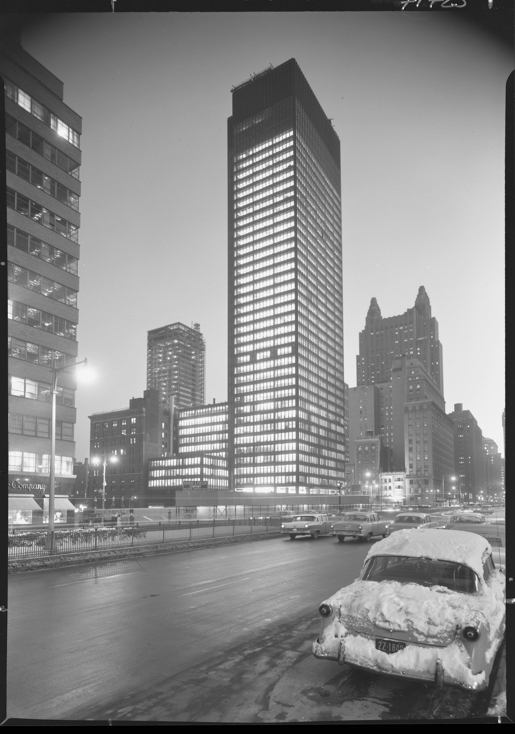
Seagram Building, night view, 3 January 1958. The Four Seasons restaurant in this building became the intended setting for Rothko’s mural commission later that year.
Library of Congress, Prints & Photographs Division, Gottscho-Schleisner Collection; LC-G612-71723; LC-DIG-gsc-5a16908. Resized without cropping. [42]
The Phillips Collection's Rothko Room offers an instructive third history.[18] Phillips bought three canvases between 1957 and 1960 and gave them a small dedicated room in 1960; a fourth joined in 1964. Rothko visited in 1961 and discussed the lighting and seating. The museum says its 2006 relocation kept the room's original dimensions and orientation. Here the artist did not begin with a commission for a new mural cycle, but an installation assembled from individual paintings nevertheless became a closely considered encounter. Comparing the three cases—Phillips, Seagram, Chapel—shows that “site-specific” is too blunt a label for every Rothko room. The documented relation between paintings and space differs in each case.
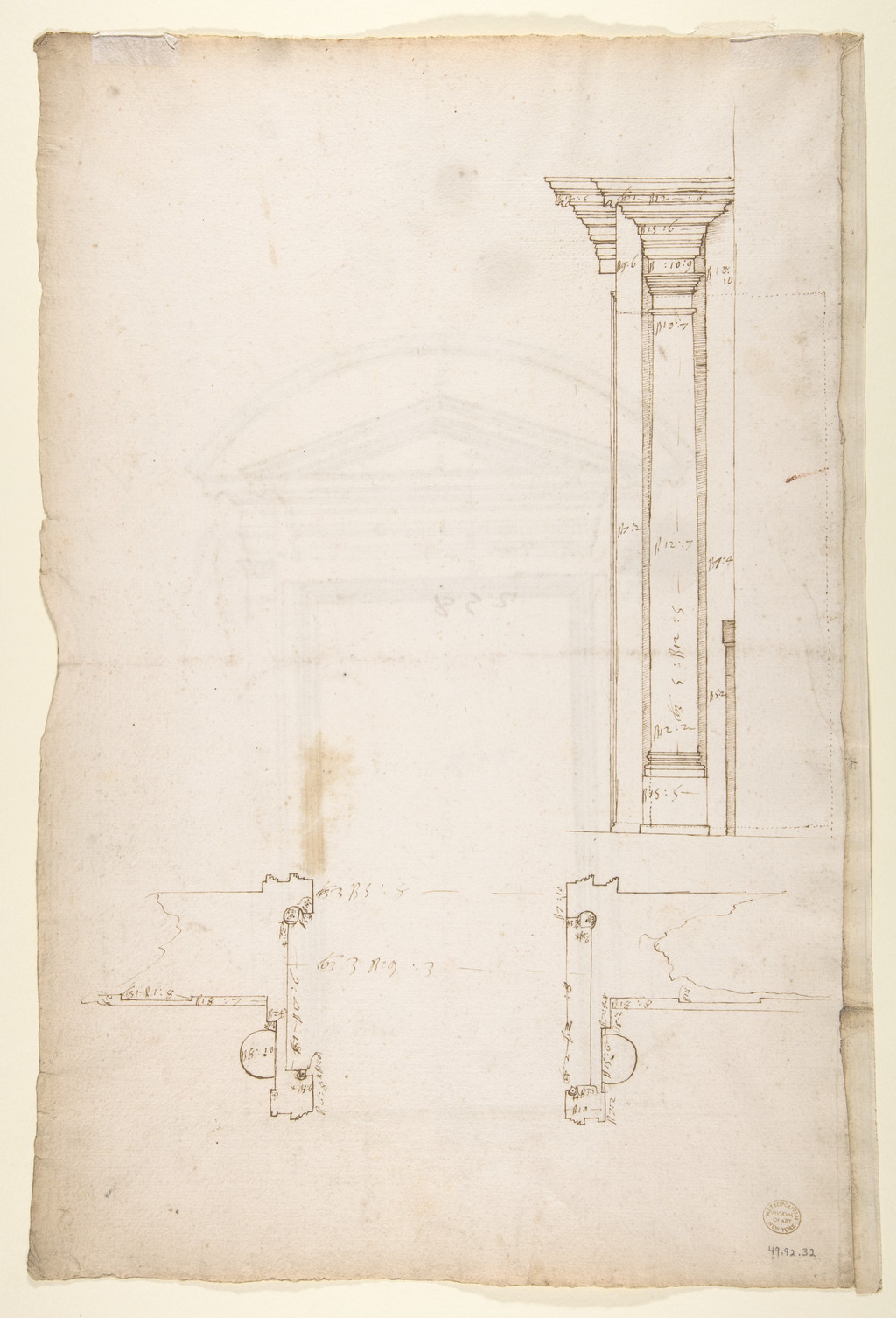
A sixteenth-century plan and section of the Laurentian Library’s vestibule entrance portal, on the reverse of Met drawing 49.92.32. Rothko’s 1959 visit to the Florence vestibule belongs to the architectural context of the Seagram project.
The Metropolitan Museum of Art, Gift of Janos Scholz and Anne Bigelow Scholz, in memory of Flying Officer Walter Bigelow Rosen, RCAF, 1949; 49.92.32. [43]
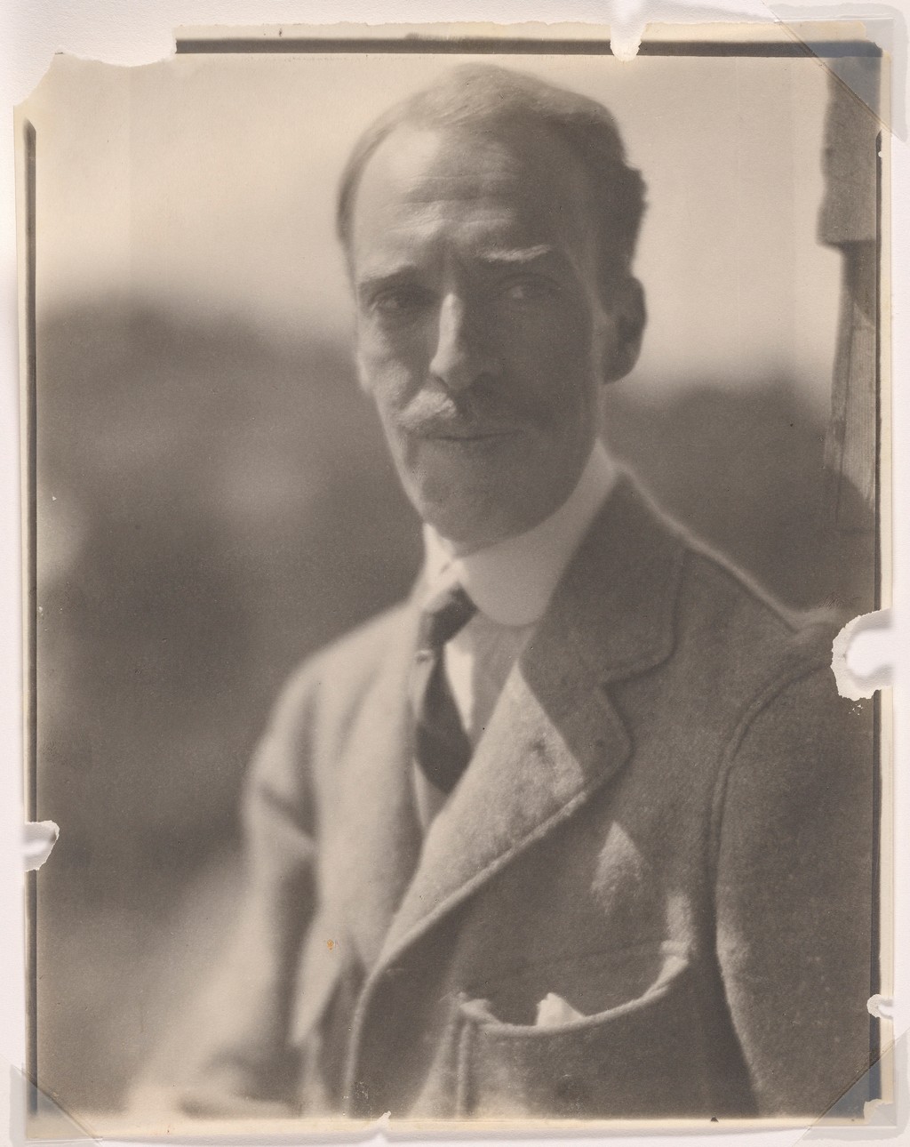
Duncan Phillips, circa 1921, photographed by Clara Sipprell. He later acquired the paintings assembled in the Phillips Collection’s Rothko Room.
Clara Sipprell; National Portrait Gallery, Smithsonian Institution; bequest of Phyllis Fenner; NPG.82.200. Resized without cropping. [44]
Harvard: an ensemble with a material history
The Harvard commission deserves a place beside Seagram and Houston. Rothko made its canvases in 1962 for a room in the Holyoke Center, designed by Josep Lluís Sert. Five were installed together; a sixth panel remained outside the original installation. Harvard’s 2014–15 exhibition reunited the group with the additional panel and preparatory material.[25] The commission’s history includes a completed room, deterioration, storage and a new form of presentation decades later.
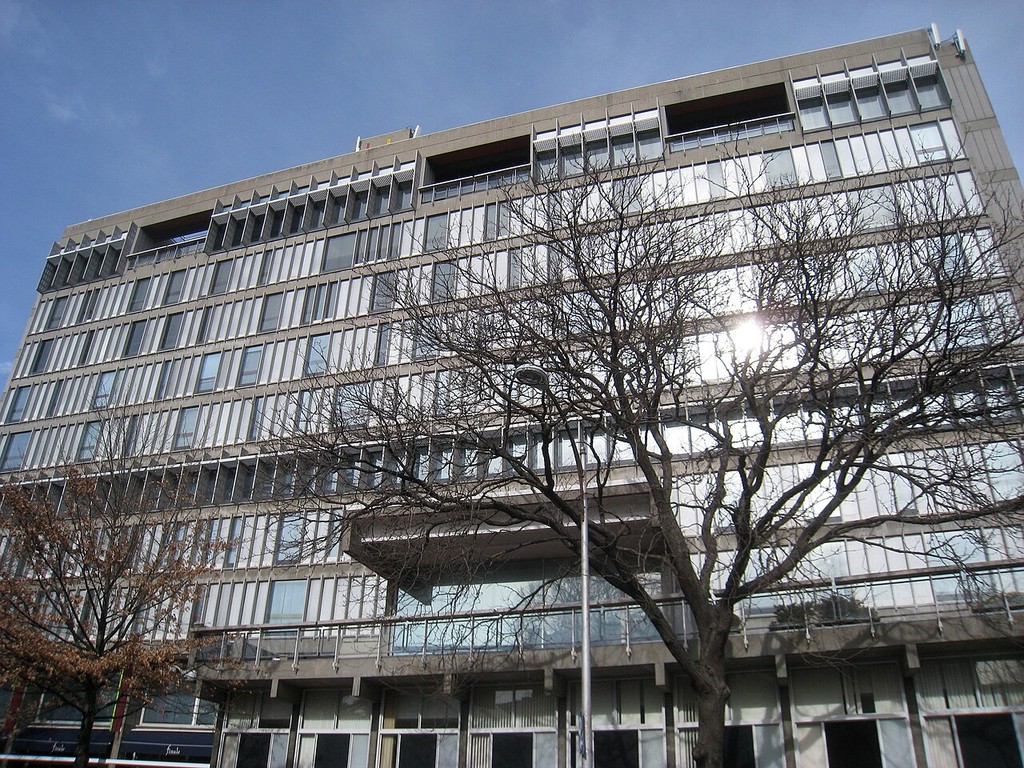
Harvard’s Holyoke Center in 2010, now the Smith Campus Center. Rothko’s Harvard murals were made for a room in this building, designed by Josep Lluís Sert.
Photograph: Daderot. Resized without cropping. [45]
The differences among the three major mural projects are instructive. Seagram lost its intended restaurant setting when Rothko withdrew. Harvard’s original installation exposed the works to conditions under which their appearance changed severely. The Houston paintings entered a building completed after the painter’s death and have required continuing adjustments to light and environment. “Mural” can consequently describe works with very different histories of architectural use and public access.
Restoring an appearance with light
Harvard’s conservation project began with the problem of a deep crimson pigment, Lithol red, that had faded. Scientists and conservators developed a projected colour-compensation system instead of physically replacing the lost colour. To establish a reference, they used the sixth panel, which had escaped the original display conditions, and photographs made in 1964. The photographs had also changed with age and needed separate digital correction.[26]
The resulting system compared the paintings’ present appearance with the reconstructed reference and projected a calculated image onto the original surfaces. Harvard’s team worked with specialists at MIT and the University of Basel.[26] The original canvases remained the objects being viewed; the added illumination altered their visible colour relationships. Switching off the projection made the difference available for comparison.
This case makes the word restoration unusually concrete. One can preserve the physical material and still alter the experience of its colour. One can also reconstruct relationships among the panels without claiming to transport the viewer into an unchanged 1960s room. The reference photographs, the extra canvas and the technical modelling are all parts of the argument for the appearance presented.
Why pigment names do not tell the whole story
Harvard conservation scientist Narayan Khandekar described tests in which Lithol red proved comparatively stable as a powder but much more vulnerable to light when mixed with ultramarine blue and a binding medium.[28] That finding concerns the behaviour of a mixture. Knowing that a painting contains a particular red pigment does not, by itself, reveal how the paint will age.
This is a useful starting point for understanding the technical literature. A coloured surface consists of materials acting together, and their interaction can change over time. Support, ground, pigment, binder and later coatings can affect the result. Naming the hue describes an appearance; identifying the mixture helps explain the physical work that sustains it.
Two 2016 studies formalise the Harvard research: The making of Mark Rothko’s Harvard Murals and Conservation of a room. The first reports a combination of imaging, material analysis and fading tests; the second sets out the projected-light proposal.[29][30] Their accessible abstracts provide a route into the specialist research. The fuller findings need the complete articles before they can be discussed in detail.
A conservation debate, rather than a single verdict
Harvard’s March 2015 study events brought artists, curators, conservators and Rothko’s children into discussion of the results. The museum’s report describes different responses. Terry Winters found the altered, faded state moving; Kate Rothko Prizel believed its premature ageing would have been unacceptable to her father. Christopher said he appreciated both appearances. Carol Mancusi-Ungaro raised the possibility that a work need not have only one meaningful state.[27]
The disagreement opens several questions for looking. Should a presentation make age visible, recover an earlier relation among colours, or allow comparison between them? How much can documentation establish about an intended appearance? What changes when a work originally conceived as a group is viewed in a different room? The Harvard project keeps these questions connected to actual surfaces and documented choices.
Tate: research after an act of damage
A different technical investigation followed the 2012 ink damage to Tate’s Black on Maroon of 1958, accession T01170. A 2022 open-access paper by Scott Wills and colleagues records the analytical work supporting removal. The investigators studied the unfamiliar ink, tested its solubility and used representative samples before treatment. The painting returned to display in 2014.[31]
The study describes a fragile, layered paint structure with several natural and synthetic materials, including passages whose finish differed. It also examines the implications of ink remaining in the canvas where removal would have risked further harm.[31] The case establishes why care for a Rothko depends on more than recognising the visible colours. Conservation must distinguish the original surface, the introduced material and the consequences of an intervention.
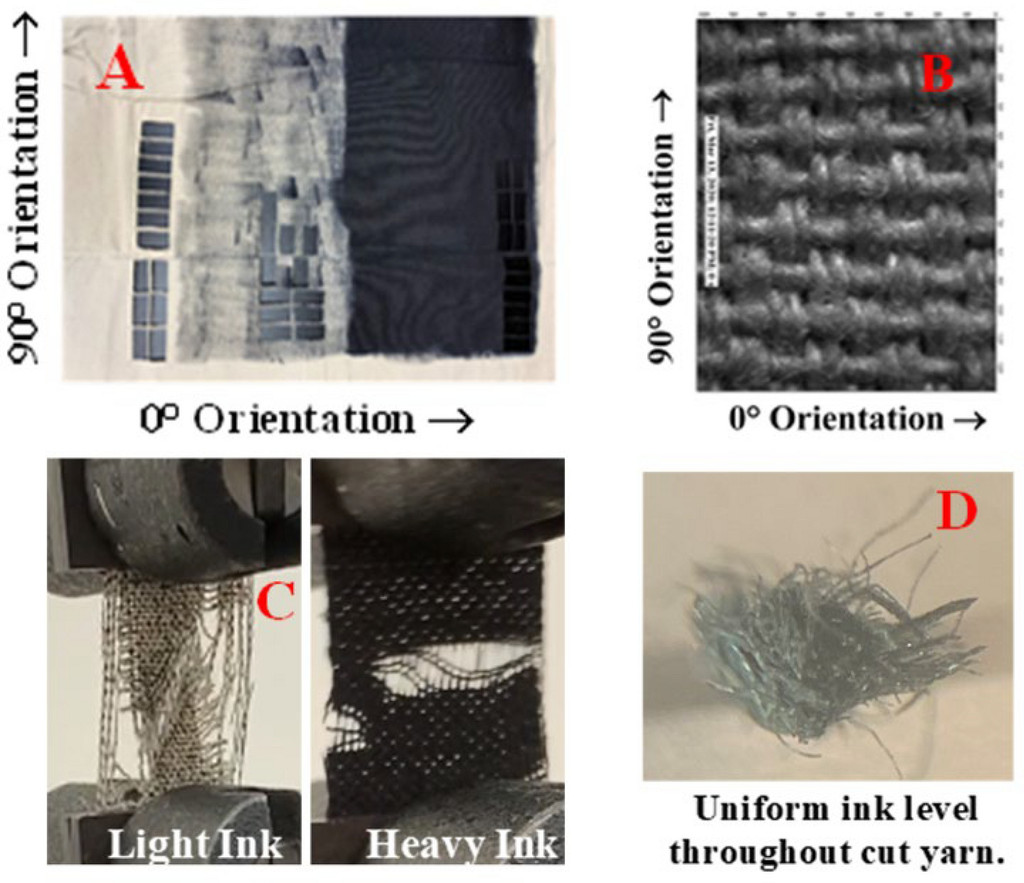
Experimental cotton-duck canvas and inked fibres in the 2022 conservation study, Figure 2. These are test materials used to investigate ink behaviour, not a photograph of Rothko’s original painted surface.
Scott T. Wills, Bronwyn A. Ormsby, Melinda H. Keefe and Robert L. Sammler, 2022, Figure 2, DOI: 10.1186/s40494-022-00770-x. Resized without cropping. [46]
This history belongs to the exact 1958 object. Another painting with the same short title cannot inherit its treatment record. The Black on Maroon guide provides the object identity, while the published study supplies a specialist account of the intervention.
Surfaces, supports and viewing
The classic Rothko format is easy to reduce to a diagram of rectangles. Material evidence makes that reduction untenable. National Gallery conservators studying paintings on paper found taped edges, staple holes, brushwork that travelled beyond a sheet's final boundaries and layers whose colour and gloss vary within a single field.[13] One late work began with black and red acrylic washes, gained yellow, orange and red layers, and then received two black rectangular forms; the order is documented for that particular object, not a universal recipe for every painting. The Gallery also records broad brushes and traces of the artist's movements. A field that seems calm from across a room may reveal rapid or uneven handling up close.
Support changes the encounter as much as paint does. Rothko made paintings on canvas and more than a thousand paintings on paper.[13] In the 1940s he sometimes mounted watercolours with minimal framing, and by the late 1940s he wanted some classic-format paper paintings shown without glazing, mounted on supports. A sheet later attached to canvas is still a work on paper in its original making. It should not be silently recatalogued as an oil canvas because the final presentation resembles one. This is why the medium lines on the individual pages matter, especially for the late brown-and-gray paper works and Untitled (Red on Red).
Edges are particularly revealing. The Gallery documents a Brown and Gray experiment in which Rothko left masking tape over the outer limits of a painted composition; subsequent works in the series used a hard border of bare white paper.[13] That is a different visual problem from a soft rectangle breathing into a coloured ground. Neither should be folded into a single formula called “Rothko technique.” His mature work retains repeated formats, but the evidence of support, border, layering and mounting shows continuing change within them.
For looking, start at a distance that allows the whole format to register, then move closer to compare the ground and the edges of each field. Notice where colour appears to continue through a border, where the surface becomes more opaque, and where the apparent geometry loosens. Return to the original viewing distance before drawing a conclusion about scale or mood. These are observations to test against the actual work or a collection's detailed record, not inferences that a compressed screen image can settle. The directory below leads to individual guides and collection records.
The 1960s and late work
SFMOMA's No. 14, 1960 sets orange and blue in a monumental format. Orange, Red, Yellow was painted in 1961 and later appeared at auction with a precise Anfam citation. Rothko also continued working on paper, and the NGA's late Untitled (brown and gray) is acrylic on paper, while MOCA's similarly named Untitled (Black and Gray) is a 1970 acrylic canvas.[11][12] Sotheby's Untitled (Red on Red) is oil on paper mounted on canvas: a reminder that even a canvas mount does not erase the paper support.
Black as a field of attention
Harry Cooper’s essay for the National Gallery’s 2010 In the Tower exhibition reassesses the black paintings of 1964. He follows changes in sheen, the visibility of violet at an edge, and the different effects produced as the viewer moves. He also places those paintings beside earlier works in which black had a substantial role.[32] The exhibition’s checklist distinguishes oil, acrylic and other mixed media across the selected canvases.
Cooper connects the 1964 group to the Chapel commission while challenging a direct equation between darkness and despair.[32] His account gives the late palette an artistic context before it becomes a biographical symbol. A viewer can attend to black as a visible material that reflects light, changes with angle and interacts with another dark passage.
The distinction is especially useful beside a late brown-and-gray work. A sharp division between two areas, a white outer border and a black field whose gloss shifts are different pictorial situations. Grouping them as “dark late Rothkos” loses what each asks the viewer to notice. Their dates, supports and structures provide a firmer basis for comparison.
The inventory and the public life of works on paper
Adam Greenhalgh and Christopher Rothko’s 2024 conversation describes the late inventory of 1968–69 as an important distinction between public and private works. Works assigned numbers entered the public category; many more private objects remained unnumbered. The authors acknowledge that some cases fall between the categories. Greenhalgh also explains that gaps in the inventoried paper sequence do not establish that Rothko stopped working on paper during those intervals.[33]
This distinction changes how a list of works should be read. A numbered corpus reflects acts of selection as well as production. An unnumbered study may illuminate decisions that a finished painting conceals. A finished paper work may have an independent public history. The drawings guide follows those differences in greater detail, including the separate works-on-paper catalogue project.
What later exhibitions reveal about the sequence
The 2026 Palazzo Strozzi retrospective in Florence describes Rothko's development through handling as well as iconography. Its curators note quick marks, abrasions and rubbing in mythic works, followed by irregular, saturated colour masses around 1946–47. By 1948–49, they argue, the compositions were becoming more ordered and reduced, with No. 3/No. 13 among the early examples of the classic format.[14] This is a curator's synthesis across works, not a technical finding about every canvas. It makes the transition worth looking at closely: colour did not simply replace a depicted figure one day. Forms that had suggested bodies gradually lost their fixed outline and took on a different role as relations among areas of colour.
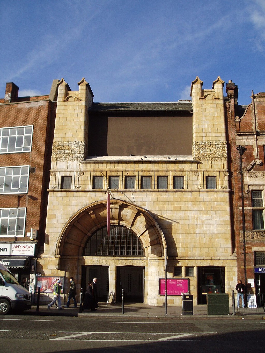
Whitechapel Gallery’s historic facade in 2005. Its 1961 Rothko exhibition forms part of the artist’s lifetime international exhibition history.
Photograph: Steve Cadman. Photograph remains CC BY-SA 2.0. Resized without cropping. [47]
MoMA's 1961 retrospective press release provides a different kind of evidence. Its curator Peter Selz selected early watercolours, fifteen canvases from 1947–49, a substantial group of 1950s works and eleven Seagram mural canvases shown for the first time.[15] That selection shows how a major museum publicly explained Rothko's changes while he was alive. The exhibition was not an exhaustive catalogue. It is nevertheless valuable for tracing contemporary reception: the mature paintings were presented alongside the earlier work that made their differences legible.
The same checklist documents Orange and Yellow (1956) with the Albright Art Gallery credit, five years after it was painted.[15] The present-day Buffalo AKG record governs its current title, accession and credit.[9] Reading the two records together distinguishes exhibition history from an object's identity today. It also prevents the misleading impression that a museum's current online description is the first or only context in which viewers encountered a canvas.
The commission histories require a similar distinction. MoMA showed eleven Seagram works in 1961 after Rothko refused the restaurant site; the Fondation Louis Vuitton displayed the nine paintings he gave to Tate in 1969 in its 2023–24 retrospective.[15][16] These are different historical selections from a larger production, not competing counts for one definitive mural installation. The Chapel's fourteen designated paintings are a third case: a permanent ensemble in a purpose-built space, though its East Triptych is currently away for conservation.[17] A directory of individual canvases needs to send readers to the series histories where object-by-object data alone cannot explain the role of a room.
The French and Italian exhibitions also sharpen the late chronology. The Fondation Louis Vuitton notes brighter canvases in 1967 and an unfinished final red painting, and cautions against reading Black and Gray solely through Rothko's death.[16] Palazzo Strozzi discusses Black and Grey canvases beside several groups of large late paper works, including some in blue, pink and terracotta ranges.[14] These are curatorial readings, while exact media remain matters for each object record. Together they show why a late work should be identified by support, paint and date before being placed in a psychological narrative.
Collections offer different encounters with the same career
The Madrid Thyssen-Bornemisza collection holds Untitled (Green on Maroon) of 1961, a mixed-media canvas measuring 258 × 229 centimetres. Paloma Alarcó’s account places its floating fields and dark palette within a discussion of emotion and the sublime.[35] That curatorial interpretation belongs beside the painting’s exact medium and dimensions: both contribute to the encounter, answering different questions.
The work also gives a useful point of comparison with the bright 1961 Orange, Red, Yellow. The shared year does not produce a shared palette. A chronological guide becomes more informative when it lets such simultaneous possibilities remain visible. It can ask how a large green field on maroon differs from warmer combinations without turning the year into one uniform mood.
Collections and exhibitions make further choices about context. A painting shown among other Rothkos offers relations of proportion and palette across the group. A painting shown near contemporaries brings differences of handling or format into view. A dedicated room changes the role of seating, intervals and sustained attention. The visitor experiences the object through a particular presentation, while the object’s broader history continues beyond it.
Catalogues, titles and the evidence for a painting
Anfam’s The Works on Canvas and the National Gallery’s works-on-paper project answer the need to identify objects across changing titles, collections and publications. A catalogue raisonné is especially useful where a common number or colour phrase has attached itself to more than one work. It allows the reader to locate one object within a larger sequence.
There are several kinds of number to distinguish. A museum accession identifies a work within its collection. An estate inventory number belongs to the artist’s or estate’s records. A catalogue number identifies an entry in a scholarly publication. These may all refer to the same object, but they cannot substitute for each other. A year included in a familiar title is also not an accession number.
For Orange, Red, Yellow, Christie’s literature list gives Anfam catalogue no. 693, page 550.[36] For White Center, Sotheby’s gives no. 444, page 337.[7] These are useful bibliographic pointers reported by the auction houses. The entry text needs to be consulted before attributing an interpretation or further detail to the book itself. The accessible 2007 White Center essay is separately authored by Anfam and can be read directly.[7]
Orientation raises another research question. In his 2006 review of Seeing Rothko, Anfam disputed a particular account of inverted canvases and proposed connections to symmetry and reflections in the artist’s mid-1940s imagery.[34] That is a debate within published criticism. It does not give permission to rotate every classic painting according to preference. Inscriptions, installation photographs and the object record remain essential to establishing an individual work’s display history.
A closer looking sequence
Start with the whole object and give its dimensions a physical meaning. A canvas nearly three metres high offers a different relationship to your body from a small mounted portrait. Then identify the principal intervals: between fields, around the perimeter and between the object and nearby works. Follow one boundary far enough to notice whether its character remains consistent.
Compare the ground with the forms it holds. At some points the ground may seem to continue behind a field; at others, it may appear as an active passage in its own right. Let your attention move between a small detail and the whole arrangement. If the painting is part of an ensemble, turn to another wall and then return. This tests the role of a neighbouring work in the impression you first formed.
Finally, distinguish what you saw from what the documentation tells you. A collection record can identify a support you could not see. A conservation study can establish a layer that is concealed. A letter may explain a choice of lighting. Your description becomes stronger when these kinds of evidence remain connected to the particular work. The individual guides below provide the next stage of that investigation.
Using the artwork directory
The directory below lists site guides to identified works. It does not purport to be Anfam's complete catalogue or the NGA's full works-on-paper register. A row gives a route, date and broad medium; the individual page should be used for exact measurements, owner, title variants and source citations. Current display status and auction ownership can change, so follow the linked museum or sale record for the latest information. The directory’s neutral cards identify subjects; contextual photographs show places connected with the works.
Rothko works in this guide
| Name | Date | Medium |
|---|---|---|
| Entrance to Subway | 1938 | Painting |
| Hierarchical Birds | 1944 | Painting |
| Slow Swirl at the Edge of the Sea | 1944 | Painting |
| No. 3/No. 13 | 1949 | Painting |
| Untitled (Violet, Black, Orange, Yellow on White and Red) | 1949 | Painting |
| White Center | 1950 | Painting |
| No. 10 | 1950 | Painting |
| No. 6 (Violet, Green and Red) | 1951 | Painting |
| Untitled | 1952 | Painting |
| No. 61 (Rust and Blue) | 1953 | Painting |
| No. 1 (Royal Red and Blue) | 1954 | Painting |
| Untitled (Yellow and Blue) | 1954 | Painting |
| Orange and Yellow | 1956 | Painting |
| Light Red over Black | 1957 | Painting |
| Four Darks in Red | 1958 | Painting |
| Black on Maroon | 1958 | Painting |
| No. 14 | 1960 | Painting |
| Orange, Red, Yellow | 1961 | Painting |
| Untitled (brown and gray) | 1969 | Painting |
| Untitled (Red on Red) | 1969 | Painting |
| Untitled (Black and Gray) | 1970 | Painting |
| Tentacles of Memory | 1945–46 | Drawing |
Frequently Asked Questions
No. His earlier paintings include portraits, city scenes and mythic creatures. The stacked colour fields emerged through his late-1940s experiments and became a mature format around 1950. Hierarchical Birds and Slow Swirl at the Edge of the Sea, both from 1944, show a different visual language.[1][3][4]
A number or the word Untitled does not identify a unique Rothko by itself. Titles recur, and some paintings also have colour subtitles. Date, dimensions and collection help distinguish them: MOCA’s No. 61 (Rust and Blue) and the route Number 61, for example, refer to the same 1953 canvas.[8]
No. His media and supports vary. The NGA’s 1969 Untitled (brown and gray) is acrylic on paper, while MOCA’s 1970 Untitled (Black and Gray) is acrylic on canvas. Painted paper may also be mounted on another support without becoming a reproduction.[11][12][13]
Begin with the whole arrangement, then follow an edge or the interval between two fields. Notice changes in density, proportion and surrounding ground as you move your attention across the work. A small reproduction conveys the layout but reduces the bodily scale and surface relationships that matter in a gallery encounter.[22][23][24]
No single emotional label explains every dark canvas. The Seagram project, the Chapel and the late Black and Gray works have different dates, settings and materials. Brighter paintings also continued into his final years, making a simple progression from light to despair inadequate.[1][10][12][16]
The browse grid links to 21 distinct paintings, from Entrance to Subway of 1938 to Untitled (Black and Gray) of 1970. The complete directory also includes the drawing Tentacles of Memory. Each artwork page follows the particular object’s colours, scale and history.
Discussion
Which documented work or source changed your understanding of Rothko’s paintings?
Reader Insights
Begin with a specific work, title and date.
Compare the object record with this career guide.
What still needs a catalogue or archive check?
Join the Conversation
Share an observation grounded in the work or its history.
References
- National Gallery of Art, “Mark Rothko,” artist chronology.
- NGA, Mark Rothko: Works on Paper project; David Anfam, Mark Rothko: The Works on Canvas (1998), bibliographic lead in the NGA artist record.
- NGA, Hierarchical Birds.
- MoMA, Slow Swirl at the Edge of the Sea.
- SFMOMA, Tentacles of Memory.
- Adolph & Esther Gottlieb Foundation, 1943 Jewell letters.
- Sotheby's, White Center lot record and 2007 David Anfam essay.
- MOCA, No. 61 (Rust and Blue).
- Buffalo AKG, Orange and Yellow.
- Rothko Chapel, institutional history.
- NGA, Untitled (brown and gray).
- MOCA, Untitled (Black and Gray).
- National Gallery of Art, “How Mark Rothko Made Paintings on Paper”, conservation-based discussion of supports, edges, mounting and layering.
- Fondazione Palazzo Strozzi, Rothko a Firenze, Italian press dossier (2026), room-by-room account, pp. 10–14.
- Museum of Modern Art, 18 January 1961 Rothko exhibition release and checklist.
- Fondation Louis Vuitton, Mark Rothko retrospective (2023–24), French curatorial account.
- Rothko Chapel, current conservation notice, on the East Triptych's absence.
- The Phillips Collection, “The Rothko Room”, collection, installation and 2006 relocation history.
- Jewish Museum, Untitled (Portrait of Edith Sachar), c. 1932, object, support and dimensions.
- Jewish Museum, Crucifix, 1941–42, object record and institutional subject tags.
- National Gallery of Australia, Multiform, 1948, American Masters collection essay, Michael Lloyd and Michael Desmond, adapted by Steven Tonkin and Jaklyn Babington; includes the history of the category name.
- Christopher Rothko, “Ceci n’est pas un frigo,” authorised excerpt from Mark Rothko: From the Inside Out (Yale University Press, 2015); excerpt consulted, not the entire book.
- Maïa Morgensztern, interview with Christopher Rothko, Dorotheum, 8 March 2019, discussion of form, sketches and scale.
- Peter Selz, Mark Rothko, MoMA exhibition catalogue (1961), especially pp. 12–14, contemporary interpretation of the mature paintings.
- Harvard Art Museums, Mark Rothko’s Harvard Murals, exhibition announcement, 20 May 2014, commission, exhibition and conservation research.
- Colleen Walsh, “A light touch for Rothko murals,” Harvard Gazette, 20 May 2014, historical photographs, reference panel and projected colour compensation.
- Katie Aberbach, “Up for debate,” Harvard Gazette, 27 March 2015, report on the museum’s March study events and different responses to the conservation.
- Colleen Walsh, “A wall of color, a window to the past,” Harvard Gazette, 17 September 2015, Narayan Khandekar’s account of Lithol red tests.
- Jens Stenger and colleagues, “The making of Mark Rothko’s Harvard Murals,” Studies in Conservation 61, no. 6 (2016), pp. 331–47, publication record and accessible abstract; full article not consulted.
- Jens Stenger and colleagues, “Conservation of a room: A treatment proposal for Mark Rothko’s Harvard Murals,” Studies in Conservation 61, no. 6 (2016), pp. 348–61, publication record and accessible abstract; full article not consulted.
- Scott T. Wills, Bronwyn A. Ormsby, Melinda H. Keefe and Robert L. Sammler, “Key characterization efforts to support the graffiti ink removal and care of Mark Rothko’s painting ‘Black on Maroon’ 1958,” Heritage Science 10, 143 (2022), open-access research article.
- Harry Cooper, “Rothko’s Black Paintings: Facts and Imaginings,” In the Tower: Mark Rothko, NGA exhibition brochure (2010), authored essay and checklist.
- Adam Greenhalgh, Christopher Rothko and David Ebony, “Mark Rothko’s Sublime Works on Paper,” Yale University Press, 19 March 2024, author interview on the late inventory and selection of paper works.
- David Anfam, review of Seeing Rothko, The Art Newspaper, 1 March 2006, directly consulted review, distinct from the 1998 catalogue raisonné.
- Museo Nacional Thyssen-Bornemisza, Untitled (Green on Maroon), 1961, collection record and Paloma Alarcó’s curatorial account, available in English and Spanish.
- Christie’s, Orange, Red, Yellow, 2012 lot record, literature list citing Anfam catalogue no. 693, p. 550; book entry not directly consulted.
- Michaela Milgrom, “Artists Who Inspired Mark Rothko,” National Gallery of Art, 13 October 2023, Rothko's sustained looking at Matisse's The Red Studio.
- Fondation Louis Vuitton, Matisse: The Red Studio exhibition dossier, 2024, identification of Le Luxe II within the 1911 studio painting.
- SMK, Henri Matisse, Le Luxe II, KMSr76, exact date, medium and open collection image; museum object data.
- Rembrandt, Self-Portrait, 1659. National Gallery of Art, Washington, Andrew W. Mellon Collection, 1937.1.72. Source · NGA Open Access / public domain.
- Henri Matisse, Le Luxe II. Henri Matisse, Le Luxe II; SMK – National Gallery of Denmark; KMSr76. Resized without cropping. Source · Public Domain Mark 1.0.
- Seagram Building, night view. Library of Congress, Prints & Photographs Division, Gottscho-Schleisner Collection; LC-G612-71723; LC-DIG-gsc-5a16908. Resized without cropping. Source · Public domain; heirs’ release.
- Laurentian Library vestibule entrance portal, plan and section, verso. The Metropolitan Museum of Art, Gift of Janos Scholz and Anne Bigelow Scholz, in memory of Flying Officer Walter Bigelow Rosen, RCAF, 1949; 49.92.32. Source · CC0 1.0.
- Duncan Phillips. Clara Sipprell; National Portrait Gallery, Smithsonian Institution; bequest of Phyllis Fenner; NPG.82.200. Resized without cropping. Source · CC0 1.0.
- Holyoke Center, Harvard Square, Cambridge, MA - IMG 4375.JPG. Photograph: Daderot. Resized without cropping. Source · Public-domain dedication.
- Conservation study Figure 2. Scott T. Wills, Bronwyn A. Ormsby, Melinda H. Keefe and Robert L. Sammler, 2022, Figure 2, DOI: 10.1186/s40494-022-00770-x. Resized without cropping. Source · CC BY 4.0.
- The Whitechapel Gallery 2005.jpg. Photograph: Steve Cadman. Photograph remains CC BY-SA 2.0. Resized without cropping. Source · CC BY-SA 2.0.