 by Tom Gurney
Tom Gurney BSc (Hons) is an art history expert with over 20 years experience
Published on October 11, 2026 / Updated on October 11, 2026
Email: tomgurney1@gmail.com / Phone: +44 7429 011000
No. 14, 1960: Introduction
Mark Rothko's No. 14, 1960 is a monumental oil painting in the collection of the San Francisco Museum of Modern Art. It measures 290.8 × 268.2 cm (114½ × 105⅝ inches): a height close to three metres and a width that gives its colour fields room to act as an environment rather than a small design. SFMOMA acquired it in 1997 through the Helen Crocker Russell Fund, and records it as accession 97.524.[1] The numerical title is part of the work's identification; it does not supply a subject or explain the painting's emotional effect.
At a Glance
- ArtistMark Rothko
- Date1960 [1]
- MediumOil on canvas [1]
- Dimensions290.8 × 268.2 cm [1]
- CollectionSFMOMA, 97.524 [1]
This work in Rothko’s career
Contents
- Orange, blue and a changing ground
- Why scale matters
- A painting from 1960
- The painting in SFMOMA's collection
- How to look at No. 14
Orange, blue and a changing ground
The painting sets a broad orange area above a darker blue rectangle. Both stand against a purple-toned ground. SFMOMA's audio description notes that the orange occupies about two thirds of the upper composition, while the lower shape is a deep cobalt blue.[1] The relationship is not a diagram of sky and land. Each area has a different density and extent, and the ground remains active around the coloured forms. The space between them draws attention to the edge of each field rather than functioning as an empty separator.
Colour names alone cannot reproduce an encounter with the painting. Orange may appear radiant beside blue, yet the darker lower rectangle alters the weight of the whole surface. The purple around them prevents the forms from becoming simple blocks on white. A viewer can follow the transitions where one field approaches another, or stand back and see how the two main areas hold the large canvas together. SFMOMA observes differences in paint application: some passages are heavier, while thinner paint near transitions makes the colours seem to emerge or recede.[1] Those material variations give the composition movement without a depicted scene.
Why scale matters
At almost nine feet square, No. 14 cannot be taken in like a small printed illustration. Its dimensions influence the distance from which it is seen, the amount of colour in a viewer's field of vision, and the time needed to compare a border with the centre of a coloured area. The work is still a canvas with edges, but those edges do not confine the visual experience to a compact image. Scale and surface work together: a thin passage looks different when a viewer approaches it, while the large relationship of orange to blue becomes clearer farther back.
SFMOMA's teaching resource asks viewers to consider how the painting's mood would change if its colours or scale changed.[2] That question is useful because it directs attention to the actual choices in this work. It should not imply that the painting delivers the same emotion to everyone. Rothko's mature works leave room for differing responses, and their apparent simplicity is part of what makes close attention rewarding. A first impression of two fields may give way to an account of multiple edges, tonal differences and changes in opacity.
A painting from 1960
Rothko developed his familiar arrangement of broad, softly bounded colour fields after a long period of figurative, mythic and transitional work. By 1960 he had made many paintings in this general format, but the format did not make them interchangeable. No. 14 offers a particular balance of a bright upper area, a dark lower area and a ground that remains visible between and around them. Comparing it with a 1950 work such as White Center shows how substantially Rothko could vary the proportions, temperature and pressure of these areas while keeping a recognisable compositional language.
The year also falls shortly after the Seagram commission. Rothko had produced a group of darker canvases for the Four Seasons restaurant in New York but withdrew from that project. No. 14 should not be called a Seagram mural on that basis. Its orange and blue relationship belongs to another, more open colour arrangement, and SFMOMA records it as an individual painting rather than as part of that commission. The nearby chronology helps situate the work; it does not supply a programme or hidden subject for it.
The painting in SFMOMA's collection
SFMOMA has repeatedly treated No. 14 as a major work in its Rothko holdings. A 2019 museum statement explained that its late-1990s purchase had been funded by an earlier deaccession and distinguished it from another 1960 Rothko that the museum later sold.[3] That distinction matters: Untitled (1960) and No. 14, 1960 are not the same canvas. SFMOMA's current object record gives the painting's title, medium, measurements and credit line. Display status can change; the collection record should be consulted for current viewing information rather than relying on older press material.
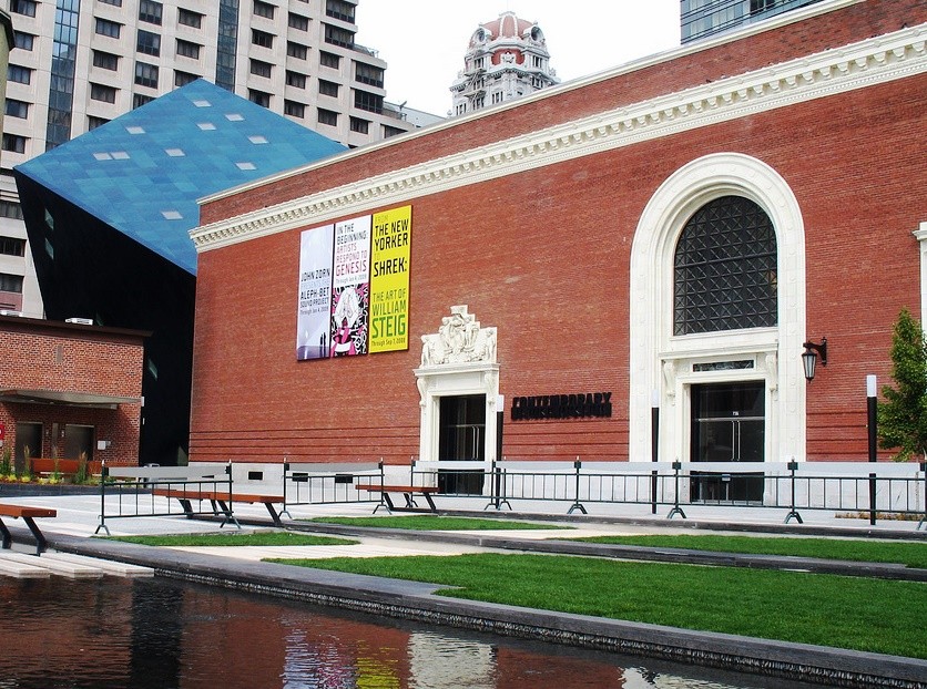
The Contemporary Jewish Museum in 2008. No. 14 was included in its 2013 collaboration with SFMOMA, Beyond Belief: 100 Years of the Spiritual in Modern Art.
Photograph: Allan Ferguson. Resized without cropping. [10]
The painting's institutional life can be followed through more than the acquisition. SFMOMA placed it with a 1947–48 Rothko work during a 2001 programme accompanying Thomas Crow's lecture on colour-field painting.[5] The pair offered a way to compare the earlier move toward abstraction with a mature canvas made more than a decade later; the programme notice establishes the juxtaposition, although Crow's full argument must be read or heard separately. The Fondation Louis Vuitton later used an image of No. 14 in its material for the 2023–24 Paris retrospective.[6] A work in a California museum could thus become a reference point in international narratives of Rothko, even when the visitor's present-day access to the original varies with collection display.
The painting also appeared in Beyond Belief: 100 Years of the Spiritual in Modern Art, the 2013 collaboration between SFMOMA and the Contemporary Jewish Museum.[7] The museum identified this very canvas in its press image and placed Rothko among artists examined through questions of spirituality and Jewish cultural thought. That is a curatorial interpretation of the work in a particular exhibition, not evidence that No. 14 depicts a religious subject. A very different international dialogue frames RM x SFMOMA: Between You and Me (3 October 2026–7 February 2027), whose bilingual English–Korean exhibition page includes No. 14 in its preview.[8] The show brings Korean art from RM’s collection into conversation with SFMOMA holdings. Together, the two presentations show how one painting can be given distinct contexts across institutions and languages while its basic identity remains fixed.
SFMOMA’s 2019 release called No. 14 permanently on view at that time, while its object page currently says it is not on view.[1][3] The 2026 exhibition preview identifies the canvas, but that preview alone is not a live gallery checklist.[8] These public pages can be updated on different schedules; visitors should check directly with the museum before making a trip specifically to see it. “Permanent collection” describes ownership, not a guarantee of continuous display.
The museum also supplied an audio description that gives readers a way into the work without assuming the image can be reproduced freely. SFMOMA identifies the artwork copyright as held by Kate Rothko Prizel and Christopher Rothko through the Artists Rights Society.[1] A reproduction in a museum record or shop is therefore no general licence to reuse the image.
How to look at No. 14
Begin with the overall balance: the high orange region and the lower blue one. Then notice that their colour is not uniform from edge to edge. Where a field meets the ground, paint density and surrounding tone change what the edge seems to do. Follow the ground around the forms and consider how much of the canvas is needed for the blue to carry its share of the composition. Finally, change viewing distance. A detail can disclose a passage of paint, while the wider view returns the relation among the fields.
The painting offers no single prescribed narrative. Its force depends on the interaction of dimensions, surface and attention. That combination helps explain why a work with so few named parts can sustain an extended encounter.
Related works
The paintings overview follows Rothko's changing formats. No. 10 (1950) offers an earlier mature comparison; Four Darks in Red shows a very different tonal range near the Seagram period. Each is a separate canvas with its own date and collection history.
Rothko works in this guide
| Name | Date | Medium |
|---|---|---|
| Entrance to Subway | 1938 | Painting |
| Hierarchical Birds | 1944 | Painting |
| Slow Swirl at the Edge of the Sea | 1944 | Painting |
| No. 3/No. 13 | 1949 | Painting |
| Untitled (Violet, Black, Orange, Yellow on White and Red) | 1949 | Painting |
| White Center | 1950 | Painting |
| No. 10 | 1950 | Painting |
| No. 6 (Violet, Green and Red) | 1951 | Painting |
| Untitled | 1952 | Painting |
| No. 61 (Rust and Blue) | 1953 | Painting |
| No. 1 (Royal Red and Blue) | 1954 | Painting |
| Untitled (Yellow and Blue) | 1954 | Painting |
| Orange and Yellow | 1956 | Painting |
| Light Red over Black | 1957 | Painting |
| Four Darks in Red | 1958 | Painting |
| Black on Maroon | 1958 | Painting |
| No. 14 | 1960 | Painting |
| Orange, Red, Yellow | 1961 | Painting |
| Untitled (brown and gray) | 1969 | Painting |
| Untitled (Red on Red) | 1969 | Painting |
| Untitled (Black and Gray) | 1970 | Painting |
| Tentacles of Memory | 1945–46 | Drawing |
Frequently Asked Questions
It is Rothko’s monumental oil canvas at SFMOMA, accession 97.524, measuring 290.8 × 268.2 cm. The museum acquired it in 1997 through the Helen Crocker Russell Fund. Its numerical title identifies the work without prescribing a depicted scene.[1]
The large fields establish an orange and blue relationship against a changing ground. SFMOMA’s description and viewing questions encourage attention to their scale and interaction. Their uneven boundaries remain part of the experience rather than turning the painting into a sharply ruled diagram.[1][2]
Its height is close to three metres and its width exceeds two and a half metres. At that scale, the colour fields occupy a substantial part of a viewer’s sight line. A small image records the arrangement while reducing the relationship between painting and body.[1]
No. SFMOMA’s 2019 statement distinguished the work being deaccessioned from its retained holdings. No. 14, 1960 remained one of those holdings. The similar prominence of different Rothkos in collection news should not obscure their separate titles and dates.[3]
Discussion
What changes when you look at No. 14, 1960 as a physical painting rather than a small reproduction?
Use the questions below to compare the work with its neighbours in Rothko’s career.
Reader Insights
Which edge or interval asks you to slow down?
How does this painting differ from the earlier and later works linked here?
What remains uncertain after reading the museum record and looking closely?
Join the Conversation
Share an observation grounded in the work or its documented history.
References
- SFMOMA, No. 14, 1960, accession 97.524, object record and audio-description transcript.
- SFMOMA, No. 14, 1960 discussion questions, May 2017.
- SFMOMA, 2019 collection and deaccession statement.
- David Anfam, Mark Rothko: The Works on Canvas—Catalogue Raisonné (National Gallery of Art and Yale University Press, 1998). Bibliographic reference only; the detailed entry is subscription restricted.
- SFMOMA, 2001 Wattis Lecture Series notice, on the pairing of No. 14 with a 1947–48 Rothko.
- Fondation Louis Vuitton, Mark Rothko retrospective, 2023–24, featuring No. 14 in its exhibition presentation.
- SFMOMA and Contemporary Jewish Museum, Beyond Belief press release, 2013.
- SFMOMA, RM x SFMOMA: Between You and Me, bilingual exhibition page, 2026–27.
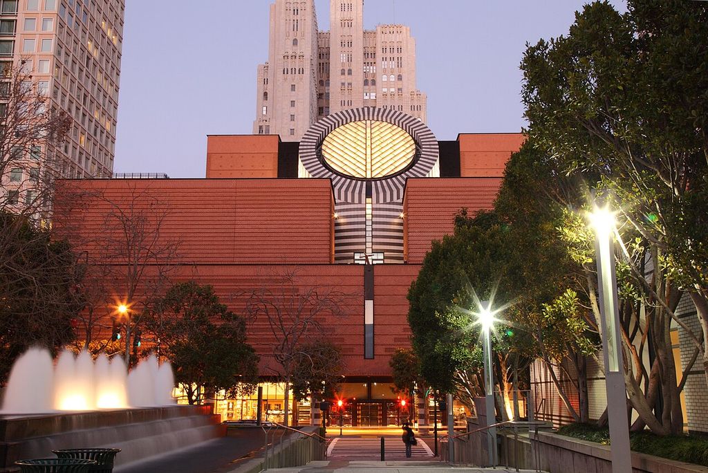
- SFMOMA’s exterior in 2011. The museum holds No. 14, 1960; this contextual photograph does not show the painting. Photograph: (User: Wgreaves ); source record; CC BY-SA 3.0. Resized to 1024px without cropping.
- Contemporary Jewish Museum.jpg. Photograph: Allan Ferguson. Resized without cropping. Source · CC BY 2.0.