 by
Tom Gurney
Tom Gurney BSc (Hons) is an art history expert with over 20 years experience
Email:
tomgurney1@gmail.com
/ Phone:
+44 7429 011000
Anthony van Dyck: Style and Technique: Introduction
A silver sleeve can look as substantial as the arm inside it, yet close inspection reveals a few loose strokes riding over darker paint. A ruff becomes crisp linen through ridges of white; a face seems alive through much smaller changes of colour and texture. Anthony van Dyck made these differences matter. His technique joined careful observation to selective description, giving particular weight to a face, a gesture or the turn of a body. Drawings, exposed grounds and discoveries beneath the paint help explain how he achieved that apparent ease. [1] [2]
At a Glance
- Principal medium Oil painting, usually on canvas, with important works and smaller designs on wood panels. [1]
- Preparation Coloured grounds, drawing with a brush and, in some examined works, a preliminary dry drawing material. [1]
- Paint handling Thin transparent passages, opaque modelling, lightly dragged paint and raised highlights used together. [1]
- Drawing Chalk, ink and oil studies served different purposes; surviving studies do not establish a single sequence for every portrait. [3] [4]
- Technical evidence Microscopy, analysis of small paint samples, X-radiography, infrared imaging and autoradiography reveal different aspects of individual pictures. [1] [5] [6]
- Essential caution Results from a small group of examined paintings cannot supply a recipe for the whole career or identify every hand involved. [1] [7]
Contents
- How Van Dyck directs the eye
- What canvas and panel contribute
- Drawing on paper and drawing in paint
- Faces, linen and the scale of a brushstroke
- How cloth acquires depth and sheen
- Blues and reds change their roles
- Oil and the temptation of a secret formula
- Revisions inside an apparently settled image
- What lies beneath Saint Rosalie
- The difference between original colour and present appearance
How Van Dyck directs the eye
In Lord John Stuart and his Brother, Lord Bernard Stuart , the brothers' clothes demand attention almost as insistently as their faces. Gold fabric gathers around John's bent arm. Bernard turns towards us inside an expanse of silver, with blue cloth below. The setting is comparatively quiet. A column, steps and a ledge establish the space, but they receive little of the elaboration concentrated in the costumes. Technical examination makes that difference tangible: the architecture is thinly and freely painted, while the draperies combine several kinds of modelling and surface application. [1]
This uneven distribution of attention is part of the picture's design. The setting gives the bodies somewhere to stand; the more elaborate surfaces distinguish those bodies from their surroundings. Bernard's turning pose makes the reflective sleeve unusually prominent. The painter can therefore suggest the sitter's physical presence and the magnificence of his dress through the same large shape. Looking moves between flesh and fabric, following their shared role in presenting the sitter.
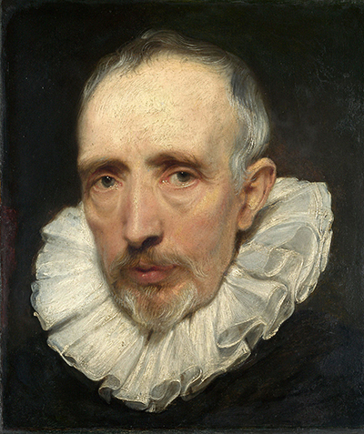
The much smaller Portrait of Cornelis van der Geest , painted about 1620, offers another arrangement of attention. The close framing keeps the face and ruff together. Wisps of hair meet the dark background; the edge of a lower eyelid projects through thicker paint; tiny light touches make the eyes appear moist. Differences in paint texture help distinguish the soft beard, taut skin and folded linen. [2] The compelling effect depends on knowing where a mark will carry the most information.
Van Dyck developed these resources through contact with Rubens and sustained attention to Italian painting, especially the Venetians. His engagement with Titian helps explain his interest in colour, fabric and the expressive possibilities of a visible brushstroke. [1] [3] Yet a simple progression from an energetic Flemish manner to an elegant Italian one misses the choices already present in early works. The purple satin in Portrait of a Woman and Child is an elaborate construction of colour and layers. Conversely, a later court portrait may leave extensive areas lightly worked. [1]
His technique also extended beyond portraiture. In Charity , smooth flesh is set against more vigorously brushed cloth; in Saint Rosalie Interceding for the Plague-stricken of Palermo , changes beneath the surface reveal the construction of a religious composition. [1] [6] These pictures make the question of style more interesting than a list of recurring poses. They show how a painter adapted the same broad resources to different kinds of encounter: a likeness, an allegory, a scene of intercession.
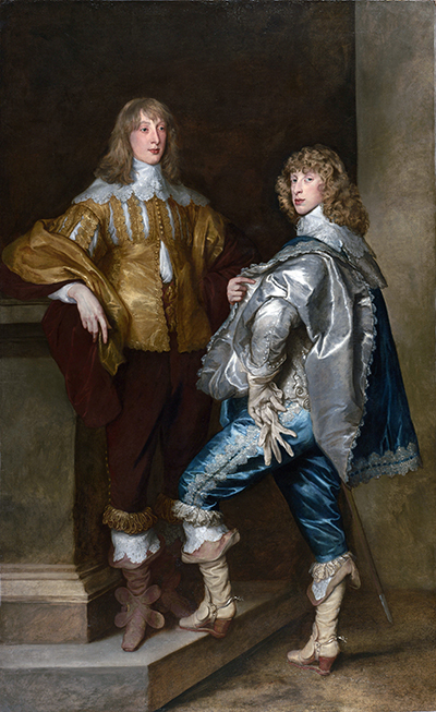
Anthony van Dyck, Lord John Stuart and his Brother, Lord Bernard Stuart, about 1638, oil on canvas, 237.5 × 146.1 cm. National Gallery, London, NG6518. John stands on the left; Bernard stands on the right.
What canvas and panel contribute
The support is the material carrying the painting. Van Dyck most often used canvas, which suited large portraits and ambitious narrative pictures. Wood remained useful for smaller designs and could also provide a substantial finished picture. The National Gallery's Charity , painted about 1627–28, is on a large oak panel assembled from five vertical planks. Its carefully smoothed flesh differs from the more openly textured surfaces possible on canvas. [1]
A smooth panel permits very fine control, and Van Dyck could combine that precision with more open handling. In Charity , radiography records the early application of flesh paint through a stippling action. Van Dyck then brushed and blended the paint until much of that texture disappeared. Long, more substantial strokes remain in the white drapery. The support accommodates both effects within one picture. [1]
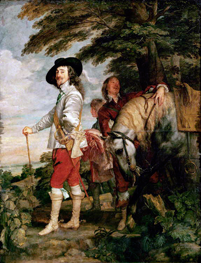
The monumental Equestrian Portrait of Charles I in the National Gallery, painted about 1638, presents a different practical problem. It measures approximately 3.68 by 2.93 metres. Its support consists of two pieces of twill canvas with a dark ticking pattern, joined horizontally near the middle. [5] A seam in such a work is part of its original construction. Its presence cannot by itself indicate that the picture was enlarged later.
Above the support lies the ground: a prepared layer separating the paint from the fabric or wood and establishing the surface on which the artist works. A coloured ground can also contribute to the visible image. When the upper paint is thin or broken, that underlying colour shows through, joining separate strokes and supplying an intermediate tone. Painting over it involves decisions about what to cover, what to veil and what to leave exposed. [1]
The surveyed National Gallery pictures do not share one ground formula. Charity has a chalk preparation bound in glue beneath a thin greyish-brown priming. The Stuart brothers' canvas carries a light biscuit-coloured ground, largely lead white with a little brown earth. Charles I's equestrian portrait has two preparatory layers: a reddish-brown lower ground followed by a thicker light grey layer. Marks in its radiograph suggest that the upper preparation was applied with a broad spatula. [1] [5]
These differences affect how one reads the finished paintings. The pale ground visible through the Stuart portrait's sketchy architecture helps hold the setting together without dense paint throughout. In Charity , by contrast, the underlying preparation is largely concealed, while the painter develops contrasts through the paint itself. [1] Materials supplied a starting condition, and Van Dyck used that condition differently from work to work. Ground composition can suggest connections with local practice and supply, but it does not provide a geographical fingerprint independent of other evidence.
Drawing on paper and drawing in paint
A preparatory drawing need not contain everything the finished portrait will show. It might test the inclination of a body, the relationship of hands to a chair, or the arrangement of a cloak. Such selectivity makes sense when the painter can study the sitter's features directly in oil. The surviving material discussed by Stijn Alsteens shows several kinds of preparation, including drawings, head studies and designs for complex group portraits. Their relationships have to be established individually. [3]
The seated study of Cesare Alessandro Scaglia , about 1634, uses black chalk heightened with white on brown paper. The paper supplies a middle tone between the dark marks and the lights. Its exposed colour helps describe the figure alongside the chalk marks. Scaglia sits with a document in his hand; the drawing may preserve a seated plan abandoned in favour of a standing portrait. [4] Its value as preparation survives that change. A tested pose can matter to a painter even when it is not the pose eventually selected.
Oil studies answer a somewhat different need. For the Brussels group portrait associated with Justice Flanked by Seven Magistrates , surviving head studies concentrate on individual faces, while a small panel establishes the collective arrangement. The large finished painting was destroyed, but the studies preserve complementary parts of its preparation. Alsteens suggests that the scale and number of sitters may explain why these separate oil likenesses were useful. [3] They allowed the problem of each face to be addressed apart from the problem of the whole.
The canvas or panel could itself become a place for drawing. In Charity , infrared examination detected traces of a dry, dark drawing material around principal forms. Van Dyck reinforced and developed the design with fluid reddish-brown paint, establishing the bodies, draperies and their overlaps. Some brush lines remain visible where adjoining painted forms do not meet completely. [1] A drawing beneath a painting need not resemble a finished sheet. Its lines are working decisions embedded in a larger process.
One consequence is the use of reserves: areas left for forms to be painted subsequently. In Charity , Van Dyck allowed for the children's heads and limbs while painting surrounding areas. The contrast is especially clear in radiography because the lead-white-rich drapery registers differently from a thinly painted arm crossing it. [1] The arm was anticipated in the organisation of the layers; it did not have to be painted across a fully completed stretch of cloth.
Other pictures show different sequences. Recent examination of the equestrian Charles I found that some leaves and parts of the attendant were painted over an existing brown layer. The investigators also could not establish with certainty how the design was transferred to the enormous canvas, or identify the original sketching material. [5] What is clear in one work can remain unresolved in another. The surviving drawings are especially rewarding when read alongside these different possibilities for designing directly in paint.
Faces, linen and the scale of a brushstroke
Cornelis van der Geest's ruff makes an unusually good introduction to impasto: paint applied thickly enough to stand above the surrounding surface. The folds are represented by colour and shading, but the edges also acquire a physical relief. Actual light falls on those raised marks as we look at the portrait. The illusion of stiff linen is therefore assisted by the material presence of the paint. [2]
The National Gallery draws attention to the raised lower eyelids, the delicate white flecks in the eyes and the much longer, finer marks of the beard and hair. [2] A useful way to examine the portrait is to follow the transition from cheek to beard and then from beard to ruff. Each boundary asks for a different kind of information. Gradual tonal changes model the cheek; slender strokes suggest hairs; more abrupt pale edges articulate linen.
The result can appear highly finished without requiring every feature to be described in equal detail. A light touch in an eye has disproportionate visual force because it sits inside a carefully related system of darker shapes and flesh tones. Enlarging a reproduction helps reveal the marks, but returning to the scale of the whole portrait explains their economy. Their purpose is fulfilled when they combine into a convincing head.
Charity offers a complementary lesson. Its smoothly blended flesh can conceal the variety of actions that produced it. The radiographic evidence of stippling beneath the finished surface shows that an apparently seamless passage may have begun in a more visibly marked form. [1] Equally, visible brushwork is not automatically evidence that a passage was painted in one effortless burst. A painter can add a decisive final stroke after substantial preparation.
In Portrait of a Woman and Child , the flesh tones are based chiefly on lead white, lightly tinted with vermilion and modified with earth colours in shadow. Roy identified azurite lightly scumbled over the child's pink cheek to introduce a cooler tone. [1] This is a small material adjustment with a perceptual effect: the face gains a variation that a single uniform flesh mixture could not provide. The finding brings us very close to the painter's adjustment of this particular face.
Watch: Van Dyck’s art and working methods
Choose a museum introduction, a specialist lecture or a conservation film to continue exploring Van Dyck’s work.
Van Dyck, The Anatomy of Portraiture
The Frick curators introduce Van Dyck’s portraits, drawings and prints.
Watch on YouTubeHow cloth acquires depth and sheen
The child's purple satin in Portrait of a Woman and Child looks like a colour that might have come ready-made from the palette. Analysis revealed a more surprising construction. Van Dyck combined lead white, red lake and charcoal black in varying proportions, with reflective lead-white underpaint beneath the lighter and middle tones. [1] The purple emerges from the behaviour of those materials together. A tube labelled with the name of the apparent colour would explain very little about it.
A lake pigment is made by associating a dye with a solid material that allows it to function as a pigment. Red lakes were especially valuable for transparent colour. A glaze is a relatively transparent paint layer through which underlying paint remains effective. Light passing through and returning from below can give a glazed passage a depth different from an opaque mixture of similar colour. [1]
Van Dyck combines those effects in the portrait's crimson curtain. Roy found a sequence of layers involving vermilion, red lake and other pigments, with black contributing to the deepest shadows. Orange-red vermilion is prominent underneath; lake-rich upper paint deepens the colour; opaque red accents articulate particular edges. [1] The curtain contains changes of colour, transparency and thickness. Together they distinguish the light catching a fold from the recess beside it.
Scumbling works differently. A thin, relatively opaque paint is spread or dragged over a lower layer, allowing that layer to remain perceptible through or between the upper marks. In the Stuart brothers' portrait, Bernard's blue satin was modelled with indigo, including mixtures with white, before azurite and combinations of azurite with indigo were scumbled over it. [1] The changing relationship of the layers helps give the fabric its sheen. The painted light does not have to behave like a uniformly coloured coating.
John's gold costume has another structure. Its brightest accents use lead-tin yellow; warmer passages combine ochre, white and red earth; the deeper brownish shadows contain earth colours including Cassel earth. [1] Looking at the bent sleeve, one can see why the separation matters. Light strikes outward-facing folds while the cloth bunches into dark hollows. Small bright accents gain their brilliance through their relationship with those hollows.
The two costumes share the space of a double portrait while answering different optical problems. Blue satin, pale reflective cloth and golden material do not all catch light in the same way. Van Dyck changes his handling accordingly. The surrounding steps and architecture, painted with far less elaboration, strengthen the contrast. [1] Material analysis becomes most useful here when it returns us to the act of looking: which passages absorb attention, which seem to reflect light, and how does the painter make those effects cooperate with the pose?
Blues and reds change their roles
Colour names can disguise differences in materials. Van Dyck had several blues available, among them ultramarine, azurite, smalt and indigo. He used them in mixtures and in successive layers. The important question is often how a particular blue works with its underpaint, neighbouring colours and intended degree of transparency. [1]
In The Abbot Scaglia adoring the Virgin and Child , the Virgin's blue drapery has indigo-based modelling beneath final ultramarine glazes. The sky also contains ultramarine mixed with white. In Charity , indigo under the ultramarine contributes to a deeper, greener blue, and indigo alone supplies some shadow passages. [1] The same prestigious mineral pigment could therefore be adjusted to different ends. Its presence does not mean that the painter always sought the brightest blue possible.
The equestrian Charles I contains a further distinction. Its sky was built with ultramarine over an underpaint containing smalt, while indigo appears in the saddle's blue details. Recent examination identified different red lakes in the attendant's tunic and the saddle: cochineal predominates in the former, while brazilwood is the principal dye source in the latter. [5] These differences matter both to the original appearance and to what has survived.
Van Dyck also obtained effects by mixing colours that a viewer might not expect to find together. Black can cool a mixture as well as darken it, as the child's purple dress demonstrates. A white-containing underlayer can reflect light through colour above it; brown earth beneath a red passage can establish a useful middle tone. [1] [5] The effect belongs to the arrangement of the paint as much as to the list of ingredients.
The arrangement of those colours depends on decisions about light, edges and volume. A bright accent can sharpen a fold or carry the eye towards a hand; a soft transition can let one form recede behind another. Analysis clarifies the materials through which these pictorial decisions became visible.
Oil and the temptation of a secret formula
Pigments need a binding medium to hold them together and attach them to the painted surface. Raymond White's study of twelve National Gallery works identified linseed oil widely, with walnut oil occurring in several pictures and particular passages. The study also found variations in the extent to which the oils had been heat-bodied, or altered by heating before use. [7]
The differences can occur inside one painting. In the Stuart brothers' portrait, sampled paint from John's yellow costume contained walnut oil, while several other sampled passages contained linseed oil. Birch-derived pitch was identified in certain dark or yellow-brown passages, including some using different oils. [1] [7] Such results make an account based on one unchanging medium implausible. They also show why the words “oil painting” cover a range of working properties.
White found evidence for pine products in some glaze-like paints, and his table distinguishes samples carefully. That care matters in the Cornelis portrait. The white impasto of the original ruff was identified as bound in heat-bodied linseed oil. A separate pine-resin result came from the later added surround. [7] Moving that result from the surround to the ruff would change the meaning of the analysis entirely.
Interpretation can become more cautious as examination advances. The recent Charles I entry notes that pine resin detected in certain samples might represent an original ingredient or contamination from later varnish. Other new samples from the attendant's tunic and the horse's tail contained heat-bodied linseed oil without detectable organic brown pigments. [5] A result has to be read with its sampling location, the layers included and the limits of identification.
White also tested a practice recorded by the seventeenth-century physician Théodore de Mayerne: the use of an aqueous medium for blue and green paint followed by varnish. Examination of the sampled National Gallery passages did not provide evidence that this procedure had been used. [7] Historical testimony remains valuable, but an account of a discussion cannot establish what happened in every painting. These studies give a collection of specific findings, with qualified wider patterns, rather than access to a lost universal formula.
Revisions inside an apparently settled image
The equestrian Charles I looks composed around a stable central presence: the king sits above us, the horse occupies the foreground and the attendant approaches with a helmet. Beneath this arrangement are choices that continued during painting. The recent technical entry records as many as three positions for the horse's rear left leg. Van Dyck adjusted the canopy of trees, the horizon and the ground between the horse's legs. A large distant building, possibly a castle, was subsequently removed from the view. [5]
Each change affects a different scale of the image. The leg belongs to the mechanics and appearance of the horse's movement. The trees shape the space around the king. Altering a distant building changes the landscape against which he is seen. The technical evidence establishes the alterations, while their precise motivations remain open. It would be tempting to supply a political reason for removing the building, but the recovered form alone cannot tell us why it disappeared.
The same entry makes a useful distinction between an actual revision and an image that merely looks like one in infrared. A supposed change to Charles's collar may instead arise from the painter's modulation of light and shade. The investigators also caution that linear marks in an infrared image can be difficult to separate into preliminary drawing and later brushwork. [5] Images beneath the surface still require interpretation.
The Abbot Scaglia adoring the Virgin and Child provides a smaller, more concentrated example. Infrared examination shows that Scaglia's robe initially extended farther to the right and that the Child's foot was raised from an earlier position. [1] These adjustments tighten the relationships among adjoining bodies and cloth. Their modest scale makes them valuable evidence of design continuing through execution, even where no dramatic change of subject occurred.
The oil design Carlo and Ubaldo see Rinaldo conquered by Love for Armida , National Gallery NG877.2, offers a different kind of sequence. Its incised grid cuts through much of the painting but passes beneath the final raised white highlights. Squaring therefore belonged to the preparation of the design for reproduction, before the last touches were complete. [1] This small monochrome panel must be distinguished from Van Dyck's larger coloured paintings of Rinaldo and Armida . Its material history reflects its particular job as a model for an engraver.
What lies beneath Saint Rosalie
The Metropolitan Museum's Saint Rosalie Interceding for the Plague-stricken of Palermo offers an unusually revealing view of a composition taking shape. The museum's investigation, published in Art and Autoradiography , found an underlying painted sketch in umber. Van Dyck went on to develop the background around reserved figures, varying the brushwork for clouds, rays and landscape. [6]
The design changed during this process. The angel who crowns Rosalie with roses in the upper left was absent from the first recorded arrangement. Contours and portions of other figures were reconsidered as the painting developed. The investigators treated these alterations as evidence of an evolving conception, and as relevant to the relationship between the New York painting and other versions. [6] They did not have equivalent examinations of all the related paintings, so the evidence did not settle every question of priority.
The investigation also clarified a head beneath the religious scene. An X-radiograph had revealed an upside-down face, but autoradiography made it more legible. The authors identified it as a young self-portrait of Van Dyck, comparing its features with known likenesses. This earlier sketch used principally bone black; the design for Rosalie used mostly umber. [6]
Those materials explain the discovery. In neutron activation autoradiography, different elements in the paint produce different responses over time, allowing a sequence of images to distinguish features that overlap in other forms of examination. Here the contrast between the two sketching materials helped separate the portrait from the saint's composition. [6] Reading the resulting images required comparison with the visible surface, other forms of imaging and the behaviour of particular materials.
The hidden portrait establishes an earlier use of the support and offers a rare glimpse of direct painting beneath a finished religious work. Why he covered it remains unknown. The interest of the discovery lies in what can be demonstrated: one physical object preserves different moments of his work, and the materials make parts of those moments recoverable.
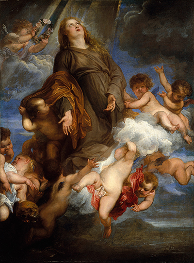
Anthony van Dyck, Saint Rosalie Interceding for the Plague-stricken of Palermo, 1624. Oil on canvas, 99.7 × 73.7 cm. The Metropolitan Museum of Art, New York, 71.41.
The difference between original colour and present appearance
A painting's surface records ageing and treatment alongside the artist's decisions. The recent Charles I examination describes fading in the yellow lake used in landscape greens and browns. Some greens have consequently become bluer, while certain dark passages now appear grey. Brazilwood lake and indigo in the saddle have also faded. The smalt beneath the sky's ultramarine has partially discoloured. [5]
These changes do not all work in the same direction. Some colours weaken; others alter in hue; changes in transparency can allow a lower layer to become more prominent. Consequently, the muted appearance of a passage cannot automatically be interpreted as a deliberate choice of subdued colour. Equally, a dark area need not once have been bright. The original mixtures, layer structures and better-preserved portions have to support a proposed reconstruction. [1] [5]
Treatment history matters too. Charles I's equestrian portrait was cleaned and restored in 2018–19 and relined in 2019. The current account describes the king and horse's coat as well preserved, while recording abrasion elsewhere, including loss of much of the final ultramarine in the upper sky. [5] An older description of the picture under discoloured varnish cannot stand unchanged as an account of its present condition.
Cornelis van der Geest's portrait has a different kind of altered appearance. X-rays show a simulated oval stone surround beneath the dark background. Later additions extended the wooden support and converted the small head into a larger bust-length portrait; these extensions are now covered by the frame. Part of the original ruff was also overpainted. [2] Later hands changed the object and its format, as well as its painted surface.
Close looking and scientific examination therefore work best together. Texture, pose and the placing of colour reveal how the image addresses us; examination explains more of the means and the changes those means have undergone. Neither a familiar pigment mixture nor an exposed underdrawing can establish that every passage is by Van Dyck himself. Attribution also requires comparison, judgement and attention to the history of the object, questions explored further in his workshop and influence . [1] [7] [3]
Artworks directory
A selected directory of paintings, drawings and prints, including works discussed in the articles and the Frick’s 2016 portraiture exhibition. It is not a complete catalogue of Van Dyck’s work. Print titles identify collaborators or later printmakers; disputed and workshop attributions are retained. The exhibition checklist supplies additional object records; current collection information governs the updated article entries. [8]
Frequently Asked Questions
He usually painted in oil, often on a coloured ground, combining brushed drawing, opaque modelling, transparent glazes, scumbles and raised highlights. Their balance varies between pictures and between passages in the same work. In the Stuart brothers' portrait, for example, the setting is thinly painted while the clothes receive more elaborate treatment. [1]
Most of his paintings are on canvas, but he also used panels. Charity is a substantial oak-panel painting, while the small monochrome Carlo and Ubaldo see Rinaldo conquered by Love for Armida is a panel design for engraving. The support should be checked for each individual object. [1]
Some surviving drawings explore pose, costume and hands, and some projects have separate oil head studies. Examination also reveals drawing directly on the prepared painting surface. These possibilities do not establish that every portrait passed through the same sequence of paper drawing, oil sketch and final canvas. [1] [3] [4]
He adjusted colour, opacity, thickness and the direction of his marks to distinguish highlights from recesses. In Bernard Stuart's blue satin, indigo-based modelling lies beneath azurite-containing scumbles. In John's golden clothes, bright lead-tin-yellow accents sit against warmer ochres and brown shadows. The arrangement of folds gives these material differences their pictorial purpose. [1]
The National Gallery's sampled works show extensive use of linseed oil and some walnut oil, sometimes with evidence of heat-bodying. Findings vary by painting and passage. The group examined is small beside Van Dyck's complete output, so it cannot establish an exclusive medium for his whole career. [7]
Tests can identify materials, distinguish layers, reveal alterations and help evaluate whether a work is consistent with its proposed date and history. They contribute to attribution, but materials shared by contemporaries and studio assistants cannot independently name the person who applied a particular stroke. [1] [7] [3]
Discussion
Look again at the images and ideas explored in Anthony van Dyck: Style and Technique. These editorial prompts invite your observations.
Reader Insights
In the Stuart brothers' portrait, how does the difference between the clothes and the lightly painted setting affect your sense of the figures' presence?
Does learning that Cornelis van der Geest's ruff is partly built from raised paint change the way you look at its folds and edges?
What does the hidden portrait beneath Saint Rosalie help us understand, and which questions about Van Dyck's decisions remain unanswered?
Join the Conversation
Share a detail, comparison or question about Anthony van Dyck: Style and Technique below.
References
- Ashok Roy , “The National Gallery Van Dycks: Technique and Development”, National Gallery Technical Bulletin , vol. 20, London: National Gallery Publications, 1999, pp. 50–83. Full article. English. View source .
- National Gallery , London, “Anthony van Dyck, Portrait of Cornelis van der Geest ”, about 1620, NG52; overview, in-depth account and object details. Collection entry. English. View source .
- Stijn Alsteens and Adam Eaker , Van Dyck: The Anatomy of Portraiture , with contributions by An Van Camp, Xavier F. Salomon and Bert Watteeuw, New York: The Frick Collection, in association with Yale University Press, 2016. The publisher's excerpt includes Alsteens, “A Portraitist's Progress”, pp. 1–5, and selected entries, including nos. 31–33, pp. 128–129 and 132–133, on the Brussels group-portrait studies. Publisher's excerpt. English. View source .
- The Frick Collection , “ Cesare Alessandro Scaglia, Seated ”, about 1634, exhibition object 25, Van Dyck: The Anatomy of Portraiture , 2016; drawing in the Frits Lugt Collection, Fondation Custodia, Paris. Exhibition entry. English. View source .
- Gregory Martin , Nina Cahill, Marta Melchiorre, Paul Ackroyd, Rachel Billinge and David Peggie, “NG1172, Equestrian Portrait of Charles I ”, 2024, online version 5, 8 May 2025, in Gregory Martin, Nina Cahill and Bart Cornelis, The Flemish Paintings , London: National Gallery. Technical notes compiled by Melchiorre and Ackroyd, with contributions by Billinge and Peggie. Catalogue entry. English. View source .
- Maryan Wynn Ainsworth , John Brealey, Egbert Haverkamp-Begemann and Pieter Meyers, “Paintings by Van Dyck, Vermeer, and Rembrandt Reconsidered Through Autoradiography”, in Art and Autoradiography: Insights into the Genesis of Paintings by Rembrandt, Van Dyck, and Vermeer , New York: The Metropolitan Museum of Art, 1982, especially pp. 12–18, “Anthony van Dyck: Saint Rosalie Interceding for the Plague-stricken of Palermo”. Museum publication. English. View source .
- Raymond White , “Van Dyck's Paint Medium”, National Gallery Technical Bulletin , vol. 20, London: National Gallery Publications, 1999, pp. 84–88. Full article. English. View source .
- The Frick Collection, Van Dyck: The Anatomy of Portraiture, online exhibition checklist (2016). View source.