


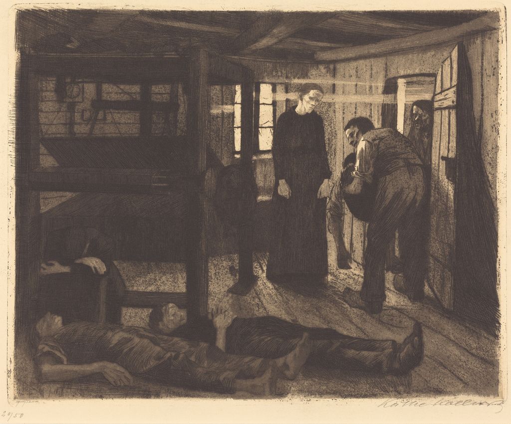
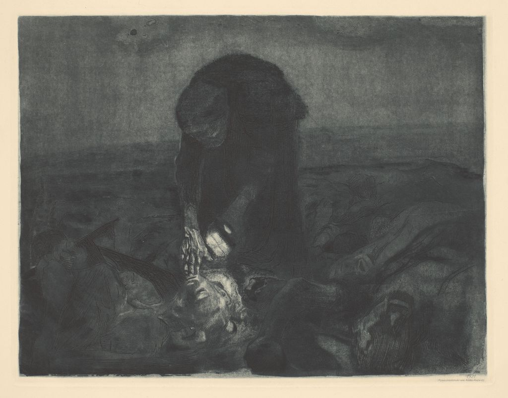
Käthe Kollwitz, The End, 1897. National Gallery of Art, 1943.3.5307. National Gallery of Art, Washington. Image source. Public domain. Resized and exported as JPEG.
 by Tom Gurney
Tom Gurney BSc (Hons) is an art history expert with over 20 years experience
Email: tomgurney1@gmail.com / Phone: +44 7429 011000
Käthe Kollwitz’s Prints: Introduction
In one impression of Käthe Kollwitz’s 1924 woodcut Self-Portrait, her right hand rests on her knee. In another, the knee and hand have disappeared. The prints share a title and a date, and both came from the same block. Between them, Kollwitz cut the block down to nearly half its former height, leaving the face and raised hand to carry the portrait. Seen together, the two impressions show a decision that either print alone would leave invisible. [1]
That comparison opens up a way of looking at Kollwitz’s work. A pale streak can come from scraping a lithographic stone. A grainy shadow can come from texture bitten into copper. A dark line can come from a pencil that touched the paper after printing. All three can be visible on a finished sheet, but they belong to different stages of the work. The trick is to look at the image, the paper and the catalogue entry together. [2]
At a Glance
- MatrixThe surface that carries the image for printing, such as a lithographic stone, a metal plate or a woodblock.
- ImpressionAn individual print pulled from a matrix. A working proof may preserve a trial before the artist settles on a design or printing arrangement.
- StateA stage in the life of a matrix. A cut, scraped passage or newly etched line can establish a new state. Pencil, chalk or ink applied after printing belongs to the individual sheet.
- EditionA group of impressions issued together. A portfolio can contain several prints, and the same portfolio can be issued in different editions.
- KnAlexandra von dem Knesebeck’s catalogue numbering for Kollwitz’s prints. A record may also give August Klipstein’s earlier number and state designation. [3]
Contents
- What can change between two impressions?
- Lithography in brown, orange and blue
- From lithography to etching in A Weavers’ Revolt
- How Kollwitz built texture in Sharpening the Scythe
- Paper, ink and gold in Woman with Dead Child
- Woodcuts, portfolios and editions
- How to read a Kollwitz print caption
What can change between two impressions?
The two 1924 self-portraits in Cologne show what a physical change to a block can do. The fourth state, Kn 203 IV, measures 400 × 300 mm. There is room for a three-quarter figure, with one hand raised beside the turned head and the other resting on the knee. In the later Kn 203 VI b, the width remains 300 mm while the height drops to 208 mm. The new lower edge brings the face and raised hand into much closer company. The earlier impression, one of only two known to the museum, preserves a height that the block could no longer print after Kollwitz shortened it. [1]
In woodcut, the raised areas of the block take ink. Where Kollwitz cut into the wood, she could leave the paper showing through. Her preparatory drawing for the portrait, NT 1001, uses opaque white and dark washes on dark green paper to try out the effect of light lines against a dark mass. She could test that relationship with a brush before committing it to the block. The drawing, the tall impression and the shorter one give three views of the decisions that went into the portrait. [1] [2]
Two impressions of Inspiration show how different sheets can be even when the state stays the same. Starr Figura’s 2024 retrospective at the Museum of Modern Art brought together preparatory drawings, working proofs and published prints. The checklist identifies two state-IV impressions of this rejected first design for sheet three of Peasants’ War. The Berlin Kupferstichkabinett impression and the Mayer family impression have the same recorded plate dimensions, 564 × 297 mm, but different sheet dimensions. The checklist records charcoal, white chalk and ink over the printed image on the Mayer sheet. On that sheet a dark passage might owe something to the ink transferred from the plate and something to the charcoal Kollwitz applied afterwards. The designation IV locates the plate in its history. The rest of the entry tells you which impression she worked over. [4] [5]
Selected works by Käthe Kollwitz
The Grieving Parents
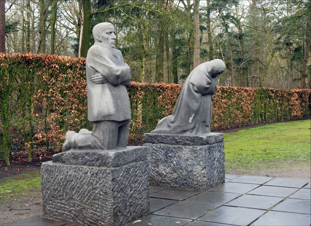
The Grieving Parents at Vladslo, the memorial’s location since 1956. Photograph by Bva, resized. Image source. CC BY-SA 3.0. Resized and exported as JPEG.
Mother with Her Dead Son
Look at Käthe Kollwitz’s small Pietà and learn how its later enlargement became the centre of the Neue Wache memorial in Berlin.
Memorial for Karl Liebknecht
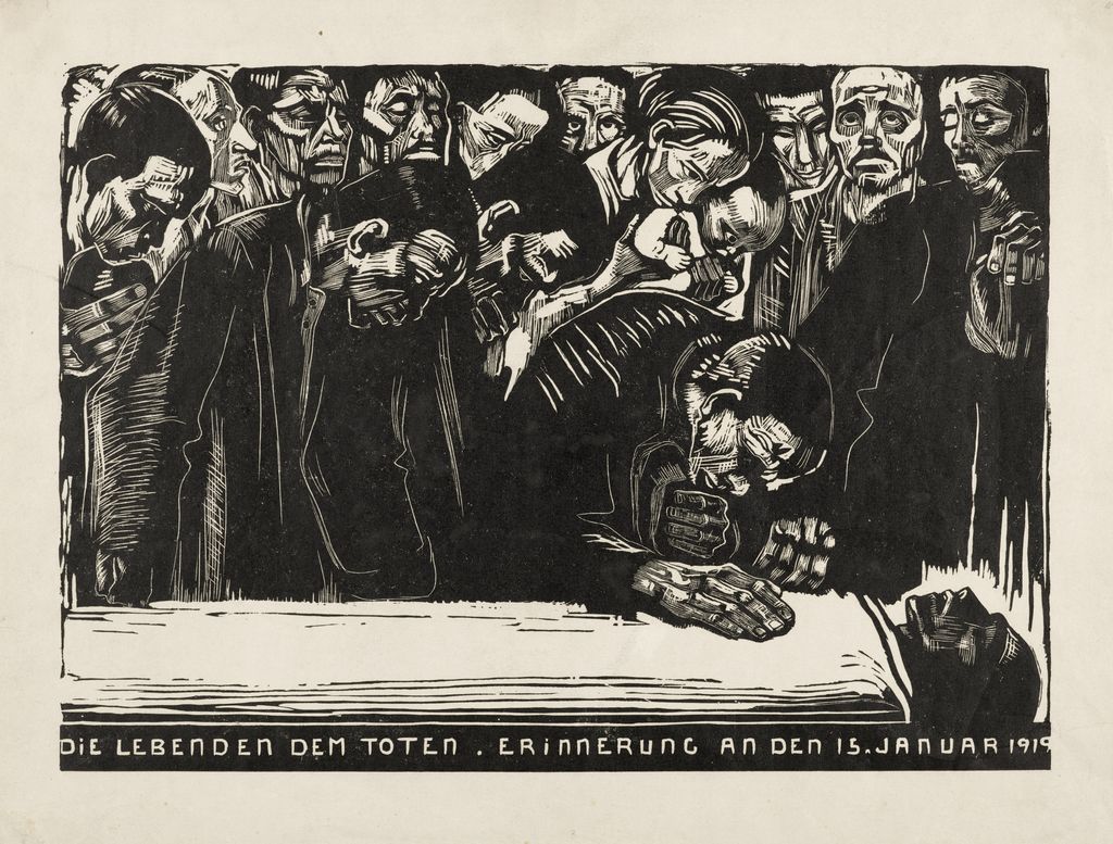
Memorial for Karl Liebknecht, 1920. Kunstsammlungen Chemnitz, 86-47, Kn 159 VI. Photo: Kunstsammlungen Chemnitz/PUNCTUM/Bertram Kober. Image source. Public domain. Resized and exported as JPEG.
The Mothers
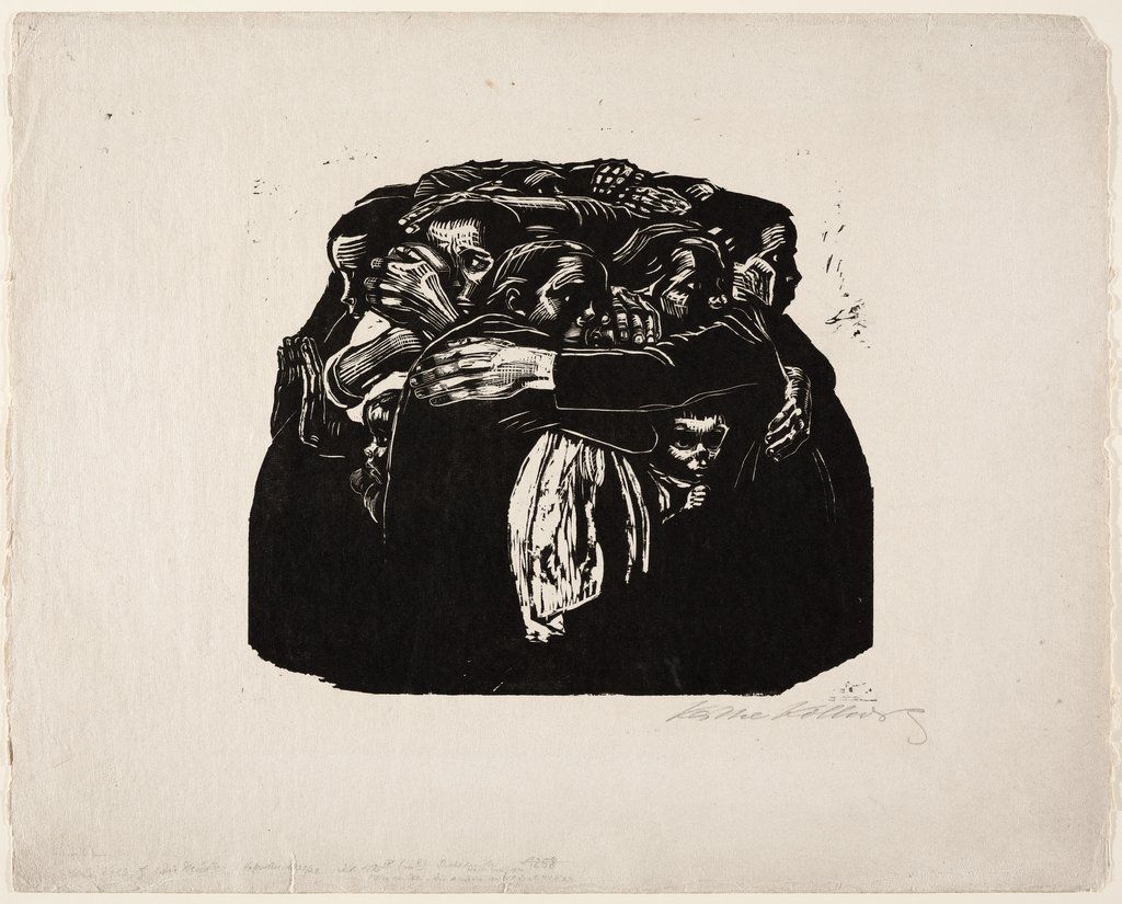
The Mothers, 1921–22. Städel Museum, Frankfurt am Main, SG 4289A D. Image source. Public domain. Resized and exported as JPEG.
Lithography in brown, orange and blue
In the 1901 Self-Portrait Looking Left, Kn 52 I, the face seems to emerge from the surrounding brown. Lithography prints from a flat surface. Greasy drawing marks accept oily ink, while the dampened areas around them repel it. Kollwitz drew with brush and pen and worked back into both the drawing stone and the stone that printed the brown tone. Cologne identifies the highlights on the face with scraping on the brown-printing stone. Look at where the cheek and brow begin to separate from the dark. Kollwitz could bring the face forward by interrupting the printed tone in quite small areas. [2] [6]
Woman with Orange, made the same year, puts colour to a different use. Cologne’s Kn 56 II 2, accession 70300/97001, combines aquatint, lift-ground etching and drypoint on copper with brush lithography from a stone inked in orange. The museum records a little charcoal reworking on the cream-coloured paper, which is laid onto a grey backing. Three surfaces matter here. The plate and stone supplied the printed image, and the paper received further work in charcoal. Cologne relates the narrow format, flat shapes and cropped tabletop to Pierre Bonnard’s The Chequered Blouse. After the print went on show at the Berlin Secession in November 1901, the journal Die Kunst für Alle debated the merits of combining printing processes. The conspicuous orange was part of an experiment that contemporary viewers could recognise and argue about. [7]
In Bust of a Working Woman with a Blue Shawl, the edges tell the story. In Cologne’s 1903 proof, Kn 75 A I 1, light brown extends unevenly above the drawing and the blue trails off at the sides. Kollwitz evened up the edges of both stones for publication and used a different blue. The Städel’s standard-edition impression, Kn 75 A III b, accession 64744 D, records blue printed over light brown from two stones on wove paper. The printed line below the image names the Viennese Society for Reproductive Art, which issued it in its 1906 annual portfolio. Cologne identifies it as the one colour lithograph from Kollwitz’s experiments of 1898–1904 that appeared in an edition. The corrections to the two stones and the choice of ink belong to the history of how that particular design reached a wider audience. [8] [9]
The published impression in Paris is INHA JAHRESMAPPE 10 (4). The loan catalogue records a 560 × 450 mm sheet and describes scraping on the blue-printing stone. The Städel’s impression is lettered Arbeiterfrau, a short title worth checking against an accession number. The INHA also reproduces a separately catalogued impression, EM KOLLWITZ 17, under Arbeiterfrau. Its Japanese paper is thin enough for the image to show through. Compare the front and back and the apparent reversal comes from turning the sheet over. The two views document one piece of paper, while the Cologne and Städel blue-shawl impressions document different stages in the making of a printed image. [9] [10] [11]
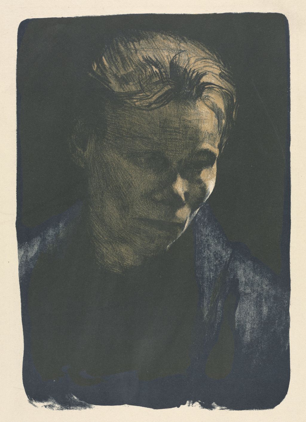
Käthe Kollwitz, Working Woman with Blue Shawl, 1903. Colour lithograph, Klipstein 68, state III/III. Cleveland Museum of Art, 1932.320. Image source. CC0 / Public domain. Resized and exported as JPEG.
From lithography to etching in A Weavers’ Revolt
Kollwitz initially intended to etch all six sheets of A Weavers’ Revolt. Technical difficulties led her to make the first three as lithographs. A surviving rejected Need at the Getty gives that change a physical form. The etched trial uses drypoint, aquatint, sandpaper and a burnisher, with black wash and white gouache added to the impression. The lithographic Need in the same collection uses crayon, pen and scraping and is printed in brown ink. The two objects show how much work could go into a plate before Kollwitz chose a different way to make the image. [12] [13]
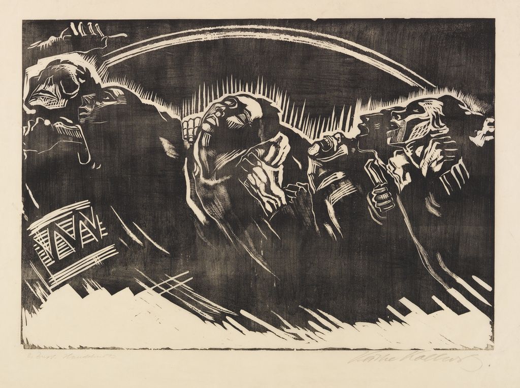
The three lithographs, Need, Death and Conspiracy, lead into two etchings of the weavers in public action, March of the Weavers and Storming the Gate. The last etching, End, takes the viewer indoors again. Lines give edges to bodies and furnishings while shadow spreads across the room. Aquatint allows a plate to carry such passages of tone by giving it a finely bitten texture that holds ink. A burnisher can smooth a worked area so it prints lighter. That range matters in the final sheet, where figures have to remain legible in a dark interior. [2] [12] [14]
The National Gallery of Art in Washington catalogues its 1897 The End (Ende), Rosenwald Collection accession 1943.3.5307, as aquatint, etching and emery stone pencil, Klipstein 37, state ii/v. Cologne’s End, accession 70300/84008, is Kn 38 II a and measures 247 × 307 mm in its caption. Cologne lists line etching, aquatint, sandpaper and burnisher. Both records identify the sixth sheet of the cycle. Their descriptions give different levels of technical detail, and the state designations make sense within their respective catalogues. Keep each caption beside the impression it describes when comparing where edges sharpen or shadows soften. [14] [15]
The archive in Dresden shows what it took to assemble a set. On 8 June 1898, Max Lehrs asked Kollwitz to reserve a set of especially good impressions for the 1899 Dresden exhibition. He explained the limits of the print room’s purchasing funds and raised the possibility of keeping the exhibition set for the collection. On 13 June, Kollwitz replied that she would have to arrange fresh impressions of the last plate because she had run out of good ones. She had expected to be able to send the cycle straight away. The exchange gives weight to the word impression. Lehrs could ask for the six familiar designs and still care which particular pulls he would put on the wall. The last plate had to go back to press before Kollwitz could supply the set she wanted to send. [16]
How Kollwitz built texture in Sharpening the Scythe
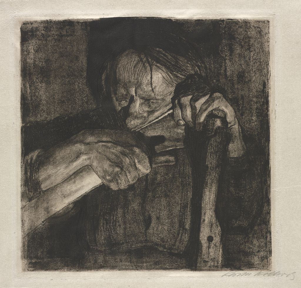
The square format of Sharpening the Scythe brings an older woman’s eyes, arm and blade into close quarters. Cologne’s Kn 88 X b, accession 70300/23007, records an image of 297 × 297 mm and lists several ways Kollwitz worked the metal. For line etching, a needle opens paths in an acid-resistant ground and acid bites the exposed metal. Drypoint cuts directly into the plate and can raise a burr that holds extra ink along the line. Aquatint supplies areas of tone. Sandpaper can introduce a grain that breaks up a surface which would otherwise print more evenly. These processes gave Kollwitz a range from incisive lines to dense, broken shadows. [2] [17]
The laid paper and Ziegler’s transfer paper in the medium description have another role. A textured material pressed against a soft etching ground can lift the ground where it makes contact. Acid bites the exposed pattern into the metal, and the plate can then print that texture in ink. The Getty’s ninth-state impression was pulled on copperplate paper even though the plate carried patterns made with other papers. A similar distinction applies to Woman with Scythe, the rejected second design for sheet three. Cologne’s Kn 87 I records a fabric imprint in the soft ground and brush and pen work in black ink on the impression. The Basel state-III sheet shown at MoMA also records a fabric imprint, with black ink, opaque white and pencil worked over that particular print. Each institution describes its own sheet. [5] [6] [17]
MoMA’s checklist follows the square plate through states I, IV and VII. The Boston state I is trimmed to the plate mark and worked over in graphite. The San Francisco state IV lists aquatint and sandpaper among the plate processes, along with pencil, charcoal and black and white chalk applied to the print. It also records work to the lower left corner, including a glued addition. The University of Connecticut state VII has pencil additions and is trimmed to or inside the plate mark. The checklist records a further impression from Basel with much more paper around the image. The square plate provides a point of comparison even when trimming, pasted paper and drawing make the sheets different objects to handle and view. [5]
Compare three impressions across the MoMA and Getty records. The graphite on Boston’s state I was applied to the paper. The Getty’s state VI was printed in black and retouched with charcoal and black chalk. For its state IX, the Getty identifies additional lines to the left of the figure’s chest as a feature of the state. Those lines can recur in impressions from that stage of the plate, while the charcoal on state VI belongs to the sheet that received it. The Getty dates its working impressions to 1905. In 1908 the Association of Historical Art and Emil Richter issued the complete cycle, with Sharpening the Scythe in third place. The dates record work on the plate and publication of the sequence. [5] [6] [17] [18]
Paper, ink and gold in Woman with Dead Child
The Simms collection at the Getty preserves two proofs of Woman with Dead Child alongside a related drawing, Nagel/Timm 241. In that drawing, Kollwitz used black chalk and graphite with white and orange chalk on green wove paper mounted on a second sheet. Part of the woman’s head is drawn on the mount itself. The drawing shows her continuing a form across the join between two papers. MoMA’s gallery labels describe another kind of transfer in the first state of the etching, where Kollwitz used soft ground to carry a drawing onto copper. From that pale beginning she developed a denser image through further work with line, drypoint and texture. [6] [19]
The Getty’s Kn 81 II and Kn 81 VIII a were both printed in black ink. The earlier impression is on copperplate paper. The later one is printed on greenish-grey chine collé, a thin paper attached to a heavier support, and the finding aid gives separate measurements for the print and mount. The state describes the development of the plate, while the greenish cast comes from the paper carrying the black ink. To see why the distinction matters, compare the Getty proof with MoMA’s own state-VIII impression, accession 181.2018. Both are on chine collé, and each has its own object history. MoMA identifies Otto Felsing as its printer and places its impression among the known proofs before the edition of 50 issued in 1918, fifteen years after the date of the image. [6] [20] [21]
The experimental impression shown by the Kunsthalle Bielefeld brings a different material into the comparison. It has a gold-coloured background, which the exhibition records as the product of work with a sprayed lithographic stone alongside the etched image. MoMA likewise describes a trial in which Kollwitz printed a gold background lithographically. Set Bielefeld’s example beside the Getty’s state VIII a and the term colour needs some precision. The Getty sheet carries black ink on greenish-grey paper. Bielefeld’s gold belongs to a further printing operation. The two objects show how differently the space surrounding the figures could be made, even when the etched design is immediately recognisable. [6] [19] [22]
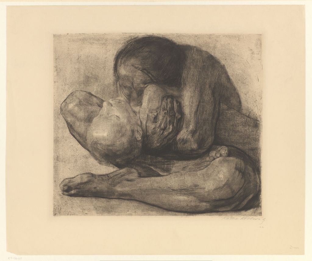
Käthe Kollwitz, Woman with Dead Child, 1903. Rijksmuseum, RP-P-1916-507. Image source. CC0 / Public domain. Resized and exported as JPEG.
Woodcuts, portfolios and editions
For War, Kollwitz explored etching in 1918 and tried lithography from 1919 before settling on woodcut. MoMA used a 1918 The Mothers from the Ute Kahl collection to introduce its retrospective. The record describes an etching worked over in black ink, opaque white, charcoal and pencil. In the published woodcut of The Mothers, the adults form a compact dark mass, with light picking out children’s faces and sheltering hands. MoMA’s portfolio impression is state VII/VII. The early etched sheet and the woodcut share a subject and a title, but they belong to separate matrices. The change of medium gave Kollwitz a different way to organise light, from building and revising tones on plate and paper to carving openings in a dark shape. In October 1922 she wrote to Romain Rolland that the woodcuts had brought her closer to what she had been trying to express. [4] [23] [24]
Emil Richter’s 1923 issue of War gives the seven designs a shared publication date. MoMA’s detailed portfolio record identifies its set as one of 100 hand-printed, numbered and signed sets on imperial Japan paper. It also records 100 hand-printed examples on wove paper and a 1924 issue of 200 on imitation Japan paper printed from electrotype plates. If a collection record gives an edition of 100, read the paper and issue details alongside that number. They tell you which group of impressions the figure describes. MoMA’s record also names Fritz Voigt as the probable printer, retaining the qualification while identifying Richter as publisher. [25]
Richter published Proletariat in Dresden in 1926, in an edition of 100. The woodcuts were made in 1924–25. The Städel holds the three Japanese-paper impressions as set 22/100. The order is Unemployment, Hunger and Child Mortality, although their Knesebeck numbers run 215, 222 and 216. The sequence in the portfolio and the sequence of numbers in the catalogue answer different questions. Berlin’s Unemployment, inventory 362-1927, is catalogued as state 10 and as an unnumbered proof for Richter’s edition. The state and the absence of an edition number are separate facts about that sheet. [26] [27]
The two Unemployment records also show why a single measurement can be misleading. The Städel gives a block size of 360 × 300 mm and a sheet size of 504 × 364 mm. Berlin records the same printing dimensions on a sheet of 693 × 550 mm. Both are on Japanese paper, with substantially more margin around the Berlin image. The Städel records the edition number on its first sheet as a pencil inscription in another hand. The margins carry evidence about paper, printing and numbering that a reproduction cropped to the image would leave out. [27] [28]
How to read a Kollwitz print caption
Start with the title, series and accession number. The accession identifies a particular object. A catalogue number identifies the design and, where specified, a state or variant. Max Lehrs’s first catalogue, published in 1903, listed fifty works, drawing heavily on Dresden’s holdings. Johannes Sievers’s 1913 catalogue listed 122. Knesebeck’s two-volume revision of Klipstein, published in 2002, catalogues 275 graphic works with their proofs and editions. The Getty’s ninth-state Sharpening the Scythe shows why it is worth noting which catalogue is in use. Kn 88 IX and Klipstein 90 VIII are two designations for that same impression. [3] [6]
Then read the measurements, inscriptions and credits. The Getty’s ninth-state Sharpening the Scythe bears Otto Felsing’s printer’s inscription alongside Kollwitz’s pencil signature. Kollwitz made the image, Felsing printed that impression, and the Association of Historical Art and Emil Richter later issued the cycle. A different kind of inscription appears on Strasbourg’s Battlefield, accession 5.916, which the French Joconde record describes as signed in pencil in the lower right margin. The same record gives dimensions without explicitly saying what was measured. Its French technical terms identify drypoint, aquatint, emery and soft ground with paper imprints, but its dimensions need a like-for-like field before they can establish any difference in plate size. [6] [18] [29]
Occasionally a surviving matrix gives you a direct comparison. Cologne reproduces the original lithographic stone for Call of Death, the eighth sheet in the Death series, alongside its 1937 impression, Kn 269 b. Follow the reaching hand or the diagonal of the forearm from stone to print. Their orientation changes when the inked image transfers to the paper. This reversal takes place in printing. In the INHA’s Arbeiterfrau, the reversal between the two photographs comes from viewing the same thin sheet from opposite sides. [11] [30]
The records also show how particular sheets reached public collections. The INHA reproduces Lehrs’s 1911 correspondence with Jacques Doucet and documents from the Arnold and Richter galleries. Lehrs offered to help select impressions at a time when they were difficult to find in Paris. In Britain, Campbell Dodgson bought Kollwitz prints in Germany before the First World War under Lehrs’s influence, and his bequest helped form the British Museum’s holdings. He also bought a 1924 Self Portrait for the Contemporary Art Society, which presented it to the museum in 1930. That sheet, accession 1930,0111.41, is a black lithograph on white laid paper, signed and dated in pencil. Its date and title resemble those of the Cologne woodcut, while its medium, accession and acquisition history identify a different work. [11] [31] [32]
Collectors such as Richard A. Simms also sought working material, including impressions from Kollwitz’s estate. Those sheets preserve decisions a published portfolio can only hint at. When two prints differ, compare the image edges and the dimensions first, then look for changes in lines or tone. Check the paper, ink, inscriptions and any hand additions against the individual records. The taller self-portrait, the overworked Inspiration and the greenish-grey Woman with Dead Child each ask a different question about what changed and where. [1] [5] [6]
Käthe Kollwitz artworks directory
Selected documented works, including the complete published sequences of the five cycles discussed here. Catalogue links identify the specific record behind each row.
Frequently Asked Questions
Yes. A change to a plate, stone or block can produce a new state. Impressions can also differ within one state through printing, paper, trimming or hand additions. The two state-IV impressions of Inspiration shown at MoMA are a clear example. Both carry the same state designation, while only the Mayer impression is recorded as worked over in charcoal, white chalk and ink. [5]
Discussion
Look again at the images and ideas explored in Käthe Kollwitz’s Prints. These editorial prompts invite your observations.
Reader Insights
What differences would you look for when comparing two impressions from the same matrix?
How can a printed surface preserve both the marks of a tool and the texture of a paper?
What evidence helps distinguish a change made to a printing plate from a mark added to a sheet?
Join the Conversation
Share a detail, comparison or question about Käthe Kollwitz’s Prints below.
References
- Kollwitz Museum Köln, Selbstbildnis, 1924, Kn 203 IV and VI b, with preparatory drawing NT 1001. View source.
- Kollwitz Museum Köln, Die druckgraphischen Techniken, printmaking technique guide. View source.
- Kollwitz Museum Köln, Werkverzeichnis der Druckgrafik, history of the catalogues of Kollwitz’s prints. View source.
- The Museum of Modern Art, Käthe Kollwitz, exhibition, 31 March–20 July 2024. View source.
- The Museum of Modern Art, Käthe Kollwitz Exhibition Checklist, 2024, especially pp. 16–19 and 29–31. View source.
- Getty Research Institute, Finding aid for the Dr. Richard A. Simms collection, 2016.PR.34, Series I.A and I.B, especially boxes 5, 6 and 19. View source.
- Kollwitz Museum Köln, Frau mit Orange, 1901, Kn 56 II 2, accession 70300/97001. View source.
- Kollwitz Museum Köln, Brustbild einer Arbeiterfrau mit blauem Tuch, 1903, Kn 75 A I 1, accession 70300/87011. View source.
- Städel Museum, Brustbild einer Arbeiterfrau mit blauem Tuch, Kn 75 A III b, accession 64744 D, standard portfolio issue of 1906. View source.
- Fondation Pierre Gianadda, De Manet à Kelly, loan list, cat. 105, INHA JAHRESMAPPE 10 (4). View source.
- Institut national d’histoire de l’art, Käthe Kollwitz (1867–1945) – 2/2, including Arbeiterfrau, EM KOLLWITZ 17, and the Clément-Janin archives. View source.
- Kollwitz Museum Köln, A Weavers’ Revolt, cycle overview, 1893–97. View source.
- Getty Research Institute, Käthe Kollwitz: Prints, Process, Politics, exhibition checklist, p. 1. View source.
- Kollwitz Museum Köln, End, sheet six of A Weavers’ Revolt, Kn 38 II a, accession 70300/84008. View source.
- National Gallery of Art, Washington, The End (Ende), 1897, Rosenwald Collection, accession 1943.3.5307. View source.
- Staatliche Kunstsammlungen Dresden, Briefwechsel zwischen Käthe Kollwitz und Max Lehrs, pp. 8–9, letters of 8 and 13 June 1898, 01/KK 04 Bd. 4, nos. 535–537 and 538–539. View source.
- Kollwitz Museum Köln, Sharpening the Scythe, Kn 88 X b and V, with rejected design Woman with Scythe, Kn 87 I. View source.
- Kollwitz Museum Köln, The Peasants’ War Cycle, 1901–08. View source.
- The Museum of Modern Art, Käthe Kollwitz, extended gallery labels, 2024. View source.
- Getty Research Institute, Käthe Kollwitz: Prints, Process, Politics, exhibition checklist, p. 2, drawing and two proofs of Woman with Dead Child. View source.
- The Museum of Modern Art, Woman with Dead Child, 1903, state VIII/X, accession 181.2018. View source.
- Kunsthalle Bielefeld, Taking a Stand. Käthe Kollwitz, Mona Hatoum, experimental impression of Woman with Dead Child. View source.
- Kollwitz Museum Köln, The War Series, including Kollwitz’s October 1922 letter to Romain Rolland. View source.
- The Museum of Modern Art, The Mothers, state VII/VII, sheet six of War. View source.
- The Museum of Modern Art, War (Krieg), portfolio 470.1992.1–8, with edition and paper details. View source.
- Städel Museum, Proletariat, 1924–25, set 22/100. View source.
- Staatliche Museen zu Berlin, Kupferstichkabinett, Erwerbslos, state 10, unnumbered proof, inventory 362-1927. View source.
- Städel Museum, Erwerbslos, 1924–25, sheet one of Proletariat. View source.
- Ministère de la Culture, Joconde, Le champ de bataille, sheet six of Peasants’ War, Strasbourg inventory 5.916. View source.
- Kollwitz Museum Köln, Call of Death, 1937, Kn 269 b, accession 70300/02051, with the original lithographic stone. View source.
- British Museum, Portrait of the Artist: Käthe Kollwitz, 2019 exhibition dossier. View source.
- Contemporary Art Society, Self Portrait, 1924, British Museum accession 1930,0111.41. View source.
More KOLLWITZ Works
The Mothers
The Mothers, 1921–22. Städel Museum, Frankfurt am Main, SG 4289A D. Image source. Public domain. Resized and exported as JPEG.
The Grieving Parents
The Grieving Parents at Vladslo, the memorial’s location since 1956. Photograph by Bva, resized. Image source. CC BY-SA 3.0. Resized and exported as JPEG.
Memorial for Karl Liebknecht
Memorial for Karl Liebknecht, 1920. Kunstsammlungen Chemnitz, 86-47, Kn 159 VI. Photo: Kunstsammlungen Chemnitz/PUNCTUM/Bertram Kober. Image source. Public domain. Resized and exported as JPEG.