Kandinsky’s 1926 book and its elements
In 1926, while teaching at the Bauhaus, Wassily Kandinsky published a second major book about the means of painting. Usually called Point and Line to Plane in English, it studies how a point becomes a visible mark, how a line is made or imagined as movement, and how both act upon a bounded surface. It belongs to the Bauhausbücher series, yet its ambitions reach beyond a handbook of geometry. Kandinsky asks how elementary forms can carry tension, rhythm and what he calls an inner sound. [1]; [3].
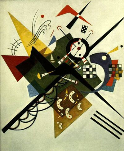
The page image is Nachdruck, a separate 1926 watercolour and ink work in the Lenbachhaus collection. Its circles, straight bars, curves and coloured areas make a useful contemporary comparison, but it is not a diagram from the book and should not be treated as a step-by-step application of one of its rules. The museum identifies the object and releases its image under CC0. The book itself is discussed from a catalogued 1926 copy, a digitised German 1928 edition and institutional accounts of Kandinsky’s teaching. [6]; [2].
Watch: Wassily Kandinsky
Five museum videos about Kandinsky’s art, sources of inspiration and the relationship between colour and music.
Vasily Kandinsky: Around the Circle
Curator Megan Fontanella introduces Kandinsky and the Guggenheim collection.
Watch on YouTubeAt a Glance
- Book:Punkt und Linie zu Fläche: Beitrag zur Analyse der malerischen Elemente, commonly Point and Line to Plane in English; catalogues vary between zu and zur Fläche.
- First publication:Munich, 1926, in the Bauhausbücher series; a digitised German copy used below is a 1928 edition.
- Author’s setting:Kandinsky joined the Bauhaus in 1922, first in Weimar; the school moved to Dessau in 1925.
- Three elements:point, line and basic plane, considered as interacting visual and material conditions.
- Related earlier book:Kandinsky regarded this study as an organic continuation of Concerning the Spiritual in Art, first issued in 1911.
- Image:Nachdruck (1926), an independent work on board, not a page from the book.
Contents
- The book and its Bauhaus setting
- A point is more than a dot
- A line implies movement
- The basic plane is an active support
- Analysis, synthesis and inner sound
- How to read the book now
- Frequently asked questions
- References
The book and its Bauhaus setting
The 1926 date is supported by Kunstmuseum Den Haag’s record for a Munich letterpress copy, which measures 23 × 18.1 cm. Museum collections also hold later copies: MoMA catalogues a 1928 second edition with a Herbert Bayer design credit, and the Met records a 1928 volume. A reader of the Heidelberg digitisation is seeing a 1928 German edition, not photographic proof of every detail of the first printing. The varying zu/zur Fläche spellings appear across catalogues and reproductions; citations should follow the particular object or edition being discussed. [1]; [5]; [2].
Kandinsky was not a founder of the Bauhaus in 1919. He joined its faculty in 1922, after years of painting, exhibiting, writing and institutional work in Germany and Russia. The school’s move from Weimar to Dessau in 1925 placed the 1926 book in a changed architectural and teaching environment. His diagrams and verbal analyses make sense as part of a broader Bauhaus interest in materials, elementary forms and relations among art, craft and design. Yet the book is his own proposal, not a universal Bauhaus doctrine shared without disagreement by every teacher. [4]; [3].
The Lenbachhaus describes an earlier classroom questionnaire, circulated around 1923, in which students were asked to match circle, triangle and square to primary colours and give reasons. Oskar Schlemmer’s teasing comment about a settled yellow triangle, blue circle and red square shows that such pairings were debatable even among contemporaries. They should be presented as historical teaching propositions, not as a law of human perception. The book’s wider account of points, lines and surfaces is richer than those three familiar shape-colour pairs. [3].
A point is more than a dot
Kandinsky begins with the geometric point, an abstract limit without physical size. In painting or drawing, however, a point must be made by a tool on a support. The 1928 German edition explains that a pencil, brush, needle or other implement meets paper, canvas, wood, metal or another ground; a visible mark then takes up some area and acquires an outline. Its scale and shape change its effect. The distinction is easy to miss if “point” is taken to mean a perfectly round, identical black dot every time. [2].
A mark can even stop reading as a point when another element is placed beside it. Its role depends on the field and its neighbours. Kandinsky’s analysis moves between geometry, physical mark-making and perceptual relation. This is not an instruction to calculate an exact emotional value from a dot’s diameter. It is a way to notice that a small accent near an edge may feel different from the same accent near the centre, and that a cluster can acquire a rhythm unlike a single isolated mark. The book develops these possibilities through examples and diagrams rather than one final point formula. [2]; [3].
The small circle near the upper left of the page’s Nachdruck illustration can begin such a comparison. It is not floating in an empty mathematical field: a fine vertical line attaches to it, a large black curve passes below, and coloured and ruled forms gather across the sheet. The mark’s effect depends on the whole arrangement. Lenbachhaus calls the work a 1926 watercolour and black-ink drawing on board, 23.6 × 15.3 cm. That object record supplies the medium and size; the observation about visual balance is a reading of the reproduction. [6].
A line implies movement
In Kandinsky’s scheme a geometric line can be imagined as the path of a moving point. This lets him contrast the point’s relative concentration with the line’s direction and duration. Straight, curved and angular lines can suggest different tensions; horizontal, vertical and diagonal directions matter in relation to the surrounding plane. This vocabulary is analytical. It does not mean that every diagonal is objectively restless for every person or that a painter must plot each stroke from a fixed table. [8]; [3].
A line can also be thick, thin, broken, doubled or crossed. The Lenbachhaus essay says Kandinsky’s methodical separation of elements serves a hoped-for synthesis, not a permanent isolation of marks from one another. On a real surface, a curved black stroke may pass over a coloured patch and across several parallel ruled lines. The eye registers those relations together. The 1926 Nachdruck makes that visible: its sweeping black arc, upright bar, fine bundle of diagonals and outlined shapes do not behave as interchangeable “lines.” Their weights, directions and contacts differ. [3]; [6].
The book also ranges outside painting. Reproduced excerpts discuss points in musical rhythm and movement in dance. These comparisons extend Kandinsky’s earlier habit of learning from other arts without making a painted line literally equivalent to a musical note or a dancer’s path. They are analogies that test how a concentrated event, a direction or a sequence may be perceived in another medium. As with the earlier Concerning the Spiritual in Art, a music analogy does not establish a clinical claim that Kandinsky experienced sound and colour as one sensation. [8]; earlier book guide.
The basic plane is an active support
“Plane” here is not only an abstract flat shape. Kandinsky’s Grundfläche, often rendered “basic plane,” includes the material support that receives marks. A canvas, sheet or other bounded surface has edges, dimensions and an orientation before a point or line is placed on it. The book’s diagrams explore how a mark near one boundary feels different from one near another. If the surface is treated as inert background, the relation that Kandinsky wants to analyse disappears. [2]; [8].
That idea is practical for looking at any work on paper. The white field left around a watercolour can keep separate clusters apart, while an ink stroke reaching the edge can change the whole sheet’s balance. Paper and board also absorb and carry marks differently from oil on canvas. The book’s abstract diagrams direct attention to those decisions, but the object record still has to tell us the actual material. In Nachdruck, the coloured and black forms sit within a broad pale margin, itself inside the photographed board. The margin is visually important, while the Lenbachhaus material description prevents us from mistaking the photograph for a weightless digital diagram. [6].
A helpful comparison is Composition VIII of 1923, whose geometric forms occupy a very different painted field. It predates the book, so it cannot be called an illustration made for it. The book may give names to relations one can observe in the painting: circles and diagonals, a field of varied marks, and the balance between concentrated and dispersed areas. The canvas’s owner record and the artwork page govern facts about the object; theory supplies a way to ask questions, not a hidden plan that replaces looking. [9].
Analysis, synthesis and inner sound
The book can look coolly systematic at first. Kandinsky classifies elementary visual means and uses diagrams, a procedure that suited teaching and shared discussion. The Lenbachhaus, however, stresses his larger aim: analysis of separate parts leads toward synthesis and toward the “inner sound” he had already sought in his earlier writing. He called the later book an organic continuation of Concerning the Spiritual in Art. The Bauhaus study changes the method and scale of examination while retaining an ambition to connect formal decisions to inner content. [3]; earlier book.
This helps avoid two caricatures. The first is that Kandinsky abandoned his spiritual concerns and became a technician of circles. The second is that his geometry is merely a private symbol language with no material or compositional discipline. The Lenbachhaus essay sets his book amid Russian Constructivism and other Bauhaus approaches but also distinguishes his wish for a synthesis of art and something beyond it. That interpretation is the museum author’s account of the text, not proof that every reader or fellow teacher agreed. [3].
MoMA’s Small Worlds VII record notes that Kandinsky developed arguments about print techniques in the 1922 portfolio foreword and the 1926 book. That connection reminds us that “pictorial elements” are not confined to oil painting. A point cut into a woodblock, etched into metal or applied in lithographic ink changes with the process. The medium makes the theoretical element specific. See the Prints guide for the portfolio and its techniques. [7].
How to read the book now
Begin by keeping three levels apart: an idealised element, a mark made from a particular material, and the element’s role inside a finished composition. Kandinsky moves among them quickly. If he calls a point silent or a line dynamic, he is describing an artistic relation through metaphor, not reporting a measurable property of all marks. Compare his words with a diagram from the edition you are using, then with a dated object whose material and scale are known. That sequence makes the book more exact and leaves room to question its judgments. [2]; [3].
The 1926 publication date should not be applied to every work that resembles its diagrams. Kandinsky had developed geometric arrangements before the book and continued changing them afterwards. Several Circles is also dated 1926, but its multiple circles, dark field and colour relationships should be judged as a painting, not as a textbook exercise. The independent 1926 Nachdruck offers another comparison in a smaller paper format. Their date creates a useful conversation with the book, not a documented instruction-to-product sequence. [10]; [6].
A further question is what the book cannot explain. It does not provide a complete catalogue of Kandinsky’s works, an empirical proof of every viewer’s emotional response, or a universal rule for matching colour to shape. Its value is a disciplined set of prompts about placement, direction, contact, material, rhythm and the whole surface. Those prompts can make close looking more precise even when the viewer disagrees with Kandinsky’s proposed effects. The Drawings guide and Paintings guide let you carry the questions across different supports without treating every work as the same experiment.
The format of a digital facsimile can also affect interpretation. Diagrams that occupy separate printed pages may appear as thumbnails in an online index, and a cropped detail can hide the basic plane Kandinsky is trying to describe. When checking a claim about direction or placement, open the whole page and note the edition. A 1928 reproduction can document that edition’s diagrams and text, while the 1926 museum record establishes the first publication date. Neither should be stretched into proof about a particular painting’s making. This is especially important for works whose later catalogue titles resemble the book’s vocabulary: a title such as Transverse Line may invite comparison, but the image, object record and date must still be checked before claiming a direct relation. [2]; [1].
Kandinsky artworks directory
Frequently Asked Questions
A 1926 Munich copy is catalogued by Kunstmuseum Den Haag. MoMA and the Met also record 1928 copies, and Heidelberg has digitised a 1928 German edition. Cite the edition used for page-specific claims. [1]; [2].
Yes. He joined the school in 1922, and the book appeared in its Bauhausbücher series in 1926 after the move to Dessau. The school itself had been founded earlier, in 1919. [4]; [3].
No. Kandinsky distinguishes a dimensionless geometric point from a physical mark with size and outline. Its role also changes with its neighbours and the basic plane. The 1928 German edition makes the material distinction explicit. [2].
No. Shape-colour pairings were part of Kandinsky’s Bauhaus teaching and prompted debate. The Lenbachhaus discusses a student questionnaire and Oskar Schlemmer’s skeptical response; these are historical propositions, not universal scientific findings. [3].
No. It is Nachdruck, a separate 1926 watercolour and black-ink work on board, catalogued by the Lenbachhaus and released under CC0. It is used as a contemporary object for visual comparison. [6].
Kandinsky called the 1926 book an organic continuation of his earlier treatise. The later book analyses elementary marks and the basic plane in more methodical detail, while continuing his interest in the inner effect of art. The two texts should be read in their different publication and teaching contexts. [3]; earlier-book guide.
Discussion
Which point, line or plane relation changes how you see a particular work?
Name the work and passage, then describe the connection.
Reader Insights
Compare the lines in a 1926 paper work with those in Composition VIII.
How does the material support affect a point or line?
Which page or edition would help resolve a term in the book?
Join the Conversation
Share an observation anchored to an edition and a specific artwork.
References
- Kunstmuseum Den Haag, Punkt und Linie zur Fläche book record. 1926 Munich copy and dimensions. View source.
- Wassily Kandinsky, Punkt und Linie zu Fläche, German 1928 edition digitised by Heidelberg University. Primary page-level text and facsimile; page 22 on the point and material support. View source.
- Lenbachhaus, Kai-Inga Dost, Punkt und Linie zu Fläche. Bauhaus setting, arguments and shape-colour questionnaire. View source.
- MoMA, Kandinsky: Compositions catalogue. Bauhaus chronology and period interpretation. View source.
- MoMA, Herbert Bayer / Kandinsky, 1928 second-edition book object. Bibliographic comparison; image not reused. View source.
- Lenbachhaus, Nachdruck (1926), G 15916. Independent work, material, size and CC0 image rights. View source.
- MoMA, Small Worlds VII object record. Relationship of print technique to Kandinsky’s writing. View source.
- Bauhaus Bookshelf, excerpt and diagram index. Access aid for English excerpts; the German edition remains the primary textual reference. View source.
- Guggenheim Composition VIII. View source.
- Guggenheim Several Circles. View source.