Colour and form across Kandinsky’s work
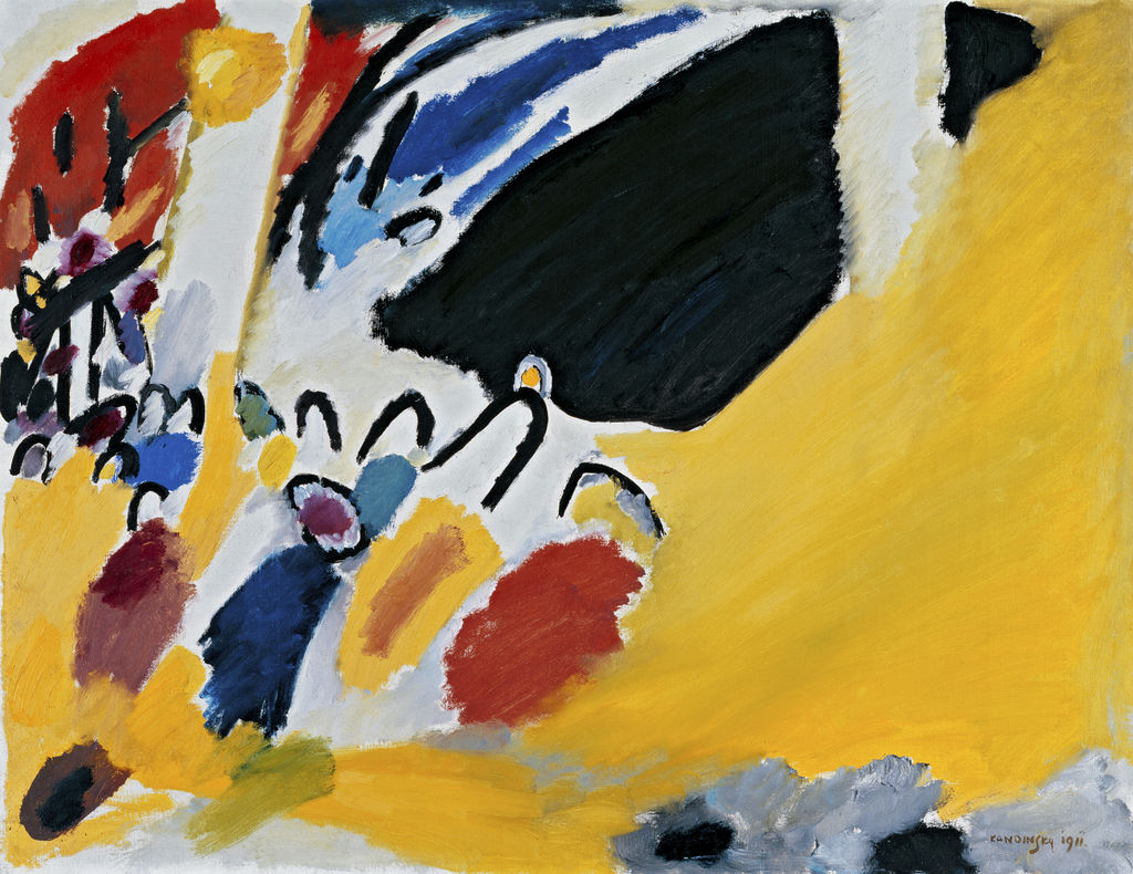
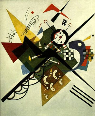
Colour and form were not separate ingredients that Wassily Kandinsky mixed according to a fixed recipe. In his writing, a colour can seem to move toward or away from a viewer, while a line, circle or rough patch changes the effect of the colour it carries or neighbours. He wanted painters to decide how these relationships served a work’s “inner necessity.” In practice, he made landscapes with intensified colour, studies on paper, large layered canvases, geometric Bauhaus paintings and later works with small organic-looking forms. This guide follows his ideas across those changing objects instead of assigning one permanent meaning to each hue or shape. [1]; [4].
The image above is Farbstudie – Quadrate mit konzentrischen Ringen (Colour Study – Squares with Concentric Rings), a small 1913 sheet in watercolour, gouache and chalk. Its twelve related cells make comparison easy, but they are not twelve separate paintings or a laboratory chart proving that one combination gives every viewer the same response. The work provides a vivid place to begin looking; Kandinsky’s books, an owner’s object record and our own observations answer different questions about it. [3].
Watch: Wassily Kandinsky
Five museum videos about Kandinsky’s art, sources of inspiration and the relationship between colour and music.
Vasily Kandinsky: Around the Circle
Curator Megan Fontanella introduces Kandinsky and the Guggenheim collection.
Watch on YouTubeAt a Glance
- Early argument:Über das Geistige in der Kunst, first issued in December 1911 with a 1912 imprint, proposes effects of colour and form and the principle of inner necessity.
- 1913 example:Colour Study – Squares with Concentric Rings is a 23.9 × 31.5 cm work on paper, not an oil canvas.
- Bauhaus context:Kandinsky joined in 1922; his 1926 Point and Line to Plane examines marks and the surface in more methodical detail.
- Comparison works:Composition VIII (1923), Yellow-Red-Blue (1925), Several Circles (1926) and Sky Blue (1940) show different relations of hue, line, shape and scale.
- Reading rule:Kandinsky’s colour descriptions are artistic propositions, not scientifically established reactions shared by every viewer.
Contents
- What Kandinsky meant by an effect of colour
- The 1913 colour study: variation on paper
- Form is not a compulsory symbol
- The Bauhaus: teaching and geometry
- Yellow-Red-Blue : opposites in one field
- Several Circles : one form, many effects
- A later blue field is not a return to one rule
- A way to look without a colour code
- Frequently asked questions
- References
What Kandinsky meant by an effect of colour
Kandinsky’s early book distinguishes an immediate physical impression from what he calls a deeper psychic effect. He considers familiar associations, then argues that colour can act more directly on a viewer. The keyboard metaphor expresses his conviction that an artist can arrange colour to stir an inner response. Sadleir’s 1914 English translation gives one historical wording, while the German original should be used when exact terms matter. Neither text turns every painting into a coded score. [2]; [1].
In the chapter on colour and form, Kandinsky contrasts yellow and blue, warm and cold, light and dark. He describes yellow as seeming to push outward and blue as drawing inward. These images can make a reader attentive to how a colour occupies space in a composition. They are not experimental proof that the same yellow will always feel aggressive or the same blue calm to every person. In the early English edition a footnote explicitly says that a set of colour-movement claims has no scientific basis and rests on spiritual experience. A claim in an artist’s theory is evidence of that artist’s thinking; it is not automatically a fact about all visual perception. [2]; [1].
There is another complication: a painted colour rarely appears alone. Its brightness depends on the support, pigment, neighbouring hues, thickness of application, light in the gallery and the viewer’s screen when seen online. Kandinsky’s own book spends time on relations and contrasts; it is misleading to pull a single colour adjective from it and paste it onto an entire painting. A close reading begins by asking where the colour sits, how much space it occupies and what forms touch it. The words “yellow” or “blue” are starting descriptions, not complete interpretations.
The 1913 colour study: variation on paper
The Lenbachhaus records Farbstudie – Quadrate mit konzentrischen Ringen as a drawing or work on paper from 1913, made with watercolour, gouache and chalk. At 23.9 × 31.5 cm it is much smaller than the major canvases with which it is often reproduced. The sheet divides into twelve approximately square cells, each holding nested rounded bands of colour. The repeated layout supplies a common frame for comparison, while the rings’ handmade irregularity prevents the work from looking like a mechanical colour wheel. [3].
Look across a row before focusing on a favourite cell. A similar blue may be surrounded by very different neighbours; a strong outer band can make an inner colour seem denser, while a pale band gives it room. The edges vary and the divided surface is visibly worked by hand. Those observations come from the object’s appearance. The title Farbstudie supports calling it a study of colour, but no owner record cited here identifies a named oil painting for which it was preparatory or a precise experiment Kandinsky was measuring. It is safer to describe the relationships it lets us see than to invent his intended result for each cell.
The support matters as much as the hues. Watercolour can remain translucent, gouache can be more covering, chalk gives a different surface. A flattened reproduction tends to hide those distinctions, even when the image is large. The owner’s material record restores them, while the photograph helps with arrangement. This separation between visual observation and object fact is useful throughout Kandinsky’s work. The individual colour-study page follows its title, dimensions and collection history in detail; the Drawings guide explains why a work on paper is not merely a minor painting.
Compare the sheet with Composition VII, also dated 1913. The latter’s large oil canvas builds density through sweeping, overlapping passages; the paper study presents repeated, bounded units. Their shared year does not make them a documented study and final canvas pair. The comparison instead shows that Kandinsky could use colour and form in radically different formats at the same moment. Scale, medium and structure should be checked before we make a single “1913 style” from two photographs. [3]; [11].
Form is not a compulsory symbol
Kandinsky’s early argument asks whether painters must give up recognisable objects. His answer rejects an external rule: a form can stay, change or disappear according to what a particular composition requires. A rider, a hill or a piano need not be a literal illustration, and an abstract circle need not be more spiritually significant by default. The “inner necessity” he describes concerns how artistic means answer the work’s purpose. It cannot be read from the title of a shape alone. [1]; [2].
This makes the visible relation among elements important. A thin diagonal can cross a broad field; a circle can be central, displaced, sharply edged or partly hidden. The same named shape changes when its size and neighbours change. Kandinsky’s later methodical vocabulary of point, line and plane asks readers to notice those conditions. The Bauhaus-period analysis should not be backdated as if it were the exact making plan for an earlier painting, but it offers questions one can bring to a work from any year. [5]; book guide.
The contrast between form as named geometry and form as painted event is useful. “Circle” tells us an outline is round; it says little about whether that outline is crisp, translucent, heavy, glossy or crossed by another mark. An artwork’s material can make the difference decisive. The distinction also protects against using a simplistic chart in which triangle always means aggression, square always means rest and circle always means spirit. Kandinsky explored such associations, but the paintings remain more varied than the chart.
The Bauhaus: teaching and geometry
Kandinsky joined the Bauhaus in 1922, after its 1919 founding. Teaching encouraged an explicit vocabulary for elementary marks and for relationships between shape and colour. A Lenbachhaus account describes a questionnaire circulated around 1923 asking students to match circle, triangle and square with primary colours and explain their choices. Oskar Schlemmer’s sceptical aside shows that these pairings were not accepted as incontestable laws among the artists around him. They belong to a teaching and theoretical debate. [4].
His 1926 book Punkt und Linie zu Fläche was published in the Bauhausbücher series. Kandinsky considered it an organic continuation of the earlier spiritual treatise, but its close analysis of a point, a line and the basic plane changes the method. The point can be an abstract geometric limit or a visible mark with size and outline; a line can be understood as a moving point; the material plane receives both. These are starting concepts for seeing a composition’s tensions. The digitised German edition cited here is from 1928, while Kunstmuseum Den Haag catalogues a 1926 Munich copy; edition and page claims should not be confused. [5]; [6].
The painted works show more than textbook geometry. The 1923 Composition VIII sets circles, straight and curved lines, varied weights and a pale ground into a dynamic relationship. Because it predates the book, it should not be described as an illustration made for the 1926 text. MoMA’s catalogue characterises the Bauhaus paintings through controlled but active geometries, with colour and form carrying expressive roles together. A compositional circle can feel stable beside a sharp diagonal, yet its effect still depends on colour, scale and placement rather than a fixed “circle = calm” rule. [7]; [12].
Yellow-Red-Blue : opposites in one field
The Centre Pompidou catalogues Gelb-Rot-Blau (Yellow-Red-Blue) as a 1925 oil on canvas measuring 128 × 201.5 cm. Its record places its making in Weimar between March and May 1925, before the Bauhaus move to Dessau. The owning museum describes brighter colours and straighter geometric lines on the left, darker tones and freer curves on the right. Yellow, red and blue organise the long composition without being isolated into three neat compartments. Those owner facts and observations are more useful than calling it merely “a painting of the three primary colours.” [8].
The Pompidou’s education essay notes that the work can look like a visual statement of Kandinsky’s theories, yet its complexity makes it more than a manifesto diagram. The contrast between geometric and free forms is not a simple split between an orderly good side and a chaotic bad side. Curves and lines cross, colours grade into one another, and the central area mediates between poles. The museum proposes several readings, including cosmic or day-and-night analogies. These are curatorial interpretations, not object identities. The oil canvas itself remains a specific material arrangement with recorded dimensions and provenance. [8]; [8].
This painting is an antidote to the idea that the Bauhaus years replaced Kandinsky’s earlier art with only rulers and circles. It includes disciplined geometry and freer painted movement at once. Its bright and dark zones influence each other across a broad surface. To read it through theory, ask how the particular yellow area behaves next to its black marks or how the blue side meets the pale ground. Then return to what the actual owner record says rather than treating the 1926 book as a set of answers published before the painting was made. The individual artwork page gives the painting’s more detailed object history.
Several Circles : one form, many effects
Kandinsky made Several Circles in January–February 1926, according to the Guggenheim’s checklist. The nearly square oil canvas measures 140.7 × 140.3 cm. Circles of many sizes and colours overlap or float within a dark ground; some appear transparent, some denser. A single geometric name covers very different visual events. The Guggenheim describes selected glossy, varnished circles against matte passages, a material difference that a small digital reproduction can barely show. [9].
The Guggenheim reads the field as suggestive of cosmic space. That interpretation is plausible as a response to the dark ground and scattered luminous forms, but the work is not documented as a literal star chart or a map of a known planetary alignment. Its own formal relations—size, overlap, transparency, surface sheen—should be seen first. Kandinsky later wrote to Will Grohmann about his attraction to the circle’s varied inner possibilities, comparing it with the earlier rider motif; Centre Pompidou cites the 1930 letter. That retrospective statement helps with his interest in the form, but it is not a key assigning a fixed meaning to every circle in this 1926 canvas. [13]; [9].
Compare it back to the 1913 paper colour study shown above. The earlier sheet repeats rounded bands inside twelve cells; the 1926 oil spreads circles across one dark field. Both invite attention to colour beside colour, but their support, scale and arrangement are different. One is a compact work on paper of approximately 24 × 32 cm; the other is a large oil canvas around 141 cm square. The comparison illustrates how a form can recur without one unchanging job. It does not establish a direct preparatory relationship between the two objects. [3]; [9].
A later blue field is not a return to one rule
In the Neuilly years Kandinsky continued to combine abstract marks but often made their forms more organic-looking. The Centre Pompidou catalogues Bleu de ciel (Sky Blue) as a 1940 oil on canvas, 100 × 73 cm. Small, differently scaled forms occupy a milky blue field. The museum’s essay relates the title and ground to the sky Kandinsky could see near his studio and cautions against reading each little form too literally. The painting feels open, but the forms are placed; the field is not accidental scattering. [10].
It would be too simple to say that Kandinsky abandoned geometry in Paris or that “blue” had one psychological meaning from 1911 to 1940. A 1940 pale ground, animated by biomorphic forms, operates differently from the dark blues and circles of a Bauhaus canvas. The scale, time, place and painted relations have changed. Kandinsky’s earlier writing may make the blue surface a question for us, but it cannot substitute for the later object’s own evidence. The Sky Blue page follows the owner’s documentation and the arrangement of forms more closely. [14].
A way to look without a colour code
Choose one dated artwork and begin with four concrete questions. What is its support and scale? Which colours take up the most area and which appear only as accents? Where are the strongest edges, crossings and gaps? Which shapes repeat, and what changes from one repetition to the next? The object record can answer the first question and sometimes illuminate technique or provenance; the remaining questions require looking closely at the work or a trustworthy reproduction. Only then bring in Kandinsky’s books as historical statements of what he hoped colour and form could do.
Next distinguish a museum interpretation from a documented object fact. The Pompidou’s reading of Yellow-Red-Blue as a balance of opposites is a scholarly reading supported by visible features. The Guggenheim’s cosmic language for Several Circles is a curatorial reading, not proof that the circles depict literal planets. Our own comparisons are another layer again. Keeping these levels apart does not weaken interpretation. It tells a reader where the evidence is strongest and where an idea can be debated.
Kandinsky’s central question remains productive: how do colour and form act together when a painting is not required to imitate the external world? The answer is different in a 1913 paper study, a 1925 canvas, a 1926 dark circle field and a 1940 blue ground. That range is why the early-book guide, the 1926 book guide and the dated artwork pages should be read beside, not instead of, one another. A theory can direct attention; each object shows what Kandinsky actually made.
Kandinsky artworks directory
Frequently Asked Questions
No. He proposed characteristic effects and contrasts in his writings, but their claims include subjective and spiritual experience rather than scientific proof for every viewer. In a work, colour also changes with form, neighbour, material and scale. [1]; [2].
No. The Lenbachhaus identifies the 1913 Farbstudie as a drawing or work on paper made with watercolour, gouache and chalk, 23.9 × 31.5 cm. Its repeated cells do not prove a specific later canvas was planned from it. [3].
At the Bauhaus he explored associations among circle, triangle and square and the primary colours. A classroom questionnaire asked students to make and justify pairings; contemporaries could challenge them. They are historical teaching propositions, not a universal code for reading every canvas. [4].
The Centre Pompidou relates its 1925 colour and form contrasts to Kandinsky’s teaching, but its detailed essay emphasises that the large canvas is too complex to be only a manifesto diagram. It combines geometric and free forms, tonal gradation and multiple kinds of balance. [8]; [8].
The Guggenheim describes a cosmic quality, but its catalogue does not identify the canvas as a map of specific planets. The circles differ in size, colour, overlap and surface treatment. “Cosmic” is a curatorial interpretation of those effects. [9].
No. Sky Blue of 1940 uses organic-looking motifs and a pale field, but Centre Pompidou describes an organised arrangement of scales and directions. The later language differs from the Bauhaus canvases without becoming random. [10].
Discussion
Which relation between colour and form changes your reading of a particular work?
Name the work and the visible relationship before drawing on a theory.
Reader Insights
Compare the paper Colour Study with the oil painting Several Circles.
Where do colour, line and the support interact most strongly?
Which museum object record helps separate fact from interpretation?
Join the Conversation
Share an observation anchored to an edition and a specific artwork.
References
- Wassily Kandinsky, Über das Geistige in der Kunst insbesondere in der Malerei, German 1912 third edition. Primary early colour and form argument. View source.
- Wassily Kandinsky, Concerning the Spiritual in Art, translated by Michael T. H. Sadleir, 1914. Historical English rendering. View source.
- Lenbachhaus, Farbstudie – Quadrate mit konzentrischen Ringen, 1913. Object, medium, dimensions and CC0 image. View source.
- Lenbachhaus, Punkt und Linie zu Fläche essay. Bauhaus teaching and theoretical context. View source.
- Heidelberg University, digitised 1928 German edition of Punkt und Linie zu Fläche. Primary later-edition page on the point and support. View source.
- Kunstmuseum Den Haag, 1926 book copy. First-publication period evidence. View source.
- MoMA, Kandinsky: Compositions catalogue. Bauhaus-era context. View source.
- Centre Pompidou, Gelb-Rot-Blau object record and education essay. 1925 work and interpretive nuance. View source 1 · View source 2.
- Guggenheim, Several Circles 2021 press kit and checklist. 1926 object and material description. View source.
- Centre Pompidou, Bleu de ciel object record. 1940 late-work comparison. View source.
- Tretyakov Composition VII. View source.
- Guggenheim Composition VIII. View source.
- Centre Pompidou Kandinsky dossier. View source.
- Centre Pompidou English monograph. View source.