


 by Tom Gurney
Tom Gurney BSc (Hons) is an art history expert with over 20 years experience
Published on / Updated on
Email: tomgurney1@gmail.com / Phone: +44 7429 011000
Miss Loïe Fuller: Toulouse-Lautrec’s Dance of Colour: Introduction
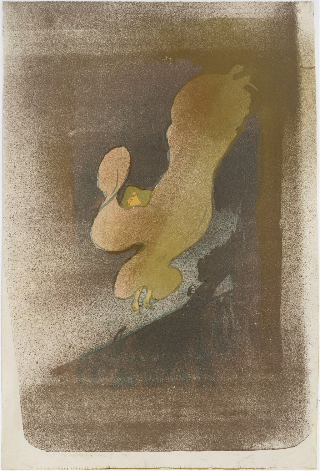
A small face and two feet emerge from an enormous turning shape. In Henri de Toulouse-Lautrec’s Miss Loïe Fuller, the dancer’s costume seems almost to have become the dancer. This 1893 lithograph translates a performance at the Folies-Bergère into a few swelling contours surrounded by a haze of printed dots. The Metropolitan Museum of Art’s impression, examined here, gives the fabric muted gold, olive and pale peach tones. Other impressions change the colours while retaining the extraordinary silhouette. [1]
At a Glance
- ArtistHenri de Toulouse-Lautrec
- TitleMiss Loïe Fuller
- Date1893
- Medium of the Met impressionBrush and spatter lithograph printed in five colours on wove paper; only state
- Dimensions of the Met impressionSheet: 38 × 25.8 cm; image: 36.8 × 25.8 cm
- Printer and publisherEdward Ancourt; André Marty, Paris
- CollectionThe Metropolitan Museum of Art, Rogers Fund, 1970; accession 1970.534
These particulars identify the Met sheet rather than every impression of the design. [1] MoMA records an edition of approximately sixty, each unique. [2]
This work across Henri de Toulouse-Lautrec’s career
Contents
- Finding the Dancer Inside the Fabric
- A Performance Made from Cloth and Light
- The Darkness Is Full of Marks
- Why the Colours Change Between Impressions
- A Print with a Printer and Publisher
- The Albi Painting and a Japanese Comparison
- Annotated details
Finding the Dancer Inside the Fabric
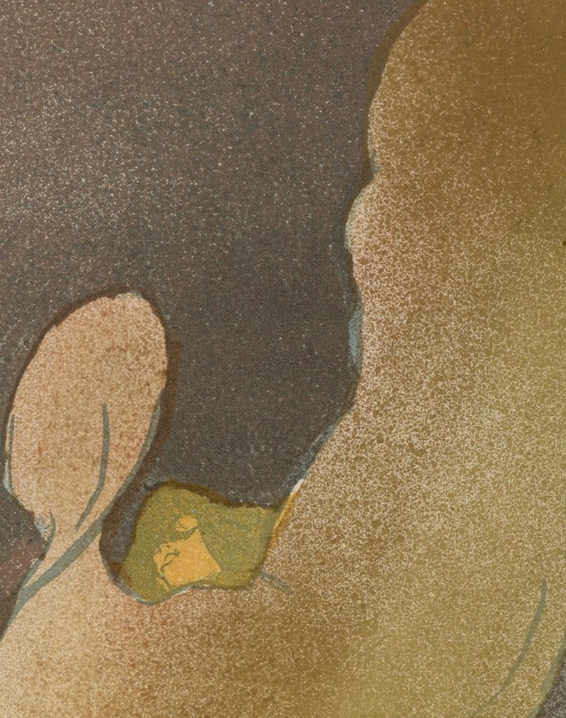
Begin at the centre rather than the top. Fuller's tiny yellow face sits in a dark green opening, slightly left of the image’s vertical axis. Above and below it, rounded expanses of fabric occupy the space where a viewer might expect to find shoulders, arms and torso. The face makes the silhouette intelligible without explaining all its mechanics. Once it has been found, the eye can connect it to the two small feet emerging beneath the lowest fold.
Those exposed fragments establish a human scale against which the costume becomes immense. The feet are close together, lightly articulated and disproportionately small beside the breadth above them. Their separation from the head is partly filled by an overlapping, curling shape rather than a clearly outlined body. The image leaves the viewer to imagine the physical effort concealed within that volume.
The outline has several different rhythms. At the left, an upright oval curves down into a large, rounded lobe. Below that, the fabric pinches inward, creating a dark notch. Another rounded projection hangs nearer the feet. The largest movement sweeps towards the upper right, where its edge breaks into small, irregular points. Each turn redirects the eye. Read from bottom to top, the form appears to gather and expand; followed downwards, it seems to curl back upon itself.
The word “spiral” describes the experience of looking more readily than a literal diagram of the cloth. Lautrec does not draw a regular coil with an obvious beginning and end. He places a succession of curves across and around an obscured figure. The broad upper-right mass could momentarily suggest a wing, leaf or plume. None of those resemblances needs to become a fixed symbolic meaning. Their instability belongs to a picture in which the edge keeps offering a new possibility as the eye moves.
Notice, too, how much space surrounds this expansion. The dancer does not fill the rectangle evenly. A large area of mottled darkness extends above the head and to the left. The luminous shape seems suspended within that field, with the small feet hovering just above a diagonal dark boundary. The design depends as much on this surrounding space as on the costume’s outline.
A Performance Made from Cloth and Light
Fuller was an American performer whose 1892 Folies-Bergère debut included the serpentine dance. MoMA’s account stresses her innovations in costume, production design and coloured stage lighting: fabric whirled around her while its illumination changed. These elements made the appearance of the body inseparable from an environment that she helped create. [2]
The physical enlargement of the costume was deliberate. The Met explains that Fuller manipulated her silk gown with large poles held in her hands. [1] This knowledge changes the relationship between the tiny face and enormous silhouette. The fabric’s reach is an extension of the performer’s action. What looks briefly like an independent cloud was produced by a person handling cloth through an apparatus.
Catherine Brun’s account for Musées Occitanie offers a useful emphasis: in Fuller’s choreography, the mobility of forms and light takes precedence over the straightforward display of the body. [12] Lautrec’s image makes that displacement visible. The stage act gives him a subject in which recognisable anatomy can recede while a performer remains present. The face is almost an interruption in the fabric’s larger sweep.
The print nevertheless gives us a visual response to a performance, rather than a technical plan for restaging it. Its pale and dark regions cannot tell us the number of lamps, the timing of their changes or the precise arrangement used on a particular evening. The pleasure of looking lies in how effectively printed colour suggests illumination. The figure appears to carry brightness within its boundaries even though the image consists of ink on paper.
Annotated Details from Miss Loïe Fuller: Toulouse-Lautrec’s Dance of Colour
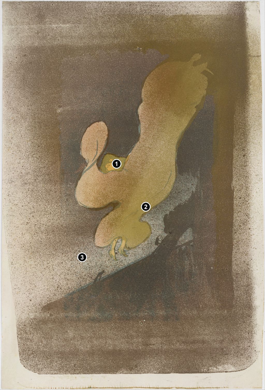
The numbered points identify visible features discussed in this article. Return from each detail to the whole composition. Miss Loïe Fuller, 1893, The Metropolitan Museum of Art, 1970.534. Rogers Fund, 1970. Image source. CC0 / Public domain. Resized only; native appearance preserved.
Details from MISS LOÏE FULLER: TOULOUSE-LAUTREC’S DANCE OF COLOUR
Compare the cropped details with the complete images above. Notice how their colours, shapes and positions contribute to the larger compositions.
The small suspended face
A small pale face remains within the swirling coloured form.
Sweeping fabric
Broad curves suggest the spreading silk rather than a clearly outlined torso.
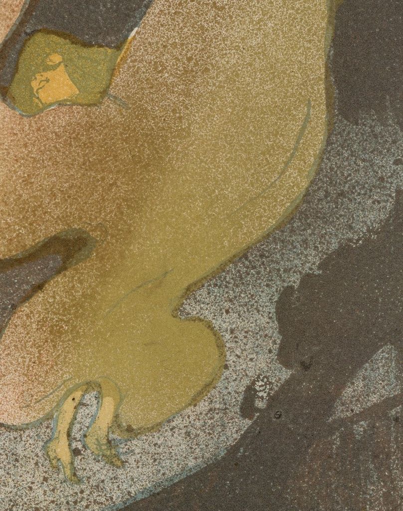
The spattered edge
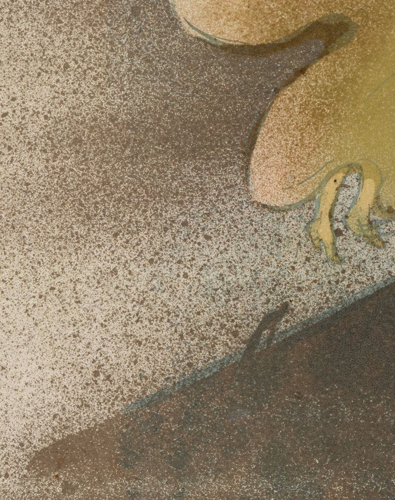
Speckled marks soften the boundary between the coloured shape and the paper.
The Darkness Is Full of Marks
From a distance the background can seem like a dark curtain. Closer examination reveals a surface alive with small deposits and gaps. Dense brown areas alternate with lighter, more open patches. Around the left side of the dancer, pale paper shows between scattered marks; above the figure, the grain becomes more concentrated. The atmosphere is built from differences in coverage rather than a smoothly shaded progression.
“Brush and spatter,” the Met’s medium description, is therefore a useful instruction for looking. [1] The broad shapes have a different visual character from the fine, dispersed texture that surrounds and crosses them. A contour can be abrupt and legible while the adjoining area breaks into tiny interruptions. That contrast lets the silhouette remain forceful without making its setting inert.
The grain also prevents a simple division between a solid dancer and an empty background. In the Met reproduction, the pale peach area on the left has a speckled surface, while the long gold-coloured sweep is veiled by minute marks. Light and dark regions belong to one printed field. The surrounding atmosphere seems to enter the cloth, and the cloth takes on some of the background’s instability.
Thin blue-green lines occasionally clarify an edge or fold. Follow the line that curves down the left oval towards the neck, then compare it with the more lightly indicated curve along the rising right-hand form. Such lines do less work than the large coloured masses. They give the eye a route through those masses without describing every crease. Lautrec can suggest fabric’s direction while leaving its full structure unresolved.
At the bottom, a broad dark diagonal brings another rhythm into play. Its upper edge climbs from lower left towards the right, underneath the feet. Against the rounded costume, it acts like a firm obstruction. Riva Castleman identifies the nearly submerged form at the lower right as the head of a contrabass projecting from the orchestra. Its presence places the spectator across a foreground barrier from the dancer. [13]
The instrument is difficult to recognise on first viewing because its dark shape merges with the surrounding tones. Once noticed, it changes the image’s depth. The luminous fabric no longer floats in an entirely unlocated space: something intervenes between us and the performance. Lautrec provides just enough of the theatre to make the view feel partial, as though the spectacle exceeds what can be neatly framed.
Watch: Toulouse-Lautrec
Choose an artist introduction, a film about graphic design or a closer look at At the Moulin Rouge.
Why the Colours Change Between Impressions
The same sweeping outline can look strikingly different in another sheet. Cleveland’s impression, accession 1925.1202, introduces strong pink into the left-hand loop and the lower curling fabric. Its upper reach is pale yellow, and the background appears comparatively cool and grey. In the Met sheet, the corresponding regions form a quieter relationship of peach, olive-gold and brown. The shapes can be matched point by point while the balance of warmth, brightness and darkness changes. Cleveland identifies its work as a colour lithograph, catalogued as Wittrock 17 and Delteil 39. [14]
The change is particularly revealing around the head. In both impressions, the small face occupies the gap between the left loop and the long rising sweep. In Cleveland’s sheet, the adjoining pink gives the lower contour an immediate visual emphasis. In the Met image, the closer relationship between adjacent tones makes the figure appear more enveloped in a continuous golden mass. This is a comparison of the museum reproductions; a screen cannot reproduce every quality of ink, paper or metallic reflection.
MoMA describes the edition as approximately sixty unique impressions, printed in different colour combinations, some dusted with metallic pigments. [2] The variation is part of the work’s material history. A reproduction of one impression can accurately convey that sheet while giving an incomplete impression of the design’s possibilities.
It is useful here to distinguish an impression, an individual printed example, from a state, a stage in a printing image’s alteration. The Met calls its sheet the only state. [1] A pink costume and a gold-coloured costume do not, by themselves, establish different states. Colour can vary while the same underlying arrangement persists. Nor does a digital image establish whether a particular gleam comes from printed metallic ink, added powder or the way a sheet was photographed.
The 2005 Toulouse-Lautrec and Montmartre checklist makes this plurality tangible. Its sequence of Fuller lithographs, catalogue numbers 204–217, includes the Met impression as no. 216 and Cleveland’s as no. 214, alongside sheets from other collections. Their measurements and ownership records remain individual. Encountering a group allows the repeated contour and changing colour relationships to be considered together, rather than treating one familiar reproduction as the definitive palette. [15]
A Print with a Printer and Publisher
The Met credits Edward Ancourt as printer and André Marty as publisher. Those names locate the lithograph within the collaboration that brought an image onto paper and into circulation. [1] Designing, printing and publishing the work involved related activities with different responsibilities.
Phillip Dennis Cate places Marty within the contemporary revival of artists’ prints. He published L’Estampe originale as well as the Fuller lithograph; his activities connected Lautrec with a market for original graphic work. [13] The small edition and its variations invite close comparison of sheets, an experience different from recognising an advertisement across a street.
The visible image reinforces that distinction. It contains no large announcement of the Folies-Bergère, no programme information and no block of lettering naming Fuller. Instead, the whole rectangle is given to the relationship between her apparition and the surrounding dark. Even the foreground instrument is absorbed into that relationship. The viewer has time to search the image rather than being directed immediately towards a venue or an event.
This does not remove the performer’s public identity. The title supplies her name, while the characteristic costume supplies the action around which the image turns. The sheet makes a theatrical celebrity recognisable through the form of her performance. In the wider range of Toulouse-Lautrec’s prints, it offers an especially concentrated example of how much can be conveyed when descriptive detail and advertising text are pared away.
The Albi Painting and a Japanese Comparison
Miss Loïe Fuller is distinct from La Loïe Fuller aux Folies-Bergère, the 1893 oil on cardboard in Albi. Brun describes the painting as a developed work that prepares the lithographs. [12] In the painting’s museum reproduction, green and violet lines run through pale fabric against exposed brown cardboard. The legs extend farther below the costume, and the towering right-hand sweep continues out of the image at the top. The face, tucked between the rising forms, already occupies the crucial opening that will organise the print.
Comparing the two shows a change in the distribution of attention. In the painting, long strokes let the eye follow movement within the fabric. In the lithograph, broader areas and the speckled surrounding field give the entire silhouette a more unified presence. The print also introduces a stronger dark diagonal beneath the dancer. Recognising the related arrangement does not make the two objects interchangeable: their surfaces, edges and relationships to the surrounding space differ.
Colta Ives places the Met lithograph beside a Japanese theatrical woodcut in which a small head emerges from an expansive costume. She also connects the use of metallic enrichment with Japanese printmaking. These are illuminating comparisons, although her assertion that the image could only have derived from Japanese art is stronger than the visible resemblance can establish. [10] The comparison helps isolate a formal choice: costume can become the dominant shape while a tiny face remains sufficient to anchor it to a human figure.
Fuller’s performance supplies a further, immediate reason for that relationship. Her manipulated cloth genuinely enlarged and transformed her appearance. Looking between the painting, the lithograph and its differently coloured impressions reveals Lautrec testing how to make that transformation readable. The viewer repeatedly loses the body in the fabric and finds it again through the same small clues: the face, the feet and the curves connecting them.
Toulouse-Lautrec artworks directory
Browse 84 identified works and publications in this researched selection. Dates and titles follow the individual records; this is not a complete catalogue of the surviving oeuvre. Print impressions remain attached to their designs. Some listed works do not have a dedicated article. The Drawings guide also contains nine illustrated studies consolidated from former articles.
Frequently Asked Questions
Lautrec’s edition comprised approximately sixty unique impressions in different colour combinations. MoMA also records metallic dusting on some examples. Reproductions therefore need to be matched to an identified sheet. [2]
She manipulated her silk gown using large poles held in her hands. Coloured electric lighting contributed to the changing appearance of the performance. The lithograph evokes these effects without documenting a complete lighting arrangement. [1]
Castleman identifies the partly obscured instrument form as the head of a contrabass rising from the orchestra. It interrupts the view and places the spectator at a distance from the dancer. [13]
Discussion
Look again at the images and ideas explored in Miss Loïe Fuller: Toulouse-Lautrec’s Dance of Colour. These editorial prompts invite your observations.
Reader Insights
How does the stronger pink in Cleveland’s sheet change the route your eye follows through the fabric?
After finding the face and feet, does the silhouette become easier to read, or do its changing shapes remain more compelling than the body inside them?
Join the Conversation
Share a detail, comparison or question about Miss Loïe Fuller: Toulouse-Lautrec’s Dance of Colour below.
References
- The Metropolitan Museum of Art, Miss Loïe Fuller, 1893, accession 1970.534. Current object record, medium, dimensions, printer, publisher, curatorial description and object image. View source.
- The Museum of Modern Art, Miss Loïe Fuller, 1893, accession 513.2006. Edition details and gallery label for The Paris of Toulouse-Lautrec: Prints and Posters, 2014–15. View source.
- Autoportrait, 1880 (in French). View source.
- ALBERTINA: Der Schimmel Gazelle,GE123DL. View source. (in German).
- Franka Blok, Portrait of Vincent van Gogh, 2024. View source.
- Art Institute of Chicago: Moulin Rouge, La Goulue. View source.
- Art Institute of Chicago: At the Moulin Rouge. View source.
- Jane Avril, 1893. View source.
- Au Salon de la rue des Moulins (in French). View source.
- Colta Ives, Toulouse-Lautrec in The Metropolitan Museum of Art, 1996, p. 43, figs. 43–44, and checklist p. 62. Met impression and Japanese theatrical-print comparison. View source.
- Maurice Joyant (in French). View source.
- Catherine Brun, La Loïe Fuller aux Folies-Bergère, Musées Occitanie. Object record, painting image and commentary on Fuller and Lautrec (in French). View source.
- Riva Castleman and Phillip Dennis Cate, Henri de Toulouse-Lautrec: Images of the 1890s, Museum of Modern Art, 1985, pp. 13 and 84; Wolfgang Wittrock, catalogue entries 38–43, p. 114. Castleman’s orchestra interpretation, Cate’s publishing context and exact print distinctions. View source.
- Cleveland Museum of Art, Miss Loïe Fuller, 1893, accession 1925.1202. Object identification, catalogue references and image of the pink-and-yellow impression. View source.
- Art Institute of Chicago, Toulouse-Lautrec and Montmartre: exhibition checklist, 2005, nos. 204–217. Identified Fuller impressions, including Cleveland no. 214 and Met no. 216. View source.
- Splash image, Miss Loïe Fuller, 1893, The Metropolitan Museum of Art, 1970.534. Rogers Fund, 1970. Image source. CC0 / Public domain. Resized only; native appearance preserved.


 Henri de Toulouse-Lautrec.jpg)