Henri de Toulouse-Lautrec.jpg)
 by Tom Gurney
Tom Gurney BSc (Hons) is an art history expert with over 20 years experience
Published on / Updated on
Email: tomgurney1@gmail.com / Phone: +44 7429 011000
Toulouse-Lautrec's Style and Technique: Introduction
Look at the spaces between Toulouse-Lautrec's marks. In a pastel portrait, tiny intervals of paper keep adjacent colours distinct. In an oil study, the brown support participates in a sleeve. In a poster, a dress can become an almost uninterrupted black shape. These are different ways of making a figure appear, each asking line, colour and surface to do a particular job. The Van Gogh Museum's technical account of his 1887 portrait of Vincent van Gogh makes this especially clear: the pastel remains unblended, with the paper visible throughout. [1]
Lautrec's recognisable style emerges through such choices. A contour may establish a person's posture while a cluster of short strokes makes the face more particular. An enormous foreground instrument may locate us in an orchestra, then turn into a decorative border. Comparing individual objects reveals how these decisions change when paint becomes print, or when the viewer moves from a quiet interior to a crowded performance.
At a Glance
- How can coloured lines build a face?Portrait of Vincent van Gogh, 1887: layered pastel strokes, left unblended. [1]
- What is peinture à l'essence?Thinned oil paint; Chicago documents turpentine-thinned washes on canvas in Moulin de la Galette, 1889. [2]
- What changes between painting and print?The 1892 Englishman at the Moulin Rouge: a painted study on cardboard and a separate colour lithograph. [3] [4]
- Were all printed colours made by overlapping primaries?No. The Englishman lithograph uses a separately mixed purple ink. [5]
- What organises the viewpoint?Cropped bodies, rails, instruments and strongly unequal figure sizes; their effects differ from work to work.
- How does Japanese art enter the discussion?Through specific comparisons involving actor likenesses, flat colour, outlines and the picture's edges. [6]
Contents
- A line can describe more than an outline
- Thinned oil, cardboard and the part played by the support
- The Englishman: remaking a painting for lithography
- Colour can organise a sheet or illuminate a room
- Texture makes a printed surface breathe
- Cropping gives the viewer a position
- Japanese prints and the concentration of likeness
- Degas, Manet and a shared field of experiment
A line can describe more than an outline
In the portrait of Jeanne Wenz, the boundary of the face is exceptionally easy to follow. Forehead, nose, lips and chin make a clean sequence against the greenish background. Inside that boundary, however, the surface is mobile. Small strokes turn around the eye, pass through the cheek and gather beneath the jaw. The difference between the clear outer profile and varied inner marks gives the head both a stable shape and a sense of worked, responsive paint. The Art Institute dates this oil on canvas to 1886 and associates the profile format with Renaissance portraiture. [7]
The rest of the canvas changes the density of description. Broad strokes in the dark clothing are more widely separated than the touches around the face. The chair finial receives a few sharply placed lights; the wallpaper's pattern stays loose enough to avoid competing with the features. Looking from one passage to another, we can see that apparent finish is distributed unevenly. Lautrec concentrates information where it distinguishes the sitter, then permits other areas to declare themselves through larger, simpler marks.
The pastel of Van Gogh takes this principle into a different material. Franka Blok's 2024 catalogue entry, drawing on examination by the museum's paper conservator, describes prepared paper stretched over cardboard. Several layers of strokes vary in length and direction. The head is worked more delicately than its setting, and brown accents strengthen the back and collar. Blok identifies the decorative front of the bar as the only area where Lautrec used the crayon's broad side. These are documented observations about this object, rather than deductions from the appearance of pastel in general. [1]
The visible pattern is worth following without immediately translating it into personality. Marks curve around the skull, run across the jacket and change direction against the upright divisions behind the sitter. The outline of the back gives the body a firm boundary even while the interior remains full of small interruptions. The head turns into the relatively open interval above the table; its distinctive profile can be read before the surrounding marks have been disentangled.
A pastel could have been smoothed into broad transitions. Here the museum confirms that Lautrec used neither a stump nor a finger to blend it. The little gaps therefore belong to the construction of the finished image. [1] The portrait asks the eye to assemble a person from neighbouring strokes while continuing to notice them as strokes. The coexistence gives the portrait immediacy without establishing how quickly it was completed or how many stages preceded its final surface.
Thinned oil, cardboard and the part played by the support
The phrase peinture à l'essence describes paint handling. In Moulin de la Galette, the Art Institute identifies oil thinned with turpentine and applied in washes. The support is canvas. This example immediately separates two things sometimes confused in accounts of Lautrec: the way paint is diluted and the material on which it is placed. Cardboard was useful to him, but cardboard alone does not make a painting à l'essence. [2]
Across the Galette scene, narrow vertical marks gather in coats and the rear wall, while the broad foreground barrier supplies long, more continuous directions. Faces remain distinct within a setting that is densely drawn rather than thoroughly filled. The thin applications let the strokes retain their edges. What might appear casually unfinished at a distance becomes a system for distinguishing people, furniture and the movement of the crowd. The museum's technical description supports the identification of washes; it does not turn every visible brown or green interval into evidence of a particular solvent mixture. [2]
Rousse (La toilette) offers a different surface and viewpoint. The Musée d'Orsay records oil on cardboard and explicitly dates the work to 1889, correcting the 1896 found in older catalogues. The exposed back makes a large light form amid wicker chairs, floor lines and fabric. A few darker passages sharpen the shoulders and waist, while lighter strokes travel across the body without sealing it into a polished skin. [8] The contrast with the busier surroundings helps the torso register at once. Its simplicity is relative: it emerges because the nearby furniture and cloth carry so much linear activity.
Cleveland's Monsieur Boileau at the Café complicates the distinction between drawing and painting further. Its recorded materials are oil and tempera with charcoal on millboard. The museum specifically describes thinned oil absorbing into that support, and it classifies the object as a drawing. [9] The hat, lapels and facial features can be picked out among forceful coloured marks; the pale table cuts diagonally through the lower field. Dry drawing and paint operate within one object. The museum category is useful, but the full medium description tells us more about the image's construction.
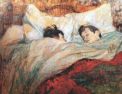
In In Bed: The Kiss, the version catalogued as Dortu P.438, Christie's specifies peinture à l'essence on board. [10] The comparison is especially revealing along the foreground arm. A continuous dark contour holds the limb together, while separate coloured strokes cross its interior. In the adjoining bedding, marks become longer and more dispersed. The distinction between flesh and cloth depends on direction, concentration and enclosure as well as hue. We can describe those visible differences without inventing a pigment list or a preparation recipe for the board.
The Englishman: remaking a painting for lithography
A direct comparison survives between two versions of The Englishman at the Moulin Rouge. The Metropolitan Museum's 1892 painting, 67.187.108, represents William Tom Warrener with two women and served as a preparatory study for the colour lithograph. The current Met record specifies oil on cardboard. Ives's 1996 catalogue described the same object as oil and gouache; that historical label should remain attributed to her publication. Chicago's 1931.67 is a separate lithograph on ivory laid paper. [3] [4] [6]
The painting makes the hat into a small field of restless brushwork. Strokes move across its crown and around the brim; similar activity continues down the coat. Warrener's white neckwear creates a bright, angular opening beneath the head. At the left, the nearer woman's enormous sleeve contains pale marks over brown cardboard, with areas of support contributing directly to its appearance. The woman between them is partly concealed, so that eyes, a nose and a mouth emerge through the foreground figure's silhouette. All three people are established through selective concentrations of paint.
The lithograph retains their encounter while substantially altering how we read it. Warrener's neckwear and coat no longer have the same strong division of white and violet. Much of his upper body becomes one purple field, with lines supplying collar, lapels, pocket, fingers and facial detail. The near sleeve is reorganised as a pale, textured green mass. Yellow spreads around the figures, and the red-orange area at the upper left gives the large pale hat a new setting. Less internal modelling makes the meeting of one colour with another more consequential.
Look particularly at the arm nearest Warrener. In the painting, its pale, broken handling lets it belong to the surrounding atmosphere. In the print, its outer edge becomes a more insistent division between green and purple. A small black glove introduces a concentrated dark interruption below it. The image therefore changes its emphasis without needing a wholly new arrangement of bodies. What was achieved through the difference between paint and exposed support can be reconsidered through the contrast between printed fields.
The passage from one medium to another was an act of design. Keeping every painted variation would have defeated much of the lithograph's particular force. The print makes the body more continuous and the contours more readable, but it also invents a different colour rhythm. There is no need to call one version more complete than the other. Each organises the same close encounter around the possibilities of its own surface. Ives likewise treats the pair as a transformation from a painterly study to a more decorative abstraction. [6]
Phillip Dennis Cate supplies the crucial technical distinction: the lithograph's purple was mixed as an ink and printed from its own stone. It was not generated by overlapping red and blue. He identifies six colours in the design, including olive-green, purple, blue, red, yellow and black. [5] That evidence explains why the purple can act as such a dominant independent shape. The colour is a chosen component of the print, rather than merely the incidental meeting of two others.
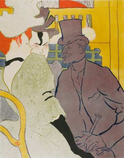
Henri de Toulouse-Lautrec, The Englishman at the Moulin Rouge, 1892. Colour lithograph on ivory laid paper. Art Institute of Chicago, 1931.67; image52.7 ×37.3cm, sheet61.8 ×48.7cm. Image source. Public domain. Resized only; native appearance preserved.
Colour can organise a sheet or illuminate a room
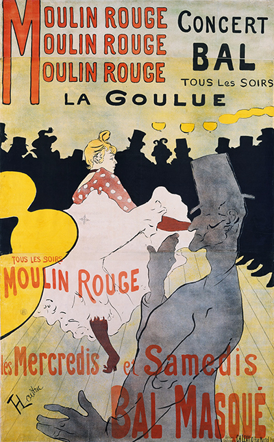
Cate contrasts the Englishman with the 1891 Moulin Rouge: La Goulue poster. For that earlier design he gives a sequence of yellow, red, blue and black, with overlaps producing further hues. He argues that Lautrec used those overlaps to establish broad flat areas rather than to build continuous painterly modelling. The subsequent use of separately mixed colours shows an artist adjusting the process to the effects he wanted. A single formula about primary inks cannot explain the whole printed oeuvre. [5]
The 1891 poster makes the difference between colour and illumination especially interesting. Yellow bowls and large yellow curves identify lights, yet they do not cast a fully described wash over rounded figures. The black crowd, grey foreground performer and pale dancing skirt remain assertively separate. Those divisions make the entertainment readable across the sheet. The depicted lamps are objects in a room and strong decorative shapes at the same time. Their flatness is part of the design's clarity. [11]
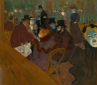
In At the Moulin Rouge, oil on canvas dated 1892–95, the relationships are more atmospheric. The Art Institute identifies the figure at the right as May Milton and connects her startling green illumination with the venue's electric lighting. [12] Her face intensifies cool colours that also occur more quietly behind the central group. The orange hair of the seated woman and the warm wooden foreground establish a different attraction. These passages do not divide the room into the same discrete colour units as the Englishman lithograph.
The comparison makes the word “unnatural” less useful than it initially seems. Milton's colour has a documented relationship to modern artificial glare; the print's purple has a documented relationship to a selected ink. Both can look startling in reproduction, but their functions differ. One makes a face emerge forcefully within a painted atmosphere, while the other joins coat and torso into a large printed area. Colour can organise recognition, light, distance or the balance of the rectangle, and these purposes need not coincide.
Riva Castleman's account of Lautrec's graphic practice stresses his understanding of transparent colour, solid black, open paper and scattered dots as contrasting resources. [13] The useful principle is variety within a restricted vocabulary. A broad flat ink field need not exclude texture elsewhere, and a powerful painted outline need not eliminate illumination. Looking at the relationship between adjacent passages usually tells us more than giving the entire work one label such as flat, decorative or realistic.
Watch: Toulouse-Lautrec
Choose an artist introduction, a film about graphic design or a closer look at At the Moulin Rouge.
Texture makes a printed surface breathe
“Print” also covers materially different methods. Cate distinguishes the photographic relief processes used for Lautrec's early journal illustrations from lithography; some relief-printed covers then received colour through stencils. That distinction changes the relationship between a drawn black image and its coloured areas. A few stencil colours could accent selected passages while leaving much of the white paper active. In a colour lithograph, the separate printed components could instead coordinate solid areas, fine lines and dispersed texture across the whole sheet. Similar-looking economies of colour therefore need not result from the same process. [5]
Not every lithograph is built around a silhouette as solid as Avril's black dress. Miss Loïe Fuller, 1893, brings a figure close to dissolution. In the Met's impression, 1970.534, a pale pink curve and a long yellow-green sweep emerge from a densely speckled brown field. Only a tiny face and small bodily indications make the swirling form intelligible as a dancer. The museum identifies the process as brush and spatter lithography printed in five colours. Its description relates the billowing gown to Fuller's manipulation of silk with poles during performances combining music and coloured electric light. [14]
Here the scattering of marks changes how the edge behaves. Some boundaries are quite clear, while others dissolve into dots. The surrounding dark field also thins towards the paper's margins. Instead of enclosing a completely described body, the texture makes a temporary appearance seem to gather out of a larger darkness. This is a visible effect of the sheet, rather than proof that Lautrec recorded a precise instant in Fuller's choreography. The dance and its lighting supplied a subject for transformation.
The Met records numerous variations of the design in different coloured inks. [14] That history matters to looking: the appearance of one impression cannot define the colour of all the others. Nor should every sparkling-looking point in a digital image be identified as gold without evidence for that sheet. In this impression, the documented brush and spatter are enough to focus attention on the contrast between continuous curves and granular atmosphere. The pattern of the marks carries movement even where anatomy is barely stated.
The Met's 1896 Elles cover design offers almost the reverse distribution of emphasis. In its frontispiece-edition impression, the blue robe contains a wealth of long, curved marks, but much of the bed and surrounding furniture is only lightly drawn. Orange hair swings above a raised arm; a top hat in the foreground is defined with restrained brown lines. The record specifies crayon, brush and spatter lithography in three colours, and connects the curving robe and hair with Art Nouveau. [15]
The almost absent passages are active. Their faintness lets the robe become a substantial hanging form, while the pale bed gives it room to expand. The light frilled blouse divides the blue into sleeves and lower garment, so that the figure remains readable through carefully arranged interruptions. Compared with Fuller, the subject is more firmly anchored, but the same range between dense colour and sparse marks controls what appears first. The suite's subjects and publication warrant their own discussion; here the useful comparison concerns how much visual work can be assigned to a lightly occupied surface.
Cropping gives the viewer a position
Cropping is more than the removal of an inconvenient fragment. It can establish how close we stand to something and how much of the surrounding world the image lets us see. The giant grey Valentin in Moulin Rouge: La Goulue makes the pale dancer look further away, while the black band of spectators closes the view behind her. The foreground body is comparatively empty of detail, yet it has tremendous spatial authority. Its scale makes our position near the performance tangible. We seem to look around a person rather than through a neutral window. [11]
Divan Japonais redistributes that authority. Jane Avril fills the foreground in a dark dress; Yvette Guilbert survives at the upper left as a pale skirt and long black gloves, with her head outside the sheet. The Met identifies both performers and the writer Édouard Dujardin beside Avril. [16] The most prominently placed person is watching. The act being watched can be understood from a much smaller fragment. Recognition and compositional size have been separated.
The orchestra adds another scale between them. Instrument necks and the conductor's arms angle through the space without complete bodies attached. These fragments connect the distant singer with the near spectators. Their incompleteness is useful because a fully populated pit would make the already crowded composition much harder to read. Ives discusses this orchestral cropping in relation to Degas, alongside the flattened colour masses and tilted space associated with Japanese prints. [6]
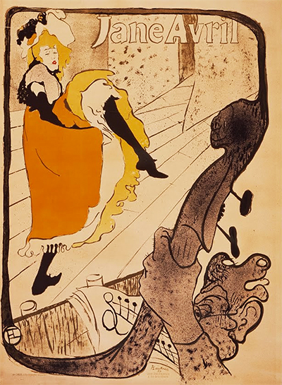
In the 1893 Jane Avril poster, one double bass replaces that dispersed orchestral activity. The musician's hand and the instrument rise so close to us that the dancer is approached through their much larger scale. The Met notices an echo between the instrument's upward thrust and Avril's kick. [17] Follow its curve and the object takes on another role: the outline continues around the whole scene as a border. Castleman describes this transformation of theatrical foreground into a frame. [13]
The bass therefore holds the image together while interrupting our view into it. Its surface remains rougher and denser than the relatively open stage around the raised foot. The dancer's action needs that empty interval, whereas the foreground needs weight. The same composition can make the spectator feel close to music-making and further from the advertised performer. Distorted scale creates a coherent experience of looking even where it would be difficult to reconstruct a literal seat.
The rail in At the Moulin Rouge works differently again. Its broad diagonal takes up an extraordinary amount of the foreground without resembling a person or performer. Beyond it, the pale table draws us towards the group; the rail restricts that approach. Because the obstruction is continuous wood rather than a cropped body, it establishes a physical boundary within the room. Comparing these arrangements reveals four distinct results: Valentin supplies proximity, Avril supplies a conspicuous audience, the bass joins accompaniment to frame, and the painted rail makes access to a gathering feel partial. “Unusual viewpoint” describes their common interest, but each work gives that interest a different form.
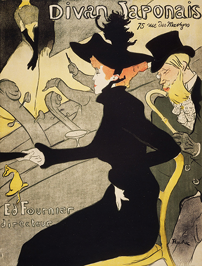
Divan Japonais, 1893. Colour lithograph. National Gallery of Victoria, Melbourne, Felton Bequest 1948, 1846-4. Jane Avril’s silhouette dominates the advertisement while Guilbert’s gloves identify the cropped singer. National Gallery of Victoria, Melbourne, 1846-4. Image source. Public domain. Resized only; native appearance preserved.
Japanese prints and the concentration of likeness
Lautrec's interest in Japanese prints is documented by Ives through collecting, encounters with dealers and his use of a seal-like circular monogram. Her catalogue links his performer images with ukiyo-e actor portraits, including Tōshūsai Sharaku's The Actor Ōtani Oniji III as Edobei. [6] The comparison is valuable because it identifies what a highly selective portrait can retain. Sharaku's pale face, fiercely articulated eyebrows, splayed hands and large blocks of patterned costume turn a figure into a memorable arrangement of characteristic signs.
The relationship to Lautrec is not a matter of matching costume or copying a complete pose. His black-hatted spectators and performers inhabit different places and address different publics. Yet the Englishman lithograph similarly asks a small number of internal lines to animate a large, relatively continuous figure. The hat, moustache, nose and fingers remain distinctive inside broad coloured areas. Reduction does not have to make a person generic. Carefully selected differences can become more conspicuous when incidental description is removed.
Castleman discusses Utamaro's portraiture in terms of the balance between dominant hair shapes and the more finely described features of a face. [13] That provides another specific comparison for Lautrec's distribution of detail. In Divan Japonais, the hat and dress have far more area than Avril's profile, but the small pale face is indispensable to recognising the whole figure. The large mass makes the fine line more consequential; the line gives the mass a human identity. Their inequality is precisely what makes the relationship work.
Japonisme also helps explain why an edge could become a means of composition rather than a passive boundary. A partly excluded figure, a steeply rising floor and a large flat shape could make a densely arranged rectangle feel like a selected portion of a continuing world. Ives and Castleman supply scholarly comparisons for those devices. Their arguments need not be converted into certainty that Lautrec saw or copied one exact Japanese sheet before making a particular poster. Named examples clarify the possibilities he was exploring while allowing each print its own history.
Lautrec also changed the scale and purpose of what he adapted. An actor portrait made as a Japanese woodblock print and a Parisian advertisement almost two metres high are different objects. Large lettering, a venue address and a public-facing promotional task alter the relation between image and viewer. His achievement lies in making such formal resources useful to those circumstances. The curve around a dress, the interruption at an edge and the seal-like signature enter a new arrangement in which a recognisable performer must also direct attention towards a business.
Degas, Manet and a shared field of experiment
Degas offers more than a general explanation for unexpected cropping. Orsay specifically relates the close framing and high viewpoint of La toilette to his bathing figures, including the series shown at the last Impressionist exhibition in 1886. [8] In Lautrec's picture, the figure's back rises out of an expanse of fabric while the surrounding furniture tilts towards us. The body is given a place among ordinary materials rather than isolated as an academic pose.
Degas's Woman Having Her Hair Combed, dated about 1886–88 by the Met, makes a precise comparison possible. The seated nude occupies most of the height; the attendant enters from the right with her upper body cut by the top edge. The patterned furnishings and drapery surround the larger pale body with a denser field of colour. The Met's curator Susan Stein describes layered pastel strokes, changes of direction and contrasting hatching in the décor. [18] Lautrec's La toilette uses oil on cardboard and turns the figure away from us more decisively. The comparison concerns the organisation of close domestic space and the unequal treatment of body and surroundings, rather than an identical technique.
Manet's A Bar at the Folies-Bergère, 1882, illuminates another aspect of Lautrec's interiors. The Courtauld explains how the mirror brings the audience into the background while shifting the barmaid's reflection and a male customer to the right. [19] Its cropped trapeze artist is reduced to green boots at the upper left. The performance is partly absent, but the room remains full of spectators, lights and merchandise. That provides a useful comparison with the displaced attention of At the Moulin Rouge: entertainment can be understood through the people around it and through the obstacles between them.
The two pictures organise the encounter differently. Manet places the barmaid centrally behind a nearly horizontal counter, giving us a frontal person against reflected activity. Lautrec lets an oblique rail, a turned head and a face entering from the edge break up that stability. This is a comparison of visible solutions, rather than proof that his canvas derives from Manet's. Both make a modern public interior difficult to comprehend from one secure position. Their constructed viewpoints matter as much as their choice of venue.
Van Gogh's relationship with Lautrec supplies a more direct case of shared artistic experiment. Blok traces their contact through Cormon's studio and describes their related use of short strokes and diluted oil in the Paris years. She also sets out the debate over the direction of influence. The resemblance cannot responsibly be reduced to Lautrec copying Van Gogh's hand: the catalogue distinguishes Lautrec's shorter, more erratic strokes from Van Gogh's stronger, tauter lines. [1]
That distinction returns attention to individual decisions. Shared admiration for other artists and proximity in studios could make similar questions available to both painters without producing identical answers. Lautrec's pastel of his fellow artist preserves its own pattern of unblended marks; his subsequent lithographs reorganise line and colour for another surface and audience. Following those changes through actual works gives a more useful understanding of his style than treating influence as a sequence of names. Each comparison becomes a way to see what he kept, altered or made newly effective.
Toulouse-Lautrec artworks directory
Browse 84 identified works and publications in this researched selection. Dates and titles follow the individual records; this is not a complete catalogue of the surviving oeuvre. Print impressions remain attached to their designs. Some listed works do not have a dedicated article. The Drawings guide also contains nine illustrated studies consolidated from former articles.
Frequently Asked Questions
He repeatedly coordinates emphatic outlines with selective internal marks and strongly unequal areas of colour. The balance changes with the medium: unblended pastel lines build Van Gogh's portrait, while the Englishman lithograph gives a large purple field much of the work done by separate strokes in the painting. [1] [3] [5]
No. It refers to a way of using thinned oil paint. Moulin de la Galette is documented as turpentine-thinned oil on canvas. Support and paint handling are separate parts of a work's material description. [2]
No. Cate documents that system in the 1891 Moulin Rouge poster, then distinguishes the separately mixed inks of the 1892 Englishman. Its purple was printed as purple rather than generated by a red-and-blue overlap. [5]
The effect depends on the work. Guilbert's gloves preserve recognition when her face is absent in Divan Japonais; the enormous foreground bass in Jane Avril establishes proximity to the orchestra and becomes a frame. Cropping makes particular relationships between viewer, performer and surrounding space. [16] [17] [13]
Discussion
Look again at the images and ideas explored in Toulouse-Lautrec's Style and Technique. These editorial prompts invite your observations.
Reader Insights
Join the Conversation
Share a detail, comparison or question about Toulouse-Lautrec's Style and Technique below.
References
- Franka Blok, “Henri de Toulouse-Lautrec, Portrait of Vincent van Gogh, 1887,” cat. 132, in Contemporaries of Van Gogh 1: Works Collected by Theo and Vincent, Van Gogh Museum, 2024; especially “Friendship” and “Pastel crayon,” including conservator observations in notes 27 and 29. View source.
- Art Institute of Chicago, Moulin de la Galette, 1889, accession 1933.458, collection record and commentary on turpentine-thinned washes. View source.
- Metropolitan Museum of Art, The Englishman (William Tom Warrener, 1861–1934) at the Moulin Rouge, 1892, accession 67.187.108, current painting record, preparatory relationship and image. View source.
- Art Institute of Chicago, The Englishman at the Moulin Rouge, 1892, accession 1931.67, colour lithograph on ivory laid paper; exact object record. View source.
- Phillip Dennis Cate, “The Popularization of Lautrec,” in Henri de Toulouse-Lautrec: Images of the 1890s, Museum of Modern Art, 1985, pp. 77–82; especially pp. 81–82, four-colour sequence, premixed inks and proofing. View source.
- Colta Ives, Toulouse-Lautrec in The Metropolitan Museum of Art, 1996, pp. 18–19 on Japanese collecting and the monogram; pp. 32–34 on the Englishman pair and Sharaku; pp. 38–41 on Divan Japonais, line and proofing. The historical oil-and-gouache label for Met 67.187.108 appears on p. 32. View source.
- Art Institute of Chicago, Portrait of Jeanne Wenz, 1886, accession 1941.824, collection description and medium. View source.
- Musée d'Orsay, Rousse (La toilette), 1889, RF 2242, current medium, date correction and discussion of Degas (in French). View source.
- Cleveland Museum of Art, Monsieur Boileau at the Café, 1893, accession 1925.1409, current medium, drawing classification and commentary on absorption into millboard. View source.
- Christie's, Au lit: Le baiser, 1892, Dortu P.438, 2015 catalogue, object details and catalogue identity. View source.
- Art Institute of Chicago, Moulin Rouge, La Goulue, 1891, accession 1954.1193, exact colour-lithograph record and identification of La Goulue and Valentin le Désossé. View source.
- Art Institute of Chicago, At the Moulin Rouge, 1892–95, accession 1928.610, medium and commentary on May Milton and artificial lighting. View source.
- Riva Castleman, “Introduction,” in Henri de Toulouse-Lautrec: Images of the 1890s, Museum of Modern Art, 1985, pp. 9–13; line, open paper, texture, Japanese portraiture and theatrical framing. View source.
- Metropolitan Museum of Art, Miss Loïe Fuller, 1893, accession 1970.534, brush and spatter lithograph, performance context and impression variations. View source.
- Metropolitan Museum of Art, Elles (portfolio cover), 1896, accession 1984.1203.166(2), second state of three, frontispiece edition; crayon, brush and spatter lithograph in three colours. View source.
- Metropolitan Museum of Art, Divan Japonais, 1892–93, accession 58.621.17, identification of Avril, Dujardin and Guilbert and four-colour medium. View source.
- Metropolitan Museum of Art, Jane Avril, 1893, accession 32.88.15, commission and relationship of kick to double bass. The same colour-poster design was also examined in MoMA impression 456.1954. View source 1. View source 2.
- Metropolitan Museum of Art, Edgar Degas, Woman Having Her Hair Combed, about 1886–88, accession 29.100.35, object record and Susan Stein's curatorial audio transcript on layered colour and directional strokes. View source.
- The Courtauld, Édouard Manet, A Bar at the Folies-Bergère, 1882, collection interpretation of the mirror, reflected spectators and displaced figures; image examined in its A Closer Look educational sheet. View source 1. View source 2.
- Splash image, Portrait of Vincent van Gogh, 1887. Pastel on prepared paper stretched over cardboard. Van Gogh Museum, Amsterdam, d0693V1962. Unblended strokes build the likeness and café setting. Van Gogh Museum,Amsterdam,d0693V1962. Image source. Public domain. Resized only; native appearance preserved.