


 by Tom Gurney
Tom Gurney BSc (Hons) is an art history expert with over 20 years experience
Published on / Updated on
Email: tomgurney1@gmail.com / Phone: +44 7429 011000
Yvette Guilbert: Toulouse-Lautrec’s Rejected Poster Project: Introduction
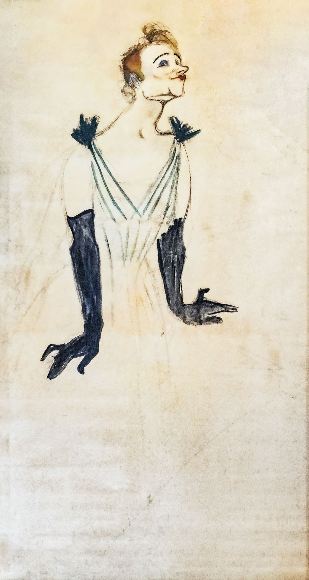
Two long black gloves give Yvette Guilbert a presence that the lightly drawn dress can scarcely contain. Her head tilts upwards, her mouth tightens into an extravagant little curve, and her hands open in different directions. In this enormous drawing, Toulouse-Lautrec made a performer recognisable through a few sharply chosen features. The surviving sheet, dated 1894, is charcoal with gouache highlights on paper, measuring 186 × 93 centimetres. It belongs to the Musée Toulouse-Lautrec in Albi. [1]
The design was intended to advertise Guilbert’s appearances at the Ambassadeurs. According to Albi’s account, she declined it and chose Steinlen’s proposal. Yet the encounter produced more than a rejected advertisement: Lautrec’s subsequent books of Guilbert images explore how an individual face, a costume and a vocabulary of gestures can become a performance on paper. [2]
At a Glance
- ArtistHenri de Toulouse-Lautrec
- TitleYvette Guilbert, a poster project
- Date1894
- MediumCharcoal with gouache highlights on paper
- Dimensions186 × 93 cm, as recorded in Albi’s current collection entry
- CollectionMusée Toulouse-Lautrec, Albi
- AcquisitionGift of the Comtesse Adèle de Toulouse-Lautrec, 1922
- Intended purposeAdvertisement for Guilbert at the Ambassadeurs; the project was rejected
Object information follows the museum’s collection record; the commission and rejection follow its 2025 exhibition account. [1] [2]
This work across Henri de Toulouse-Lautrec’s career
Contents
- A performer who had already designed her appearance
- The scale of a figure still being worked out
- How the gloves organise the body
- A face sharpened into performance
- Why Guilbert refused the design
- Recognition without a face: Divan Japonais
- The 1894 album: the gloves become the portrait
- The 1898 series and the work of collaboration
- Annotated details
A performer who had already designed her appearance
Guilbert brought an established visual identity to Lautrec. MoMA describes her pale complexion, coloured hair, close-fitting low neckline and long black gloves as a deliberate departure from the more elaborately dressed entertainers around her. Her delivery drew on speaking as much as singing. The costume was part of the act: an audience could recognise the performer before distinguishing her words. [12]
Lautrec was working with choices Guilbert had made about how to appear in public. The plainness of the dress around her body and the force of the dark arms are inseparable from that preparation. His contribution was to redistribute their importance. A complete garment becomes a handful of lines; the gloves become substantial black shapes; the small turns of the mouth and eyes receive disproportionate emphasis.
The result can be read as a meeting between two forms of selection. Guilbert had selected the costume and manner through which audiences knew her. Lautrec selected from those features to make a striking image. Agreement on the recognisable ingredients did not guarantee agreement on the resulting portrait. The drawing makes that difference tangible: recognisability and flattery are separate achievements.
The scale of a figure still being worked out
At 186 centimetres high, this is a human-height sheet. A small reproduction can make it look like a quick sketchbook drawing, especially because so much paper remains lightly marked. In person, its dimensions would give the broad black gloves and searching facial outlines a very different physical force. The size asks us to imagine marks made across a considerable surface, rather than a miniature enlarged only in reproduction. [1]
Its proportions are unusually insistent: the sheet is twice as high as it is wide. Guilbert’s head rises near the top, while her body extends down the narrow format. Nevertheless, the lower part never becomes a fully described standing figure. The dress fades into faint lines, and the image leaves a large field of paper beneath the hands. There is no firmly drawn floor on which she stands and no detailed stage to explain her position.
The uneven finish is especially revealing. Hair, eyes, lips, shoulder ornaments and gloves carry dark or coloured accents. The torso is established more economically, and the lower garment remains elusive. Looking from top to bottom, one moves from concentrated description towards suggestion. The figure seems to emerge out of the surface instead of occupying a completely constructed room.
This is a design in progress, not a printed announcement with a missing caption. No advertising lettering identifies the venue or gives a programme. The museum calls it a study and records its hand-worked materials. Those facts allow us to examine its possibilities without imagining an edition, an arrangement of type or a completed colour scheme that the surviving object does not supply. [1]
Annotated Details from Yvette Guilbert: Toulouse-Lautrec’s Rejected Poster Project
The numbered points identify visible features discussed in this article. Return from each detail to the whole composition. Yvette Guilbert, rejected poster project, 1894, Musée Toulouse-Lautrec, Albi. Photograph by Didier Descouens, CC BY-SA 4.0; resized. Photograph: Didier Descouens / CC BY-SA 4.0. Image source. CC BY-SA 4.0. Numbers added to a separately resized overview; detail crops taken from the immutable original. These overview and crop derivatives are shared under CC BY-SA 4.0. No recolouring or retouching.
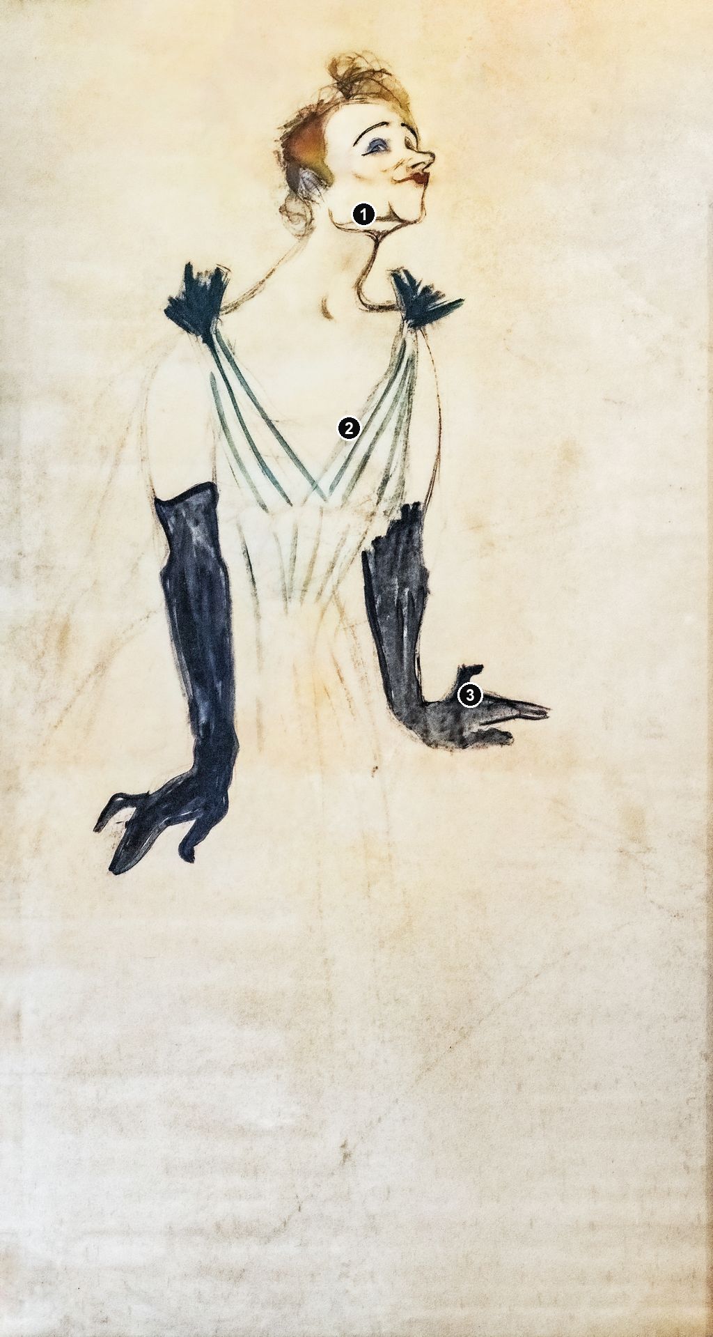
Details from YVETTE GUILBERT: TOULOUSE-LAUTREC’S REJECTED POSTER PROJECT
Compare the cropped details with the complete images above. Notice how their colours, shapes and positions contribute to the larger compositions.
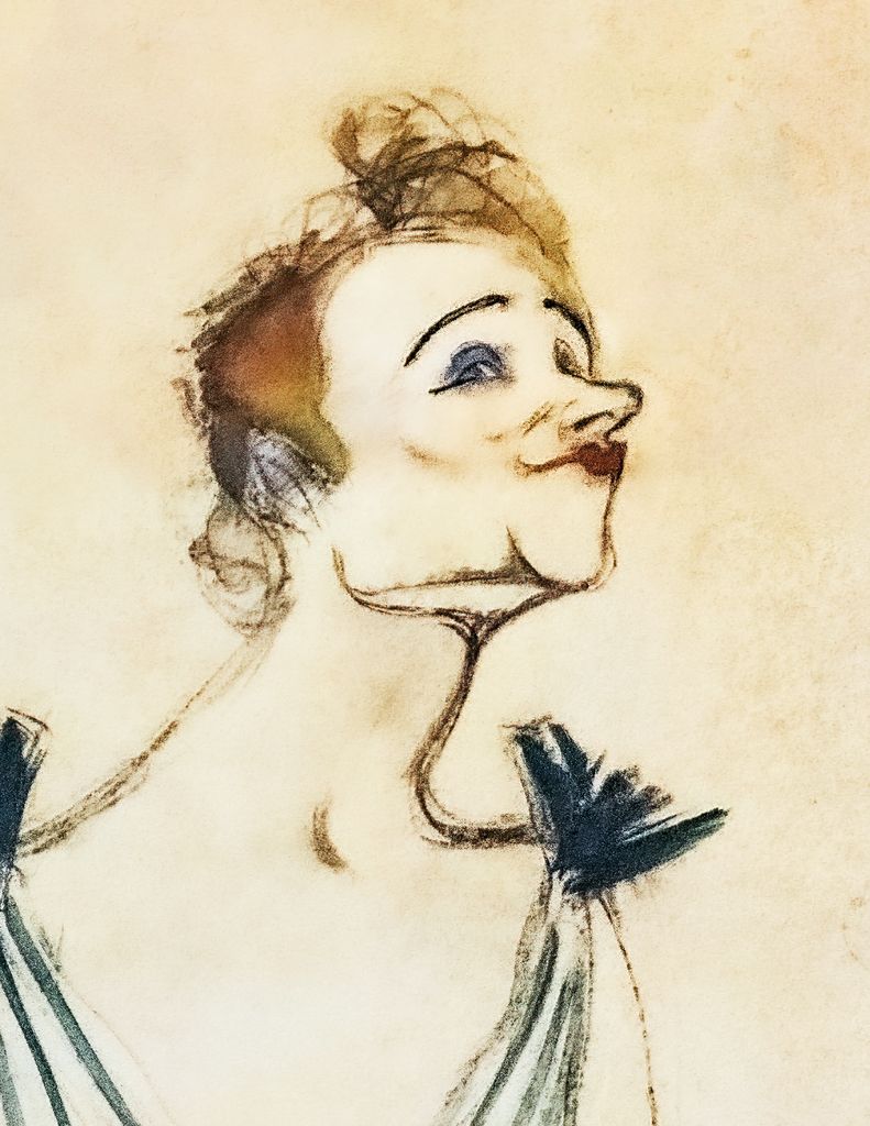
The upturned head
The red mouth and long neck make the small head sharply legible.
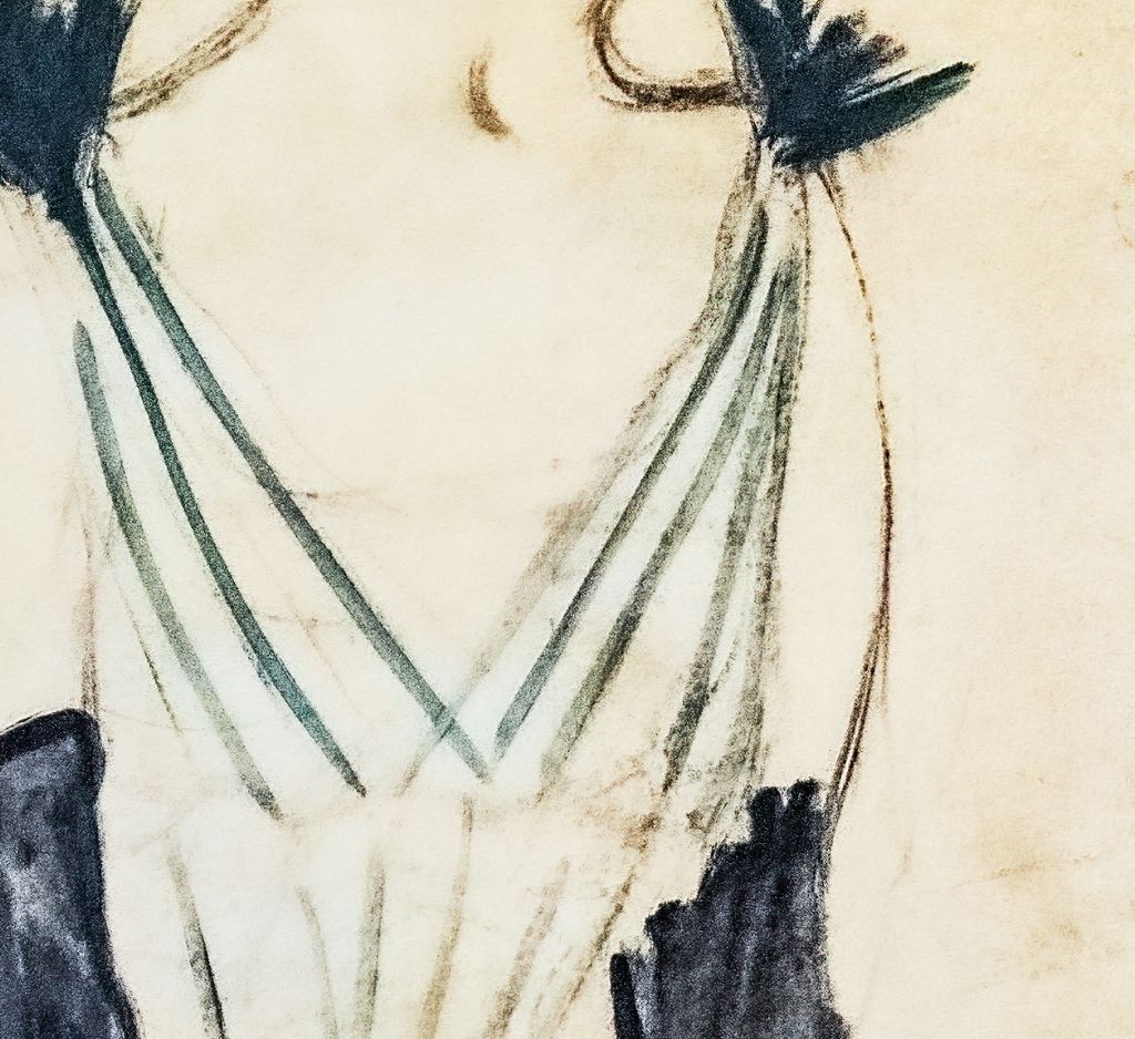
Crossing green strokes
Sparse crossing strokes suggest the bodice without filling the paper.
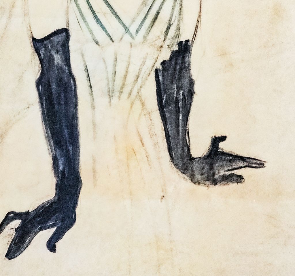
The long black gloves
Black gloves and spread fingers contrast with the open areas around them.
How the gloves organise the body
The black gloves are the most immediately legible parts of the drawing. Against the warm paper and faint dress, they have the density of silhouettes. Their long shapes pull the eye down from the shoulders, then turn it outwards through the hands. The shape on the viewer’s left descends almost vertically before opening into spread fingers; the other bends at the elbow and extends a hand towards the right. Their asymmetry prevents the figure from settling into a formal, balanced pose.
Each hand has its own rhythm. On the left, the fingers taper diagonally downwards, separating into angular points. On the right, the extended fingers make a flatter, more horizontal movement. They suggest the punctuation of a performance, although they do not identify a particular lyric or prove the precise sequence of movements Guilbert made on stage.
The arms also change our understanding of the dress. Green strokes run from the shoulders across the bodice, making intersecting diagonals that converge towards the waist. Little black bursts at the shoulders echo the darkness of the gloves. Between these accents, much of the chest and upper arms consists of exposed paper. The body is held together by relationships between dark masses and coloured lines more than by continuous shading.
Try following only the outer edges of the gloves. They establish a surprisingly large part of the figure’s stance even when attention is withheld from her face. Then look again at the face: its tilt and sharp expression begin to answer the hands. The design works through this exchange between separated points of emphasis. The space between them remains quiet enough to make each inflection count.
“Silhouette” therefore describes more than a long, thin outline. It describes Lautrec’s ability to make selected shapes carry the identity of the whole person. Here those shapes remain attached to a recognisable body, but they are already strong enough to be imagined apart from it. His book-cover design of the same year would test that possibility much further. [12]
A face sharpened into performance
The face rewards slower looking than the gloves. Guilbert turns towards the right, lifting her chin and stretching the long curve of her neck. Her eyebrows arch above strongly marked eyes. The nose projects decisively, while the mouth forms a small red accent above the jutting chin. The hair is gathered high, with looping, exploratory lines around its upper edge. Lautrec combines an emphatic expression with visible signs that its contours were being sought.
The red of the lips matters because it is so local. It does not describe a broad area of colour comparable to the gloves. It concentrates attention at the exact place where a voice would issue. Visually, the tiny coloured mouth holds its own against the much larger black forms below. The drawing connects face and hands without having to fill the intervening dress with detail.
Caricature here operates through emphasis and proportion. The lifted chin, long neck, arched brow and compressed mouth are pushed into a tightly coordinated expression. They do not simply record the distances between features. They create a face that seems caught at an expressive pitch. Albi connects the study with Guilbert’s stage mimicry; the visible exaggerations make that interpretation persuasive without revealing her private thoughts. [1]
A drawn smile does not establish that the sitter was happy with the portrait, just as an upturned face does not prove confidence, vanity or defiance. Lautrec’s marks tell us how he constructed an expression. Guilbert’s response has to come from documentary evidence. An image can be wonderfully expressive and still fail its subject’s requirements.
Watch: Toulouse-Lautrec
Choose an artist introduction, a film about graphic design or a closer look at At the Moulin Rouge.
Why Guilbert refused the design
Albi’s 2025 account places the project within preparations for Guilbert’s 1894–95 Ambassadeurs season. It reproduces a letter in which she protests, in translation, “do not make me so atrociously ugly.” The passage also says another winter poster was already commissioned and nearly finished, and reports alarmed responses to the coloured project. The museum identifies the chosen alternative as Steinlen’s. It supplies no exact date for the letter in this passage. [2]
Her objection has a practical force. An advertisement would expose an image repeatedly to people who might know little about its subject. A performer could accept exaggeration as art while judging its consequences for her own public appearance differently. This is a useful way to understand the disagreement, rather than a claim to know every consideration behind her decision. The letter gives a specific objection to a specific design; it does not grant access to the whole relationship.
Another much-repeated remark belongs to a different kind of source. Colta Ives quotes Guilbert’s 1927 memoir, through Julia Frey’s later biography, recalling her description of Lautrec as “a genius at deformity.” Ives associates this recollection with the 1894 album and Guilbert’s agreement to sign it. It is retrospective testimony about their exchanges, not a dated remark transcribed during the rejection of this sheet. [13]
The difference changes the story. The letter expresses resistance to an image; the memoir looks back on an artist whose portrayals had become inseparable from Guilbert’s public identity. Neither document requires us to turn her into an unimaginative obstacle to artistic progress. She was the person whose appearance was at stake. Equally, her refusal does not make the drawing a failure as an image. It marks the point at which artistic invention and the subject’s judgement did not coincide.
Recognition without a face: Divan Japonais
The earlier Divan Japonais poster offers a precise comparison. In the 1893 design, Guilbert appears on stage at the upper left, with her head cut off by the top edge. Her long gloves remain visible. Jane Avril and Édouard Dujardin dominate the foreground, yet the fragment of the singer is enough to establish a second, distinct personality behind them. Wolfgang Wittrock’s catalogue identifies all three figures. [14]
The comparison makes the Albi drawing’s face newly conspicuous. Recognition had already been achieved without it. Here Lautrec gives the face an enlarged expressive task: it must work with the hands to convey the performer’s manner. Cropping in the poster and exaggeration in the study are two ways of deciding what an image needs to show.
These are designed arrangements, not equivalent records of a single performance. Wittrock notes that Guilbert had not appeared at the Divan Japonais since 1890. Her inclusion in the advertisement cannot therefore be used as straightforward evidence that Lautrec witnessed her there during the period promoted by the poster. [14]
The 1894 album: the gloves become the portrait
The book Yvette Guilbert, with text by Gustave Geffroy, was published by André Marty’s L’Estampe originale in 1894. Its cover is a separate lithograph. MoMA records an edition of one hundred, with Ancourt as printer of the image and Frémont as printer of the text. This is a published object with its own material history, distinct from the monumental Albi study. [12]
On the cover, the gloved arms are detached from any visible torso. They bend across the surface among the title and author’s name. A small fan lies nearby, and diagonal lines run through the arrangement. The fingers retain their distinctive tapered shapes even though the person to whom they belong has disappeared. The reader encounters Guilbert through an accessory and a gesture before opening the book. [14]
This is a bolder act of abbreviation than simply leaving a head outside the frame. There is no surrounding scene in which to reconstruct the absent body. The gloves have become a visual signature. Set beside the Albi study, the cover reveals how portable its strongest forms were: the black arms could carry identity across a change of scale, format and purpose.
Inside the album, the figure returns in differing attitudes. The MoMA catalogue reproduces a small standing image with an umbrella, another scene in which Guilbert addresses a seated figure, and a closely observed head drawing among the related studies. Such differences matter more than a single formula about Lautrec caricaturing his subject. He could move between dress, encounter, facial detail and graphic shorthand, choosing a different amount of information for each image. [14]
The album also changes the viewer’s pace. An advertisement must make itself felt in a crowded visual environment. A book allows the reader to turn back, compare expressions and discover a succession of appearances. The same performer can therefore sustain a series rather than being compressed into one definitive likeness. Ives understands the albums as attempts to convey performance through changing attitudes and expressions. [13]
The 1898 series and the work of collaboration
The second album, published in London by Bliss, Sands & Co. in 1898, contains eight principal lithographs with a frontispiece and cover. Ives reproduces Linger Longer, Loo and Saluant le public, or Taking a Bow, as its seventh and eighth principal plates. The first brings the crossed gloved arms close to Guilbert’s face; the second places her bending figure within a stage setting. [13]
In Linger Longer, Loo, the arms become a broad diagonal screen across the foreground. The face seems to rise above their dark band. Compared with the Albi study’s separated, downward-reaching arms, this is a more compressed arrangement: face, hands and gloves almost interlock. In the bowing image, the body occupies a larger environment, with the curtain and audience helping to define the theatrical act. The contrast shows how much could change while the identifying gloves persisted.
The series was also the result of practical work with a publisher and printers. Phillip Dennis Cate’s study of the Sands correspondence describes exchanges about payment, preparation and reproduction. Lautrec asked whether the cover should be lithographic or use the photomechanical process employed for another Sands publication; lithography was chosen. Henry Stern’s bill itemised preparation of the eight stones, proofs, the stones themselves and packing. These are concrete traces of decisions and labour behind the apparently immediate images. [15]
Cate identifies these preparations separately from the album’s printing in London. That distinction helps explain why drawing an image, preparing its printing surface and producing its edition should not be collapsed into a single act. It also gives substance to the continuing Guilbert projects: the later album required organised production, not merely the repetition of an entertaining likeness. [15]
Returning to the Albi sheet after these prints, the open paper becomes especially striking. The gloves already have a remarkable independence, but the whole figure remains available for change. The drawing preserves a particular proposal that never became a printed edition. The albums show how much further the same face and black-gloved arms could still be explored. [1] [14]
Toulouse-Lautrec artworks directory
Browse 84 identified works and publications in this researched selection. Dates and titles follow the individual records; this is not a complete catalogue of the surviving oeuvre. Print impressions remain attached to their designs. Some listed works do not have a dedicated article. The Drawings guide also contains nine illustrated studies consolidated from former articles.
Frequently Asked Questions
The museum’s account on Musées Occitanie says she preferred Steinlen’s more flattering proposal and reproduces her objection to being portrayed as excessively ugly. That written response supplies firmer evidence than guesses about her expression in the drawing. [16]
Albi’s current object record gives 186 × 93 centimetres. Its height helps explain why the sparingly drawn body and strongly marked gloves have a monumental presence. [1]
Discussion
Look again at the images and ideas explored in Yvette Guilbert: Toulouse-Lautrec’s Rejected Poster Project. These editorial prompts invite your observations.
Reader Insights
In the Albi study, do the face or the hands do more to suggest a performance?
How does your response change when the 1894 cover removes Guilbert’s body and leaves the gloves among the words?
Join the Conversation
Share a detail, comparison or question about Yvette Guilbert: Toulouse-Lautrec’s Rejected Poster Project below.
References
- Musée Toulouse-Lautrec, Yvette Guilbert: collection entry and object image, 1894; current record of medium, 186 × 93 cm dimensions and 1922 gift (in French). View source.
- Musée Toulouse-Lautrec, Toulouse-Lautrec et l’art de l’affiche: exhibition press dossier, 2025, p. 11, “Yvette Guilbert, 1894”: Ambassadeurs commission, letter excerpt, rejection and subsequent albums (in French; short English quotation translated here). View source.
- Autoportrait, 1880 (in French). View source.
- ALBERTINA: Der Schimmel Gazelle,GE123DL. View source. (in German).
- Franka Blok, Portrait of Vincent van Gogh, 2024. View source.
- Art Institute of Chicago: Moulin Rouge, La Goulue. View source.
- Art Institute of Chicago: At the Moulin Rouge. View source.
- Jane Avril, 1893. View source.
- Au Salon de la rue des Moulins (in French). View source.
- Colta Ives, Toulouse-Lautrec in The Metropolitan Museum of Art, 1996. View source.
- Maurice Joyant (in French). View source.
- Museum of Modern Art, Cover for Yvette Guilbert, 1894, object 1066.1964.1; collection metadata and 2014–15 gallery label on Guilbert’s appearance, delivery and the Geffroy book. View source.
- Colta Ives, Toulouse-Lautrec in The Metropolitan Museum of Art, 1996, p. 55, figs. 61–64, and checklist pp. 69–70. Ives cites Guilbert’s La chanson de ma vie: Mes mémoires (1927), p. 272, through Julia Frey (1994), p. 311. View source.
- Wolfgang Wittrock, catalogue entries in Riva Castleman and Wolfgang Wittrock, eds., Henri de Toulouse-Lautrec: Images of the 1890s, Museum of Modern Art, 1985, pp. 141–42, entries 84–92 and illustrations; p. 208, entries 215–16; p. 232, entries 259–61, Divan Japonais. View source.
- Phillip Dennis Cate, “The Popularization of Lautrec,” in Henri de Toulouse-Lautrec: Images of the 1890s, 1985, pp. 82, 84, 86–87, with notes 8 and 17–18: the Geffroy publication, Sands correspondence, cover process and Stern’s preparation bill. View source.
- Musée Toulouse-Lautrec, “Toulouse-Lautrec et Yvette Guilbert,” Musées Occitanie, museum account of the rejected study, Guilbert’s protest and the separate albums (in French). View source.
- Splash image, Yvette Guilbert, rejected poster project, 1894, Musée Toulouse-Lautrec, Albi. Photograph by Didier Descouens, CC BY-SA 4.0; resized. Photograph: Didier Descouens / CC BY-SA 4.0. Image source. CC BY-SA 4.0. Photograph resized proportionally; colour and content preserved. Photographic derivative available under CC BY-SA 4.0.


 Henri de Toulouse-Lautrec.jpg)