


 by Tom Gurney
Tom Gurney BSc (Hons) is an art history expert with over 20 years experience
Email: tomgurney1@gmail.com / Phone: +44 7429 011000
David Hockney’s A Rake’s Progress: Introduction
A young man arrives in New York, sells some prints, changes his appearance and begins to spend. By the end of David Hockney’s A Rake’s Progress, he has joined a group of almost interchangeable figures. The adventure has taken him from the excitement of being somewhere new to the danger of becoming indistinguishable from everyone around him. Made in 1961–63, this cycle of sixteen etchings with aquatint draws on Hockney’s first American journey and William Hogarth’s eighteenth-century story of squandered wealth. Personal experience, borrowed narrative and invention continually overlap. [1]
The pleasure of the series lies partly in its changes of register. A museum transaction becomes an inheritance; a bottle of hair dye promises a transformed life; a familiar young man dwindles to a floating head. These prints ask us to follow a story while noticing how pictures manufacture one. Their subject is arrival in America, but also the construction of a public self.
At a Glance
- ArtistDavid Hockney
- TitleA Rake’s Progress
- Date1961–63
- Medium and formatSixteen etchings/aquatints
This work across David Hockney’s career
A Bigger Splash
1967 [2]Mr and Mrs Clark and Percy
1970–71 [2]My Parents
1977 [2]Garrowby Hill
1998 [2]A Year in Normandie
2020–21 [3]Contents
- New York, 1961: making a life in prints
- What Hockney borrowed from Hogarth
- Arrival and an earned inheritance
- Hair dye, desire and the promise of transformation
- A city encountered through pictures and words
- How etching, aquatint and colour tell the story
- Bedlam and the disappearance of difference
- The 1963 edition, posters and the later book
- Returning to the Rake on stage
- The beginning of a sustained conversation
New York, 1961: making a life in prints
Hockney was studying at the Royal College of Art in London when etching offered a practical answer to the cost of painting. The graphics department supplied materials free of charge. His early work there included Myself and My Heroes, which placed his own bespectacled likeness alongside Walt Whitman and Mahatma Gandhi. Printmaking already allowed him to bring drawing, words and personal allegiances together on one sheet. The economic circumstances mattered: an accessible college workshop gave an ambitious student room to experiment. [4]
In summer 1961 he visited New York for the first time. Richard Riley’s British Council essay recounts how the dealer Robert Erskine advised him to take etchings to William S. Lieberman at the Museum of Modern Art. Lieberman bought work and introduced him to the Pratt Graphic Workshop. Hockney thus encountered the city as both a visitor and an artist who could participate in its cultural life. Selling prints supplied money for experience; experience would supply material for further prints. [5]
The Foundation’s chronology preserves his recollection of the excitement of late-night television, bars and a city that seemed to stay awake. It also connects his newly bleached hair to a Lady Clairol commercial watched on Long Island. New York offered pleasures already mediated through advertising, popular imagery and expectations. The resulting suite began after his return to London that autumn, so even its earliest conception involved recollection and selection. [4]
The prints can look as direct as a quick sketch or a page from a travel diary, but the final sequence developed over roughly two years. In the artist’s prefatory account, discussed by Martin Hammer, approximately thirty-five plates were made and nineteen abandoned. Hockney was editing a pictorial story, testing which episodes and forms would hold together. Hammer also records the artist’s statement that plates 7 and 7a were etched at Pratt in May 1963, a reminder that the work’s making extended beyond the first visit it evokes. [6]
What Hockney borrowed from Hogarth
Hogarth’s A Rake’s Progress was published as eight engravings in 1735, following his painted cycle. Its protagonist, Tom Rakewell, inherits money, pursues expensive pleasures, contracts a marriage intended to replenish his fortune and finally ends in Bethlem Hospital, known as Bedlam. Hogarth fills his scenes with people, objects and competing actions through which the viewer reconstructs the consequences of Tom’s choices. Hockney borrowed the possibility of telling a contemporary life across successive prints, along with several recognisable episodes. [1]
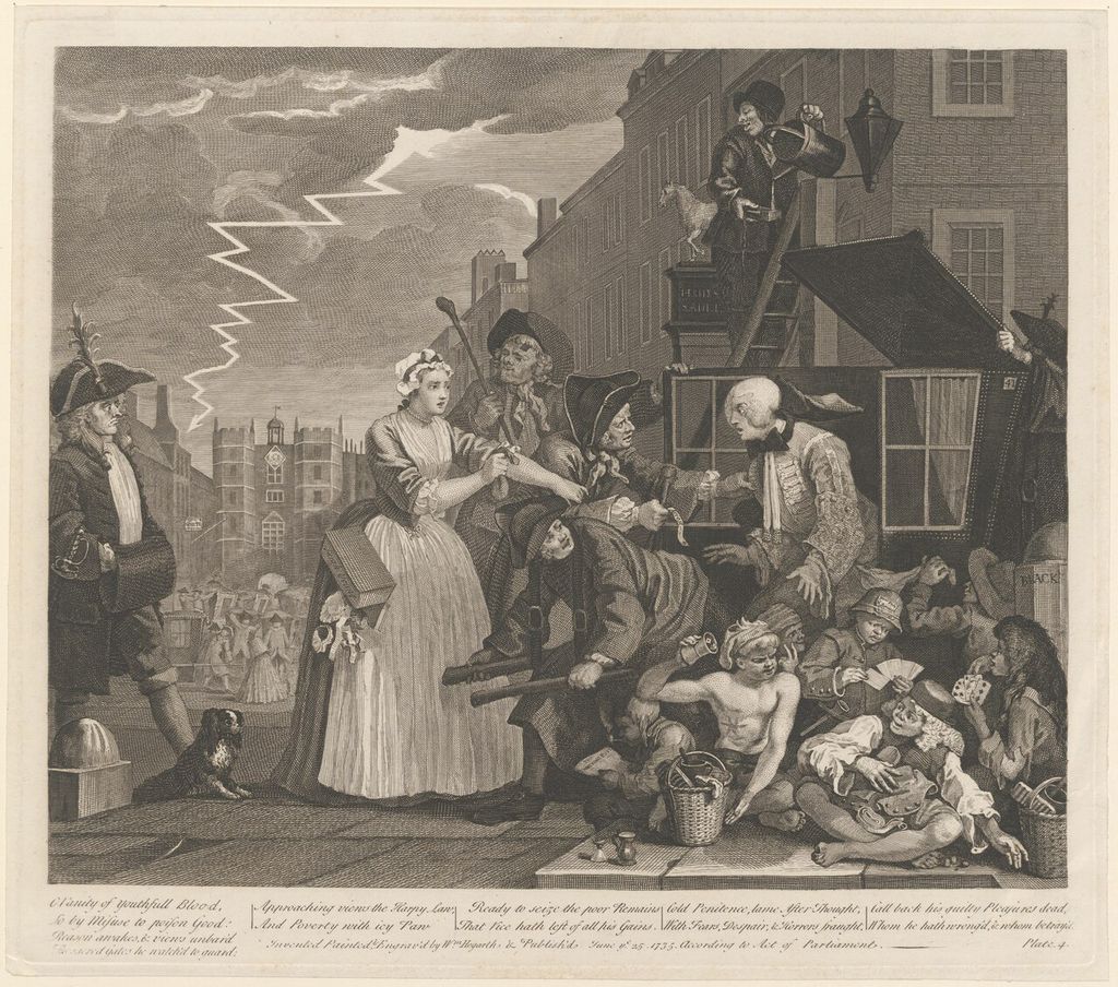
William Hogarth, The Rake’s Progress: the rake arrested for debt. This impression is catalogued circa 1815 by Leiden University Libraries, PK-P-126.391. Hogarth, William (1697-1764) / Wikimedia Commons. Image source. CC BY 4.0. Resized and converted to JPEG; no crop or recolouring.
He initially envisaged eight plates. The Royal College encouraged an expanded book project, and the finished suite retained the old eight-part framework while inserting a second sheet into each numbered stage. Its numbering runs 1, 1a, 2, 2a, and so on to 8a. That structure keeps Hogarth visible without forcing every Hockney scene into an exact counterpart. Riley traces the enlargement from eight to a proposed twenty-four prints, then the final sixteen. [5]
The complete sequence makes its shifts of emphasis clear. Each pair belongs to the published order; the titles do not imply that all sixteen events happened to Hockney. The checklist in Mary Weaver Chapin’s Portland exhibition brochure identifies the plates as follows. [1]
| Stage | First print | Following print |
|---|---|---|
| 1 / 1a | The Arrival | Receiving the Inheritance |
| 2 / 2a | Meeting the Good People (Washington) | The Gospel Singing (Good People) Madison Square Garden |
| 3 / 3a | The Start of the Spending Spree and the Door Opening for a Blonde | The Seven Stone Weakling |
| 4 / 4a | The Drinking Scene | Marries an Old Maid |
| 5 / 5a | The Election Campaign (with Dark Message) | Viewing a Prison Scene |
| 6 / 6a | Death in Harlem | The Wallet Begins to Empty |
| 7 / 7a | Disintegration | Cast Aside |
| 8 / 8a | Meeting the Other People | Bedlam |
This is a progress with diversions. Washington interrupts New York; a concert, a political campaign and a film scene widen the narrative beyond the young man’s private pleasures. Some episodes describe looking at something, making the protagonist an audience as well as a participant. The titles move from arrival and acquisition to exclusion, then replace the earlier encounters with the good people by a meeting with the other people. Reading those verbal changes across the sequence is as important as following the figure.
Arrival and an earned inheritance
The opening plate establishes a stranger moving into a city. The Musée Granet’s curatorial account identifies the Chrysler Building as the destination towards which the figure strides. Architecture provides a compact emblem of arrival: Hockney does not need a fully described street to make New York legible. The isolated figure and abbreviated setting also leave space for the reader to imagine movement between them. A journey becomes a few purposeful marks on an otherwise open sheet. [7]
Receiving the Inheritance changes the terms of Hogarth’s beginning. The money comes through an exchange of artworks, replacing the death of a wealthy parent with the young artist’s own activity. The 1976 Australian National Gallery catalogue transcribes the prices and the reference to Myself and My Heroes within the plate. A picture containing a picture also contains a transaction: the means by which Hockney can afford his adventure becomes its subject. [8]
Emily Porter-Salmon’s close reading draws attention to the negotiation between twenty dollars and eighteen. That small difference makes the apparent windfall comic and particular. Hockney’s figure has entered an institution capable of validating his work, but he still has to bargain. The earlier self-portrait print on the table provides another link between maker and protagonist, placing one representation of Hockney inside another. Autobiography is being built through repeated signs, including the glasses, rather than through a promise that every incident is documentary fact. [9]
Hair dye, desire and the promise of transformation
The unusually long title of plate 3 joins spending to an opening door. In The Start of the Spending Spree and the Door Opening for a Blonde, an oversized bottle of Lady Clairol rises above the protagonist’s head, while a doorway offers access to a landscape of palms, water and a red sunset. Porter-Salmon describes how the branded object and imagined destination occupy different parts of the sheet. The composition turns the language of an advertisement into a spatial proposition: change your appearance and another world will open. [9]
The following Seven Stone Weakling complicates that promise. The protagonist looks towards athletic runners, bringing the transformed hair into contact with a different ideal of the body. His self-presentation has altered, but the title preserves a gap between the person looking and the physical image he admires. Across the two prints, desire moves between consumer product, personal appearance and other men. Hockney makes the pleasures of looking comic without making the desires themselves disappear. [9]
This mixture helps explain the series’ place in Hockney’s relationship with Pop Art. Advertising enters his work through an encounter that matters to an individual. A hair-dye bottle carries a brand, a remembered television appeal and the possibility of self-invention at once. Yet the progression immediately tests the product’s promise. Buying a new appearance cannot settle the larger questions of attraction, confidence and belonging.
A city encountered through pictures and words
The suite moves through public monuments, gospel singing, a bar, electoral campaigning, cinema and death. Its range prevents the city from becoming merely a backdrop for one young man’s nightlife. It is also a place of messages: announcements, religious declarations, prices and prohibitions compete for attention. The Australian catalogue’s transcriptions show how much of this verbal environment Hockney retained, from the voting announcement to the admission price in The Wallet Begins to Empty. Words supply information, interrupt the scene and establish the terms of entry. [8]
Some titles announce the distance between an event and its representation. Viewing a Prison Scene makes looking its subject; it does not say that the protagonist has been imprisoned. The fictional marriage similarly borrows a narrative role from Hogarth. Such differences give the reader a way through the suite: ask whether each plate presents an experience, a spectacle, an imagined danger or an adaptation of an older story. They can coexist within the same graphic language.
In The Drinking Scene, the change from Hogarth is also social and atmospheric. Chapin contrasts his disorderly tavern with Hockney’s comparatively subdued gay bar. A borrowed episode acquires a different kind of encounter and a different degree of exposure. The scene belongs to the rake’s pleasures, but Hockney avoids the crowded accumulation of scandal that makes Hogarth’s version so insistent. The quieter treatment leaves more room for the reader’s attention to rest on the encounter itself. [1]
Death in Harlem adds another layer. Hammer traces its source to a photograph reproduced in Cecil Beaton’s 1938 book about New York and identifies the underlying image with James Van Der Zee’s funeral photography. The plate therefore cannot be assumed to record a death Hockney personally witnessed during his stay. The borrowed image expands the suite’s emotional range while revealing how a remembered or collected picture could enter the narrative alongside direct experience. [6]
How etching, aquatint and colour tell the story
Etching lets an artist draw through an acid-resistant ground on a metal plate. Acid then bites the exposed lines; after inking and wiping, those recessed marks transfer to paper under pressure. The National Portrait Gallery’s explanation emphasises the freedom with which the soft ground can be drawn into. This helps explain why an etched figure can preserve the quickness of drawing even though the finished impression requires several stages of work. [10]
Aquatint supplies a different resource. Grains of resin protect tiny areas of the plate while acid bites around them, producing a surface capable of holding ink as tone. As Colta Ives explains for the Metropolitan Museum of Art, the result can range from pale shading to a rich dark. Line can describe a contour; aquatint can give weight to an area without filling it with individual drawn strokes. The two processes allow a sparse figure to stand against a dense shape or an open field. [11]
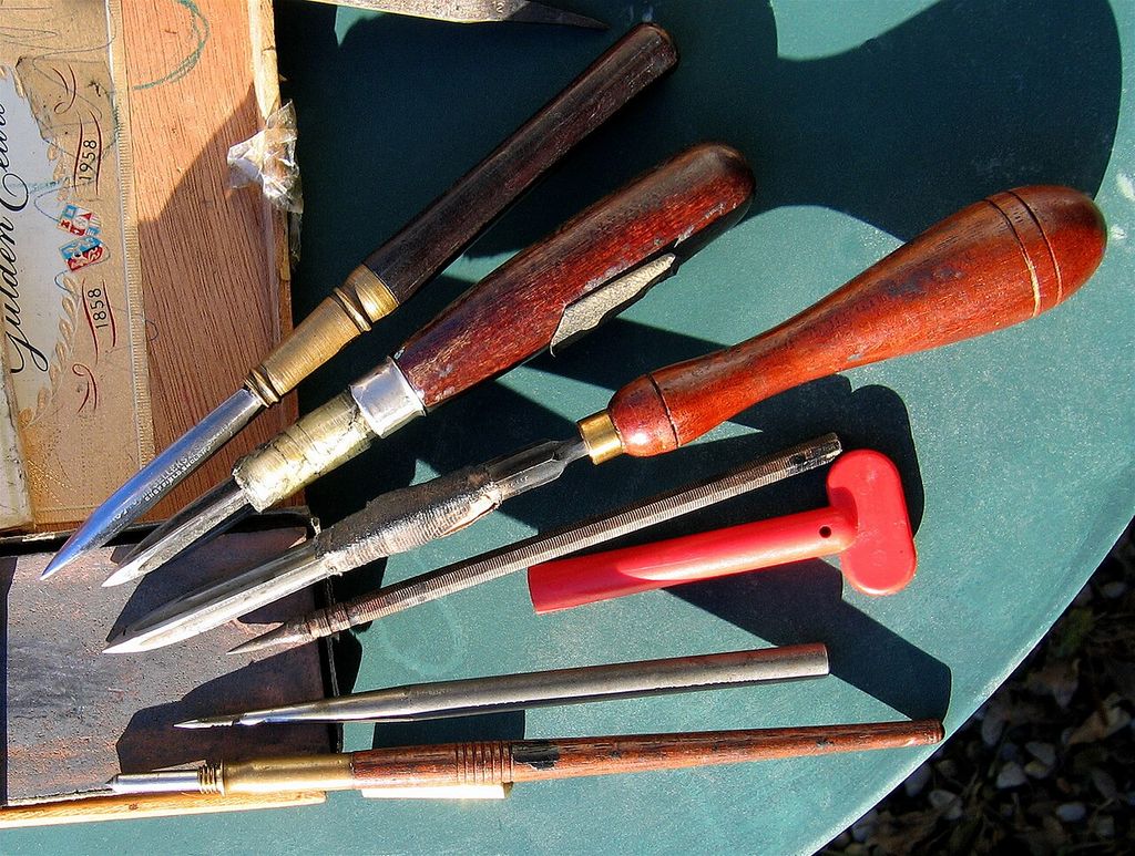
Workshop context: printmaking tools photographed by Hubertine Heijermans. Hubertine Heijermans from Ollon, Saint-Triphon, Switzerland / Wikimedia Commons. Image source. Public domain. Resized and converted to JPEG; no crop or recolouring.
Hockney used this economy with a restricted palette. The National Galleries of Scotland records The Drinking Scene as etching and aquatint in two colours, with an image approximately thirty by forty centimetres. The modest scale suits close reading: the viewer moves between a figure, a sign and a tonal passage, rather than taking in a room-sized spectacle. Printed colour belongs to the construction of these original impressions. It should not be confused with colour added to a later reproduction. [12]
Hockney’s comments on printmaking, reprinted in the 1976 Australian catalogue, emphasise his enjoyment of an etched line and his attachment to the combination of red, black and white. He also described etching as a medium in which he remained willing to tell stories, while acknowledging how slowly alterations could be made. That combination of visual freedom and laborious revision is useful here. The finished suite’s informality was achieved through decisions about selection, spacing and the relationship between drawing and tone. [8]
The red accents give the eye something to seek across otherwise very different scenes. Because the palette is so restricted, a coloured head, object or word can register immediately against black and untouched paper. Aquatint’s larger areas and the fine etched contours establish different kinds of visual weight. The series can therefore move from a physical setting to an emblem or an almost diagrammatic situation while keeping a consistent appearance. [6]
Text participates in the same material language. The repeated identification of the series and individual plate gives each sheet a place in a larger work, while lettering within the scenes behaves like part of the depicted world. A price can reduce a hoped-for pleasure to a sum of money; a brand can promise a new self. The reader alternates between seeing words as marks and accepting what they say. This shifting attention gives the prints a pace that comes from both looking and reading.
Bedlam and the disappearance of difference
As the wallet empties, the story becomes more openly fantastic. In Cast Aside, the protagonist enters the jaws of a monster. Berlin’s Nationalgalerie describes the suite as an interweaving of personal experience, adaptations from Hogarth and nightmares. The monster is a useful reminder of that mixture. Social rejection acquires a visible form, but there is no reason to translate it into a specific undocumented episode in Hockney’s life. [13]
The final Bedlam replaces Hogarth’s asylum with a group of similar figures. Riley reads the small arrow identifying the protagonist as the last surviving distinction between him and the crowd. The individual whom the reader has followed can now be located only with assistance. The series makes anonymity a graphic problem: once the same signs are repeated across several bodies, recognition becomes difficult. [5]
The Detroit Institute of Arts records the final print’s etched title, its London/New York designation and its 1961–62 inscription, as well as the pencil numbering of its particular impression. Those words anchor the invented ending to the same declared journey as the opening. [14] Elsewhere in the plate, the repeated radio slogan places the figures within a shared commercial world. They occupy one image while listening separately, a pointed ending for a sequence filled with encounters. [8]
The contrast can suggest anxiety about conformity, yet the city’s pleasures remain vivid throughout. Hockney gives the reader reasons to enjoy what his protagonist discovers. His own recollections of New York’s excitement resist a reading in which the suite simply condemns the trip. For a young gay artist, looking, changing his appearance and entering new social spaces could carry possibility as well as uncertainty. The fictional downward curve lets him explore that tension without surrendering the work’s humour.
The 1963 edition, posters and the later book
The print cycle was completed and published by Editions Alecto in 1963, in an edition of fifty. The Foundation records the work’s exhibition in London that December and Hockney’s recollection that sales made a stay in California financially possible. The fictional story and the career it helped sustain move in different directions: the protagonist runs out of money, while the artist’s narrative becomes a means of travelling further. [15]
MoMA identifies the publisher as Editions Alecto, London, in association with the Royal College of Art, and distinguishes C. H. Welch’s printing of the plates from the Curwen Press’s printing of the text. Its collection record uses the category of an illustrated book and dates the work 1961–62, published 1963. Other accounts describe the original publication as a folio or portfolio and use the broader 1961–63 date. The difference between a date inscribed within an image, the period of making and the publication year helps explain these descriptions. [16]
The Australian catalogue records fifty numbered sets and ten artist’s proofs, describing two-colour etching and aquatint on zinc, printed on Barcham Green paper. Those details distinguish the edition as a group of original impressions made from worked plates. The sheet includes margins beyond the image, with pencil signatures and edition numbers giving information additional to the lettering printed inside the plate. A measurement of the whole sheet consequently describes a different extent from a measurement of the image itself. [8]
A separate book followed in 1967. The Fitzwilliam Museum holds A Rake’s Progress: A Poem in Five Sections, with a text by David Posner and illustrations after Hockney’s etchings, published by the Lion and Unicorn Press. Its record specifies two-colour halftone plates and explicitly notes the etchings’ earlier publication in 1963. The reproduced images and accompanying poem make this a distinct publication, not a new date for the original suite. [17]
Exhibition posters form another object category. The Metropolitan Museum of Art catalogues A Rake’s Progress and Other Etchings by David Hockney as a poster of 1963. Zorian Clayton’s V&A account connects the poster to the Editions Alecto exhibition at the Print Centre that December. A poster advertising the prints, an original numbered impression and a page reproducing an image from the suite serve different purposes, even when their titles look closely related. [18] [19]
Returning to the Rake on stage
Hockney returned to the subject for John Cox’s Glyndebourne production of Stravinsky’s 1951 opera The Rake’s Progress, first performed there on 21 June 1975. This was a separate commission to design sets and costumes for an opera with a libretto by W. H. Auden and Chester Kallman. The sixteen-print journey through modern America did not become the opera’s plot. Hogarth supplied a shared historical point of departure for two different Hockney projects. [1]
Glyndebourne’s account describes how he enlarged the visual language of engraving through crosshatching and parallel lines. Marks associated with a sheet of paper could cover scenery and clothing, creating the impression of people inhabiting a print. The problems were now those of stage scale and an audience viewing from a distance. The connection with the early cycle lies in his continuing interest in how graphic conventions can make a world convincing. The fuller production history belongs to Hockney’s opera and stage designs. [20]
The beginning of a sustained conversation
The British Council’s Words & Pictures exhibition placed A Rake’s Progress alongside the Cavafy illustrations, the Brothers Grimm fairy tales and The Blue Guitar. Across those later projects, poetry and inherited stories offered occasions to reconsider intimacy, invention and the relationship between an image and its source. The Rake had established an especially flexible approach: a historical work could supply a structure while leaving the artist free to change setting, emphasis and visual language. [21]
Within Hockney’s original prints, the suite remains distinctive for making the young artist both its recognisable actor and an object of amusement. Its ending can erase his character’s individuality, but the act of telling the story asserts a highly particular way of looking. Hockney’s progress is also the reader’s movement across sixteen sheets, discovering how much a line, a patch of tone, a word or an unexpected gap can contribute to a life in pictures.
Works directory
This source-bounded directory combines the works in the Metropolitan Museum’s 2017 retrospective checklist with reviewed museum object records and the additional works and series examined in this guide. It spans several media and is not a complete catalogue raisonné. Titles without an article link remain useful dated records. Metropolitan Museum final retrospective checklist (2017); additional object and series sources are given in the linked articles. [2]
| Name | Date | Medium |
|---|---|---|
| Love Painting | 1960 | Painting |
| Shame | 1960 | Painting |
| The Third Love Painting | 1960 | Painting |
| Tyger Painting No. 2 | 1960 | Painting |
| A Rake’s Progress | 1961–63 | Print series |
| Tea Painting in an Illusionistic Style | 1961 | Painting |
| The Cha-Cha That Was Danced in the Early Hours of 24th March | 1961 | Painting |
| Cleaning Teeth, Early Evening (10pm) W11 | 1962 | Painting |
| Flight into Italy - Swiss Landscape (Painting in a Scenic Style) | 1962 | Painting |
| Man in a Museum (or You're in the Wrong Movie) | 1962 | Painting |
| My Brother is Only Seventeen | 1962 | Painting |
| The First Marriage (A Marriage of Styles I) | 1962 | Painting |
| Domestic Scene, Los Angeles | 1963 | Painting |
| Play Within a Play | 1963 | Painting |
| The Hypnotist | 1963 | Painting |
| Arizona | 1964 | Painting |
| California Art Collector | 1964 | Painting |
| Man in Shower in Beverly Hills | 1964 | Painting |
| Portrait Surrounded by Artistic Devices | 1965 | Painting |
| Rocky Mountains and Tired Indians | 1965 | Painting |
| Beverly Hills Housewife | 1966–67 | Painting |
| Medical Building | 1966 | Painting |
| Peter | 1966 | Drawing |
| Peter Getting Out of Nick’s Pool | 1966 | Painting |
| A Bigger Splash | 1967 | Painting |
| A Lawn Being Sprinkled | 1967 | Painting |
| Kasmin in Bed in His Chateau in Carennac | 1967 | Drawing |
| Peter Feeling Not Too Good | 1967 | Drawing |
| Savings and Loan Building | 1967 | Painting |
| The Room, Tarzana | 1967 | Painting |
| American Collectors (Fred and Marcia Weisman) | 1968 | Painting |
| Christopher Isherwood and Don Bachardy | 1968 | Painting |
| Henry Geldzahler and Christopher Scott | 1968-1969 | Painting |
| W. H. Auden | 1968 | Drawing |
| Peter Langan in His Kitchen at Odins | 1969 | Drawing |
| Mark Glazebrook | 1970 | Drawing |
| Mr and Mrs Clark and Percy | 1970-1971 | Painting |
| Ossie Wearing a Fairisle Sweater | 1970 | Drawing |
| Pool and Steps, Le Nid du Duc | 1971 | Painting |
| Rubber Ring Floating in a Swimming Pool | 1971 | Painting |
| Celia in a Black Dress with White Flowers | 1972 | Drawing |
| Mount Fuji and Flowers | 1972 | Painting |
| Portrait of an Artist (Pool with Two Figures) | 1972 | Painting |
| Portrait of the Artist's Mother, Mrs Laura Hockney, Bradford | 1972 | Drawing |
| The Artist's Father | 1972 | Drawing |
| Dr Eugene Lamb, Lucca | 1973 | Drawing |
| Andy, Paris | 1974 | Drawing |
| Contre-jour in the French Style (Against the Day dans le Style-Français) | 1974 | Painting |
| Gregory Sitting on Base of Column | 1975 | Drawing |
| Kerby (after Hogarth) Useful Knowledge | 1975 | Painting |
| Ron Kitaj Outside Akademie der Kunste Vienna | 1975 | Drawing |
| Kasmin Reading the Udaipur Guide | 1977 | Drawing |
| Looking at Pictures on a Screen | 1977 | Painting |
| My Parents | 1977 | Painting |
| Canyon Painting | 1978 | Painting |
| Mother, Bradford, 19 Feb. 1979 (inscribed 1978) | 1979 | Drawing |
| Mulholland Drive: The Road to the Studio | 1980 | Painting |
| Nichols Canyon | 1980 | Painting |
| Outpost Drive, Hollywood | 1980 | Painting |
| Hollywood Hills House | 1981-1982 | Painting |
| Celia. Los Angeles. April 10th 1982 | 1982 | Polaroid composite |
| Don + Christopher, Los Angeles, 6th March 1982 | 1982 | Polaroid composite |
| Gregory Swimming Los Angeles March 31st 1982 | 1982 | Polaroid composite |
| My Mother, Bolton Abbey, Yorkshire, Nov. 1982 | 1982 | Photocollage |
| Self Portrait 30th Sept. 1983 | 1983 | Drawing |
| Pearblossom Hwy., 11-18th April 1986, #1 | 1986 | Photocollage |
| Pearblossom Hwy., 11–18th April 1986, #2 | 1986 | Photocollage |
| Large Interior, Los Angeles | 1988 | Painting |
| Breakfast at Malibu, Sunday, 1989 | 1989 | Painting |
| Pacific Coast Highway and Santa Monica | 1990 | Painting |
| The Other Side | 1991-1993 | Painting |
| The Eleventh V. N. Painting | 1992 | Painting |
| The Twenty Sixth V. N. Painting | 1992 | Painting |
| The Road Across the Wolds | 1997 | Painting |
| 9 Canvas Study of the Grand Canyon | 1998 | Painting |
| A Bigger Grand Canyon | 1998 | Painting |
| Colorado River | 1998 | Painting |
| Garrowby Hill | 1998 | Painting |
| Colin St. John Wilson. London. 3rd June 1999 | 1999 | Drawing |
| Gregory Evans. Los Angeles. 18th September 1999 | 1999 | Drawing |
| Laura Huston. London. 22nd June 1999 | 1999 | Drawing |
| Lindy. Marchioness of Dufferin and Ava. London. 17th June | 1999 | Painting |
| Going Up Garrowby Hill | 2000 | Painting |
| Red Pots in the Garden | 2000 | Painting |
| A Closer Winter Tunnel, February - March | 2006 | Painting |
| Elderflower Blossom, Kilham, July 2006 | 2006 | Painting |
| The Road to Thwing, July 2006 | 2006 | Painting |
| Bigger Trees near Warter | 2007 | Painting |
| Hawthorn Blossom near Rudston | 2008 | Painting |
| Views Through the Artist's Bedroom Window, Bridlington | 2010-2013 | Digital animation |
| The Arrival of Spring in Woldgate, East Yorkshire in 2011 (twenty eleven) | 2011 | Painting / digital series |
| 82 Portraits and 1 Still-life | 2013–16 | Portrait series |
| Garden | 2015 | Painting |
| Garden with Blue Terrace | 2015 | Painting |
| Garden #3 | 2016 | Painting |
| A Bigger Interior with Blue Terrace | 2017 | Painting |
| Interior with Blue Terrace and Garden | 2017 | Painting |
| A Year in Normandie | 2020–21 | Digital frieze |
Discussion
Look again at the images and ideas explored in David Hockney’s A Rake’s Progress. These editorial prompts invite your observations.
Reader Insights
How does selling his own etchings change the meaning of the inheritance Hockney borrows from Hogarth?
Compare the promise of the opening door in plate 3 with the athletic runners in plate 3a. What can the change of appearance achieve, and what remains unresolved?
In Bedlam, how do repeated figures and the small identifying arrow change the experience of recognising the protagonist?
Join the Conversation
Share a detail, comparison or question about David Hockney’s A Rake’s Progress below.
References
- Mary Weaver Chapin / Portland Art Museum. David Hockney: A Rake’s Progress, exhibition brochure, 2015, pp. 3–8, including essay, notes and checklist. View source.
- The Metropolitan Museum of Art, David Hockney, final exhibition checklist, 15 November 2017. View source.
- The David Hockney Foundation, 2021 chronology. View source.
- The David Hockney Foundation. “1961,” chronology, especially “Etching,” “First trip to NYC,” “Blond hair” and “Back in London.” View source.
- Richard Riley / British Council. David Hockney: Words and Pictures: Four Print Portfolios 1961–77, essay first published in David Hockney: Prints from the British Council Collection, British Council / Editions Jannink, 2002, PDF pp. 3–5 and 7–11. View source.
- Martin Hammer. “David Hockney’s Early Etchings: Going Transatlantic and Being British,” Tate Papers, no. 27, 2017, author’s accepted manuscript, pp. 13–29 and note 1, accessed through the University of Kent repository. View source.
- Musée Granet / Tate. David Hockney: Works from the Tate Collection, press pack, 2023, p. 15, “The Rake’s Progress.” View source.
- Australian National Gallery. David Hockney Prints Selected from the Collection of the Australian National Gallery, Canberra, 1976, pp. 4–8 and 10–13, interview and catalogue entries 1–16. View source.
- Emily Porter-Salmon. Textual Cues, Visual Fictions: Representations of Homosexualities in the Works of David Hockney, PhD thesis, University of Birmingham, 2011, pp. 123–134, especially pp. 126–133. View source.
- National Portrait Gallery. “Etching,” glossary of art terms. View source.
- Colta Ives / Metropolitan Museum of Art. “The Printed Image in the West: Aquatint,” October 2003. View source.
- National Galleries of Scotland. The Drinking Scene, 1961–63, collection record, GMA 5272. View source.
- Staatliche Museen zu Berlin, Nationalgalerie. “A Rake’s Progress: David Hockney’s Prints from the 1960s,” exhibition text, 2012. View source.
- Detroit Institute of Arts. Bedlam, 1961–62, collection record and inscriptions, 68.290. View source.
- The David Hockney Foundation. “1963,” chronology, “A Rake’s Progress” and exhibition list. View source.
- Museum of Modern Art. A Rake’s Progress, 1961–62, published 1963, collection record, 521.1964.1–16. View source.
- Fitzwilliam Museum. A Rake’s Progress: A Poem in Five Sections, David Posner, illustrated by David Hockney, Lion and Unicorn Press, 1967, collection record, PB 129-2003. View source.
- Metropolitan Museum of Art. A Rake’s Progress and Other Etchings by David Hockney, poster, 1963, collection record, 2007.49.619. View source.
- Zorian Clayton / Victoria and Albert Museum. “David Hockney in the V&A: Printmaker, Painter, Pioneer,” 9 July 2026, early prints and exhibition-poster sections. View source.
- Glyndebourne. “The Rake Progressed,” exhibition text, 2021, curated by Philip Boot and Nerissa Taysom. View source.
- British Council. “David Hockney: Words & Pictures,” exhibition account. View source.
More HOCKNEY Works
A Bigger Splash
A momentary disturbance becomes the focus of a large acrylic painting, made through weeks of patient work.
Mr and Mrs Clark and Percy
The designers Celia Birtwell and Ossie Clark occupy a room shaped by light, repeated sittings and the demands of a double portrait.
A Bigger Grand Canyon
Sixty canvases gather memory, studies and changing viewpoints into an immense painting of 1998.
Garrowby Hill
The 1998 oil painting transforms a remembered Yorkshire journey into a road, fields and an expansive view.
Portrait of an Artist (Pool with Two Figures)
Photographic studies, two figures and a swimming pool become a carefully constructed painting of 1972.
My Parents
The 1977 oil painting sets Kenneth and Laura Hockney within a quietly organised interior.
Pearblossom Hwy., 11–18th April 1986, #2
Hundreds of separately made photographs construct a road scene that unfolds through movement and time.
Bigger Trees near Warter
Fifty canvases join into a large outdoor painting of Yorkshire trees, with photography helping the artist organise the whole.