


 by Tom Gurney
Tom Gurney BSc (Hons) is an art history expert with over 20 years experience
Email: tomgurney1@gmail.com / Phone: +44 7429 011000
David Hockney Prints: Introduction
An etched line, a wash of lithographic colour and a shape formed from wet paper pulp each offer a different way into David Hockney’s art. His work with prints ranged from small, sharply observed encounters to pictures assembled across several sheets. Poetry and fairy tales prompted some of his best-known suites, while the practical discoveries of printers opened further possibilities for colour, scale and space. Later, he brought an office copier into the studio and made the receiving fax machine part of a picture’s journey.
The word print needs care here. It can describe an original work conceived through a printing process, or a reproduction of a painting made for circulation. Hockney worked across that boundary with considerable curiosity, but the objects remain different. Knowing how a particular image was made helps explain what its lines, colours and paper are doing. The V&A’s useful starting point is that the finished impression can itself be the original artwork: the printing plate is the means of making it. [1]
At a Glance
- ArtistDavid Hockney
- Born9 July 1937, Bradford, England
- Died11 June 2026
- FocusPrints
Contents
- What makes a Hockney print an original work?
- Etching, aquatint and the freedom of a line
- A Rake’s Progress: a life turned into a sequence
- Cavafy: intimacy through economical drawing
- Grimm: telling more with less
- The Blue Guitar: poetry, Picasso and coloured etching
- Ken Tyler, lithography and the Weather series
- Paper Pools: when the paper becomes the picture
- Moving Focus: portable drawing and expanding space
- Home Made Prints: a copier in the studio
What makes a Hockney print an original work?
In an original etching or lithograph, printing participates in the invention of the picture. A line is drawn for the properties of a plate; colours are tested in proofs; the image takes its final form through its transfer to paper. Several authorised impressions can belong to the same edition. Multiplicity is part of the medium, and does not turn each impression into a photographic copy of a separate painting. A later poster reproducing a Hockney canvas has a different relationship to its source, however faithfully it records the composition. [1]
That distinction is especially rewarding with Hockney because a change of tool often changed the picture’s visual language. Interviewed in 2023, Museum of Contemporary Art Tokyo curator Ai Kusumoto emphasised his interest in marks particular to a medium. She compared the textures of the vase and its pale shadow in the 1969 etching and aquatint Vase and Flowers: different kinds of mark give different things their character. The subject may remain familiar while the means of describing it changes. Printmaking belongs within the larger investigation of Hockney’s style and techniques, with its own material questions. [2]
A print therefore repays attention at more than one distance. From across a room, colour and composition establish themselves; closer up, a wiry contour, a granular tone or an overlap of printed layers becomes important. Its surrounding sheet also belongs to the encounter. The apparent modesty of paper should not suggest that the image is merely a reduced version of something larger elsewhere.
Explore the literary print series
A Rake’s Progress
Sixteen etchings with aquatint rework Hogarth’s narrative through Hockney’s first journey to New York.
Etching, aquatint and the freedom of a line
Hockney’s sustained engagement with etching began at the Royal College of Art in 1961, although he had already made lithographs as a student in Bradford. Richard Riley’s British Council essay places those earlier prints in 1954 and distinguishes them from the later concentration on etching. There was a practical incentive at the Royal College: while painting materials strained Hockney’s finances, the graphics department supplied its materials free. Access to the workshop helped make experiment possible. [3] [4]
Etching converts drawing into a printable metal surface. The artist opens lines through an acid-resistant ground, allowing acid to bite the exposed metal. The plate is inked and wiped so that ink remains in the recessed lines. This gives the etched line its close relationship to drawing, while introducing the intervening work of preparing, biting, inking and wiping the plate. [5] Lithography, which later became equally important for Hockney, works from a flat stone or metal surface and depends on the different behaviour of grease and water. [1]
Aquatint expands the tonal possibilities. In the traditional process described by Metropolitan Museum curator Colta Ives, resin particles protect tiny parts of a plate while acid bites around them. The resulting texture holds ink across areas, producing gradations that can resemble washes. An etching with aquatint can consequently place a crisp outline beside a much softer field of shadow. Its apparent ease on paper depends on decisions about how the plate will retain and release ink. [6]
The early Myself and My Heroes of 1961 already makes the printed sheet a place for personal declaration. Hockney sets himself beside Walt Whitman and Mahatma Gandhi, combining figures with written comments. V&A curator Zorian Clayton draws attention to the halos given to the two heroes and to the artist’s humorous annotation of Gandhi’s vegetarianism. Writing and drawing share the space; public admiration and self-description become parts of one graphic statement. [7]
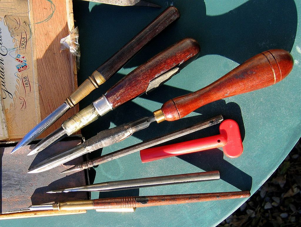
Workshop context: printmaking tools photographed by Hubertine Heijermans. Hubertine Heijermans from Ollon, Saint-Triphon, Switzerland / Wikimedia Commons. Image source. Public domain. Resized and converted to JPEG; no crop or recolouring.
A Rake’s Progress: a life turned into a sequence
The sixteen etchings with aquatint of A Rake’s Progress, made in 1961–63, transform Hockney’s first New York visit into a partly invented coming-of-age story. William Hogarth’s eight engravings, published in 1735, supplied the narrative framework. Hockney doubled the number of images, retaining a paired numbering system from 1 and 1a to 8 and 8a. The extra episodes follow a changing identity within an unfamiliar city. [8]
One particularly sharp alteration is Receiving the Inheritance. Instead of inheriting his father’s money, the young artist receives the proceeds of selling prints to William S. Lieberman at the Museum of Modern Art. A transaction from Hockney’s own trip occupies the place of Hogarth’s inherited fortune. Other episodes weave experience into fiction, so the suite should not be read as a literal diary. The restrained gay bar of The Drinking Scene also gives Hogarth’s tavern episode a contemporary setting. [8]
The work developed after Hockney returned to London and was issued by Editions Alecto in 1963. A proposed book had prompted an expansion of the project, but the completed series appeared as a limited-edition portfolio. Its movement between individual sheets matters: each image has its own title and graphic economy, yet the sequence builds an account of a changing identity. [3]
The print suite also needs to be distinguished from Hockney’s designs for Stravinsky’s opera The Rake’s Progress, first performed at Glyndebourne in 1975. The later project enlarged the language of crosshatching into theatrical space. The separate accounts of the sixteen-print Rake and Hockney’s stage design follow those two undertakings in greater detail. [8]
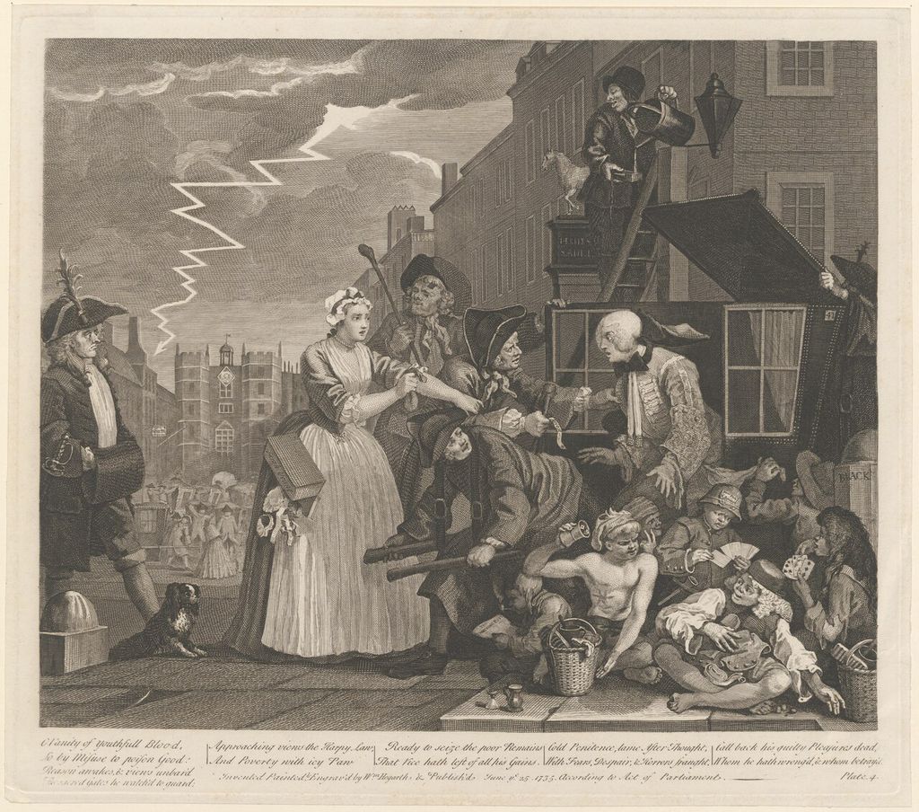
William Hogarth, The Rake’s Progress: the rake arrested for debt. This impression is catalogued circa 1815 by Leiden University Libraries, PK-P-126.391. Hogarth, William (1697-1764) / Wikimedia Commons. Image source. CC BY 4.0. Resized and converted to JPEG; no crop or recolouring.
Cavafy: intimacy through economical drawing
Illustrations for Fourteen Poems from C. P. Cavafy brought a different kind of closeness. Hockney had admired the Greek poet’s writing since his Royal College years. In early 1966 he travelled to Beirut and made preparatory drawings for the etchings, which he printed with Maurice Payne back in London. Cavafy’s evocations of desire between men provided a literary companion to Hockney’s own experience. The figures acquired presence through sparse contours and the small distances between bodies. [9]
The relationship between journey and finished image is subtler than the travel history might suggest. The British Council records that Hockney selected poems in a new translation by Nikos Stangos and Stephen Spender, then drew directly on the copper plates. Only four illustrations have a Middle Eastern setting; most drew on intimate studies of friends in London. Rather than reconstructing Cavafy’s world in exhaustive historical detail, Hockney found a corresponding life around him. [10]
This economy changes the reader’s attention. A room does not need to be fully furnished for the encounter to be legible. The absence of elaborate surroundings gives the relation between the men more weight, while the spareness allows poetry and image to retain their different kinds of suggestion. The pictures make intimacy a subject that can be looked at quietly, without turning every gesture into a narrative explanation. The Foundation’s account connects these scenes with Hockney’s frank defence of his own way of living. [9]
Creation and publication occurred in different years: the plates were made in 1966 and the book and portfolios were published by Editions Alecto in 1967. The phrase Fourteen Poems describes the literary selection, not a universal count of fourteen etchings. The British Council identifies thirteen published images across the project and explains that Portrait of Cavafy II accompanied only certain editions. MoMA’s particular illustrated book is catalogued with twelve etchings, eight with aquatint, in an edition of seventy-five. These records describe different publication forms, and should be kept attached to the objects they identify. [10] [11]
Grimm: telling more with less
The Brothers Grimm gave Hockney a world in which an ordinary sentence could present an extraordinary drawing problem. Work on Illustrations for Six Fairy Tales from the Brothers Grimm occupied much of 1969. He was attracted to the stories’ direct language and strange events; a king building a glass mountain was an invitation to work out how such a thing might be pictured. The Foundation records his collaboration with publisher Paul Cornwall-Jones and printer Maurice Payne. [12]
The scale of the project should not be confused with the size of its published selection. Hockney made more than eighty etchings while developing the illustrations, from which thirty-nine were published by Petersburg Press in 1970. The six chosen tales included Rapunzel, Rumpelstiltskin and The Boy Who Left Home to Learn Fear. Alongside A Rake’s Progress, the Cavafy illustrations and The Blue Guitar, the Grimm work formed the British Council’s exhibition Words & Pictures. Those four literary suites make a revealing route through his early printmaking, without exhausting it. [3] [13]
Technical development supported the stories’ peculiar mixture of clarity and darkness. Hockney described building dense blacks through successive applications of crosshatching and repeated etching. Where a largely open area leaves a figure exposed, a dark accumulation of lines can give the surrounding world a different weight. The distinction is made through the behaviour of marks, without requiring a naturalistic account of every surface. A fairy tale can move abruptly between the everyday and the impossible; the print can make an equally abrupt change between empty paper and concentrated black. [12]
The workshop history survives in objects beyond the finished impressions. The V&A received preparatory drawings in 1972 and the cancelled printing plates in 1973. Clayton explains that holes bored through the plates prevented further intact impressions. The drawings, plates and published prints therefore document different stages of the project. Their survival also helps make the meaning of an edition concrete: the authorised impressions belong to a controlled period of printing, while the altered plate preserves evidence of the image’s manufacture. [7]
The Blue Guitar: poetry, Picasso and coloured etching
Hockney first read Wallace Stevens’s The Man with the Blue Guitar on Fire Island in summer 1976, at Henry Geldzahler’s suggestion. Drawings led into the coloured etchings of 1976–77; Petersburg Press published the project in 1977. The sequence of encounters matters. Stevens’s poem prompted Hockney’s images, while Picasso supplied a further artistic presence. The extended publication title openly acknowledges that chain of inspiration. The Foundation records both a print portfolio and a book. [14]
The portfolio contains twenty etchings, although that convenient description conceals a mixture of processes. MoMA specifies eighteen with aquatint and one with drypoint, and names Maurice Payne and Petersburg Press in the printing record. Its title print is dated 1976–77, published 1977, and belongs to an edition of two hundred. A creation date, a publication date and an edition size answer separate questions about the same work. [15]
The images interpret questions raised by the poem rather than illustrating each passage in sequence. In MoMA’s 1979 exhibition account, curator Alexandra Schwartz drew attention to shadows, glass, curtains and theatrical settings: devices through which Hockney explored the difficulty of representing space and volume. Picasso’s changing pictorial languages provided opportunities to bring different forms of representation together. A picture inside another picture can establish one kind of illusion and then expose it, asking the viewer to keep both the depicted object and its construction in mind. [16]
There was a practical connection to Picasso as well. Working in Paris with Aldo Crommelynck, who had printed Picasso’s work, Hockney learned further etching methods, including sugar-lift and colour techniques. The encounter began with prints made in homage to Picasso in 1973. This is an especially clear example of collaboration enlarging an artist’s vocabulary: learning how a plate could carry a brushlike passage or a new range of colour opened possibilities for subsequent images. The later Blue Guitar collaboration with Payne brought those acquired skills into another workshop relationship. [17] [14]
Ken Tyler, lithography and the Weather series
Kenneth Tyler’s contribution to Hockney’s prints extended across several workshops and decades. Their first group together, A Hollywood Collection of 1965, was made at Gemini Ltd in Los Angeles. Jane Kinsman, writing for the National Gallery of Australia, describes its six colour lithographs as an imagined collection: a portrait, a landscape, a still life, a cityscape, a nude and an abstraction. The conceit allowed a group of prints to play with the expectations attached to different kinds of painting. [18]
In 1973, Hockney and Tyler worked together on the Weather series at Gemini G.E.L. Atmospheric effects became problems in graphic language. Rain, mist, sunlight and lightning demand different descriptions, although none can be reduced to a stable, solid object. Japanese prints offered relevant models for stylising such effects. Hockney’s contemporary comments, preserved in the Foundation chronology, praised Tyler’s ability to retain the smallest marks drawn on the stone. That precision gave apparently casual strokes practical consequences in the finished print. [17]
Kinsman also emphasises the range of colours and drawing methods made available to him, including subtle washes. The printer’s expertise was involved in what the artist could attempt. A delicately varied passage depended on being able to transfer it convincingly; a strong area of colour depended on decisions made through the printing process. The collaboration joined artistic intention to technical knowledge at the point where the picture was still developing. [18]
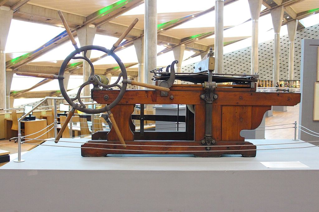
Process context: a lithographic printing machine in the Bibliotheca Alexandrina. علاء / Wikimedia Commons. Image source. CC BY-SA 3.0. Resized and converted to JPEG; no crop or recolouring. Image derivative retains CC BY-SA 3.0.
Paper Pools: when the paper becomes the picture
The 1978 Paper Pools grew from work with Tyler at Bedford Village, New York. They belong to this history of collaboration, but they require a different medium description. Hockney explicitly called them unique objects. Coloured pulp was moulded and pressed to form the picture itself. The fine point of an etching needle had encouraged him to think through lines; wet pulp called for masses and areas of colour. Paper was becoming the substance of the image, as well as its support. [18] [19]
Tyler Graphics’ project notes describe metal-strip moulds made to follow Hockney’s drawings. These were placed on newly formed pulp sheets and filled with coloured pulps and dyes. After lifting away the moulds, he continued to work freehand, using implements that included spoons, ladles and dog combs. Repeated pressing did not end the process immediately: he could add, remove and alter the pulp before the completed sheets were dried. The procedure brought firm boundaries and more freely worked passages into the same object. [20]
The notes also distinguish early groups of variations from the later compositions made across several sheets. For the larger works, three, six or twelve sheets could be placed beside one another, and Tyler built an outdoor platform to give Hockney working room near the swimming pool. An image could extend seven to fourteen feet across. This was a change in bodily scale as much as a new material: the artist worked across an expanse of wet colour, and the viewer encountered a pool picture stretching well beyond the dimensions of a conventional book illustration. [20]
A Diver, Paper Pool 17 demonstrates the distinction particularly clearly. The National Gallery of Australia describes twelve unique, hand-coloured sheets of pressed pulp and records Hockney’s use of Polaroids as source material. The photographs helped him develop a composition, but the completed object is a pulp work. Its physical seams and expanses of colour belong to that object’s construction. A photograph used in preparation, a unique work assembled from sheets and a later printed reproduction should therefore retain their separate identities, even when they share the same swimming-pool subject. [21]
Moving Focus: portable drawing and expanding space
The Moving Focus prints of 1984–87 brought Hockney’s investigations of multiple viewpoints into demanding colour printmaking. The National Gallery of Australia connects the series with Cubism and his interest in Chinese painting, tracing its title to a section in George Rowley’s Principles of Chinese Painting (1947). Interiors, chairs, portraits and views of a Mexican hotel became settings in which perspective could shift. In some works, specially shaped, hand-painted frames extended that investigation beyond the printed rectangle. A sheet of paper could be the centre of a more elaborate constructed object. [22]
Tyler developed a practical answer to the weight of lithographic stones: a portable drawing pad of textured, near-transparent Mylar. National Gallery curator David Greenhalgh explains that the surface could hold lithographic drawing materials and that successive layers could carry different colours. Hockney could work outdoors and move around his subject. At the Hotel Romano Angeles in Acatlán, Mexico, Tyler documented him shifting between the veranda and the courtyard. The technology allowed the activity of looking from different positions to enter the print’s preparation directly. [23]
This mobility helps explain the series’ title. Kunstmuseum Luzern’s account describes Hockney combining views made from beside the fountain and from the arcade, so that the space feels dynamic. Its discussion of Amaryllis in Vase identifies another device: the table uses reversed perspective, with its edges directed towards a vanishing point behind the viewer. Such a construction makes a viewer conscious of approaching, looking across and turning towards things. The furniture and flowers remain recognisable, while the familiar rules for fixing their positions begin to move. [24]
Different versions of a subject also register continued looking. The Granet/Tate exhibition guide points out the temporal progression in the Acatlán views, which include a first day, a second day and a return two weeks later. It also places the four-panel Caribbean Tea Time of 1987 alongside these spatial experiments. That folding screen combines lithography, screenprint, printed paper and stencil. Its format requires a reader to think beyond a small image reproduced on a page: the work has an extent and an articulated structure that affect how it occupies a room. [25]
Home Made Prints: a copier in the studio
In 1986, Hockney began his Home Made Prints using an office photocopier. He could change coloured cartridges, enlarge or reduce an image, repeat elements and place objects directly on the scanning bed. He compared the layering of the resulting images to lithography, while valuing a much quicker cycle of making, inspecting and changing a picture. The machine allowed him to complete these operations himself in the studio. The term home made described that independence from the specialist workshop. [26]
The change answered a difference in working time. Kusumoto notes that some mid-1980s colour lithographs involved more than thirty printing plates, requiring complex preparation. The copier allowed the next alteration to follow almost at once. An everyday machine gave Hockney access to a different rhythm of work. [2]
These prints also connect with his photographic collages, where an image can be built from several distinct parts. The Foundation records Hockney noticing the relation himself in 1986: he compared the construction of space from photographed surfaces in Pearblossom Highway with his work on the copier. In both cases, assembling a picture involves decisions about what meets what. An overlap or a change in scale can become a pictorial event, rather than a flaw to be concealed. [26]
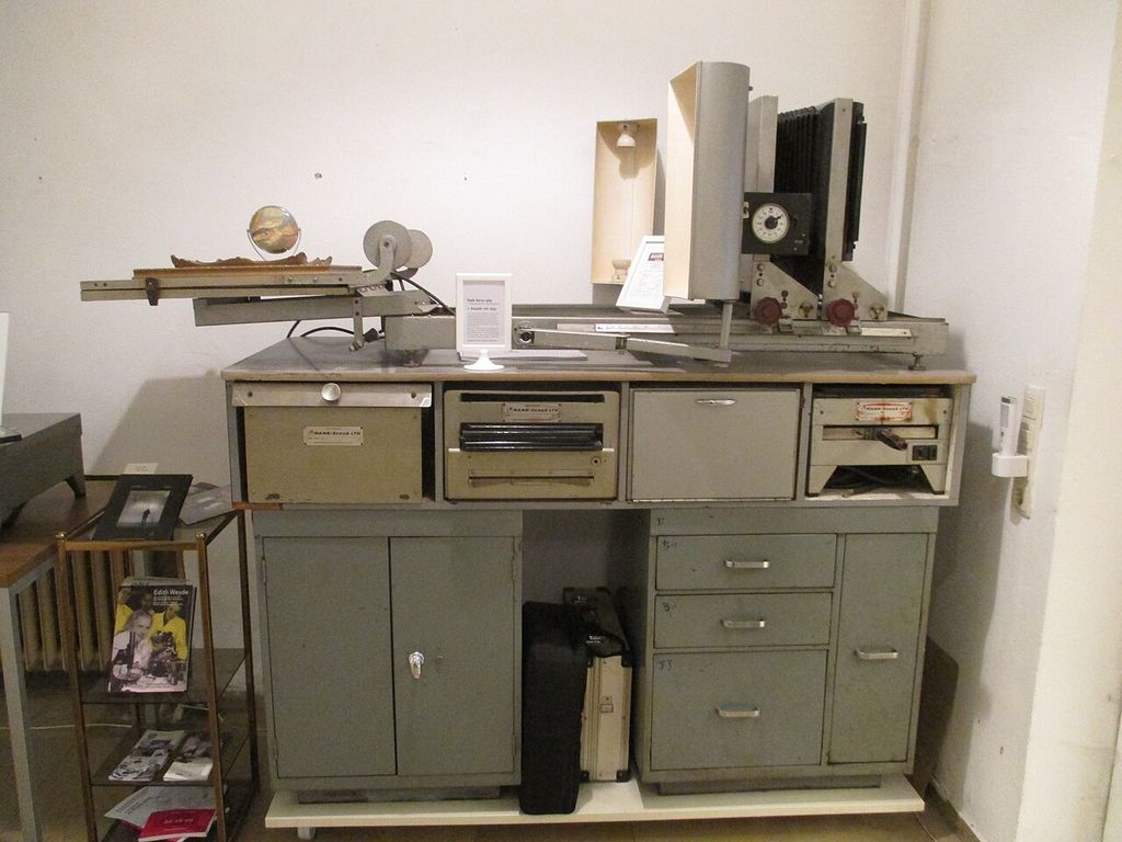
Technology context: historical Rank Xerox reproduction equipment in a museum display. Dat doris / Wikimedia Commons. Image source. CC BY-SA 4.0. Resized and converted to JPEG; no crop or recolouring. Image derivative retains CC BY-SA 4.0.
Fax pictures: making and sending
Fax introduced transmission into this experiment in 1988. Hockney worked with the machine’s capacities, testing ways to stretch, reduce and recombine images, and developing compositions that the receiver assembled from several sheets. His Hollywood Sea Picture Supply Co. made communication itself part of the undertaking. The Foundation’s account preserves his practical distinction between a wash and the opaque grey that a fax machine could translate effectively into dots. Successful marks came from understanding how that particular machine read them. [27]
The large projects gave this apparently small format a public scale. For Tennis in 1989, Hockney sent 144 sheets from Los Angeles to four fax machines at Salts Mill in Yorkshire, where they were assembled according to his instructions. His São Paulo Biennial project that year also used fax, although a failure of the telephone connection required an improvised solution: sheets faxed between rooms in a Los Angeles hotel were carried to Brazil for installation. The work depended on the receiving and assembling arrangements as well as the sending device. [28]
The experiment continued in Japan. Kusumoto describes public projects in Tokyo in 1990 for which drawings arrived from Los Angeles in more than two hundred fragments and were joined at the venue. Making an image and sharing it rapidly remained connected in later experiments, including Hockney’s iPad work. [2]
Editions, versions and later reproductions
The practical way to understand this varied field is to keep the work’s title, medium, dates and publication form together. The date 1966 on a Cavafy etching can refer to making the plate, while 1967 records publication. A portfolio and a bound book can contain different selections. A preparatory drawing, a proof and a published impression record different stages. MoMA’s Blue Guitar entry, for example, separately identifies the printing methods, publisher, printer, plate dimensions, sheet dimensions and edition. Those distinctions explain an object’s place in the work’s history. [11] [15]
Hockney also used copying to circulate existing pictures. The Foundation records that the colour laser copier he acquired in 1987 reproduced paintings as well as allowing him to reconfigure and collage earlier drawings. A machine could serve several purposes within the studio. Its name alone cannot settle the status of an output; understanding what Hockney was doing with it is more informative. [29]
Digital work makes the same attentiveness useful. The National Gallery of Victoria catalogues Striped Mug of 2010 as an iPad drawing printed on paper and identifies its own impression as 7/25. The description tells us both where the drawing originated and what form the museum’s object takes. A paper output can therefore belong to a work conceived digitally; the word printed alone does not establish that something reproduces an earlier canvas. [30]
Works directory
This source-bounded directory combines the works in the Metropolitan Museum’s 2017 retrospective checklist with reviewed museum object records and the additional works and series examined in this guide. It spans several media and is not a complete catalogue raisonné. Titles without an article link remain useful dated records. Metropolitan Museum final retrospective checklist (2017); additional object and series sources are given in the linked articles. [31]
| Name | Date | Medium |
|---|---|---|
| Love Painting | 1960 | Painting |
| Shame | 1960 | Painting |
| The Third Love Painting | 1960 | Painting |
| Tyger Painting No. 2 | 1960 | Painting |
| A Rake’s Progress | 1961–63 | Print series |
| Tea Painting in an Illusionistic Style | 1961 | Painting |
| The Cha-Cha That Was Danced in the Early Hours of 24th March | 1961 | Painting |
| Cleaning Teeth, Early Evening (10pm) W11 | 1962 | Painting |
| Flight into Italy - Swiss Landscape (Painting in a Scenic Style) | 1962 | Painting |
| Man in a Museum (or You're in the Wrong Movie) | 1962 | Painting |
| My Brother is Only Seventeen | 1962 | Painting |
| The First Marriage (A Marriage of Styles I) | 1962 | Painting |
| Domestic Scene, Los Angeles | 1963 | Painting |
| Play Within a Play | 1963 | Painting |
| The Hypnotist | 1963 | Painting |
| Arizona | 1964 | Painting |
| California Art Collector | 1964 | Painting |
| Man in Shower in Beverly Hills | 1964 | Painting |
| Portrait Surrounded by Artistic Devices | 1965 | Painting |
| Rocky Mountains and Tired Indians | 1965 | Painting |
| Beverly Hills Housewife | 1966–67 | Painting |
| Medical Building | 1966 | Painting |
| Peter | 1966 | Drawing |
| Peter Getting Out of Nick’s Pool | 1966 | Painting |
| A Bigger Splash | 1967 | Painting |
| A Lawn Being Sprinkled | 1967 | Painting |
| Kasmin in Bed in His Chateau in Carennac | 1967 | Drawing |
| Peter Feeling Not Too Good | 1967 | Drawing |
| Savings and Loan Building | 1967 | Painting |
| The Room, Tarzana | 1967 | Painting |
| American Collectors (Fred and Marcia Weisman) | 1968 | Painting |
| Christopher Isherwood and Don Bachardy | 1968 | Painting |
| Henry Geldzahler and Christopher Scott | 1968-1969 | Painting |
| W. H. Auden | 1968 | Drawing |
| Peter Langan in His Kitchen at Odins | 1969 | Drawing |
| Mark Glazebrook | 1970 | Drawing |
| Mr and Mrs Clark and Percy | 1970-1971 | Painting |
| Ossie Wearing a Fairisle Sweater | 1970 | Drawing |
| Pool and Steps, Le Nid du Duc | 1971 | Painting |
| Rubber Ring Floating in a Swimming Pool | 1971 | Painting |
| Celia in a Black Dress with White Flowers | 1972 | Drawing |
| Mount Fuji and Flowers | 1972 | Painting |
| Portrait of an Artist (Pool with Two Figures) | 1972 | Painting |
| Portrait of the Artist's Mother, Mrs Laura Hockney, Bradford | 1972 | Drawing |
| The Artist's Father | 1972 | Drawing |
| Dr Eugene Lamb, Lucca | 1973 | Drawing |
| Andy, Paris | 1974 | Drawing |
| Contre-jour in the French Style (Against the Day dans le Style-Français) | 1974 | Painting |
| Gregory Sitting on Base of Column | 1975 | Drawing |
| Kerby (after Hogarth) Useful Knowledge | 1975 | Painting |
| Ron Kitaj Outside Akademie der Kunste Vienna | 1975 | Drawing |
| Kasmin Reading the Udaipur Guide | 1977 | Drawing |
| Looking at Pictures on a Screen | 1977 | Painting |
| My Parents | 1977 | Painting |
| Canyon Painting | 1978 | Painting |
| Mother, Bradford, 19 Feb. 1979 (inscribed 1978) | 1979 | Drawing |
| Mulholland Drive: The Road to the Studio | 1980 | Painting |
| Nichols Canyon | 1980 | Painting |
| Outpost Drive, Hollywood | 1980 | Painting |
| Hollywood Hills House | 1981-1982 | Painting |
| Celia. Los Angeles. April 10th 1982 | 1982 | Polaroid composite |
| Don + Christopher, Los Angeles, 6th March 1982 | 1982 | Polaroid composite |
| Gregory Swimming Los Angeles March 31st 1982 | 1982 | Polaroid composite |
| My Mother, Bolton Abbey, Yorkshire, Nov. 1982 | 1982 | Photocollage |
| Self Portrait 30th Sept. 1983 | 1983 | Drawing |
| Pearblossom Hwy., 11-18th April 1986, #1 | 1986 | Photocollage |
| Pearblossom Hwy., 11–18th April 1986, #2 | 1986 | Photocollage |
| Large Interior, Los Angeles | 1988 | Painting |
| Breakfast at Malibu, Sunday, 1989 | 1989 | Painting |
| Pacific Coast Highway and Santa Monica | 1990 | Painting |
| The Other Side | 1991-1993 | Painting |
| The Eleventh V. N. Painting | 1992 | Painting |
| The Twenty Sixth V. N. Painting | 1992 | Painting |
| The Road Across the Wolds | 1997 | Painting |
| 9 Canvas Study of the Grand Canyon | 1998 | Painting |
| A Bigger Grand Canyon | 1998 | Painting |
| Colorado River | 1998 | Painting |
| Garrowby Hill | 1998 | Painting |
| Colin St. John Wilson. London. 3rd June 1999 | 1999 | Drawing |
| Gregory Evans. Los Angeles. 18th September 1999 | 1999 | Drawing |
| Laura Huston. London. 22nd June 1999 | 1999 | Drawing |
| Lindy. Marchioness of Dufferin and Ava. London. 17th June | 1999 | Painting |
| Going Up Garrowby Hill | 2000 | Painting |
| Red Pots in the Garden | 2000 | Painting |
| A Closer Winter Tunnel, February - March | 2006 | Painting |
| Elderflower Blossom, Kilham, July 2006 | 2006 | Painting |
| The Road to Thwing, July 2006 | 2006 | Painting |
| Bigger Trees near Warter | 2007 | Painting |
| Hawthorn Blossom near Rudston | 2008 | Painting |
| Views Through the Artist's Bedroom Window, Bridlington | 2010-2013 | Digital animation |
| The Arrival of Spring in Woldgate, East Yorkshire in 2011 (twenty eleven) | 2011 | Painting / digital series |
| 82 Portraits and 1 Still-life | 2013–16 | Portrait series |
| Garden | 2015 | Painting |
| Garden with Blue Terrace | 2015 | Painting |
| Garden #3 | 2016 | Painting |
| A Bigger Interior with Blue Terrace | 2017 | Painting |
| Interior with Blue Terrace and Garden | 2017 | Painting |
| A Year in Normandie | 2020–21 | Digital frieze |
Discussion
Look again at the images and ideas explored in David Hockney Prints. These editorial prompts invite your observations.
Reader Insights
Which process most changes what the drawn mark can become on the finished sheet?
How does keeping the book, portfolio, plate and individual impression distinct affect your reading of the literary suites?
What connects the collaborative workshop with Hockney’s more independent copier and fax experiments?
Join the Conversation
Share a detail, comparison or question about David Hockney Prints below.
References
- Victoria and Albert Museum, “What is print?”, updated 17 April 2024, introduction and sections on intaglio, etching and lithography. View source.
- Tamaki Sugihara, interview with Ai Kusumoto, “ホックニーはなぜ評価と人気を60年も獲得し続けられたのか?”, Tokyo Art Beat, 25 August 2023, sections on medium-specific marks and office technologies. View source.
- Richard Riley, “David Hockney: Words and Pictures — Four Print Portfolios 1961–77”, essay first published in David Hockney: Prints from the British Council Collection (2002), exhibition PDF, pp. 3–5 and 7. View source.
- The David Hockney Foundation, chronology, 1961, “Etching”. View source.
- National Portrait Gallery, “Etching”, glossary of art terms. View source.
- Colta Ives, “The Printed Image in the West: Aquatint”, Heilbrunn Timeline of Art History, Metropolitan Museum of Art, October 2003, description of the technique. View source.
- Zorian Clayton, “David Hockney in the V&A: printmaker, painter, pioneer”, Victoria and Albert Museum, 9 July 2026, passages on Myself and My Heroes and the Grimm drawings and cancelled plates. View source.
- Mary Weaver Chapin, David Hockney: A Rake’s Progress, Portland Art Museum exhibition brochure, 2015, pp. 3–7, including the essay and checklist. View source.
- The David Hockney Foundation, chronology, 1966, “Beirut and Cavafy”. View source.
- British Council Collection, “‘He Enquired after the Quality’ from Illustrations for Fourteen Poems from C. P. Cavafy”, collection record and suite description. View source.
- Museum of Modern Art, Portrait of Cavafy in Alexandria from Fourteen Poems, 1966, published 1967, object 45.1967.1, illustrated-book record. View source.
- The David Hockney Foundation, chronology, 1969, “Grimm’s Fairy Tales”, including the artist’s account of crosshatching. View source.
- British Council, “David Hockney: Words & Pictures”, exhibition account. View source.
- The David Hockney Foundation, chronology, 1977, “The Man with the Blue Guitar”. View source.
- Museum of Modern Art, The Blue Guitar from The Blue Guitar, 1976–77, published 1977, object 437.1977.1. View source.
- Museum of Modern Art / Alexandra Schwartz, “David Hockney Etchings ‘The Blue Guitar’ on View at MoMA”, press release no. 18, April 1979, pp. 1–2. View source.
- The David Hockney Foundation, chronology, 1973, “Working with Ken Tyler at Gemini G.E.L.” and “Honoring Picasso”. View source.
- Jane Kinsman, “David Hockney”, National Gallery of Australia, Kenneth E. Tyler Collection, artist account. View source.
- The David Hockney Foundation, chronology, 1978, “Paper Pools”. View source.
- Tyler Graphics Ltd, “David Hockney: Paper Pools”, project description, National Gallery of Australia archive, p. 1. View source.
- National Gallery of Australia, “David Hockney: symbolic expressions of queer experience”, passage on A Diver, Paper Pool 17. View source.
- National Gallery of Australia, David Hockney: Prints, secondary education resource, pp. 15–17, “The Modern-day Cubist”. View source.
- David Greenhalgh, “Travelling through images: David Hockney in Mexico”, National Gallery of Australia, 28 November 2019, passages on the Mylar drawing pad and Acatlán. View source.
- Kunstmuseum Luzern, “Moving Focus”, 2022 exhibition microsite, sections on reversed and multiple perspective and Acatlán. View source.
- Musée Granet / Tate, David Hockney: Collection de la Tate, 2023 exhibition press guide, p. 16, “Moving Focus”. View source.
- The David Hockney Foundation, chronology, 1986, “Home Made Prints” and the artist’s comparison with Pearblossom Highway. View source.
- The David Hockney Foundation, chronology, 1988, “Fax machine”. View source.
- The David Hockney Foundation, chronology, 1989, “XX Bienal de São Paulo” and “Tennis”. View source.
- The David Hockney Foundation, chronology, 1987, “Color photocopier”. View source.
- National Gallery of Victoria, Everyday Moments: Inspired by David Hockney’s Digital Still Life Paintings, teaching resource, p. 3, object details for Striped Mug. View source.
- The Metropolitan Museum of Art, David Hockney, final exhibition checklist, 15 November 2017. View source.
More HOCKNEY Works
A Bigger Splash
A momentary disturbance becomes the focus of a large acrylic painting, made through weeks of patient work.
Mr and Mrs Clark and Percy
The designers Celia Birtwell and Ossie Clark occupy a room shaped by light, repeated sittings and the demands of a double portrait.
A Bigger Grand Canyon
Sixty canvases gather memory, studies and changing viewpoints into an immense painting of 1998.
Garrowby Hill
The 1998 oil painting transforms a remembered Yorkshire journey into a road, fields and an expansive view.
Portrait of an Artist (Pool with Two Figures)
Photographic studies, two figures and a swimming pool become a carefully constructed painting of 1972.
My Parents
The 1977 oil painting sets Kenneth and Laura Hockney within a quietly organised interior.
Pearblossom Hwy., 11–18th April 1986, #2
Hundreds of separately made photographs construct a road scene that unfolds through movement and time.
Bigger Trees near Warter
Fifty canvases join into a large outdoor painting of Yorkshire trees, with photography helping the artist organise the whole.