


 by Tom Gurney
Tom Gurney BSc (Hons) is an art history expert with over 20 years experience
Email: tomgurney1@gmail.com / Phone: +44 7429 011000
David Hockney’s Opera and Stage Design: Introduction
The stage gave David Hockney a place to test what a painted image could do when people walked through it, music filled it and light changed its apparent depth. A hatched line could spread from scenery onto a costume; a flat could slide away to uncover another world. His designs made the pleasures and uncertainties of pictorial illusion part of a live performance. Recognisable rooms, gardens and cities emerged from marks, colours and arranged surfaces, allowing the pictured place and its construction to register together.
Opera became a sustained part of that investigation with The Rake’s Progress at Glyndebourne in 1975. His first theatre commission had come earlier: Alfred Jarry’s Ubu Roi at London’s Royal Court Theatre in 1966. Hockney brought an existing interest in theatrical devices to the stage, then carried new experience of space, scale and spectatorship back into his wider practice. [1] [2]
At a Glance
- ArtistDavid Hockney
- Born9 July 1937, Bradford, England
- Died11 June 2026
- FocusOpera and Stage Design
Contents
- Before opera: the painted theatre of Ubu Roi
- The Rake’s Progress: three related works
- A drawing had to work from the back row
- The Magic Flute: colour, moving flats and an Italian dragon
- Parade: designed in 1980, performed in 1981
- A second Met evening: Stravinsky
- Tristan und Isolde: light became part of the image
- Turandot: models, costumes and the moving chorus
- Collaboration and the life of a revival
- What the stage brought back to painting
Before opera: the painted theatre of Ubu Roi
For the 1966 revival of Ubu Roi, Hockney found a useful challenge in Jarry’s rejection of conventional scenery. As he later recalled in the account reproduced by his Foundation, he had already used theatrical devices in paintings and wondered what would happen when those devices returned to a theatre. His solution began with a drawing for each scene. Small painted backdrops, approximately twelve by eight feet, descended on conspicuous ropes. They occupied only part of the available stage and suggested an enlarged toy theatre. [1]
Those proportions suggest how the design could work. A backdrop smaller than the stage does not have to persuade the viewer that its pictured world continues indefinitely beyond the proscenium. The surrounding space and the visible means of lowering it can remain part of the joke. Hockney’s recollection describes an approach in which the picture’s status as a picture supplies theatrical energy. A scene arrives before the audience as a deliberately fashioned object, available to be exchanged for the next one. It raises a productive question for the opera designs: how much could a stage acknowledge its own construction while still making an absorbing imaginary world?
The Rake’s Progress: three related works
The title A Rake’s Progress connects several different projects. William Hogarth published his cycle of eight engravings in 1735. Hockney’s sixteen etchings with aquatint, made in 1961–63, transformed that narrative into an account drawing on his first visit to New York. The stage and costume designs for Stravinsky’s opera belonged to another commission, first performed at Glyndebourne on 21 June 1975, with John Cox directing. The prints helped make Hockney an apt choice, but the opera required a new visual solution. [2]
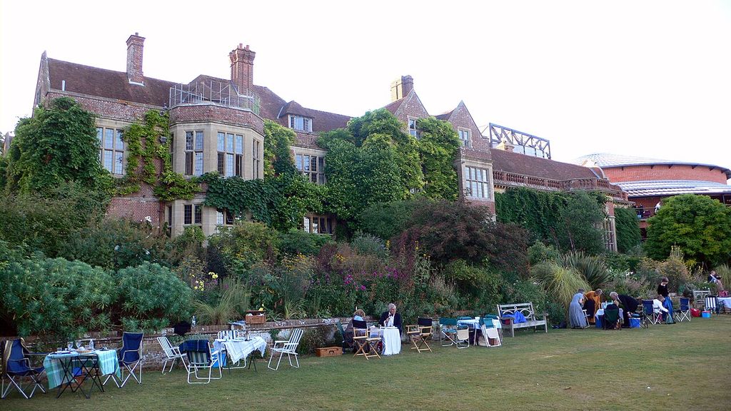
Glyndebourne House and the auditorium behind it, photographed in 2006. A later view of the setting for Hockney’s opera-design work. Wolfiewolf / Wikimedia Commons. Image source. CC BY 2.0. Image resized; framing and colours retained.
The engravings were the crucial historical reference. Crosshatching builds tone from closely spaced lines, often crossing in different directions. Hockney enlarged this language across sets and costumes, giving the performed world the graphic texture of an eighteenth-century print. Mary Weaver Chapin’s Portland Art Museum essay connects that linearity to Hockney’s response to Stravinsky’s score: its modern angularity and its reworking of older musical forms. The limited red, blue and green accents also recalled the resources of earlier colour printing. Readers interested in the separate autobiographical series can follow the fuller account of Hockney’s A Rake’s Progress prints. [2]
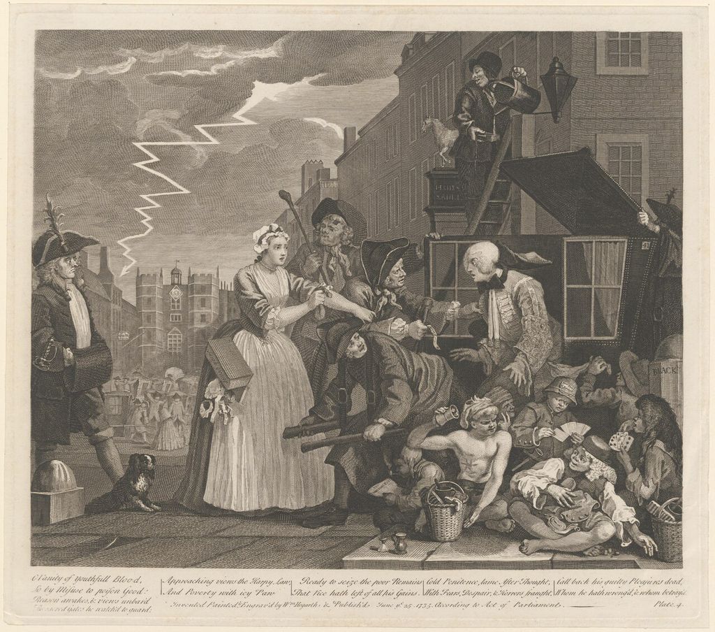
William Hogarth, The Rake’s Progress: the rake arrested for debt. This impression is catalogued circa 1815 by Leiden University Libraries, PK-P-126.391. Hogarth, William (1697-1764) / Wikimedia Commons. Image source. CC BY 4.0. Resized and converted to JPEG; no crop or recolouring.
The effect brought flatness into contact with bodily presence. A drawn shadow ordinarily tells us that a represented surface turns away from light. Here, such marks covered objects and clothing already occupying real space. The performer’s movement and the printed-looking surface could therefore give different kinds of information at once. That tension helped make the historical reference active: Hogarth’s graphic vocabulary became the substance of a new theatrical environment. Glyndebourne’s exhibition account aptly describes the enlargement of the engraving language into a living stage world. [3]
A drawing had to work from the back row
Hockney could not simply enlarge the marks that looked convincing on a sheet of paper. Glyndebourne records his experiments with samples of crosshatching hung on the stage while he judged them from the rear of the auditorium using binoculars. Chapin’s account preserves the practical alternatives: lines too fine would merge into a solid tone, while lines too large would produce an inappropriate chequered effect. The chosen interval had to survive the distance between scenery and spectator. [2] [3]
This episode gives a concrete meaning to the relationship between drawing and theatre. The expressive mark had become a measurement problem, and the viewer’s seat was part of its solution. A costume needed to register as clothing on a moving body and as a patterned surface at a distance. Scenery needed enough graphic definition to preserve the engraving reference without dissolving into visual noise. Scale was therefore inseparable from the idea. Hockney tested the design by looking from the place where its public would encounter it. The shift from studio drawing to stage design involved learning how a mark behaved across an actual room. [3]
The Magic Flute: colour, moving flats and an Italian dragon
Hockney and Cox worked together again on Mozart’s The Magic Flute, which opened at Glyndebourne in May 1978. The Foundation dates the start of Hockney’s work to 1977 and records thirty-five backdrops and a visit to Egypt. The commission interrupted his painting for nearly a year. For this production he chose moving flats, recalling theatrical methods of Mozart’s period, and responded to what he heard as the score’s clarity, colour and fun. His account resists the ponderous character that he associated with nineteenth-century interpretations of the opera. [4]
The comparison with The Rake’s Progress shows how differently he could interpret music. Crosshatching had supplied a common graphic language for Stravinsky’s eighteenth-century references. Mozart prompted a succession of distinct, brightly articulated settings. Flats moving into and out of view allowed the spectator to experience a painted place as a temporary arrangement, capable of changing with the drama. Hockney described beginning with the clarity of an Italian painting, keeping everything in focus and avoiding perspective tricks in the opening rocky landscape. His stated model was a way of organising attention across the scene. [4]
He also named a precise borrowing: the dragon in the National Gallery’s Uccello. The relevant comparison is Paolo Uccello’s Saint George and the Dragon, painted about 1470. In that picture, the strange angular creature stands before a dark cave while the knight attacks and the princess holds its leash. The National Gallery explains how the landscape’s differing directions and vanishing points contribute to its marvellous atmosphere. A reader can use the painting to understand the kind of concentrated, sharply defined fantasy that interested Hockney, while keeping the Renaissance painting and the opera design distinct. His testimony establishes the dragon connection; it does not establish that he copied every feature of Uccello’s spatial scheme. [4] [5]
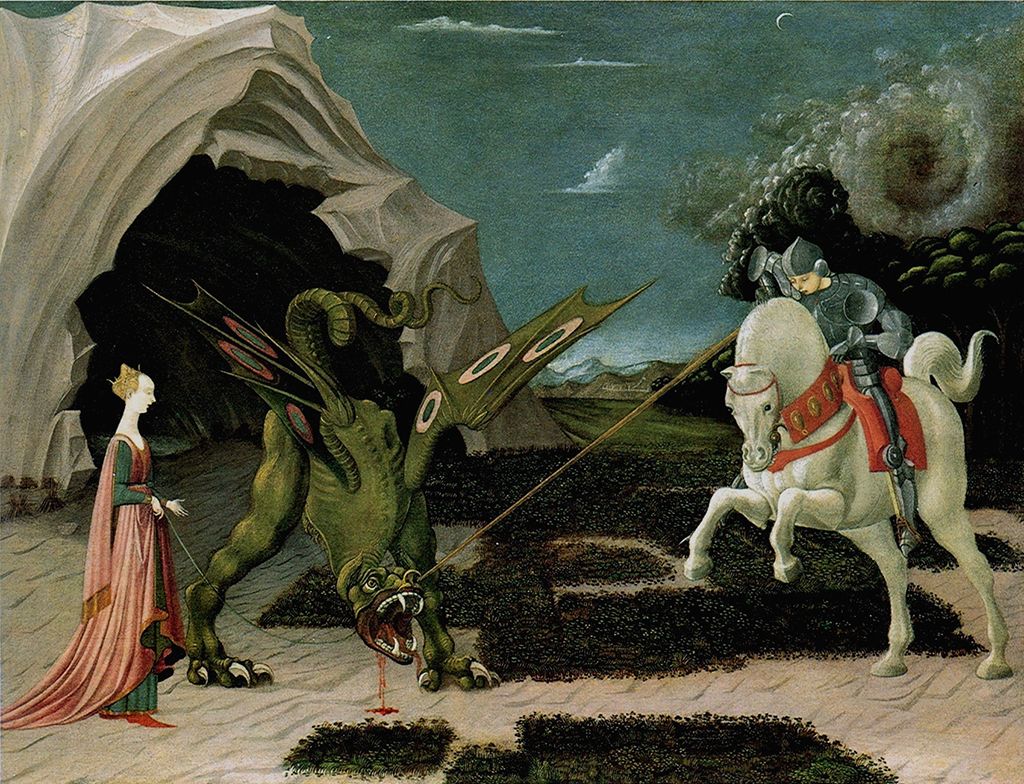
Paolo Uccello, Saint George and the Dragon, about 1470, National Gallery, London, NG6294. Hockney named Uccello’s dragon when describing The Magic Flute designs.
Parade: designed in 1980, performed in 1981
The Metropolitan Opera commission widened both the scale and the variety of the work. Hockney was designing its French triple bill in 1980 at the invitation of director John Dexter; the project also brought the young assistant Ian Falconer into his working circle. Under the collective title Parade, the evening joined Erik Satie’s ballet Parade with Francis Poulenc’s Les Mamelles de Tirésias and Maurice Ravel’s L’Enfant et les Sortilèges. [6]
Preparations began before audiences saw the production. The Foundation records a delay caused by a workers’ strike, and the Met’s performance archive gives the premiere as 20 February 1981. That archive credits Dexter with the production, Hockney as designer and Gil Wechsler as lighting designer; it also records different choreographic responsibilities across the evening. The bill depended on a coordinated theatrical team. [7] [8]
The three works offered different visual problems. Parade brought a world of performers and theatrical display; Poulenc’s opera supplied comic transformations; Ravel’s involved a child confronting animated objects and creatures. In a contemporary review preserved by the Met, Peter Goodman described the Mediterranean brightness of the setting for Les Mamelles and the powerful red and blue forest of L’Enfant. He also noted recurring performers who helped join the three parts. Colour and movement could give the audience continuity without making every work occupy an identical setting. [8]
One preparatory sheet makes the process more tangible. Seattle Art Museum’s Ideas for Zanzibar with Dancer from Parade Triple Bill, dated 1980, concerns Les Mamelles de Tirésias. Elisabeth Smith’s collection discussion identifies barbed wire in the drawing and places it among Hockney’s references to wartime equipment and imagery. Such details complicate the assumption that bright theatrical colour always produces an uncomplicated world. A light or comic surface can coexist with signs of threat. The sheet is also evidence of a stage idea in development: its medium, crayon on paper, and its preparatory role differ from the constructed scenery and from a finished performance. [9]
A second Met evening: Stravinsky
Dexter and Hockney’s next triple bill opened on 3 December 1981, in the following Met season. It combined Le Sacre du printemps (The Rite of Spring), Le Rossignol (The Nightingale) and Oedipus Rex. The Met archive again distinguishes Hockney’s design from Wechsler’s lighting and the production’s other responsibilities. A ballet, an opera and an opera-oratorio brought different forms of performance into one evening. [10] [11]
These commissions also changed the context in which Hockney’s engagement with earlier artists could operate. An opera evening placed painting’s shapes and references within the duration of music, the pacing of entrances and the changing balance between an individual performer and a group. The work had to unfold. The Met’s later assessment emphasises the success of the French bill’s designs and remembers the two triple bills as substantial parts of the company’s history, subsequently revived into the early 2000s. Their later revivals belonged to the history of those particular productions. [11]
Tristan und Isolde: light became part of the image
For Wagner’s Tristan und Isolde, presented by Los Angeles Music Center Opera in December 1987 and directed by Jonathan Miller, Hockney placed particular emphasis on light. The Foundation preserves his explanation that his later approach involved deciding where the light source would be and what it would do. Lighting controlled the audience’s perception of the image and could produce the illusion of deep space. The design developed through the interaction of painted surfaces, constructed space and changing illumination. [12]
Light introduces a kind of pictorial change that a fixed painted surface cannot accomplish alone. It can bring forward an edge, allow an area to disappear, separate one plane from another or alter the apparent distance between them. Hockney’s statement makes the spectator’s image the controlling concern: the position of a lamp mattered because of the space it caused people to see. His account of Tristan describes this as a developed understanding, while acknowledging that the earlier operas had been competently lit. The change concerned how thoroughly he incorporated illumination into his design process. [12]
LA Opera’s 2026 remembrance identifies the 1987 Tristan with the company’s second season and recalls its importance to the young institution. Its history also includes Hockney’s scenic designs for Richard Strauss’s Die Frau ohne Schatten in 1993. These later commissions show the continuing breadth of his theatrical work after Glyndebourne and the Met. They also remind us that a production belongs to an institution’s practical and musical history: the same designs may return with a new cast, new rehearsals and renewed technical attention. [13]
Turandot: models, costumes and the moving chorus
Hockney’s own short account of Turandot, published online by San Francisco Opera as an excerpt from his 1993 book, describes collaboration with unusual clarity. Richard Schmidt prepared the model and its technical lighting arrangements; Hockney and Ian Falconer shared aesthetic decisions, with Falconer undertaking the extensive costume work. Hockney linked the predominant reds to the Forbidden City and his 1981 visit to China. Against the red walls, the chorus would appear in black. [14]
His account also explains the relationship between dramatic interpretation and form. He wanted the opening city to communicate cruelty through severe edges and forceful diagonals. Dragon imagery could be absorbed into the shapes of roofs instead of appearing as a collection of decorative beasts. Lighting entered the models from the outset. The large chorus created a further, essential problem: its members had to enter, leave and form a relationship with the principal characters. Scenery, costumes and the routes of human movement had to be worked out together. [14]
The production was a joint project for Chicago and San Francisco. LA Opera’s artist biography places its first presentation at Lyric Opera of Chicago in 1992; San Francisco Opera dates its own first performances to 1993. LA Opera presented the designs in 2024. These are different moments in the life of a production, and the later date does not indicate a newly conceived Hockney design. [14] [15]
The WFMT Studs Terkel Radio Archive’s synopsis of Hockney’s January 1992 interview adds a revealing account of spectatorship. It records his interest in seeing Turandot on more than one night and from different seats, using those encounters to improve present or future work. His concern with different seats recognises that a theatre contains many viewpoints, even when its audience remains seated. The central position, the rear stalls and the side of the auditorium do not deliver one interchangeable image. Hockney’s attention to repeated viewing made that variation a practical resource for design. The same synopsis records his inability to paint while music played in the background. Listening could guide the design of a performance even though simultaneous music was unwelcome during painting: the relationship between his art and music took different forms in different working situations. [16]
Collaboration and the life of a revival
The recurring names in these productions reveal how Hockney’s authorship operated within a process involving other people’s decisions, skills and responsibilities. Cox helped shape the Glyndebourne operas; Dexter worked with Hockney at the Met; Miller directed the Los Angeles Tristan. The model, rehearsal and auditorium were places where pictorial ideas could be tested in conditions that a drawing alone could not supply. [6] [12] [17]
Glyndebourne’s remembrance offers a specific example of longevity. It records The Rake’s Progress returning in 2023, when Hockney attended both the opening and final performances. Executive chairman Gus Christie also recalled Hockney returning for revivals over the years. The company’s account connects the designs’ continued life with an ongoing relationship. A revival reactivates the meeting of image, music and live action. Hockney and Cox also reunited for The Magic Flute, while Hockney’s relationship with Glyndebourne extended to Festival programme covers in 1975, 1978, 1989, 1995 and 2010. Those printed covers were separate commissions, each addressing the festival’s public beyond the performance itself. [17]
What the stage brought back to painting
Theatre belongs within the larger account of Hockney’s style and techniques because it gave his ideas about pictorial space practical consequences. In a 2023 interview, Museum of Contemporary Art Tokyo curator Ai Kusumoto placed stage design among the experiences that helped him reconsider naturalism and the relation between an image and its viewer. She discussed it alongside his renewed engagement with Picasso, drawing and East Asian art. This is a curatorial account of several interacting developments, and it avoids assigning every later experiment to a single opera commission. [18]
Kusumoto’s emphasis on the viewer’s body is especially useful. A represented space may imply a fixed observation point, yet actual looking involves attention moving through time. Theatre made the relationship unavoidable: a spectator occupied a physical seat while performers and scenery changed before them. Hockney’s later work with changing viewpoints in photography, printmaking and painting approached related questions through other means. Each medium gave that investigation a different material form. [18]
Opera models also entered his paintings. The Foundation’s 1981 account describes Hollywood Hills House as a painting based on the experience of moving through Hockney’s Los Angeles home, passing opera models among other objects. The models occupied his domestic and studio world as well as the production process. Theatre could become part of what a painting remembered and reorganised. [7]
For the Walker Art Center exhibition Hockney Paints the Stage, which opened in November 1983, Hockney created nearly full-scale tableaux based on selected earlier scenes. Some were fresh departures from the original productions. Their status therefore needs to be understood carefully: an exhibition environment derived from a stage design was another act of making, with a new viewer relationship. The Foundation’s account also records Hockney describing theatrical design as the creation of different kinds of perspective through illusion. The constructed stage was a place to examine how space could be made persuasive without reproducing ordinary space exactly. [19]
A different kind of opera commission brought his interest in curtains into the auditorium itself. For Vienna State Opera’s 2012–13 season, Hockney designed an image on an iPad that was printed on a plastic net of 176 square metres and attached magnetically to the existing, protected safety curtain. In the accompanying essay, Marco Livingstone connected this work with the revealing and concealing devices of Hockney’s curtain paintings from 1963 onwards. Livingstone also described the later curtain’s words as physical-looking objects placed on a podium in reverse perspective. This was an image for the threshold of performance, encountered in the opera house without belonging to one opera’s scenery. Its journey from a small screen to an architectural surface extended the question already posed by the crosshatching samples at Glyndebourne: how does a pictorial idea change when its scale and viewing conditions change? [20]
That interest survived into the way he presented his career. For the 2025 Fondation Louis Vuitton exhibition, he collaborated with 59 Studio on a musical and visual reinterpretation of his stage work in the building’s largest gallery. The presentation gave those earlier designs a further setting and a different kind of audience experience. Across the original productions, their revivals and these later reinterpretations, Hockney’s stage work kept returning to a precise set of questions: how colour establishes a world, how surfaces produce depth, and how an image changes as people encounter it over time. [21]
Works directory
This source-bounded directory combines the works in the Metropolitan Museum’s 2017 retrospective checklist with reviewed museum object records and the additional works and series examined in this guide. It spans several media and is not a complete catalogue raisonné. Titles without an article link remain useful dated records. Metropolitan Museum final retrospective checklist (2017); additional object and series sources are given in the linked articles. [22]
| Name | Date | Medium |
|---|---|---|
| Love Painting | 1960 | Painting |
| Shame | 1960 | Painting |
| The Third Love Painting | 1960 | Painting |
| Tyger Painting No. 2 | 1960 | Painting |
| A Rake’s Progress | 1961–63 | Print series |
| Tea Painting in an Illusionistic Style | 1961 | Painting |
| The Cha-Cha That Was Danced in the Early Hours of 24th March | 1961 | Painting |
| Cleaning Teeth, Early Evening (10pm) W11 | 1962 | Painting |
| Flight into Italy - Swiss Landscape (Painting in a Scenic Style) | 1962 | Painting |
| Man in a Museum (or You're in the Wrong Movie) | 1962 | Painting |
| My Brother is Only Seventeen | 1962 | Painting |
| The First Marriage (A Marriage of Styles I) | 1962 | Painting |
| Domestic Scene, Los Angeles | 1963 | Painting |
| Play Within a Play | 1963 | Painting |
| The Hypnotist | 1963 | Painting |
| Arizona | 1964 | Painting |
| California Art Collector | 1964 | Painting |
| Man in Shower in Beverly Hills | 1964 | Painting |
| Portrait Surrounded by Artistic Devices | 1965 | Painting |
| Rocky Mountains and Tired Indians | 1965 | Painting |
| Beverly Hills Housewife | 1966–67 | Painting |
| Medical Building | 1966 | Painting |
| Peter | 1966 | Drawing |
| Peter Getting Out of Nick’s Pool | 1966 | Painting |
| A Bigger Splash | 1967 | Painting |
| A Lawn Being Sprinkled | 1967 | Painting |
| Kasmin in Bed in His Chateau in Carennac | 1967 | Drawing |
| Peter Feeling Not Too Good | 1967 | Drawing |
| Savings and Loan Building | 1967 | Painting |
| The Room, Tarzana | 1967 | Painting |
| American Collectors (Fred and Marcia Weisman) | 1968 | Painting |
| Christopher Isherwood and Don Bachardy | 1968 | Painting |
| Henry Geldzahler and Christopher Scott | 1968-1969 | Painting |
| W. H. Auden | 1968 | Drawing |
| Peter Langan in His Kitchen at Odins | 1969 | Drawing |
| Mark Glazebrook | 1970 | Drawing |
| Mr and Mrs Clark and Percy | 1970-1971 | Painting |
| Ossie Wearing a Fairisle Sweater | 1970 | Drawing |
| Pool and Steps, Le Nid du Duc | 1971 | Painting |
| Rubber Ring Floating in a Swimming Pool | 1971 | Painting |
| Celia in a Black Dress with White Flowers | 1972 | Drawing |
| Mount Fuji and Flowers | 1972 | Painting |
| Portrait of an Artist (Pool with Two Figures) | 1972 | Painting |
| Portrait of the Artist's Mother, Mrs Laura Hockney, Bradford | 1972 | Drawing |
| The Artist's Father | 1972 | Drawing |
| Dr Eugene Lamb, Lucca | 1973 | Drawing |
| Andy, Paris | 1974 | Drawing |
| Contre-jour in the French Style (Against the Day dans le Style-Français) | 1974 | Painting |
| Gregory Sitting on Base of Column | 1975 | Drawing |
| Kerby (after Hogarth) Useful Knowledge | 1975 | Painting |
| Ron Kitaj Outside Akademie der Kunste Vienna | 1975 | Drawing |
| Kasmin Reading the Udaipur Guide | 1977 | Drawing |
| Looking at Pictures on a Screen | 1977 | Painting |
| My Parents | 1977 | Painting |
| Canyon Painting | 1978 | Painting |
| Mother, Bradford, 19 Feb. 1979 (inscribed 1978) | 1979 | Drawing |
| Mulholland Drive: The Road to the Studio | 1980 | Painting |
| Nichols Canyon | 1980 | Painting |
| Outpost Drive, Hollywood | 1980 | Painting |
| Hollywood Hills House | 1981-1982 | Painting |
| Celia. Los Angeles. April 10th 1982 | 1982 | Polaroid composite |
| Don + Christopher, Los Angeles, 6th March 1982 | 1982 | Polaroid composite |
| Gregory Swimming Los Angeles March 31st 1982 | 1982 | Polaroid composite |
| My Mother, Bolton Abbey, Yorkshire, Nov. 1982 | 1982 | Photocollage |
| Self Portrait 30th Sept. 1983 | 1983 | Drawing |
| Pearblossom Hwy., 11-18th April 1986, #1 | 1986 | Photocollage |
| Pearblossom Hwy., 11–18th April 1986, #2 | 1986 | Photocollage |
| Large Interior, Los Angeles | 1988 | Painting |
| Breakfast at Malibu, Sunday, 1989 | 1989 | Painting |
| Pacific Coast Highway and Santa Monica | 1990 | Painting |
| The Other Side | 1991-1993 | Painting |
| The Eleventh V. N. Painting | 1992 | Painting |
| The Twenty Sixth V. N. Painting | 1992 | Painting |
| The Road Across the Wolds | 1997 | Painting |
| 9 Canvas Study of the Grand Canyon | 1998 | Painting |
| A Bigger Grand Canyon | 1998 | Painting |
| Colorado River | 1998 | Painting |
| Garrowby Hill | 1998 | Painting |
| Colin St. John Wilson. London. 3rd June 1999 | 1999 | Drawing |
| Gregory Evans. Los Angeles. 18th September 1999 | 1999 | Drawing |
| Laura Huston. London. 22nd June 1999 | 1999 | Drawing |
| Lindy. Marchioness of Dufferin and Ava. London. 17th June | 1999 | Painting |
| Going Up Garrowby Hill | 2000 | Painting |
| Red Pots in the Garden | 2000 | Painting |
| A Closer Winter Tunnel, February - March | 2006 | Painting |
| Elderflower Blossom, Kilham, July 2006 | 2006 | Painting |
| The Road to Thwing, July 2006 | 2006 | Painting |
| Bigger Trees near Warter | 2007 | Painting |
| Hawthorn Blossom near Rudston | 2008 | Painting |
| Views Through the Artist's Bedroom Window, Bridlington | 2010-2013 | Digital animation |
| The Arrival of Spring in Woldgate, East Yorkshire in 2011 (twenty eleven) | 2011 | Painting / digital series |
| 82 Portraits and 1 Still-life | 2013–16 | Portrait series |
| Garden | 2015 | Painting |
| Garden with Blue Terrace | 2015 | Painting |
| Garden #3 | 2016 | Painting |
| A Bigger Interior with Blue Terrace | 2017 | Painting |
| Interior with Blue Terrace and Garden | 2017 | Painting |
| A Year in Normandie | 2020–21 | Digital frieze |
Discussion
Look again at the images and ideas explored in David Hockney’s Opera and Stage Design. These editorial prompts invite your observations.
Reader Insights
How would the scale of the crosshatching in The Rake’s Progress change your experience from the back row compared with a seat close to the stage?
What does Hockney’s borrowing of Uccello’s dragon help explain about the clear, fantastical world he wanted for the opening of The Magic Flute?
Compare the sliding painted flats of The Magic Flute with the light, diagonals and chorus movements discussed for Turandot. Which element most strongly shapes your sense of a theatrical place?
Join the Conversation
Share a detail, comparison or question about David Hockney’s Opera and Stage Design below.
References
- The David Hockney Foundation, chronology, 1966, “Ubu Roi in London”, including Hockney’s recollection of his first theatre designs. View source.
- Mary Weaver Chapin / Portland Art Museum, David Hockney: A Rake’s Progress, exhibition brochure, 2015, pp. 3–5; checklist, pp. 6–8. View source.
- Glyndebourne / Philip Boot and Nerissa Taysom, “The Rake Progressed”, exhibition account, 8–31 October 2021. View source.
- The David Hockney Foundation, chronology, 1978, “The Magic Flute”, including Hockney’s account of moving flats, music, Italian painting and Uccello. View source.
- National Gallery, London, Paolo Uccello, Saint George and the Dragon, about 1470, NG6294, collection record and interpretative text. View source.
- The David Hockney Foundation, chronology, 1980, “Parade triple bill”. View source.
- The David Hockney Foundation, chronology, 1981, “The Metropolitan Opera” and “Hollywood Hills House”. View source.
- Metropolitan Opera Archives, Parade: An Evening of French Music Theater, premiere performance record, 20 February 1981, CID 263670; Peter Goodman’s contemporary Newsday review reproduced with the record. View source.
- Elisabeth Smith / Seattle Art Museum, “Object of the Week: Ideas for Zanzibar with Dancer from Parade Triple Bill”, 20 July 2018. View source.
- Metropolitan Opera Archives, Stravinsky, premiere production record, 3 December 1981, CID 266810. View source.
- Metropolitan Opera, “David Hockney, 1937–2026”, memorial account of the French and Stravinsky triple bills and Die Zauberflöte. View source.
- The David Hockney Foundation, chronology, 1987, “Tristan und Isolde”, including Hockney’s account of light and spatial illusion. View source.
- LA Opera, “Remembering David Hockney (July 9, 1937 – June 11, 2026)”, 12 June 2026. View source.
- David Hockney / San Francisco Opera, “Designing ‘Turandot’”, published excerpt from That’s the Way I See It (1993), with the company’s production introduction. View source.
- LA Opera, “David Hockney”, artist biography and production dates. View source.
- WFMT Studs Terkel Radio Archive / Chicago History Museum, “David Hockney discusses his career and his recent work with the Lyric Opera”, broadcast 20 January 1992, archive synopsis. View source.
- Glyndebourne, “David Hockney at Glyndebourne”, memorial account of the 1975 and 1978 productions and later revivals. View source.
- Tamaki Sugihara, interviewing Ai Kusumoto / Tokyo Art Beat, “混迷から新境地へ。巨匠ホックニーが喜びに満ちた作品に辿り着くまで。「デイヴィッド・ホックニー展」担当学芸員が徹底解説!【後編】”, 22 September 2023, sections on naturalism, stage design and the viewer’s body. View source.
- The David Hockney Foundation, chronology, 1983, “Hockney Paints the Stage” and exhibition dates. View source.
- Marco Livingstone / museum in progress, “David Hockney, Safety Curtain 2012/2013”, commissioned project essay for Vienna State Opera. View source.
- Fondation Louis Vuitton, “David Hockney 25”, 2025 exhibition text, gallery 10’s reinterpretation of the stage designs with 59 Studio. View source.
- The Metropolitan Museum of Art, David Hockney, final exhibition checklist, 15 November 2017. View source.
More HOCKNEY Works
A Bigger Splash
A momentary disturbance becomes the focus of a large acrylic painting, made through weeks of patient work.
Mr and Mrs Clark and Percy
The designers Celia Birtwell and Ossie Clark occupy a room shaped by light, repeated sittings and the demands of a double portrait.
A Bigger Grand Canyon
Sixty canvases gather memory, studies and changing viewpoints into an immense painting of 1998.
Garrowby Hill
The 1998 oil painting transforms a remembered Yorkshire journey into a road, fields and an expansive view.
Portrait of an Artist (Pool with Two Figures)
Photographic studies, two figures and a swimming pool become a carefully constructed painting of 1972.
My Parents
The 1977 oil painting sets Kenneth and Laura Hockney within a quietly organised interior.
Pearblossom Hwy., 11–18th April 1986, #2
Hundreds of separately made photographs construct a road scene that unfolds through movement and time.
Bigger Trees near Warter
Fifty canvases join into a large outdoor painting of Yorkshire trees, with photography helping the artist organise the whole.