 by Tom Gurney
Tom Gurney BSc (Hons) is an art history expert with over 20 years experience
Published on June 19, 2020 / Updated on September 28, 2026
Email: tomgurney1@gmail.com / Phone: +44 7429 011000
About the painting
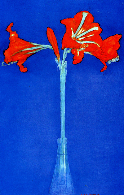
Three red amaryllis flowers spread across the top of a tall blue field. A fourth bud rises between them. Their pale stem continues down into a narrow glass flask, leaving a broad area of blue around it. In Red Amaryllis with Blue Background, Piet Mondrian gives a single flowering stem the space and attention usually reserved for a portrait. The bold red petals draw the eye first; the long, straight stem then makes the viewer look more slowly at the shape of the whole plant.
The Museum of Modern Art in New York identifies this work as a watercolor on paper, dated around 1907, measuring 46.5 × 33.0 cm. Its object number is 1773.1967 and its credit is The Sidney and Harriet Janis Collection. RKD catalogues the same MoMA amaryllis as C35, though its date line is the wider c. 1907–1930. Both records place this blue-background watercolor in MoMA's collection.[1][2]
At a glance
- ArtistPiet Mondrian (Piet Mondriaan, 1872–1944)
- Museum titleRed Amaryllis with Blue Background
- MoMA datec. 1907
- RKD catalogueC35, with a broader c. 1907–1930 date line
- MediumWatercolor on paper
- Dimensions46.5 × 33.0 cm (height × width)
- CollectionThe Museum of Modern Art, New York
- CreditThe Sidney and Harriet Janis Collection
- Museum object number1773.1967[1][2]
Where this amaryllis sits in Mondrian's career
Contents
- What does Red Amaryllis with Blue Background show?
- Why did Mondrian focus on a single flower?
- How do the red and blue colours work together?
- Is this the same as Mondrian's other Amaryllis works?
- How did the watercolor enter MoMA's collection?
What does Red Amaryllis with Blue Background show?
A single stem stands nearly upright in a slim transparent vessel. Near the top it branches into open flowers facing left, forward and right, while a narrow bud rises between them. The three red heads create a broad horizontal crown. Below them, the pale stem forms a long vertical line that extends toward the bottom of the sheet. The contrast between that wide cluster and the slender support gives the composition its basic shape.
 The Red Tree Piet Mondrian.jpg)
The blue background reaches every edge. It offers no tabletop, window or room to locate the flask in a familiar interior. At the lower part of the image, the vessel is lightly drawn against blue that changes subtly in tone. The absence of detailed surroundings lets the flower's proportions become the main event: a high, spreading top held by a thin, lengthy stem.
The petals are emphatically red-orange, but their outlines are irregular. Some curl or hang down; others push to the sides. Mondrian has not turned them into matching decorative shapes. Pale blue and white strokes mark the flower's centre and trace parts of the stem. Their cool colour connects the plant to the surrounding blue even as the red blossoms stand out sharply against it.
The glass flask is easy to overlook because it is so close in colour to the background. Its opening catches the stem, and faint vertical edges suggest a transparent body. Looking down from the flowers to the vessel changes the scale of attention. The red crown feels expansive, while the small container and thin stem seem almost fragile. Both impressions belong to the same carefully balanced image.
The composition rewards a second look at the space between the blossoms. Blue shows through gaps in the red, and a narrow upright bud interrupts the otherwise spreading form. The plant is represented clearly enough to recognize, yet the distances among its parts are just as important as the parts themselves. The picture is a study of an amaryllis and of how a few lines and colour areas can hold a tall sheet together.
Why did Mondrian focus on a single flower?
MoMA discusses this watercolor alongside a Chrysanthemum drawing from 1906 as examples of Mondrian's early flower studies. The museum cites his stated preference for painting a single flower rather than a bouquet, because that allowed him to express its structure more fully. The remark is a useful guide to looking at the amaryllis, though it should not be treated as a diary entry made while this particular sheet was in progress.[3]
The amaryllis makes its structure unusually visible. Its straight stem, branching point, open heads and bud can be followed from bottom to top. A bouquet would introduce many stems and overlapping flowers. Here the viewer can examine how one plant expands from a narrow base into a broad flowering crown. Mondrian's choice of a tall format gives that rise plenty of room.
MoMA's essay suggests that attention to the form of natural subjects connects these early studies with questions Mondrian pursued in later work. That is an interpretation of a long artistic career, not evidence that the red amaryllis secretly contains a later grid. The watercolor has its own strengths: the clarity of a single stem, the differing directions of the flowers and a simple yet striking colour relationship.[3]
RKD lists several amaryllis works across its catalogues. Some are studies, some show different arrangements, and they are not all in the same collection. This repeated interest supports MoMA's account of flowers as a sustained subject. It also makes exact identification important. An artwork called simply Amaryllis can point to another Mondrian flower altogether.[2][4]
Watch: Piet Mondrian
See his studio, the move toward geometric abstraction and the rhythms of his New York paintings.
Piet Mondrian: Abstract Painting as We Know It
Curator Michael White explores the paintings and Mondrian’s studio as an abstract space.
Watch on YouTubeHow do the red and blue colours work together?
The red blossoms occupy a relatively small portion of the sheet, yet they command attention because the surrounding blue is so extensive. Their warm colour appears strongest where a petal meets the cool field directly. There is no need to imagine a realistic blue room or sky to feel that contrast. Blue works as both background and an active part of the composition.
The stem softens the opposition. Its pale blue-white colour belongs to neither the red flowers nor the saturated blue field entirely. It leads the eye between the two. Similar light strokes within the flower heads bring cool accents into the red. The flask at the bottom seems almost absorbed into the background, so the central pale line remains the clearest connection between the top and bottom of the sheet.
The medium matters. MoMA identifies watercolor on paper, and the reproduction shows areas of colour alongside more delicate lines. That material description is more accurate than treating this image as an oil painting. It also reminds us that the strong red-blue effect did not require Mondrian's later use of solid rectangular colour planes. Here petals, bud, stem and glass remain recognisable throughout.[1]
MoMA's collection record does not explain an exact symbolic meaning for every colour. A viewer may find the blue calming or the red startling, and the museum's essay links Mondrian's early interest in nature to Theosophical ideas in a broader sense. Neither point proves a fixed code for this particular watercolor. The visible choices are already specific: three open red heads, a pale central axis and a deep blue field that leaves little else to compete with them.[3]
Is this the same as Mondrian's other Amaryllis works?
No. RKD's entry for the MoMA watercolor is C35, Red amaryllis with blue background. Its late-naturalistic flower list includes other similarly named works, including C34, C36 and C38. The catalogue gives different dates and collections for them. A similar title alone cannot settle which flower is being discussed; MoMA's object number and the blue-background image do that here.[2]
RKD also lists four amaryllis entries among the flowers of 1908–1911. A624 is Amaryllis in round bottle at the Sheldon Museum of Art; A625 is a study; A626 is an Amaryllis dated 1910 in a private collection; and A627 is Amaryllis II, also dated 1910. Those separate objects help explain why “Amaryllis, 1910” can appear in discussions of Mondrian. It does not describe the exact MoMA image displayed here.[4]
MoMA currently dates its watercolor c. 1907. RKD's C35 line extends to c. 1930. Neither short catalogue line, on its own, explains the reason for that difference. For the object facts and current museum information, MoMA's direct record is the clearest guide; the broader RKD entry is valuable for locating the sheet among Mondrian's other flower works. The two records should be read together rather than flattened into an unsupported single year.[1][2]
How did the watercolor enter MoMA's collection?
MoMA's published provenance begins with Mondrian himself. It then records Charles J. F. Karsten Sr. and Mrs C. H. Karsten-van Rossem, who acquired it from the artist in 1931. Sidney and Harriet Janis acquired it in 1967, and it entered MoMA that year as part of their collection. This ownership history belongs to C35; it should not be transferred to the other red amaryllis sheets listed by RKD.[1]
The original belongs to The Museum of Modern Art in New York, object 1773.1967. MoMA's direct artwork page supplies the current collection details and, at the time of this writing, says the work is not on view. Display can change, so check that page before travelling specifically to see the watercolor.[1]
The short title Amaryllis is understandable, but MoMA's fuller title points to what makes this particular study memorable. Red blossoms fan out above a single pale stem; an expansive blue field surrounds them. Mondrian presents a familiar flower so that its structure and the spaces around it can be seen afresh.
Mondrian artworks directory
Frequently asked questions
When was Red Amaryllis with Blue Background made?
Is it a painting in oils?
No. MoMA identifies watercolor on paper, measuring 46.5 × 33.0 cm.[1]
Where is the original?
It belongs to The Museum of Modern Art, New York, object 1773.1967. Check MoMA's current display listing before visiting.[1]
Are all Mondrian's red amaryllis pictures the same work?
Why is there so much blue around the flower?
The broad blue field gives the red blossoms and long pale stem a clear setting. Their contrast and the open space around them are visible choices, although MoMA does not assign an exact meaning to each colour.[1]
Discussion
Which red blossom draws your eye first, and how does the stem lead it downward?
Reader Insights
Follow the pale stem into the flask. Where does it blend into the blue?
What changes when you look at the open blue space between the petals?
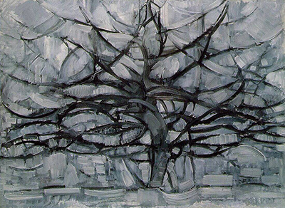
How does this single flower differ from Mondrian’s spreading tree pictures?
Join the Conversation
Share what you notice in this painting below.
References
- The Museum of Modern Art, collection record for Piet Mondrian, Red Amaryllis with Blue Background, object 1773.1967. View source.
- RKD – Netherlands Institute for Art History, Mondrian catalogue raisonné, late-naturalistic flower representations, C35 and related amaryllis entries. View source.
- The Museum of Modern Art, Samantha Friedman, “Avant-Abstraction: Kupka and Mondrian Represent,” 24 January 2013. View source.
- RKD – Netherlands Institute for Art History, Mondrian catalogue raisonné, Amsterdam 1908–11 flower representations, A624–A627. View source.
- Lead image credit. Piet Mondrian, Red Amaryllis with Blue Background, c. 1907. The Museum of Modern Art, object 1773.1967.